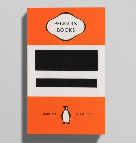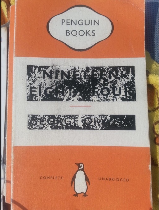
In 2013, Penguin released in the UK a series of new covers for five works by George Orwell, including a particularly bold cover design for Orwell’s best-known work, 1984. According to Creative Review, the designer, David Pearson, made it so that the book’s title and Orwell’s name were debossed, then almost completely obscured by black foiling, leaving just “enough of a dent for the title to be determined.” No doubt, the design plays on the whole idea of censorship, “referencing the rewriting of history carried out by the novel’s Ministry of Truth.”
Years later, you’ll have difficulty buying new copies of Pearson’s design. They’re in pretty short supply. But anyone with a well-worn copy of the book might discover what one Redditor has also observed–that the cover design “becomes less censored with wear.” Compare the “before” image above to the “after” image down below. Was this all part of Pearson’s long-range master plan? Or something of a design flaw? We’ll probably never know. But if you’re looking for a book that gets better with age, then this is one to add to your list.

If you would like to sign up for Open Culture’s free email newsletter, please find it here. It’s a great way to see our new posts, all bundled in one email, each day.
If you would like to support the mission of Open Culture, consider making a donation to our site. It’s hard to rely 100% on ads, and your contributions will help us continue providing the best free cultural and educational materials to learners everywhere. You can contribute through PayPal, Patreon, and Venmo (@openculture). Thanks!
Related Content:
George Orwell’s Harrowing Race to Finish 1984 Before His Death
Aldous Huxley to George Orwell: My Hellish Vision of the Future is Better Than Yours (1949)


Leave a Reply