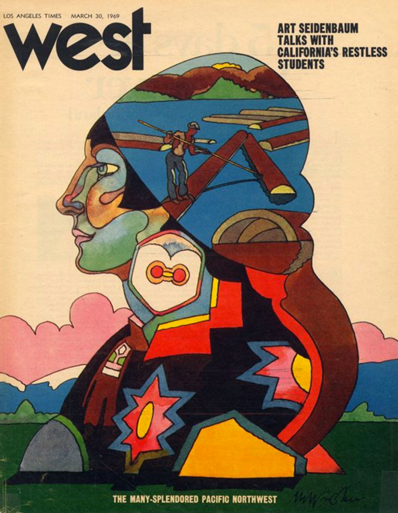
In the late 1960s, a counterculture-minded media professional could surely have imagined more appealing places to work than the Los Angeles Times. Widely derided as the official organ of the Southern California Babbitt, the paper also put out a bland Sunday supplement called West magazine. But West had the potential to evolve into something more vital — or so seemed to think its editor, Jim Bellows. The creator of “the original New York magazine in the early 1960s,” writes Design Observer’s Steven Heller, Bellows convinced a young adman named Mike Salisbury, “who worked for Carson Roberts Advertising in L.A. (where Ed Ruscha and Terry Gilliam worked), to accept the job as art director.”
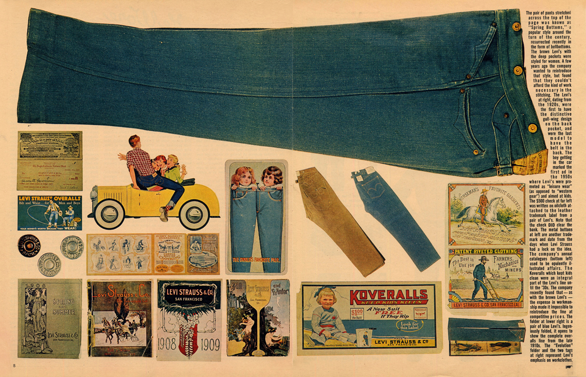
Salisbury injected West “with such an abundance of pop culture visual richness that it was more like a miniature museum than weekly gazette.” Its weekly issues “covered a wide range of themes — mostly reflecting Salisbury’s insatiable curiosities — from a feature on basketball that illustrated the tremendous size of center forwards by showing a life-size photograph of Wilt Chamberlin’s Converse sneaker, to a pictorial history of movie star pinups with a bevy of gorgeous silhouettes fanning on the page, to an array of souped-up VW Beetles in all shapes and sizes.”
On any given Sunday, subscribers might find themselves treated to “the history of Mickey Mouse, Coca-Cola art (the first time it was published as ‘art’), the visual history of Levis, Hollywood garden apartments, Raymond Chandler locations, and Kustom Kars.”
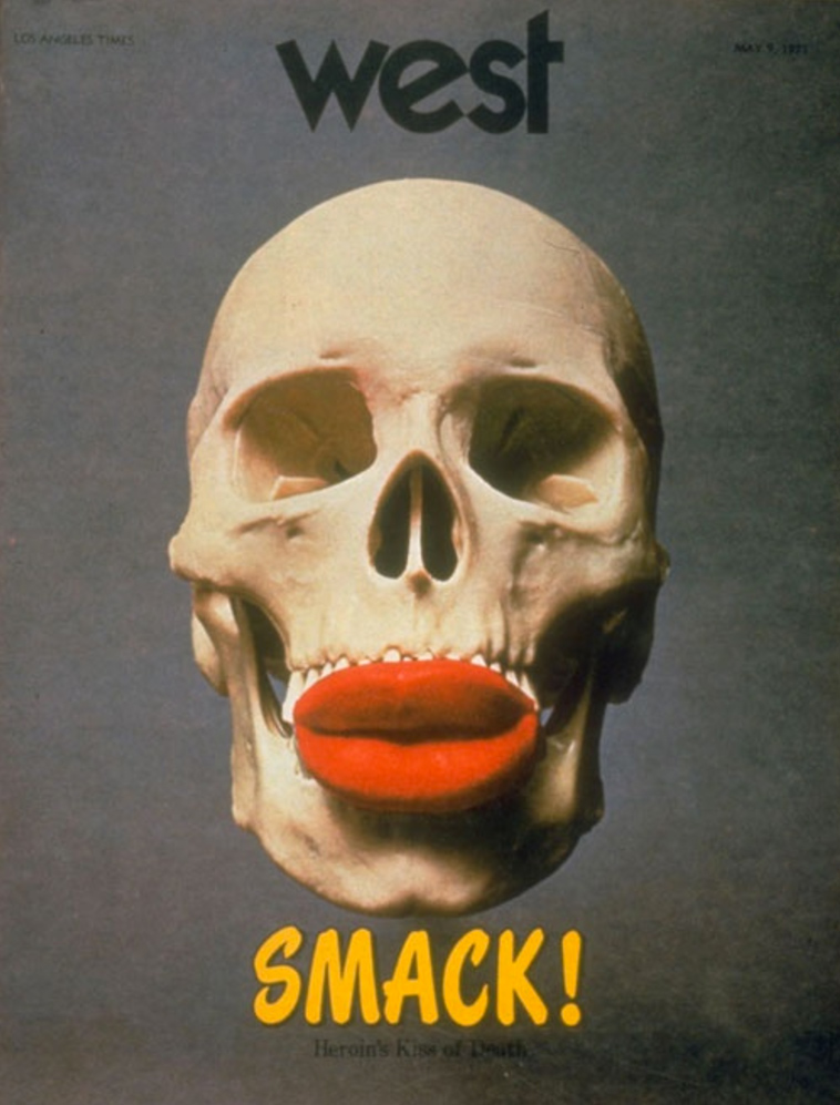
“I was the writer on the Coca-Cola ‘art’ piece as well as the first ‘programmatic’ architecture article to see print,” says a commenter under the Design Observer retrospective named Larry Dietz. He also claims to have written the feature on Raymond Chandler’s Los Angeles; much later, he adds, Chinatown screenwriter “Robert Towne said that he was inspired to learn about L.A. history from that piece, but that the writing was crappy.” But then, the main impact of Salisbury’s West was never meant to be textual. Heller quotes Salisbury as saying that “design was not my sole objective: cinema-graphic information is a better definition.” Of all the covers he designed, he remembers the one just above, promoting an exposé on heroin, as having been the most controversial: “Don’t give me too much reality over Sunday breakfast,” he heard readers grumbling.
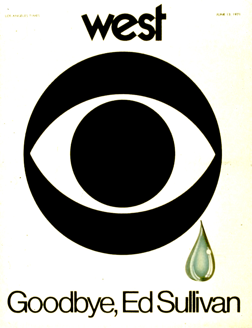
Other memorable West covers include the magazine’s tribute to the just-canceled Ed Sullivan show in 1971, as well as contributions by artists and designers like Victor Moscoso, Gahan Wilson, John Van Hamersveld, and Milton Glaser, all figures who did a great deal to craft the American zeitgeist of the 1960s and 70s. The magazine as a whole consolidated the Southern Californian pop-cultural aesthetic of its period, as distinct from what Salisbury calls the “quasi-Victorian” look and feel of San Francisco to the north and the “Rococo or Baroque” New York to the east. Los Angeles, to his mind, was “streamline,” emblematized by the culture and industry of motorcycle customization and its “belief in Futurism.”
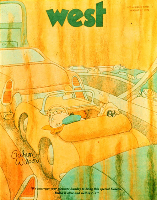
West was a product of the Los Angeles Times under Otis Chandler, publisher from 1960 to 1980, who dedicated his career to expanding the scope and ambition of the newspaper his great-grandfather had once run. His labors paid off in retrospect, especially from readers as astute as Joan Didion, who praised Chandler’s Times to the skies. But by 1972, West seemed to have become too much of an extravagance even for him. After the magazine’s cancellation, Salisbury moved on to Rolling Stone, then in the process of converting from a newspaper to a magazine format. No small part of that magazine’s pop-cultural power in the 70s must have owed to his art direction.
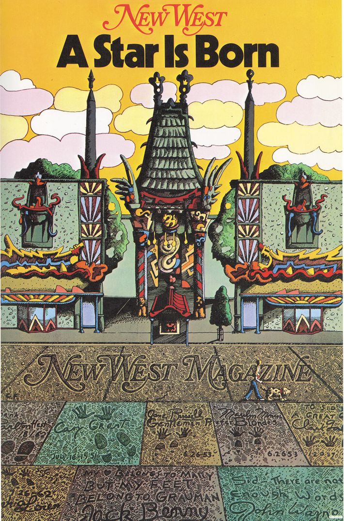
Later in the decade, both Salisbury and Glaser would bring their talents to the just-launched New West magazine. It had no direct connection with West or the Los Angeles Times, but was conceived as the sister publication of New York Magazine, which itself had been re-invented by Glaser and publisher Clay Felker in the mid-1960s. Its debut cover, just above, featured Glaser’s artwork; three years later, in 1979, Salisbury designed a cover on California’s water crisis that the American Institute of Graphic Arts’ Steven Brower calls “prescient.” At that same time, he notes, Salisbury “worked with Francis Ford Coppola on the set design for Apocalypse Now; he designed Michael Jackson’s breakthrough album, Off the Wall,” and he even collaborated with George Harrison on his eponymous album.” But when “veteran magazine art directors” get together and “reminisce about the glory years,” writes Heller, it’s West they inevitably talk about.
Related Content:
Milton Glaser’s Stylish Album Covers for The Band, Nina Simone, John Cage & Many More
Based in Seoul, Colin Marshall writes and broadcasts on cities, language, and culture. His projects include the Substack newsletter Books on Cities, the book The Stateless City: a Walk through 21st-Century Los Angeles and the video series The City in Cinema. Follow him on Twitter at @colinmarshall or on Facebook.


Thank you so much as the cashier shouted out at Kmart-”..attention! attention ! ‑I just love attention!”