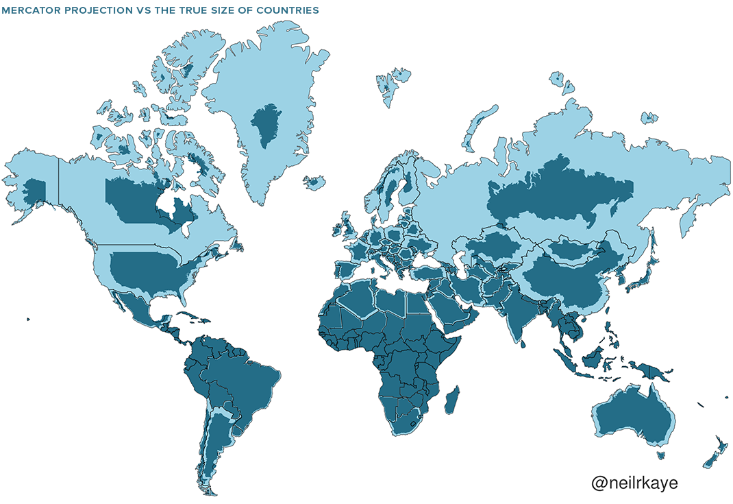
The world maps we know all misrepresent the world itself: we’ve all heard it many times before, but how well do we understand the nature of that misrepresentation? “For many people, the Earth as they know it is heavily informed by the Mercator projection – a tool used for nautical navigation that eventually became the world’s most widely recognized map,” writes Visual Capitalist’s Nick Routley. But the Mercator projection dates to 1569, and “the vast majority of us aren’t using paper maps to chart our course across the ocean anymore, so critics of the Mercator projection argue that the continued use of this style of map gives users a warped sense of the true size of countries.”

Some of the geographical misconceptions Gerardus Mercator inadvertently instilled in humanity to this day include exaggerations of the size of Europe and North America. “Visually speaking, Canada and Russia appear to take up approximately 25% of the Earth’s surface” on a Mercator map, “when in reality they occupy a mere 5%.”
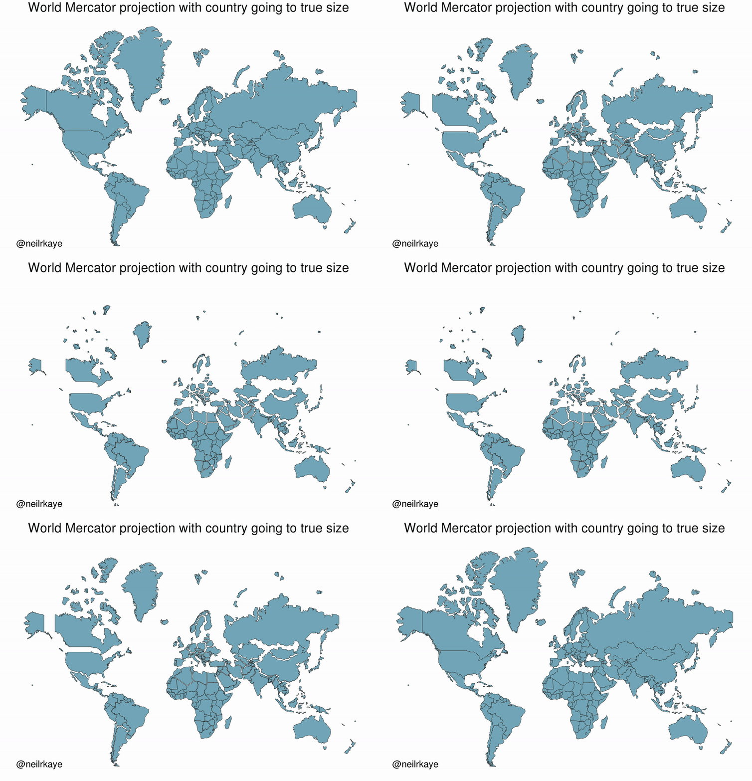
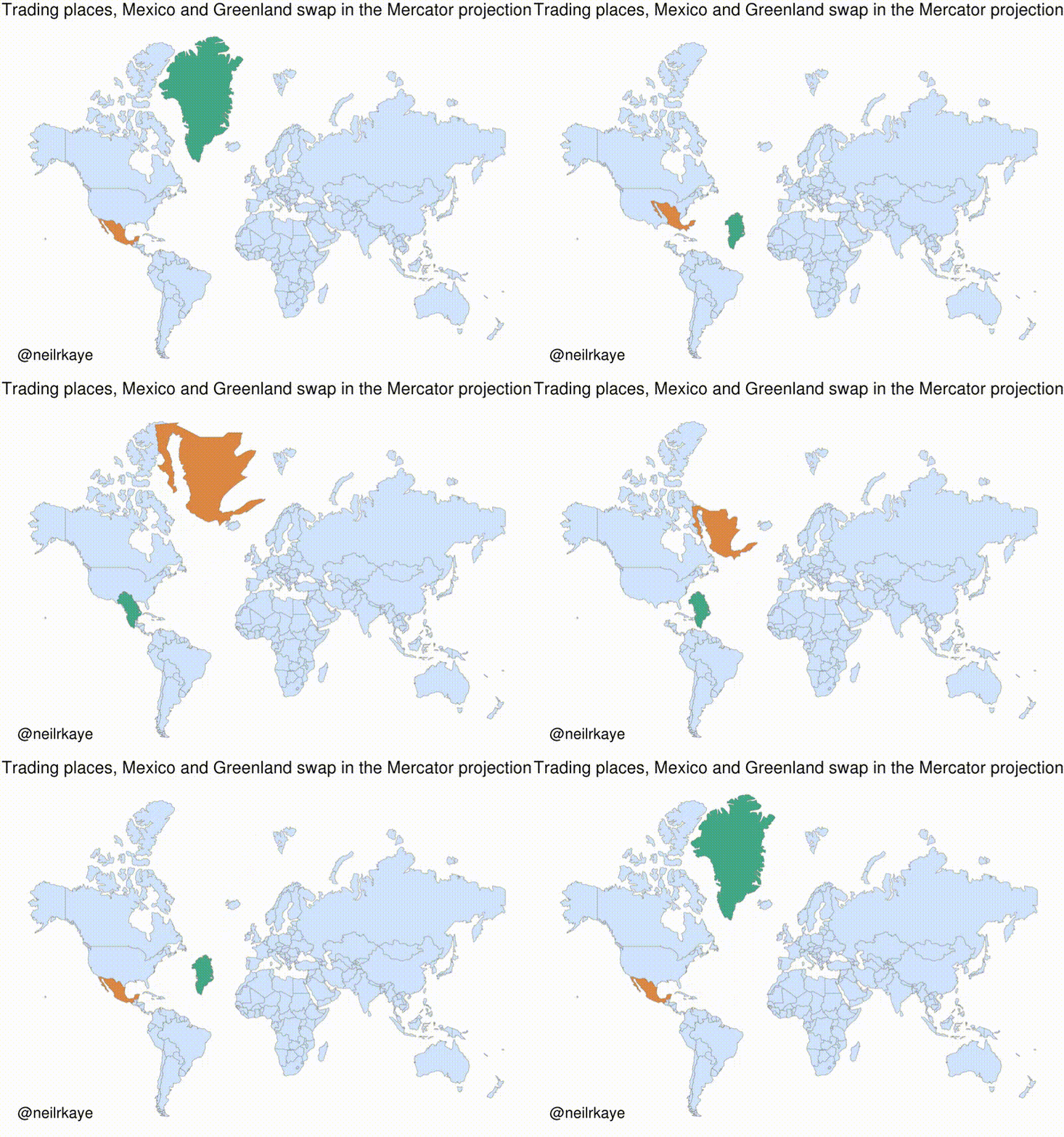
Figures are one thing, but a fair few 21st century cartography enthusiasts have also used technology unavailable and indeed unimaginable in Mercator’s day to show us in a more immediately legible way exactly how his projection distorts land masses. Recently, a climate data scientist named Neil Kaye has used the form of the animated GIF to show what happens when countries shrink to their actual size on a Mercator map, and when Mexico and Greenland trade places.

As soon as Mexico goes north and Greenland goes south, it becomes obvious that both are really of a similar size, though we might have assumed the latter to be much larger than the former. And in fact, Mercator projection makes all countries farther from the equator look larger in relation to all countries nearer to the equator. We’ve pointed out the impossibility of making a perfectly faithful two-dimensional world map before here before on Open Culture, an impossibility that hasn’t stopped cartographers from trying to come up with more and more accurate projections. But even they can’t substitute for an acute awareness of how even the most popular maps can be wrong, an awareness you can develop even more intensively by viewing the many other cartographic creations Kaye has posted to the “Map Porn” subreddit — another technological development Mercator surely couldn’t have foreseen.
Related Content:
Japanese Designers May Have Created the Most Accurate Map of Our World: See the AuthaGraph
The History of Cartography, the “Most Ambitious Overview of Map Making Ever,” Now Free Online
New York Public Library Puts 20,000 Hi-Res Maps Online & Makes Them Free to Download and Use
A Radical Map Puts the Oceans – Not Land – at the Center of Planet Earth (1942)
Why Making Accurate World Maps Is Mathematically Impossible
Based in Seoul, Colin Marshall writes and broadcasts on cities, language, and culture. His projects include the book The Stateless City: a Walk through 21st-Century Los Angeles and the video series The City in Cinema. Follow him on Twitter at @colinmarshall or on Facebook.


WOW !
Check out the Google Earth app. It shows the full globe. This is the closest you can get to view the proper size of countries, continents, oceans and their surrounding areas.
It would have been interesting to remember why we used these maps in the first time…
this is sadly a modern misconception / misuse, since the first Mercator map was created purely for navigational needs (representing on a unique map all the world oceans and sailing directions as straight lines).
At the same time, Cassini maps were introduced in the 18th century for land management / census per country; and later for military purpose (they represented distance accurately enough on a local map)
Like Mercator, they distort the world since NO PLANAR MAP can ever represent at the same time accurate distance, shape and size.
Unfortunately, the use has been lost in modern times since this type of map is no longer required at the age of GPS. What was purely a functional map has now become a political representation, and thus becomes wrong.
Name two days