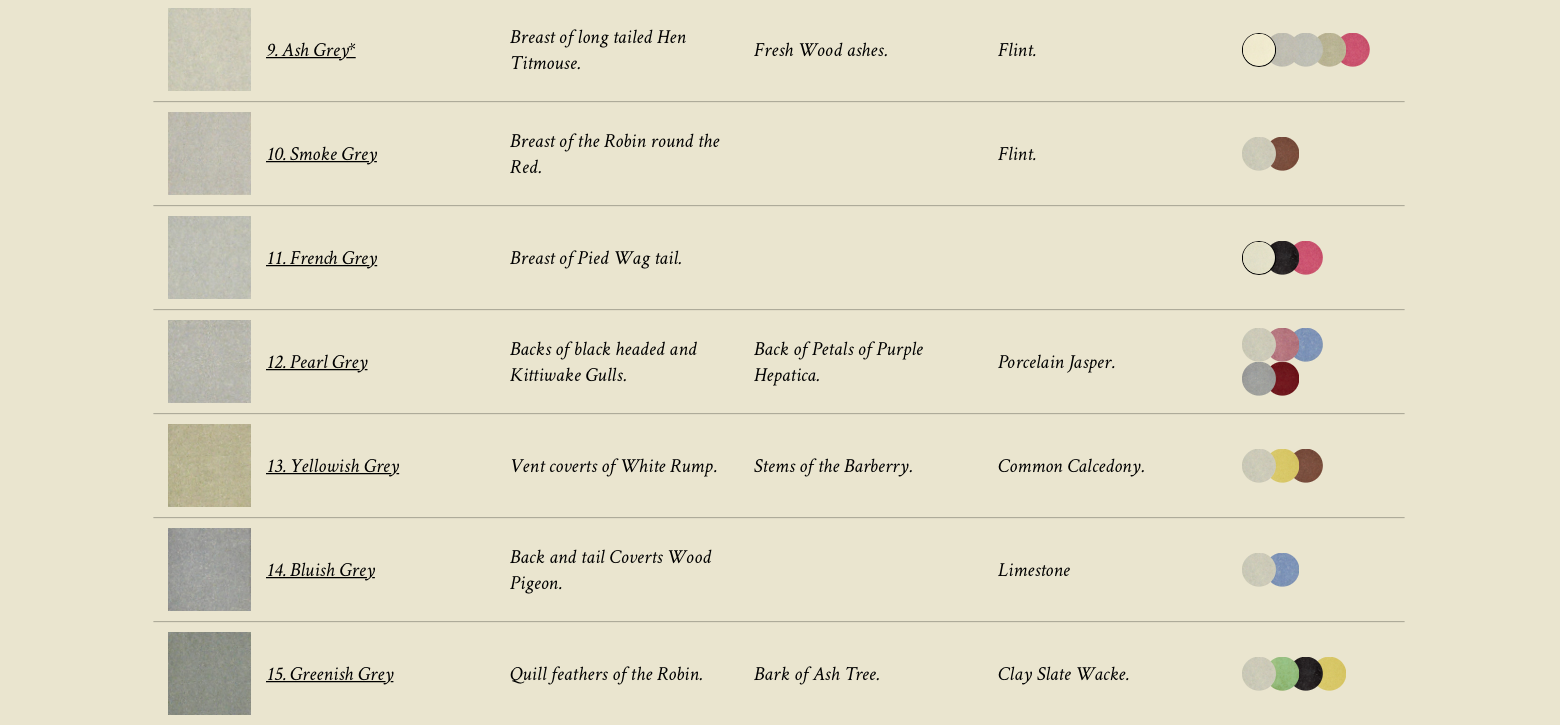
In a post earlier this year, we brought to your attention Werner’s Nomenclature of Colours. Used by artists and naturalists alike, the guide originally relied on written description alone, without any color to be found among its pages. Instead, in the late eighteenth century, German mineralogist Abraham Gottlob Werner painstakingly detailed the qualities of the 110 colors he surveyed, by reference to where they might be found on animals, vegetables, and minerals. The color “Pearl Gray,” for example, might be located on the “Backs of black headed and Kittwake Gulls,” the “Back of Petals of Purple Hetatica,” or on “Porcelain Jasper.”
The literary possibilities of this approach may seem vast. But its usefulness to those engaged in the visual arts—or in close observation of new species in, say, the Galapagos Islands—may have been somewhat lacking until Scottish painter Patrick Syme updated the guide in 1814 with color swatches, most of them using the very minerals Werner described.
It was the second edition of Syme’s guide that accompanied Charles Darwin on his 1831 voyage aboard the HMS Beagle, where he “used it to catalogue the flora and fauna that later inspired his theory of natural selection,” as historian Daniel Lewis writes at Smithsonian.

While we might think of taxonomies of color as principally guiding artists, web designers, and house painters, they have been indispensable for scientists. “They can indicate when a plant or animal is a different species or a subspecies,” Lewis notes; “in the 19th century, the use of color to differentiate species was important for what it said about evolution and how species changed over time and from region to region.” For historians of science, therefore, Werner’s Nomenclature of Colours represents an essential tool in the early development of evolutionary biology.
Other color dictionaries followed, “designed to give people around the world a common vocabulary to describe the colors of everything from rocks and flowers to stars, birds, and postage stamps.” Some of these were highly specialized, such as the two-volume set created by the French Society of Chrysanthemists in 1905. All of them, however, strove to meet the high bar set by Werner when it came to level of detailed description. These are guides that speak in human terms, in contrast to the nomenclature most often used today, which “is really a machine language,” Kelsey Cambell-Dollaghan writes at Fast Company, “numerical hex codes crafted to communicate with software on computers and printers.”

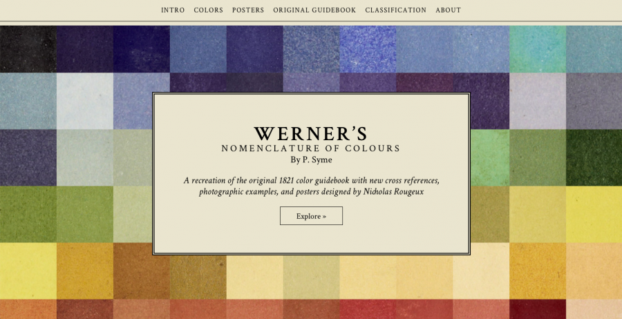
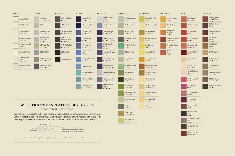
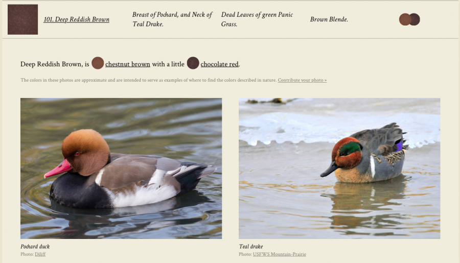
In recognition of Werner and Syme’s contribution to color nomenclature, Smithsonian Books recently republished the 1814 edition of their guide, and the revised 1821 edition has been available for some time as scans at the Internet Archive. Now it has received a 21st update thanks to designer Nicholas Rougeux, who has created an online interactive version of the book, “with additions like data visualizations of its 100 colors and internet-sourced photographs of the animals and minerals that the book references”—a feature its creators could never have dreamed of. You can read Werner’s complete text, see all of the colors as illustrated and categorized by Syme, and even purchase through Rougeux’s site cool 36” x 24” posters like that above, starting at $27.80.

It’s true, viewing the book online has its drawbacks, related to how Syme’s paint swatches are translated into hex codes, then displayed differently depending on various screen settings. But Rougeux has tried to compensate for this difference between print and screen. On a publicly accessible Google Doc, he has provided the hex codes “for each of the 18th-century hues, from Skimmed Milk (#e6e1c9) to Veinous Blood Red (#3f3033).” Not nearly as poetic as Werner’s descriptions, but it’s what we have to work with these days when reference books get written for computers as much as they do for humans.
See the interactive Werner’s Nomenclature of Colours here.
via Fast Company
Related Content:
The Vibrant Color Wheels Designed by Goethe, Newton & Other Theorists of Color (1665–1810)
Josh Jones is a writer and musician based in Durham, NC. Follow him at @jdmagness


This is lovely, but it’s worth pointing out that the photograph on the left is a red-crested pochard, not a (common) pochard which I assume was intended, as they have somewhat different breast colours (the former is black, not the shade of brown referred to).