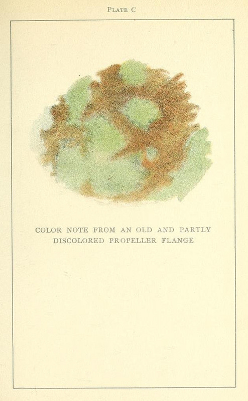
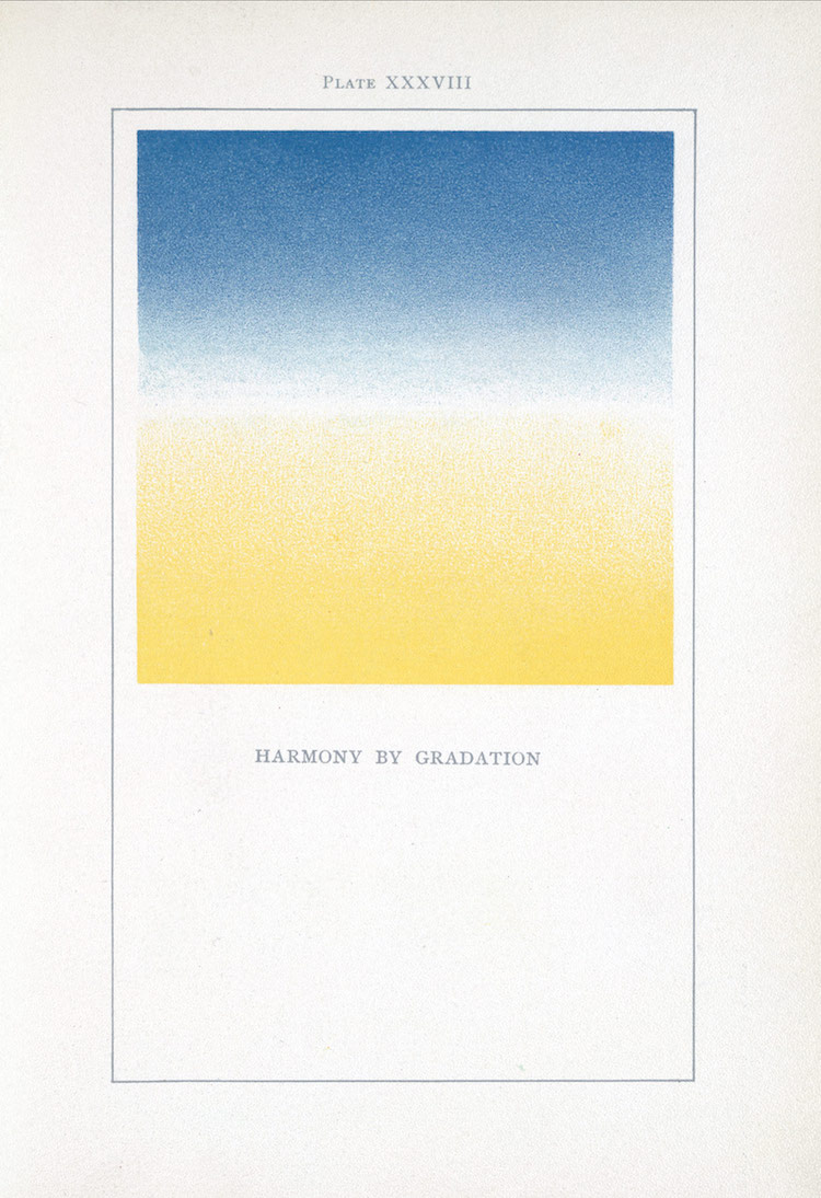
Nobody can doubt that we can live in an age of screen-reading, nor that it has brought a few problems along with its considerable conveniences. To name just one of those problems, each of us reads on our own screen, and each screen reproduces the information fed into it to display differently. A color, for instance, might well not look quite the same to any given reader of an e‑book as it did to the designer who originally chose it. This imbues with a new relevance the old dorm-room philosophical question of whether what I call “blue” really looks the same as what you call “blue,” and at least the more controllable nature of old-fashioned print books takes the issue of screen variation out of the equation.

Hence the value in bringing back to print certain visually-oriented books, even when we can already read them on our screens. This goes especially for volumes like Emily Noyes Vanderpoel’s Color Problems: a Practical Manual for the Lay Student of Color, which deals directly with issues of color in the physical world and its representation. Vanderpoel, an artist and historian, first published the book “under the guise of flower painting and decorative arts, subjects that were appropriate for a woman of her time,” writes Colossal’s Kate Sierzputowski. But “the study provided an extensive look at color theory ideas of the early 20th century,” and one whose techniques proved silently influential over time. “Many of the included studies predict design and art trends that wouldn’t occur for several decades, such as a concentric square format that predates Joseph Albers’s Homage to the Square by fifty years.”
You can read a digitized version of Color Problems at the Internet Archive (or embedded right above), but know that publisher The Circadian Press and Sacred Bones Records recently raised well over $200,000 on Kickstarter to republish the book in its full paper glory. “With this new edition we have taken meticulous measures to reproduce the original artifact at an affordable price,” says the project’s about page. “Working with the Historical Society that Emily Noyes Vanderpoel helped establish, we are the first to invest the time, money, and love it takes to replicate this brilliant collection of color studies accurately. Using the most current digital methods and archival printing production, we aim to finally do justice to Vanderpoel’s forgotten legacy as visionary and pioneer.”

This new edition will also feature an introduction by design scholar Alan P. Bruton meant to “reflect on her incredible body of work from the vantage point of 21st century art history and women’s movements, helping to illustrate that Vanderpoel remains one of the most important, underrated, and contemporarily relevant artists of her time and of the last century.” Had Vanderpoel published Color Problems thirty years later, writes John F. Ptak in his examination of the book, “we’d call it some sort of constructivist/constructionist art form. But since the artwork in the book comes a decade before the first non-representational artwork in human history (or so), I don’t know exactly what to call it.” Its republication will allow generations of new readers, seeing it in the way Vanderpoel intended it to be seen, to come to conclusions like Ptak’s: “I still do not know what this book is trying to tell me, but I do know that it is remarkable.”
Related Content:
A Pre-Pantone Guide to Colors: Dutch Book From 1692 Documents Every Color Under the Sun
The Vibrant Color Wheels Designed by Goethe, Newton & Other Theorists of Color (1665–1810)
Based in Seoul, Colin Marshall writes and broadcasts on cities and culture. His projects include the book The Stateless City: a Walk through 21st-Century Los Angeles and the video series The City in Cinema. Follow him on Twitter at @colinmarshall or on Facebook.


Leave a Reply