Photo via Kosuke Takahashi
To those of us who’ve never had reason to learn it, the Braille alphabet can have an appealingly retro-futuristic look, not least because Braille signage in America seems most often installed in pre-2000s public buildings. But it must smack of the past to many of the visually impaired as well, who these days have a host of ever higher-tech reading devices available to them (thanks to which, of course, they can read sites like this one). And though public support for producing materials in Braille exists, the educational programs needed to spread Braille literacy in the first place have fewer champions. Braille itself, perhaps, needs an upgrade for the 21st century.
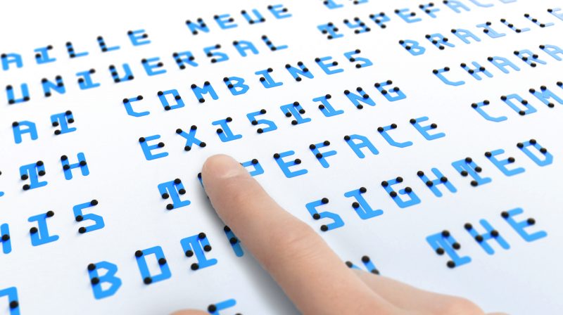
Kosuke Takahashi may be just the graphic designer to provide that upgrade. He’s come up with Braille Neue, “a universal typeface that combines braille with existing characters. This typeface communicates to both the sighted and blind people in the same space.” He has, in other words, designed a readable alphabet that allows for the overlaying of English with the corresponding raised Braille dots, keeping both legible at a glance — or at a touch, as the case may be. Other designers have tried their hand at the same project, but unlike Takahashi, none of their alphabets support phonetic Japanese characters as well. “Our aim is to use this universal typeset for [the] Tokyo Olympics and Paralympics 2020 to create a truly universal space where anyone can access information,” says Takahashi’s Braille Neue page.
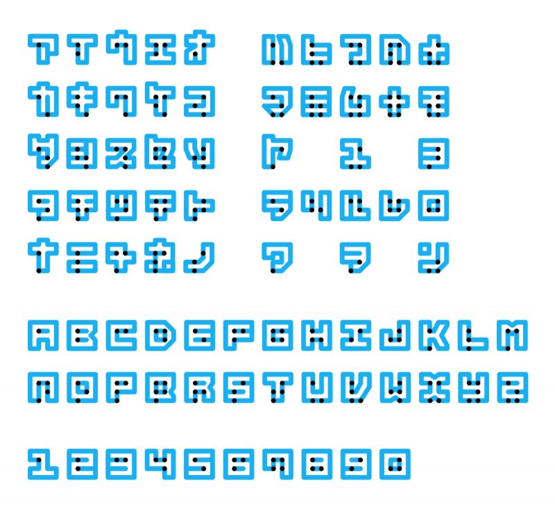
Photo via Kosuke Takahashi
Based on the existing Helvetica Neue font, Braille Neue — whose designer, according to My Modern Met, “is still experimenting with cost-effective printing and is refining the font prior to final release” — has the potential to spread not just awareness but literacy of Braille, given that it essentially shows sighted non-Braille readers a key every time they read it. As any non-Japanese person who has lived in Takahashi’s native land knows, even if you start with no idea of how to read a character in an unknown writing system, you’ll start to get a sense of it almost automatically if you see it often enough in context with your own. They’ll also know that if any country can implement retrofuturistic design in a way that fascinates the world, it’s Japan.
Related Content:
Helen Keller Had Impeccable Handwriting: See a Collection of Her Childhood Letters
How to Write Like an Architect: Short Primers on Writing with the Neat, Clean Lines of a Designer
Jorge Luis Borges, After Going Blind, Draws a Self-Portrait
Based in Seoul, Colin Marshall writes and broadcasts on cities and culture. His projects include the book The Stateless City: a Walk through 21st-Century Los Angeles and the video series The City in Cinema. Follow him on Twitter at @colinmarshall or on Facebook.
Hello, I am a visually impaired. I know how to read braille, but I don’t know the new version of braille. So how can I learn the new braille version?
How do I get my hands on some of this material to teach braille & low vision..Great way to teach dual readers!
Lisa
hey thats pretty good i can use this to send secret messages
Braille Neue is not, as you say, “Based on the existing Helvetica Neue font”. This has nothing to do with Helvetica Neue, or in fact, any existing font, except for standard braille. “Neue”, German for “new”, is a common addition to a font name that signifies that some minor, but significant, improvements were made.
One of the most widespread free neue fonts are Bebas Neue, a visual touch-up of the older, and now largely unused, Bebas. One of the most used commercial neues is Neue Frutiger.
Hi,
Where can I get this font?