No scene in a movie counts for as much as its opening, but even before its first frame passes through the projector, its poster has already made the real first impression. This remains basically as true in the era of digital cinema as it was when film actually passed through projectors. But while filmmakers only occasionally go back and retool their past works — not that the experience of, say, George Lucas and the original Star Wars trilogy vouches for the practice — film posters can easily undergo any number of revisions through the decades. What cinephile graphic designer wouldn’t want to take a shot at creating a new face for a favorite movie?

Last year, the Sydney-based designer Peter Majarich took shots at 365 of them, creating one new poster for an existing movie each and every day. “The feat is a huge undertaking,” writes the Creators Project’s Diana Shi, “but Majarich’s final products never give the impression of last-minute creations; instead, they show off an acute attention to detail and a bold, digital-influenced style. The inventiveness of each poster reveals how much of a cinephile Majarich really is.” His selections include “a pool of zeitgeist directors, Oscar winners, and art-house films with cult followings.

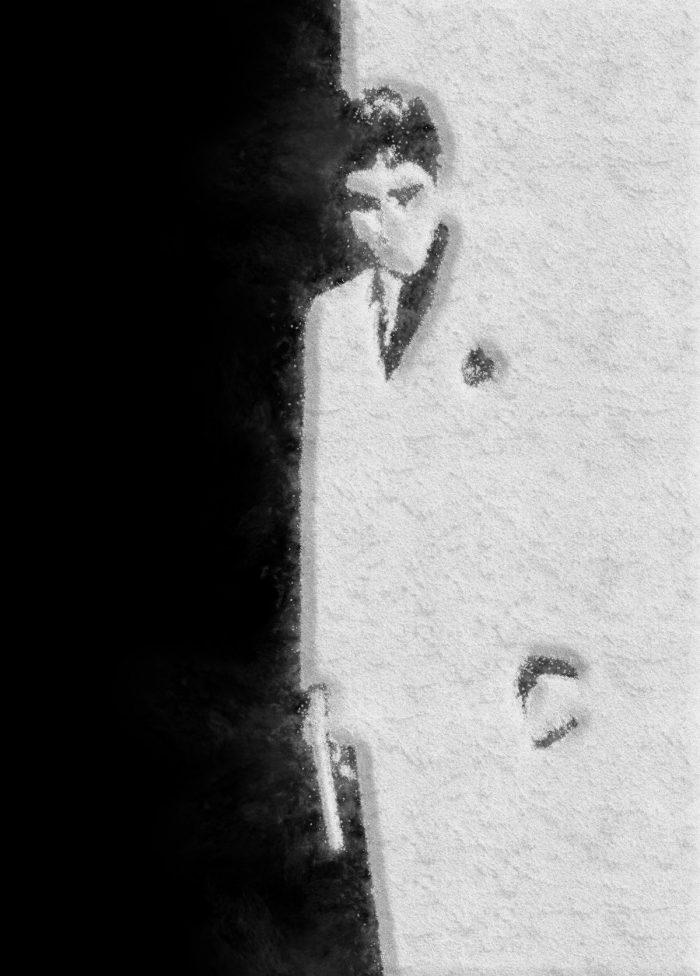
A rendering of De Palma’s Scarface is a subtle assembly of white powder to starkly draw out Al Pacino’s profile. While what looks like a body of complex coding language forms the blank-staring face of Alicia Vikander’s lead in Ex Machina.” You can browse all these at A Movie Poster a Day, see them displayed in sequence in the video above, and buy them on his design company’s site.

Their simultaneous aesthetic and cinematic references will please design- and film-lovers alike (groups hardly separate on the Venn diagram anyway), and while many constitute good visual gags, the best provide new perspectives on even much-watched favorite movies.

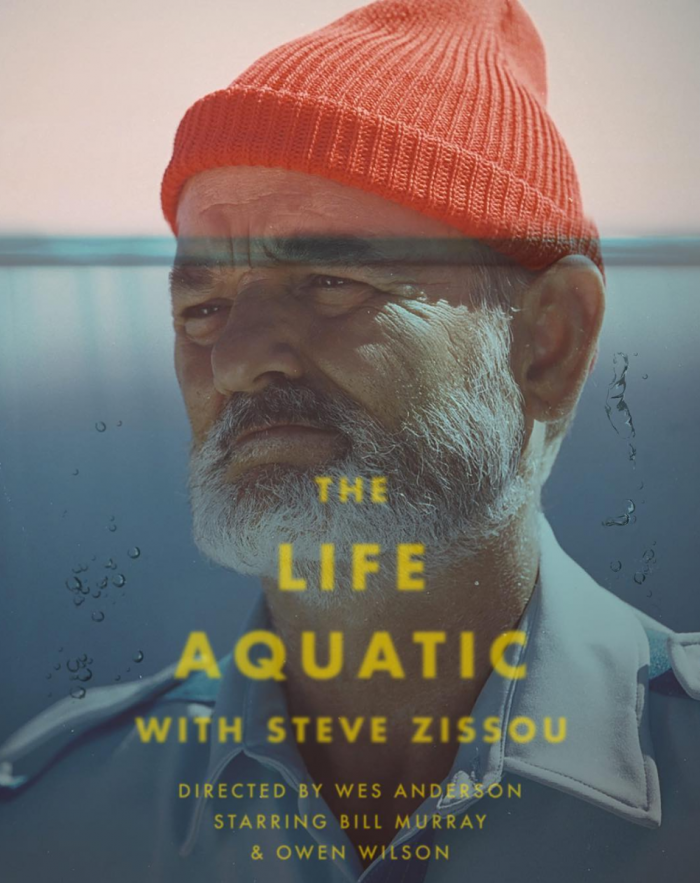
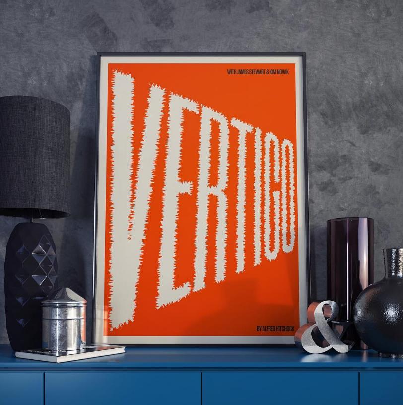
For Wes Anderson’s The Life Aquatic with Steve Zissou, Majarich depicts the emotional submersion of its seafaring protagonist; for Alfred Hitchcock’s Vertigo he works only with the title itself imbuing the type with the combination of shock and dread on display in the film; for David Lynch’s Mulholland Drive he uses a pink-skied landscape of the titular Los Angeles road leading off, as Lynch’s work often does, to who knows where. After you’ve seen the first 286, you’ll come upon a selection that will hardly surprise you: Gary Hustwit’s Helvetica.

Related Content:
A Look Inside Martin Scorsese’s Vintage Movie Poster Collection
The Strange and Wonderful Movie Posters from Ghana: The Matrix, Alien & More
Based in Seoul, Colin Marshall writes and broadcasts on cities and culture. He’s at work on a book about Los Angeles, A Los Angeles Primer, the video series The City in Cinema, the crowdfunded journalism project Where Is the City of the Future?, and the Los Angeles Review of Books’ Korea Blog. Follow him on Twitter at @colinmarshall or on Facebook.


Leave a Reply