Sit back, relax, put on some music (I’ve found Chopin’s Nocturne in B major well-suited), and watch the video above, a silent data visualization by visionary architect and systems theorist Buckminster Fuller, “the James Brown of industrial design.” The short film from 1965 combines two of Fuller’s leading concerns: the exponential spread of the human population over finite masses of land and the need to revise our global perspective via the “Dymaxion map,” in order “to visualize the whole planet with greater accuracy,” as the Buckminster Fuller Institute writes, so that “we humans will be better equipped to address challenges as we face our common future aboard Spaceship Earth.”
Though you may know it best as the name of a geodesic sphere at Disney’s Epcot Center, the term Spaceship Earth originally came from Fuller, who used it to remind us of our interconnectedness and interdependence as we share resources on the only vehicle we know of that can sustain us in the cosmos.
“We are all astronauts,” he wrote in his 1969 Operating Manual for Spaceship Earth, and yet we refuse to see the long-term consequences of our actions on our specialized craft: “One of the reasons why we are struggling inadequately today,” Fuller argued in his introduction, “is that we reckon our costs on too shortsighted a basis and are later overwhelmed with the unexpected costs brought about by our shortsightedness.”

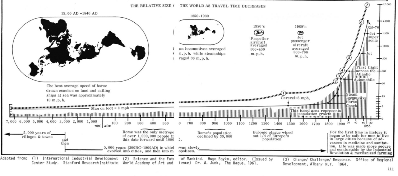
Like all visionaries, Fuller thought in long spans of time, and he used his design skills to help others do so as well. His population visualization documents human growth from 1000 B.C.E. to Fuller’s present, at the time, of 1965. In the image above (see a larger version here), we have a graphic from that same year—made collaboratively with artist and sociologist John McHale—showing the “shrinking of our planet by man’s increased travel and communication speeds around the globe.” (It must be near microscopic by now.) Fuller takes an even longer view, looking at “the confluence of communication and transportation technologies,” writes Rikke Schmidt Kjærgaard, “from 500,000 B.C.E. to 1965.”
Here Fuller combines his population data with the technological breakthroughs of modernity. Though he’s thought of in some quarters as a genius and in some as a kook, Fuller demonstrated his tremendous foresight in seemingly innumerable ways. But it was in the realm of design that he excelled in communicating what he saw. “Pioneers of data visualization,” Fuller and McHale were two of “the first to chart long-term trends of industrialization and globalization.” Instead of becoming alarmed and fearful of what the trends showed, Fuller got to work designing for the future, fully aware, writes the Fuller Institute that “the planet is a system, and a resilient one.”
Fuller thought like a radically inventive engineer, but he spoke and wrote like a peacenik prophet, writing that a system of narrow specializations ensures that skill sets “are not comprehended comprehensively… or they are realized only in negative ways, in new weaponry or the industrial support only of war faring.” We’ve seen this vision of society played out to a frightening extent. Fuller saw a way out, one in which everyone on the planet can live in comfort and security without consuming (then not renewing) the Earth’s resources. How can this be done? You’ll have to read Fuller’s work to find out. Meanwhile, as his visualizations suggest, it’s best for us to take the long view—and give up on short-term rewards and profits—in our assessments of the state of Spaceship Earth.
Related Content:
Buckminster Fuller’s Map of the World: The Innovation that Revolutionized Map Design (1943)
200,000 Years of Staggering Human Population Growth Shown in an Animated Map
The Life & Times of Buckminster Fuller’s Geodesic Dome: A Documentary
Josh Jones is a writer and musician based in Durham, NC. Follow him at @jdmagness


Haven’t seen this in ages; thanks for sharing. I listened to it to the sound of Dark Star by the Grateful Dead. Worked for me.