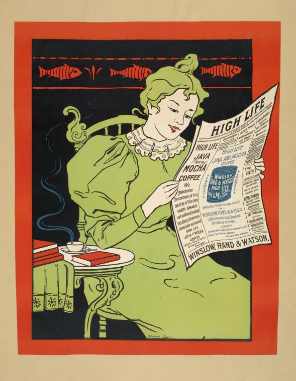
A scroll through any collection of contemporary graphic design portfolios makes for a dizzying tour of the seemingly unlimited range of colors, textures, fonts, etc. available to the modern commercial artist. From the most colorful pop art to the subtlest fine art, it seems that any and every vision can be realized on the page or screen thanks to digital technology. Turn the dial back over a hundred years, and the posters, magazine covers, and advertisements can seem primitive by initial comparison, somewhat washed out and anemic, and certainly nothing like the candy-colored visual feast that meets our eyes on laptop and smartphone screens these days.
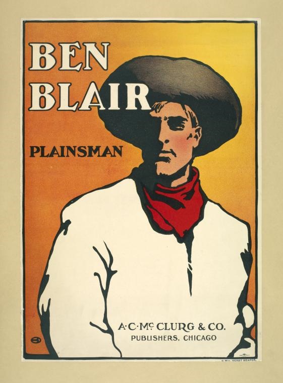
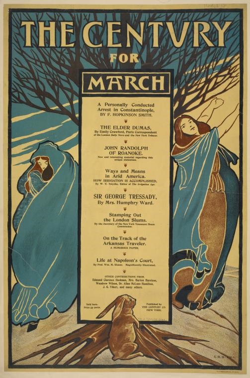
But look closer at the design of a century past, and you’ll find, I think, just as much variety, skill, and imagination—if not nearly so much color and slickness—as is on display today. And though software enables designers to create images and surfaces of which their predecessors could only dream, those hand-illustrated graphics of the past hold a strikingly simple allure that still commands our attention—drawing from art nouveau, impressionism, pre-Raphaelite, and other fine art forms and incorporating modernist lines and contrasts.
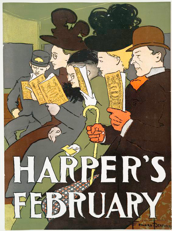
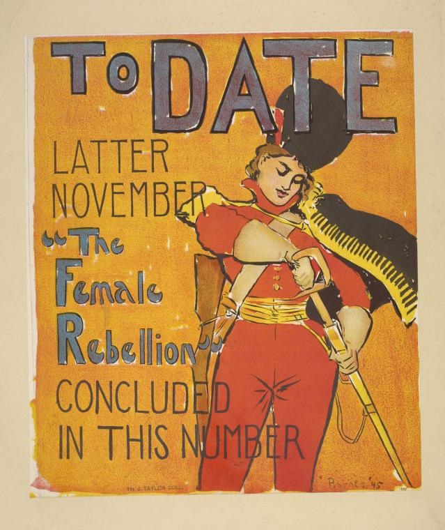
Any graphic designer working today can learn from the advertising posters you see here, and—thanks to the New York Public Library’s Turn of the Century Posters collection—can view and download hundreds more in high resolution, over 2000 more.
“The advent of the art poster in America,” writes NYPL, “is traceable to the publication of Edward Penfield’s poster advertising the March 1893 issue of Harper’s. [See a collection of his Harper’s posters here.] Unlike earlier advertising posters, Penfield’s work presented an implied graphic narrative to which text was secondary. In this way, and subsequently, in the hands of major artists such as Penfield, Will Bradley and Ethel Reed, the poster moved from the realm of commercial art to an elevated, artistic position.” These posters quickly became collector’s items, and “became more desirable than the publication they were advertising.”
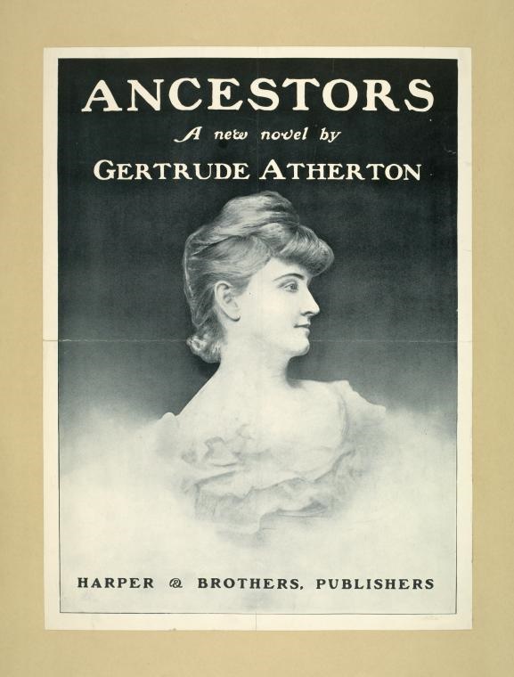
As such, the turn-of-the-century art poster pushed the publishing industry toward graphically illustrated-magazine covers and book jackets. The increasingly stylish, beautifully-executed posters on display in the NYPL archive show us not only the development of modern commercial design as advertising, but also its development as an art form. Though we may have needed Andy Warhol and his contemporaries to remind us that commercial art can just as well be fine art, a look through this stunning gallery of posters shows us that popular graphics and fine art often traded places long before the pop art revolution.
Related Content:
100,000+ Wonderful Pieces of Theater Ephemera Digitized by The New York Public Library
Foodie Alert: New York Public Library Presents an Archive of 17,000 Restaurant Menus (1851–2008)
Josh Jones is a writer and musician based in Durham, NC. Follow him at @jdmagness


Where can I buy some of these posters
Thank you for sharing this amazing work. Great article.
If you click the link to the library page, you can download them, then take them to a printer on a thumb drive and have them print them for you, or you could print them on a sheet of paper.
http://digitalcollections.nypl.org/collections/turn-of-the-century-posters#/?tab=about