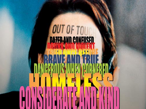
A decade ago, I voluntarily watched a Powerpoint presentation. That may sound unremarkable, but under normal circumstances I go to almost any length to avoid Powerpoint presentations. I throw my lot in with The Visual Display of Quantitative Information author Edward Tufte, known for his indictment of the “Powerpoint cognitive style” that “routinely disrupts, dominates, and trivializes content.” But this particular Powerpoint presentation didn’t happen under normal circumstances: it came from none other than artist, writer, and former Talking Head David Byrne.

Byrne may have done a number of such presentations under the banner of “I Love Powerpoint,” but he and Tufte regard that omnipresent Microsoft slideshow application more similarly than you might think. “Having never used the program before, I found it limiting, inflexible, and biased, like most software,” Byrne wrote of his user experience in Wired. “On top of that, PowerPoint makes hilariously bad-looking visuals.” And yet, “although I began by making fun of the medium, I soon realized I could actually create things that were beautiful. I could bend the program to my own whim and use it as an artistic agent.”

The fruits of Byrne’s experimentation, apart from those talks in the 2000s, include the book Envisioning Epistemological Emotional Information, a collection of his Powerpoint “pieces that were moving, despite the limitations of the ‘medium.’ ” You can find more information on davidbyrne.com’s art page, which documents the host of non-musical projects Byrne has pulled off in his post-Heads career, including whimsical urban bike racks installed in Manhattan and Brooklyn. The short Wall Street Journal video at the top of the post documents the project, which fits right in the wheelhouse of a such a design-minded, New York-based, bicycle-loving kind of guy.

Byrne, as his musical output might have you expect, tends to stray from too-established forms whenever possible. Just above, we have one example of his works in the form of the corporate sign, each image of which shows the name of a big, bland company when viewed from one angle, and a world like “TRUST,” “GRACE,” or “COURAGE” when viewed from another. “Multinational tombstones nestled in the (landscaped) pastoral glade,” Byrne’s site calls these enhanced photographs taken in North Carolina’s office park-intensive Research Triangle. “A utopian vision in the American countryside.”

However witty, amusing, and even frivolous it may look on its face, Byrne’s infrastructural, corporate, and Powerpoint-ified art also accomplishes what all the best art must: making us see things differently. He may not have made me love Powerpoint, but I’ve never quite looked at any slideshow created in the program in quite the same way since — not that anyone else has since created one that I could sit through wholly without objection. Still, all the best art also gives us something to aspire to.
Related Content:
David Byrne: From Talking Heads Frontman to Leading Urban Cyclist
David Byrne: How Architecture Helped Music Evolve
Hear the Earliest Known Talking Heads Recordings (1975)
Colin Marshall writes on cities, language, Asia, and men’s style. He’s at work on a book about Los Angeles, A Los Angeles Primer, and the video series The City in Cinema. Follow him on Twitter at @colinmarshall or on Facebook.


Leave a Reply