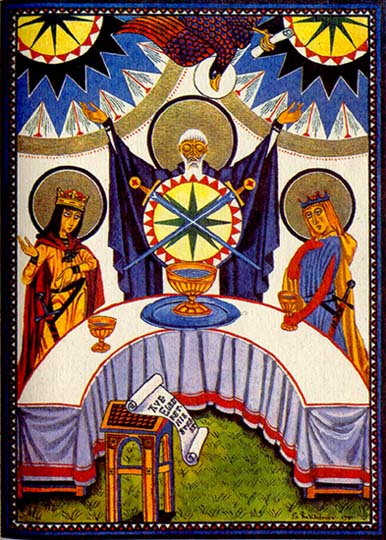
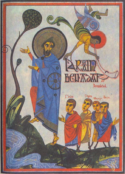
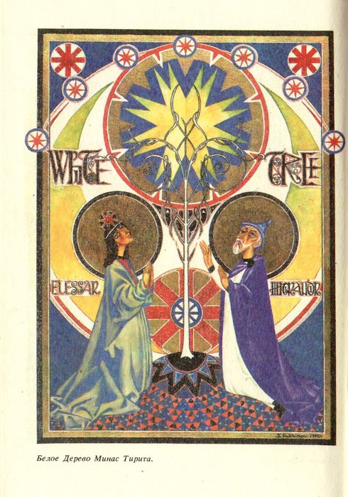
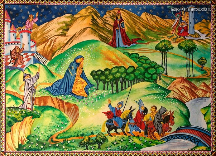
Given the detail with which J.R.R. Tolkien describes his fantastical yet earthily grounded characters and landscapes, you’d think illustrators would have an easy time putting pictures to the words. You might even assume that any artist who tried his or her hand at the job would produce more or less the same visual interpretation. And yet the history of illustrated editions of The Hobbit and the Lord of the Rings trilogy hasn’t gone that way at all. Different publishers at different times and different places have commissioned very stylistically different things. We have shown you examples of Tolkien’s Personal Book Cover Designs for The Lord of the Rings Trilogy as well as what Where the Wild Things Are author Maurice Sendak could come up with. And, in March, we featured a playfully visualized Soviet LOTR edition from 1976. Now, take a look at the large set of images here, pulled from a 1993 edition illustrated by Sergey Yuhimov (more information, albeit in Russian, here and here), and you’ll get the sense that the Russians may have a knack for visualizing the goings-on of Middle-Earth.
Still, the illustrations from Russia’s Hobbit and almost 30-years-newer Lord of the Rings could hardly share less of a sensibility. A Metafilter post on the latter draw a number of attempted descriptions by Tolkien fans: “LOTR translated almost as Christian iconography.” “They leap around about 1000 years of art history.” “Mad, but also charming.” “They would make great tarot cards.”

You can see a gallery of images in four parts: Part 1 — Part 2, Part 3, Part 4.
Our thanks go to @zeljka8 for helping find background information for these illustrations.
Related content:
Soviet-Era Illustrations Of J. R. R. Tolkien’s The Hobbit (1976)
Discover J.R.R. Tolkien’s Personal Book Cover Designs for The Lord of the Rings Trilogy
The Only Drawing from Maurice Sendak’s Short-Lived Attempt to Illustrate The Hobbit
Colin Marshall hosts and produces Notebook on Cities and Culture and writes essays on cities, language, Asia, and men’s style. He’s at work on a book about Los Angeles, A Los Angeles Primer. Follow him on Twitter at @colinmarshall or on Facebook.


Those ilustrations, like that, make the Middle-Earth sound not a place in time, as a wonder but a place in space as a reality *-* A big thank you Collin Marshall for this post, and of course, all the others ^^
These are far from anything like Russian iconographic style… They are more Celtic illuminations or Western Medieval or even Armenian in style!