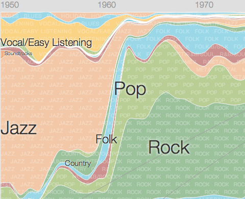
The state of music has changed radically in recent years. Of course, the largest change that springs to mind is Napster, the program that made collective musical sharing possible and triggered the inexorable decline in record sales in the early 2000s. Business model aside, however, the music industry has also weathered tremendously volatile changes in taste over the past half-century.
To see just how dramatic the changes in musical fashion have been, check out Google’s new Music Timeline, pictured above. This simple, color-coded chart displays the popularity of various genres from 1950 onwards (pre-50s sales data is just too spotty and inconsistent). While jazz record sales held the lion’s share of the market throughout much of the 1950’s, the advent of rock and pop acts such as the Beatles in the 1960s relegated jazz to the minor leagues.
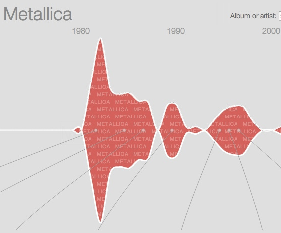
The timeline also allows you to look at the popularity of various bands throughout the course of their careers. Metallica, the litigious critics of Napster’s file-sharing ways, are an interesting example of the waxing and waning of a particular band’s success. Initial spike of popularity aside, as is clear from the image right above, the band had been relatively successful with each of their studio albums. After the release of their cover album in 1998, entitled Garage Inc., things quickly headed south. Whether it’s because of the Napster debacle of 2000, when the band’s lawsuit effectively shut down the company, or a regrettable change of direction, many former fans simply weren’t interested anymore.
Before fans come to the defense of whichever bands were slighted by Google’s visualization, a few caveats: the data used to judge relative success is derived from Google Play user libraries. The more users have an album, the more successful it’s deemed by the algorithm. Additionally, if you’re a classical music fan, you’re out of luck. For various logistical reasons, Google decided against its inclusion in the timeline.
For more information about Google’s Music Timeline, click here. For a Michael Hann’s first look review over at The Guardian’s music blog, which discusses the possible skews in the data, head this way.
Ilia Blinderman is a Montreal-based culture and science writer. Follow him at @iliablinderman.
Related Content:
The History of Music Told in Seven Rapidly Illustrated Minutes
100 Years of Rock in Less Than a Minute: From Gospel to Grunge
The Story of the Bass: New Video Gives Us 500 Years of Music History in 8 Minutes


I don’t buy the country numbers. I would like to see the actual sales numbers of Country vs. Rock.
Hey Ilia,
The Gurdian did only half of the job. I had to dig really hard to find much more flaws in there! :-)
http://www.musicharger.com/10-reasons-why-googles-music-timeline-sucks/