Alice’s Restaurant. It’s now a Thanksgiving classic, and something of a tradition around here. Recorded in 1967, the 18+ minute counterculture song recounts Arlo Guthrie’s real encounter with the law, starting on Thanksgiving Day 1965. As the long song unfolds, we hear all about how a hippie-bating police officer, by the name of William “Obie” Obanhein, arrested Arlo for littering. (Cultural footnote: Obie previously posed for several Norman Rockwell paintings, including the well-known painting, “The Runaway,” that graced a 1958 cover of The Saturday Evening Post.) In fairly short order, Arlo pleads guilty to a misdemeanor charge, pays a $25 fine, and cleans up the thrash. But the story isn’t over. Not by a long shot. Later, when Arlo (son of Woody Guthrie) gets called up for the draft, the petty crime ironically becomes a basis for disqualifying him from military service in the Vietnam War. Guthrie recounts this with some bitterness as the song builds into a satirical protest against the war: “I’m sittin’ here on the Group W bench ’cause you want to know if I’m moral enough to join the Army, burn women, kids, houses and villages after bein’ a litterbug.” And then we’re back to the cheery chorus again: “You can get anything you want, at Alice’s Restaurant.”
We have featured Guthrie’s classic during past years. But, for this Thanksgiving, we give you the illustrated version. Happy Thanksgiving to everyone who plans to celebrate the holiday today.
If you would like to support the mission of Open Culture, consider making a donation to our site. It’s hard to rely 100% on ads, and your contributions will help us continue providing the best free cultural and educational materials to learners everywhere. You can contribute through PayPal, Patreon, and Venmo (@openculture). Thanks!
Here’s the gist: Masterclass’s annual plans are typically available at $120 a year for the Individual plan, which provides access to MasterClass classes on one device, $180 a year for the Duo plan (two devices), and $240 a year for the Family plan (six devices). For a limited time this Black Friday sale period, each of these plans will be available with the buy one, get one free offer–meaning you can buy one membership for yourself, and gift another membership for free.
For that fee, you–and a family member or friend–can watch courses created by Annie Leibovitz, Neil Gaiman, Jon Kabat-Zinn, Werner Herzog, Martin Scorsese, Michael Pollan, Jane Goodall, Margaret Atwood, Helen Mirren, Alice Waters, Bill Nye, Malcolm Gladwell, and 170+ other leading figures. The deal is available now. Find it here.
Note: If you sign up for a MasterClass course by clicking on the links in this post, Open Culture will receive a small fee that helps support our operation.
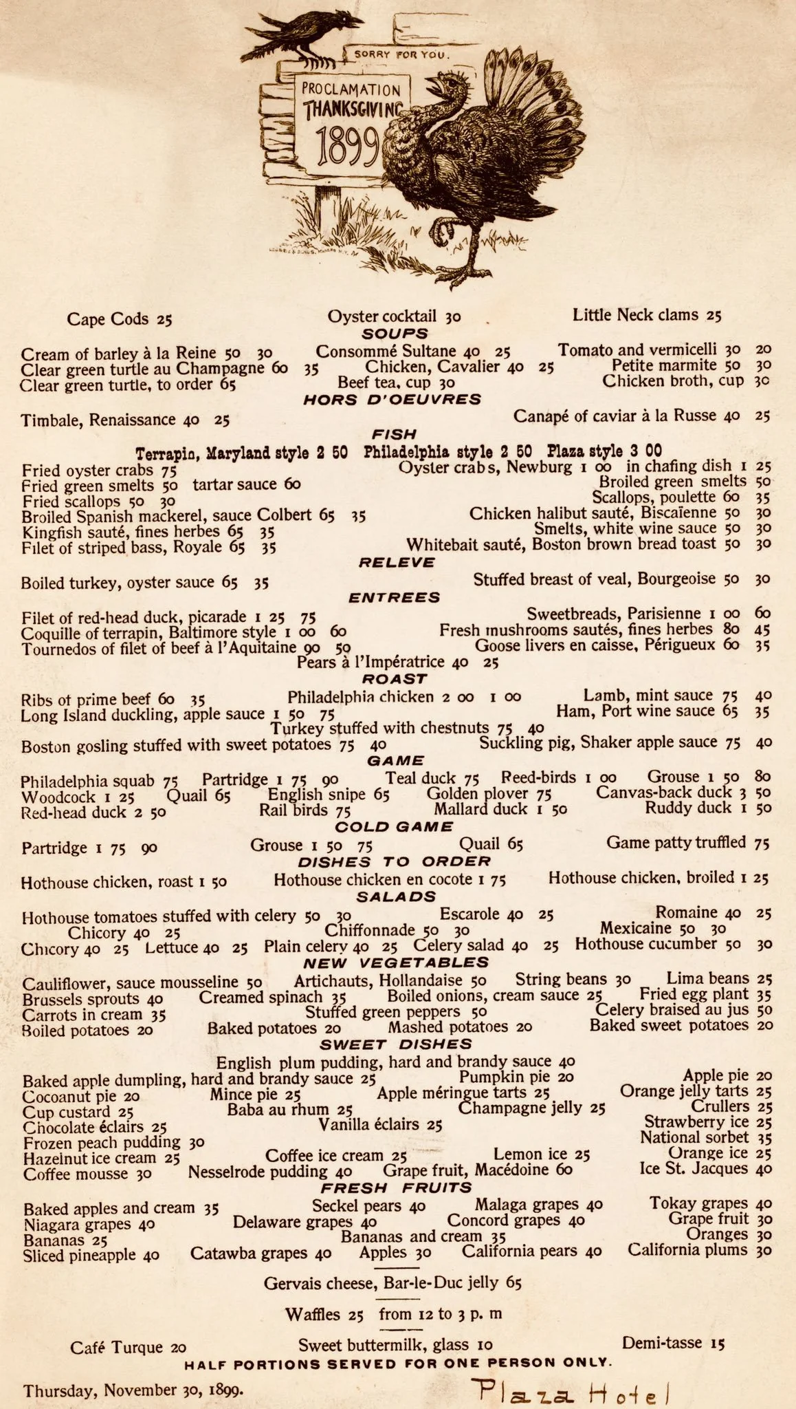
Above, we have the menu for an 1899 Thanksgiving dinner at the Plaza Hotel in New York. If you were a turkey, you had it relatively easy. But the ducks? Not so much. On the menu, you’ll find Mallard duck and Ruddy duck. But also Red-head duck, Long Island duckling, Teal duck and Canvas-back duck, too. A duck in NYC was not a good place to be.
And, oh, those prices! Not one item above a dollar. But let’s account for inflation, shall we? In 2021, one Redditor noted: “I found a calculator and it turns out that $.30 in 1899 equals $10.00 now. The Fried oyster crabs would be $24.99 now and a Philadelphia chicken would be $66.65. So, the cheapest thing on the menu is Sweet buttermilk for $.10, but today would be $3.33.”
For our U.S. readers, enjoy your holiday tomorrow…
When it comes to maps, your first hit is always free. For you, maybe it was a Mercator projection of the world hung on the wall of an elementary-school classroom; maybe it was a road atlas in the glove box of your parents’ car. For Neil Sunderland, the earliest cartographic high seems to have come in childhood, from a humble map of Lancashire. When he found success in finance, his addiction grew in proportion to his means, and today his multi-million-dollar map collection includes the work of renowned sixteenth-century artists like Albrecht Dürer, Hans Holbein, and Giovanni Cimerlino, who in 1566 depicted the known world in the shape of a heart.
Cimerlino’s cordiform Earth (bottom) is just one of the 130 historic “world maps, celestial maps, atlases, books of knowledge and globes” now available for your perusal at Oculi Mundi, an elaborate web site with the digitized holdings of the Sunderland Collection. “A platform to explore high-resolution images of these beautiful objects, to peek inside the books, and to discover information and stories,” it offers both a chronologically ordered “research” mode and a more free-form “explore” mode for browsing.
Either way, with its oldest artifact dating to the early thirteenth century and its newest to the early nineteenth, it contains a great swath of cartographic history to behold.
The New York Times’ Susanne Fowler quotes Sunderland’s daughter Helen Sunderland-Cohen, who oversees the Oculi Mundi project, describing a particularly venerable atlas by fifteenth-century humanist scholar Francesco Berlinghieri as “one of the earliest uses of copper plate, in atlases and in print. You can see how finely engraved the lines are, and how they’re learning to use copper plate.” All art may be inseparable from the state of technology of its time, but maps — the makers of which have always been driven to visualize and organize as much knowledge of the world as possible — reflect it with a special clarity.
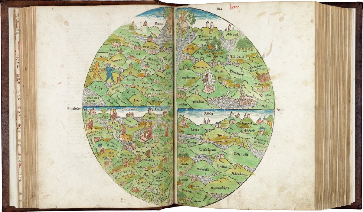
Exploring the Sunderland Collection through Oculi Mundi, you can also trace changes in what sort of knowledge belongs on maps in the first place. Sunderland-Cohen names as a personal favorite the “Rudimentum Novitiorum” from 1475 (above), “an illustrated chronicle in Latin used by monks as a teaching aid for novices.” Besides maps, it includes “Biblical history that is illustrated with lots of wonderful woodblock drawings, and everybody’s wearing clothing of the day, and in the houses of the day”; the connoisseur will notice techniques imported from illuminated manuscripts. As for what such a work costs today, well, if you have to ask, you’re not fully hooked on maps yet. Enter Oculi Mundi here.
Based in Seoul, Colin Marshall writes and broadcasts on cities, language, and culture. His projects include the Substack newsletterBooks on Cities, the book The Stateless City: a Walk through 21st-Century Los Angeles and the video series The City in Cinema. Follow him on Twitter at @colinmarshall or on Facebook.
“Modern architecture died in St Louis, Missouri on July 15, 1972, at 3:32pm (or thereabouts).” This oft-quoted pronouncement by cultural and architectural theorist Charles Jencks refers to the demolition of the Wendell O. Pruitt Homes and William Igoe Apartments. The fate of that short-lived public housing complex, better and more infamously known as Pruitt-Igoe, still holds rhetorical value in America in arguments against the supposed social-engineering ambitions made concrete (often literally) in large-scale postwar modernist buildings. Though the true story is more complicated, the fact remains that, whenever we pinpoint it, modern architecture was widely regarded as “dead.” What would come after it?
Why, postmodernism, of course. Jencks did more than his part to define modernism’s anything-goes successor movement with The Language of Post-Modern Architecture, in which he tells the tale of Pruitt-Igoe, which was then relatively recent history.
The first edition came out in 1977, early days indeed in the life of postmodernism, which in a video from Historic England architectural historian Elain Harwood calls “the style of the nineteen-eighties.” Its riots of deliberately incongruous shape and color, as well as its heaped-up unsubtle cultural and historical references, suited that unbridled decade as perfectly as did the elegantly garish furniture of the Memphis group.
In recent years, however, the buildings left behind by postmodernism have got more than a few of us asking questions — questions like, “Are they intentionally weird and tacky, or just designed with no taste?” That’s how Youtuber Betty Chen puts it in the ARTiculations video just above, before launching into an investigation of postmodern architecture’s origin, purpose, and place in the built environment today. In her telling, the style was born in the early nineteen-sixties, when architect Robert Venturi designed a rule-breaking house for his mother in Philadelphia, deciding “to distort the pure order of the modernist box by reintroducing disproportional arrangements of classical elements such as four-pane windows, arches, the pediment, and the decorative dado.”
An important theorist of postmodernism as well as a practitioner (usually working in both roles with his wife and collaborator Denise Scott Brown), Venturi converted arch-modernist Ludwig Mies van der Rohe’s declaration that “less is more” into what would become, in effect, postmodernism’s brief manifesto: “Less is a bore.” Venturi described himself as choosing “messy vitality over obvious unity,” and the same could be said of a range of his colleagues in the eighties and nineties: Frank Gehry, Michael Graves, and Charles Moore in America; Also Rossi, Ricardo Bofill, and Bernard Tschumi in Europe; Minoru Takeyama, Kengo Kuma, and Arata Isozaki in Japan.
Postmodern architecture flowered especially in Britain: “The irreverence came from America, the classicism from Europe,” says Harwood. “What British architects did was weave those two elements together.” As one of those architects, Sir Terry Farrell, tells Historic England, “the preceding era had been earnest and anonymous”; after international modernism, the time had come to re-introduce personality, and in a flamboyant manner. His colleague Piers Gough remembers feeling, in the mid-sixties, a certain envy for pop art — “they were doing color, they were doing popular imagery, they had prettier girlfriends” — that inspired them to “ransack popular imagery in architecture.” This project posed certain practical difficulties of its own: “You can design a building to look like a soup can, but the problem really comes when you put the windows in it.”
Renovations to many an aging postmodern building have proven difficult to justify, given that “irreverence and exaggeration are out,” as Brock Keeling writes in a recent Bloomberg piece. “Significant postmodern buildings like the Abrams House in Pittsburgh and the Museum of Contemporary Art in San Diego have already been demolished,” and others are endangered: “Fans of the James R. Thompson Center — Helmut Jahn’s 1985 civic building, noted for its sliced-off dome facade and 17-story atrium with blue-and-salmon trim — fear it will deboned in preparation for Google’s new Chicago headquarters.” The true architectural postmodernism enthusiast also appreciates much humbler works, such as Jeffrey Daniels’ Los Angeles Kentucky Fried Chicken franchise that unintentionally evokes of both a chicken and a chicken bucket. Long may it stand.
Based in Seoul, Colin Marshall writes and broadcasts on cities, language, and culture. His projects include the Substack newsletterBooks on Cities, the book The Stateless City: a Walk through 21st-Century Los Angeles and the video series The City in Cinema. Follow him on Twitter at @colinmarshall or on Facebook.
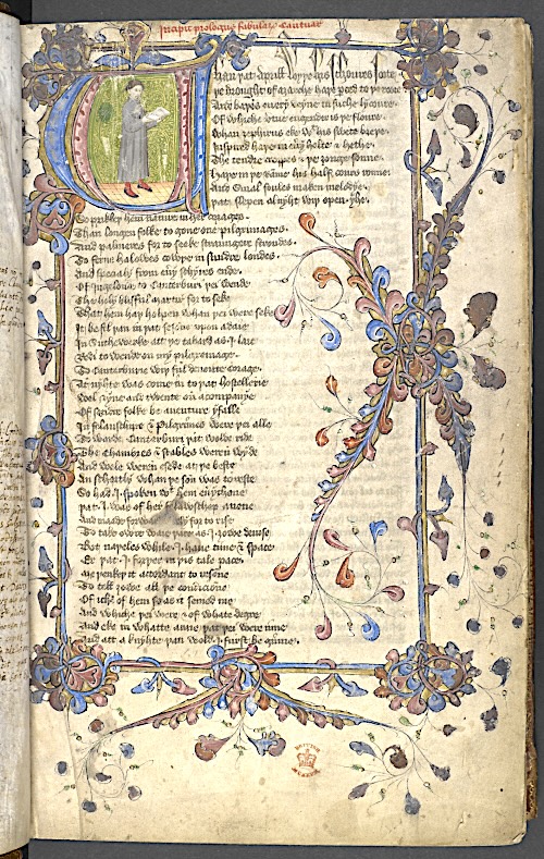
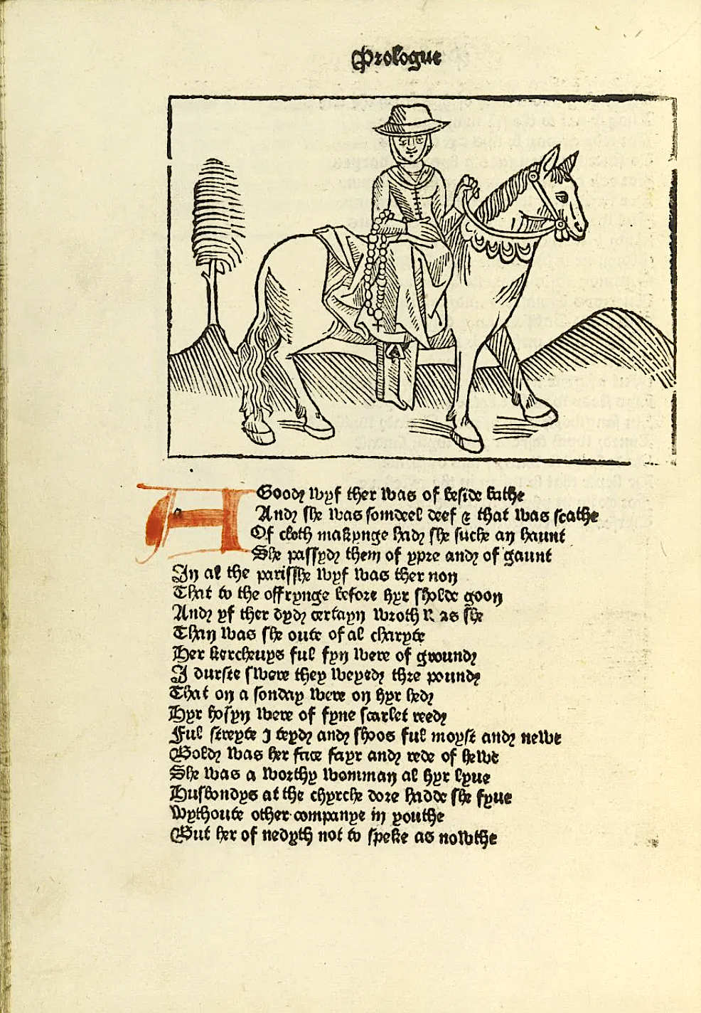
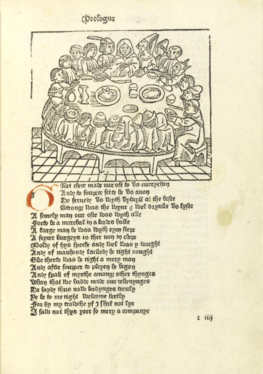
Earlier this year, Oxford professor of English literature Marion Turner published The Wife of Bath: A Biography. Even if you don’t know anything about that book’s subject, you’ve almost certainly heard of her, and perhaps also of her traveling companions like the Knight, the Summoner, the Nun’s Priest, and the Canon’s Yeoman. These are just a few of the pilgrims whose storytelling contest structures Geoffrey Chaucer’s fourteenth-century magnum opus The CanterburyTales, whose influence continues to reverberate through English literature, even all these centuries after the author’s death. In commemoration of the 623rd anniversary of that work, the British Library has opened a vast online Chaucer archive.
This archive comes as a culmination of what the Guardian’s Caroline Davies describes as “a two and a half year project to upload 25,000 images of the often elaborately illustrated medieval manuscripts.” Among these artifacts are “complete copies of Chaucer’s poems but also unique survivals, including fragmentary texts found in Middle English anthologies or inscribed in printed editions and incunabula (books printed before 1501).”
If you’re looking for The Canterbury Tales, you’ll find no fewer than 23 versions of it, the earliest of which “was written only a few years after Chaucer’s death in roughly 1400.” Also digitized are “rare copies of the 1476 and 1483 editions of the text made by William Caxton,” now considered “the first significant text to be printed in England.”
Four centuries later, designer-writer-social reformer William Morris collaborated with celebrated painter Edward Burne-Jones to create an edition W. B. Yeats once called “the most beautiful of all printed books”: the Kelmscott Chaucer, previously featured here on Open Culture, which you can also explore in the British Library’s new archive (as least as soon as its ongoing cyber attack-related issues are resolved). As its wider contents reveal, Chaucer was the author of not just The Canterbury Tales but also a variety of other poems, the classical-dream-vision story collection The Legend of Good Women, an instruction manual for an astrolabe, and translations of The Romance of the Rose and The Consolation of Philosophy. And his Trojan epic Troilus and Criseyde may sound familiar, thanks to the inspiration it gave, more than 200 years later, to a countryman by the name of William Shakespeare.
Based in Seoul, Colin Marshall writes and broadcasts on cities, language, and culture. His projects include the Substack newsletterBooks on Cities, the book The Stateless City: a Walk through 21st-Century Los Angeles and the video series The City in Cinema. Follow him on Twitter at @colinmarshall or on Facebook.
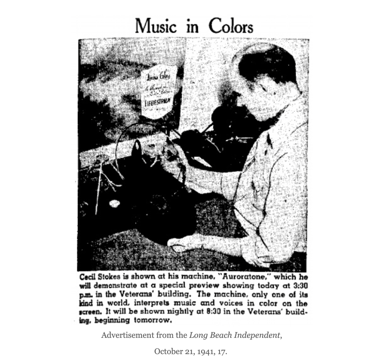
That wasn’t the case in the 1940s, when psychologist Cecil A. Stokes used chemistry and polarized light to invent soothing abstract music videos, a sort of cinematic synesthesia experiment such as can be seen above, in his only known surviving Auroratone.
(The name was suggested by Stokes’ acquaintance, geologist, Arctic explorer and Catholic priest, Bernard R. Hubbard, who found the result reminiscent of the Aurora Borealis.)
The trippy visuals may strike you as a bit of an odd fit with Bing Crosby’s cover of the sentimental crowdpleaser “Oh Promise Me,” but traumatized WWII vets felt differently.
Army psychologists Herbert E. Rubin and Elias Katz’s research showed that Auroratone films had a therapeutic effect on their patients, including deep relaxation and emotional release.
The music surely contributed to this positive outcome. Other Auroratone films featured “Moonlight Sonata,” “Clair de Lune,” and an organ solo of “I Dream of Jeannie with the Light Brown Hair.”
Drs. Rubin and Katz reported that patients reliably wept during Auroratones set to “The Lost Chord,” “Ave Maria,” and “Home on the Range” — another Crosby number.
In fact, Crosby, always a champion of technology, contributed recordings for a full third of the fifteen known Auroratones free of charge and footed the bill for overseas shipping so the films could be shown to soldiers on active duty and medical leave.
[Stokes’] procedure was to cut a tape recorded melody into short segments and splice the resulting pieces into tape loops. The audio signal from the first loop was sent to a radio transmitter. The radio waves from the radio transmitter were confined to a tube and focused up through a glass slide on which he had placed a chemical mixture. The radio waves would interact with the solution and trigger the formation of the crystals. In this way each slide would develop a shape interpretive of the loop of music it had been exposed to. Each loop, in sequence, would be converted to a slide. Eventually a set of slides would be completed that was the natural interpretation of the complete musical melody.
Vets suffering from PTSD were not the only ones to embrace these unlikely experimental films.
Patients diagnosed with other mental disorders, youthful offenders, individuals plagued by chronic migraines, and developmentally delayed elementary schoolers also benefited from Auroratones’ soothing effects.
The general public got a taste of the films in department store screenings hyped as “the nearest thing to the Aurora Borealis ever shown”, where the soporific effect of the color patterns were touted as having been created “by MOTHER NATURE HERSELF.”
Auroratones were also shown in church by canny Christian leaders eager to deploy any bells and whistles that might hold a modern flock’s attention.
The Guggenheim Museum’s brass was vastly less impressed by the Auroratone Foundation of America’s attempts to enlist their support for this “new technique using non-objective art and musical compositions as a means of stimulating the human emotions in a manner so as to be of value to neuro-psychiatrists and psychologists, as well as to teachers and students of both objective and non-objective art.”
Co-founder Hilla Rebay, an abstract artist herself, wrote a letter in which she advised Stokes to “learn what is decoration, accident, intellectual confusion, pattern, symmetry… in art there is conceived law only –never an accident.”
A plan for projecting Auroratones in maternity wards to “do away with the pains of child-birth” appears to have been a similar non-starter.
While only one Auroratone is known to have survived — and its discovery by Robert Martens, curator of Grandpa’s Picture Party, is a fascinating tale unto itself — you can try cobbling together a 21st-century DIY approximation by plugging any of the below tunes into your preferred music playing software and turning on the visualizer:
Yesterday a friend and I were standing on a New York City sidewalk, waiting for the light, when Stayin’ Alive began issuing at top volume from a nearby car.
Pavlovian conditioning kicked in immediately. We’d been singing along with the Bee Gees for nearly a minute before realizing that neither of us knew the lyrics. Like, at all.
The difference being that should I ever need to prep for karaoke, Stayin’ Alive’s lyrics are widely available online, whereas Prisencolinensinainciusol’s lyrics are kind of anyone’s guess…nonsense in any language.
Celentano improvised this gibberish in 1972 in an attempt to recreate how American rock and roll lyrics sound like to non-English-speaking Italian fans like himself.
As he told NPR’s All Things Considered through a translator during a 2012 interview:
Ever since I started singing, I was very influenced by American music and everything Americans did. So at a certain point, because I like American slang — which, for a singer, is much easier to sing than Italian — I thought that I would write a song which would only have as its theme the inability to communicate…I sang it with an angry tone because the theme was important. It was an anger born out of resignation. I brought to light the fact that people don’t communicate.
And yet, his 1974 appearance in the above sketch on the Italian variety series Formula Due spurs strangers to make stabs at communication by sharing their best guess transcriptions of Prisencolinensinainciusol’s lyrics in YouTube comments, 51 years after the song’s original release.
A sampling, anchored by the chorus’ iconic and unmistakeable “all right:”
@glassjester:
My eyes lie, senseless. I guess I’m throwing pizza. Eyes.
And the cold wind sailor, freezing cold and icy in Tucson Alright.
@emanueletardino8545:
My eyes are way so sensitive And it gets so cold, it’s freezing Ice
You’re the cold, main, the same one Please let’s call ’em ‘n’ dance with my shoes off All right
@sexydudeuk2172
My eyes smile senseless but it doesn’t go with diesel all right.
@leviathan3187:
I don’t know why but I want a maid to say I want pair of ice blue shoes with eyes…awight.
Prisencolinensinainciusol’s looping, throbbing beat is wildly catchy and imminently danceable, as evidenced by Celentano’s performance on Formula Due and that of the black clad dancers backing him up during an appearance on Milleluci, another mid-70s Italian variety show, below.
The attention generated by these variety show segments — both lip synched — sent Prisencolinensinainciusol up the charts in Italy, Belgium, Germany, France, the Netherlands, the UK, and even the United States.
Its mix of disco, hip hop and funk has proved surprisingly durable, inspiring remixes and covers, including the one that served as philosopher Slavoj Žižek’s Eurovision Song Contest entry.
We’ll probably never get a firm grasp on the lyrics, despite Italian television host Paolo Bonolis’ puckish 2005 attempt to goad befuddled native English speaker Will Smith into deciphering them.
No matter.
Celentano’s supremely confident delivery of those indelible nonsense syllables is what counts, according to a YouTube viewer from Slovenia with fond memories of playing in a rock band as a teen in the 1960’s:
This is exactly how we non-English-speakers sung the then hit songs. You learned some beginning parts of lyrics so that the audience recognized the song. They heard it at Radio Luxembourg. From here on it was exactly the same style — outside the chorus of course. Adriano Celentano was always been a legend for us back in Slovenia.
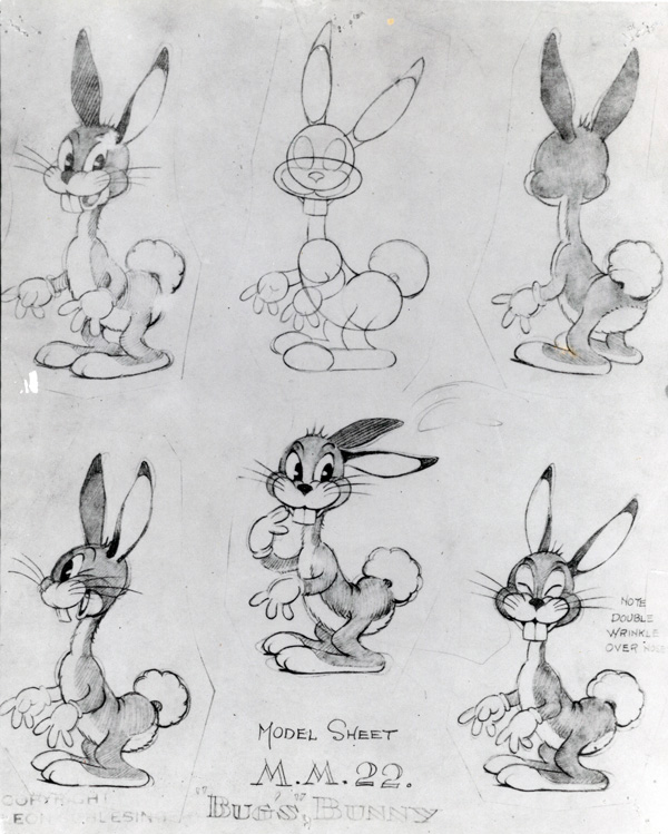
Bugs Bunny is a quick-thinking, fast-talking, wascally force of nature, and a preternaturally gifted physical comedian, too.
But unlike such lasting greats as Charlie Chapin and Buster Keaton, it took him a while to find his iconic look.
His first appearance, as “Happy Rabbit” in the 1938 black and white theatrical short, Porky’s Hare Hunt, might remind you of those yearbook photos of celebrities before they were famous.
In a video essay considering how Bugs Bunny’s look has evolved over his eight-decade career, animation fan Dave Lee of the popular YouTube series Dave Lee Down Under breaks down some early characteristics, from an undefined, small body and oval-shaped head to white fur and a fluffy cotton ball of a tail.
His voice was also a work in progress, more Woody Woodpecker than the hybrid Brooklyn-Bronx patois that would make him, and voice actor Mel Blanc, famous.
The following year, the rabbit who would become Bugs Bunny returned in Prest‑o Change‑o, a Merry Melodies Technicolor short directed by Chuck Jones.
A few months later character designer (and former Disney animator) Charlie Thorson subjected him to a pretty noticeable makeover for Hare-um Scare-um, another rabbit hunting-themed romp.
The two-toned grey and white coat, oval muzzle, and mischievous buck-toothed grin are much more aligned with the Bugs most of us grew up watching.
His pear-shaped bod’, long neck, high-rumped stance, and pontoon feet allowed for a much greater range of motion.
A notation on the model sheet alluding to director Ben Hardaway’s nickname — “Bugs” — gives some hint as to how the world’s most popular cartoon character came by his stage name.
For 1940’s Elmer’s Candid Camera, the pink-muzzled Bugs dropped the yellow gloves Thorsen had given him and affected some black ear tips.
Tex Avery, who was in line to direct the pair in the Academy Award-nominated short A Wild Hare, found this look objectionably cute.
He tasked animator Bob Givens with giving the rabbit, now officially known as Bugs Bunny, an edgier appearance.
In the Givens design, Bugs was no longer defined by Thorson’s tangle of curves. His head was now oval, rather than round. In that respect, Bugs recalled the white rabbit in Porky’s Hare Hunt, but Givens’s design preserved so many of Thorson’s refinements—whiskers, a more naturalistic nose—and introduced so many others—cheek ruffs, less prominent teeth—that there was very little similarity between the new version of Bugs and the Hare Hunt rabbit.
Barrier also details a number of similarities between the titular rabbit character from Disney’s 1935 Silly Symphonies short,The Tortoise and the Hare, and former Disney employee Givens’ design.
While Avery boasted to cartoon historian Milt Gray in 1977 that “the construction was almost identical”, adding, “It’s a wonder I wasn’t sued,” Givens insisted in an interview with the Animation Guild’s oral history project that Bugs wasn’t a Max Hare rip off. ( “I was there. I ought to know.”)
Whatever parallels may exist between Givens’ Bugs and Disney’s Hare, YouTuber Lee sees A Wild Hare as the moment when Bugs Bunny’s character coalesced as “more of a lovable prankster than a malicious deviant,” nonchalantly chomping a carrot like Clark Gable in It Happened One Night, and turning a bit of regional Texas teen slang — “What’s up, Doc?”- into one of the most immortal catch phrases in entertainment history.
A star was born, so much so that four directors — Jones, Avery, Friz Freleng and Bob Clampett — were enlisted to keep up with the demand for Bugs Bunny vehicles.
This multi-pronged approach led to some visual inconsistencies, that were eventually checked by the creation of definitive model sheets, drawn by Bob McKimson, who animated the Clampett-directed shorts.
Historian Barrier takes stock:
Bugs’s cheeks were broader, his chin stronger, his teeth a little more prominent, his eyes larger and slanted a little outward instead of in. The most expressive elements of the rabbit’s face had all been strengthened …but because the triangular shape of Bugs’s head had been subtly accentuated, Bugs was, if anything, futher removed from cuteness than ever before. McKimson’s model sheet must be given some of the credit for the marked improvement in Bugs’s looks in all the directors’ cartoons starting in 1943. Not that everyone drew Bugs to match the model sheet, but the awkwardness and uncertainty of the early forties were gone; it was if everyone had suddenly figured out what Bugs really looked like.
Now one of the most recognizable stars on earth, Bugs remained unmistakably himself while spoofing Charles Dickens, Alfred Hitchcock and Wagner; held his own in live action appearances with such heavy hitters as Doris Day and Michael Jordan; and had a memorable cameo in the 1988 feature Who Framed RogerRabbit, after producers agreed to a deal that guaranteed him the same amount of screen time as his far squarer rival, Mickey Mouse.
This millennium got off to a rockier start, owing to an over-reliance on low budget, simplified flash animation, and the truly execrable trend of shows that reimagine classic characters as cloying toddlers.
In 2011, on the strength of her 2‑minute animated short I Like Pandas, an initially reluctant 24-year-old Jessica Borutski was asked to “freshen up” Bugs’ look for The Looney Tunes Show,a series of longer format cartoons which required its cast to perform such 21st-century activities as texting:
I made their heads a bit bigger because I didn’t like [how] in the ’60s, ’70s Bugs Bunny’s head started to get really small and his body really long. He started to look like a weird guy in a bunny suit.
Lee’s Evolution of Bugs Bunny- 80 Years Explained was released in 2019.
In a push led by Looney Tunes Cartoons’ Alex Kirwan—who spearheads the franchise’s current slate of shorts on HBO Max—the beloved animation icons will soon expand into even more content. There’s the upcoming Tiny Toons Loooniversityrevival, a Halloween special, Cartoonito’s Bugs Bunny Builders for kids, and two feature-length animated movies on the way—and we have a feeling that’s not all, folks!
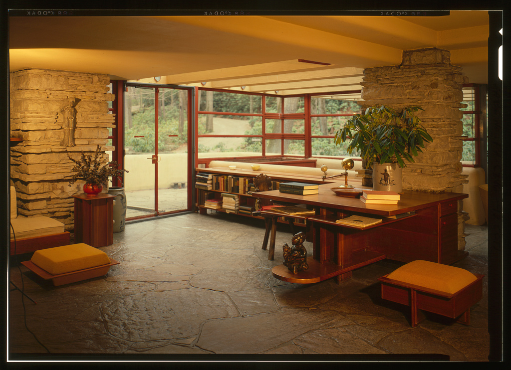
We’ve featured a variety of buildings designed by Frank Lloyd Wright here on Open Culture, from his personal home and studio Taliesin and the Imperial Hotel in Tokyo, to a gas station and a doghouse. But if any single structure explains his enduring reputation as a genius of American architecture, and perhaps the genius of American architecture, it must be the house called Fallingwater.
Designed in 1935 for Pittsburgh department-store magnate Edgar J. Kaufmann and his wife Liliane, it sits atop an active waterfall — not below it as Kaufmann had originally requested, to name just one of the disagreements that arose between client and architect throughout the process.
In the event, Wright had his way as far as the positioning of the house on the site, as with much else about the project — and so much the better for its stature in the history of architecture, which has only risen since completion 85 years ago.
Inspired by the Kaufmann’s love of the outdoors, as well as his own appreciation for Japanese architecture, Wright employed techniques to integrate Fallingwater’s spaces with one another, as well as with the surrounding nature. Time magazine wasted no time, as it were, declaring the result Wright’s “most beautiful job”; more recently, it’s received high praise from no less a master Japanese architect than Tadao Ando.
When he visited Fallingwater, Ando experienced first-hand a use of space similar to that which he knew from the built environment of his homeland, and also how the house lets in the sounds of nature. Though such a pilgrimage can greatly expand one’s appreciation of the house, rare is the viewer who fails to be enraptured by pictures alone.
Nearly as astute in the realm of publicity as in that of architecture, Wright would have known that Fallingwater had to photograph well, a quality vividly on display in this archive of 137 high-resolution images at the Library of Congress. From it, you can download color and black-and-white photos of the house’s exterior and interior as well as its plans, which — so the story goes — Wright originally drew up in just two hours after months of inaction. Fallingwater thus stands as not just concrete proof of once-brazen architectural notions, but also vindication for procrastinators everywhere.
Based in Seoul, Colin Marshall writes and broadcasts on cities, language, and culture. His projects include the Substack newsletterBooks on Cities, the book The Stateless City: a Walk through 21st-Century Los Angeles and the video series The City in Cinema. Follow him on Twitter at @colinmarshall or on Facebook.
In the observable universe, there are estimated to be between 200 billion to two trillion galaxies. By comparison to these super-Saganian numbers, the 383,620 galaxies captured by the Siena Galaxy Atlas may seem like small potatoes. But the SGA actually represents a landmark achievement among digital astronomy catalogs: as Samantha Hill writes in Astronomy, it draws its data from three Dark Energy Spectroscopic Instrument Legacy Surveys, which together constitute “one of the largest surveys ever conducted.” Coming to 7,637 downloadable pages, it “presents a new possible naming convention for the galaxies, and captures images of the objects in optical and infrared wavelengths. Each of the target’s data set includes a whole slew of other information including its size and morphology.”
Though publicly accessible online, the formidably technical SGA may present the non-astronomer with a somewhat steep learning curve. One way to approach the archive through some of the especially impressive galaxies it captures is to organize the list below its search filters according to size. The images that result are not, of course, photographs of the kind any of us could take by pointing a camera up at the night sky, no matter how pricey the camera. Rather, they’re the results, processed into visual legibility, of enormous amounts of data collected by advanced telescope and satellite.
To get more technical, the SGA is also “the first cosmic atlas to feature the light profiles of galaxies — a curve that describes how the brightness of the galaxy changes from its brightest point, usually at the center, to its dimmest, commonly at its edge.”
So writes Space.com’s Robert Lea, who also explains more about the SGA’s usefulness to scientific professionals. It “represents peak accuracy, promising to be a gold mine of galactic information for scientists aiming to investigate everything from the births and evolutions of galaxies to the distribution of dark matter and propagation of gravitational waves through space.” Its data could also help astronomers “find the sources of gravitational wave signals detected on Earth, because these faint ripples in the very fabric of space and time wash over our planet after traveling for millions of light years.” Even if you’re undertaking no such searches of your own, a trip through the SGA can still enhance your appreciation of how much humanity has come to learn about these “nearby” galaxies — and how much remains to be learned about all those that lie beyond. Enter the archive here.
Based in Seoul, Colin Marshall writes and broadcasts on cities, language, and culture. His projects include the Substack newsletterBooks on Cities, the book The Stateless City: a Walk through 21st-Century Los Angeles and the video series The City in Cinema. Follow him on Twitter at @colinmarshall or on Facebook.
We're hoping to rely on loyal readers, rather than erratic ads. Please click the Donate button and support Open Culture. You can use Paypal, Venmo, Patreon, even Crypto! We thank you!
Open Culture scours the web for the best educational media. We find the free courses and audio books you need, the language lessons & educational videos you want, and plenty of enlightenment in between.


