Most people’s to-do lists are, almost by definition, pretty dull, filled with those quotidian little tasks that tend to slip out of our minds. Pick up the laundry. Get that thing for the kid. Buy milk, canned yams and kumquats at the local market.
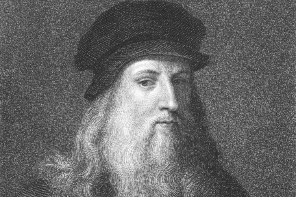
Leonardo Da Vinci was, however, no ordinary person. And his to-do lists were anything but dull.
Da Vinci would carry around a notebook, where he would write and draw anything that moved him. “It is useful,” Leonardo once wrote, to “constantly observe, note, and consider.” Buried in one of these books, dating back to around the 1490s, is a to-do list. And what a to-do list.
NPR’s Robert Krulwich had it directly translated. And while all of the list might not be immediately clear, remember that Da Vinci never intended for it to be read by web surfers 500 years in the future.
[Calculate] the measurement of Milan and Suburbs
[Find] a book that treats of Milan and its churches, which is to be had at the stationer’s on the way to Cordusio
[Discover] the measurement of Corte Vecchio (the courtyard in the duke’s palace).
[Discover] the measurement of the castello (the duke’s palace itself)
Get the master of arithmetic to show you how to square a triangle.
Get Messer Fazio (a professor of medicine and law in Pavia) to show you about proportion.
Get the Brera Friar (at the Benedictine Monastery to Milan) to show you De Ponderibus (a medieval text on mechanics)
[Talk to] Giannino, the Bombardier, re. the means by which the tower of Ferrara is walled without loopholes (no one really knows what Da Vinci meant by this)
Ask Benedetto Potinari (A Florentine Merchant) by what means they go on ice in Flanders
Draw Milan
Ask Maestro Antonio how mortars are positioned on bastions by day or night.
[Examine] the Crossbow of Mastro Giannetto
Find a master of hydraulics and get him to tell you how to repair a lock, canal and mill in the Lombard manner
[Ask about] the measurement of the sun promised me by Maestro Giovanni Francese
Try to get Vitolone (the medieval author of a text on optics), which is in the Library at Pavia, which deals with the mathematic.
You can just feel Da Vinci’s voracious curiosity and intellectual restlessness. Note how many of the entries are about getting an expert to teach him something, be it mathematics, physics or astronomy. Also who casually lists “draw Milan” as an ambition?
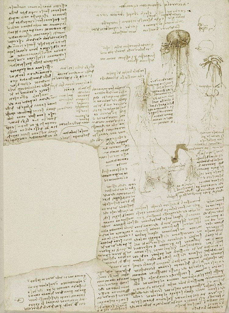
Later to-do lists, dating around 1510, seemed to focus on Da Vinci’s growing fascination with anatomy. In a notebook filled with beautifully rendered drawings of bones and viscera, he rattles off more tasks that need to get done. Things like get a skull, describe the jaw of a crocodile and tongue of a woodpecker, assess a corpse using his finger as a unit of measurement.
On that same page, he lists what he considers to be important qualities of an anatomical draughtsman. A firm command of perspective and a knowledge of the inner workings of the body are key. So is having a strong stomach.
You can see a page of Da Vinci’s notebook above but be warned. Even if you are conversant in 16th century Italian, Da Vinci wrote everything in mirror script.
Note: An earlier version of this post appeared on our site in December, 2014.
If you would like to sign up for Open Culture’s free email newsletter, please find it here. It’s a great way to see our new posts, all bundled in one email, each day.
If you would like to support the mission of Open Culture, consider making a donation to our site. It’s hard to rely 100% on ads, and your contributions will help us continue providing the best free cultural and educational materials to learners everywhere. You can contribute through PayPal, Patreon, and Venmo (@openculture). Thanks!
Related Content:
Thomas Edison’s Hugely Ambitious “To-Do” List from 1888
Leonardo da Vinci’s Visionary Notebooks Now Online: Browse 570 Digitized Pages
How Leonardo da Vinci Drew an Accurate Satellite Map of an Italian City (1502)
1,700 Free Online Courses from Top Universities
Jonathan Crow is a Los Angeles-based writer and filmmaker whose work has appeared in Yahoo!, The Hollywood Reporter, and other publications. You can follow him at @jonccrow. And check out his blog Veeptopus, featuring lots of pictures of badgers and even more pictures of vice presidents with octopuses on their heads. The Veeptopus store is here.