Behold One of the Earliest Known Color Charts: The Table of Physiological Colors (1686)

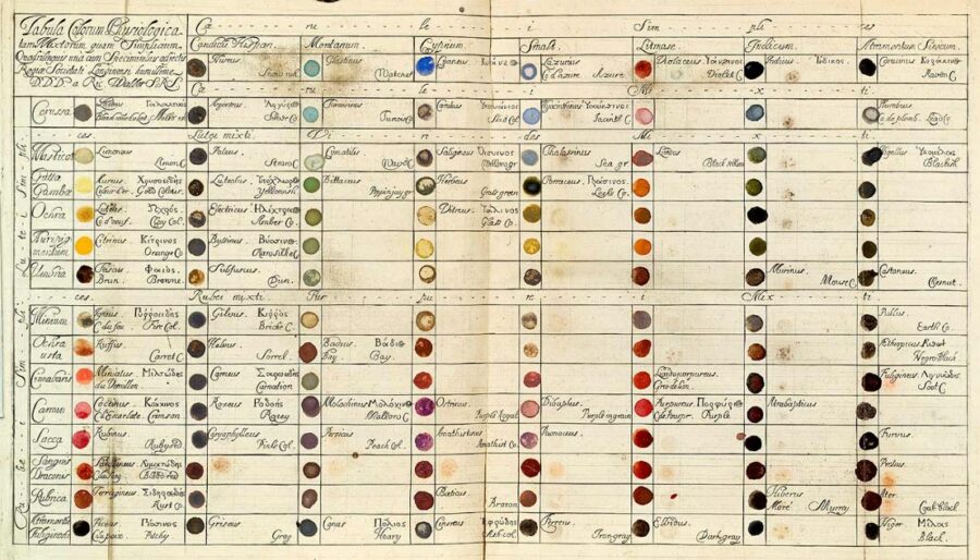
The peri­od called the Enlight­en­ment pro­duced a rev­o­lu­tion in which one sense, vision, became priv­i­leged above all oth­ers. As a result, Sachiko Kusukawa writes at The Roy­al Soci­ety Jour­nal of the His­to­ry of Sci­ence, “sci­ence is supreme­ly visu­al. Indeed, one might say, exces­sive­ly so.” Kusukawa sit­u­ates Eng­lish nat­u­ral­ist and illus­tra­tor Richard Waller at the begin­ning of her his­to­ry about how sight came to dom­i­nate, and Sarah Lowen­gard places Waller’s col­or chart, pre­sent­ed at the Roy­al Soci­ety in 1686, at a for­ma­tive moment in “the cre­ation of col­or in Eigh­teenth-Cen­tu­ry Europe.”

That’s not to say, of course, that col­or didn’t exist before charts like Waller’s, but it did­n’t exist in neat tax­onomies that divid­ed col­or dis­crete­ly, named and cat­e­go­rized it, and mapped the nat­ur­al world by means of col­or the­o­ry. Waller’s “‘Table of Phys­i­o­log­i­cal Col­ors Both Mixt and Sim­ple’ would per­mit unam­bigu­ous descrip­tions of the col­ors of nat­ur­al bod­ies. To describe a plant, for exam­ple, one could com­pare it to the chart and use the names found there to iden­ti­fy the col­ors of the bark, wood, leaves, etc. Sim­i­lar appli­ca­tions of the infor­ma­tion col­lect­ed in the chart might also extend to the arts and trades, he sug­gest­ed.”

The nat­u­ral­ist approach to col­or would inform the arti­fi­cial cre­ation of col­or, help­ing “man­u­fac­tur­ers to pro­duce con­sis­tent dyes and paints,” notes the Smith­son­ian Libraries. Waller’s sys­tem was not pre­cise enough for the task, but many oth­ers, includ­ing board game pio­neer Mil­ton Bradley, picked up his work and refined it, pro­duc­ing not only sci­en­tif­ic and indus­tri­al col­or guides, but also ped­a­go­gies like Bradley’s Ele­men­tary Col­or text­book for chil­dren. Kei­th Moore, Head of Library & Infor­ma­tion Ser­vices at the Roy­al Soci­ety, traces Waller’s col­or dots through the arts, “from the low art Ben-Day dots in the vin­tage com­ic books I used to read as a child to the high art pointil­lism and divi­sion­ism pio­neered by Georges Seu­rat.”

Dozens of col­or sys­tems, wheels, charts, and tables appeared over the next few hun­dred years, from the elab­o­rate to the very sim­ple. All of them have encoun­tered the same basic issue, name­ly the sub­jec­tiv­i­ty of visu­al per­cep­tion. “Waller’s visu­al sys­tem exhibits the same con­cep­tu­al prob­lem… that plagued near­ly all eigh­teenth-cen­tu­ry clas­si­fi­ca­tion sys­tems. Which col­ors can be includ­ed and what is their ‘cor­rect’ order? The answer was always tem­pered by avail­able col­or­ing mate­ri­als and choice of media.” As more pig­ments became avail­able, so too did more col­ors in the col­or charts.

Is the mak­ing of col­or clas­si­fi­ca­tion sys­tems more of a sci­ence or an art? It depends, per­haps, on what they’re used for, but “col­or remains elu­sive to sci­en­tists and col­or experts,” the Smith­son­ian points out, over 400 years after Waller’s chart. Since then, how­ev­er, the lan­guage of col­or has evolved, as he envi­sioned, into a prac­ti­cal and poet­ic syn­tax and vocab­u­lary.

See a larg­er ver­sion of the chart here and read about it in detail in Lowen­gard’s excel­lent arti­cle.

Relat­ed Con­tent: 

Werner’s Nomen­cla­ture of Colour, the 19th-Cen­tu­ry “Col­or Dic­tio­nary” Used by Charles Dar­win (1814)

A Pre-Pan­tone Guide to Col­ors: Dutch Book From 1692 Doc­u­ments Every Col­or Under the Sun

The Vibrant Col­or Wheels Designed by Goethe, New­ton & Oth­er The­o­rists of Col­or (1665–1810)

Josh Jones is a writer and musi­cian based in Durham, NC. Fol­low him at @jdmagness

How Errol Morris Became Obsessed with — and Figured Out — the Truth of a Famous War Photograph

Errol Mor­ris did­n’t go all the way to the Crimean Penin­su­la just because of a sen­tence writ­ten by Susan Son­tag. “No,” he once explained to a friend, “it was actu­al­ly two sen­tences.” Found in Regard­ing the Pain of Oth­ers, Son­tag’s late book-length essay on war pho­tog­ra­phy, these lines deal with the fact that “many of the canon­i­cal images of ear­ly war pho­tog­ra­phy turn out to have been staged, or to have had their sub­jects tam­pered with.” Take Val­ley of the Shad­ow of Death, pio­neer­ing war pho­tog­ra­ph­er Roger Fen­ton’s famous­ly des­o­late 1855 image from the Crimean War. Fen­ton actu­al­ly shot this land­scape twice: in one pic­ture, “can­non­balls are thick on the ground to the left of the road, but before tak­ing the sec­ond pic­ture — the one that is always repro­duced — he over­saw the scat­ter­ing of the can­non­balls on the road itself.”

Or did he? Mor­ris had his doubts — and, as the mak­er of such acclaimed doc­u­men­taries on the nature of truth and its rep­re­sen­ta­tion as The Thin Blue Line and Stan­dard Oper­at­ing Pro­ce­dure and the author of the book Believ­ing is See­ing: Obser­va­tions on the Mys­ter­ies of Pho­tog­ra­phyhe clear­ly has an intel­lec­tu­al invest­ment in the sub­ject.

“I spent a con­sid­er­able amount of time look­ing at the two pho­tographs and think­ing about the two sen­tences,” Mor­ris writes in a 2007 New York Times blog post. “How did Son­tag know that Fen­ton altered the land­scape or, for that mat­ter, ‘over­saw the scat­ter­ing of the can­non­balls on the road itself?’ ” How, for that mat­ter, “did Son­tag know the sequence of the pho­tographs? How did she know which pho­to­graph came first?”

Unable to turn up any per­sua­sive evi­dence, Mor­ris launched an inves­ti­ga­tion of his own, inter­view­ing experts, dig­ging into Fen­ton’s let­ters, and even­tu­al­ly mak­ing his way to the Val­ley of the Shad­ow of Death itself (not to be con­fused with the oth­er, bet­ter-known val­ley across which Ten­nyson’s Light Brigade charged). All of this Mor­ris did in the name of find­ing out which came first, the pho­to with the can­non­balls beside the road, or the one with the can­non­balls on the road. You can hear him dis­cuss this increas­ing­ly obses­sive quest for the truth in the video above from Vox’s Dark­room, the series that pre­vi­ous­ly gave us a break­down of the very first faked pho­to­graph. But then, as this and oth­er inves­ti­ga­tions by Mor­ris into the rela­tion­ship between images, lan­guage, and real­i­ty have under­scored, there is no such thing as a true pho­to­graph.

Relat­ed Con­tent:

Errol Mor­ris: Two Essen­tial Truths About Pho­tog­ra­phy

Errol Mor­ris Med­i­tates on the Mean­ing and His­to­ry of Abra­ham Lincoln’s Last Pho­to­graph

How the “First Pho­to­jour­nal­ist,” Math­ew Brady, Shocked the Nation with Pho­tos from the Civ­il War

Why the Sovi­ets Doc­tored Their Most Icon­ic World War II Vic­to­ry Pho­to, “Rais­ing a Flag Over the Reich­stag”

The First Faked Pho­to­graph (1840)

Errol Mor­ris Makes His Ground­break­ing Series, First Per­son, Free to Watch Online: Binge Watch His Inter­views with Genius­es, Eccentrics, Obses­sives & Oth­er Unusu­al Types

Based in Seoul, Col­in Mar­shall writes and broad­casts on cities, lan­guage, and cul­ture. His projects include the Sub­stack newslet­ter Books on Cities, the book The State­less City: a Walk through 21st-Cen­tu­ry Los Ange­les and the video series The City in Cin­e­ma. Fol­low him on Twit­ter at @colinmarshall, on Face­book, or on Insta­gram.

Leonardo Da Vinci’s To-Do List from 1490: The Plan of a Renaissance Man

da vinci todo list

Most people’s to-do lists are, almost by def­i­n­i­tion, pret­ty dull, filled with those quo­tid­i­an lit­tle tasks that tend to slip out of our minds. Pick up the laun­dry. Get that thing for the kid. Buy milk, canned yams and kumquats at the local mar­ket.

Leonar­do Da Vin­ci was, how­ev­er, no ordi­nary per­son. And his to-do lists were any­thing but dull.

Da Vin­ci would car­ry around a note­book, where he would write and draw any­thing that moved him. “It is use­ful,” Leonar­do once wrote, to “con­stant­ly observe, note, and con­sid­er.” Buried in one of these books, dat­ing back to around the 1490s, is a to-do list. And what a to-do list.

NPR’s Robert Krul­wich had it direct­ly trans­lat­ed. And while all of the list might not be imme­di­ate­ly clear, remem­ber that Da Vin­ci nev­er intend­ed for it to be read by web surfers 500  years in the future.

[Cal­cu­late] the mea­sure­ment of Milan and Sub­urbs

[Find] a book that treats of Milan and its church­es, which is to be had at the stationer’s on the way to Cor­du­sio

[Dis­cov­er] the mea­sure­ment of Corte Vec­chio (the court­yard in the duke’s palace).

[Dis­cov­er] the mea­sure­ment of the castel­lo (the duke’s palace itself)

Get the mas­ter of arith­metic to show you how to square a tri­an­gle.

Get Mess­er Fazio (a pro­fes­sor of med­i­cine and law in Pavia) to show you about pro­por­tion.

Get the Brera Fri­ar (at the Bene­dic­tine Monastery to Milan) to show you De Pon­deribus (a medieval text on mechan­ics)

[Talk to] Gian­ni­no, the Bom­bardier, re. the means by which the tow­er of Fer­rara is walled with­out loop­holes (no one real­ly knows what Da Vin­ci meant by this)

Ask Benedet­to Poti­nari (A Flo­ren­tine Mer­chant) by what means they go on ice in Flan­ders

Draw Milan

Ask Mae­stro Anto­nio how mor­tars are posi­tioned on bas­tions by day or night.

[Exam­ine] the Cross­bow of Mas­tro Gian­net­to

Find a mas­ter of hydraulics and get him to tell you how to repair a lock, canal and mill in the Lom­bard man­ner

[Ask about] the mea­sure­ment of the sun promised me by Mae­stro Gio­van­ni Francese

Try to get Vitolone (the medieval author of a text on optics), which is in the Library at Pavia, which deals with the math­e­mat­ic.

You can just feel Da Vinci’s vora­cious curios­i­ty and intel­lec­tu­al rest­less­ness. Note how many of the entries are about get­ting an expert to teach him some­thing, be it math­e­mat­ics, physics or astron­o­my. Also who casu­al­ly lists “draw Milan” as an ambi­tion?

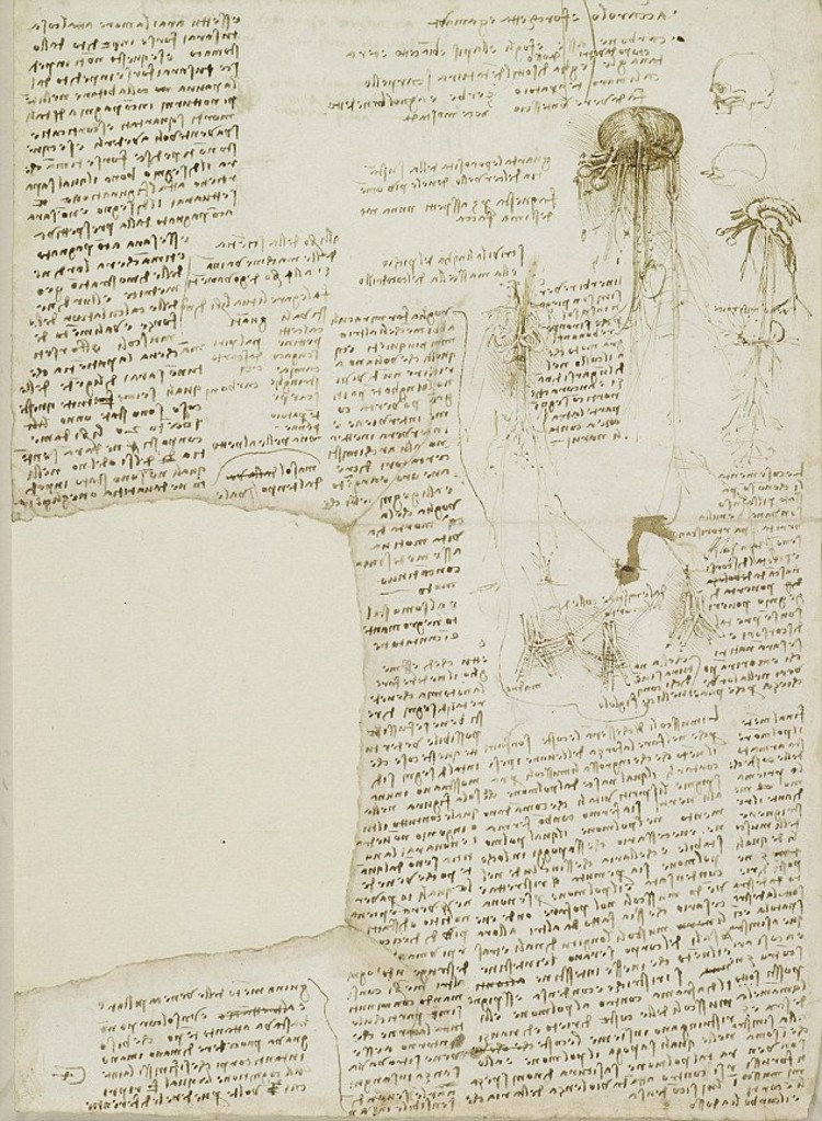
Lat­er to-do lists, dat­ing around 1510, seemed to focus on Da Vinci’s grow­ing fas­ci­na­tion with anato­my. In a note­book filled with beau­ti­ful­ly ren­dered draw­ings of bones and vis­cera, he rat­tles off more tasks that need to get done. Things like get a skull, describe the jaw of a croc­o­dile and tongue of a wood­peck­er, assess a corpse using his fin­ger as a unit of mea­sure­ment.

On that same page, he lists what he con­sid­ers to be impor­tant qual­i­ties of an anatom­i­cal draughts­man. A firm com­mand of per­spec­tive and a knowl­edge of the inner work­ings of the body are key. So is hav­ing a strong stom­ach.

You can see a page of Da Vinci’s note­book above but be warned. Even if you are con­ver­sant in 16th cen­tu­ry Ital­ian, Da Vin­ci wrote every­thing in mir­ror script.

Note: An ear­li­er ver­sion of this post appeared on our site in Decem­ber, 2014.

If you would like to sign up for Open Culture’s free email newslet­ter, please find it here. Or fol­low our posts on Threads, Face­book, BlueSky or Mastodon.

If you would like to sup­port the mis­sion of Open Cul­ture, con­sid­er mak­ing a dona­tion to our site. It’s hard to rely 100% on ads, and your con­tri­bu­tions will help us con­tin­ue pro­vid­ing the best free cul­tur­al and edu­ca­tion­al mate­ri­als to learn­ers every­where. You can con­tribute through Pay­Pal, Patre­on, and Ven­mo (@openculture). Thanks!

Relat­ed Con­tent:

Thomas Edison’s Huge­ly Ambi­tious “To-Do” List from 1888

MIT Researchers 3D Print a Bridge Imag­ined by Leonar­do da Vin­ci in 1502— and Prove That It Actu­al­ly Works

Leonar­do da Vinci’s Vision­ary Note­books Now Online: Browse 570 Dig­i­tized Pages

How Leonar­do da Vin­ci Drew an Accu­rate Satel­lite Map of an Ital­ian City (1502)

1,700 Free Online Cours­es from Top Uni­ver­si­ties

Jonathan Crow is a Los Ange­les-based writer and film­mak­er whose work has appeared in Yahoo!, The Hol­ly­wood Reporter, and oth­er pub­li­ca­tions. You can fol­low him at @jonccrow. And check out his blog Veep­to­pus, fea­tur­ing lots of pic­tures of bad­gers and even more pic­tures of vice pres­i­dents with octo­pus­es on their heads.  The Veep­to­pus store is here.

The Beautiful Video for David Gilmour’s “The Girl in the Yellow Dress,” Featuring 9,000 Hand-Drawn Frames of Animation

The ani­mat­ed video for David Gilmour’s “The Girl in the Yel­low Dress” opens on a sax­o­phon­ist with a famil­iar story—one so well-known to his band­mates they can read it on his face. But then the per­spec­tive shifts, and we fol­low instead the woman (or “girl”) of his woes, as she comes to see him play, gets ogled and turned into a fan­ta­sy by the men in the club, pur­sues the res­i­dent lothario, crush­ing the hearts of them all, includ­ing the sax­o­phon­ist, who plays his blues instead of col­laps­ing into a drink.

At least that seems to be the sto­ry, a typ­i­cal nightlife scene ren­dered in a very dynam­ic, atyp­i­cal way. The video, from a track off Gilmour’s 2015 album Rat­tle that Lock, was direct­ed by Dan­ny Mad­den for Ornana Films, who write, “The music video is made of about 9,000 frames of ani­ma­tion that were touched by sev­er­al hands to get the lay­ered con­tours, vibrant col­ors, and exag­ger­at­ed char­ac­ter design of old French Lith­o­graph posters. We want­ed to cre­ate a mov­ing ver­sion of that look, as if each frame had all the lay­ers stamped on the page.”

An incred­i­ble amount of inten­sive artis­tic labor went into cre­at­ing the boozy, swirling effects in each scene. “We ani­mat­ed with pen­cil, then con­tour lines were gone over with a brush tip mark­er. We used gouache to get nice life in the vary­ing brush­strokes, then we lay­ered the con­tours over the paint lay­er in the com­posit­ing step so that the colours would do inter­est­ing things when they ran togeth­er.” Maybe these images could be recre­at­ed con­vinc­ing­ly with dig­i­tal effects… but I sus­pect not.

The song “looks back at [Gilmour’s] ear­li­est musi­cal influ­ence,” writes a Guardian review of the Rat­tle that Lock. If so, it’s a nascent influ­ence that did not emerge often in his Pink Floyd play­ing, though the song may also indi­rect­ly pay trib­ute to the jazz-trained Richard Wright, memo­ri­al­ized else­where on the album. You can see sev­er­al more scenes from this extra­or­di­nary video at Dezeen.

via Laugh­ing Squid 

Relat­ed Con­tent: 

David Gilmour Talks About the Mys­ter­ies of His Famous Gui­tar Tone

How Pink Floyd’s “Com­fort­ably Numb” Was Born From an Argu­ment Between Roger Waters & David Gilmour

Watch Tom Waits For No One, the Pio­neer­ing Ani­mat­ed Music Video from 1979

Josh Jones is a writer and musi­cian based in Durham, NC. Fol­low him at @jdmagness

Discover the Cyanometer, the Device Invented in 1789 Just to Measure the Blueness of the Sky

Eng­lish astronomer and physi­cist James Jeans’ 1931 essay “Why the Sky is Blue” has become a clas­sic of con­cise expos­i­to­ry writ­ing since it was first pub­lished in a series of talks. In only four para­graphs and one strik­ing­ly detailed, yet sim­ple anal­o­gy, Jeans gave mil­lions of stu­dents a grasp of celes­tial blue­ness in prose that does not sub­sti­tute nature’s poet­ry for sci­en­tif­ic jar­gon and dia­grams.

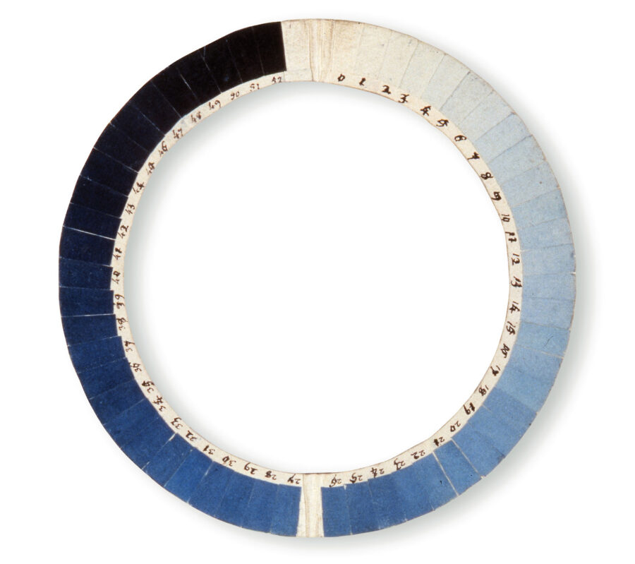
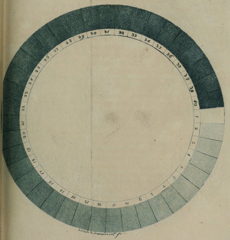
Over a hun­dred years ear­li­er, anoth­er sci­en­tist cre­at­ed a sim­i­lar­ly poet­ic device; in this case, one which attempt­ed to depict how the sky is blue. Swiss physi­cist Horace Béné­dict de Saus­sure’s 1789 Cyanome­ter, “a cir­cle of paper swatch­es dyed in increas­ing­ly deep blues, shad­ing from white to black,” Sarah Laskow writes at Atlas Obscu­ra, “includ­ed 52 blues… in its most advanced iter­a­tion,” intend­ed to show “how the col­or of the sky changed with ele­va­tion.”

Saussure’s fas­ci­na­tion with the blue­ness of the sky began when he was a young stu­dent and trav­eled to the base of Mont Blanc. Over­awed by the sum­mit, he dreamt of climb­ing it, but instead used his fam­i­ly’s wealth to offer a reward to the first per­son who could. Twen­ty-sev­en years lat­er, Saus­sure him­self would ascend to the top, in 1786, car­ry­ing with him “pieces of paper col­ored dif­fer­ent shades of blue, to hold up against the sky and match its col­or.”

Saus­sure was tak­en with a phe­nom­e­non report­ed by moun­taineers: as one climbs high­er, the sky turns a deep­er shade of blue. He began to for­mu­late a hypoth­e­sis, the Roy­al Soci­ety of Chem­istry Explains:

Armed with his tools and a small chem­istry set, he trekked round the val­leys and beyond. As his trips car­ried him ever high­er, he puz­zled about the colour of the sky. Local leg­end had it that if one climbed high enough it turned black and one would see, or even fall into, the void — such ter­rors kept ordi­nary men away from the peaks. But to Saus­sure, the blue colour was an opti­cal effect. And because on some days the blue of the sky fad­ed imper­cep­ti­bly into the white of the clouds, Saus­sure con­clud­ed that the colour must indi­cate its mois­ture con­tent. 

At the top of Mont Blanc, the physi­cist mea­sured what he deemed “a blue of the 39th degree.” The num­ber meant lit­tle to any­one but him. “Upon its inven­tion, the cyanome­ter rather quick­ly fell into dis­use,” as Maria Gon­za­lez de Leon points out. “After all, very lit­tle sci­en­tif­ic infor­ma­tion was giv­en.”

The tool did, how­ev­er, accom­pa­ny the famed geo­g­ra­ph­er Alexan­der von Hum­boldt across the Atlantic, “to the Caribbean, the Canary Islands, and South Amer­i­ca,” writes Laskow, where Hum­boldt “set a new record, at the 46th degree of blue, for the dark­est sky ever mea­sured” on the sum­mit of the Andean moun­tain Chimb­o­ra­zo. This would be one of the only notable uses of the poet­ic device. “When the true cause of the sky’s blue­ness, the scat­ter­ing of light, was dis­cov­ered decades lat­er, in the 1860s, Saussure’s cir­cle of blue had already fall­en into obscu­ri­ty.”

via Messy­Nessy/Colos­sal

Relat­ed Con­tent: 

A 900-Page Pre-Pan­tone Guide to Col­or from 1692: A Com­plete Dig­i­tal Scan

The Vibrant Col­or Wheels Designed by Goethe, New­ton & Oth­er The­o­rists of Col­or (1665–1810)

A Vision­ary 115-Year-Old Col­or The­o­ry Man­u­al Returns to Print: Emi­ly Noyes Vanderpoel’s Col­or Prob­lems

Josh Jones is a writer and musi­cian based in Durham, NC. Fol­low him at @jdmagness

Experience Blade Runner Like You Never Have Before Through a Feature-Length Remastered Soundtrack

There is no one Blade Run­ner. Rid­ley Scot­t’s influ­en­tial “neo-noir” has appeared in sev­er­al dif­fer­ent ver­sions over the past 38 years, both offi­cial — the “direc­tor’s cut,” the “final cut,” and lest we for­get, the now-derid­ed first the­atri­cal cut — and unof­fi­cial. So has Blade Run­ner’s sound­track, the first offi­cial release of which lagged the film by about a dozen years, and even then did­n’t include all the music so inte­gral to the unprece­dent­ed aes­thet­ic rich­ness of the futur­is­tic set­ting. Then, about a dozen more years lat­er, fol­lowed an expand­ed sound­track album, which for many fans still proved unsat­is­fy­ing. In the name of com­plete­ness and son­ic fideli­ty, at least five wide­ly dis­trib­uted bootlegs have attempt­ed to fill the gap.

Now, in our 21st-cen­tu­ry age of stream­ing, we have fan-made “remas­ters” of the Blade Run­ner sound­track like the above, the 5.7‑million-times-viewed work of a user called Greendragon861. Run­ning just over one hour and 52 min­utes — near­ly the length of the var­i­ous cuts of Blade Run­ner itself — this son­ic expe­ri­ence includes, of course, the well-known elec­tron­ic pieces by com­pos­er Van­ge­lis, those that come right to mind when you envi­sion the flame-belch­ing indus­tri­al land­scape of 21st-cen­tu­ry Los Ange­les or a police “spin­ner” tak­ing to the skies. But it also incor­po­rates back­ground music, sound effects, and even snatch­es of dia­logue from the movie. The result feels a great deal like watch­ing Blade Run­ner with­out actu­al­ly watch­ing Blade Run­ner.

Despite ini­tial­ly flop­ping, at least in the West, Blade Run­ner has exert­ed an enor­mous influ­ence on oth­er art and media — indeed, on the way human­i­ty envi­sions the future — and one still spread­ing near­ly four decades lat­er. The film seems unsur­pass­able in that regard, an achieve­ment cred­itable to a range of cre­ators: direc­tor Rid­ley Scott, of course; but also Philip K. Dick, author of its source mate­r­i­al; the late Syd Mead, who as a “visu­al futur­ist” gave focus to the world’s look and feel; mod­el mas­ter Dou­glas Trum­bull, thanks in part to whom its built and mechan­i­cal envi­ron­ment has aged so well. The list goes on, and it should­n’t fail to include Van­ge­lis as well as every­one else respon­si­ble for this intri­cate sound­scape, with­out which Blade Run­ner would­n’t be Blade Run­ner, no mat­ter the cut.

Relat­ed Con­tent:

How Blade Run­ner Cap­tured the Imag­i­na­tion of a Gen­er­a­tion of Elec­tron­ic Musi­cians

Sean Con­nery (RIP) Reads C.P. Cavafy’s Epic Poem “Itha­ca,” Set to the Music of Van­ge­lis

The Sounds of Blade Run­ner: How Music & Sound Effects Became Part of the DNA of Rid­ley Scott’s Futur­is­tic World

Stream 72 Hours of Ambi­ent Sounds from Blade Run­ner: Relax, Go to Sleep in a Dystopi­an Future

Drone Footage of San Fran­cis­co Set to the Music of Blade Run­ner 2049

The City in Cin­e­ma Mini-Doc­u­men­taries Reveal the Los Ange­les of Blade Run­ner, Her, Dri­ve, Repo Man, and More

Based in Seoul, Col­in Mar­shall writes and broad­casts on cities, lan­guage, and cul­ture. His projects include the Sub­stack newslet­ter Books on Cities, the book The State­less City: a Walk through 21st-Cen­tu­ry Los Ange­les and the video series The City in Cin­e­ma. Fol­low him on Twit­ter at @colinmarshall, on Face­book, or on Insta­gram.

Pop Songs with Narrative: Pretty Much Pop (#69) Discusses Tunes Ranging from Bob Dylan’s “Hurricane” to “The Pina Colada Song” with Songwriter/Author Rod Picott

Plen­ty of songs pur­port to tell sto­ries, and the nar­ra­tive bal­lad of course has a long enough his­to­ry that the two forms cer­tain­ly aren’t alien. But how do our lis­ten­ing prac­tices con­di­tioned by pop music jibe with rec­og­niz­ing and under­stand­ing nar­ra­tive?

Singer/songwriter and short sto­ry author Rod Picott joins your hosts Mark Lin­sen­may­er, Eri­ca Spyres, and Bri­an Hirt to talk about clas­sics by writ­ers like Bob Dylan and John­ny Cash, for­ma­tive night­mares like “Leader of the Pack” and “Escape (The Pina Cola­da Song), bor­der­line cas­es like “Bohemi­an Rhap­sody,” and more. We also con­sid­er how this form relates to musi­cal the­ater, music videos, sound­tracks, and com­mer­cials.

We tried to stick to pop­u­lar songs, but most of us are pret­ty old. You can lis­ten and read the lyrics if you’re not fol­low­ing:

Why these songs? Well, we found a few lists online:

Hear Mark inter­view Rod on Naked­ly Exam­ined Music. Learn more at rodpicott.com.

Hear more of this pod­cast at prettymuchpop.com. This episode includes bonus dis­cus­sion you can access by sup­port­ing the pod­cast at patreon.com/prettymuchpop. This time, an update on Rod’s music plus polit­i­cal dis­cus­sion and more.

This pod­cast is part of the Par­tial­ly Exam­ined Life pod­cast net­work.

Pret­ty Much Pop: A Cul­ture Pod­cast is the first pod­cast curat­ed by Open Cul­ture. Browse all Pret­ty Much Pop posts.

A Free Stanford Course on How to Teach Online: Designed for Middle & High School Teachers

Update: You can find the video record­ing of the work­shop here.

This past spring, teach­ers and stu­dents every­where got an abrupt intro­duc­tion to online learn­ing. When class­rooms moved online in March, many teach­ers exper­i­ment­ed with online ped­a­gogy for the first time, often with­out much train­ing or sup­port. To help ease this tran­si­tion, the Stan­ford Online High School–an inde­pen­dent high school that oper­ates entire­ly online–launched a free course designed to help teach­ers get com­fort­able teach­ing in this new medi­um. 7,000 teach­ers signed up. To con­tin­ue pro­vid­ing sup­port, an updat­ed ver­sion of this free course will be offered again this week­end.

Teach­ing Your Class Online” will take place this Sat­ur­day (Novem­ber 21) and Sun­day (Novem­ber 22),  and run from 9:00 am — 11:00 am Pacif­ic time each day. (Update: The lec­tures are now avail­able online.) Designed main­ly for instruc­tors teach­ing grades 7–12, the course can be help­ful for ele­men­tary and col­lege instruc­tors as well. Top­ics cov­ered will include “chal­lenges [such] as stu­dent engage­ment and dis­cus­sion (includ­ing for large groups, break­out rooms, and hybrid groups), effec­tive com­mu­ni­ca­tion with stu­dents and par­ents, assess­ment and cur­ricu­lum adap­ta­tion for online ped­a­gogy, and strate­gies for sup­port­ing both stu­dents and your­selves.”

Teach­ing Your Class Online” is sup­port­ed by Stan­ford Online High School and Stan­ford Con­tin­u­ing Stud­ies. You can enroll in the course on the Con­tin­u­ing Stud­ies web­site here.

If you know any teach­ers who could ben­e­fit from this free course, please feel free to share this post with them.

Relat­ed Con­tent:

1,700 Free Online Cours­es from Top Uni­ver­si­ties

200 Free Kids Edu­ca­tion­al Resources: Video Lessons, Apps, Books, Web­sites & More

“I Will Sur­vive,” the Coro­n­avirus Ver­sion for Teach­ers Going Online

How to Teach and Learn Phi­los­o­phy Dur­ing the Pan­dem­ic: A Col­lec­tion of 450+ Phi­los­o­phy Videos Free Online

by | Permalink | Make a Comment ( 87 ) |

What Happens When You Spend Weeks, Months, or Years in Solitary Confinement

The lone­li­ness and iso­la­tion of quar­an­tine is noth­ing to laugh about, though we might have heard grim jokes about soli­tary con­fine­ment in the last few months. We’ve also seen over­wrought com­par­isons of social dis­tanc­ing to prison. These are, I think, release valves for real pain. One hopes the har­row­ing expe­ri­ence of the pan­dem­ic will give Amer­i­cans some com­pas­sion for the lives of pris­on­ers, a shock­ing num­ber of whom spend years, even decades, in soli­tary, most­ly deprived of nat­ur­al light, human con­tact, enter­tain­ment, edu­ca­tion, or a change of scenery. It seems, inar­guably, like a form of tor­ture.

Unsur­pris­ing­ly, soli­tary con­fine­ment does real harm to the body and brain. Even inmates placed in soli­tary for a few days expe­ri­ence symp­toms of acute anx­i­ety and depres­sion. “Iso­lat­ed inmates often report symp­toms sim­i­lar to those of hyper­ten­sion, such as chron­ic headaches, trem­bling sweaty palms, extreme dizzi­ness and heart pal­pi­ta­tions,” Mary Mur­phy Cor­co­ran writes at NYU’s Applied Psy­chol­o­gy Opus. “Inmates in iso­la­tion may also have dif­fi­cul­ty sleep­ing, and some may expe­ri­ence insom­nia…. Con­se­quent­ly, inmates report feel­ings of chron­ic lethar­gy.” Over the years, this stress exacts its long-term toll.

In the Slate video at the top, for­mer inmate Five Mual­imm-Ak describes the five years he spent in soli­tary dur­ing a 12-year prison sen­tence. His account and those of oth­ers were recent­ly col­lect­ed in a book with the grim­ly evoca­tive title Hell is a Very Small Place. For­mer soli­tary inmate Ter­rence Slater describes a kind of fur­ther soli­tary of the mind: how impor­tant it is to lim­it the amount of time one thinks about loved ones dur­ing a 23-hour day alone in a cell, or “you’re going to lose your mind in there.” It’s esti­mat­ed that rough­ly 80,000 inmates in the U.S. are placed in such con­di­tions every year.

Giv­en enough time, one may lit­er­al­ly lose one’s mind, as Robert King dis­cov­ered. King was “con­fined in a 6x9-foot cell for almost 30 years,” Elana Blan­co-Suarez writes at Psy­chol­o­gy Today. “King knew that soli­tary con­fine­ment was chang­ing the way his brain worked. When he final­ly left his cell, he real­ized he had trou­ble rec­og­niz­ing faces and had to retrain his eyes to learn what a face was like.” He could no longer fol­low sim­ple direc­tions. “It was as if his brain had erased all those capa­bil­i­ties that were no longer nec­es­sary for sur­vival in a cell no big­ger than the back of a pick-up truck.”

Pro­longed peri­ods of sen­so­ry depri­va­tion can be espe­cial­ly inju­ri­ous for pris­on­ers who go into soli­tary with pre-exist­ing men­tal health issues, and “men­tal­ly impaired pris­on­ers are dis­pro­por­tion­ate­ly rep­re­sent­ed in soli­tary con­fine­ment,” Kirsten Weir notes at the Amer­i­can Psy­cho­log­i­cal Asso­ci­a­tion. One 2005 study found that the “preva­lence of men­tal ill­ness in admin­is­tra­tive seg­re­ga­tion” in Col­orado “was greater than 35 per­cent, com­pared with a men­tal ill­ness rate of less than 25 per­cent among the gen­er­al prison pop­u­la­tion.”

Clin­i­cal pro­fes­sor of psy­chi­a­try at the Uni­ver­si­ty of Col­orado Jef­frey Met­zn­er argues that the “cor­rec­tion­al sys­tem has become our men­tal health care sys­tem for too many peo­ple,” using abu­sive, bar­bar­ic prac­tices that haven’t exist­ed in men­tal health wards for decades. The effects of soli­tary con­fine­ment sug­gest that “it doesn’t make facil­i­ties safer, doesn’t make our com­mu­ni­ties safer, and that peo­ple are devel­op­ing men­tal and phys­i­cal ail­ments because of this prac­tice.”

So says James Burns, a for­mer­ly incar­cer­at­ed film­mak­er who vol­un­tar­i­ly entered soli­tary con­fine­ment for 30 days in 2016 and livestreamed the whole expe­ri­ence. See his last four hours above and read at Vice about his rea­sons for sub­mit­ting him­self to hell—not a “dark dun­geon,” he writes, but “a very ster­ile, bright hell” which is, “more than any­thing… a mind fuck.”

Relat­ed Con­tent: 

Pris­ons Around the U.S. Are Ban­ning and Restrict­ing Access to Books

Inmates in New York Prison Defeat Harvard’s Debate Team: A Look Inside the Bard Prison Ini­tia­tive

Art Class Instead Of Jail: New Pro­gram Lets Young Offend­ers Take Free Art Class­es Rather Than Spend Time in the Crim­i­nal Sys­tem

Josh Jones is a writer and musi­cian based in Durham, NC. Fol­low him at @jdmagness.

How Soy Sauce Has Been Made in Japan for Over 220 Years: An Inside View

Soy sauce has fig­ured into the cui­sine of east Asia for more than two mil­len­nia. By that stan­dard, the two-cen­tu­ry-old Fue­ki Shoyu Brew­ing has­n’t been in the game long. But in run­ning the oper­a­tion today, Masat­sugu Fue­ki can hard­ly be accused of fail­ing to uphold tra­di­tion: he adheres to just the same prac­tices for mak­ing soy sauce (shoyu, in Japan­ese) as the com­pa­ny’s founders did back in 1879. You can see the entire process in the Eater video above, shot at the Fue­ki fac­to­ry in Saita­ma Pre­fec­ture, just north­west of Tokyo. Fue­ki him­self guides the tour, explain­ing first the sheer sim­plic­i­ty of the ingre­di­ents — soy­beans, flour, and salt — and then the intri­cate bio­log­i­cal inter­ac­tions between them that must be prop­er­ly man­aged if the result is to pos­sess a suit­ably rich uma­mi fla­vor.

That we all know what uma­mi is today owes in part to the prop­a­ga­tion of soy sauce across the world. One of the “five basic fla­vors,” this dis­tinc­tive savori­ness man­i­fests in cer­tain fish, cheeses, toma­toes, and mush­rooms, but if you need a quick shot of uma­mi, you reach for the soy sauce. In bot­tles small and large, it had already become a com­mon prod­uct in the Unit­ed States by the time I was grow­ing up there in the 1980s and 90s.

It must be said, how­ev­er, that Amer­i­cans then still had some odd ways of using it: the now-acknowl­edged West­ern faux pas, for instance, of lib­er­al­ly driz­zling the stuff over rice. But wider aware­ness of soy sauce has led to a wider under­stand­ing of its prop­er place in food, and also of what sets the best apart from the mediocre — as well as a curios­i­ty about what it takes to make the best.

Fue­ki and his work­ers take pains every step of the way, from steam­ing the soy­beans to decom­pos­ing the wheat with a mold called koji to heat­ing the raw soy sauce in tanks before bot­tling. But the key is the kioke, a large wood­en fer­men­ta­tion bar­rel, the old­est of which at Fue­ki Shoyu Brew­ing goes back 150 years. Today, Fue­ki explains, few­er that 50 crafts­men in all of Japan know how to make them: hence the launch of the in-house Kioke Project, a series of work­shops meant to revi­tal­ize the craft. As he climbs down into an emp­ty kioke, Fue­ki describes it as “filled with invis­i­ble yeast fun­gus that’s unique to our place” — far from a con­t­a­m­i­nant, “the most impor­tant ele­ment, or trea­sure and our heart.” The care and sen­si­tiv­i­ty required, and indeed the indus­tri­al tech­niques them­selves, aren’t so dif­fer­ent from those involved in the mak­ing of fine wines. But it sure­ly takes a palate as expe­ri­enced as Fuek­i’s to taste “choco­late, vanil­la, cof­fee, rose, hyacinth” in the final prod­uct.

Relat­ed Con­tent:

Short Fas­ci­nat­ing Film Shows How Japan­ese Soy Sauce Has Been Made for the Past 750 years

How Japan­ese Things Are Made in 309 Videos: Bam­boo Tea Whisks, Hina Dolls, Steel Balls & More

Cook­pad, the Largest Recipe Site in Japan, Launch­es New Site in Eng­lish

20 Mes­mer­iz­ing Videos of Japan­ese Arti­sans Cre­at­ing Tra­di­tion­al Hand­i­crafts

The Right and Wrong Way to Eat Sushi: A Primer

Based in Seoul, Col­in Mar­shall writes and broad­casts on cities, lan­guage, and cul­ture. His projects include the Sub­stack newslet­ter Books on Cities, the book The State­less City: a Walk through 21st-Cen­tu­ry Los Ange­les and the video series The City in Cin­e­ma. Fol­low him on Twit­ter at @colinmarshall, on Face­book, or on Insta­gram.

Rubens’ Cupid Escapes His Painting & Flies Around Brussels Airport, Thanks to Projection Mapping Technology

Peter Paul Rubens’ zaftig beau­ties and plump lit­tle angels burst with health. His “pow­er­ful and exu­ber­ant style,” notes one analy­sis of his tech­nique, “came to char­ac­ter­ize the Baroque art of north­ern Europe.” Rubens’ name became syn­ony­mous with fig­ures who were “real­is­tic, fleshy and indeed cor­pu­lent… set in dynam­ic com­po­si­tions that echo the grand orga­ni­za­tions of the Renais­sance mas­ters.”

An excel­lent exam­ple of such a com­po­si­tion is The Feast of Venus (1636), paint­ed in the “ecsta­t­ic inten­si­ty” of Rubens’ own style, writes the Kun­sthis­torisches Muse­um Wien, after a “descrip­tion in antiq­ui­ty of a Greek paint­ing in which a cult image of Aphrodite is dec­o­rat­ed by nymphs, with winged cupids danc­ing around it.” Venus may be at the cen­ter of the huge piece, but the cupids’ roly-poly arms and legs upstage her.

Rubens’ cupids already look like they’re going to pop off the can­vas. In the video at the top, one of them does—breaks right through the frame, scam­pers across the top and takes flight around the gallery over the heads of awed onlook­ers. Cupid retrieves a bow and arrows and begins fir­ing love darts around the room. The scene is Brus­sels Air­port, where a selec­tion of Rubens’ paint­ings recent­ly hung in an art-themed lounge.

The spec­ta­tors are pas­sen­gers wait­ing for their flights, and the escaped cupid is a trick of pro­jec­tion map­ping, cre­at­ed by the Bel­gian com­pa­ny SkullMap­ping and com­mis­sioned by the tourist agency Vis­it­Flan­ders. The cupid flew until April of last year, when the paint­ings were replaced by work from Brueghel as part of a larg­er project to pro­mote Flem­ish art and cul­ture in places where peo­ple are most like­ly to encounter it.

Would such small-scale pro­jec­tion maps, “mini-map­ping,” as it’s called, ever be employed in an actu­al gallery, to the work of revered old mas­ters? Might this be some­thing of an art world heresy? Or might we see in the near future huge, detailed can­vas­es of painters like Rubens and his role mod­el, Tit­ian, sud­den­ly burst into three dimen­sions, their sub­jects giv­en life, of some kind, and invit­ed to walk or fly around the halls?

Do these gim­micks triv­i­al­ize great art or renew appre­ci­a­tion for it? I’d wager that, if he were alive, Rubens might thrill to see his well-fed cupids and angels in motion, and he might just take to build­ing pro­jec­tion maps him­self. We have some small idea, at least, of what they might look like, above.

Relat­ed Con­tent:

The Largest & Most Detailed Pho­to­graph of Rembrandt’s The Night Watch Is Now Online: Zoom In & See Every Brush Stroke

Bat­man & Oth­er Super Friends Sit for 17th Cen­tu­ry Flem­ish Style Por­traits

Artist Nina Katchadouri­an Cre­ates Flem­ish Style Self-Por­traits in Air­plane Lava­to­ry

Josh Jones is a writer and musi­cian based in Durham, NC. Fol­low him at @jdmagness


  • Great Lectures

  • Sign up for Newsletter

  • About Us

    Open Culture scours the web for the best educational media. We find the free courses and audio books you need, the language lessons & educational videos you want, and plenty of enlightenment in between.


    Advertise With Us

  • Archives

  • Search

  • Quantcast