If you happen to have grown up in the English countryside, you probably retain a certain sensitivity to and affinity for nature. This can express itself in any number of ways, most often by a compulsion to garden, no matter how urban the setting in which you now live. But Jo Brown has shown how to base a career on it: an artist and illustrator — and “birder wildlifer mushroomer,” according to her Twitter bio — she has long kept a “nature journal” documenting the flora and fauna encountered in the countryside around her home in Devon.
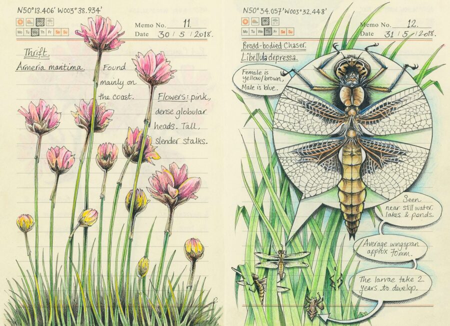
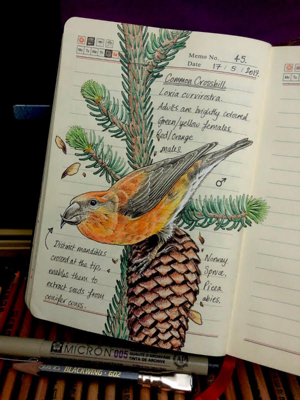
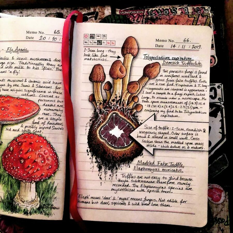
“At the end of April 2019, Jo posted a video of her journal so far on Twitter,” says her web site. “It went viral and her followers jumped from 9K followers to 20K followers in two days.” A glance at any given page reveals what so impressed them. “Each page of Brown’s notebook contains a pen and colored pencil drawing that begins at the pages’ edges, appearing to grow from the corner or across the paper,” writes Colossal’s Grace Ebert.
“Sometimes captured through close-ups that mimic scientific illustrations, the delicate renderings depict the detail of a buff-tailed bumblebee’s fuzzy torso and the red tendrils of a round-leaved sundew. Brown notes the common and Latin names for each species and common characteristics, in addition to where and when she spotted it.”
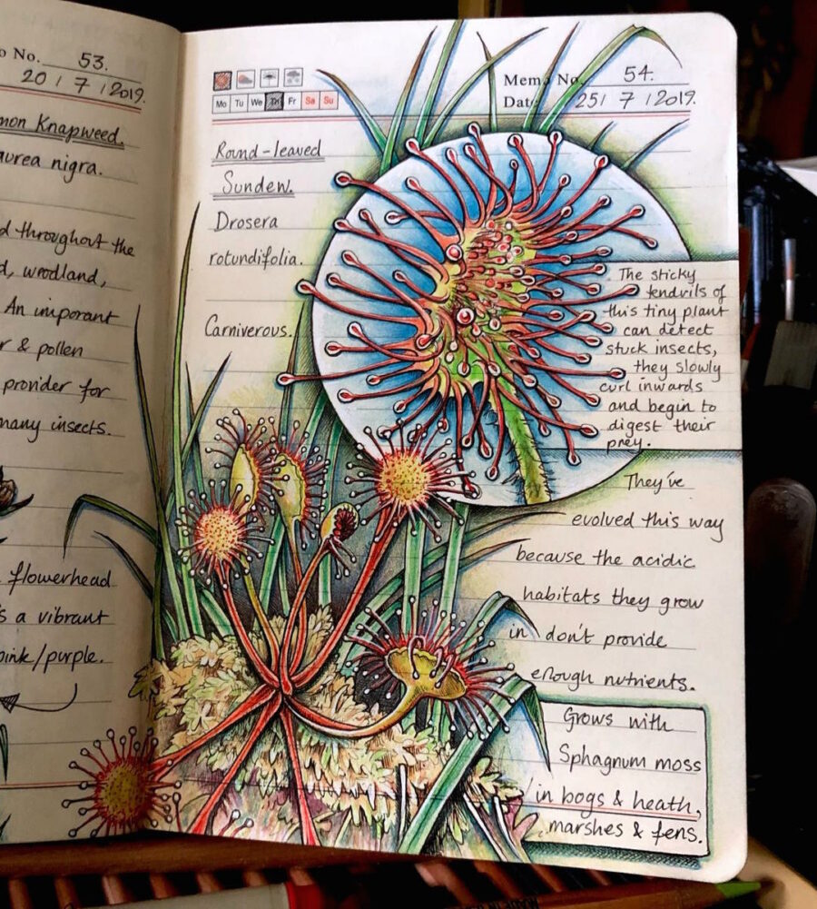
In other words, the nature journal showcases at once its creator’s keen eye, well-trained hand, and formidable knowledge of the natural world. It also stands as a prime example of the art of notebooking.
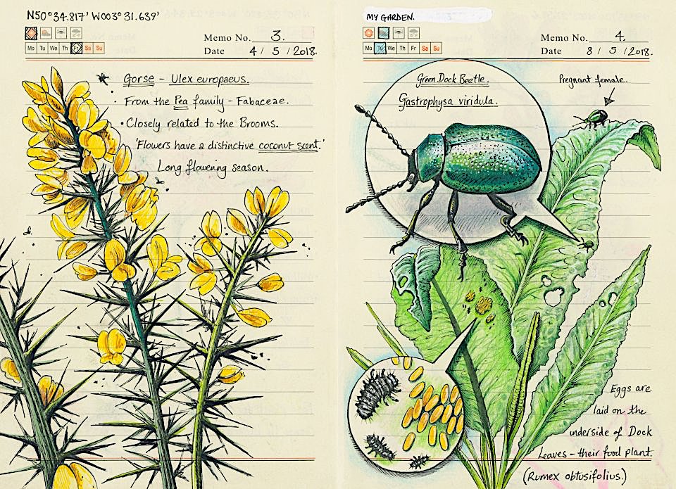
Using to its fullest advantage her ruled Moleskine notebook (the brand of choice for those invested in doing their jotting and sketching on the go for a couple of decades now), Brown effectively delivers a master class in the vivid, legible, and elegant — dare we say organic? — organization of both visual and textual information in the space of a small page.
You can take a closer look at how she does it on her web site as well as her feeds on both Twitter and Instagram. More recently, her journal has been published in book form as Secrets of a Devon Wood. Few nature-lovers, perhaps, can equal Jo Brown as an artist, but everyone can enjoy the gloriously varied realm of life that surrounds them just as much as she does. “All that’s required,” she says, “is a little patience and quiet observation.”
Related Content:
Two Million Wondrous Nature Illustrations Put Online by The Biodiversity Heritage Library
Based in Seoul, Colin Marshall writes and broadcasts on cities, language, and culture. His projects include the Substack newsletter Books on Cities, the book The Stateless City: a Walk through 21st-Century Los Angeles and the video series The City in Cinema. Follow him on Twitter at @colinmarshall, on Facebook, or on Instagram.


.jpg)