Those who harbor a deep-seated fear of the water may want to look for other methods of stress relief than BBC Earth’s relaxing 10-hour video loops, but everyone else is encouraged to take a dip in these stunning natural worlds, presented without commentary or background music.
As in most compelling nature documentaries, non-human creatures loom large, but unlike such BBC Earth offerings as Creepiest Insect Moments or Ants Attack Termite Mounds, there’s a benign, live-and-let-live vibe to the proceedings.
Unsurprisingly, the photography is breathtaking, and the uses of these marathon-length portraits are manifold: meditation tool, sleep aid, child soother, social media decompressor, travelogue, and—less calmingly—call to action.
Science tells us that many of these life forms, and the ocean in which they dwell, are in serious danger, thanks to decades of human disregard for the environment. This is an opportunity to immerse ourselves in what we stand to lose while it’s still possible to do something about it.
Click here to travel the oceans with polar bears, jellyfish, dolphins, seahorses, brightly colored tropical fish and other creatures of the deep, compliments of BBC’s Earth’s Oceanscapes playlists.
Ayun Halliday is an author, illustrator, theater maker and Chief Primatologist of the East Village Inky zine. Join her in NYC on Monday, November 4 when her monthly book-based variety show, Necromancers of the Public Domain celebrates Louise Jordan Miln’s “Wooings and Weddings in Many Climes (1900). Follow her @AyunHalliday.
Hollywood science fiction films imagine future humans in worlds that are no longer green, or never were—from Soylent Green’s dying Earth to that of Interstellar. And from Soylent Green to Ad Astra, humans in the future experience plant and animal life as simulations on a screen, in hyperreal photography and video meant to pacify and comfort. Maybe we live in that world already, to some extent, with apocalyptic films and science fiction expressing a collective mourning for the extinctions brought on by climate change.
“Over the course of my lifetime—I’m 46,” writes Washington Post art critic Sebastian Smee, “the planet has lost more than half of its wildlife populations, according to the World Wildlife Fund.” Surely this brute fact explains the immense popularity of high production-value nature documentaries, the antidote to apocalyptic futurism. They have become “blockbuster events,” argues Ed Yong at The Atlantic, with fandoms as fierce as any.
Viewed “from the perspective of the future,” writes Smee, nature documentaries “are great art. Maybe the greatest of our time.” But can viewing film and photographs of nature produce in us the feelings of awe and wonder that poets, artists, and philosophers have described feeling in actual nature for centuries? BBC Earth, producer of several major blockbuster nature documentary series, undertook some psychological research to find out, partnering with researchers from the University of California, Berkeley.
The team examined the effects of watching the BBC’s Planet Earth II documentary series relative to other kinds of programs. “It is a deep human intuition that viewing nature and being in nature is good for the mind and body,” they write in the study, titled “Exploring the Emotional State of ‘Real Happiness.’” (Sociobiologist E.O. Wilson coined the term “biophilia” to describe the evolved preference for natural beauty.) Does screentime equal physical time spent outdoors? Not exactly, but nature documentaries can lower stress levels and, yes, produce feelings of “real happiness.”
There have been several previous such studies. The authors cite one in which a few minutes of the original series Planet Earth “led people, compared to control participants, to feel 45.6% more awe and 31.4% more gratitude, but no shifts in feelings of negative emotions such as fear and sadness.” The Planet Earth II study may be the largest of its kind, with almost 3,500 participants in the U.S., around a thousand in the U.K., India, and Australia, each, and around 500 in both South Africa and Singapore for a total of approximately 7,500 viewers.
Participants across a range of age groups, from 16 to 55 and over, were shown short clips of a variety of TV programs, including clips from Planet Earth II. They were surveyed on an array of emotional responses before and after each viewing. The study also measured stress levels using the Perceived Stress Scale (PSS), and used a facial mapping technology called CrowdEmotion to track physical responses. The researchers aggregated the data and controlled for population size in each country.
The findings are fascinating. Across the scale, Planet Earth II clips generated more feelings of happiness and awe, with clips from news and entertainment shows causing more fear. In most of the study’s measures, these good feelings peaked highest at the lower demographic age range of 16–24. Younger viewers showed greater positive emotional responses in facial mapping and survey data, a fact consistent with BBC ratings data showing that 16–34 year-olds make up around 41% of the audience share for Planet Earth II.
“This younger group,” note the authors, “was more likely to experience significant positive shifts in emotion.” They also started out, before viewing the clips, with significantly more environmental anxiety, scoring highly on the stress scale. 71% described themselves as “extremely worried about the state of the world’s environment and what it will mean for my future.” A smaller percentage showed the lowest level of agreement with the statement “I regularly get outside and enjoy spending time with nature.”
For nearly all of the study’s viewers, nature documentaries seemed to produce at least fleeting feelings of “real happiness.” For many, they may also be a way of countering fears of the future, and compensating in advance for a loss of the natural beauty that remains. Unfortunately, the study did not measure the number of participants who viewed Planet Earth II and other “blockbuster” nature documentaries as a call to action against environmental destruction. Maybe that’s a subject for another study. Read the full Planet Earth II study results here. And if you’re feeling stressed, watch thirty minutes of “Visual Soundscapes,” presented by Planet Earth II, above.
As we pointed out back in 2017, Cormac McCarthy, author of such gritty, blood-drenched novels as Blood Meridian, Child of God, The Road, and No Country for Old Men, prefers the company of scientists to fellow writers. Since the mid-nineties, he has maintained a desk at the Santa Fe Institute, an interdisciplinary scientific think tank, and has served as a volunteer copy-editor for several scientists, including Lisa Randall, Harvard’s first female tenured theoretical physicist, and physicist Geoffrey West, author of the popular science book Scale.
One of McCarthy’s first such academic collaborations came after a friend, economist W. Brian Arthur, mailed him an article in 1996. McCarthy helped Arthur completely revise it, which sent the editor of the Harvard Business Review into a “slight panic,” the economist remembers. I can’t imagine why, but then I’d rather read any of McCarthy’s novels than most academic papers. Not that I don’t love to be exposed to new ideas, but it’s all about the quality of the writing.
Scholarly writing has, after all, a reputation for obscurity, and obfuscation for a reason, and not only in postmodern philosophy. Scientific papers also rely heavily on jargon, overly long, incomprehensible sentences, and disciplinary formalities that can feel cold and alienating to the non-specialist. McCarthy identified these problems in the work of associates like biologist and ecologist Van Savage, who has “received invaluable editing advice from McCarthy,” notes Nature, “on several science papers published over the past 20 years.”
During “lively weekly lunches” with the author during the winter of 2018, Savage discussed the finer points of McCarthy’s editing advice. Then Savage and evolutionary biologist Pamela Yeh presented the condensed version at Naturefor a wider audience. Below, we’ve excerpted some of the most striking of “McCarthy’s words of wisdom.” Find the complete compilation of McCarthy’s advice over atNature.
Use minimalism to achieve clarity…. Remove extra words or commas whenever you can.
Decide on your paper’s theme and two or three points you want every reader to remember…. If something isn’t needed to help the reader to understand the main theme, omit it.
Limit each paragraph to a single message.
Keep sentences short, simply constructed and direct.
Try to avoid jargon, buzzwords or overly technical language. And don’t use the same word repeatedly—it’s boring.
Don’t over-elaborate. Only use an adjective if it’s relevant…. Don’t say the same thing in three different ways in any single section.
Choose concrete language and examples.
When you think you’re done, read your work aloud to yourself or a friend. Find a good editor you can trust and who will spend real time and thought on your work.
Finally, try to write the best version of your paper—the one that you like. You can’t please an anonymous reader, but you should be able to please yourself.
When you make your writing more lively and easier to understand, people will want to invest their time in reading your work.
As Kottke points out, “most of this is good advice for writing in general.” This is hardly a surprise given the source, though, as McCarthy’s primary body of work demonstrates, literary writers are free to tread all over these guidelines as long as they can get away with it. Still, his straightforward advice is an invitation for writers of all kinds—academic, popular, aspiring, and professional—to remind themselves of the fundamental principles of clear, compelling communicative prose.
My beach house must be somewhere around here. I used to be able to see the ocean from it. I should be able to see it from the ocean. Ooo, that looks familiar. Lady Liberty. Ha ha! Hellooo! All the best to you. —Admiral Horatio Horntower
The absurdist 30-second shorts feature Odenkirk, encrusted in epaulets and naval insignia, as the fictional Horntower, “an admiral of a fleet of one and perhaps the last man on Earth.” Marooned on a small block of ice, he rails against the inexpertly animated wildlife encroaching on his domain.
(“You don’t even have the facility of language!” he tells a penguin, and later threatens a walrus that it will “get painted out” of the final cut for “complaining all the time…”)
Certainly a documentarian of Morris’ stature could have taken a lengthier, more serious approach to the subject, but as he notes:
Logic rarely convinces anybody of anything. Climate change has become yet another vehicle for political polarization. If Al Gore said the Earth was round there would be political opposition insisting that the Earth was flat. It’s all so preposterous, so contemptible.
Odenkirk also has some out-of-uniform concerns about climate change, as expressed in “Where I Got These Abs,” a 2011 Shouts & Murmurs piece for The New Yorker:
The middle ab on the left (not my left, your left, if you are looking at me) is called Terrence. It’s a dignified ab. It tenses each time I read an op-ed article about global warming. The article’s point of view is immaterial; simply being reminded that I can do nothing to stop the horrific future of floods and catastrophe gives this ab a taut yank that lingers, burning calories in my well-creased forehead at the same time.
How do you sell a government program that spends tens of millions of dollars on research and development for space travel? While the average taxpayer may love the idea of braving new frontiers, far fewer are apt to vote for funding scientific research, the space program’s ostensible reason for being.
During the Cold War, however, when the biggest breakthroughs in space flight occurred, selling the program didn’t involve sophisticated methods, only the broadest themes of heroism, patriotism, futurism, and, in more or less subtle ways, militarism. The appeal to science always went hand-in-hand with an appeal to the sublimely austere beauty of the heavens (which we’d hate to lose to the other guys.)
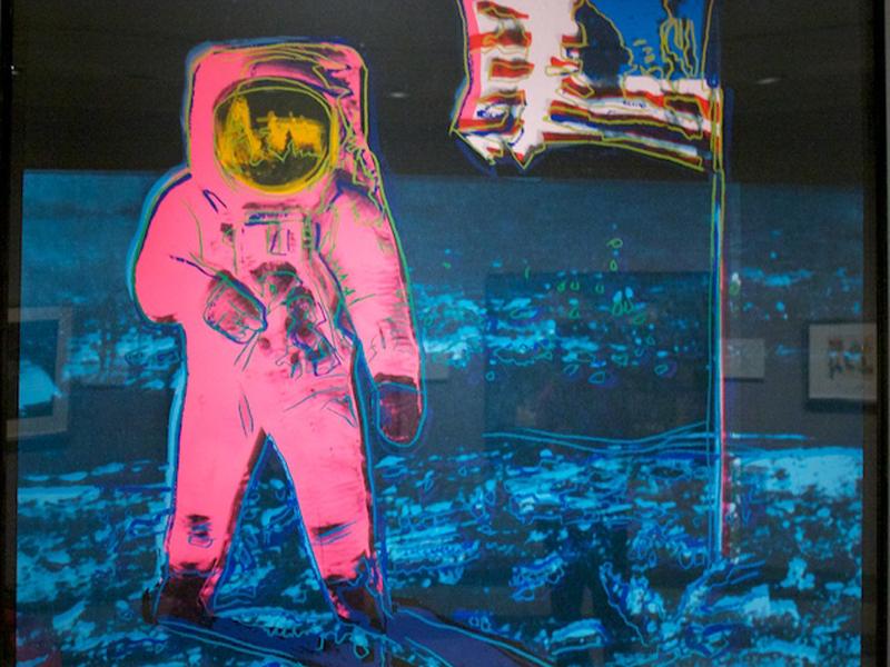
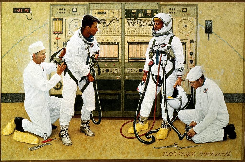
All of these were strategies NASA utilized, and then some. In addition to planting a U.S. flag on the moon, they delivered the first color image of Earth from space. On the ground, they enlisted artists like Andy Warhol, Norman Rockwell, and Laurie Anderson and actors like Star Trek’s Nichelle Nichols to sell the program.
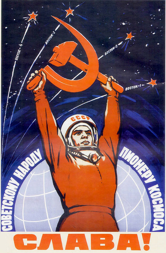
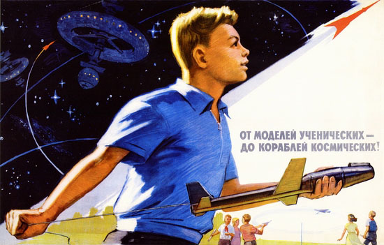
Recently, NASA has seemed to be in a reflective mood, from its antiquarian preparations for the 50th anniversary of the moon landing to its ad campaign of retro posters that resemble not only vintage sci-fi book jackets and movie ads, but also the futuristic social realism of their former Soviet rivals.
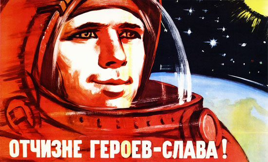
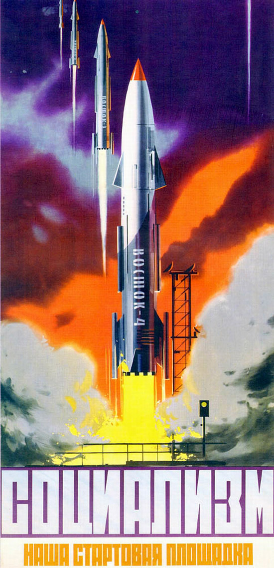
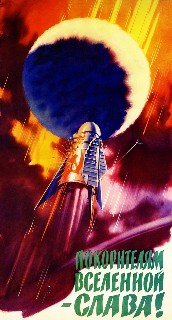
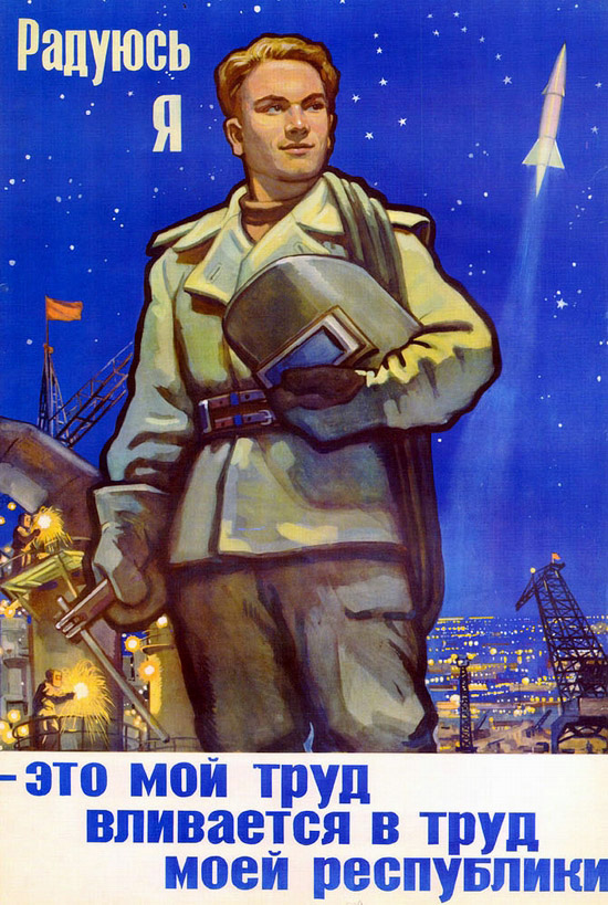
There’s almost something of an admission in NASA’s retro posters: we may have won the “space race,” but it wasn’t winner take all. There were some things the Soviets just did better—and when it came to making space travel look like the most monumentally heroic and exciting thing ever, they excelled, as you can see in this early collection of Soviet space posters from 1958–1963.
There’s something for, well, not everyone, but for men, women, young, old, young adults. Sci-fi geeks and model builders, people celebrating the new year, children celebrating the new year, a gaggle of young students who somehow all look just like Mary Tyler Moore. The artists are not celebrities, they’re fellow workers who “foresaw a Utopia in space,” writes Flashbak.
The Communists would bring peace and prosperity not only to the people of Earth but also to the technology-enabled, God-free Great Beyond. The artists created Soviet Space posters, vivid, energising and inspiring visions of the rosy-fingered dawn of tomorrow. They’re terrific.
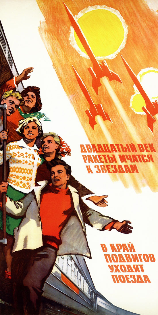
They’re maybe even more terrific when we consider that ordinary citizens didn’t have much say, at all, in the funding and direction of the U.S.S.R.’s space program. (Whether American citizens did is another question.) It was important that Soviets know, however, that “We will open the distant worlds!” as one poster reads, and, as the sixties teenage cigarette ad on a train above proclaims, “In the 20th century, the rockets race to the stars, the trains are going to the lands of achievements!”
The number of posters here is but a smattering of those posted on All about Russia (here and here) and Flashbak. Each poster has its own enchanting quality: emulating the propaganda of the 1930s; turning industrial laborers into anonymous towering heroes; and reaching some very heavy metal heights of bombast, as in the ad above, which declares, “Glory to the conquerors of the universe!”
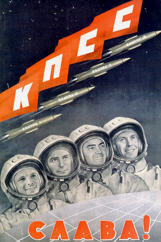
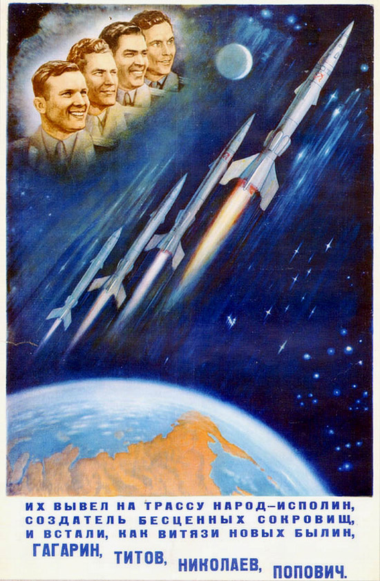
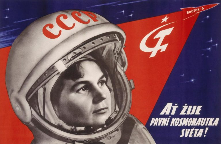
One poster superimposes the beaming faces of four cosmonauts, lined up like Kraftwerk, over a scene of four rockets leaving the earth. “Gagarin, Titov, Nikolaev, Popoviich—the mighty knights of our days.” (I’m not sure how that pun works in Russian.) The Soviets could also proclaim “Glory to the first woman cosmonaut!,” Valentina Tereshkova, who became the first woman to fly in space in 1963.
The Soviet space program deserves plenty of recognition for its many historic firsts, and also for the wildly enthusiastic optimism of its ad campaigns. They sold grand ideas about the exploration and, yes, conquest of space (and “the universe”) with the same verve and populist appeal as U.S. companies sold cars, cigarettes, and washing machines. Glory to the unsung Mad Men of the Soviet space poster!
As an insomniac in a morning person’s world, I wince at sleep news, especially from Matthew Walker, neuroscientist, Berkeley professor, and author of Why We Sleep. Something of a “sleep evangelist,” as Berkeley News calls him (he prefers “sleep diplomat”), Walker has taken his message on the road—or the 21st century equivalent: the TED Talk stages and animated explainer videos.
One such video has Walker saying that “sleep when you’re dead” is “mortally unwise advice… short sleep predicts a shorter life.” Or as he elaborates in an interview with Fresh Air’s Terry Gross, “every disease that is killing us in developed nations has causal and significant links to a lack of sleep.”
Yeesh. Does he lay it on thick? Nope, he’s got the evidence and wants to scare us straight. It’s a psychological tactic that hasn’t always worked so well, although next to “sleep or die” sermons, there’s good news: sleep, when harnessed properly (yes, somewhere in the area of 8 hours a night) can also be a “superpower.” Sleep does “wonderfully good things… for your brain and for your body,” boosting memory, concentration, and immunity, just for starters.
But back to the bad.…
In the Tech Insider video above, Walker delivers the grim facts. As he frequently points out, most of us need to hear it. Sleep deprivation is a serious epidemic—brought on by a complex of socio-economic-politico-technological factors you can probably imagine. See Walker’s comparisons (to the brain as an email inbox and a sewage system) animated, and learn about how lack of sleep contributes to a 24% increase in heart attacks and numerous forms of cancer. (The World Health Organization has recently “classified nighttime shift work as a probable carcinogen.”)
On the upside, rarely is health science so unambiguous. If nutritionists could only give us such clear-cut advice. Whether we’d take it is another question. Learn more about the multiple, and sometimes fatal, consequences of sleep deprivation in the animated TED-Ed video above.
Is perpetual motion possible? In theory… I have no idea…. In practice, so far at least, the answer has been a perpetual no. As Nicholas Barrial writes at Makery, “in order to succeed,” a perpetual motion machine “should be free of friction, run in a vacuum chamber and be totally silent” since “sound equates to energy loss.” Trying to satisfy these conditions in a noisy, entropic physical world may seem like a fool’s errand, akin to turning base metals to gold. Yet the hundreds of scientists and engineers who have tried have been anything but fools.
The long list of contenders includes famed 12th-century Indian mathematician Bhāskara II, also-famed 17th-century Irish scientist Robert Boyle, and a certain Italian artist and inventor who needs no introduction. It will come as no surprise to learn that Leonardo da Vinci turned his hand to solving the puzzle of perpetual motion. But it seems, in doing so, he “may have been a dirty, rotten hypocrite,” Ross Pomery jokes at Real Clear Science. Surveying the many failed attempts to make a machine that ran forever, he publicly exclaimed, “Oh, ye seekers after perpetual motion, how many vain chimeras have you pursued? Go and take your place with the alchemists.”
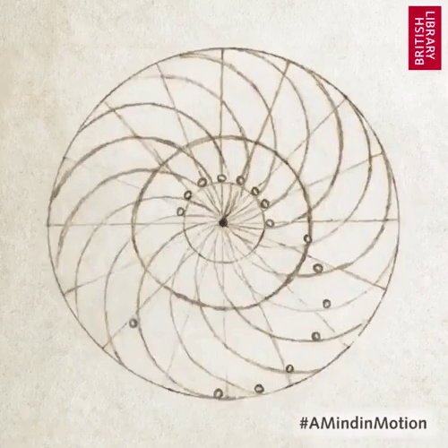
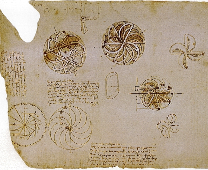
In private, however, as Michio Kaku writes in Physics of the Impossible, Leonardo “made ingenious sketches in his notebooks of self-propelling perpetual motion machines, including a centrifugal pump and a chimney jack used to turn a roasting skewer over a fire.” He also drew up plans for a wheel that would theoretically run forever. (Leonardo claimed he tried only to prove it couldn’t be done.) Inspired by a device invented by a contemporary Italian polymath named Mariano di Jacopo, known as Taccola (“the jackdaw”), the artist-engineer refined this previous attempt in his own elegant design.
Leonardo drew several variants of the wheel in his notebooks. Despite the fact that the wheel didn’t work—and that he apparently never thought it would—the design has become, Barrial notes, “THE most popular perpetual motion machine on DIY and 3D printing sites.” (One maker charmingly comments, in frustration, “Perpetual motion doesn’t seem to work, what am I doing wrong?”) The gif at the top, from the British Library, animates one of Leonardo’s many versions of unbalanced wheels. This detailed study can be found in folio 44v of the Codex Arundel, one of several collections of Leonardo’s notebooks that have been digitized and made publicly available online.
In his book The Innovators Behind Leonardo, Plinio Innocenzi describes these devices, consisting of “12 half-moon-shaped adjacent channels which allow the free movement of 12 small balls as a function of the wheel’s rotation…. At one point during the rotation, an imbalance will be created whereby more balls will find themselves on one side than the other,” creating a force that continues to propel the wheel forward indefinitely. “Leonardo reprimanded that despite the fact that everything might seem to work, ‘you will find the impossibility of motion above believed.’”
Leonardo also sketched and described a perpetual motion device using fluid mechanics, inventing the “self-filling flask” over two-hundred years before Robert Boyle tried to make perpetual motion with this method. This design also didn’t work. In reality, there are too many physical forces working against the dream of perpetual motion. Few of the attempts, however, have appeared in as elegant a form as Leonardo’s. See the fully scanned Codex Arundel at the British Library.
It’s hard to imagine that the space-crazed general public needed any help getting worked up about astronauts and NASA in the early 60s.
Perhaps the wild popularity of space-related imagery is in part what motivated NASA administrator James Webb to create the NASA Art Program in 1962.
Although the program’s handpicked artists weren’t edited or censored in any way, they were briefed on how NASA hoped to be represented, and the emotions their creations were meant capture—the excitement and uncertainty of exploring these frontiers.
NASA was also careful to collect everything the artists produced while participating in the program, from sketches to finished work.
In turn, they received unprecedented access to launch sites, key personnel, and major events such as Project Mercury and the Apollo 11 Mission.
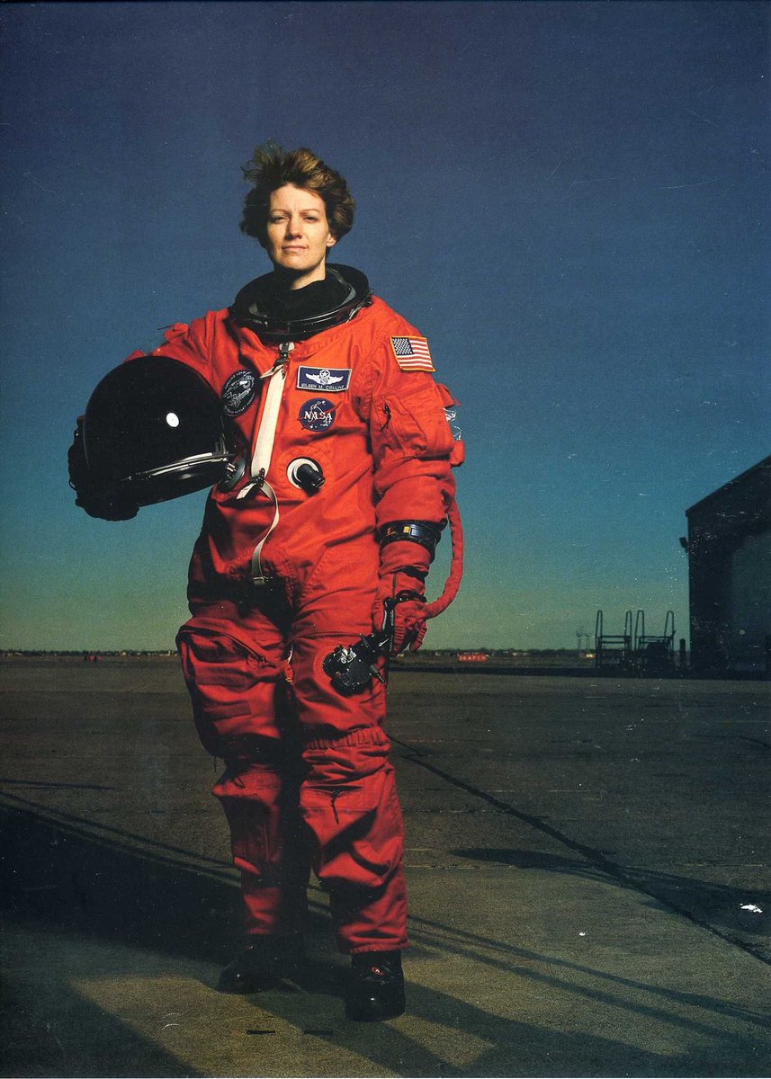
Over 350 artists, including Andy Warhol, Norman Rockwell, and Laurie Anderson, have brought their unique sensibilities to the project. (Find NASA-inspired art by Warhol and Rockwell above.)
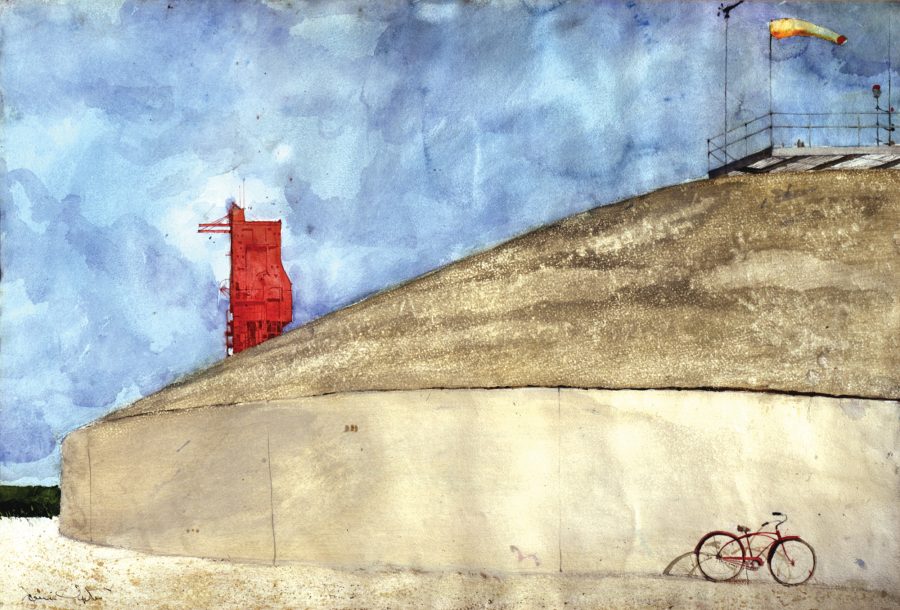
Jamie Wyeth’s 1964 watercolor Gemini Launch Pad includes a humble bicycle, the means by which technicians traveled back and forth from the launch pad to the concrete-reinforced blockhouse where they worked.
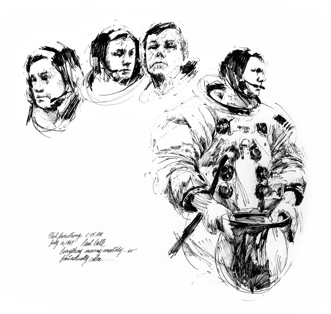
Postage stamp designer, Paul Calle, one of the inaugural group of participating artists, produced a stamp commemorating the Gemini 4 space capsule in celebration of NASA’s 9th anniversary. When the Apollo 11 astronauts suited up prior to blast off on July 16, 1969, Calle was the only artist present. His quickly rendered felt tip marker sketches lend a backstage element to the heroic iconography surrounding astronauts Armstrong, Aldrin and Collins. One of the items they carried with them on their journey was the engraved printing plate of Calle’s 1967 commemorative stamp. They hand-canceled a proof aboard the flight, on the assumption that post offices might be hard to come by on the moon.
We're hoping to rely on loyal readers, rather than erratic ads. Please click the Donate button and support Open Culture. You can use Paypal, Venmo, Patreon, even Crypto! We thank you!
Open Culture scours the web for the best educational media. We find the free courses and audio books you need, the language lessons & educational videos you want, and plenty of enlightenment in between.