40,000 Early Modern Maps Are Now Freely Available Online (Courtesy of the British Library)

Most of us do not, today, live in des­per­ate need of maps. On the inter­net we can eas­i­ly find not only the cur­rent maps we need to nav­i­gate most any ter­ri­to­ry on Earth, but also an increas­ing pro­por­tion of all the maps made before as well. You can find the lat­ter in places like the David Rum­sey Map Col­lec­tion, which, as we wrote last year here on Open Cul­ture, now boasts 91,000 his­toric maps free to down­load.  It will sure­ly add even more, as human­i­ty seems to have only just begun dig­i­tiz­ing its own many attempts to make the phys­i­cal world leg­i­ble, an art that goes back (as you know if you read the Uni­ver­si­ty of Chicago’s The His­to­ry of Car­tog­ra­phy online) to pre­his­toric Las­caux cave paint­ings of the night sky.

By that stan­dard, the maps cur­rent­ly being dig­i­tized and uploaded by the British Library are down­right mod­ern — or ear­ly mod­ern, to be more spe­cif­ic. Dat­ing between 1500 and 1824, says Medievalists.net, these maps “are part of the Topo­graph­i­cal Col­lec­tion of King George III (K. Top),” which also includes “maps, atlases, archi­tec­tur­al draw­ings, car­toons and water­col­ors.”

Part of “the larg­er King’s Library which was pre­sent­ed to the Nation by George IV in 1823,” the col­lec­tion was amassed “dur­ing the for­ma­tive peri­od of the British Empire” and thus shows “how Britain viewed and inter­act­ed with the wider world dur­ing this peri­od.”

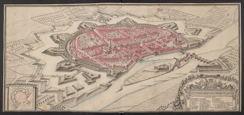
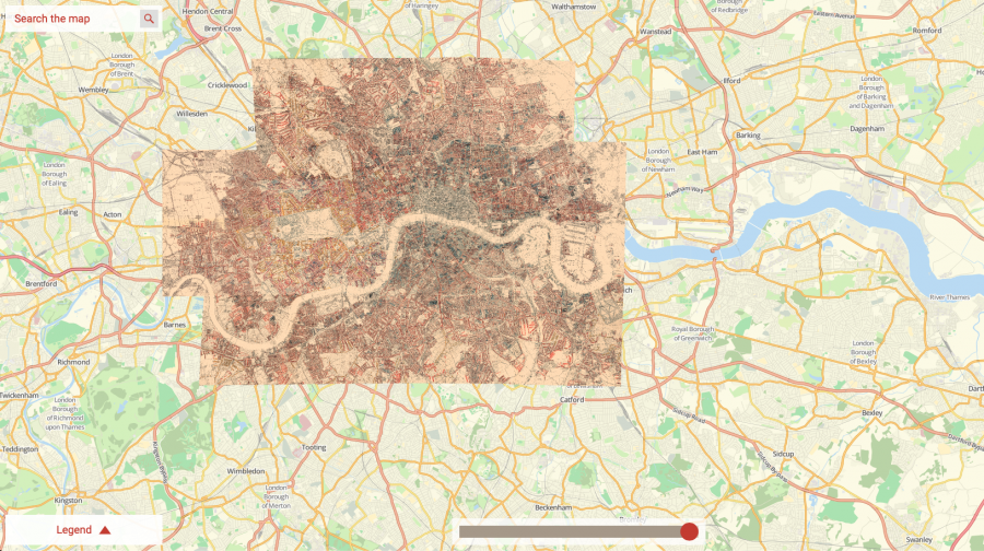
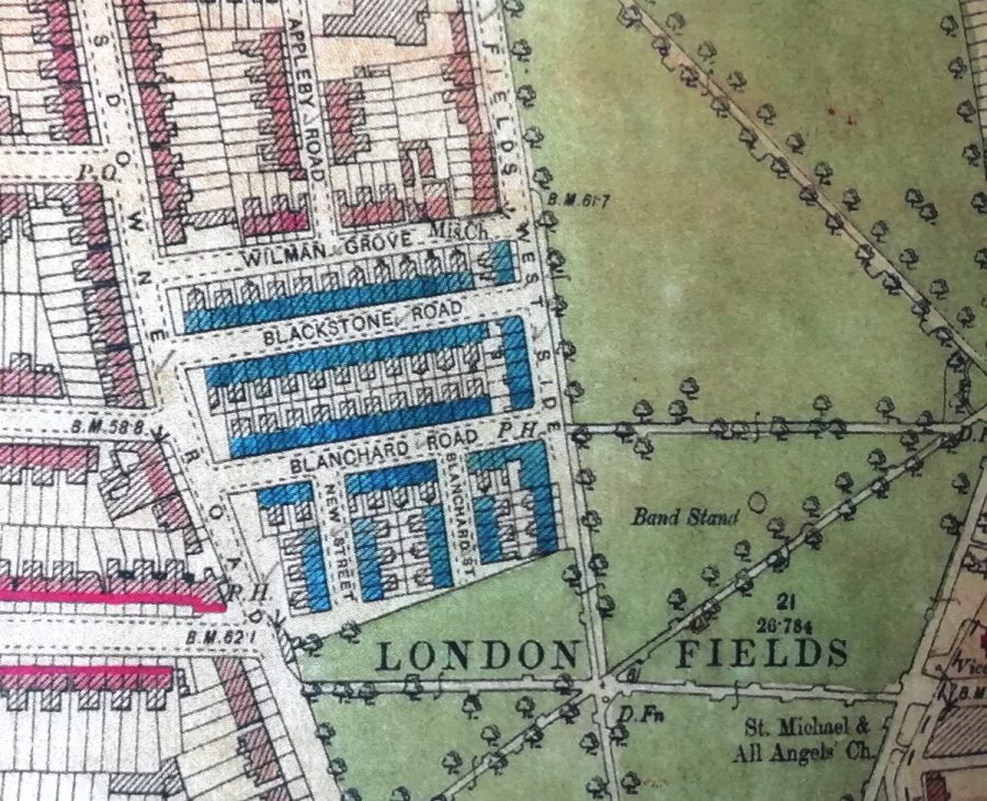
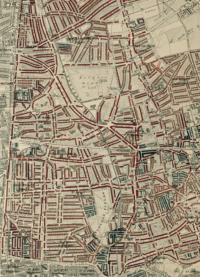
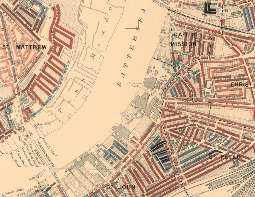
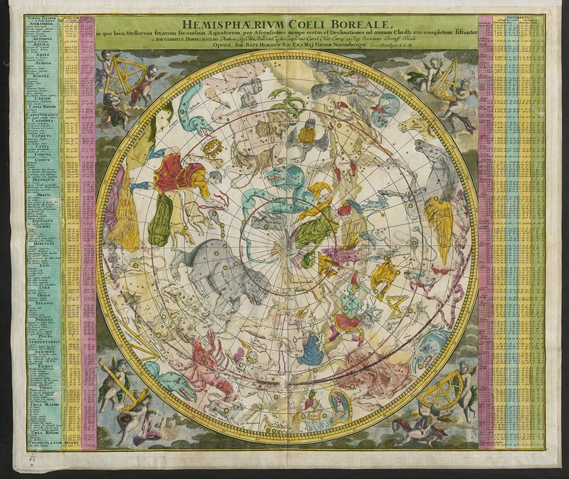
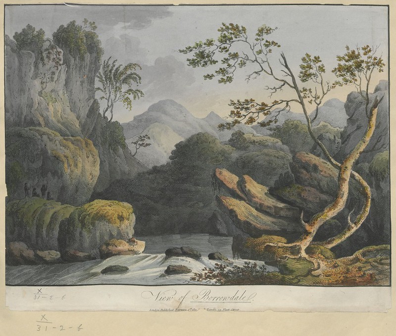
The British Library plans to post 40,000 of these maps (broad­ly con­sid­ered), and you can now view the first set of rough­ly 18,000 at the insti­tu­tion’s Flickr Com­mons col­lec­tion. Medievalists.net names as high­lights of the full Topo­graph­i­cal Col­lec­tion of King George III such arti­facts as “a hand-drawn map of New York City, pre­sent­ed to the future James II in 1664,” “The vast Kangxi Map of Chi­na of 1719 made by the Ital­ian Jesuit Mat­teo Ripa,” “the ear­li­est com­pre­hen­sive land-use map of Lon­don from 1800,” and even “water­col­ors by not­ed 18th cen­tu­ry artists such as Paul Sand­by and Samuel Hierony­mus Grimm.”

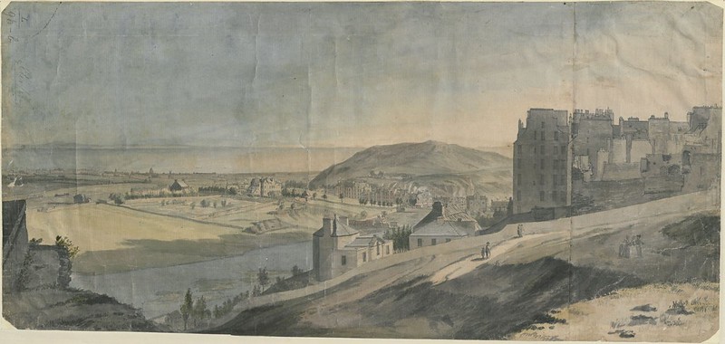
Many of the pieces the British Library has thus far uploaded to Flickr look like maps to us still today, but just as many, per­haps most, strike us more as works of art. This goes for tra­di­tion­al bird’s-eye-views ren­dered more vivid­ly (and some­times imag­i­na­tive­ly) than we’re used to, as well for as rich­ly drawn or even paint­ed land­scapes, all of which exist to pro­vide a faith­ful rep­re­sen­ta­tion of land, sea, and sky. You can view more such images along that spec­trum, as well as read their sto­ries in con­text, at the British Library’s Pic­tur­ing Places site. The artis­tic and his­tor­i­cal rich­ness exud­ed by these maps today echoes the more tan­gi­ble val­ue they had when first cre­at­ed: back then, those who had the maps pos­sessed the world.

via Medievalist.net

Relat­ed Con­tent:

Behold an Incred­i­bly Detailed, Hand­made Map Of Medieval Trade Routes

Ancient Maps that Changed the World: See World Maps from Ancient Greece, Baby­lon, Rome, and the Islam­ic World

Down­load 91,000 His­toric Maps from the Mas­sive David Rum­sey Map Col­lec­tion

The His­to­ry of Car­tog­ra­phy, “the Most Ambi­tious Overview of Map Mak­ing Ever Under­tak­en,” Is Free Online

The British Library Puts 1,000,000 Images into the Pub­lic Domain, Mak­ing Them Free to Reuse & Remix

Based in Seoul, Col­in Mar­shall writes and broad­casts on cities, lan­guage, and cul­ture. His projects include the Sub­stack newslet­ter Books on Cities, the book The State­less City: a Walk through 21st-Cen­tu­ry Los Ange­les and the video series The City in Cin­e­ma. Fol­low him on Twit­ter at @colinmarshall, on Face­book, or on Insta­gram.

GPS Tracking Reveals the Secret Lives of Outdoor Cats

We track sharksrhi­no, and bears, so why not Boo Boo Kit­tyPeanut, and Pump­kin?

The Long Island feline res­i­dents volunteered—or more accu­rate­ly, were volunteered—by their human com­pan­ions to par­tic­i­pate in a domes­tic cat move­ment study as part of the inter­na­tion­al Cat Track­er project.

Each beast was out­fit­ted with a GPS track­er-enhanced har­ness, which they wore for a week.

(Many cat own­ers will find that alone some­thing of an achieve­ment.)

In total, almost a thou­sand house­holds in four coun­tries took part—the Unit­ed StatesNew ZealandAus­tralia, and the UK.

Sci­en­tists were par­tic­u­lar­ly inter­est­ed to learn the degree of may­hem these cher­ished pets were vis­it­ing on sur­round­ing wildlife in their off hours.

Any­one who’s been left a present of a fresh­ly mur­dered baby bun­ny, mole, or wing­less bat can prob­a­bly guess.

It’s a con­sid­er­able amount, though by and large the domes­ti­cat­ed par­tic­i­pants stuck close to home, rarely trav­el­ing more than two foot­ball fields away from the com­forts of their own yards. The impulse to keep the food bowl with­in easy range con­fines their hunt­ing activ­i­ties to a fair­ly tight area. Woe to the field mice who set up shop there.

Their move­ments also revealed the per­il they put them­selves in, cross­ing high­ways, roads, and park­ing lots. Researcher Hei­dy Kikil­lus, who tracked cats in New Zealand, report­ed that a num­ber of her group’s sub­jects wound up in a fatal encounter with a vehi­cle.

Gen­er­al­ly speak­ing, gen­der, age, and geog­ra­phy play a part in how far a cat roams, with males, younger ani­mals, and coun­try dwellers cov­er­ing more ground. Unsur­pris­ing­ly, those who have not been neutered or spayed tend to have a freer range too.

“With­out the moti­va­tions of food and sex, most cats seem con­tent to be home­bod­ies,” zool­o­gist Roland Kays, one of the US Project lead­ers, not­ed.

Amer­i­can cit­i­zen sci­en­tists who’d like to enroll their cat can find infor­ma­tion and the nec­es­sary forms on the Cat Track­er web­site.

The cat-less and those with indoor cats can enjoy pho­tos of select par­tic­i­pants and explore their tracks here.

And what bet­ter fall craft than a DIY cat track­ing GPS har­ness?

via Nation­al Geo­graph­ic

Relat­ed Con­tent: 

In 1183, a Chi­nese Poet Describes Being Domes­ti­cat­ed by His Own Cats

An Ani­mat­ed His­to­ry of Cats: How Over 10,000 Years the Cat Went from Wild Preda­tor to Sofa Side­kick

How Humans Domes­ti­cat­ed Cats (Twice)

Ayun Hal­l­i­day is an author, illus­tra­tor, the­ater mak­er and Chief Pri­ma­tol­o­gist of the East Vil­lage Inky zine.  Fol­low her @AyunHalliday.

Hand-Colored Maps of Wealth & Poverty in Victorian London: Explore a New Interactive Edition of Charles Booth’s Historic Work of Social Cartography (1889)

Map­ping has always been con­tentious, no mat­ter where you look in time. Maps pre­serve ide­o­log­i­cal assump­tions on paper, ratio­nal­iz­ing phys­i­cal space as they ren­der it in two dimen­sions. No mat­ter how didac­tic, they can become polit­i­cal weapons. In the case of Charles Booth’s visu­al­ly impres­sive Maps Descrip­tive of Lon­don Pover­ty, we have a series of maps whose own assump­tions can some­times seem at odds with their osten­si­ble pur­pose: to improve the liv­ing con­di­tions of London’s poor.

Booth’s “colour­ful pover­ty maps were cre­at­ed between 1886 and 1903,” Zoe Craig writes at Lon­don­ist, as part of a “ground-break­ing study into the lives of ordi­nary Lon­don­ers.” A phil­an­thropist born into wealth in the ship­ping trade, Booth took it upon him­self to study pover­ty in Lon­don in order to ini­ti­ate social reforms.

He suc­ceed­ed. The study, con­duct­ed by Booth and a team of researchers, led to the cre­ation of Old Age pen­sions, which Booth called “lim­it­ed social­ism,” as well as school meals for hun­gry chil­dren. He was clear about that fact that he saw such reforms as a bul­wark against social­ist rev­o­lu­tion.

The study’s sev­en­teen vol­umes are filled with pic­turesque accounts. “Pick­ing through the tid­bits of infor­ma­tion from these people’s lives will make you feel a bit like a Vic­to­ri­an cos­tume dra­ma police detec­tive,” Craig remarks. This ref­er­ence to polic­ing feels point­ed, giv­en the role of the police in main­tain­ing class hier­ar­chies in Vic­to­ri­an Lon­don. As an Amer­i­can, it can be hard to look at Booth’s map and not also see the 20th redlin­ing prac­tices in U.S. cities. Con­sid­er, for exam­ple, the cat­e­gories Booth applied to London’s class­es:

Called ‘Inquiry Into the Life and Labour of the Peo­ple in Lon­don’, the epic work stud­ied fam­i­lies and res­i­dents liv­ing across Lon­don, and coloured the streets accord­ing to their finan­cial sit­u­a­tion: between black for ‘low­est class, vicious, semi-crim­i­nal’ through pink for mixed ‘some com­fort­able, some poor’ to orange for ‘wealthy’.

As in Daniel Patrick Moynihan’s pater­nal­is­tic 1965 report on the Black under­class in the U.S., the lan­guage rein­forces Social Dar­win­ist ideas that deem the “low­est class” unfit for full par­tic­i­pa­tion in civ­il society—“vicious, semi-crim­i­nal…”

Of course, the social and his­tor­i­cal con­text dif­fers marked­ly, but we might also con­sid­er Fear­gus O’Sullivan’s obser­va­tions at Bloomberg City­Lab. A new pub­lished edi­tion of the map, he writes, “accom­pa­nied by com­pelling if bleak peri­od pho­tos, reveals a city that pos­sess­es echoes of Lon­don today. It depicts, after all, a dense­ly-packed metrop­o­lis with a cos­mopoli­tan pop­u­la­tion where immense­ly wealthy peo­ple lived just around the cor­ner from neigh­bors who were strug­gling to make ends meet.”

Maps may not cre­ate the social con­di­tions they describe, but they can help per­pet­u­ate them, ren­der­ing peo­ple vis­i­ble in ways that allow for even more con­trol over their lives. Crit­i­cisms of Booth’s study claimed that not only did the pro­posed reforms not go far enough but that the report described London’s class struc­ture while offer­ing lit­tle to no analy­sis of the caus­es of pover­ty. In lan­guage that sound­ed less objec­tion­able to Vic­to­ri­an ears, the poor are most­ly blamed for their own con­di­tion.

None of the study’s par­tic­u­lar lim­i­ta­tions take away from the graph­ic achieve­ments of its maps and explana­to­ry charts. They are, the Lon­don School of Eco­nom­ics writes, a strik­ing “ear­ly exam­ple of social car­tog­ra­phy.” The LSE hosts an incred­i­bly detailed, search­able, high-res­o­lu­tion inter­ac­tive ver­sion of the maps, assem­bled togeth­er and over­laid on a mod­ern GPS map of Lon­don. They also detail the var­i­ous edi­tions of the maps as they appeared between 1898 and 1903.

Hand-col­ored and based on the 1869 Ord­nance Sur­vey, the maps seemed “suf­fi­cient­ly impor­tant” to Booth to war­rant “com­pre­hen­sive revi­sion.” Here, the police appear in per­son to guide the process. “Social inves­ti­ga­tors accom­pa­nied police­men on their beats across Lon­don,” the LSE writes, “and record­ed their own impres­sions of each street and the com­ments of the police­men.” You can read the police note­books from these sur­veys at the LSE and learn more about the 12 dis­trict maps and the demo­graph­ic data they rep­re­sent at Map­ping Lon­don. The LSE print­ed a hard­cov­er print edi­tion of Booth’s work in 2019, com­plete with 500 illus­tra­tions. You can pur­chase a copy here. Or vis­it the inter­ac­tive edi­tion here.

via Messy Nessy

Relat­ed Con­tent:

The 1855 Map That Rev­o­lu­tion­ized Dis­ease Pre­ven­tion & Data Visu­al­iza­tion: Dis­cov­er John Snow’s Broad Street Pump Map

Ani­ma­tions Visu­al­ize the Evo­lu­tion of Lon­don and New York: From Their Cre­ation to the Present Day

Syn­chro­nized, Time­lapse Video Shows Train Trav­el­ing from Lon­don to Brighton in 1953, 1983 & 2013

Josh Jones is a writer and musi­cian based in Durham, NC. Fol­low him at @jdmagness

A New Interactive Map Shows All Four Million Buildings That Existed in New York City from 1939 to 1941

New York­ers have borne wit­ness to a notice­able uptick in the num­ber of shiny, new build­ings going up in the city over the last few years, crowd­ing the water­front, ris­ing from the ash­es of com­mu­ni­ty gar­dens and old­er, infi­nite­ly more mod­est struc­tures.

Their devel­op­ers have tak­en care to top load them with luxu­ry ameni­ties—rooftop cabanas, 24-hour fit­ness clubs, mar­ble coun­ter­tops, screen­ing rooms.

But one thing they can’t pro­vide is the sense of lived his­to­ry that imbues every old build­ing with a true sense of char­ac­ter, mys­tique, and oft-grub­by charm.

I fear that the occu­pants of these new­er build­ings won’t have near­ly as much fun as the rest of us search­ing for our cur­rent address­es on the NYC Munic­i­pal Archives’ inter­ac­tive map, above.

Every dot rep­re­sents a Works Progress Admin­is­tra­tion pho­to­graph of a New York City build­ing, snapped between 1939 and 1941 as a means of stan­dard­iz­ing the way in which prop­er­ty val­ues were assessed and record­ed.

There are 4,282,000 dots, spread out between five bor­oughs.

Does that sound dense­ly packed?

You should see it today… there’s been a lot of ver­ti­cal build.

This unas­sum­ing fuel oil plant near Brooklyn’s Gowanus Canal has giv­en way to a 430-unit build­ing boast­ing a yoga room, spin stu­dios, and valet ser­vices for those in need of dry-clean­ing, laun­dry, apart­ment clean­ing, or dog walking…though sad­ly, no on-premis­es motor oil. We find that omis­sion some­what sur­pris­ing for such a full-ser­vice res­i­den­tial devel­op­ment on the banks of a Super­fund site, whose clean up is esti­mat­ed to tip the scales at $500 mil­lion.

We also won­der what the occu­pants of the above build­ings would have made of the glassy 25-sto­ry com­plex that opened on their coor­di­nates ear­li­er this year. Is it just us, or does it seem a bit disin­gen­u­ous of its devel­op­ers to trum­pet that its loca­tion is “the epit­o­me of New York City’s authen­tic­i­ty, with over a cen­tu­ry of rich his­to­ry, where the world’s sar­to­r­i­al and culi­nary trends are born”?

(You can find us a few blocks away mut­ter­ing into our chopped liv­er at Russ and Daugh­ters, a ven­er­a­ble food shop that looks much the same today as it did in 1940, though you’ll have to con­firm with a bit of research on your own if you don’t want to take our word for it, the WPA “dot” reveal­ing lit­tle more than a man with a stick and sev­er­al mov­ing vehi­cles.)

Our final stop is one of many archi­tec­tur­al ghosts to haunt the Hud­son Yards colos­sus, the self-described “epi­cen­ter of Manhattan’s New West Side… a bea­con for cre­ative pro­fes­sion­als, a hub for fash­ion, design, com­mu­ni­ca­tions and art.” In addi­tion to a much reviled $200 mil­lion shawar­ma-shaped “3‑dimensional pub­lic space” and state of the art wine fridges, ameni­ties now include diag­nos­tic and anti­body test­ing “per­formed by top med­ical pro­fes­sion­als.”

It’s telling that in the sum­mer of 2020, prospec­tive ten­ants were offered incen­tives includ­ing two months’ free rent and a $2,000 gift card.

Proof, per­haps, that New York will con­tin­ue as it always has—a city in con­stant flux. The preva­lence of mod­ern high rise build­ings in dystopi­an fic­tion gives us pause.…

Explore the Street View of 1940s New York here.

Relat­ed Con­tent: 

Behold the New York City Street Tree Map: An Inter­ac­tive Map That Cat­a­logues the 700,000 Trees Shad­ing the Streets of New York City

New York Pub­lic Library Puts 20,000 Hi-Res Maps Online & Makes Them Free to Down­load and Use

The New York Pub­lic Library Lets You Down­load 180,000 Images in High Res­o­lu­tion: His­toric Pho­tographs, Maps, Let­ters & More

Ayun Hal­l­i­day is an author, illus­tra­tor, the­ater mak­er and Chief Pri­ma­tol­o­gist of the East Vil­lage Inky zine. Fol­low her @AyunHalliday.

3D Interactive Globes Now Online: Spin Through an Archive of Globes from the 17th and 18th Century

Willem Jan­szoon Blaeu Celes­tial Globe 1602

No mat­ter how accus­tomed we’ve grown over the cen­turies to flat maps of the world, they can nev­er be per­fect­ly accu­rate. Strict­ly speak­ing, no map can per­fect­ly cap­ture the ter­ri­to­ry it describes (an impos­si­bil­i­ty mem­o­rably fic­tion­al­ized by Jorge Luis Borges in “On Exac­ti­tude in Sci­ence”), but there’s a rea­son we also call the Earth “the globe”: only a globe can rep­re­sent not just the plan­et’s true shape, but the true shape of the land mass­es on which we live. This is not to say that globes have always been accu­rate. Like the his­to­ry of map­mak­ing, the his­to­ry of globe-mak­ing is one of edu­cat­ed (or une­d­u­cat­ed) guess­es, free mix­ture of fact and leg­end, and labels like “ter­ra incog­ni­ta” or “here be drag­ons.” You can see that for your­self in the British Library’s new online his­toric globe archive — and not just through flat pho­tographs and scans.

“The archive presents 3D mod­els of 11 globes — a sub­set of the library’s his­toric maps col­lec­tion — that can be rotat­ed and zoomed into for greater detail at every angle,” writes Hyper­al­ler­gic’s Sarah Rose Sharp. She points to one in par­tic­u­lar, “stun­ning 1602 celes­tial globe by Dutch car­tog­ra­ph­er Willem Jan­szoon Blaeu, first pro­duced in 1602. In addi­tion to rep­re­sent­ing the con­stel­la­tions as their fan­tas­tic and mytho­log­i­cal name­sakes, it iden­ti­fies a nova in the con­stel­la­tion of Cygnus which Blaeu had per­son­al­ly observed in 1600.”

The British Library’s dig­i­tal col­lec­tion boasts sev­er­al such “celes­tial globes,” which chart the sky rather than the Earth. How­ev­er few of us have ever turned a celes­tial globe by hand, we can now do it vir­tu­al­ly. If 1602 seems a bit too vin­tage, give a dig­i­tal spin to the oth­ers from 1700, 1728, and 1783.

Back on land, these globes fea­ture not just “fan­tas­tic crea­tures,” Sharp writes, but “charm­ing archa­ic con­cep­tions of the oceans — the ‘Ata­lantick Ocean’ in the 1730 Richard Cushee ter­res­tri­al globe, or the ‘Ethipoic Ocean’ in the 1783 ter­res­tri­al globe by G. Wright and W. Bardin.” In Chushee, Wright and Bardin’s times, few globe-users, or indeed globe-mak­ers, would have had the chance to see much of those vast bod­ies of water for them­selves. Of course, with the cur­rent state of pan­dem­ic lock­down in so many coun­tries, few of us are tak­ing transocean­ic jour­neys even today. If you’re dream­ing about the rest of the world, spend some time with the British Library’s 3D-mod­eled globes on Sketch­fab — where you’ll also find the Roset­ta Stone and Bust of Nefer­ti­ti among oth­er arti­facts pre­vi­ous­ly fea­tured here on Open Cul­ture — and get your hands on an idea of how human­i­ty imag­ined it in cen­turies past.

via Hyper­al­ler­gic

Relat­ed Con­tent:

Enchant­i­ng Video Shows How Globes Were Made by Hand in 1955: The End of a 500-Year Tra­di­tion

Watch the Mak­ing of the Dymax­ion Globe: A 3‑D Ren­der­ing of Buck­min­ster Fuller’s Rev­o­lu­tion­ary Map

Why Mak­ing Accu­rate World Maps Is Math­e­mat­i­cal­ly Impos­si­ble

The Strik­ing­ly Beau­ti­ful Maps & Charts That Fired the Imag­i­na­tion of Stu­dents in the 1880s

Down­load 91,000 His­toric Maps from the Mas­sive David Rum­sey Map Col­lec­tion

The His­to­ry of Car­tog­ra­phy, “the Most Ambi­tious Overview of Map Mak­ing Ever Under­tak­en,” Is Free Online

Based in Seoul, Col­in Mar­shall writes and broad­casts on cities, lan­guage, and cul­ture. His projects include the book The State­less City: a Walk through 21st-Cen­tu­ry Los Ange­les and the video series The City in Cin­e­ma. Fol­low him on Twit­ter at @colinmarshall, on Face­book, or on Insta­gram.

The History of the Plague: Every Major Epidemic in an Animated Map

All of us have tried to come to grips with the coro­n­avirus in dif­fer­ent ways. Here on Open Cul­ture we’ve fea­tured online cours­es to get you con­ver­sant in the sci­ence around the pan­dem­ic, but read­ers of this site will also have sought out the most per­ti­nent works of his­to­ry and lit­er­a­ture. That goes espe­cial­ly for those in need of read­ing mate­r­i­al while in states of quar­an­tine or lock­down (self-imposed or oth­er­wise), and any list of rec­om­mend­ed books must include Daniel Defoe’s A Jour­nal of the Plague Year and Albert Camus’ The Plague. (I recent­ly wrote about the expe­ri­ence of read­ing that last in Korea, where I live, for the Los Ange­les Review of Books.) Both fic­tion­al­ize local out­breaks of the bubon­ic plague, but how far and wide did that hor­rif­ic and much-mythol­o­gized dis­ease actu­al­ly spread?

You can see exact­ly how far and wide in the ani­mat­ed his­tor­i­cal map above, cre­at­ed by a Youtu­ber called Emper­or­Tiger­star. It main­ly cov­ers the peri­od of 431 BC to 1353 AD, dur­ing most of which the plague looks to have occurred in Europe, the Mid­dle East, and Africa with some reg­u­lar­i­ty. Up until the 1330s, the out­breaks stay small enough that you may have to view the map in fullscreen mode to ensure that you even see them.

But even the most casu­al stu­dents of his­to­ry know what hap­pened next: the best-known occur­rence of the Black Death, whose peak last­ed from 1347 to 1351 and which claimed some­where between 75 to 200 mil­lion lives (includ­ing rough­ly half of Europe’s entire pop­u­la­tion). Ren­dered, suit­ably, in black, the plague’s spread comes even­tu­al­ly to look on the map like a sea of ink splashed vio­lent­ly across mul­ti­ple con­ti­nents.

The plague hard­ly died with the 1350s, a fact this map acknowl­edges. It would, writes Emper­or­Tiger­star, “take years to go away, and even then there would be local out­breaks in indi­vid­ual cities for cen­turies.” These Black Death after­shocks, “big in their own right,” include the Great Plague of Milan in the 1630s, the Great Plague of Seville in the 1640s, and the Great Plague of Lon­don in the 1660s — the sub­ject of Defoe’s nov­el. When Camus wrote The Plague in 1947, the Alger­ian city of Oran in which he set its sto­ry had expe­ri­enced its last out­break of the dis­ease just three years before (at least the fifth such expe­ri­ence in its his­to­ry). Though har­row­ing sto­ries are even now com­ing out of places like mod­ern-day Milan, the coro­n­avirus has yet to match the grue­some dead­li­ness of the plagues fea­tured in either of these books. But unless we under­stand how epi­demics afflict­ed human­i­ty in the past, we can hard­ly han­dle them prop­er­ly in the present.

Relat­ed Con­tent:

Free Cours­es on the Coro­n­avirus: What You Need to Know About the Emerg­ing Pan­dem­ic

Bill Gates Describes His Biggest Fear: “I Rate the Chance of a Wide­spread Epi­dem­ic Far Worse Than Ebo­la at Well Over 50 Per­cent” (2015)

The 1855 Map That Rev­o­lu­tion­ized Dis­ease Pre­ven­tion & Data Visu­al­iza­tion: Dis­cov­er John Snow’s Broad Street Pump Map

The Strange Danc­ing Plague of 1518: When Hun­dreds of Peo­ple in France Could Not Stop Danc­ing for Months

200,000 Years of Stag­ger­ing Human Pop­u­la­tion Growth Shown in an Ani­mat­ed Map

Ani­mat­ed Map Shows How the Five Major Reli­gions Spread Across the World (3000 BC – 2000 AD)

Based in Seoul, Col­in Mar­shall writes and broad­casts on cities, lan­guage, and cul­ture. His projects include the book The State­less City: a Walk through 21st-Cen­tu­ry Los Ange­les and the video series The City in Cin­e­ma. Fol­low him on Twit­ter at @colinmarshall or on Face­book.

An Artist Tricks Google Maps Into Creating a Virtual Traffic Jam, Using a Little Red Wagon & 99 Smartphones

Some­times the mirac­u­lous time-sav­ing con­ve­niences we’ve come to depend on can have the oppo­site effect, as artist Simon Wick­ert recent­ly demon­strat­ed, ambling about the streets of Berlin at a Huck Finn-ish pace, tow­ing a squeaky-wheeled red wag­on loaded with 99 sec­ond­hand smart­phones.

Each phone had a SIM card, and all were run­ning the Google Maps app.

The result?

A near-instan­ta­neous “vir­tu­al traf­fic jam” on Google Maps, even though bicy­clists seem to vast­ly out­num­ber motorists along Wick­ert’s route.

As a Google spokesper­son told 9to5 Google’s Ben Schoon short­ly after news of Wickert’s stunt began to spread:

Traf­fic data in Google Maps is refreshed con­tin­u­ous­ly thanks to infor­ma­tion from a vari­ety of sources, includ­ing aggre­gat­ed anonymized data from peo­ple who have loca­tion ser­vices turned on and con­tri­bu­tions from the Google Maps com­mu­ni­ty.

In oth­er words, had you checked your phone before head­ing out to the Baumhaus an der Mauer (Tree­house on the Wall), the Urban Art Clash GalleryOMA’s Café, or some oth­er spot close to Wickert’s lit­tle red wagon’s trail of terror—like Google’s Berlin office—you might have thought twice about your intend­ed path, or even going at all, see­ing bridges and streets change from a free and easy green to an osten­si­bly grid­locked red.

As long as Wick­ert kept mov­ing, he was able to con­tin­ue fool­ing the algo­rithm into think­ing 99 humans were all using their phone’s Maps app for nav­i­ga­tion­al pur­pos­es in a small, con­gest­ed area.

Obvi­ous­ly, a cou­ple of bus­es could eas­i­ly be respon­si­ble for car­ry­ing 99 smart­phones in active use, but it’s unlike­ly those phones own­ers would be con­sult­ing the map app in the pas­sen­ger seats, when they could be scrolling through Insta­gram or play­ing Can­dy Crush.

Wick­ert also dis­cov­ered that his vir­tu­al traf­fic jam dis­ap­peared when­ev­er a car passed his wag­onload.

The spokesper­son who engaged with Schoon put a good-natured face on Google’s response to Wickert’s hack, say­ing, “We’ve launched the abil­i­ty to dis­tin­guish between cars and motor­cy­cles in sev­er­al coun­tries includ­ing India, Indone­sia and Egypt, though we haven’t quite cracked trav­el­ing by wag­on. We appre­ci­ate see­ing cre­ative uses of Google Maps like this as it helps us make maps work bet­ter over time.”

Mean­while, the artist’s puck­ish stunt, which he describes as a “per­for­mance and instal­la­tion,” seems anchored by sin­cere philo­soph­i­cal ques­tions, as evi­denced by the inclu­sion on his web­site of the below excerpt from “The Pow­er of Vir­tu­al Maps,” urban researcher Moritz Ahlert’s recent essay in the Ham­burg­er Jour­nal für Kul­tur­an­thro­polo­gie, :

The advent of Google’s Geo Tools began in 2005 with Maps and Earth, fol­lowed by Street View in 2007. They have since become enor­mous­ly more tech­no­log­i­cal­ly advanced. Google’s vir­tu­al maps have lit­tle in com­mon with clas­si­cal ana­log maps. The most sig­nif­i­cant dif­fer­ence is that Google’s maps are inter­ac­tive  – scrol­lable, search­able and zoomable. Google’s map ser­vice has fun­da­men­tal­ly changed our under­stand­ing of what a map is, how we inter­act with maps, their tech­no­log­i­cal lim­i­ta­tions, and how they look aes­thet­i­cal­ly.

In this fash­ion, Google Maps makes vir­tu­al changes to the real city. Appli­ca­tions such as Airbnb and Car­shar­ing have an immense impact on cities: on their hous­ing mar­ket and mobil­i­ty cul­ture, for instance. There is also a major impact on how we find a roman­tic part­ner, thanks to dat­ing plat­forms such as Tin­der, and on our self-quan­ti­fy­ing behav­ior, thanks to the nike jog­ging app. Or map-based food deliv­ery apps like deliv­eroo or foodo­ra. All of these apps func­tion via inter­faces with Google Maps and cre­ate new forms of dig­i­tal cap­i­tal­ism and com­mod­i­fi­ca­tion. With­out these maps, car shar­ing sys­tems, new taxi apps, bike rental sys­tems and online trans­port agency ser­vices such as Uber would be unthink­able. An addi­tion­al map­ping mar­ket is pro­vid­ed by self-dri­ving cars; again, Google has already estab­lished a posi­tion for itself.

With its Geo Tools, Google has cre­at­ed a plat­form that allows users and busi­ness­es to inter­act with maps in a nov­el way. This means that ques­tions relat­ing to pow­er in the dis­course of car­tog­ra­phy have to be refor­mu­lat­ed. But what is the rela­tion­ship between the art of enabling and tech­niques of super­vi­sion, con­trol and reg­u­la­tion in Google’s maps? Do these maps func­tion as dis­pos­i­tive nets that deter­mine the behav­ior, opin­ions and images of liv­ing beings, exer­cis­ing pow­er and con­trol­ling knowl­edge? Maps, which them­selves are the prod­uct of a com­bi­na­tion of states of knowl­edge and states of pow­er, have an inscribed pow­er dis­pos­i­tive. Google’s sim­u­la­tion-based map and world mod­els deter­mine the actu­al­i­ty and per­cep­tion of phys­i­cal spaces and the devel­op­ment of action mod­els.

Relat­ed Con­tent: 

A Plan­e­tary Per­spec­tive: Tril­lions of Pic­tures of the Earth Avail­able Through Google Earth Engine

View and Down­load Near­ly 60,000 Maps from the U.S. Geo­log­i­cal Sur­vey (USGS)

Ancient Rome in 3D on Google Earth

Ayun Hal­l­i­day is an author, illus­tra­tor, the­ater mak­er and Chief Pri­ma­tol­o­gist of the East Vil­lage Inky zine.  Join Ayun’s com­pa­ny The­ater of the Apes in New York City this March for her book-based vari­ety series, Necro­mancers of the Pub­lic Domain, and the world pre­miere of Greg Kotis’ new musi­cal, I AM NOBODY. Fol­low her @AyunHalliday.

How Humans Migrated Across The Globe Over 200,000 Years: An Animated Look

Cov­er­age of the refugee cri­sis peaked in 2015. By the end of the year, note researchers at the Uni­ver­si­ty of Bergen, “this was one of the hottest top­ics, not only for politi­cians, but for par­tic­i­pants in the pub­lic debate,” includ­ing far-right xeno­phobes giv­en mega­phones. What­ev­er their intent, Daniel Trilling argues at The Guardian, the explo­sion of refugee sto­ries had the effect of fram­ing “these new­ly arrived peo­ple as oth­ers, peo­ple from ‘over there,’ who had lit­tle to do with Europe itself and were strangers.”

Such a char­ac­ter­i­za­tion ignores the cru­cial con­text of Europe’s pres­ence in near­ly every part of the world over the past sev­er­al cen­turies. And it frames mass migra­tion as extra­or­di­nary, not the norm. The cri­sis aspect is real, the result of dan­ger­ous­ly accel­er­at­ed move­ment of cap­i­tal and cli­mate change. But mass move­ments of peo­ple seek­ing bet­ter con­di­tions, safe­ty, oppor­tu­ni­ty, etc. may be the old­est and most com­mon fea­ture of human his­to­ry, as the Sci­ence Insid­er video shows above.

The yel­low arrows that fly across the globe in the dra­mat­ic ani­ma­tion make it seem like ear­ly humans moved by bul­let train. But when con­se­quen­tial shifts in cli­mate occurred at a glacial pace—and economies were built on what peo­ple car­ried on their backs—mass migra­tions hap­pened over the span of thou­sands of years. Yet they hap­pened con­tin­u­ous­ly through­out last 200,000 to 70,000 years of human his­to­ry, give or take. We may nev­er know what drove so many of our dis­tant ances­tors to spread around the world.

But how can we know what routes they took to get there? “Thanks to the amaz­ing work of anthro­pol­o­gists and pale­on­tol­o­gists like those work­ing on Nation­al Geographic’s Geno­graph­ic Project,” Sci­ence Insid­er explains, “we can begin to piece togeth­er the sto­ry of our ances­tors.” The Geno­graph­ic Project was launched by Nation­al Geo­graph­ic in 2005, “in col­lab­o­ra­tion with sci­en­tists and uni­ver­si­ties around the world.” Since then, it has col­lect­ed the genet­ic data of over 1 mil­lion peo­ple, “with a goal of reveal­ing pat­terns of human migra­tion.”

The project assures us it is “anony­mous, non­med­ical, and non­prof­it.” Par­tic­i­pants sub­mit­ted their own DNA with Nation­al Geographic’s “Geno” ances­try kits (and may still do so until next month). They can receive a “deep ances­try” report and cus­tomized migra­tion map; and they can learn how close­ly they are relat­ed to “his­tor­i­cal genius­es,” a cat­e­go­ry that, for some rea­son, includes Jesse James.

Do projects like these veer close to recre­at­ing the “race sci­ence” of pre­vi­ous cen­turies? Are they valid ways of recon­struct­ing the “human sto­ry” of ances­try, as Nation­al Geo­graph­ic puts it? Crit­ics like sci­ence jour­nal­ist Angela Sai­ni are skep­ti­cal. “DNA test­ing can­not tell you that,” she says in an inter­view on NPR, but it can “make us believe that iden­ti­ty is bio­log­i­cal, when iden­ti­ty is cul­tur­al.” Nation­al Geo­graph­ic seems to dis­avow asso­ci­a­tions between genet­ics and race, writ­ing, “sci­ence defines you by your DNA, soci­ety defines you by the col­or of your skin.” But it does so at the end of a video about a group of peo­ple bond­ing over their sim­i­lar fea­tures.

Despite the sig­nif­i­cance mod­ern humans have ascribed to vari­a­tions in phe­no­type, race is a cul­tur­al­ly defined cat­e­go­ry and not a sci­en­tif­ic one. argues Joseph L. Graves, pro­fes­sor of bio­log­i­cal sci­ences at the Joint School of Nanoscience and Nano­engi­neer­ing.. “Every­thing we know about our genet­ics has proven that we are far more alike than we are dif­fer­ent. If more peo­ple under­stood that, it would be eas­i­er to debunk the myth that peo­ple of a cer­tain race are ‘nat­u­ral­ly’ one way or anoth­er,” or that refugees and asy­lum seek­ers are dan­ger­ous oth­ers instead of just like every oth­er human who has moved around the world over the last 200,000 years.

Relat­ed Con­tent:

Col­or­ful Ani­ma­tion Visu­al­izes 200 Years of Immi­gra­tion to the U.S. (1820-Present)

Where Did Human Beings Come From? 7 Mil­lion Years of Human Evo­lu­tion Visu­al­ized in Six Min­utes

Ian McK­ellen Reads a Pas­sion­ate Speech by William Shake­speare, Writ­ten in Defense of Immi­grants

Josh Jones is a writer and musi­cian based in Durham, NC. Fol­low him at @jdmagness

« Go BackMore in this category... »
Quantcast