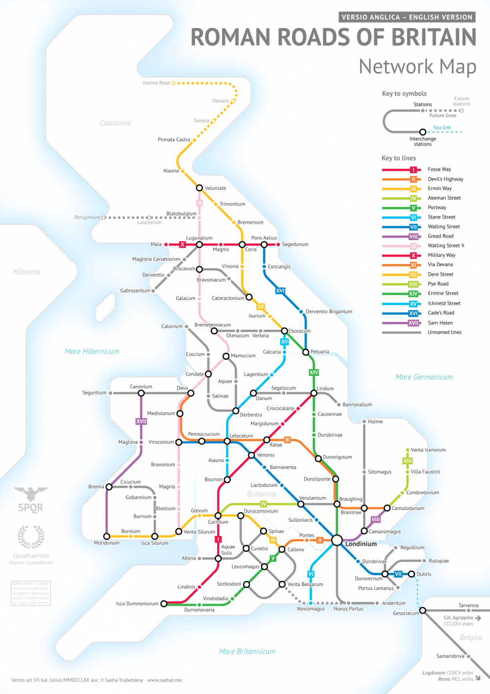
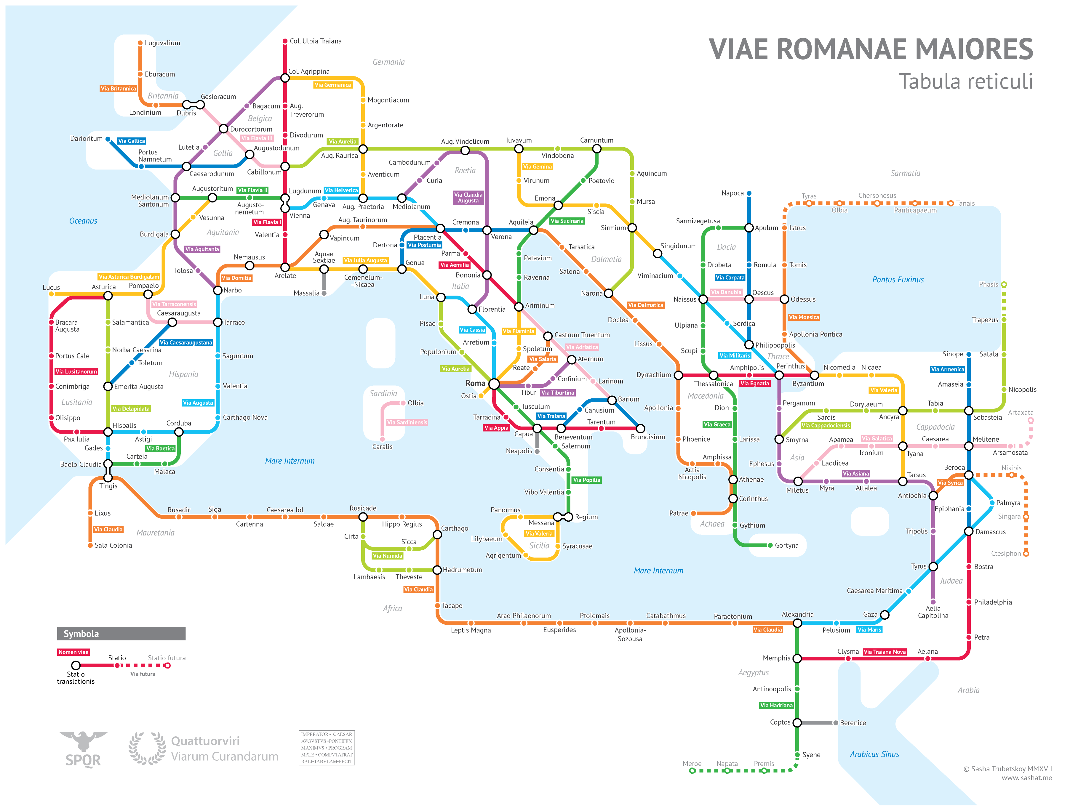
A Colorful Map Visualizes the Lexical Distances Between Europe’s Languages: 54 Languages Spoken by 670 Million People

Stephen F. Stein­bach, a res­i­dent of Vien­na and a “car­tog­ra­phy, lan­guage and trav­el enthu­si­ast, with an engi­neer­ing back­ground,” is not a lin­guist. Stein­bach, who runs the site Alter­na­tive Trans­port, seems much more inter­est­ed in map­ping and trans­porta­tion than mor­phol­o­gy and ety­mol­o­gy. But he has made a con­tri­bu­tion to a lin­guis­tic con­cept called “lex­i­cal dif­fer­ence” with the map you see above, a col­or­ful 2015 visu­al­iza­tion of Euro­pean lan­guages, grouped togeth­er in clus­ters accord­ing to their sub­fam­i­lies (Ital­ic-Romance, Baltic, Slav­ic, Ger­man­ic, etc.—see a much larg­er ver­sion here).

Straight and arc­ing lines span the rel­a­tive dis­tance these lan­guages have pre­sum­ably trav­eled from each oth­er. Sol­id lines between lan­guages rep­re­sent a very close prox­im­i­ty, dashed lines of dif­fer­ent thick­ness­es show more dis­tance, and thin dot­ted lines tra­verse the great­est expans­es.

Hun­gar­i­an and Ukrain­ian, for exam­ple, have a lex­i­cal dis­tance score of 90, where Pol­ish and Ukrain­ian, both Slav­ic lan­guages, are only 30 degrees from each oth­er. “The map shows the lan­guage fam­i­lies that cov­er the con­ti­nent,” writes Big Think, “large, famil­iar ones like Ger­man­ic, Ital­ic-Romance and Slav­ic, small­er ones like Celtic, Baltic and Ural­ic; out­liers like Semit­ic and Tur­kic; and isolates—orphan lan­guages, with­out a fam­i­ly: Alban­ian and Greek.”  (Tech­ni­cal­ly, mod­ern Greek does have a family—Hellenic—though it is the only sur­viv­ing mem­ber.)

As we might expect from this sub­set of the durable Indo-Euro­pean schema, the lan­guages with­in each clus­tered group occu­py the short­est dis­tance from each oth­er, with some excep­tions. Roman­ian, for exam­ple, is slight­ly clos­er to Alban­ian than it is to French, its Romance cousin. The Slav­ic lan­guages Russ­ian and Pol­ish seem to have trav­eled a bit fur­ther apart than Pol­ish has from the Baltic lan­guage of Lithuan­ian. What does this mean, exact­ly? Accord­ing to the mea­sure of “lex­i­cal dis­tance” pro­posed by Ukrain­ian lin­guist Kon­stan­tin Tishchenko, it means that clos­er lan­guages might be more mutu­al­ly intel­li­gi­ble, at least from a lex­i­cal stand­point, since they may share more cog­nates (sim­i­lar-sound­ing and mean­ing words) and bor­row­ings.

Gas­ton Ümlaut, the han­dle of a lin­guist on the Stack Exchange Lin­guis­tics beta, cau­tions that the con­cept of “lex­i­cal dis­tance” may be “pret­ty use­less” giv­en that the com­par­isons also include false cognates—words that sound or look sim­i­lar but have no rela­tion­ship to each oth­er. These could account for some seem­ing incon­sis­ten­cies. (Ümlaut admits he has not read the orig­i­nal arti­cle, writ­ten in Russ­ian. If you are able, you can find it online in the book Metathe­o­ry of Lin­guis­tics, here.) Stein­bach has respond­ed in the same thread.

The idea received a much more tren­chant cri­tique more recent­ly. Stein­bach clar­i­fied that the the­o­ry, and the map, only com­pare writ­ten words and not syn­tax or speech. “It has noth­ing to do with gram­mar, syn­tax, rhythm or oth­er impor­tant fea­tures that are impor­tant for intel­li­gi­bil­i­ty,” he writes. “It also com­pares a small list of words and not the entire vocab­u­lary of one lan­guage to anoth­er.” This expla­na­tion does cast doubt on whether “lex­i­cal dis­tance” is a mean­ing­ful con­cept. I’ll leave it to the lin­guists to decide. (Stein­bach reached out to Tis­chchenko but has yet to receive a reply.)

Tischchenko’s orig­i­nal “lex­i­cal dis­tance” map, fur­ther up, drawn in 1997, gets the idea across with min­i­mal fuss, but it leaves much to be desired graph­i­cal­ly. (A large, hand-drawn col­or ver­sion improves upon the print­ed map.) Stein­bach took his ver­sion from a 2008 Eng­lish-lan­guage adap­ta­tion made by Tere­sa Elms in 2008 (above). In his blog post here, he explains all of the changes he made to Elms and Tischchenko’s designs. These include adjust­ing the size of the “bub­bles” to pro­por­tion­al­ly rep­re­sent the num­ber of speak­ers of each lan­guage. Stein­bach also added sev­er­al lan­guages, as well as “grave­stones” for the dead Ana­to­lian and Tochar­i­an branch­es. In all, his map shows “54 lan­guages, rep­re­sent­ing 670 mil­lion peo­ple.” He adds, vague­ly, that “it checks out.”


After post­ing his Lex­i­cal Dis­tance Map, Stein­bach pro­posed a “3D” ver­sion, with the added dimen­sion of time. (See his pre­lim­i­nary sketch above.) The maps are intrigu­ing, the the­o­ry of “lex­i­cal dis­tance” an inter­est­ing one, but we should bear in mind, as Stein­bach writes, that he is “no lin­guist,” and that this idea is hard­ly an ortho­dox one with­in the dis­ci­pline.

via Big Think

Relat­ed Con­tent:

The Tree of Lan­guages Illus­trat­ed in a Big, Beau­ti­ful Info­graph­ic

How Lan­guages Evolve: Explained in a Win­ning TED-Ed Ani­ma­tion

Speak­ing in Whis­tles: The Whis­tled Lan­guage of Oax­a­ca, Mex­i­co       

Josh Jones is a writer and musi­cian based in Durham, NC. Fol­low him at @jdmagness

Artistic Maps of Pakistan & India Show the Embroidery Techniques of Their Different Regions

Jour­nal­ist Saima Mir post­ed to Twit­ter this “map of Pak­istan show­ing the embroi­dery tech­niques of its regions.” And, sure enough, it led to some­one sur­fac­ing a cor­re­spond­ing map of Pak­istan’s neigh­bor, India. The under­ly­ing mes­sage of the maps? It’s to show, as @AlmostLived not­ed, “how diverse ele­ments come togeth­er to make beau­ti­ful things.” The map above was orig­i­nal­ly pro­duced by Gen­er­a­tion, a Pak­istani fash­ion com­pa­ny. We’re not clear on the ori­gin of the India map, unfor­tu­nate­ly.

via Boing Boing

If you would like to sign up for Open Culture’s free email newslet­ter, please find it here. It’s a great way to see our new posts, all bun­dled in one email, each day.

If you would like to sup­port the mis­sion of Open Cul­ture, con­sid­er mak­ing a dona­tion to our site. It’s hard to rely 100% on ads, and your con­tri­bu­tions will help us con­tin­ue pro­vid­ing the best free cul­tur­al and edu­ca­tion­al mate­ri­als to learn­ers every­where. You can con­tribute through Pay­Pal, Patre­on, and Ven­mo (@openculture). Thanks!

Relat­ed Con­tent:

New BBC Drama­ti­za­tion of Salman Rushdie’s Midnight’s Chil­dren Now Stream­ing Free for a Lim­it­ed Time

Pak­istani Musi­cians Play an Enchant­i­ng Ver­sion of Dave Brubeck’s Jazz Clas­sic, “Take Five”

Pak­istani Immi­grant Goes to a Led Zep­pelin Con­cert, Gets Inspired to Become a Musi­cian & Then Sells 30 Mil­lion Albums

Intro­duc­tion to Indi­an Phi­los­o­phy: A Free Online Course

India’s Answer to M.I.T. Presents 268 Free Online Cours­es (in Eng­lish)

by | Permalink | Make a Comment ( 13 ) |

All the Rivers & Streams in the U.S. Shown in Rainbow Colors: A Data Visualization to Behold

This is a sight for sore eyes. Cre­at­ed by Hun­gar­i­an geo­g­ra­ph­er and map-design­er Robert Szucs, using open-source QGIS soft­ware, the high res­o­lu­tion map above shows:

all the per­ma­nent and tem­po­rary streams and rivers of the con­tigu­ous 48 states in beau­ti­ful rain­bow colours, divid­ed into catch­ment areas. It shows Strahler Stream Order Clas­si­fi­ca­tion. The high­er the stream order, the thick­er the line.

When you look at the map, you’ll see, as The Wash­ing­ton Post observes, “Every riv­er in a col­or drains to the same riv­er, which then drains into the ocean. The giant basin in the mid­dle of the coun­try is the Mis­sis­sip­pi Riv­er basin. Major rivers like the Ohio and the Mis­souri drain into the behe­moth.” Pret­ty impres­sive.

The map was appar­ent­ly made using data from the Euro­pean Envi­ron­ment Agency and the Rivers Net­work Sys­tem.

You can find the map on Imgur, or pur­chase “ultra high” res­o­lu­tion copies through Etsy for $8.

Szucs has als0 pro­duced data visu­al­iza­tions of the riv­er sys­tems in Chi­na, India, Europe and oth­er parts of the world.

If you would like to sign up for Open Culture’s free email newslet­ter, please find it here. It’s a great way to see our new posts, all bun­dled in one email, each day.

If you would like to sup­port the mis­sion of Open Cul­ture, con­sid­er mak­ing a dona­tion to our site. It’s hard to rely 100% on ads, and your con­tri­bu­tions will help us con­tin­ue pro­vid­ing the best free cul­tur­al and edu­ca­tion­al mate­ri­als to learn­ers every­where. You can con­tribute through Pay­Pal, Patre­on, and Ven­mo (@openculture). Thanks!

Relat­ed Con­tent 

Ancient Rome’s Sys­tem of Roads Visu­al­ized in the Style of Mod­ern Sub­way Maps 

Down­load 67,000 His­toric Maps (in High Res­o­lu­tion) from the Won­der­ful David Rum­sey Map Col­lec­tion

Japan­ese Design­ers May Have Cre­at­ed the Most Accu­rate Map of Our World: See the Autha­Graph

Buck­min­ster Fuller’s Map of the World: The Inno­va­tion that Rev­o­lu­tion­ized Map Design (1943)

by | Permalink | Make a Comment ( 3 ) |

Ancient Rome’s System of Roads Visualized in the Style of Modern Subway Maps

Sasha Tru­bet­skoy, an under­grad at U. Chica­go, has cre­at­ed a “sub­way-style dia­gram of the major Roman roads, based on the Empire of ca. 125 AD.” Draw­ing on Stanford’s ORBIS mod­el, The Pela­gios Project, and the Anto­nine Itin­er­ary, Tru­bet­skoy’s map com­bines well-known his­toric roads, like the Via Appia, with less­er-known ones (in somes cas­es giv­en imag­ined names). If you want to get a sense of scale, it would take, Tru­bet­skoy tells us, “two months to walk on foot from Rome to Byzan­tium. If you had a horse, it would only take you a month.”

You can view the map in a larg­er for­mat here. And if you fol­low this link and send Tru­bet­skoy a few bucks, he promis­es to email you a crisp PDF for print­ing. Enjoy.

via coudal

If you would like to sign up for Open Culture’s free email newslet­ter, please find it here. It’s a great way to see our new posts, all bun­dled in one email, each day.

If you would like to sup­port the mis­sion of Open Cul­ture, con­sid­er mak­ing a dona­tion to our site. It’s hard to rely 100% on ads, and your con­tri­bu­tions will help us con­tin­ue pro­vid­ing the best free cul­tur­al and edu­ca­tion­al mate­ri­als to learn­ers every­where. You can con­tribute through Pay­Pal, Patre­on, and Ven­mo (@openculture). Thanks!

Relat­ed Con­tent:

“The Won­der­ground Map of Lon­don Town,” the Icon­ic 1914 Map That Saved the World’s First Sub­way Sys­tem

Design­er Mas­si­mo Vignel­li Revis­its and Defends His Icon­ic 1972 New York City Sub­way Map

Ancient Maps that Changed the World: See World Maps from Ancient Greece, Baby­lon, Rome, and the Islam­ic World

Watch the Destruc­tion of Pom­peii by Mount Vesu­vius, Re-Cre­at­ed with Com­put­er Ani­ma­tion (79 AD)

Fash­ion­able 2,000-Year-Old Roman Shoe Found in a Well

The Rise & Fall of the Romans: Every Year Shown in a Time­lapse Map Ani­ma­tion (753 BC ‑1479 AD)

by | Permalink | Make a Comment ( 8 ) |

Animated GIFs Show How Subway Maps of Berlin, New York, Tokyo & London Compare to the Real Geography of Those Great Cities

You can’t make a per­fect­ly accu­rate map, as Jorge Luis Borges so suc­cinct­ly told us, with­out mak­ing it the exact same size and shape as the land it por­trays. But giv­en the utter use­less­ness of such an enor­mous piece of paper (which so frus­trat­ed the cit­i­zens of the imag­i­nary empire in Borges’ sto­ry that, “not with­out some piti­less­ness,” they tossed theirs into the desert), no map­mak­er would ever want to. A more com­pact map is a more use­ful one; unfor­tu­nate­ly, a more com­pact map is also, by its very nature, a less accu­rate one.

New York

The same rule applies to maps of all kinds, and espe­cial­ly to tran­sit maps, quite pos­si­bly the most use­ful spe­cial­ized maps we con­sult today. They show us how to nav­i­gate cities, and yet their clean, bold lines, some­times turn­ing but nev­er waver­ing, hard­ly rep­re­sent those cities — sub­ject as they are to vari­a­tions in ter­rain and den­si­ty, as well as cen­turies of unplannably organ­ic growth — with geo­graph­i­cal faith­ful­ness. One can’t help but won­der just how each urban tran­sit map, some of them beloved works of design, strikes the use­ful­ness-faith­ful­ness bal­ance.

Lon­don

Liv­ing in Seoul, I’ve grown used to the city’s stan­dard sub­way map. I thus get a kick out of scru­ti­niz­ing the more geo­graph­i­cal­ly accu­rate one, which over­lays the train lines onto an exist­ing map of the city, post­ed on some sta­tion plat­forms. It reveals the truth that some lines are short­er than they look on the stan­dard map, some are much longer, and none cut quite as clean a path through the city as they seem to. At Twist­ed Sifter you’ll find a GIF gallery of 15 stan­dard sub­way maps that morph into more geo­graph­i­cal­ly faith­ful equiv­a­lents, a vivid demon­stra­tion of just how much tran­sit map design­ers need to twist, squeeze, and sim­pli­fy an urban land­scape to pro­duce some­thing leg­i­ble at a glance.

Tokyo

All of those ani­ma­tions, just five of which you see in this post, come from the sub­red­dit Data Is Beau­ti­ful, a realm pop­u­lat­ed by enthu­si­asts of the visu­al dis­play of quan­ti­ta­tive infor­ma­tion — enthu­si­asts so enthu­si­as­tic that many of them cre­ate inno­v­a­tive data visu­al­iza­tions like these by them­selves. Accord­ing to their cre­ations, sub­way maps, like that of New York City’s ven­er­a­ble sys­tem, do rel­a­tive­ly lit­tle to dis­tort the city; oth­ers, like Toky­o’s, look near­ly unrec­og­niz­able when made to con­form to geog­ra­phy.

Austin

Even the maps of new and incom­plete tran­sit net­works do a num­ber on the real shape and direc­tion of their paths: the map of Austin, Texas’ Cap­i­tal Metro­Rail, for instance, straight­ens a some­what zig-zag­gy north­east-south­west track into a sin­gle hor­i­zon­tal line. It may take a few gen­er­a­tions before Austin’s “sys­tem” devel­ops into one exten­sive and com­plex enough to inspire one of the great tran­sit maps (the ranks, for exam­ple, of “The Won­der­ground Map of Lon­don Town”). But I would­n’t count out the pos­si­bil­i­ty: the more ful­ly cities real­ize their pub­lic-tran­sit poten­tial, the more oppor­tu­ni­ty opens up for the advance­ment of the sub­way map­mak­er’s art.

See all 15 of the sub­way GIFs at Twist­ed Sifter.

Relat­ed Con­tent:

A Won­der­ful Archive of His­toric Tran­sit Maps: Expres­sive Art Meets Pre­cise Graph­ic Design

Design­er Mas­si­mo Vignel­li Revis­its and Defends His Icon­ic 1972 New York City Sub­way Map

“The Won­der­ground Map of Lon­don Town,” the Icon­ic 1914 Map That Saved the World’s First Sub­way Sys­tem

Bauhaus Artist Lás­zló Moholy-Nagy Designs an Avant-Garde Map to Help Peo­ple Get Over the Fear of Fly­ing (1936)

Why Mak­ing Accu­rate World Maps Is Math­e­mat­i­cal­ly Impos­si­ble

Based in Seoul, Col­in Mar­shall writes and broad­casts on cities and cul­ture. He’s at work on a book about Los Ange­les, A Los Ange­les Primer, the video series The City in Cin­e­ma, the crowd­fund­ed jour­nal­ism project Where Is the City of the Future?, and the Los Ange­les Review of Books’ Korea Blog. Fol­low him on Twit­ter at @colinmarshall or on Face­book.

Timelapse Animation Lets You See the Rise of Cities Across the Globe, from 3700 BC to 2000 AD

Last year, a Yale-led research project pro­duced an inno­v­a­tive dataset that mapped the his­to­ry of urban set­tle­ments. Cov­er­ing a 6,000 year peri­od, the project traced the loca­tion and size of cities across the world, start­ing in 3700 BC (when the first known urban dwellings emerged in Sumer) and con­tin­u­ing through 2000 AD. Accord­ing to Yale’s Mered­ith Reba, if we under­stand “how cities have grown and changed over time, through­out his­to­ry, it might tell us some­thing use­ful about how they are chang­ing today,” and par­tic­u­lar­ly whether we can find ways to make mod­ern cities sus­tain­able.

The Yale dataset was orig­i­nal­ly pub­lished in Sci­en­tif­ic Data in 2016. And before too long, some enter­pris­ing YouTu­ber brought the data to life. Above, the his­to­ry of urban life unfolds before your eyes. The action starts off slow, but then lat­er kicks into high gear.

You can read more about the map­ping of urban set­tle­ments at this Yale web­site. And see the ani­mat­ed map in a larg­er for­mat here.

If you would like to sign up for Open Culture’s free email newslet­ter, please find it here. It’s a great way to see our new posts, all bun­dled in one email, each day.

If you would like to sup­port the mis­sion of Open Cul­ture, con­sid­er mak­ing a dona­tion to our site. It’s hard to rely 100% on ads, and your con­tri­bu­tions will help us con­tin­ue pro­vid­ing the best free cul­tur­al and edu­ca­tion­al mate­ri­als to learn­ers every­where. You can con­tribute through Pay­Pal, Patre­on, and Ven­mo (@openculture). Thanks!

Relat­ed Con­tent

The Rise & Fall of the Romans: Every Year Shown in a Time­lapse Map Ani­ma­tion (753 BC ‑1479 AD)

200,000 Years of Stag­ger­ing Human Pop­u­la­tion Growth Shown in an Ani­mat­ed Map

Buck­min­ster Fuller Cre­ates an Ani­mat­ed Visu­al­iza­tion of Human Pop­u­la­tion Growth from 1000 B.C.E. to 1965

Timelapse Film Shows How the British Library Digitized the World’s Largest Atlas, the 6‑Foot Tall “Klencke Atlas” from 1660

As a way of cur­ry­ing favor with a monarch, Johannes Klencke’s gift to Charles II (1630–1685) was one of the most auda­cious and beau­ti­ful objects ever offered. Klencke was a Dutch sug­ar mer­chant and knew that the king loved maps, and hoped that his gift would land him a favor­able trad­ing deal. (It did. He got knight­ed.)

The gift, the 1660 Klencke Atlas, is one of the world’s biggest books at near­ly six feet tall and near­ly sev­en and a half feet wide when open, and it con­tains 41 wall maps of var­i­ous accu­ra­cy. We first post­ed about the Klencke Atlas back in 2015, where you can see a short BBC doc on the British Library’s care of the book. But only recent­ly has the library been able to scan the maps so the pub­lic can now access them for free in high res­o­lu­tion.

The above video, which the British Library post­ed by way of Daniel Crouch Rare Books, shows a time-lapse of the mul­ti­ple day shoot, which took sev­er­al peo­ple, a very large room, sev­er­al lights, and a spe­cial­ly designed stand to hold the heavy vol­ume.

The pub­lic domain images are now part of the Library’s Pic­tur­ing Places web­site, which holds many exam­ples of rare maps, land­scapes, and large scale tech­ni­cal draw­ings.

The book itself, as huge as it might be, is actu­al­ly very frag­ile, so now the pub­lic and schol­ars can ful­ly explore these maps at leisure while the orig­i­nal goes back into stor­age.

via Hyper­al­ler­gic

Relat­ed Con­tent:

Behold the Largest Atlas in the World: The Six-Foot Tall Klencke Atlas from 1660

Ancient Maps that Changed the World: See World Maps from Ancient Greece, Baby­lon, Rome, and the Islam­ic World

Browse & Down­load 1,198 Free High Res­o­lu­tion Maps of U.S. Nation­al Parks

Down­load 67,000 His­toric Maps (in High Res­o­lu­tion) from the Won­der­ful David Rum­sey Map Col­lec­tion

Ted Mills is a free­lance writer on the arts who cur­rent­ly hosts the artist inter­view-based FunkZone Pod­cast and is the pro­duc­er of KCR­W’s Curi­ous Coast. You can also fol­low him on Twit­ter at @tedmills, read his oth­er arts writ­ing at tedmills.com and/or watch his films here.

New, Interactive Web Site Puts Online Thousands of International Folk Songs Recorded by the Great Folklorist Alan Lomax

These days everyone’s hung up on iden­ti­ty. But I don’t mean to talk pol­i­tics, though my point is maybe inescapably polit­i­cal: the iden­ti­ties our jobs and incomes give us—the sta­tus or lack thereof—become so cen­tral to who we are in the world that they eclipse oth­er essen­tial aspects, eclipse the things we do strict­ly because it gives us plea­sure to do them.

Music, dance, art, poet­ry.… These fall under what Alan Lomax called an expe­ri­ence of “the very core” of exis­tence, “the adap­tive style” of cul­ture, “which enables its mem­bers to cohere and sur­vive.” Cul­ture, for Lomax, was nei­ther an eco­nom­ic activ­i­ty nor a racial cat­e­go­ry, nei­ther an exclu­sive rank­ing of hier­ar­chies nor a redoubt for nation­al­ist inse­cu­ri­ties. Cul­tures, plur­al, were pecu­liar­ly region­al expres­sions of shared human­i­ty across one inter­re­lat­ed world.

Lomax did have some pater­nal­is­tic atti­tudes toward what he called “weak­er peo­ples,” not­ing that “the role of the folk­lorist is that of the advo­cate of the folk.” But his advo­ca­cy was not based in the­o­ries of suprema­cy but of his­to­ry. We could mend the rup­tures of the past by adding “cul­tur­al equi­ty… to the humane con­di­tion of lib­er­ty, free­dom of speech and reli­gion, and social jus­tice,” wrote the ide­al­is­tic Lomax. “The stuff of folk­lore,” he wrote else­where, “the oral­ly trans­mit­ted wis­dom, art and music of the peo­ple, can pro­vide ten thou­sand bridges across which men of all nations may stride to say, ‘You are my broth­er.’”

Lomax’s ide­al­ism may seem to us quaint at best, but I dare you to con­demn its results, which include con­nect­ing Lead Bel­ly and Woody Guthrie to their glob­al audi­ences and pre­serv­ing a good deal of the folk music her­itage of the world through tire­less field and stu­dio record­ing, doc­u­men­ta­tion and mem­oir, and insti­tu­tions like the Asso­ci­a­tion for Cul­tur­al Equi­ty (ACE), found­ed by Lomax in 1986 to cen­tral­ize and make avail­able the vast amount of mate­r­i­al he had col­lect­ed over the decades.

In anoth­er archival project, Lomax’s Glob­al Juke­box, we get to see rig­or­ous schol­ar­ly meth­ods applied to exam­ples from his vast library of human expres­sions. The online project cat­a­logues the work in musi­col­o­gy of Lomax and his father John, who both took on a “life long mis­sion to doc­u­ment not only America’s cul­tur­al roots, but the world’s as well,” notes an online brochure for the Glob­al Juke­box. Lomax believed that “music, dance and folk­lore of all tra­di­tions have equal val­ue” and are equal­ly wor­thy of study. The Glob­al Juke­box car­ries that belief into the 21st cen­tu­ry.

Since 1990, the Glob­al Juke­box has func­tioned as a dig­i­tal repos­i­to­ry of music from Lomax’s glob­al archive, as you can see in the very dat­ed 1998 video above, fea­tur­ing ACE direc­tor Gideon D’Arcangelo. Now, updat­ed and put online, the new­ly-launched Glob­al Juke­box web site pro­vides an inter­ac­tive inter­face, giv­ing you access to detailed analy­ses of folk music from all over the world, and high­ly tech­ni­cal “descrip­tive data” for each song. You can learn the sys­tems of “Chore­o­met­rics and Cantometrics”—specialized ana­lyt­i­cal tools for scientists—or you can casu­al­ly browse the incred­i­ble diver­si­ty of music as a layper­son, through a beau­ti­ful­ly ren­dered map view or the col­or­ful­ly attrac­tive graph­ic “tree view,” below.

Stop by the Glob­al Jukebox’s “About” page to learn much more about its tech­ni­cal speci­fici­ties and his­to­ry, which dates to 1960 when Lomax began work­ing with anthro­pol­o­gist Con­rad Arens­berg at Colum­bia and Hunter Uni­ver­si­ties to study “the expres­sive arts” with sci­en­tif­ic tools and emerg­ing tech­nolo­gies. The Glob­al Juke­box rep­re­sents a high­ly schemat­ic way of look­ing at Lomax’s body of work, and its ease of use and lev­el of detail make it easy to leap around the world, sam­pling the thrilling vari­ety of folk music he col­lect­ed.

It is not, and is not meant as, a sub­sti­tute for the liv­ing tra­di­tions Lomax helped safe­guard, and the incred­i­ble music they have inspired pro­fes­sion­al and ama­teur musi­cians to make over the years. But the Glob­al Juke­box gives us sev­er­al unique ways of orga­niz­ing and dis­cov­er­ing those traditions—ways that are still evolv­ing, such as a com­ing func­tion for build­ing your own cul­tur­al fam­i­ly tree with a playlist of songs from your musi­cal ances­try.

Relat­ed Con­tent:

Hear 17,000+ Tra­di­tion­al Folk & Blues Songs Curat­ed by the Great Musi­col­o­gist Alan Lomax

The British Library’s “Sounds” Archive Presents 80,000 Free Audio Record­ings: World & Clas­si­cal Music, Inter­views, Nature Sounds & More

Leg­endary Folk­lorist Alan Lomax: ‘The Land Where the Blues Began’

Josh Jones is a writer and musi­cian based in Durham, NC. Fol­low him at @jdmagness

« Go BackMore in this category... »
Quantcast