If you would like to sign up for Open Culture’s free email newsletter, please find it here. It’s a great way to see our new posts, all bundled in one email, each day.
If you would like to support the mission of Open Culture, consider making a donation to our site. It’s hard to rely 100% on ads, and your contributions will help us continue providing the best free cultural and educational materials to learners everywhere. You can contribute through PayPal, Patreon, and Venmo (@openculture). Thanks!
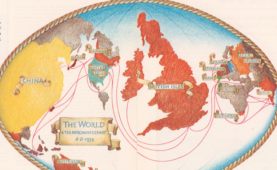
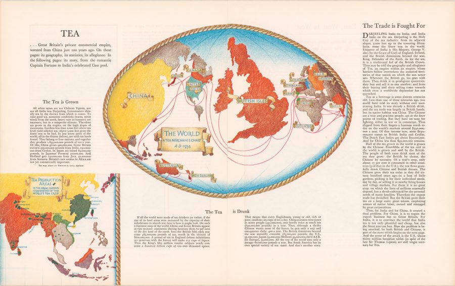
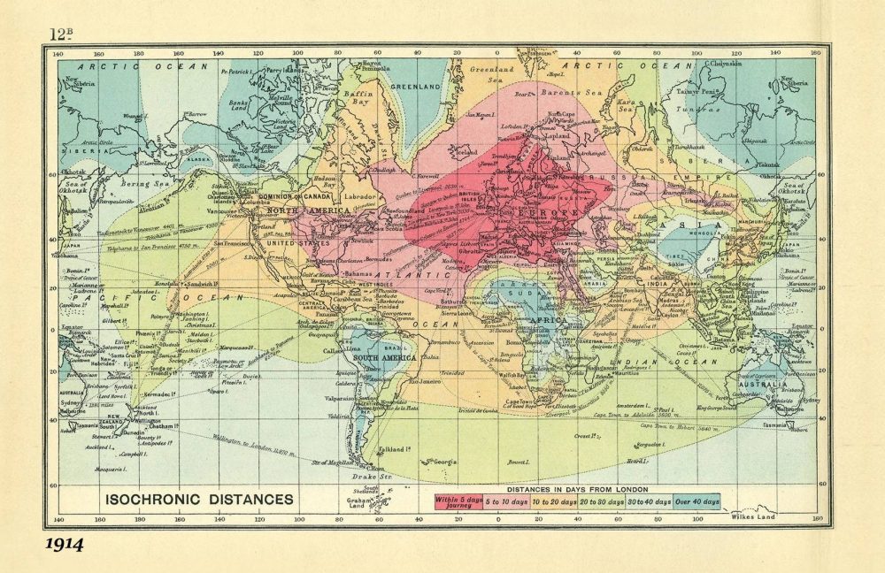
Not a day goes by that I don’t use Google Maps for something or other, whether it’s basic navigation, researching an address, or finding a dry cleaner. Though some of us might resent the dominance such mapping technology has over our daily interactions, there’s no denying its endless utility. But maps can be so much more than useful tools for getting around—they are works of art, thought experiments, imaginative flights of fancy, and data visualization tools, to name but a few of their overlapping functions. For the imperialists of previous ages, maps displayed a mastery of the world, whether cataloguing travel times from London to everywhere else on the globe, or—as in the example we have here—resizing countries according to how much tea their people drank.
But this is not a map we should look to for accuracy. Like many such cartographic data charts, it promotes a particular agenda. “George Orwell once wrote that tea was one of the mainstays of civilization,” notes Jack Goodman at Atlas Obscura. “Tea, asserted Orwell, has the power to make one feel braver, wiser, and more optimistic. The man spoke for a nation.” (And he spoke to a nation in a 1946 Evening Standard essay, “A Nice Cup of Tea.”) From the map above, titled “The Tea is Drunk” and published by Fortune Magazine in 1934, we learn, writes Goodman, that “Britain consumed 485,000 pounds of tea per year. That’s one hundred billion cups of tea, or around six cups a day for each person.” We might note however, that “the population of China was then nine times bigger than that of the U.K., and they drank roughly twice as much tea as the Brits did.” Why isn’t China at the center of the map? “The author made a tenuous point about the cultural differences between the two: the Chinese drank tea as a necessity, the British by choice.”
Cornell University library’s description of the map is more forthright: “While China actually consumed twice as much tea as Britain, its position at the edge of the map assured that the focus will be on the British Isles.” That focus is commercial in nature, meant to encourage and inform British tea merchants for whom tea was more than a beverage; it was one of the nation’s pre-eminent commodities, though most of what was sold as a national product was Indian tea grown in India. Yet the map brims with pride in the British tea trade. “Thus may be told the geography and allegiance of Tea,” its author proclaims, “an empire within an empire, whose borders follow everywhere the scattered territories of that nation on which the sun never sets.” A little over a decade later, India won its independence, and the empire began to fall apart. But the British never lost their taste for or their national pride in tea. View and download a high-resolution scan of the “Tea is Drunk” map at the Cornell Library site.
This time of year especially, we complain about the greed and arrogance of airlines, the confusion and inefficiency of airports, and the sardine seating of coach. But we don’t have to go back very far to get a sense of just how truly painful long-distance travel used to be. Just step back a hundred years or so when—unless you were a WWI pilot—you traveled by train or by ship, where all sorts of misadventures might befall you, and where a journey that might now take several dull hours could take several dozen, often very uncomfortable, days. Before railroads crossed the continents, that number could run into the hundreds.
In the early 1840s, for example, notes Simon Willis at The Economist’s 1843 Magazine, “an American dry-goods merchant called Asa Whitney, who lived near New York, travelled to China on business. It took 153 days, which he thought was a waste of time.” It’s probably easier to swallow platitudes about destinations and journeys when the journey doesn’t take up nearly half the year and run the risk of cholera. By 1914, the explosion of railroads had reduced travel times considerably, but they remained at what we would consider intolerable lengths.
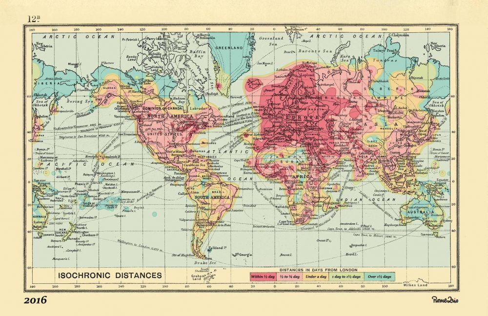
We can see just how long it took to get from place to place in the “isochronic map” above (view it in a large format here), which visualizes distances all over the globe. The railways “were well-established,” notes Gizmodo, “in Europe and the U.S., too, making travel far more swift than it had been in the past.” One could reach “the depths of Siberia” from London in under ten days, thanks to the Trans-Siberian Railway. By contrast, in Africa and South America, “any travel inland from the coast took weeks.”
The map, created by royal cartographer John G. Bartholomew, came packaged with several other such tools in An Atlas of Economic Geography, a book, Willis explains, “intended for schoolboys,” containing “everything a thrusting young entrepreneur, imperialist, trader or traveller could need.” All of the distances are measured in “days from London,” and color-coded in the legend below. Dark green areas, such as Sudan, much of Brazil, inland Australia, or Tibet might take over 40 days travel to reach. All of Western Europe is accessible, the map promises, within five days, as are parts of the east coast of the U.S., with parts further Midwest taking up to 10 days to reach.
What might have seemed like wizardry to Walter Raleigh probably sounds like hell on earth to business class denizens everywhere. How do these journeys compare to the current age of rapid air travel? Rome2rio, a “comprehensive global trip planner,” aimed to find out by recreating Bartholomew’s map, updated to 2016 standards. You can see, just above (or expanded here), the same view of the world from its onetime imperialist center, London, with the same color-coded legend below, “Distances in Days from London.” And yet here, a journey to most places will take less than a day, with certain outer reaches—Siberia, Greenland, the Arctic Circle, stretching into two, maybe three.
Should we have reason to complain, when those of us who do travel—or who must—have it so easy compared to the danger, boredom, and general unpleasantness of long-distance travel even one-hundred years ago? The question presumes humans are capable of not complaining about travel. Such complaint may form the basis of an ancient literary tradition, when heroes ventured over vast terrain, slaying monsters, solving riddles, making friends, lovers, and enemies…. The epic dimensions of historic travel can seem quaint compared to the sterile tedium of airport terminals. But just maybe—as in those long sea and railway voyages that could span several months—we can discover a kind of romance amidst the queasy food courts, tacky gift shops, and motorized moving walkways.
Arriving in a new city usually means finding the nearest decent grocery, pharmacy, coffee shop, bookstore, laundry, etc. And before nearly every musical whim could be satisfied with a few clicks, it also meant for many people finding the nearest record store. Even the local strip mall chain might hold a surprise or two. But the true finds appeared among the small proprietors, merchandisers of dusty LPs in wooden bins and keepers of local music scene lore. Entering a well-curated music shop can feel like walking into a medieval apothecary. Whatever ails you, you’re sure to find a remedy here. If it doesn’t work, there remains a certain magic in the transaction. We continue to believe in music even when it lets us down.
But have we lost faith in the record shop? I hope not. Online streaming and buying has the regrettable effect of flattening everything into the same two dimensions without the aura of physical media and the musical paraphernalia we find in real life stores. Should you be among the unlucky who lack a local music store, fear not.
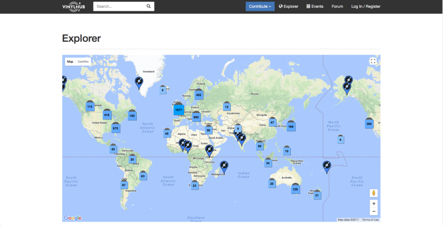
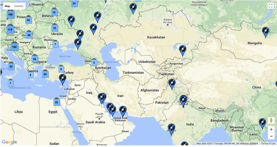
You can recover the romance by traveling to any one of the thousands of shops worldwide that are catalogued and mapped on VinylHub, a crowd-sourced “endeavor,” Ron Kretsch writes at Dangerous Minds, “to create an interactive map of every brick-and-mortar record store on Earth, a perfect resource for the world-traveling vinyl obsessive.”
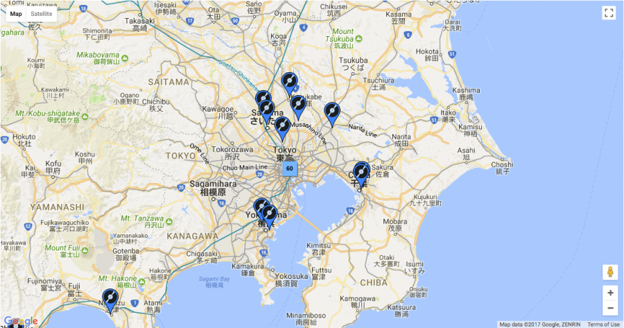
Brought to us by masterminds behind Discogs and their similar spin-off online catalogs for books, movies, etc., this project might get us out of our chairs—maybe even out of the country—and into new places to dig through the crates. But even if we’re not inclined to leave the house, VinylHub offers a wealth of fascinating information. “The single city with the largest density of shops,” we learn, “is Tokyo,” though “had you asked me,” Kretsch writes, “I’d have probably said London.” I’d have guessed New York, which comes in at a surprising 7th place.
The most remote record store on Earth is a cluster of CD stalls above a produce market in the tiny Pacific Island Kingdom of Tonga, but Vinyl Run, located on the tiny Indian Ocean island of Réunion, sure looks like a contender. The northernmost is in Alta, Norway; the southernmost is in Invercargill, New Zealand.
The UK is currently second in number of shops by country: 537, with .8443 shops per 100,000 inhabitants. The United States at number one has almost triple that number, but also over five times the population. These figures are provisional. Much of the world remains uncharted—at least as far as record shops are concerned—and Discogs members continue to submit new entries. Should you find a blank spot on the map that needs a little record icon, you can join for free and contribute to the VinylHub community. While there’s nothing like a trip to a new music store, even if you’re only in it for the data, you’ll find much here to inspire.
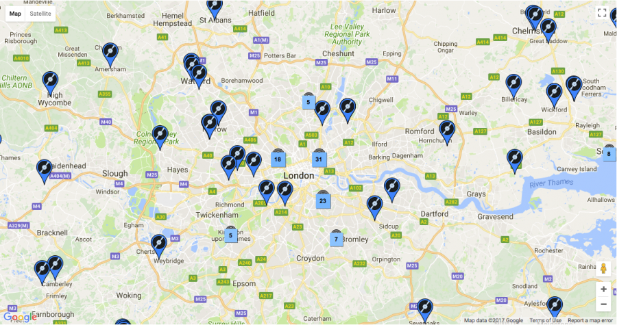
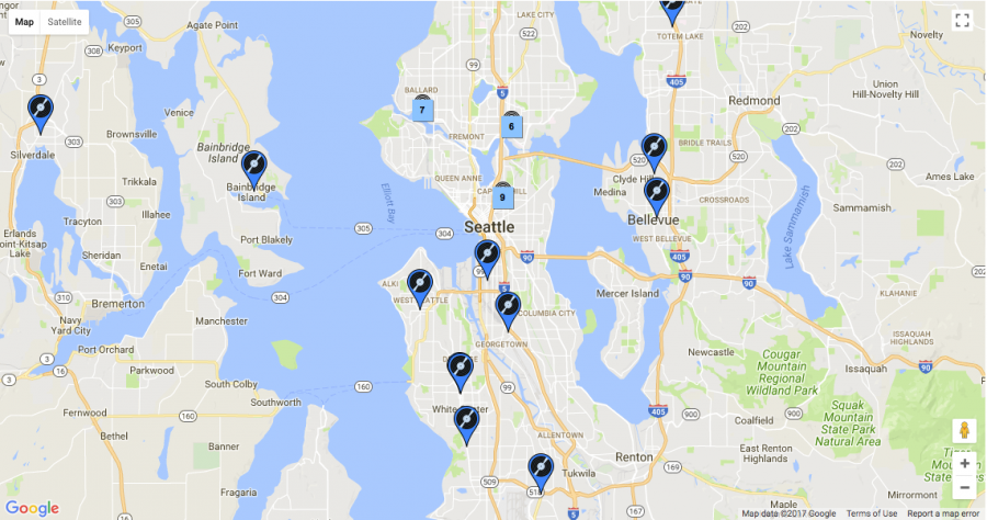
Over at the Discogs blog, we learn several more facts, such as the two shops that are farthest apart (Madrid’s Citadel Records and Star Second-Hand Book-Music in Palmerston North, New Zealand: 19,978 km) and the location of that most remote shop (the market in Nuku’alofa in Tonga, address: “Upstairs of wet market”). VinylHub’s “Explorer” map utilizes Google Maps features to give you unlimited access to every region in the world. Zoom in to see the numbers by city and the individual locations of each and every shop in the database. You can even find record stores listed in Pyongyang—or rather record sections of several hotel bookshops. I wouldn’t necessarily recommend making the trip, but it’s interesting to imagine what odd treasures we might find there—or at any of the other several thousand shops from around the world.
Hues which have words, and speak to ye of heaven,
Floats o’er this vast and wondrous monument,
And shadows forth its glory.
—Lord Byron, Childe Harold’s Pilgrimage (1818)
A modern visitor to Rome, drawn to the Coliseum on a moonlit night, is unlikely to be so bewitched, sandwiched between his or her fellow tourists and an army of vendors aggressively peddling light-up whirligigs, knock off designer scarves, and acrylic columns etched with the Eternal City’s must-see attractions.
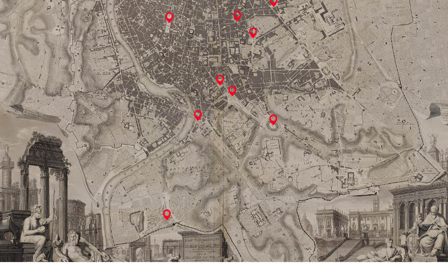
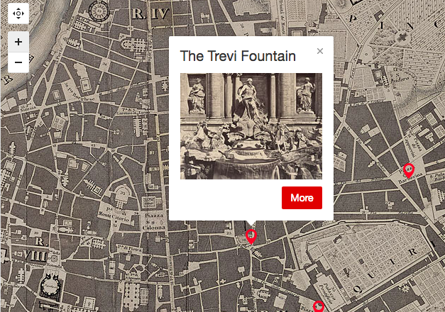
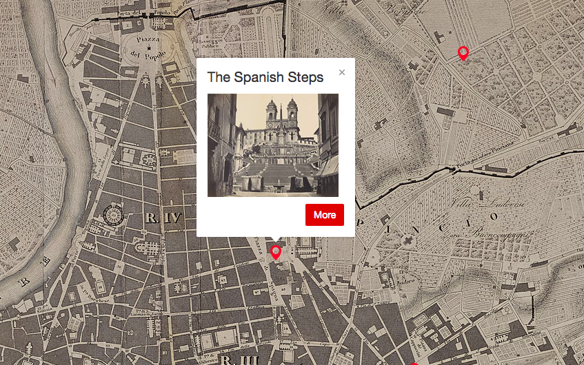
These days, your best bet for touring Rome’s best known landmarks in peace may be an interactive map, compliments of the Morgan Library and Museum. Based on Paul-Marie Letarouilly’s picturesque 1841 city plan, each digital pin can be expanded to reveal descriptions by nineteenth-century authors and side-by-side, then-and-now comparisons of the featured monuments.
The enduring popularity of the film Three Coins in the Fountain, coupled with the invention of the selfie stick has turned the area around the Trevi Fountain into a pickpocket’s dream and a claustrophobe’s worst nightmare.
Not so in Nathaniel Hawthorne’s day, though unlike Lord Byron, he cultivated a cool remove, at least at first:
They and the rest of the party descended some steps to the water’s brim, and, after a sip or two, stood gazing at the absurd design of the fountain, where some sculptor of Bernini’s school had gone absolutely mad in marble. It was a great palace-front, with niches and many bas-reliefs, out of which looked Agrippa’s legendary virgin, and several of the allegoric sisterhood; while, at the base, appeared Neptune, with his floundering steeds and Tritons blowing their horns about him, and twenty other artificial fantasies, which the calm moonlight soothed into better taste than was native to them. And, after all, it was as magnificent a piece of work as ever human skill contrived. At the foot of the palatial façade was strown, with careful art and ordered irregularity, a broad and broken heap of massive rock, looking as if it might have lain there since the deluge. Over a central precipice fell the water, in a semicircular cascade; and from a hundred crevices, on all sides, snowy jets gushed up, and streams spouted out of the mouths and nostrils of stone monsters, and fell in glistening drops; while other rivulets, that had run wild, came leaping from one rude step to another, over stones that were mossy, slimy, and green with sedge, because in a century of their wild play, Nature had adopted the Fountain of Trevi, with all its elaborate devices, for her own.
The human statues garbed as gladiators and charioteers spend hours in the blazing sun at the foot of the Spanish Steps—the heirs to the artists and models who populated William Wetmore Story’s Roba di Roma:
All day long, these steps are flooded with sunshine in which, stretched at length, or gathered in picturesque groups, models of every age and both sexes bask away the hours when they are free from employment in the studios. … Sometimes a group of artists, passing by, will pause and steadily examine one of these models, turn him about, pose him, point out his defects and excellences, give him a baiocco, and pass on. It is, in fact, a models’ exchange.
The Medici Villa houses the Académie de France, and its gardens remain a pleasant respite, even in 2017. Visitors who aren’t wholly consumed with finding a wifi signal may find themselves fantasizing about a different life, much as Henry James did in his Italian Hours:
Such a dim light as of a fabled, haunted place, such a soft suffusion of tender grey-green tones, such a company of gnarled and twisted little miniature trunks—dwarfs playing with each other at being giants—and such a shower of golden sparkles drifting in from the vivid West! … I should name for my own first wish that one didn’t have to be a Frenchman to come and live and dream and work at the Académie de France. Can there be for a while a happier destiny than that of a young artist conscious of talent and of no errand but to educate, polish and perfect it, transplanted to these sacred shades?…What mornings and afternoons one might spend there, brush in hand, unpreoccupied, untormented, pensioned, satisfied—either persuading one’s self that one would be “doing something” in consequence or not caring if one shouldn’t be.
Unless you belong to an older generation, you probably can’t remember the last time the map of the United States underwent any major change. For decades, the boundaries have remained pretty fixed. And yet the map, as we know it, shouldn’t necessarily be considered set in stone.
If billionaire Tim Draper hashis way, California voters will decide in 2018 whether California, the home to nearly 40 million people, should be divided into three states called “Northern California,” “Southern California,” and plain “California.” His argument being that California has become too large to govern, and that power should be moved toward smaller, more locally governed entities. Meanwhile, on a parallel track, another group is pushing for California to leave the union altogether. Right there, we have two initiatives that could change the map as we know it.
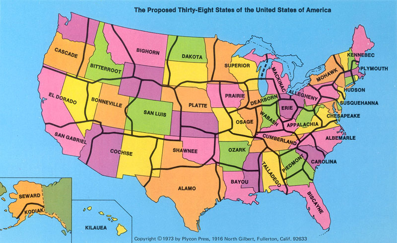
And then there was the time when, back in 1973, George Etzel Pearcy, a California State University geography professor, proposed re-drawing the map of the nation, reducing the number of states to 38, and giving each state a different name. In his creative reworking of things, California would be split into two states–“El Dorado” and “San Gabriel”. Texas would divide into “Alamo” and also “Shawnee” (along with remnants of Oklahoma). And the Dakotas would fuse into one big “Dakota.” In case you’re wondering, Pearcy chose the names by polling geography students.
Why the need for a new map? Pearcy states that many of the early surveys that drew up our boundaries were done while the areas were scarcely populated. Thus, it was convenient to determine boundaries by using the land’s physical features, such as rivers and mountain ranges, or by using a simple system of latitude and longitude.… The practicality of old established State lines is questionable in light of America’s ever-growing cities and the increasing mobility of its citizens. Metropolitan New York, for example, stretches into 2 adjacent States. Other city populations which cross State lines are Washington, D.C., St. Louis, Chicago, and Kansas City. The “straddling” of State lines causes economic and political problems. Who should pay for a rapid transit system in St. Louis? Only those citizens within the boundaries of Missouri, or all residents of St. Louis’s metropolitan area, including those who reach over into the State of Illinois?…
When Pearcy realigned the U.S., he gave high priority to population density, location of cities, lines of transportation, land relief, and size and shape of individual States. Whenever possible lines are located in less populated areas. In the West, the desert, semidesert, or mountainous areas provided an easy method for division. In the East, however, where areas of scarce population are harder to determine, Pearcy drew lines “trying to avoid the thicker clusters of settlement.” Each major city which fell into the “straddling” category is neatly tucked within the boundaries of a new State. Pearcy tried to place a major metropolitan area in the center of each State. St. Louis is in the center of the State of Osage, Chicago is centered in the State of Dearborn. When this method proved impossible, as with coastal Los Angeles, the city is still located so as to be easily accessible from all parts of the State…
According to Rob Lammle, writing in Mental Floss, Pearcy initially got support from “economists, geographers, and even a few politicians.” But the proposal–mainly outlined in a book called A 38 State U.S.A.–eventually withered in Washington, the place where ideas, both good and bad, go to die.
Below you can watch an animation showing how US map has changed in 200 years.
If you would like to sign up for Open Culture’s free email newsletter, please find it here. It’s a great way to see our new posts, all bundled in one email, each day.
If you would like to support the mission of Open Culture, consider making a donation to our site. It’s hard to rely 100% on ads, and your contributions will help us continue providing the best free cultural and educational materials to learners everywhere. You can contribute through PayPal, Patreon, and Venmo (@openculture). Thanks!
Walk around London with someone who knows its deep history — not hard to arrange, given the way London enthusiasts treat historical knowledge as a hypercompetitive sport — and you’ll have more than a few paths of “Roman roads” pointed out to you. Even in the city of Big Ben and Buckingham Palace, the Shard and the Gherkin, chicken shops and curry houses, there remain fragments and traces of the 2,000 miles of roads the Roman Army built between British towns and cities between 43 and 410 AD, Britain’s centuries as a province of the Roman Empire.
Though some of Britain’s Roman Roads have become modern motorways, most no longer exist in any form but those bits and pieces history buffs like to spot. This makes it difficult to get a sense of how they all ran and where — or at least it did until Sasha Trubetskoy made a Roman Roads of Britain Network Map in the graphic-design style of the subway maps you’ll find in London or any other major city today. Trubetskoy, an undergraduate statistics major at the University of Chicago, first found cartographical fame a few months ago with his “subway map” of roads across the entire Roman Empire circa 125 AD.
“Popular request,” he writes, demanded a Britain-specific follow up, a project he describes as “far more complicated than I had initially anticipated.” The challenges included not just the sheer number of Roman Roads in Britain but a lack of clarity about their exact location and extents. As in his previous map, Trubetskoy admits, “I had to do some simplifying and make some tough choices on which cities to include.” While this closer-up view demanded a more geographical faithfulness, he nevertheless “had to get rather creative with the historical evidence” in places, to the point of using such “not exactly Latin-sounding” names as “Watling Street” and “Ermin Way.”
Still, barring a revolutionary discovery in Roman history, you’re unlikely to find a more rigorous example of subway-mapped Roman Roads in Britain than this one. And for $9 USD you can have it as a “crisp PDF” suitable for printing as a poster and giving to anyone passionate about the history of Britain — or the history of Rome, or graphic design, or maps that aren’t what they might seem at first glance.
Stephen F. Steinbach, a resident of Vienna and a “cartography, language and travel enthusiast, with an engineering background,” is not a linguist. Steinbach, who runs the site Alternative Transport, seems much more interested in mapping and transportation than morphology and etymology. But he has made a contribution to a linguistic concept called “lexical difference” with the map you see above, a colorful 2015 visualization of European languages, grouped together in clusters according to their subfamilies (Italic-Romance, Baltic, Slavic, Germanic, etc.—see a much larger version here).
Straight and arcing lines span the relative distance these languages have presumably traveled from each other. Solid lines between languages represent a very close proximity, dashed lines of different thicknesses show more distance, and thin dotted lines traverse the greatest expanses.
Hungarian and Ukrainian, for example, have a lexical distance score of 90, where Polish and Ukrainian, both Slavic languages, are only 30 degrees from each other. “The map shows the language families that cover the continent,” writes Big Think, “large, familiar ones like Germanic, Italic-Romance and Slavic, smaller ones like Celtic, Baltic and Uralic; outliers like Semitic and Turkic; and isolates—orphan languages, without a family: Albanian and Greek.” (Technically, modern Greek does have a family—Hellenic—though it is the only surviving member.)
As we might expect from this subset of the durable Indo-European schema, the languages within each clustered group occupy the shortest distance from each other, with some exceptions. Romanian, for example, is slightly closer to Albanian than it is to French, its Romance cousin. The Slavic languages Russian and Polish seem to have traveled a bit further apart than Polish has from the Baltic language of Lithuanian. What does this mean, exactly? According to the measure of “lexical distance” proposed by Ukrainian linguist Konstantin Tishchenko, it means that closer languages might be more mutually intelligible, at least from a lexical standpoint, since they may share more cognates (similar-sounding and meaning words) and borrowings.
The idea received a much more trenchant critique more recently. Steinbach clarified that the theory, and the map, only compare written words and not syntax or speech. “It has nothing to do with grammar, syntax, rhythm or other important features that are important for intelligibility,” he writes. “It also compares a small list of words and not the entire vocabulary of one language to another.” This explanation does cast doubt on whether “lexical distance” is a meaningful concept. I’ll leave it to the linguists to decide. (Steinbach reached out to Tischchenko but has yet to receive a reply.)
Tischchenko’s original “lexical distance” map, further up, drawn in 1997, gets the idea across with minimal fuss, but it leaves much to be desired graphically. (A large, hand-drawn color version improves upon the printed map.) Steinbach took his version from a 2008 English-language adaptation made by Teresa Elms in 2008 (above). In his blog post here, he explains all of the changes he made to Elms and Tischchenko’s designs. These include adjusting the size of the “bubbles” to proportionally represent the number of speakers of each language. Steinbach also added several languages, as well as “gravestones” for the dead Anatolian and Tocharian branches. In all, his map shows “54 languages, representing 670 million people.” He adds, vaguely, that “it checks out.”
After posting his Lexical Distance Map, Steinbach proposed a “3D” version, with the added dimension of time. (See his preliminary sketch above.) The maps are intriguing, the theory of “lexical distance” an interesting one, but we should bear in mind, as Steinbach writes, that he is “no linguist,” and that this idea is hardly an orthodox one within the discipline.
We're hoping to rely on loyal readers, rather than erratic ads. Please click the Donate button and support Open Culture. You can use Paypal, Venmo, Patreon, even Crypto! We thank you!
Open Culture scours the web for the best educational media. We find the free courses and audio books you need, the language lessons & educational videos you want, and plenty of enlightenment in between.