
From time to time, Americans will talk about the mass killing, treaty-breaking, impoverishment, and forced removal or assimilation of Native peoples in the U.S. as “a shameful period in our history.” While this may sound like the noble acknowledgement of a genocidal crime, it is far too half-hearted and disingenuous, since these acts are central to the entirety of U.S. history, from the first landing of European ships on North American shores to the recent events at Standing Rock and beyond. An enormous body of scholarly and popular literature testifies to the facts.
For a thorough one-volume survey, see Roxanne Dunbar-Ortiz’s Indigenous Peoples’ History of the Unites States, a book that exhaustively cites several hundred years of well-documented events, like orders for extermination and land theft under military leaders George Washington, Andrew Jackson, and Army general Thomas S. Jesup. Dunbar-Ortiz shows how many U.S. military practices and terms (such as the phrase “in country”) came directly from the so-called “Indian Wars.”
Take the practice of “scalp hunting,” encouraged during the Pequot War and becoming routine throughout the period of New England settlement in the late 1600’s:
Bounties for Indigenous scalps were honored even in absence of war. Scalps and Indigenous children became means of exchange, currency, and this development may even have created a black market. Scalp hunting was not only a profitable privatized enterprise but also a means to eradicate or subjugate the Indigenous population of the Anglo-American Atlantic seaboard. The settlers gave a name to the mutilated and bloody corpses they left in the wake of scalp-hunts: redskins.
The American football team currently bearing that name and representing the nation’s capital, as Baxter Holmes shows at Esquire, pays tribute to the extreme brutality of murdering Indigenous people and using their scalps as cash. “This way of war,” writes Dunbar-Ortiz, “became the basis for the wars against the Indigenous across the continent into the late nineteenth century.”
In the GIF above, we see a dramatically telescoped visualization of the “violent seizing of Native Americans’ land” after 1776, writes Dylan Matthews at Vox, documented by historians like Dunbar-Ortiz and University of Georgia’s Claudio Saunt, who, along with Slate’s Rebecca Onion, created the graphic as a supplement for his book West of the Revolution: An Uncommon History of 1776. “The project’s source data,” write Saunt and Onion, “is a set of maps produced in 1899 by the Bureau of American Ethnology,” a Smithsonian research unit that “published and collected anthropological, archaeological, and linguistic research… as the nineteenth century drew to a close.”
Blue areas show Indigenous homelands, red areas show reservations. The “time-lapse function,” note the map’s creators, “is the most visually impressive aspect of this interactive,” but you can access a “deep level of detail” at the map’s site, such as the names of the hundreds of dispossessed and displaced nations and links to the historical documentation of their land “cession.”
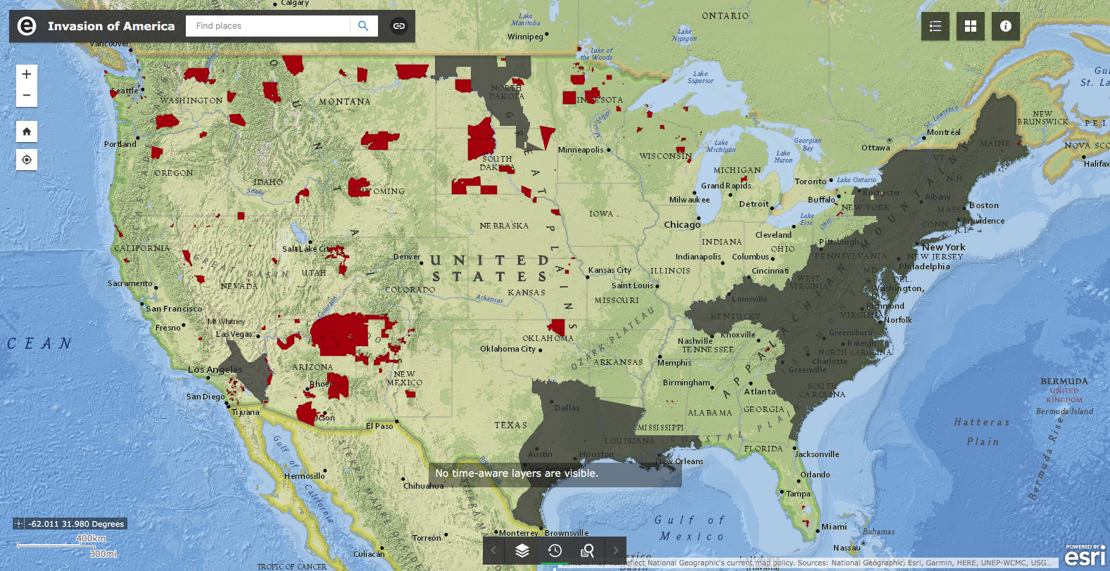
Many of the boundaries are vague, write Saunt and Onion, “a broad approach that left a lot of room for creative implementation.” As Saunt puts it, “greater legality and more precision would have made it impossible to seize so much land in so short a time,” just over 100 years shown here, from the 1776 founding to 1887, during which over 1.5 billion acres were seized and occupied by frontier settlers and the U.S. army in what Saunt calls in the map’s title the “Invasion of America.”
View the full map, searchable by place and Indigenous nation, here. You can also select a separate layer that shows current reservations. See above.
Related Content:
New Interactive Map Visualizes the Chilling History of Lynching in the U.S. (1835–1964)
Visualizing Slavery: The Map Abraham Lincoln Spent Hours Studying During the Civil War
Josh Jones is a writer and musician based in Durham, NC. Follow him at @jdmagness


