Yes, this big map depicts the realm of the humble mushroom, which “shares the forest with the plants and the animals, but it’s not a plant, and it’s not an animal.” And the mushroom itself, like we’re used to seeing sprouting beneath our feet, is only a small part of the organism: the rest “lives hidden, out of sight, below ground. Beneath every mushroom is a fungal network of hair-like strands called the mycelium,” which begins as a spore.
The hugely diverse “fruiting bodies” that they push out of the surface have only one job: “to disperse the spores and grow the next generation.” But only ten percent of fungi species actually do this; the rest don’t produce anything we would recognize as mushrooms at all.
About 150,000 species of fungi have been discovered so far. Though inanimate, they manage to do quite a lot, such as supplying nutrients to plants (or killing them), generating chemicals that have proven extremely useful (or at least consciousness-expanding) to humans, hijacking the nervous systems of arthropods, and even surviving in outer space. And of course, “because of their ability to concentrate nutrients from within the soil, fungi are an excellent source of food for us and many other animals.” Mycologists estimate that there remain at least two or three million more species “out there in nature waiting to be discovered.” At least a few of them, one hopes, will turn out to be tasty.
Based in Seoul, Colin Marshall writes and broadcasts on cities, language, and culture. His projects include the Substack newsletterBooks on Cities and the book The Stateless City: a Walk through 21st-Century Los Angeles. Follow him on the social network formerly known as Twitter at @colinmarshall.
We all know Marshall McLuhan’s pithy, endlessly quotable line “the medium is the message,” but rarely do we stop to ask which one comes first. The development of communication technologies may genuinely present us with a chicken or egg scenario. After all, only a culture that already prized constant visual stimuli but grossly undervalued physical movement would have invented and adopted television.
In Society of the Spectacle, Guy Debord ties the tendency toward passive visual consumption to “commodity fetishism, the domination of society by ‘intangible as well as tangible things,’ which reaches its absolute fulfillment in the spectacle, where the tangible world is replaced by a selection of images which exist above it, and which simultaneously impose themselves as the tangible par excellence.” It seems an apt description of a screen-addicted culture.
What can we say, then, of a culture addicted to charts and graphs? Earliest examples of the form were often more elaborate than we’re used to seeing, hand-drawn with care and attention. They were also not coy about their ambitions: to condense the vast dimensions of space and time into a two-dimensional, color-coded format. To tidily sum up all human and natural history in easy-to-read visual metaphors.
This was as much a religious project as it was a philosophical, scientific, historical, political, and pedagogical one. The domains are hopelessly entwined in the 18th and 19th centuries. We should not be surprised to see them freely mingle in the earliest infographics. The creators of such images were polymaths, and deeply devout. Joseph Priestley, English chemist, philosopher, theologian, political theorist and grammarian, made several visual chronologies representing “the lives of two thousand men between 1200 BC and 1750 AD” (conveying a clear message about the sole importance of men).
“After Priestley,” writes the Public Domain Review, “timelines flourished, but they generally lacked any sense of the dimensionality of time, representing the past as a uniform march from left to right.” Emma Willard, “one of the century’s most influential educators” set out to update the technology, “to invest chronology with a sense of perspective.” In her 1836 Picture of Nations; or Perspective Sketch of the Course of Empire, above (view and download high resolution images here), she presents “the biblical Creation as the apex of a triangle that then flowed forward in time and space toward the viewer.”
The perspective is also a forced point of view about origins and history. But that was exactly the point: these are didactic tools meant for textbooks and classrooms. Willard, “America’s first professional female mapmaker,” writes Maria Popova, was also a “pioneering educator,” who founded “the first women’s higher education institution in the United States when she was still in her thirties…. In her early forties, she set about composing and publishing a series of history textbooks that raised the standards and sensibilities of scholarship.”
Willard recognized that linear graphs of time did not accurately do justice to a three-dimensional experience of the world. Humans are “embodied creatures who yearn to locate themselves in space and time.” The illusion of space and time on the flat page was an essential feature of Willard’s underlying purpose: “laying out the ground-plan of the intellect, so far as the whole range of history is concerned.” A proper understanding of a Great Man (and at least one Great Woman, Hypatia) version of history—easily condensed, since there were only around 6,000 years from the creation of the universe—would lead to “enlightened and judicious supporters” of democracy.
History is represented literally as a sacred space in Willard’s 1846 Temple of Time, its providential beginnings formally balanced in equal proportion to its every monumental stage. Willard’s intent was expressly patriotic, her trappings self-consciously classical. Her maps of time were ways of situating the nation as a natural successor to the empires of old, which flowed from the divine act of creation. They show a progressive widening of the world.
“Half a century before W.E.B. Du Bois… created his modernist data visualizations for the 1900 World’s Fair,” Popova writes, The Temple of Time “won a medal at the 1851 World’s Fair in London.” Willard accompanied the infographic with a statement of intent, articulating a media theory, over a hundred years before McLuhan, that sounds strangely anticipatory of his famous dictum.
The poetic idea of “the vista of departed years” is made an object of sight; and when the eye is the medium, the picture will, by frequent inspection, be formed within, and forever remain, wrought into the living texture of the mind.
In the image above, we see an impressive pre-internet macro-infographic called a “Histomap.” Its creator John B. Sparks (who later created “histomaps” of religion and evolution) published the graphic in 1931 with Rand McNally. The five-foot-long chart—purportedly covering 4,000 years of “world” history—is, in fact, an example of an early illustration trend called the “outline,” of which Rebecca Onion at Slate writes: “large subjects (the history of the world! every school of philosophy! all of modern physics!) were distilled into a form comprehensible to the most uneducated layman.” Here we have the full description of most every political chart, graph, or animation in U.S.A. Today, most Internet news sites, and, of course, The Onion.
The similarity here isn’t simply one of form. The “outline” functioned in much the same way that simplified animations do—condensing heavy, contentious theoretical freight trains and ideological baggage. Rebecca Onion describes the chart as an artifact very much of its time, presenting a version of history prominent in the U.S. between the wars. Onion writes:
The chart emphasizes domination, using color to show how the power of various “peoples” (a quasi-racial understanding of the nature of human groups, quite popular at the time) evolved throughout history.
Sparks’ map, however, remains an interesting document because of its seeming disinterestedness. While the focus on racialism and imperial conquest may seem to place Sparks in company with populist “scientific” racists of the period like Lothrop Stoddard (whom Tom Buchanan quotes in Fitzgerald’s Gatsby), it would also seem that his design has much in common with early Enlightenment figures whose conception of time was not necessarily linear. Following classical models, thinkers like Thomas Hobbes tended to divide historical epochs into rising and falling actions of various people groups, rather than the gradual ascent of one race over all others towards an end of history. For example, poet Abraham Cowley writes a compressed “universal history” in his 1656 poem “To Mr. Hobs,” moving from Aristotle (the “Stagirite”) to the poem’s subject Thomas Hobbes. The movement is progressive, yet the historical representatives of each civilization receive some equal weight and similar emphasis.
Long did the mighty Stagirite retain
The universal Intellectual reign,
Saw his own Countreys short-liv’ed Leopard slain;
The stronger Roman-Eagle did out-fly,
Oftner renewed his Age, and saw that Dy. Mecha it self, in spight of Mahumet possest,
And chas’ed by a wild Deluge from the East,
His Monarchy new planted in the West.
But as in time each great imperial race
Degenerates, and gives some new one place:
The period of Cowley recognized theories of racial, cultural, and natural supremacy, but such qualities, as in Sparks’ map, were the product of a long line of succession from equally powerful and noteworthy empires and groups to others, not a social evolution in which a superior race naturally arose. Rand McNally advertised the chart as presenting “the march of civilization, from the mud huts of the ancients thru the monarchistic glamour of the middle ages to the living panorama of life in present day America.” While the blurb is filled with pseudoscientific colonialist talking points, the chart itself has the dated, yet strikingly egalitarian arrangement of information that—like much of the illustration in National Geographic—sought to accommodate the best consensus models of the times, displaying, but not proselytizing, its biases.
Note: An earlier version of this post appeared on our site in 2013.
In 1581, the medieval cartographer and Protestant theologian Heinrich Bünting created a symbolic map of the world that adorned his book Itinerarium Sacrae Scripturae(Travel Through Holy Scripture). Hand-colored and shaped like a three-leaf clover, the map put Jerusalem at its center, highlighting its central role in Christianity, Judaism, and Islam. From that center flowed three continents—Europe, Africa, and Asia—each surrounded by swirling waters teeming with ships, mermaids, and sea monsters. Then, off to one side, we find a barren “America,” otherwise known as the “New World.”
If you would like to sign up for Open Culture’s free email newsletter, please find it here. It’s a great way to see our new posts, all bundled in one email, each day.
If you would like to support the mission of Open Culture, consider making a donation to our site. It’s hard to rely 100% on ads, and your contributions will help us continue providing the best free cultural and educational materials to learners everywhere. You can contribute through PayPal, Patreon, and Venmo (@openculture). Thanks!
In an age when many of us could hardly make our way to an unfamiliar grocery store without relying on a GPS navigation system, we might well wonder how the Romans could establish and sustain their mighty empire without so much as a proper map. That’s the question addressed by the Historia Militumvideo above, “How Did Ancient People Travel Without Maps?” Or more to the point, how did they travel without scaled maps — that is, ones “in which the map’s distances were proportional to their actual size in the real world,” like almost all those we consult on our screens today?
The surviving maps from the ancient Roman world tend not to take great pains adhering to true geography. Yet as the Roman Empire expanded, laying roads across three continents, more and more Romans engaged in long-distance travel, and for the most part seem to have arrived at their intended destinations.
To do so, they used not maps per se but “itineraries,” which textually listed towns and cities along the way and the distance between them. By the fourth century, “all main Roman roads along with 225 stopping stations were compiled in a document called the Itinerarium Antonini, the Itinerary of Emperor Antonius Pius.”
This highly practical document includes mostly roads that “passed through large cities, which provided better facilities for housing, shopping, bathing, and other traveler needs.” With this information, “a traveler could copy the specific distances and stations they needed to reach their destination.” Still today, some seventeen centuries later, “most people wouldn’t use a paper scaled map for travel, but would instead break their journey down into a list of subway stations, bus stops, and intersections.” And if you were to attempt to drive across Europe, making a modern-day Roman Empire road trip, you’d almost certainly rely on the distances and points of interest provided by the synthesized voice reading aloud from the vast Itinerarium Antonini of the twenty-first century.
Based in Seoul, Colin Marshall writes and broadcasts on cities, language, and culture. His projects include the Substack newsletterBooks on Cities and the book The Stateless City: a Walk through 21st-Century Los Angeles. Follow him on Twitter at @colinmarshall.
No matter what country we live in, we’ve all fantasized about taking our own great American road trip, considering a variety of the infinitely many possible routes. The most obvious would be driving between Los Angeles and New York, a distance of 2,800 miles that would take a bit over 40 hours straight through. I myself once took a more southerly route, road-tripping from Los Angeles to Raleigh, North Carolina over a week or two; these days, I dream of an east-coast journey from Maine all the way down to Key West, a relatively manageable 1,900 miles. But if you take your road-tripping seriously, you’ve got to go to another continent entirely.
Such is the conclusion to be drawn from the Half as Interesting video above, which finds the longest drivable distance on Earth. “The North American road system goes as far as Prudhoe Bay in Canada’s Canada, Alaska, and as far south as Yaviza in Panama,” says the video’s creator Sam Denby, “but this only clocks in at 7,500 miles.”
That may require six straight days of driving, but it doesn’t set any records. A route from southern Africa and east Asia may seem promising, but they can’t be driven without passing through western Europe. That requires passage across the Mediterranean on a ferry, which — for the true road-tripper — taints the purity of the endeavor.
Starting in Europe, then, you should begin in Sagres, Portugal, “the most extreme point on the contiguous road network.” From there, you can drive as far east as “the banks of the Aldan River in Russia,” a distance of 8,437 miles. But wait, there’s longer: you could keep going to Khasan, “the only Russian town to border North Korea,” and bring the mileage up to 8,726, thus completing “the longest direct driving route in the world.” If you go pedal-to-the-metal (to the extent possible while observing local speed limits, anyway) it will take six days and 19 hours — bookended, ideally, by one meal of cataplana and another of Khasan oysters.
Based in Seoul, Colin Marshall writes and broadcasts on cities, language, and culture. His projects include the Substack newsletterBooks on Cities and the book The Stateless City: a Walk through 21st-Century Los Angeles. Follow him on Twitter at @colinmarshall or on Facebook.
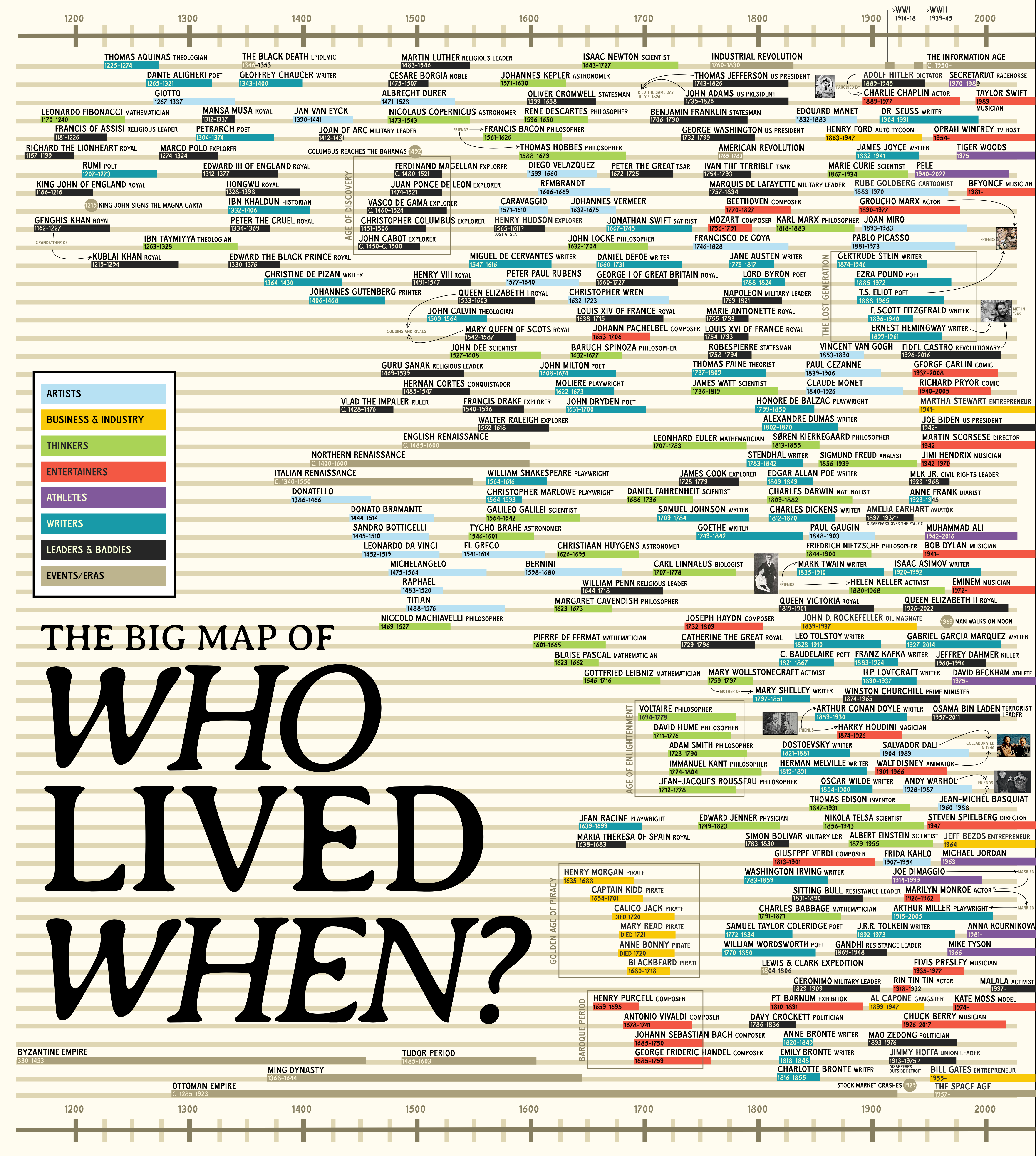
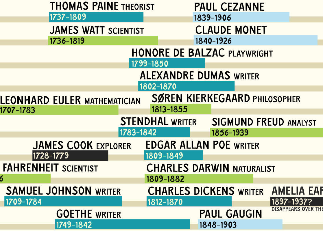
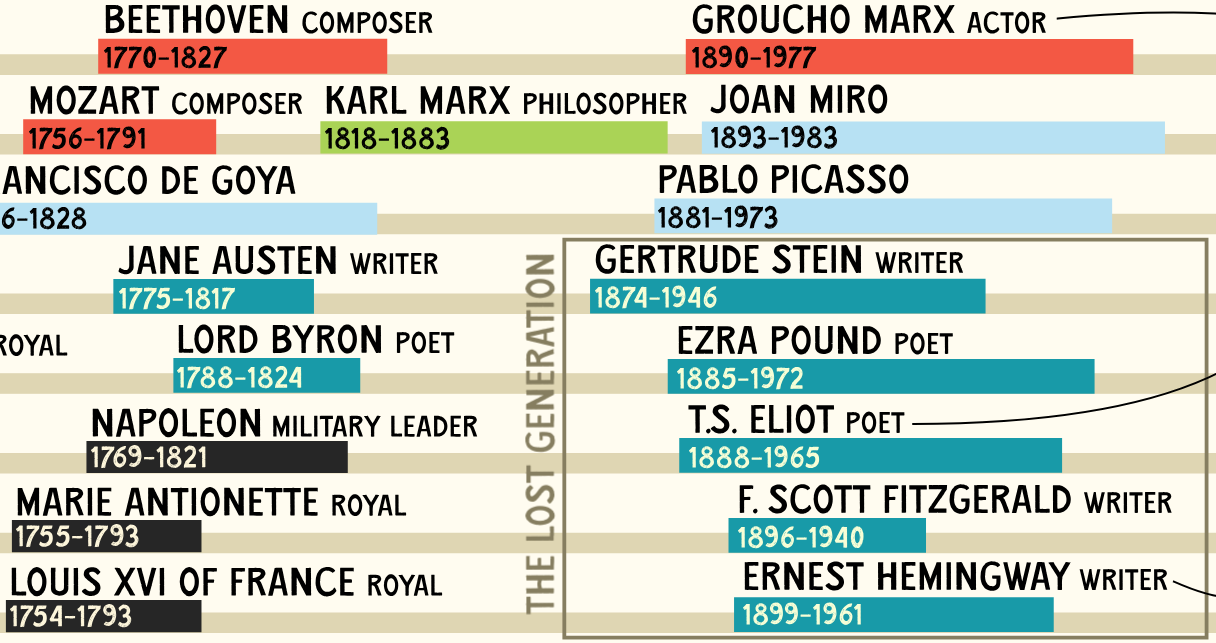
We could call the time in which we live the “Information Age.” Or we could describe it more vividly as the era of Bill Gates and Jeff Bezos, Martin Scorsese and Steven Spielberg, Oprah Winfrey and Martha Stewart, Beyoncé and Bob Dylan. Whatever you think of the work of any of these figures in particular, you can hardly deny the impact they’ve had on our culture. Were we living a century ago, we might have said the same of Henry Ford and John D. Rockefeller, James Joyce and F. Scott Fitzgerald (though he hadn’t quite published The Great Gatsby yet), Pablo Picasso and Charlie Chaplin, Marie Curie and Sigmund Freud.
Were we living in the year 1225, our lives would’ve overlapped with those of Leonardo Fibonacci, Francis of Assisi, Rumi, and Thomas Aquinas, as well as both Genghis Khan and his grandson Kublai Khan.
All this is laid out visually in The Big Map of Who Lived When, created earlier this year by a Reddit user called Profound_Whatever. As Big Think’s Frank Jacobswrites, the map reveals surprising instances of contemporaneousness, such as that current U.S. President Joe Biden “for about a year was alive at the same time as Nikola Tesla (1854–1943), the Serbian-American inventor who developed the alternating current (AC) system that is used for distributing electricity.”
For “another, more recent (and more baffling) overlap: The life of J.R.R. Tolkien (1892–1973), who wrote The Lord of the Rings, coincided ever so slightly with that of Eminem.” Going farther into the past, how many of us were fully aware that “Christopher Columbus (1451–1506), Leonardo da Vinci (1452–1519), and Martin Luther (1483–1546) were contemporaries of each other”? Or that “the lives of Oliver Cromwell (1599–1658) and René Descartes (1596–1650) synced almost perfectly with each other, despite the one being the dogmatically Puritan figurehead of the English Civil War, and the other the father of modern, rationalist philosophy by giving doubt to a central role in the pursuit of truth”?
The Big Map of Who Lived When uses a color-coding system to divide the figures whose lifespans it charts into eight categories, including artists (Leonardo da Vinci, Rube Goldberg), thinkers (John Locke, Charles Darwin), “business & industry” (including famed pirates from Henry Morgan to Blackbeard), and “leaders & baddies” (Napoleon, Adolf Hitler). It all reminds us that we’d give anything for a chance to meet some of them, or to stay out of the path of others. Of course, the individuals we think of as having defined a particular historical era weren’t always regarded that way by everyone else who lived at the same time: something it wouldn’t hurt to bear in mind when considering our own place in history.
Based in Seoul, Colin Marshall writes and broadcasts on cities, language, and culture. His projects include the Substack newsletterBooks on Cities and the book The Stateless City: a Walk through 21st-Century Los Angeles. Follow him on Twitter at @colinmarshall or on Facebook.
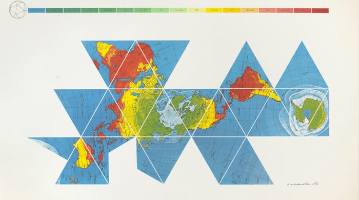
In 2017, we brought you news of a world map purportedly more accurate than any to date, designed by Japanese architect and artist Hajime Narukawa. The map, called the AuthaGraph, updates a centuries-old method of turning the globe into a flat surface by first converting it to a cylinder. Winner of Japan’s Good Design Grand Award, it serves as both a brilliant design solution and an update to our outmoded conceptions of world geography.
But as some readers have pointed out, the AuthaGraph also seems to draw quite heavily on an earlier map made by one of the most visionary of theorists and designers, Buckminster Fuller, who in 1943 applied his Dymaxion trademark to the map you see above, which will likely remind you of his most recognizable invention, the Geodesic Dome, “house of the future.”
Whether Narukawa has acknowledged Fuller as an inspiration I cannot say. In any case, 73 years before the AuthaGraph, the Dymaxion Map achieved a similar feat, with similar motivations. As the Buckminster Fuller Institute (BFI) points out, “The Fuller Projection Map is [or was] the only flat map of the entire surface of the Earth which reveals our planet as one island in the ocean, without any visually obvious distortion of the relative shapes and sizes of the land areas, and without splitting any continents.”
Fuller published his map in Life magazine, as a corrective, he said, “for the layman, engrossed in belated, war-taught lessons in geography…. The Dymaxion World map is a means by which he can see the whole world fairly at once.” Fuller, notes Kelsey Campbell-Dollaghan at Gizmodo, “intended the Dymaxion World map to serve as a tool for communication and collaboration between nations.”
Fuller believed, writes BFI, that “given a way to visualize the whole planet with greater accuracy, we humans will be better equipped to address challenges as we face our common future aboard Spaceship Earth.” Was he naïve or ahead of his time?
We may have had a good laugh at a recent replica of Fuller’s nearly undrivable, “scary as hell,” 1930 Dymaxion Car, one of his first inventions. Many of Fuller’s contemporaries also found his work bizarre and impractical. Elizabeth Kolbert at The New Yorker sums up the reception he often received for his “schemes,” which “had the hallucinatory quality associated with science fiction (or mental hospitals).” The commentary seems unfair.
Fuller’s influence on architecture, design, and systems theory has been broad and deep, though many of his designs only resonated long after their debut. He thought of himself as an “anticipatory design scientist,” rather than an inventor, and remarked, “if you want to teach people a new way of thinking, don’t bother trying to teach them. Instead, give them a tool, the use of which will lead to new ways of thinking.” In this sense, we must agree that the Dymaxion map was an unqualified success as an inspiration for innovative map design.
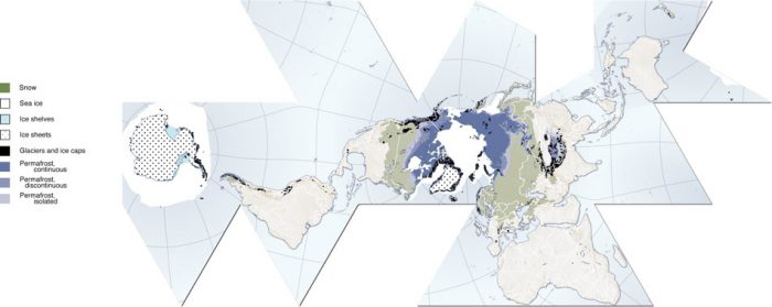
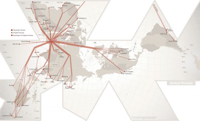
In addition to its possibly indirect influence on the AuthaGraph, Fuller’s map has many prominent imitators and sparked “a revolution in mapping,” writes Campbell-Dollaghan. She points us to, among others, the Cryosphere, further up, a Fuller map “arranged based on ice, snow, glaciers, permafrost and ice sheets”; to Dubai-based Emirates airline’s map showing flight routes; and to the “Googlespiel,” an interactive Dymaxion map built by Rehabstudio for Google Developer Day, 2011.
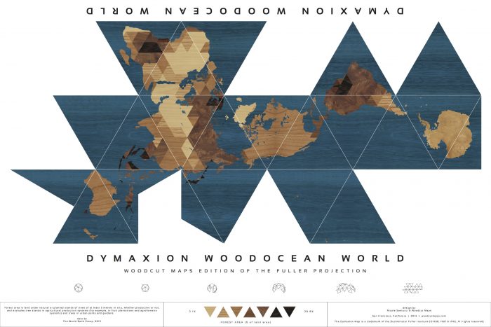
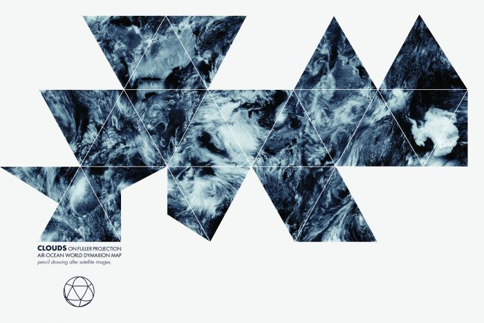
And, just above, we see the Dymaxion Woodocean World map by Nicole Santucci, winner of 2013’s DYMAX REDUX, an “open call to create a new and inspiring interpretation of Buckminster Fuller’s Dymaxion Map.” You’ll find a handful of other unique submissions at BFI, including the runner-up, Clouds Dymaxion Map, below, by Anne-Gaelle Amiot, an “absolutely beautiful hand-drawn depiction of a reality that is almost always edited from our maps: cloud patterns circling above Earth.”
We're hoping to rely on loyal readers, rather than erratic ads. Please click the Donate button and support Open Culture. You can use Paypal, Venmo, Patreon, even Crypto! We thank you!
Open Culture scours the web for the best educational media. We find the free courses and audio books you need, the language lessons & educational videos you want, and plenty of enlightenment in between.
