Andy Warhol’s Vibrant, Impractical, Illustrated Cookbook from 1959: A Feast for the Eyes


Gor­geous­ly illus­trat­ed cook­books fea­tur­ing sump­tu­ous images of fan­cy desserts and oth­er spe­cial occa­sion food can be quite an intim­i­dat­ing propo­si­tion to self-doubt­ing begin­ners.

The recipes them­selves are daunt­ing, and as every Great British Bak­ing Show view­er learns, watch­ing the top con­tes­tants squirm in advance of co-host Paul Hol­ly­wood’s icy judg­ment, fla­vor can’t save an edi­ble cre­ation that fails as art.

Andy Warhol’s approach to cook­ery appears rather more blithe.

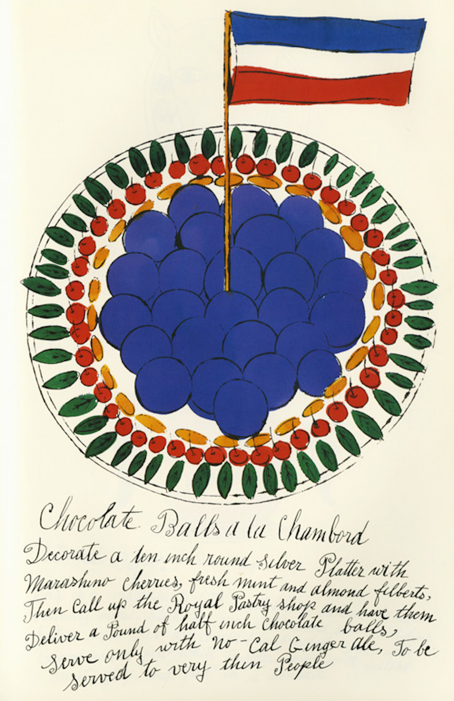
His 1959 cook­book, Wild Rasp­ber­ries — the title is a play on Ing­mar Bergman’s Wild Straw­ber­ries — dis­plays lit­tle inter­est in its read­ers’ cook­ing abil­i­ty… or, for that mat­ter, its authors.

Fan­ci­ful rep­re­sen­ta­tions of such del­i­ca­cies as Gar­doons a la Mous­se­line are pret­ty as a pic­ture… and stress free giv­en that no one is actu­al­ly expect­ed to make them.

Wild Rasp­ber­ries is all about atti­tude… and ambi­tion of a pure­ly social nature.

Warhol’s co-author, inte­ri­or dec­o­ra­tor and soci­ety host­ess Suzie Frank­furt, recalled hatch­ing the idea for this col­lab­o­ra­tion, short­ly after encoun­ter­ing the young artist at New York City’s fabled sweet spot, Serendip­i­ty: “We thought it would be a mas­ter­piece and we’d sell thou­sands. I think we sold 20.”

It’s pos­si­ble the endeav­or was a few decades ahead of its time. We can imag­ine Wild Rasp­ber­ries doing quite well as an impul­sive lifestyle type buy at Urban Out­fit­ters.

Sec­ond­hand copies of a 1997 reprint occa­sion­al­ly resur­face, as do auc­tion lots of the orig­i­nal 34 lith­o­graph sets, hand-col­ored by four school­boys who lived upstairs from Warhol, pri­or to hand-bind­ing by rab­bis on the Low­er East Side.

After con­sign­ing a few copies to Dou­ble­day and Riz­zoli book­stores, Warhol and Frank­furt gave the bulk of the first edi­tion away as Christ­mas presents to friends, who were no doubt well equipped to appre­ci­ate the tongue-in-cheek nature of its “recipes,” hand-let­tered by Warhol’s moth­er, Julia — whose spelling boo-boos were pur­pose­ful­ly allowed to stand.
The instruc­tions eschew crass men­tion of mea­sure­ments or cook­ing times… per­fect for any­one with hired staff, stand­ing reser­va­tions at Upper East Side hot spots, or a social X‑Ray diet reg­i­men.

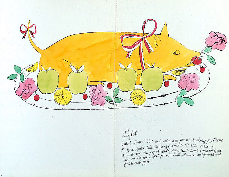
Instead, read­ers are direct­ed to send the Cadil­lac round to Trad­er Vic’s tiki bar for a suck­ling pig of suf­fi­cient size for a par­ty of 15, or to gath­er morels should they find them­selves hol­i­day­ing in the vicin­i­ty of Nor­mandy.

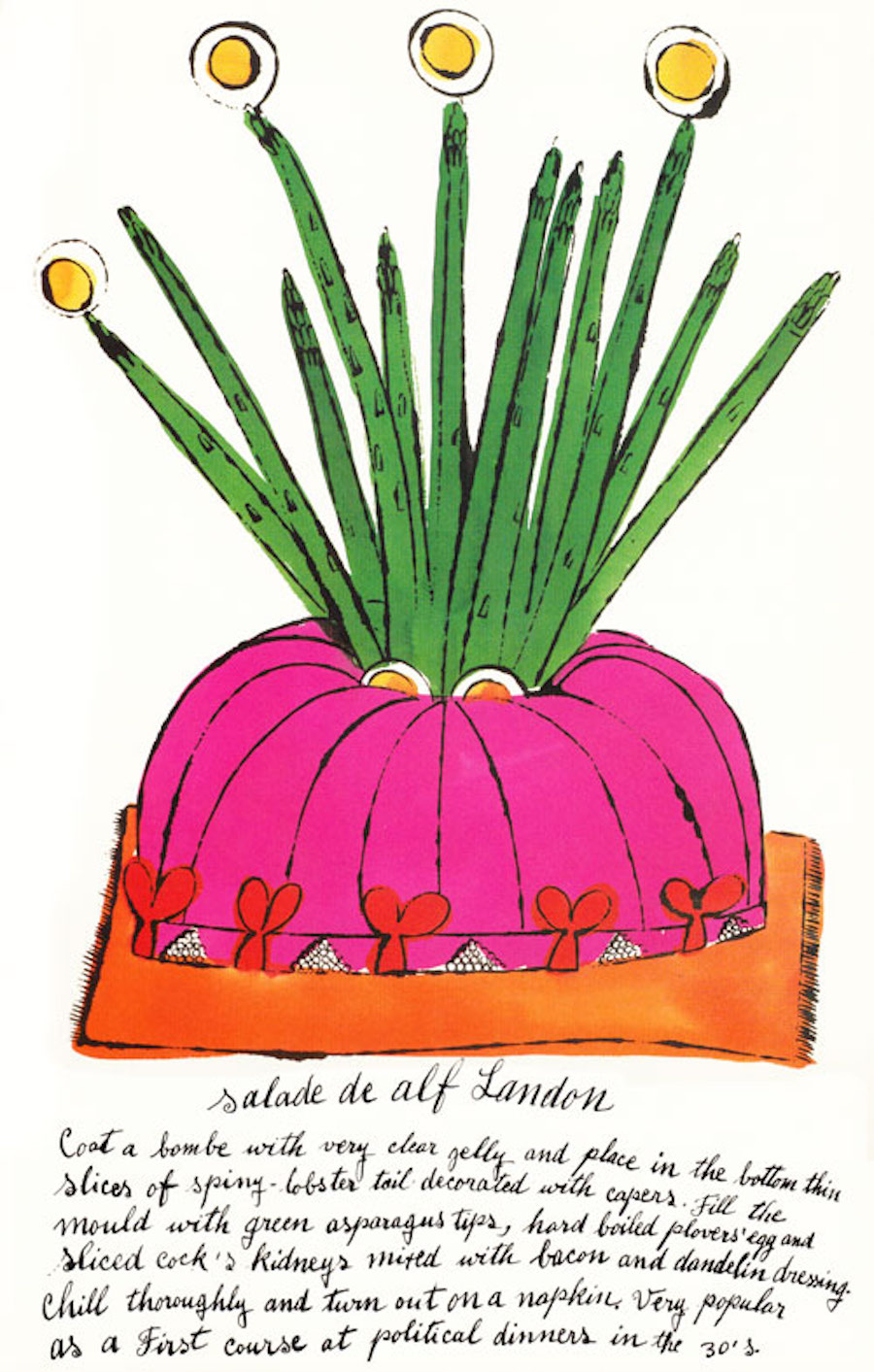
Salade de Alf Lan­don, a bombe of lob­ster tails named for FDR’s oppo­nent in the 1936 Pres­i­den­tial elec­tion, crowned with aspara­gus tips and hard­boiled plover eggs, seems like it could dou­ble as a fetch­ing cha­peau, espe­cial­ly when paired with one of Warhol’s whim­si­cal fan­ta­sy  for footwear com­pa­ny I. Miller’s week­ly ads in The New York Times.

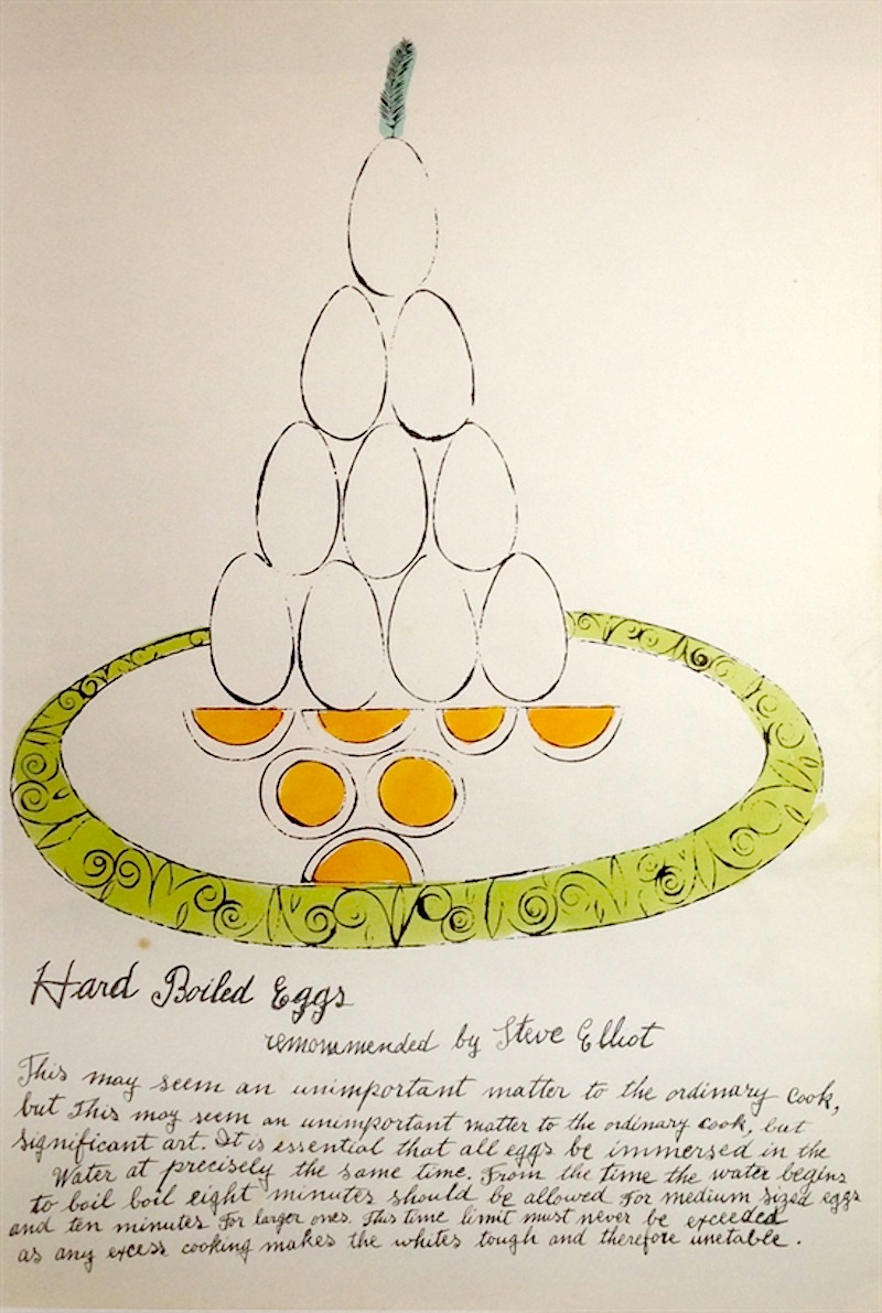
In fact, near­ly every­thing in this vibrant­ly hand col­ored “cook­book” makes for plau­si­ble mid-cen­tu­ry millinery, from Torte a la Dobosch to an imprac­ti­cal­ly ver­ti­cal arrange­ment of Hard Boiled Eggs.


Wild Rasp­ber­ries may have been a swipe at aspi­ra­tional, host­ess-ori­ent­ed late-50s cook­books, but Green­gages a la Warhol’s ref­er­ence to hyper­local pro­duce would fit right in with with Portlandia’s 21st cen­tu­ry food­ie spoofs.

High and low com­bine to great effect with wink­ing ref­er­ences to Gre­ta Gar­bo and gos­sip colum­nist Dorothy Kil­gallenLucky Whip dessert top­ping, a “Seared Roe­buck,” and store-bought super­mar­ket sponge cake (the lat­ter in Wild Rasp­ber­ries’ most legit-sound­ing recipe, some­thing of an upgrade from the recipe for “cake” Warhol shared in The Phi­los­o­phy of Andy Warhol — a choco­late bar served between slices of bread.

Relat­ed Con­tent: 

MoMA’s Artists’ Cook­book (1978) Reveals the Meals of Sal­vador Dalí, Willem de Koon­ing, Andy Warhol, Louise Bour­geois & More

300 Rarely-Seen, Risqué Draw­ings by Andy Warhol Pub­lished in the New Book, Andy Warhol: Love, Sex, and Desire. Draw­ings (1950–1962)

130,000 Pho­tographs by Andy Warhol Are Now Avail­able Online, Cour­tesy of Stan­ford Uni­ver­si­ty

Ayun Hal­l­i­day is an author, illus­tra­tor, the­ater mak­er and Chief Pri­ma­tol­o­gist of the East Vil­lage Inky zine.  Fol­low her @AyunHalliday.

Vintage Public Health Posters That Helped People Take Smart Precautions During Past Crises


We sub­scribe to the the­o­ry that art saves lives even in the best of times.

In the midst of a major pub­lic health cri­sis, art takes a front line posi­tion, com­mu­ni­cat­ing best prac­tices to cit­i­zens with eye catch­ing, easy to under­stand graph­ics and a few well cho­sen words.

In March of 2020, less than 2 weeks after COVID-19 brought New York to its knees, Angeli­na Lip­pert, the Chief Cura­tor of Poster House, one of the city’s new­er muse­ums shared a blog post, con­sid­er­ing the ways in which the CDC’s basic hygiene rec­om­men­da­tions for help­ing stop the spread had been tout­ed to pre­vi­ous gen­er­a­tions.

As she not­ed in a lec­ture on the his­to­ry of the poster as Pub­lic Ser­vice Announce­ment the fol­low­ing month, “mass pub­lic health action… is how we stopped tuber­cu­lo­sis, polio, and oth­er major dis­eases that we don’t even think of today:”

And a major part of erad­i­cat­ing them was edu­cat­ing the pub­lic. That’s real­ly what PSAs are—a means of inform­ing and teach­ing the pub­lic en masse. It goes back to that idea … of not hav­ing to seek out infor­ma­tion, but just being pre­sent­ed with it. Keep­ing the bar­ri­er for entry low means more peo­ple will see and absorb the infor­ma­tion.

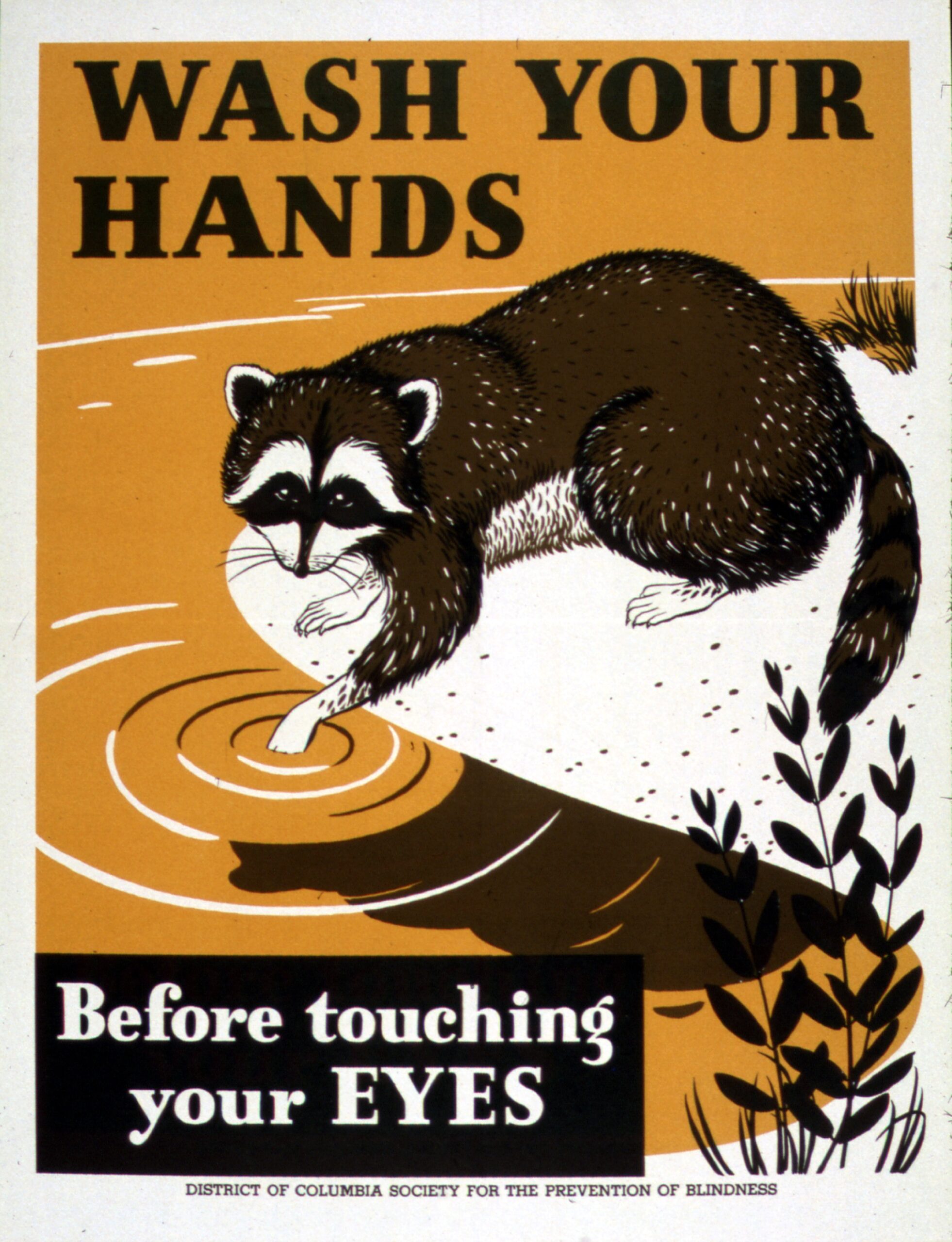
The Office of War Infor­ma­tion and the Dis­trict of Colum­bia Soci­ety for the Pre­ven­tion of Blind­ness used an approach­able look­ing rac­coon to con­vince the pub­lic to wash hands in WWII.

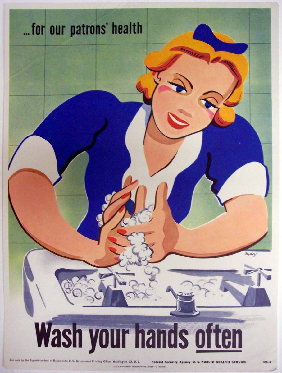
Artist Sey­mour Nydorf swapped the rac­coon for a blonde wait­ress with glam­orous red nails in a series of six posters for the U.S. Pub­lic Health Ser­vice of the Fed­er­al Secu­ri­ty Agency

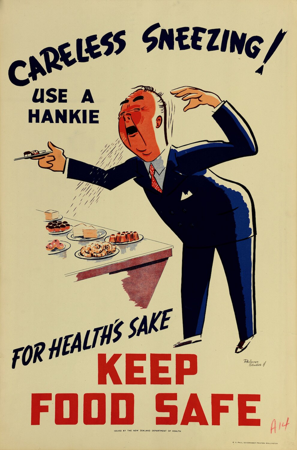
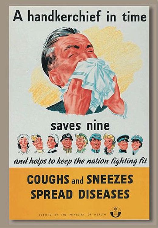
Cough­ing and sneez­ing took posters into some­what gross­er ter­rain.

The New Zealand Depart­ment of Health’s 50s era poster shamed care­less sneez­ers into using a han­kie, and might well have giv­en those in their vicin­i­ty a per­sua­sive rea­son to bypass the buf­fet table.

Great Britain’s Cen­tral Coun­cil for Health Edu­ca­tion and Min­istry of Health col­lab­o­rat­ed with

Her Majesty’s Sta­tionery Office to teach the pub­lic some basic infec­tion math in WWII.

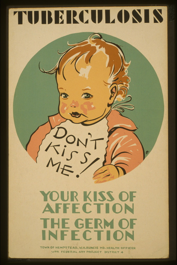
Children’s well­be­ing can be a very per­sua­sive tool. The WPA Fed­er­al Art Project was not play­ing in 1941 when it paired an image of a cheru­bic tot with stern warn­ings to par­ents and oth­er fam­i­ly mem­bers to curb their affec­tion­ate impuls­es, as well as the trans­mis­sion of tuber­cu­lo­sis.

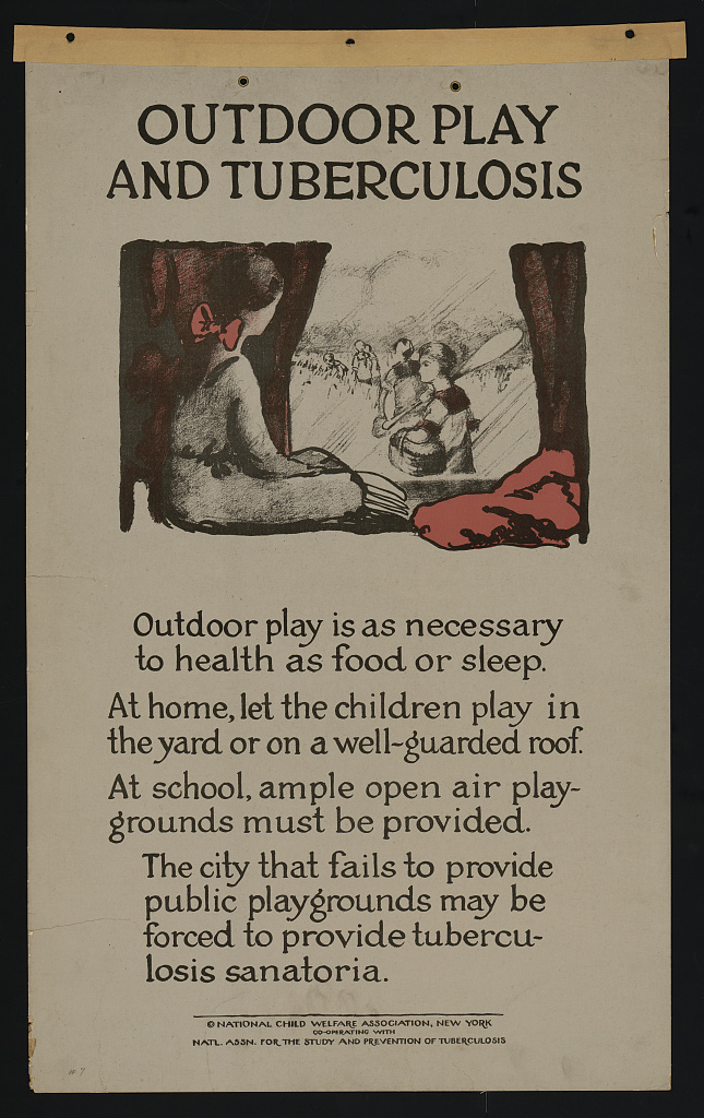
The arrest­ing image packs more of a wal­lop than this earnest and far wordier, ear­ly 20s poster by the Nation­al Child Wel­fare Asso­ci­a­tion and the Nation­al Asso­ci­a­tion for the Study and Pre­ven­tion of Tuber­cu­lo­sis.

Read Poster House Chief Cura­tor Angeli­na Lippert’s Brief His­to­ry of PSA Posters here.

Down­load the free anti-xeno­pho­bia PSAs Poster House com­mis­sioned from design­er Rachel Gin­grich ear­ly in the pan­dem­ic here.

Relat­ed Con­tent: 

Down­load Beau­ti­ful Free Posters Cel­e­brat­ing the Achieve­ments of Liv­ing Female STEM Lead­ers

The First Muse­um Ded­i­cat­ed Exclu­sive­ly to Poster Art Opens Its Doors in the U.S.: Enter the Poster House

Sal­vador Dalí Cre­ates a Chill­ing Anti-Vene­re­al Dis­ease Poster Dur­ing World War II

Down­load 2,000 Mag­nif­i­cent Turn-of-the-Cen­tu­ry Art Posters, Cour­tesy of the New York Pub­lic Library

Ayun Hal­l­i­day is an author, illus­tra­tor, the­ater mak­er and Chief Pri­ma­tol­o­gist of the East Vil­lage Inky zine.  Fol­low her @AyunHalliday.

The Birth of Espresso: The Story Behind the Coffee Shots That Fuel Modern Life

Espres­so is nei­ther bean nor roast.

It is a method of pres­sur­ized cof­fee brew­ing that ensures speedy deliv­ery, and it has birthed a whole cul­ture.

Amer­i­cans may be accus­tomed to camp­ing out in cafes with their lap­tops for hours, but Ital­ian cof­fee bars are fast-paced envi­ron­ments where cus­tomers buzz in for a quick pick me up, then right back out, no seat required.

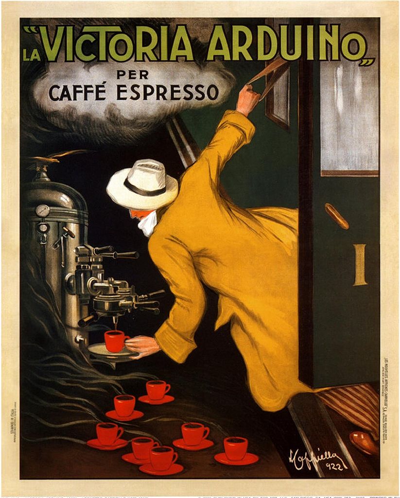
It’s the sort of effi­cien­cy the Father of the Mod­ern Adver­tis­ing Poster, Leonet­to Cap­piel­lo, allud­ed to in his famous 1922 image for the Vic­to­ria Arduino machine (below).

Let 21st-cen­tu­ry cof­fee afi­ciona­dos cul­ti­vate their Zen­like patience with slow pourovers. A hun­dred years ago, the goal was a qual­i­ty prod­uct that the suc­cess­ful busi­nessper­son could enjoy with­out break­ing stride.

As cof­fee expert James Hoff­mann, author of The World Atlas of Cof­fee points out in the above video, the Steam Age was on the way out, but Cappiello’s image is “absolute­ly lever­ag­ing the idea that steam equals speed.”

That had been the goal since 1884, when inven­tor Ange­lo Morion­do patent­ed the first espres­so machine (see below).

The bulk brew­er caused a stir at the Turin Gen­er­al Expo­si­tion. Speed wise, it was a great improve­ment over the old method, in which indi­vid­ual cups were brewed in the Turk­ish style, requir­ing five min­utes per order.

This “new steam machin­ery for the eco­nom­ic and instan­ta­neous con­fec­tion of cof­fee bev­er­age” fea­tured a gas or wood burn­er at the bot­tom of an upright boil­er, and two sight glass­es that the oper­a­tor could mon­i­tor to get a feel for when to open the var­i­ous taps, to yield a large quan­ti­ty of fil­tered cof­fee. It was fast, but demand­ed some skill on the part of its human oper­a­tor.

As Jim­my Stamp explains in a Smith­son­ian arti­cle on the his­to­ry of the espres­so machine, there were  also a few bugs to work out.

Ear­ly machines’ hand-oper­at­ed pres­sure valves posed a risk to work­ers, and the cof­fee itself had a burnt taste.

Milanese café own­er Achille Gag­gia cracked the code after WWII, with a small, steam­less lever-dri­ven machine that upped the pres­sure to pro­duce the con­cen­trat­ed brew that is what we now think of as espres­so.

Stamp describes how Gaggia’s machine also stan­dard­ized the size of the espres­so, giv­ing rise to some now-famil­iar cof­fee­house vocab­u­lary:

The cylin­der on lever groups could only hold an ounce of water, lim­it­ing the vol­ume that could be used to pre­pare an espres­so. With the lever machines also came some some new jar­gon: baris­tas oper­at­ing Gaggia’s spring-loaded levers coined the term “pulling a shot” of espres­so. But per­haps most impor­tant­ly, with the inven­tion of the high-pres­sure lever machine came the dis­cov­ery of cre­ma – the foam float­ing over the cof­fee liq­uid that is the defin­ing char­ac­ter­is­tic of a qual­i­ty espres­so. A his­tor­i­cal anec­dote claims that ear­ly con­sumers were dubi­ous of this “scum” float­ing over their cof­fee until Gag­gia began refer­ring to it as “caffe creme,“ sug­gest­ing that the cof­fee was of such qual­i­ty that it pro­duced its own creme.

Relat­ed Con­tent:

Cof­fee Entre­pre­neur Rena­to Bialet­ti Gets Buried in the Espres­so Mak­er He Made Famous

The Life & Death of an Espres­so Shot in Super Slow Motion

The Bialet­ti Moka Express: The His­to­ry of Italy’s Icon­ic Cof­fee Mak­er, and How to Use It the Right Way

Every­thing You Ever Want­ed to Know about the Bialet­ti Moka Express: A Deep Dive Into Italy’s Most Pop­u­lar Cof­fee Mak­er

Ayun Hal­l­i­day is an author, illus­tra­tor, the­ater mak­er and Chief Pri­ma­tol­o­gist of the East Vil­lage Inky zine.  Fol­low her @AyunHalliday.

How West Magazine Created a Southern-California Pop-Culture Aesthetic with the Help of Milton Glaser, Gahan Wilson, and Others (1967–1972)


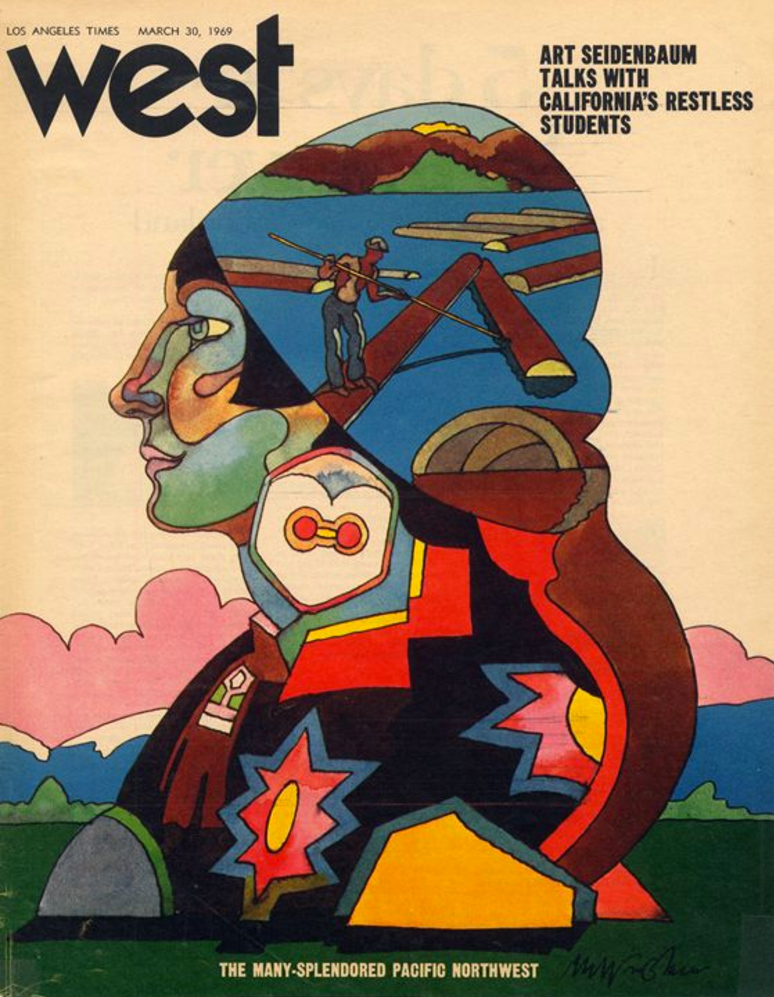
In the late 1960s, a coun­ter­cul­ture-mind­ed media pro­fes­sion­al could sure­ly have imag­ined more appeal­ing places to work than the Los Ange­les Times. Wide­ly derid­ed as the offi­cial organ of the South­ern Cal­i­for­nia Bab­bitt, the paper also put out a bland Sun­day sup­ple­ment called West mag­a­zine. But West had the poten­tial to evolve into some­thing more vital — or so seemed to think its edi­tor, Jim Bel­lows. The cre­ator of “the orig­i­nal New York mag­a­zine in the ear­ly 1960s,” writes Design Observer’s Steven Heller, Bel­lows con­vinced a young adman named Mike Sal­is­bury, “who worked for Car­son Roberts Adver­tis­ing in L.A. (where Ed Ruscha and Ter­ry Gilliam worked), to accept the job as art direc­tor.”

Sal­is­bury inject­ed West “with such an abun­dance of pop cul­ture visu­al rich­ness that it was more like a minia­ture muse­um than week­ly gazette.” Its week­ly issues “cov­ered a wide range of themes — most­ly reflect­ing Salisbury’s insa­tiable curiosi­ties — from a fea­ture on bas­ket­ball that illus­trat­ed the tremen­dous size of cen­ter for­wards by show­ing a life-size pho­to­graph of Wilt Chamberlin’s Con­verse sneak­er, to a pic­to­r­i­al his­to­ry of movie star pin­ups with a bevy of gor­geous sil­hou­ettes fan­ning on the page, to an array of souped-up VW Bee­tles in all shapes and sizes.”

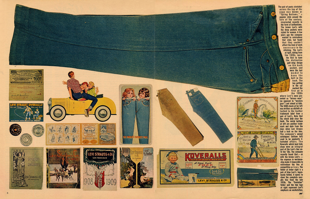
On any giv­en Sun­day, sub­scribers might find them­selves treat­ed to “the his­to­ry of Mick­ey Mouse, Coca-Cola art (the first time it was pub­lished as ‘art’), the visu­al his­to­ry of Levis, Hol­ly­wood gar­den apart­ments, Ray­mond Chan­dler loca­tions, and Kus­tom Kars.”

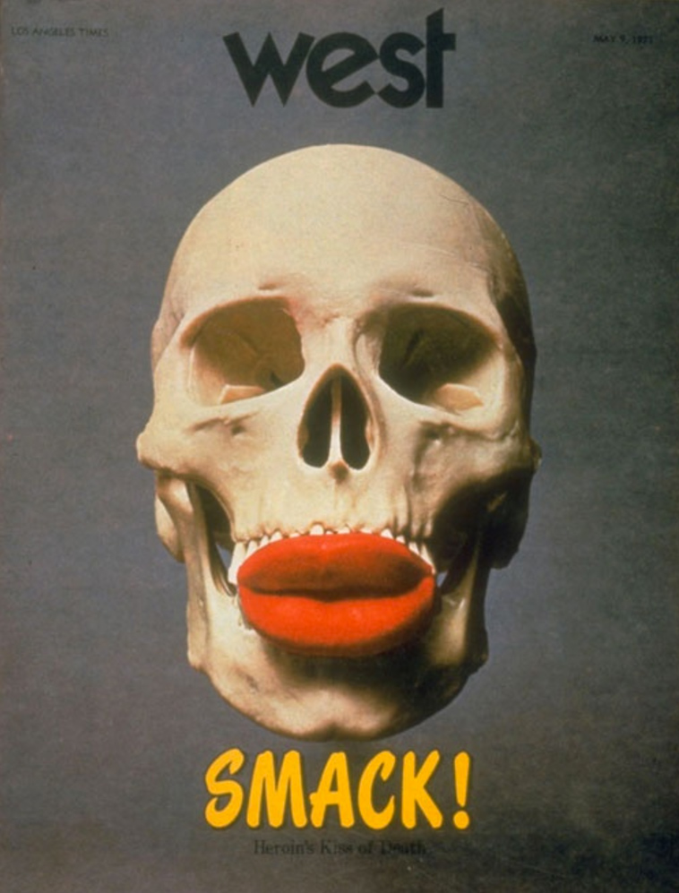
“I was the writer on the Coca-Cola ‘art’ piece as well as the first ‘pro­gram­mat­ic’ archi­tec­ture arti­cle to see print,” says a com­menter under the Design Observ­er ret­ro­spec­tive named Lar­ry Dietz. He also claims to have writ­ten the fea­ture on Ray­mond Chan­dler’s Los Ange­les; much lat­er, he adds, Chi­na­town screen­writer “Robert Towne said that he was inspired to learn about L.A. his­to­ry from that piece, but that the writ­ing was crap­py.” But then, the main impact of Sal­is­bury’s West was nev­er meant to be tex­tu­al. Heller quotes Sal­is­bury as say­ing that “design was not my sole objec­tive: cin­e­ma-graph­ic infor­ma­tion is a bet­ter def­i­n­i­tion.” Of all the cov­ers he designed, he remem­bers the one just above, pro­mot­ing an exposé on hero­in, as hav­ing been the most con­tro­ver­sial: “Don’t give me too much real­i­ty over Sun­day break­fast,” he heard read­ers grum­bling.


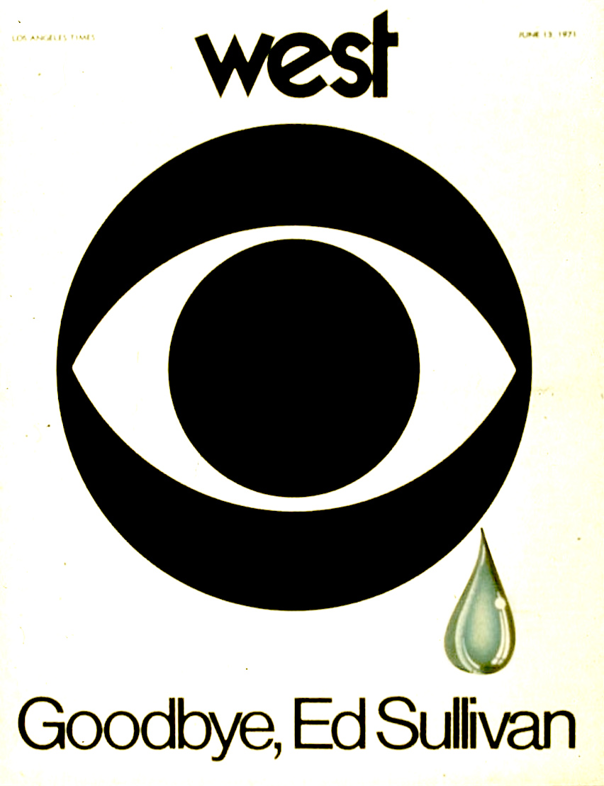
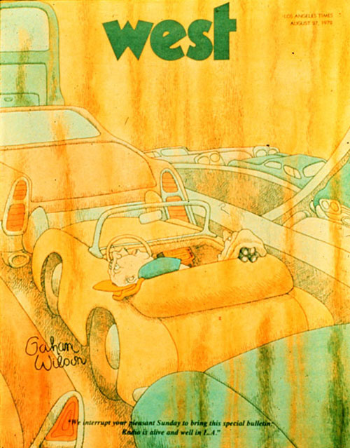
Oth­er mem­o­rable West cov­ers include the mag­a­zine’s trib­ute to the just-can­celed Ed Sul­li­van show in 1971, as well as con­tri­bu­tions by artists and design­ers like Vic­tor Moscoso, Gahan Wil­son, John Van Hamersveld, and Mil­ton Glaser, all fig­ures who did a great deal to craft the Amer­i­can zeit­geist of the 1960s and 70s. The mag­a­zine as a whole con­sol­i­dat­ed the South­ern Cal­i­forn­ian pop-cul­tur­al aes­thet­ic of its peri­od, as dis­tinct from what Sal­is­bury calls the “qua­si-Vic­to­ri­an” look and feel of San Fran­cis­co to the north and the “Roco­co or Baroque” New York to the east. Los Ange­les, to his mind, was “stream­line,” emblema­tized by the cul­ture and indus­try of motor­cy­cle cus­tomiza­tion and its “belief in Futur­ism.”

West was a prod­uct of the Los Ange­les Times under Otis Chan­dler, pub­lish­er from 1960 to 1980, who ded­i­cat­ed his career to expand­ing the scope and ambi­tion of the news­pa­per his great-grand­fa­ther had once run. His labors paid off in ret­ro­spect, espe­cial­ly from read­ers as astute as Joan Did­ion, who praised Chan­dler’s Times to the skies. But by 1972, West seemed to have become too much of an extrav­a­gance even for him. After the mag­a­zine’s can­cel­la­tion, Sal­is­bury moved on to Rolling Stone, then in the process of con­vert­ing from a news­pa­per to a mag­a­zine for­mat. No small part of that mag­a­zine’s pop-cul­tur­al pow­er in the 70s must have owed to his art direc­tion.

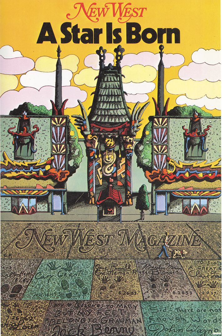
Lat­er in the decade, both Sal­is­bury and Glaser would bring their tal­ents to the just-launched New West mag­a­zine. It had no direct con­nec­tion with West or the Los Ange­les Times, but was con­ceived as the sis­ter pub­li­ca­tion of New York Mag­a­zine, which itself had been re-invent­ed by Glaser and pub­lish­er Clay Felk­er in the mid-1960s. Its debut cov­er, just above, fea­tured Glaser’s art­work; three years lat­er, in 1979, Sal­is­bury designed a cov­er on Cal­i­for­ni­a’s water cri­sis that the Amer­i­can Insti­tute of Graph­ic Arts’ Steven Brow­er calls “pre­scient.” At that same time, he notes, Sal­is­bury “worked with Fran­cis Ford Cop­po­la on the set design for Apoc­a­lypse Now; he designed Michael Jackson’s break­through album, Off the Wall,” and he even col­lab­o­rat­ed with George Har­ri­son on his epony­mous album.” But when “vet­er­an mag­a­zine art direc­tors” get togeth­er and “rem­i­nisce about the glo­ry years,” writes Heller, it’s West they inevitably talk about.

Relat­ed Con­tent:

Take a Dig­i­tal Dri­ve Along Ed Ruscha’s Sun­set Boule­vard, the Famous Strip That the Artist Pho­tographed from 1965 to 2007

Mil­ton Glaser’s Styl­ish Album Cov­ers for The Band, Nina Simone, John Cage & Many More

Down­load the Com­plete Archive of Oz, “the Most Con­tro­ver­sial Mag­a­zine of the 60s,” Fea­tur­ing R. Crumb, Ger­maine Greer & More

A Com­plete Dig­i­ti­za­tion of the 1960s Mag­a­zine Avant Garde: From John Lennon’s Erot­ic Lith­o­graphs to Mar­i­lyn Monroe’s Last Pho­tos

Down­load 50+ Issues of Leg­endary West Coast Punk Music Zines from the 1970–80s: Dam­age, Slash & No Mag

Flair Mag­a­zine: The Short-Lived, High­ly-Influ­en­tial Mag­a­zine That Still Inspires Design­ers Today (1950)

Based in Seoul, Col­in Mar­shall writes and broad­casts on cities, lan­guage, and cul­ture. His projects include the Sub­stack newslet­ter Books on Cities, the book The State­less City: a Walk through 21st-Cen­tu­ry Los Ange­les and the video series The City in Cin­e­ma. Fol­low him on Twit­ter at @colinmarshall or on Face­book.

Discover the Stettheimer Dollhouse: The 12-Room Dollhouse Featuring Miniature, Original Modernist Art by Marcel Duchamp

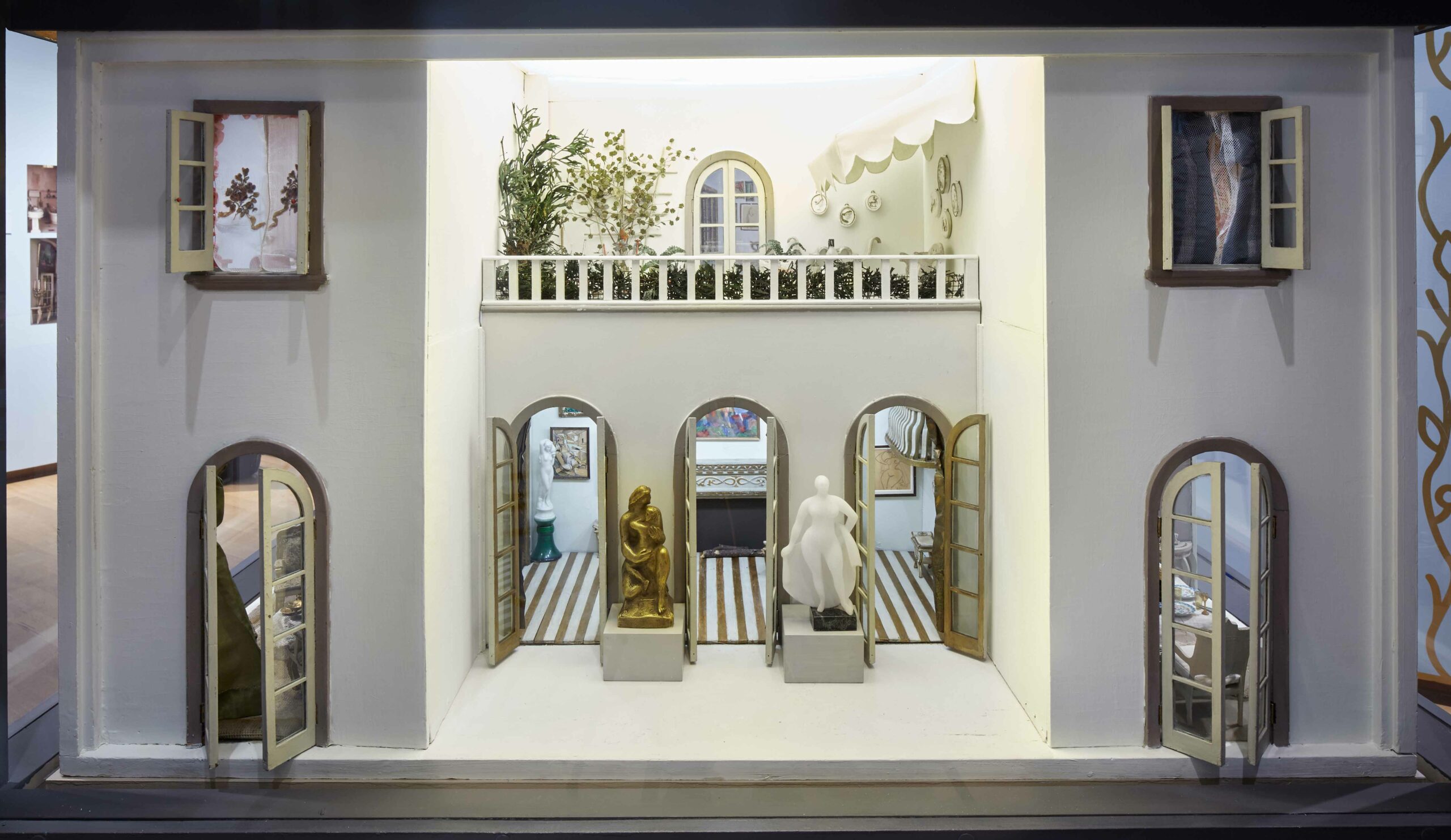
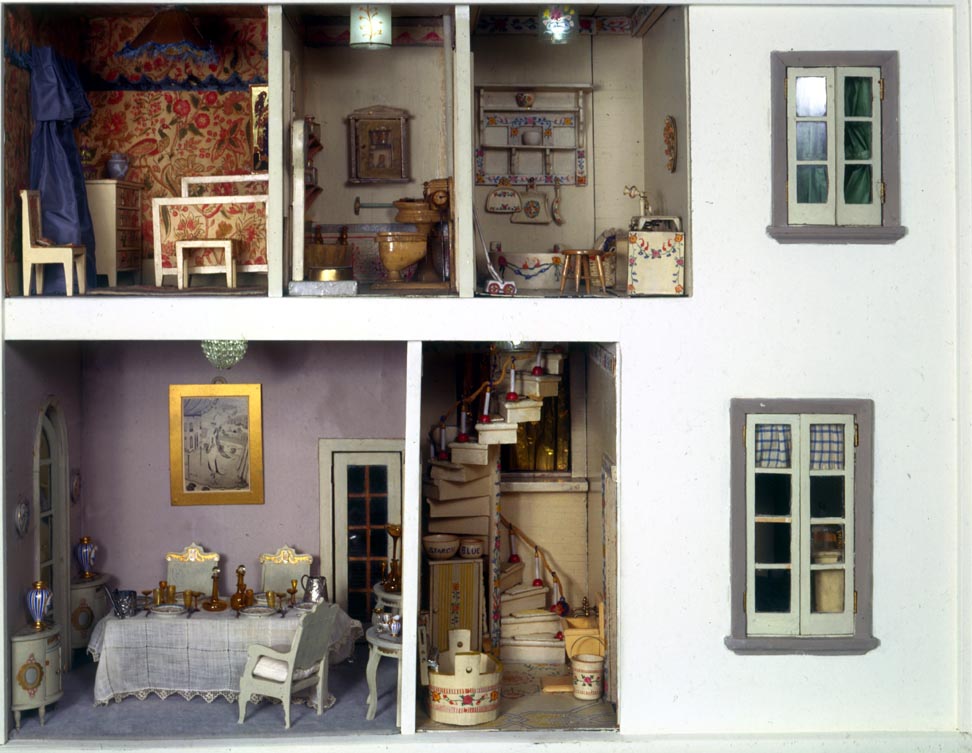
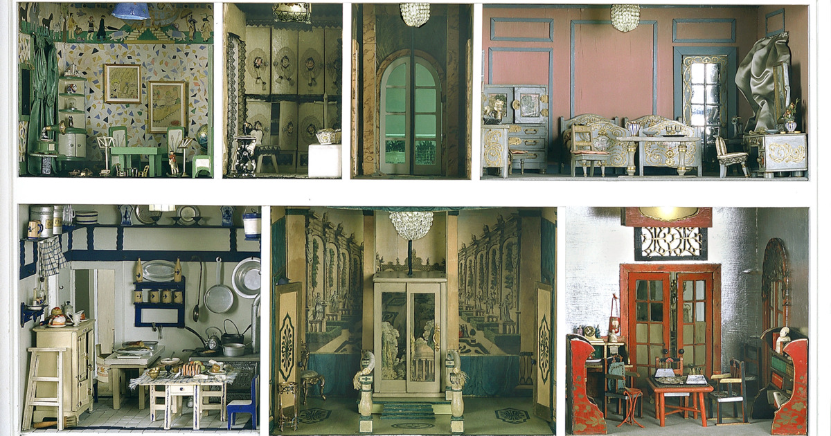
The Stet­theimer Doll­house has been wow­ing young New York­ers since it entered the Muse­um of the City of New York’s col­lec­tion in 1944.

The lux­u­ri­ous­ly appoint­ed, two-sto­ry, twelve-room house fea­tures tiny crys­tal chan­de­liers, trompe l’oeil pan­els, an itty bit­ty mah-jongg set, and a deli­cious-look­ing dessert assort­ment that would have dri­ven Beat­rix Potter’s Two Bad Mice wild.

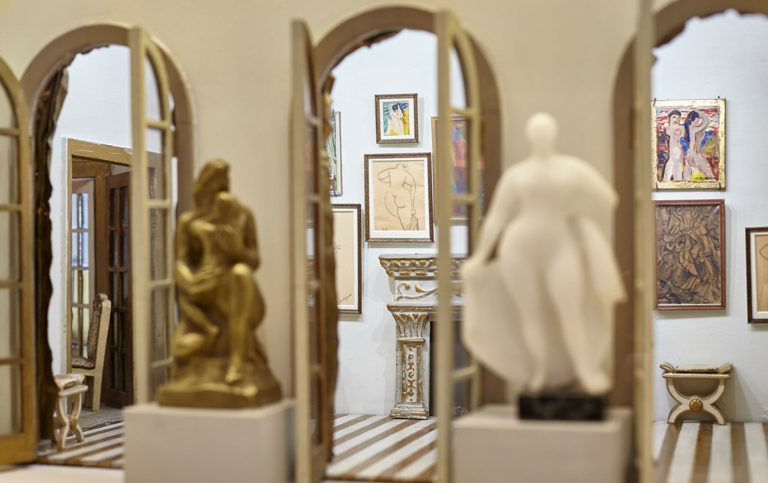
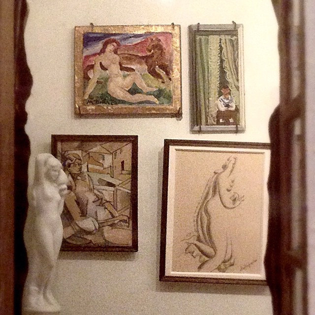
Its most aston­ish­ing fea­ture, how­ev­er, tends to go over its youngest fans’ heads — an art gallery filled with orig­i­nal mod­ernist paint­ings, draw­ings, and sculp­tures by the likes of Mar­cel DuchampGeorge Bel­lowsGas­ton Lachaise, and Mar­guerite Zorach.

The house’s cre­ator, Car­rie Wal­ter Stet­theimer, drew on her family’s close per­son­al ties to the avant-garde art world to secure these con­tri­bu­tions.

The art deal­er Paul Rosen­berg described the affin­i­ty between these artists and the three wealthy Stet­theimer sis­ters, one of whom, Florine, was her­self a mod­ernist painter:

Artists… went there and not at all mere­ly because of the indi­vid­u­al­i­ties of the trio of women and their taste­ful hos­pi­tal­i­ty. They went for the rea­son that they felt them­selves entire­ly at home with the Stetties—so the trio was called—and the Stet­ties seemed to feel them­selves entire­ly at home in their com­pa­ny. Art was an indis­pens­able com­po­nent of the mod­ern, open intel­lec­tu­al life of the place. The sis­ters felt it as a liv­ing issue. Sin­cere­ly they lived it.

Art is def­i­nite­ly part of the dollhouse’s life.

Duchamp recre­at­ed Nude Descend­ing a Stair­case, inscrib­ing the back “Pour la col­lec­tion de la poupée de Car­rie Stet­theimer à l’occasion de sa fête en bon sou­venir. Mar­cel Duchamp 23 juil­let 1918 N.Y.”

Mar­guerite Thomp­son ZorachAlexan­der Archipenko, and Paul Theve­naz also felt no com­punc­tion about fur­nish­ing a doll­house with nudes.

Louis Bouché — the “bad boy of Amer­i­can art” as per the Stet­theimers’ friend, writer and pho­tog­ra­ph­er Carl Van Vecht­en, made a tiny ver­sion of his paint­ing, Mama’s Boy.

Car­rie wrote to Gas­ton Lachaise, to thank him for two minia­ture nude draw­ings and an alabaster Venus:

My dolls and I thank you most sin­cere­ly for the love­ly draw­ings that are to grace their art gallery. I think that the dolls—after they are born, which they are not, yet—ought to be the hap­pi­est and proud­est dolls in the world as own­ers of the draw­ings and the beau­ti­ful stat­ue. I am now hop­ing that they will nev­er be born, so that I can keep them [the art works] for­ev­er in cus­tody, and enjoy them myself, while await­ing their arrival.

Car­rie worked on the doll­house from from 1916 to 1935. Her sis­ter Ettie donat­ed it to the muse­um and took it upon her­self to arrange the art­work. As Johan­na Fate­man writes in 4Columns:

Twen­ty-eight of the artists’ gifts were stored sep­a­rate­ly; Ettie select­ed thir­teen from the col­lec­tion, and her grace­ful arrange­ment became per­ma­nent, though it’s like­ly that the pieces were meant to be shown in rota­tion.

The Muse­um of the City of New York’s cur­rent exhi­bi­tion, The Stet­theimer Doll­house: Up Close, includes pho­tos of the art­works that Ettie did not choose to install.

The works that have always been on view are Mar­cel Duchamp’s Nude Descend­ing a Stair­case, Alexan­der Archipenko’s Nude, Louis Bouche’s Mama’s Boy, Gas­ton Lachaise’s Venus and two nudesCarl Sprinchorn’s Dancers, Albert Gleizes’ Seat­ed Fig­ure and Bermu­da Land­scape, Paul Thevenaz’s L’Ombre and Nude with Flow­ing Hair, Mar­guerite Zorach’s Bather and Bathers, William Zorach’s Moth­er and Child, and a paint­ing of a ship by an unknown artist.

Relat­ed Con­tent:

The Grue­some Doll­house Death Scenes That Rein­vent­ed Mur­der Inves­ti­ga­tions

A Record Store Designed for Mice in Swe­den, Fea­tur­ing Albums by Mouse Davis, Destiny’s Cheese, Dol­ly Pars­ley & More

An Art Gallery for Ger­bils: Two Quar­an­tined Lon­don­ers Cre­ate a Mini Muse­um Com­plete with Ger­bil-Themed Art

Ayun Hal­l­i­day is an author, illus­tra­tor, the­ater mak­er and Chief Pri­ma­tol­o­gist of the East Vil­lage Inky zine.  Fol­low her @AyunHalliday.

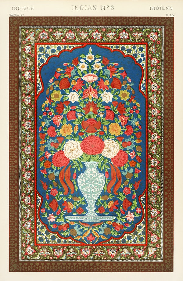
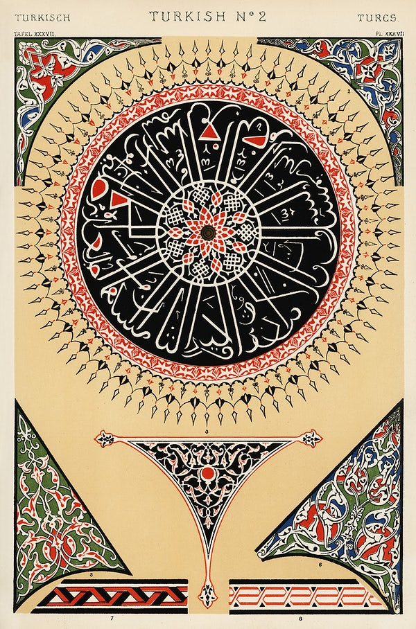
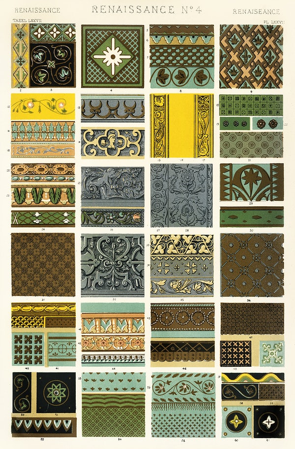
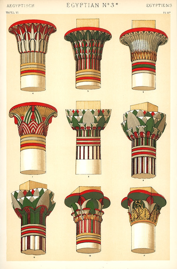
Discover The Grammar of Ornament, One of the Great Color Books & Design Masterpieces of the 19th Century

In the mid-17th cen­tu­ry, young Eng­lish­men of means began to mark their com­ing of age with a “Grand Tour” across the Con­ti­nent and even beyond. This allowed them to take in the ele­ments of their civ­i­liza­tion­al her­itage first-hand, espe­cial­ly the arti­facts of clas­si­cal antiq­ui­ty and the Renais­sance. After com­plet­ing his archi­tec­tur­al stud­ies, a Lon­don­er named Owen Jones embarked upon his own Grand Tour in 1832, rather late in the his­to­ry of the tra­di­tion, but ide­al tim­ing for the research that inspired the project that would become his lega­cy.

Accord­ing to the Vic­to­ria and Albert Muse­um, Jones vis­it­ed “Italy, Greece, Egypt and Turkey before arriv­ing in Grana­da, in Spain to car­ry out stud­ies of the Alham­bra Palace that were to cement his rep­u­ta­tion.”

He and French archi­tect Jules Goury, “the first to study the Alham­bra as a mas­ter­piece of Islam­ic design,” pro­duced “hun­dreds of draw­ings and plas­ter casts” of the his­tor­i­cal, cul­tur­al, and aes­thet­ic palimpsest of a build­ing com­plex. The fruit of their labors was the book Plans, Ele­va­tions, Sec­tions and Details of the Alham­bra, “one of the most influ­en­tial pub­li­ca­tions on Islam­ic archi­tec­ture of all time.”

Pub­lished in the 1840s, the book pushed the print­ing tech­nolo­gies of the day to their lim­its. In search of a way to do jus­tice to “the intri­cate and bright­ly col­ored dec­o­ra­tion of the Alham­bra Palace,” Jones had to put in more work research­ing “the then new tech­nique of chro­molith­o­g­ra­phy — a method of pro­duc­ing mul­ti-col­or prints using chem­i­cals.” In the fol­low­ing decade, he would make even more ambi­tious use of chro­molith­o­g­ra­phy — and draw from a much wider swath of world cul­ture — to cre­ate his print­ed mag­num opus, The Gram­mar of Orna­ment.

With this book, Jones “set out to reac­quaint his col­leagues with the under­ly­ing prin­ci­ples that made art beau­ti­ful,” write Met­ro­pol­i­tan Muse­um of Art cura­tor Femke Speel­berg and librar­i­an Robyn Flem­ing. “Instead of writ­ing an aca­d­e­m­ic trea­tise on the sub­ject, he chose to assem­ble a book of one hun­dred plates illus­trat­ing objects and pat­terns from around the world and across time, from which these prin­ci­ples could be dis­tilled.” To accom­plish this he drew on his own trav­el expe­ri­ences as well as resources clos­er at hand, includ­ing “the muse­o­log­i­cal and pri­vate col­lec­tions that were avail­able to him in Eng­land, and the objects that had been on dis­play dur­ing the Uni­ver­sal Exhi­bi­tions held in Lon­don in 1851 and 1855.”

The Gram­mar of Orna­ment was pub­lished in 1856, emerg­ing into a Britain “dom­i­nat­ed by his­tor­i­cal revivals such as Neo­clas­si­cism and the Goth­ic Revival,” says the V&A. “These design move­ments were rid­dled with reli­gious and social con­no­ta­tions. Instead, Owen Jones sought a mod­ern style with none of this cul­tur­al bag­gage. Set­ting out to iden­ti­fy the com­mon prin­ci­ples behind the best exam­ples of his­tor­i­cal orna­ment, he for­mu­lat­ed a design lan­guage that was suit­able for the mod­ern world, one which could be applied equal­ly to wall­pa­pers, tex­tiles, fur­ni­ture, met­al­work and inte­ri­ors.”

Indeed, the pat­terns so lav­ish­ly repro­duced in the book soon became trends in real-world design. They weren’t always employed with the intel­lec­tu­al under­stand­ing Jones sought to instill, but since The Gram­mar of Orna­ment has nev­er gone out of print (and can even be down­loaded free from the Inter­net Archive), his prin­ci­ples remain avail­able for all to learn — and his painstak­ing­ly artis­tic print­ing work remains avail­able for all to admire — even in the cor­ners of the world that lay beyond his imag­i­na­tion.

You can pur­chase a com­plete and unabridged col­or edi­tion of The Gram­mar of Orna­ment online.

Relat­ed Con­tent:

The Com­plex Geom­e­try of Islam­ic Art & Design: A Short Intro­duc­tion

Explore the Beau­ti­ful Pages of the 1902 Japan­ese Design Mag­a­zine Shin-Bijut­sukai: Euro­pean Mod­ernism Meets Tra­di­tion­al Japan­ese Design

A Beau­ti­ful 1897 Illus­trat­ed Book Shows How Flow­ers Become Art Nou­veau Designs

The Bauhaus Book­shelf: Down­load Orig­i­nal Bauhaus Books, Jour­nals, Man­i­festos & Ads That Still Inspire Design­ers World­wide

Every Page of Depero Futur­ista, the 1927 Futur­ist Mas­ter­piece of Graph­ic Design & Book­mak­ing, Is Now Online

Based in Seoul, Col­in Mar­shall writes and broad­casts on cities, lan­guage, and cul­ture. His projects include the Sub­stack newslet­ter Books on Cities, the book The State­less City: a Walk through 21st-Cen­tu­ry Los Ange­les and the video series The City in Cin­e­ma. Fol­low him on Twit­ter at @colinmarshall or on Face­book.

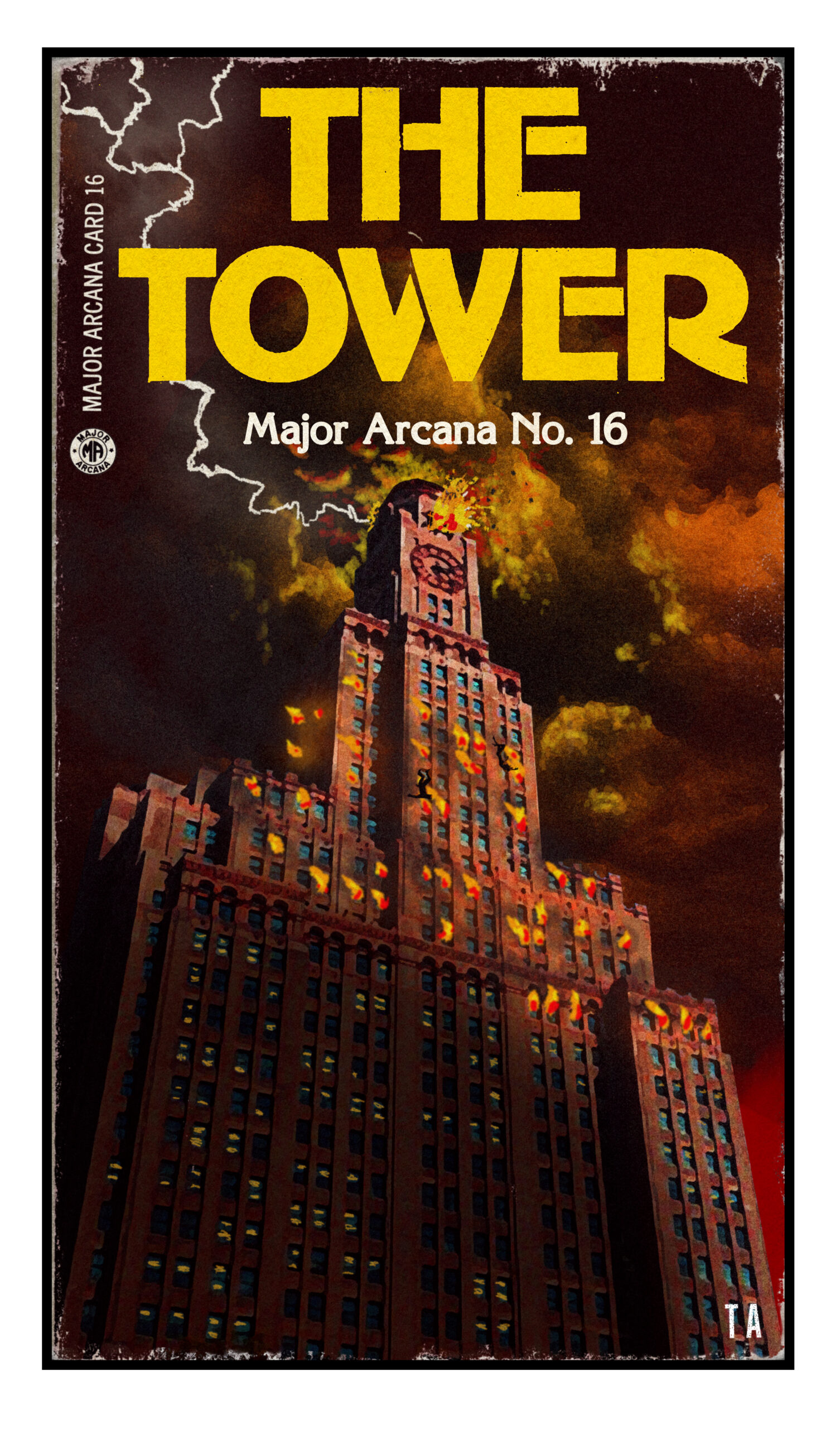
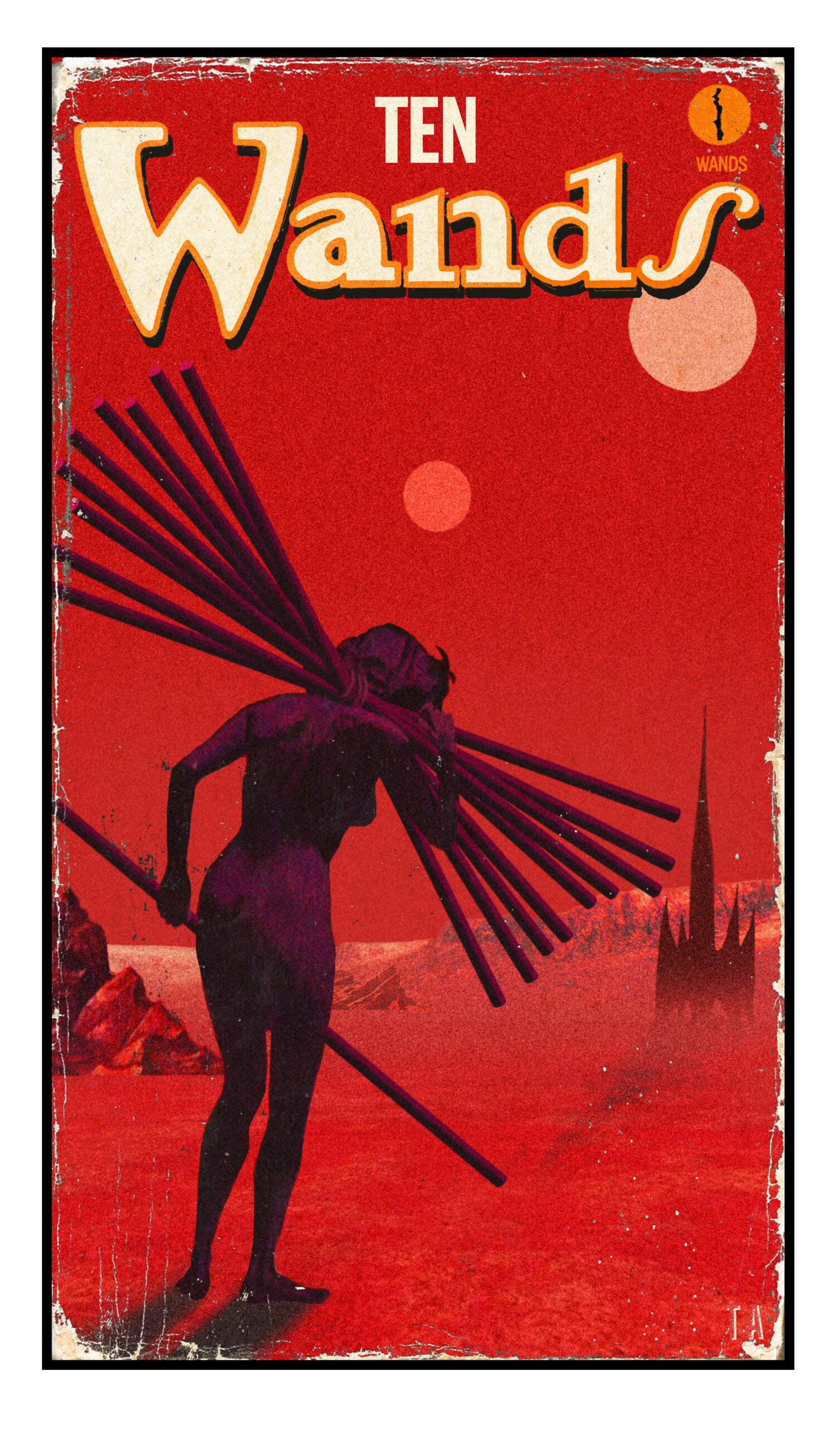
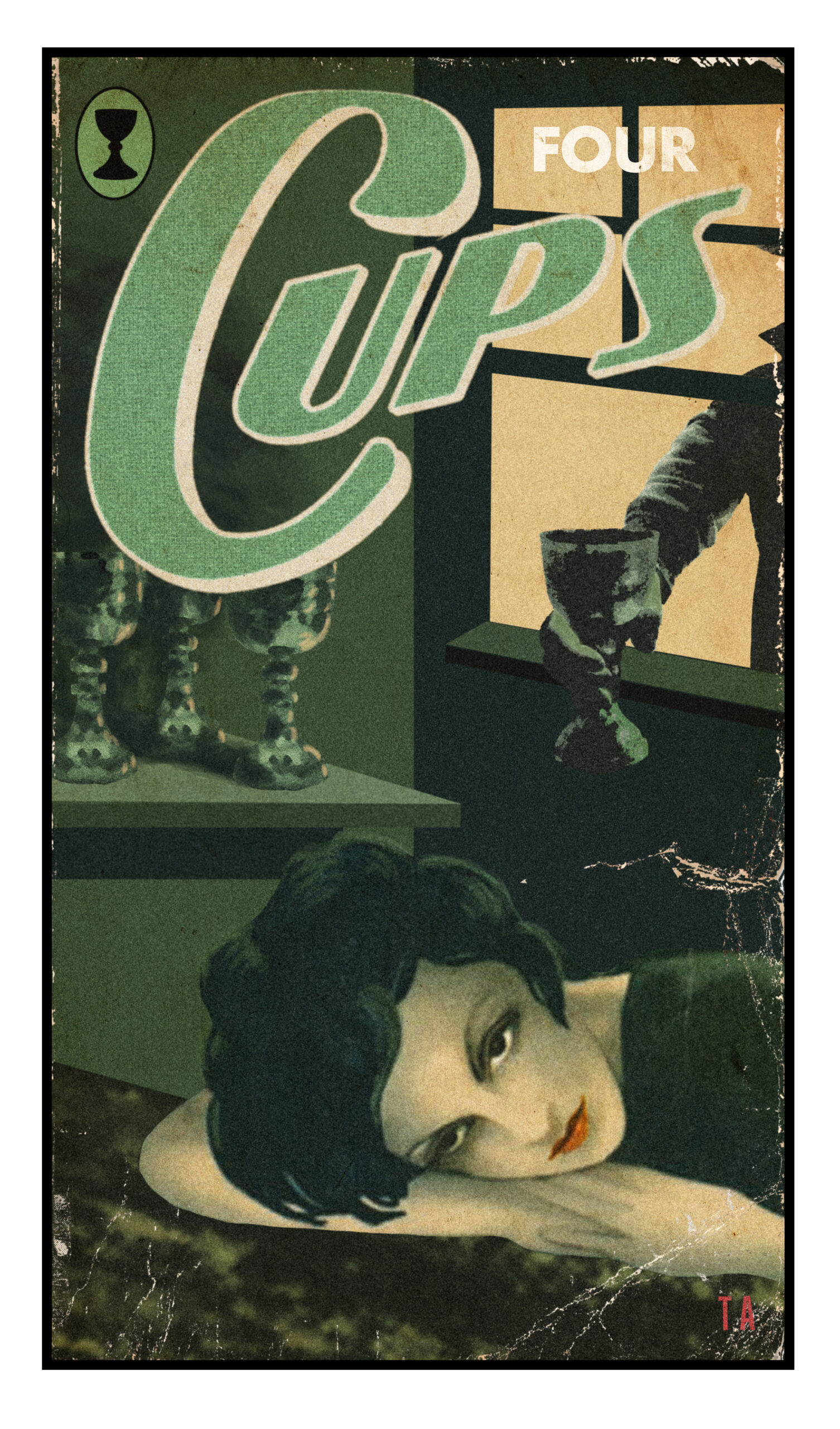
The Pulp Tarot: A New Tarot Deck Inspired by Midcentury Pulp Illustrations

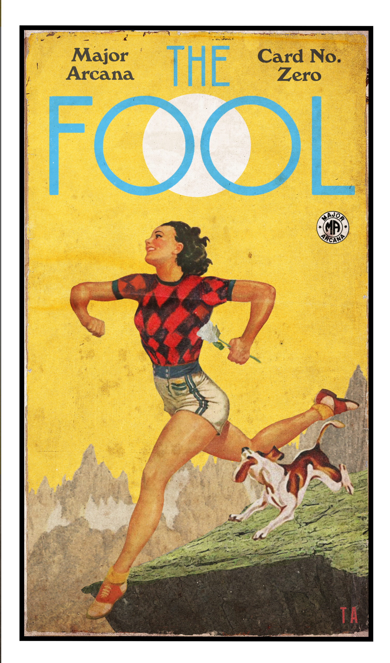
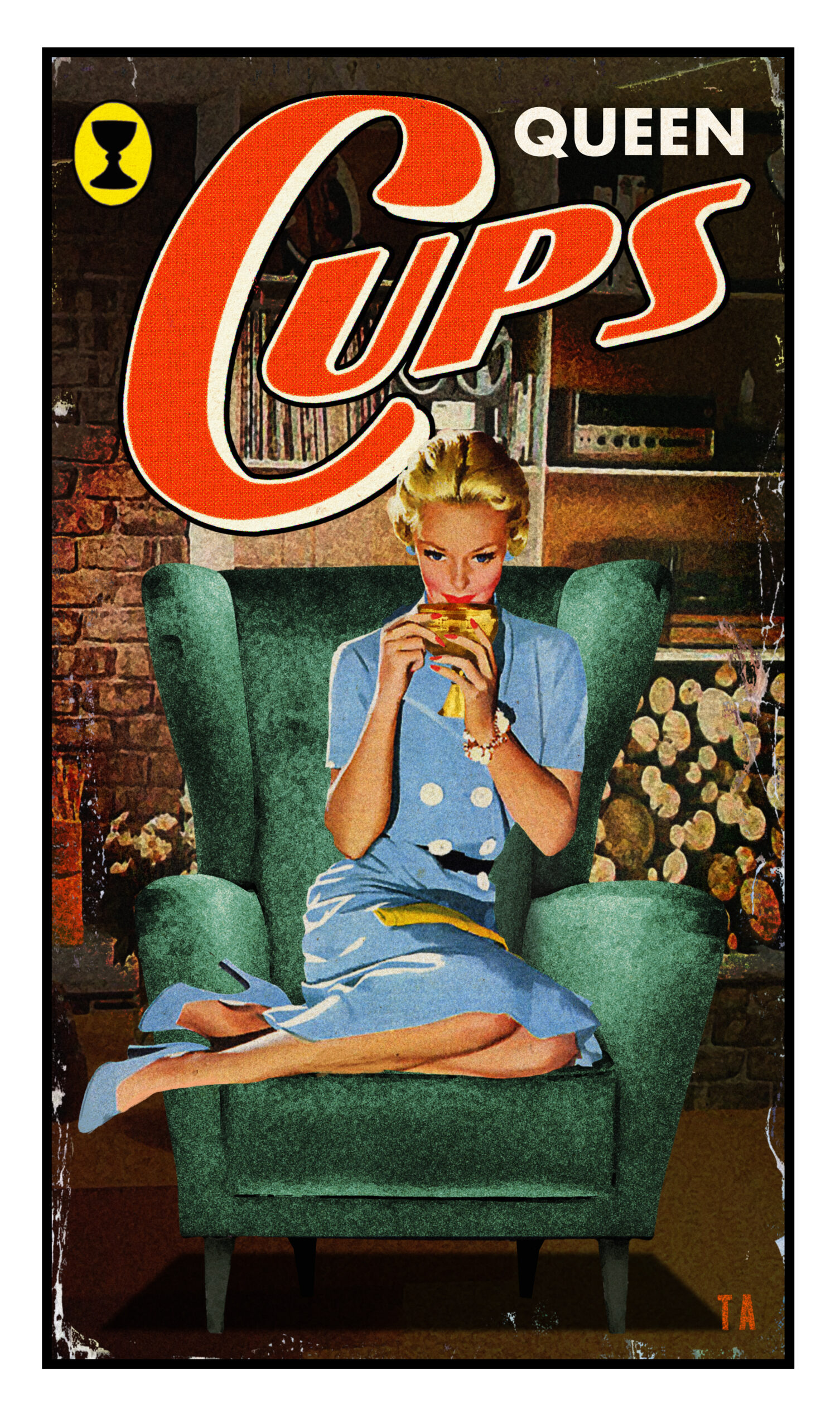
Graph­ic artist Todd Alcott has endeared him­self to Open Cul­ture read­ers by retro­fitting mid­cen­tu­ry pulp paper­back cov­ers and illus­tra­tions with clas­sic lyrics from the likes of David BowiePrinceBob Dylan, and Talk­ing Heads.

Although he’s dab­bled in the abstrac­tions that once graced the cov­ers of psy­chol­o­gy, phi­los­o­phy, and sci­ence texts, his over­ar­ch­ing attrac­tion to the visu­al lan­guage of sci­ence fic­tion and illic­it romance speak to the pre­mi­um he places on nar­ra­tive.

And with hun­dreds of “mid-cen­tu­ry mashups” to his name, he’s become quite a mas­ter of bend­ing exist­ing nar­ra­tives to his own pur­pos­es.

Recent­ly, Alcott turned his atten­tion to the cre­ation of the Pulp Tarot deck he is fund­ing on Kick­starter.

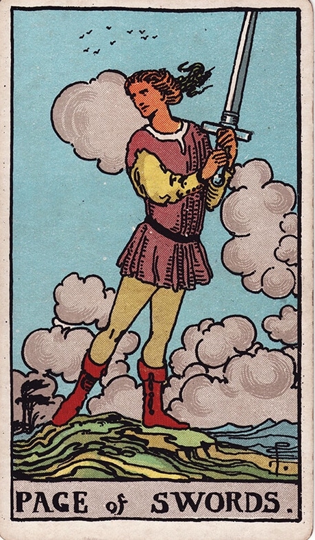
A self-described “clear-eyed skep­tic as far as para­nor­mal things” go, Alcott was drawn to the “sim­plic­i­ty and strange­ness” of Pamela Col­man Smith’s “bewitch­ing” Tarot imagery:

Maybe because they were sim­ply the first ones I saw, I don’t know, but there is some­thing about the nar­ra­tive thread that runs through them, the way they delin­eate the devel­op­ment of the soul, with all the choic­es and crises a soul encoun­ters on its way to ful­fill­ment, that real­ly struck a chord with me. You lay out enough Tarot spreads and they even­tu­al­ly coa­lesce around a hand­ful of cards that real­ly seem to define you. I don’t know how it hap­pens, but it does, every time: there are cards that come up for you so often that you think, “Yep, that’s me,” and then there are oth­ers that turn up so rarely that, when they do come up, you have to look them up in the lit­tle book­let because you’ve nev­er seen them before.

One such card for Alcott is the Page of Swords. In the ear­ly 90s, curi­ous to know what the Tarot would have to say about the young woman he’d start­ed dat­ing, he shuf­fled and cut his Rid­er-Waite-Smith deck “until some­thing inside said “now” and he flipped over the Page of Swords:

I looked it up in the book­let, which said that the Page of Swords was a secret-keep­er, like a spy. I thought about that for a moment; the woman I was see­ing was noth­ing like a spy, and had no spy-like attrib­ut­es. I shrugged and began the process again, shuf­fling and cut­ting and shuf­fling and cut­ting, until, again, some­thing inside said “now,” and turned up the card again. It was the Page of Swords, again. My heart leaped, I put the deck back in its box and qui­et­ly freaked out for a while. The next day, I asked the young lady if the Page of Swords meant any­thing to her, and she said “Oh sure, when I was a kid, that was my card.” Any­way, I’m now mar­ried to her.

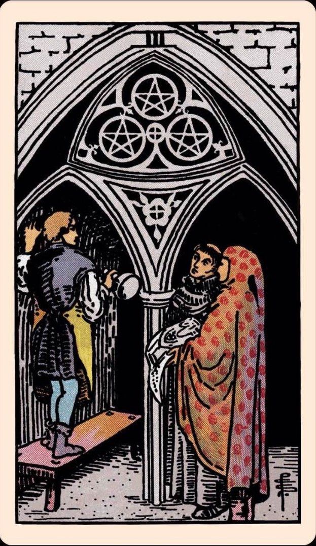
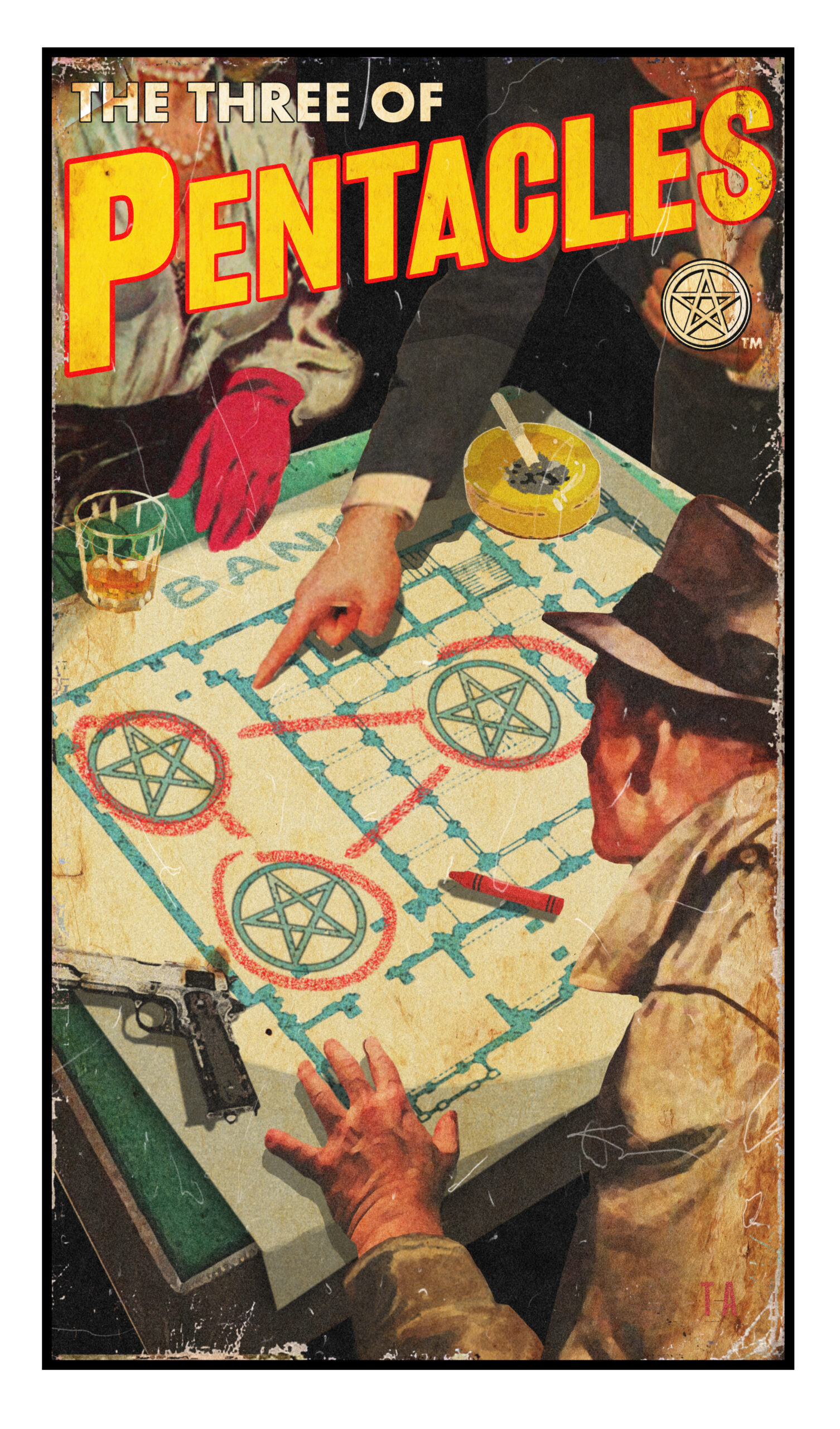
The Three of Pen­ta­cles is anoth­er favorite, one that pre­sent­ed a par­tic­u­lar design chal­lenge.

The Smith deck shows a stone­ma­son, an archi­tect and a church offi­cial, col­lab­o­rat­ing on build­ing a cathe­dral. Now, there are no cathe­drals in the pulp world, so I had to think, well, in the pulp world, pen­ta­cles rep­re­sent mon­ey, so the obvi­ous choice would be to show three crim­i­nals plan­ning a heist. I could­n’t find an image any­thing close to the one in my head, so I had to build it: the room, the table, the map of the bank, the plan, the peo­ple involved, and then stitch it all togeth­er in Pho­to­shop so it end­ed up look­ing like a cohe­sive illus­tra­tion. That was a real­ly joy­ful moment for me: there were the three con­spir­a­tors, the Big Cheese, the Dame and The Goon, their roles clear­ly defined despite not see­ing any­one’s face. It was a real break­through, see­ing that I could put togeth­er a lit­tle nar­ra­tive like that.

Smith imag­ined a medieval fan­ta­sy world when design­ing her Tarot deck. Alcott is draw­ing on 70 years of pop-cul­ture ephemera to cre­ate a trib­ute to Smith’s vision that also works as a deck in their own right “with its own moral nar­ra­tive uni­verse, based on the atti­tudes and con­ven­tions of that world.”

Before draft­ing each of his 70 cards, Alcott stud­ied Smith’s ver­sion, research­ing its mean­ing and design as he con­tem­plates how he might trans­late it into the pulp ver­nac­u­lar. He has found that some of Smith’s work was delib­er­ate­ly exact­ing with regard to col­or, atti­tude, and cos­tume, and oth­er instances where spe­cif­ic details took a back seat to mood and emo­tion­al impact:

Once I under­stand what a card is about, I look through my library to find images that help get that across. It can get real­ly com­pli­cat­ed! A lot of times, the char­ac­ter’s body is in the right posi­tion but their face has the wrong expres­sion, so I have to find a face that fits what the card is try­ing to say. Or their phys­i­cal atti­tude is right, but I need them to be grip­ping or throw­ing some­thing, so I have to find hands and arms that I can graft on, Franken­stein style. In some cas­es, there will be fig­ures in the cards cob­bled togeth­er from five or six dif­fer­ent sources. 

These cards are eas­i­ly the most com­plex work I’ve ever done in that sense. The song pieces I do are a con­ver­sa­tion between the piece and the song, but these cards are a con­ver­sa­tion between me, Smith, the entire Tarot tra­di­tion, and the uni­verse. 

Vis­it Todd Alcott’s Etsy shop to view more of his mid-cen­tu­ry mash ups, and see more cards from The Pulp Tarot and sup­port Kick­starter here.

All images from the Pulp Tarot used with the per­mis­sion of artist Todd Alcott.

Relat­ed Con­tent:

Clas­sic Songs Re-Imag­ined as Vin­tage Book Cov­ers Dur­ing Our Trou­bled Times: “Under Pres­sure,” “It’s the End of the World as We Know It,” “Shel­ter from the Storm” & More

David Bowie Songs Reimag­ined as Pulp Fic­tion Book Cov­ers: Space Odd­i­ty, Heroes, Life on Mars & More

Songs by Joni Mitchell Re-Imag­ined as Pulp Fic­tion Book Cov­ers & Vin­tage Movie Posters

Four Clas­sic Prince Songs Re-Imag­ined as Pulp Fic­tion Cov­ers: When Doves Cry, Lit­tle Red Corvette & More

Ayun Hal­l­i­day is an author, illus­tra­tor, the­ater mak­er and Chief Pri­ma­tol­o­gist of the East Vil­lage Inky zine.  Fol­low her @AyunHalliday.

Google’s UX Design Professional Certificate: 7 Courses Will Help Prepare Students for an Entry-Level Job in 6 Months

Dur­ing the pan­dem­ic, Google launched a series of Career Cer­tifi­cates that will “pre­pare learn­ers for an entry-lev­el role in under six months.” One such cer­tifi­cate focus­es on User Expe­ri­ence Design, or what’s called UX Design, the process design teams use to cre­ate prod­ucts that pro­vide mean­ing­ful expe­ri­ences to users.

Offered on the Cours­era plat­form, the User Expe­ri­ence (UX) Design Pro­fes­sion­al Cer­tifi­cate fea­tures sev­en cours­es, includ­ing the Foun­da­tions of User Expe­ri­ence, Start the UX Design Process, Build Wire­frames and Low-Fideli­ty Pro­to­types, and Con­duct UX Research and Test Ear­ly Con­cepts. In total, this pro­gram “includes over 200 hours of instruc­tion and hun­dreds of prac­tice-based activ­i­ties and assess­ments that sim­u­late real-world UX design sce­nar­ios and are crit­i­cal for suc­cess in the work­place. The con­tent is high­ly inter­ac­tive and devel­oped by Google employ­ees with decades of expe­ri­ence in UX design.” Upon com­ple­tion, stu­dents can direct­ly apply for jobs with Google and over 130 U.S. employ­ers, includ­ing Wal­mart, Best Buy, and Astreya. You can start a 7‑day free tri­al and explore the cours­es. If you con­tin­ue beyond that, Google/Coursera will charge $39 USD per month. That trans­lates to about $235 after 6 months.

Explore the User Expe­ri­ence (UX) Design Pro­fes­sion­al Cer­tifi­cate by watch­ing the video above. Learn more about the over­all Google career cer­tifi­cate ini­tia­tive here. And find oth­er Google pro­fes­sion­al cer­tifi­cates here.

Note: Open Cul­ture has a part­ner­ship with Cours­era. If read­ers enroll in cer­tain Cours­era cours­es and pro­grams, it helps sup­port Open Cul­ture.

Relat­ed Con­tent:

Online Degrees & Mini Degrees: Explore Mas­ters, Mini Mas­ters, Bach­e­lors & Mini Bach­e­lors from Top Uni­ver­si­ties.

Google Intro­duces 6‑Month Career Cer­tifi­cates, Threat­en­ing to Dis­rupt High­er Edu­ca­tion with “the Equiv­a­lent of a Four-Year Degree”

Cours­era and Google Launch an Online Cer­tifi­cate Pro­gram to Help Stu­dents Become IT Pro­fes­sion­als & Get Attrac­tive Jobs

« Go BackMore in this category... »
Quantcast
Open Culture was founded by Dan Colman.