Ergonomics Experts Explain How to Set Up Your Desk

Ergonom­ics aren’t a joke, Jim. â€” Dwight Schrute, The Office

Tech­no­log­i­cal inno­va­tions are snow­balling faster than ever in the third decade of the 21st-cen­tu­ry. A home office set-up that would have been cause for pride in 2019 seems woe­ful­ly inad­e­quate now.

Just ask any­one whose desk job piv­ot­ed to vir­tu­al in March of 2020.

So, per­haps don’t take phys­i­cal ther­a­pist’s Jon Cinkay’s near­ly three year old advice in the above Wall Street Jour­nal video as gospel, but rather as a chance to check in with your carpal tun­nels, your aching neck and back, and your favorite refur­bished office fur­ni­ture out­let.

Cinkay assumes that your desk is a stan­dard 29 — 30” tall, which is not the case here, but okay…

Our bod­ies’ unique dimen­sions mean that no desk can be a one-size-fits-all propo­si­tion, and Cinkay makes a robust case for mak­ing mod­i­fi­ca­tions:

1. Adjust your desk chair

Cinkay rec­om­mends adjust­ing the seat height until your elbows are bent at a 90-degree angle when your fin­gers are on the key­board. (As of this writ­ing, key­boards have not yet become obso­lete.)

In a 2020 arti­cle for the Hos­pi­tal of Spe­cial Surgery, he also rec­om­mends mak­ing sure your chair’s arm­rests can fit under your desk to avoid pos­tur­al com­pro­mis­es when reach­ing for your key­board or mouse.

He also wise­ly advis­es look­ing for a chair with a min­i­mum 30-day war­ran­ty so you don’t get stuck with an expen­sive mis­take.

2. Con­sid­er a foot­stool

If crank­ing your desk chair to the per­fect height leaves your feet dan­gling, you’ll need a foot­stool to help your knees main­tain a prop­er 90-degree bend. If you can’t invest in a high tech adjustable foot­stool, a ream of paper will do in a pinch.

Tech expert David Zhang, who we’ll hear from soon below, rests his cute striped socks on a yoga mat.

Who among us does not have dozens of things that could be pressed into ser­vice as a foot­stool?

I am left to pon­der the fate of the dec­o­ra­tive needle­point­ed foot­stools my late grand­moth­er and her sis­ters scat­tered around their liv­ing rooms.

Can an actu­al foot­stool be con­sid­ered a foot­stool hack?

3. Adjust the height of your mon­i­tor 

To avoid neck pain, use a mon­i­tor stand to posi­tion the top of the screen lev­el with your eyes. If you’re work­ing with a lap­top, you’ll need a stand, a sep­a­rate key­board and and a mouse.

Cinkay’s mon­i­tor stand hack is — you guessed it — a ream of paper.

Mine is 5000 Years of the Art of India which is about the same thick­ness as a ream of paper and was in easy reach at the library where I work.

To judge by some of the com­ments on Cinkay’s Wall Street Jour­nal video, his key­board dates to the Stone Age.

What­ev­er his key­board vin­tage, the afore­men­tioned arti­cle did sug­gest gel wrist rests to relieve pres­sure on the sen­si­tive carpal tun­nel area, but watch out! Zhang is not a fan!

4. Get a Head­set

Leav­ing aside the fact that the phone in ques­tion appears to be a land­line, a head­set allows you to keep your head on straight, thus min­i­miz­ing neck and shoul­der pain.

5. Remem­ber that you’re not chained to your desk

Of all the ergonom­ic advice offered above, this seems like­li­est to remain ever­green.

Take a snack break, a water break, a bath­room break, and while you’re at it toss in a cou­ple of the stretch­es Cinkay rec­om­mends.

(The Mayo Clin­ic has more, includ­ing our favorite shoul­der stretch.)

Zhang’s desk-cen­tric video was uploaded in 2017, when key­board trays were already becom­ing a rel­ic of a bygone era. 

As men­tioned, he’s anti-wrist rest. If your wrists are in need of sup­port, and they are, get a palm rest!

Zhang’s also crit­i­cal of draw­ers and — unusu­al for 2017 — stand­ing desks though like Cirkay, he’s a big fan of stand­ing up and mov­ing around.

His video descrip­tion includes some com­mon sense, ass-cov­er­ing encour­age­ment for view­ers with irreg­u­lar symp­toms or pain to seek pro­fes­sion­al help. We think this means med­ical pro­fes­sion­al, though unsur­pris­ing­ly, ergonom­ic assess­ment is a fast grow­ing field. It’s expen­sive but pos­si­bly costs less in the long run than rush­ing out to buy what­ev­er a stranger on the inter­net tells you to.

To that end, we appre­ci­ate Zhang’s trans­paren­cy regard­ing his channel’s par­tic­i­pa­tion in the Ama­zon Ser­vices LLC Asso­ciates affil­i­ate adver­tis­ing pro­gram.

Caveat emp­tor!

Relat­ed Con­tent 

Why Sit­ting Is The New Smok­ing: An Ani­mat­ed Expla­na­tion

Who Wrote at Stand­ing Desks? Kierkegaard, Dick­ens and Ernest Hem­ing­way Too

Behold the Elab­o­rate Writ­ing Desks of 18th Cen­tu­ry Aris­to­crats

- Ayun Hal­l­i­day is the Chief Pri­ma­tol­o­gist of the East Vil­lage Inky zine and author, most recent­ly, of Cre­ative, Not Famous: The Small Pota­to Man­i­festo.  Fol­low her @AyunHalliday.

The Rembrandt Book Bracelet: Behold a Functional Bracelet Featuring 1400 Rembrandt Drawings

Admit­ted­ly jew­el­ry is not one of our areas of exper­tise, but when we hear that a bracelet costs €10,000, we kind of expect it to have a smat­ter­ing of dia­monds.

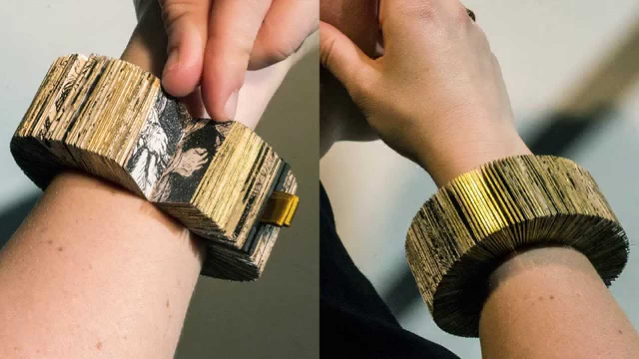
Design­ers Lyske Gais and Lia Duinker are get­ting that amount for a wrist­let com­prised chiefly of five large paper sheets print­ed with high res images down­loaded free from the Rijksmu­se­um’s exten­sive dig­i­tal archive of Rem­brandt draw­ings and etch­ings.

Your aver­age pawn­bro­ker would prob­a­bly con­sid­er its 18-karat gold clasp, or pos­si­bly the cus­tom-made wood­en box in which it can be stored when not in use the most pre­cious thing about this orna­ment.

An ardent bib­lio­phile or art lover is per­haps bet­ter equipped to see the book bracelet’s val­ue.

Each gilt edged page — 1400 in all — fea­tures an image of a hand, sourced from 303 down­loaded Rem­brandt works.

An illus­tra­tion on the design­ers’ Duinker and Dochters web­site details the painstak­ing process where­by the book­bracelet takes shape in 8‑page sec­tions, or sig­na­tures, cross stitched tight­ly along­side each oth­er on a paper band. Put it on, and you can flip through Rem­brandt hands, Rolodex-style. When you want to do the dish­es or take a show­er, just pack it flat into that cus­tom box.

Gais and Duinker also include an index, which is handy for those times when you don’t feel like hunt­ing and peck­ing around your own wrist in search of a hand that appeared in the Flute Play­er or  Christ cru­ci­fied between the two mur­der­ers.

The Rembrandt’s Hands and a Lion’s Paw bracelet, titled like a book and pub­lished in a lim­it­ed edi­tion of 10, nabbed first prize in the 2015 Rijksstu­dio Awards, a com­pe­ti­tion that chal­lenges design­ers to cre­ate work inspired by the Rijksmuseum’s col­lec­tion.

(2015’s sec­ond prize went to an assort­ment of con­serves and condi­ments that harkened to Johannes Hannot’s 1668 Still Life with Fruit. 2014’s win­ner was a palette of eye­shad­ow and some eye­lin­ers inspired by Jan Adam Kruseman’s 1833 Por­trait of Ali­da Christi­na Assink and a Leen­dert van der Cooghen sketch.)

But what about that spe­cial art lov­ing bib­lio­phile who already has every­thing, includ­ing a Rem­brandts Hands and a Lions Paw boekarm­band?

Maybe you could get them Col­lier van hond­jes, Gais and Duinker’s fol­low up to the book bracelet, a rub­ber chok­er with an attached 112-page book pen­dant show­cas­ing Rem­brandt dogs sourced from var­i­ous museum’s dig­i­tal col­lec­tions.

Pur­chase Rem­brandt’s Hands and a Lions Paw lim­it­ed edi­tion book bracelet here.

And embark on mak­ing your own improb­a­ble thing inspired by a high res image in the Rijksmu­se­um’s Rijks Stu­dio here.

via Colos­sal/Neatora­ma

– Ayun Hal­l­i­day is the Chief Pri­ma­tol­o­gist of the East Vil­lage Inky zine and cre­ator, most recent­ly of Cre­ative, Not Famous: The Small Pota­to Man­i­festo.  Fol­low her @AyunHalliday.

Japanese Researcher Sleeps in the Same Location as Her Cat for 24 Consecutive Nights!


Cross cat nap­ping with bed hop­ping and you might end up hav­ing an “adven­ture in com­fort” sim­i­lar to the one that informs stu­dent Yuri Naka­hashi’s the­sis for Tokyo’s Hosei Uni­ver­si­ty.

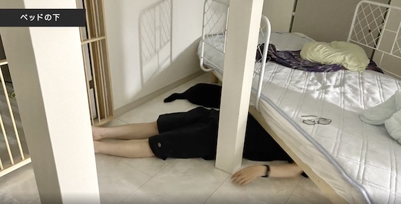
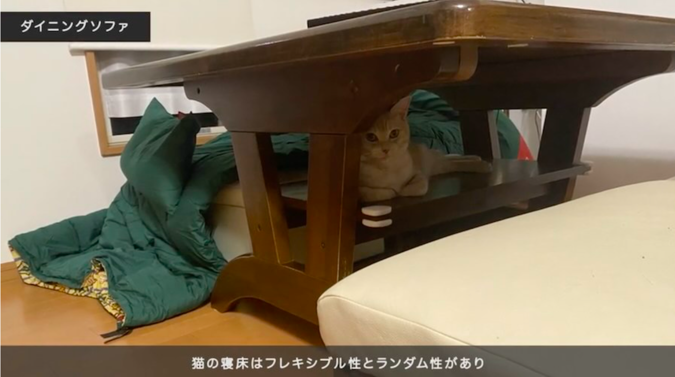
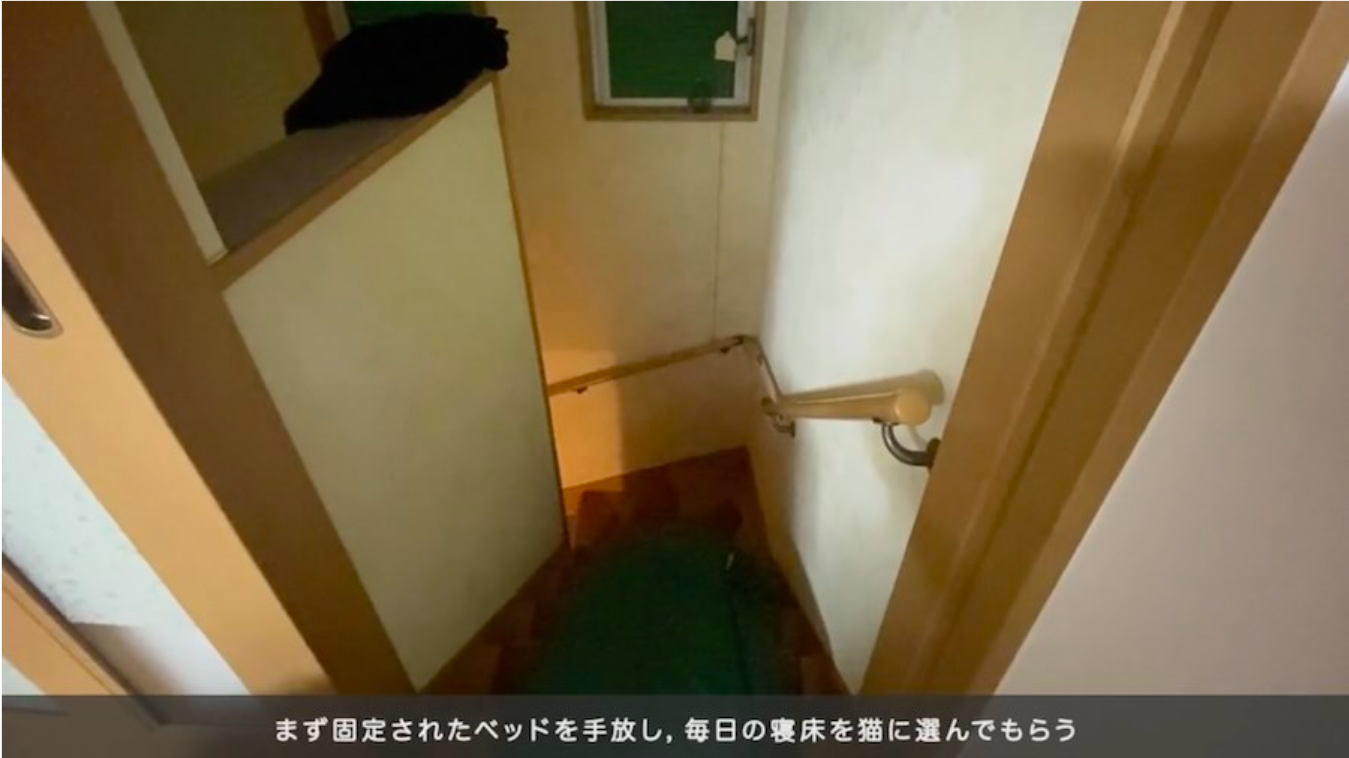
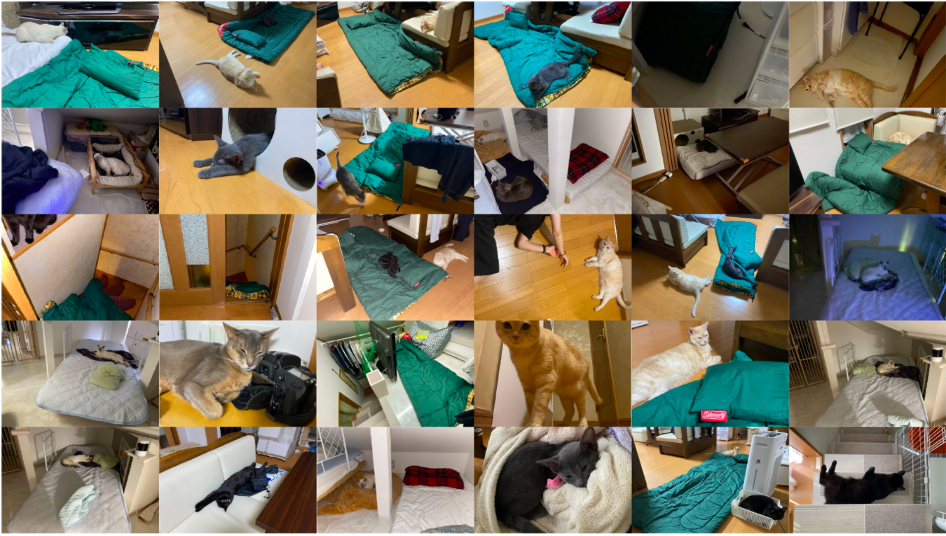
For 24 con­sec­u­tive nights, Naka­hashi for­went the com­forts of her own bed in favor of a green sleep­ing bag, unfurled in what­ev­er ran­dom loca­tion one of her five pet cats had cho­sen as its sleep­ing spot that evening.

(The choice of which cat would get the plea­sure of dic­tat­ing each night’s sleep­ing bag coor­di­nates was also ran­dom­ized.)

As the own­er of five cats, Naka­hashi pre­sum­ably knew what she was sign­ing up for…


Cats rack out atop sofa backs, on stairs, and under beds…and so did Naka­hashi.

Her pho­tos sug­gest she logged a lot of time on a bare wood­en floor.

A Fit­Bit mon­i­tored the dura­tion and qual­i­ty of time spent asleep, as well as the fre­quen­cy with which she awak­ened dur­ing the night.

She doc­u­ment­ed the phys­i­cal and psy­cho­log­i­cal effects of this exper­i­ment in an inter­ac­tive pub­lished by the Infor­ma­tion Pro­cess­ing Soci­ety of Japan.

She reports that she eager­ly await­ed the rev­e­la­tion of each night’s coor­di­nates, and that even when her sleep was dis­rupt­ed by her pets’ mid­dle of the night groom­ing rou­tines, bunk­ing next to them had a “relax­ing effect.”

Mean­while, our research sug­gests that the same exper­i­ment would awak­en a vast­ly dif­fer­ent response in a dif­fer­ent human sub­ject, one suf­fer­ing from ail­uro­pho­bia, say, or severe aller­gies to the pro­teins in feline sali­va, urine, and dan­der.

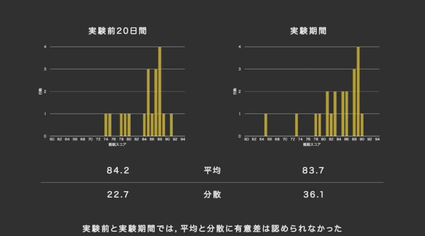
What’s real­ly sur­pris­ing about Nakahashi’s itin­er­ant, and appar­ent­ly plea­sure-filled under­tak­ing is how lit­tle dif­fer­ence there is between her aver­age sleep score dur­ing the exper­i­ment and her aver­age sleep score from the 20 days pre­ced­ing it.

At left, an aver­age sleep score of 84.2 for the 20 days lead­ing up to exper­i­ment. At right, an aver­age sleep score 83.7 dur­ing the exper­i­ment.

Nakahashi’s entry for the YouFab Glob­al Cre­ative Awards, a prize for “work that attempts a dia­logue that tran­scends the bound­aries of species, space, and time” reflects the play­ful spir­it she brought to her slight­ly off-kil­ter exper­i­ment:

 Is it pos­si­ble to add diver­si­ty to the way we enjoy sleep? Let’s think about food. In addi­tion to the taste and nutri­tion of the food, each meal is a spe­cial expe­ri­ence with diver­si­ty depend­ing on the peo­ple you are eat­ing with, the atmos­phere of the restau­rant, the weath­er, and many oth­er fac­tors. In order to bring this kind of enjoy­ment to sleep, we pro­pose an “adven­ture in com­fort” in which the cat decides where to sleep each night, away from the fixed bed­room and bed. This project is sim­i­lar to going out to eat with a good friend at a restau­rant, where the cat guides you to sleep.

She notes that tra­di­tion­al beds have an immo­bil­i­ty owing to “their phys­i­cal weight and cul­tur­al con­cepts such as direc­tion.”

This sug­gests that her work could be of some ben­e­fit to humans in decid­ed­ly less fan­ci­ful, invol­un­tary sit­u­a­tions, whose lack of hous­ing leads them to sleep in unpre­dictable, and inhos­pitable loca­tions.

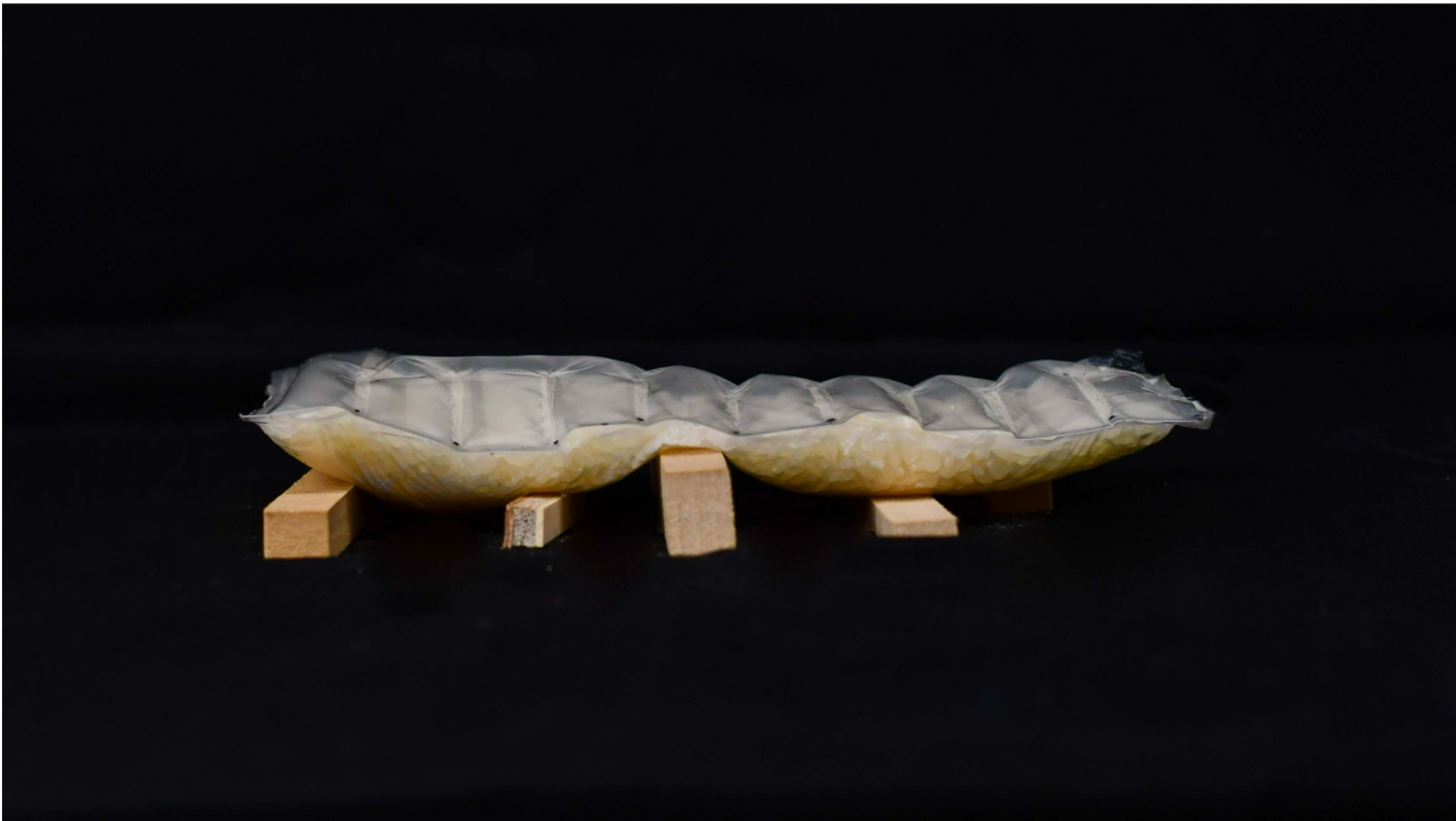
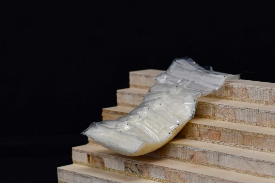
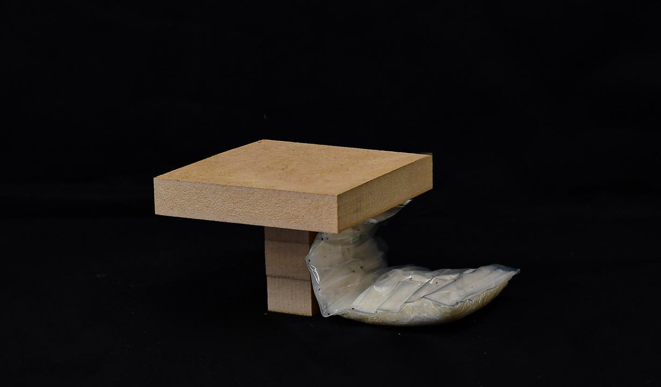
Naka­hashi’s time in the green sleep­ing bag inspired her to cre­ate the below mod­el of a more flex­i­ble bed, using a polypropy­lene bag, rice and nylon film.

We have cre­at­ed a pro­to­type of a dou­ble-lay­ered inflat­able bed that has a pouch struc­ture that inflates with air and a jam­ming struc­ture that becomes hard when air is com­pressed. The pouch side soft­ly receives the body when inflat­ed. The jam­ming side becomes hard when the air is removed, and can be firm­ly fixed in an even space. The air is designed to move back and forth between the two lay­ers, so that when not in use, the whole thing can be rolled up soft­ly for stor­age. 

It’s hard to imag­ine the pres­ence of a pussy­cat doing much to ame­lio­rate the anx­i­ety of those forced to flee their famil­iar beds with lit­tle warn­ing, but we can see how Nakahashi’s design might bring a degree of phys­i­cal relief when sleep­ing in sub­way sta­tions, base­ment cor­ners, and oth­er har­row­ing loca­tions.

Via Spoon & Toma­go

- Ayun Hal­l­i­day is the Chief Pri­ma­tol­o­gist of the East Vil­lage Inky zine and author, most recent­ly, of Cre­ative, Not Famous: The Small Pota­to Man­i­festo.  Fol­low her @AyunHalliday.

Relat­ed Con­tent 

A 110-Year-Old Book Illus­trat­ed with Pho­tos of Kit­tens & Cats Taught Kids How to Read

An Ani­mat­ed His­to­ry of Cats: How Over 10,000 Years the Cat Went from Wild Preda­tor to Sofa Side­kick

GPS Track­ing Reveals the Secret Lives of Out­door Cats

The Iconic Design of the Doomsday Clock Was Created 75 Years Ago: It Now Says We’re 100 Seconds to Midnight

Image via The Bul­letin of the Atom­ic Sci­en­tists

Last year, the fates hand­ed the New York Times’ Maria Cramer an envi­ably strik­ing lede: “Human­i­ty is 100 sec­onds away from total anni­hi­la­tion. Again.” That we all know imme­di­ate­ly what she was writ­ing about speaks to the pow­er of graph­ic design. Specif­i­cal­ly, it speaks to the pow­er of graph­ic design as prac­ticed by Martyl Langs­dorf, who hap­pened to be mar­ried to ex-Man­hat­tan Project physi­cist Alexan­der Langs­dorf. This con­nec­tion got her the gig of cre­at­ing a cov­er for the June 1947 issue of the Bul­letin of the Atom­ic Sci­en­tists. She came up with a sim­ple image: the upper-left cor­ner of a clock, its hands at sev­en min­utes to mid­night.

Asked lat­er why she set the clock to that time in par­tic­u­lar, Langs­dorf explained that “it looked good to my eye.” That quote appears in a post at the Bul­letin address­ing fre­quent­ly asked ques­tions about what’s now known as the Dooms­day Clock, “a design that warns the pub­lic about how close we are to destroy­ing our world with dan­ger­ous tech­nolo­gies of our own mak­ing. It is a metaphor, a reminder of the per­ils we must address if we are to sur­vive on the plan­et.” In the 75 years since its intro­duc­tion, its minute hand has been moved back­ward eight times and for­ward six­teen times; cur­rent­ly it still stands where Cramer report­ed it as hav­ing remained last Jan­u­ary, at 100 sec­onds to mid­night. 

To the pub­lic of 1947, “mid­night” sig­ni­fied above all the prospect of human­i­ty’s self-destruc­tion through the use of nuclear weapons. But as tech­nol­o­gy itself has advanced and pro­lif­er­at­ed, the means of auto-anni­hi­la­tion have grown more diverse. This year’s Dooms­day Clock state­ment cites not just nukes but car­bon emis­sions, infec­tious dis­eases, and “inter­net-enabled mis­in­for­ma­tion and dis­in­for­ma­tion.” Ear­li­er this month, the Bul­letin remind­ed us that even as 2022 began, “we called out Ukraine as a poten­tial flash­point in an increas­ing­ly tense inter­na­tion­al secu­ri­ty land­scape. For many years, we and oth­ers have warned that the most like­ly way nuclear weapons might be used is through an unwant­ed or unin­tend­ed esca­la­tion from a con­ven­tion­al con­flict.”

Now that “Russia’s inva­sion of Ukraine has brought this night­mare sce­nario to life,” many have found them­selves glanc­ing ner­vous­ly at the Dooms­day Clock once again. This also hap­pened after the elec­tion of Don­ald Trump, which prompt­ed the Vox video above on the Clock­’s his­to­ry and pur­pose. Its icon­ic sta­tus, as cel­e­brat­ed in the new book The Dooms­day Clock at 75, has long out­last­ed the Cold War, but the device itself isn’t with­out its crit­ics. Bul­letin co-founder Eugene Rabi­now­itch once artic­u­lat­ed the lat­ter as meant “to pre­serve civ­i­liza­tion by scar­ing men into ratio­nal­i­ty,” a some­what con­tro­ver­sial inten­tion. One could also raise objec­tions to using an inher­ent­ly lin­ear and uni­di­rec­tion­al con­cept like time to rep­re­sent a prob­a­bil­i­ty result­ing from human action. Yet some­how more tech­ni­cal­ly suit­able images — “100 cen­time­ters from the edge,” say — don’t have quite the same ring.

Relat­ed con­tent:

19th-Cen­tu­ry Skele­ton Alarm Clock Remind­ed Peo­ple Dai­ly of the Short­ness of Life: An Intro­duc­tion to the Memen­to Mori

J. Robert Oppen­heimer Explains How He Recit­ed a Line from Bha­gavad Gita — “Now I Am Become Death, the Destroy­er of Worlds” — Upon Wit­ness­ing the First Nuclear Explo­sion

The Night Ed Sul­li­van Scared a Nation with the Apoc­a­lyp­tic Ani­mat­ed Short, A Short Vision (1956)

53 Years of Nuclear Test­ing in 14 Min­utes: A Time Lapse Film by Japan­ese Artist Isao Hashimo­to

Pro­tect and Sur­vive: 1970s British Instruc­tion­al Films on How to Live Through a Nuclear Attack

How Clocks Changed Human­i­ty For­ev­er, Mak­ing Us Mas­ters and Slaves of Time

Based in Seoul, Col­in Mar­shall writes and broad­casts on cities, lan­guage, and cul­ture. His projects include the Sub­stack newslet­ter Books on Cities, the book The State­less City: a Walk through 21st-Cen­tu­ry Los Ange­les and the video series The City in Cin­e­ma. Fol­low him on Twit­ter at @colinmarshall or on Face­book.

Organized Chaos!: Watch 33 Videos Showing How Saturday Night Live Gets Made Each Week

Who do you think of when you think of Sat­ur­day Night Live?

The orig­i­nal cast? 

Cre­ator Lorne Michaels?

Who­ev­er host­ed last week’s episode?

What about the guy who makes and holds the cue cards?

Wal­ly Fer­esten is just one of the back­stage heroes to be cel­e­brat­ed in Cre­at­ing Sat­ur­day Night Live, a fas­ci­nat­ing look at how the long-run­ning tele­vi­sion sketch show comes togeth­er every week.

Like many of those inter­viewed Fer­esten is more or less of a lif­er, hav­ing come aboard in 1990 at the age of 25.

He esti­mates that he and his team of 8 run through some 1000 14” x 22” cards cards per show. Teleprompters would save trees, but the pos­si­bil­i­ty of tech­ni­cal issues dur­ing the live broad­cast presents too big of a risk.

This means that any last minute changes, includ­ing those made mid-broad­cast, must be han­dled in a very hands on way, with cor­rec­tions writ­ten in all caps over care­ful­ly applied white painter’s tape or, worst case sce­nario, on brand new cards.

(After a show wraps, its cards enjoy a sec­ond act as drop­cloths for the next week’s paint­ed sets.)

Near­ly every sketch requires three sets of cue cards, so that the cast, who are rarely off book due to the fre­quent changes, can steal glances to the left, right and cen­ter.

As the depart­ment head, Fer­esten is part­nered with each week’s guest host, whose lines are the only ones to be writ­ten in black. Bet­ty White, who host­ed in 2010 at the age of 88, thanked him in her 2011 auto­bi­og­ra­phy.

Sure­ly that’s worth his work-relat­ed arthrit­ic shoul­der, and the recur­rent night­mares in which he arrives at Stu­dio 8H just five min­utes before show­time to find that all 1000 cue cards are blank.

Cos­tumes have always been one of Sat­ur­day Night Live’s flashiest plea­sures, run­ning the gamut from Cone­heads and a rap­ping Cup o’Soup to an immac­u­late recre­ation of the white pantsuit in which Vice Pres­i­dent Kamala Har­ris deliv­ered her vic­to­ry speech a scant 3 hours before the show aired.

“A cos­tume has a job,” wardrobe super­vi­sor Dale Richards explains:

It has to tell a sto­ry before (the actors) open their mouth…as soon as it comes on cam­era, it should give you so much back­sto­ry.

And it has to cleave to some sort of real­i­ty and truth­ful­ness, even in a sketch as out­landish as 2017’s Hen­ri­et­ta & the Fugi­tive, star­ring host Ryan Gosling as a detec­tive in a film noir style romance. The gag is that the dame is a chick­en (cast mem­ber Aidy Bryant.)

Richards cites actress Bette Davis as the inspi­ra­tion for the chick­en’s look:


Because you’re not going to believe it if the detec­tive couldn’t actu­al­ly fall in love with her. She has to be very fem­i­nine, so we gave her Bette Davis bangs and long eye­lash­es and a beau­ti­ful bon­net, so the under­pin­nings were very much like an actress in a movie, although she did have a chick­en cos­tume on.

The num­ber of quick cos­tume changes each per­former must make dur­ing the live broad­cast helps deter­mine the sketch­es’ run­ning order.

Some of the break­neck trans­for­ma­tions are han­dled by Richards’ sis­ter, Don­na, who once beat the clock by pig­gy­back­ing host Jen­nifer Lopez across the stu­dio floor to the chang­ing area where a well-coor­di­nat­ed crew swished her out of her open­ing monologue’s skintight dress and sky­scraper heels and into her first cos­tume.

That’s one exam­ple of the sort of traf­fic the 4‑person crane cam­era crew must bat­tle as they hur­tle across the stu­dio to each new set. Cam­era oper­a­tor John Pin­to com­mands from atop the crane’s coun­ter­bal­anced arm.

Those swoop­ing crane shots of the musi­cal guests, open­ing mono­logue and good­nights (see below) are a Sat­ur­day Night Live tra­di­tion, a part of its icon­ic look since the begin­ning.

Get to know oth­er back­stage work­ers and how they con­tribute to this week­ly high wire act in a 33 episode Cre­at­ing Sat­ur­day Night playlist, all on dis­play below:

- Ayun Hal­l­i­day is the Chief Pri­ma­tol­o­gist of the East Vil­lage Inky zine and author, most recent­ly, of Cre­ative, Not Famous: The Small Pota­to Man­i­festo.  Fol­low her @AyunHalliday.

Relat­ed Con­tent 

When John Belushi Booked the Punk Band Fear on SNL, And They Got Banned from the Show: A Short Doc­u­men­tary

The Stunt That Got Elvis Costel­lo Banned From Sat­ur­day Night Live

Sat­ur­day Night Live’s Very First Sketch: Watch John Belushi Launch SNL in Octo­ber, 1975

Google’s UX Design Professional Certificate: 7 Courses Helps Prepare Students for an Entry-Level Job in 6 Months

Dur­ing the pan­dem­ic, Google launched a series of Career Cer­tifi­cates that will “pre­pare learn­ers for an entry-lev­el role in under six months.” One such cer­tifi­cate focus­es on User Expe­ri­ence Design, or what’s called UX Design, the process design teams use to cre­ate prod­ucts that pro­vide mean­ing­ful expe­ri­ences to users.

Offered on the Cours­era plat­form, the User Expe­ri­ence (UX) Design Pro­fes­sion­al Cer­tifi­cate fea­tures sev­en cours­es, includ­ing the Foun­da­tions of User Expe­ri­ence, Start the UX Design Process, Build Wire­frames and Low-Fideli­ty Pro­to­types, and Con­duct UX Research and Test Ear­ly Con­cepts. In total, this pro­gram “includes over 200 hours of instruc­tion and hun­dreds of prac­tice-based activ­i­ties and assess­ments that sim­u­late real-world UX design sce­nar­ios and are crit­i­cal for suc­cess in the work­place. The con­tent is high­ly inter­ac­tive and devel­oped by Google employ­ees with decades of expe­ri­ence in UX design.” Upon com­ple­tion, stu­dents can direct­ly apply for jobs with Google and over 130 U.S. employ­ers, includ­ing Wal­mart, Best Buy, and Astreya. You can start a 7‑day free tri­al and explore the cours­es. If you con­tin­ue beyond that, Google/Coursera will charge $39 USD per month. That trans­lates to about $235 after 6 months.

Explore the User Expe­ri­ence (UX) Design Pro­fes­sion­al Cer­tifi­cate by watch­ing the video above. Learn more about the over­all Google career cer­tifi­cate ini­tia­tive here. And find oth­er Google pro­fes­sion­al cer­tifi­cates here.

Note: Open Cul­ture has a part­ner­ship with Cours­era. If read­ers enroll in cer­tain Cours­era cours­es and pro­grams, it helps sup­port Open Cul­ture.

Relat­ed Con­tent:

Google Intro­duces 6‑Month Career Cer­tifi­cates, Threat­en­ing to Dis­rupt High­er Edu­ca­tion with “the Equiv­a­lent of a Four-Year Degree”

Cours­era and Google Launch an Online Cer­tifi­cate Pro­gram to Help Stu­dents Become IT Pro­fes­sion­als & Get Attrac­tive Jobs

Become a Project Man­ag­er With­out a Col­lege Degree with Google’s Project Man­age­ment Cer­tifi­cate

Discover Khipu, the Ancient Incan Record & Writing System Made Entirely of Knots

Khi­pus, the portable infor­ma­tion archives cre­at­ed by the Inca, may stir up mem­o­ries of 1970s macrame with their long strands of intri­cate­ly knot­ted, earth-toned fibers, but their func­tion more close­ly resem­bled that of a dense­ly plot­ted com­put­er­ized spread­sheet.

As Cecil­ia Par­do-Grau, lead cura­tor of the British Museum’s cur­rent exhi­bi­tion Peru: a jour­ney in time explains in the above Cura­tors Cor­ner episode, khi­pus were used to keep track of every­thing from inven­to­ries and cen­sus to his­tor­i­cal nar­ra­tives, using a sys­tem that assigned mean­ing to the type and posi­tion of knot, spaces between knots, cord length, fiber col­or, etc.

Much of the infor­ma­tion pre­served with­in khi­pus has yet to be deci­phered by mod­ern schol­ars, though the Open Khipu Repos­i­to­ry — com­pu­ta­tion­al anthro­pol­o­gist Jon Clin­daniel’s open-source data­base — makes it pos­si­ble to com­pare the pat­terns of hun­dreds of khi­pus resid­ing in muse­um and uni­ver­si­ty col­lec­tions.

Even in the Incan Empire, few were equipped to make sense of a khipu. This task fell to quipu­ca­may­ocs, high born admin­is­tra­tive offi­cials trained since child­hood in the cre­ation and inter­pre­ta­tion of these organ­ic spread­sheets.

Fleet mes­sen­gers known as chask­is trans­port­ed khipus on foot between admin­is­tra­tive cen­ters, cre­at­ing an infor­ma­tion super­high­way that pre­dates the Inter­net by some five cen­turies. Khi­pus’ stur­dy organ­ic cot­ton or native camelid fibers were well suit­ed to with­stand­ing both the rig­ors of time and the road.

A 500-year-old com­pos­ite khipu that found its way to British Muse­um organ­ics con­ser­va­tor Nicole Rode pri­or to the exhi­bi­tion was intact, but severe­ly tan­gled, with a brit­tle­ness that betrayed its age. Below, she describes falling under the khipu’s spell, dur­ing the painstak­ing process of restor­ing it to a con­di­tion where­by researchers could attempt to glean some of its secrets.

Vis­it Museo Chileno de Arte Precolombino’s web­site to learn more about khipu in a series of fas­ci­nat­ing short arti­cles that accom­pa­nied their ground­break­ing 2003 exhib­it QUIPU: count­ing with knots in the Inka Empire.

via Aeon.

Relat­ed Con­tent: 

How the Inca Used Intri­cate­ly-Knot­ted Cords, Called Khipu, to Write Their His­to­ries, Send Mes­sages & Keep Records

Take a Vir­tu­al Tour of Machu Pic­chu, One of the New 7 Won­ders of the World

Ancient Maps that Changed the World: See World Maps from Ancient Greece, Baby­lon, Rome, and the Islam­ic World

Ayun Hal­l­i­day is the Chief Pri­ma­tol­o­gist of the East Vil­lage Inky zine and author, most recent­ly, of Cre­ative, Not Famous: The Small Pota­to Man­i­festo.  Fol­low her @AyunHalliday.

When Maurice Sendak Created a Dark Nutcracker Ballet

Chil­dren are the per­fect audi­ence for The Nut­crack­er. 

(Well, chil­dren and the grand­moth­ers who can’t wait for the tod­dler to start sit­ting still long enough to make the hol­i­day-themed bal­let an annu­al tra­di­tion…)

Mau­rice Sendak, the cel­e­brat­ed children’s book author and illus­tra­tor, agreed, but found the stan­dard George Bal­an­chine-chore­o­graphed ver­sion so trea­cly as to be unwor­thy of chil­dren, dub­bing it the “most bland and banal of bal­lets.”

The 1983 pro­duc­tion he col­lab­o­rat­ed on with Pacif­ic North­west Bal­let artis­tic direc­tors Kent Stow­ell and Fran­cia Rus­sell did away with the notion that chil­dren should be â€ścod­dled and sweet­ened and sug­arplummed and kept away from the dark aspects of life when there is no way of doing that.”

Tchaikovsky’s famous score remained in place, but Sendak and Stow­ell ducked the source mate­r­i­al for, well, more source mate­r­i­al. As per the New York City Ballet’s web­site, the Russ­ian Impe­r­i­al Ballet’s chief bal­let mas­ter, Mar­ius Peti­pa, com­mis­sioned Tchaikovsky to write music for an adap­ta­tion of Alexan­der Dumas’ child-friend­ly sto­ry The Nut­crack­er of Nurem­berg. But The Nut­crack­er of Nurem­berg was inspired by the much dark­er E.T.A. Hoff­man tale, 1816’s “The Nut­crack­er and the Mouse King.”

The “weird, dark qual­i­ties” of the orig­i­nal were much more in keep­ing with Sendak’s self pro­claimed “obses­sive theme”: “Chil­dren sur­viv­ing child­hood.”

Sendak want­ed the bal­let to focus more intent­ly on Clara, the young girl who receives the Nut­crack­er as a Christ­mas present in Act I:

It’s about her vic­to­ry over her fear and her grow­ing feel­ings for the prince… She is over­whelmed with grow­ing up and has no knowl­edge of what this means. I think the bal­let is all about a strong emo­tion­al sense of some­thing hap­pen­ing to her, which is bewil­der­ing.


Bal­an­chine must have felt dif­fer­ent­ly. He benched Clara in Act II, let­ting the adult Sug­arplum Fairy take cen­ter­stage, to guide the chil­dren through a pas­sive tour of the Land of Sweets.

As Sendak scoffed to the Dal­las Morn­ing News:

It’s all very, very pret­ty and very, very beau­ti­ful… I always hat­ed the Sug­arplum Fairy. I always want­ed to whack her.

“Like what kids real­ly want is a can­dy king­dom. That short­changes children’s feel­ings about life,” echoes Stow­ell, who revived the Sendak com­mis­sion, fea­tur­ing the illus­tra­tor’s sets and cos­tumes every win­ter for 3 decades.

In lieu of the Sug­ar Plum Fairy, Sendak and Stow­ell intro­duced a daz­zling caged pea­cock — a fan favorite played by the same dancer who plays Clara’s moth­er in Act I.

The threats, in the form of eccen­tric uncle Drosselmeier, a fero­cious tiger, and a mas­sive rat pup­pet with an impres­sive, puls­ing tail, have a Freudi­an edge.

The paint­ed back­drops, grow­ing Christ­mas tree, and Nut­crack­er toy look as if they emerged from one of Sendak’s books. (He fol­lowed up the bal­let by illus­trat­ing a new trans­la­tion of the Hoff­man orig­i­nal.)

The Sendak-designed cos­tumes are more under­stat­ed, thought Pacif­ic North­west Bal­let cos­tumer Mark Zap­pone, who described work­ing with Sendak as “an incred­i­ble joy and plea­sure” and recalled the fun­ny ongo­ing bat­tle with the Act II Moors cos­tumes to Seat­tle Met:

Maurice’s design had the women in quite bil­lowy pants. So we ripped them out of the box, threw them on the girls upstairs in the stu­dios, and Kent start­ed rehears­ing the Moors. And one by one, the girls got their legs stuck in those pants and—boom—hit the floor, all six of them. It was like, “Oh my God, what are we going to do about that one?” They end­ed up, for years, twist­ing the legs in their cos­tumes and mak­ing a lit­tle tuck here and there. It was a rite of pas­sage; if you were going to do the Moors, don’t for­get to twist your pants around so you won’t get stuck in them.

Rent a filmed ver­sion of Mau­rice Sendak’s The Nut­crack­er on Ama­zon Prime. (Look for a Wild Thing cameo in the boat­ing scene with Clara and her Prince.)

Relat­ed Con­tent: 

The Only Draw­ing from Mau­rice Sendak’s Short-Lived Attempt to Illus­trate The Hob­bit

Mau­rice Sendak Sent Beau­ti­ful­ly Illus­trat­ed Let­ters to Fans — So Beau­ti­ful a Kid Ate One

Mau­rice Sendak Illus­trates Tol­stoy in 1963 (with a Lit­tle Help from His Edi­tor)

Ayun Hal­l­i­day is the Chief Pri­maol­o­gist of the East Vil­lage Inky zine and author, most recent­ly, of Cre­ative, Not Famous: The Small Pota­to Man­i­festo.  Fol­low her @AyunHalliday.

« Go BackMore in this category... »
Quantcast
Open Culture was founded by Dan Colman.