Behold the Bridges in India Made of Living Tree Roots

Liv­ing green walls and upcy­cled build­ing mate­ri­als are wel­come envi­ron­men­tal­ly-con­scious design trends, but when it comes to sus­tain­able archi­tec­ture, the liv­ing root bridges made by indige­nous Khasi and Jain­tia peo­ple in the north-east­ern Indi­an state of Megha­laya have them beat by cen­turies.

These tra­di­tion­al plant-based sus­pen­sion bridges make it much eas­i­er for vil­lagers to trav­el to neigh­bor­ing com­mu­ni­ties, mar­kets and out­ly­ing farms by span­ning the dense trop­i­cal rainforest’s many gorges and rivers.

Their con­struc­tion requires patience, as builders train the aer­i­al roots of well-sit­u­at­ed, mature rub­ber fig trees into posi­tion using bam­boo, old tree trunks, and wire for sup­port, weav­ing more roots in as they become avail­able.

This mul­ti-gen­er­a­tional con­struc­tion project can take up to 30 years to com­plete. The care­ful­ly-tend­ed bridges become stur­dier with age, as the roots that form the deck and handrails thick­en.

The vil­lage of Non­gri­at has one bridge that has been in place for 200-some years. An upper bridge, sus­pend­ed direct­ly over­head, is a hun­dred years younger.

As vil­lage head and life­long res­i­dent Wis­ton Miwa told Great Big Sto­ry, above, when he was a child, peo­ple were leery of using the new­er bridge, wor­ried that it was not yet strong enough to be safe. Six decades lat­er, vil­lagers (and tourists) tra­verse it reg­u­lar­ly.

Archi­tect San­jeev Shankar, in a study of 11 liv­ing root bridges, learned that new struc­tures are loaded with stones, planks, and soil to test their weight bear­ing capac­i­ty. Some of the old­est can han­dle 50 pedes­tri­ans at once.

Humans are not the only crea­tures mak­ing the cross­ing. Bark deer and cloud­ed leop­ards are also known trav­el­ers. Squir­rels, birds, and insects set­tle in for per­ma­nent stays.

The Khasi peo­ple fol­low an oral tra­di­tion, and have lit­tle writ­ten doc­u­men­ta­tion regard­ing their his­to­ry and cus­toms, includ­ing the con­struc­tion of liv­ing root bridges.

Archi­tect Fer­di­nand Lud­wig, a cham­pi­on of Baub­otanik — or liv­ing plant con­struc­tion — notes that there is no set design being fol­lowed. Both nature and the vil­lagers tend­ing to the grow­ing struc­tures can be con­sid­ered the archi­tects here:

When we con­struct a bridge or a build­ing, we have a plan – we know what it’s going to look like. But this isn’t pos­si­ble with liv­ing archi­tec­ture. Khasi peo­ple know this; they are extreme­ly clever in how they con­stant­ly ana­lyze and inter­act with tree growth, and accord­ing­ly adapt to the conditions…How these roots are pulled, tied and woven togeth­er dif­fer from builder to builder. None of the bridges looks sim­i­lar.

The bridges, while remote, are becom­ing a buck­et list des­ti­na­tion for adven­tur­ers and eco­tourists, Nongriat’s dou­ble bridge in par­tic­u­lar.

The BBC’s Zinara Rath­nayake reports that such out­side inter­est has pro­vid­ed vil­lagers with an addi­tion­al source of income, as well as some pre­dictable headaches — lit­ter, inap­pro­pri­ate behav­ior, and over­crowd­ing:

Some root bridges see crowds of hun­dreds at a time as tourists clam­ber for self­ies, poten­tial­ly over­bur­den­ing the trees.

The Liv­ing Bridge Foun­da­tion, which works to pre­serve the liv­ing root bridges while pro­mot­ing respon­si­ble eco­tourism is seek­ing to have the area des­ig­nat­ed as a UNESCO World Her­itage Site.


Relat­ed Con­tent 

1,100 Del­i­cate Draw­ings of Root Sys­tems Reveals the Hid­den World of Plants

The Secret Lan­guage of Trees: A Charm­ing Ani­mat­ed Les­son Explains How Trees Share Infor­ma­tion with Each Oth­er

Daisu­gi, the 600-Year-Old Japan­ese Tech­nique of Grow­ing Trees Out of Oth­er Trees, Cre­at­ing Per­fect­ly Straight Lum­ber

The Tree of Lan­guages Illus­trat­ed in a Big, Beau­ti­ful Info­graph­ic

– Ayun Hal­l­i­day is the Chief Pri­ma­tol­o­gist of the East Vil­lage Inky zine and author, most recent­ly, of Cre­ative, Not Famous: The Small Pota­to Man­i­festo and Cre­ative, Not Famous Activ­i­ty Book. Fol­low her @AyunHalliday.

Behold the Fantastical, Uncannily Lifelike Puppets of Barnaby Dixon

Barn­a­by Dixon’s incred­i­ble two-piece cre­ations rede­fine the notion of hand pup­pets, by mov­ing and respond­ing in high­ly nuanced, real­is­tic ways.

The pinkie and index fin­ger of one hand slip into the crea­ture’s arms, leav­ing the thumb free to oper­ate the tiny con­trols that tilt head and mouth move­ments.

The pinkie and index fin­ger of one hand slip into the creature’s legs, an attribute few hand pup­pets can claim.

A waist­line mag­net joins the pup­pet’s top half to its bot­tom.

His goal is for view­ers to “for­get the mech­a­nisms and for­get the process that’s gone into mak­ing it so they can just enjoy the motions.”

Each char­ac­ter has a unique set of motions and a cus­tom-designed plas­tic, sil­i­cone and met­al assem­bly, informed by many hours of anatom­i­cal obser­va­tion and study. Their struc­tures speak to Dixon’s ear­ly years as a stop motion ani­ma­tor, as do his fab­ri­ca­tion meth­ods.

His frus­tra­tion with the glacial pace of achiev­ing the end prod­uct in that realm spurred him to exper­i­ment with pup­pets who could be filmed mov­ing in real time.

His first pup­pet, Dab Chick, below, holds a spe­cial place in his heart, and is also one of his mouthi­est.

Dab Chick­’s tiny head cocks on spec­ta­cle hinges and a hand-wound spring wrapped in sil­i­cone. The mech­a­nism that opens and clos­es his beak is a minia­ture spin on bicy­cle hand brakes.

While many of Dixon’s recent pup­pets thrive in a Day-Glo, synth-heavy envi­ron­ment, Dab Chick is a crowd-pleas­ing cur­mud­geon, spout­ing opin­ions and repar­tee. He even plays drunk… a hard assign­ment for any per­former to pull off, but Dixon nails it.

Phil the fish is oper­at­ed with two rods. He per­forms best in water, appro­pri­ate­ly enough, high­light­ing his tal­ent for blow­ing bub­bles, as well as Dixon’s for using physics to his advan­tage.

Many pup­peteers match their breath­ing to that of their puppet’s in an effort to get into the zone. Dixon takes it to the next lev­el by stream­ing real time video of his mouth to a tiny screen embed­ded below the nose of the pup­pet he is oper­at­ing.

In addi­tion to cre­at­ing and direct­ing orig­i­nal work, he pup­peteered the True His­to­ry of Thra, The Dark Crys­tal: Age of Resis­tance’s play with­in a play and designed the origa­mi-inspired, ani­mal-shaped demon pup­pets for the Bridge The­atre pro­duc­tion of Book of Dust – La Belle Sauvage.

The Guardian laud­ed the lat­ter as “gor­geous,” a “mar­vel (that) seem like Jun­gian pro­jec­tions rather than airy, fan­tas­ti­cal crea­tures.”

Watch more of Barn­a­by Dixon’s pup­pet videos here.

Relat­ed Con­tent:

The Hand Pup­pets That Bauhaus Artist Paul Klee Made for His Young Son

Meet Lit­tle Amal, the 12-Foot Pup­pet of a 10-Year-Old Syr­i­an Girl, Who Has Been Tour­ing the World

Hiroshige, Mas­ter of Japan­ese Wood­block Prints, Cre­ates a Guide to Mak­ing Shad­ow Pup­pets for Chil­dren (1842)

– Ayun Hal­l­i­day is the Chief Pri­ma­tol­o­gist of the East Vil­lage Inky zine and author, most recent­ly, of Cre­ative, Not Famous: The Small Pota­to Man­i­festo and Cre­ative, Not Famous Activ­i­ty Book. Fol­low her @AyunHalliday.

An Architect Breaks Down the Design of New York City Subway Stations, from the Oldest to Newest

With 26 lines and 472 sta­tions, the New York City sub­way sys­tem is prac­ti­cal­ly a liv­ing organ­ism, and way too big a top­ic to tack­le in a short video.

Archi­tect Michael Wyet­zn­er may not have time to touch on rats, crime track fires, flood­ing, night and week­end ser­vice dis­rup­tions, or the adults-in-a-Peanuts-spe­cial sound qual­i­ty of the announce­ments in the above episode of Archi­tec­tur­al Digest’s Blue­prints web series, but he gives an excel­lent overview of its evolv­ing design, from the sta­tions them­selves to side­walk entrances to the plat­form sig­nage.

First stop, the old City Hall sta­tion, whose chan­de­liers, sky­lights, and Guas­tavi­no tile arch­ing in an alter­nat­ing col­ors her­ring­bone pat­tern made it the star attrac­tion of the just-opened sys­tem in 1904.

(It’s been closed since 1945, but savvy tran­sit buffs know that they can catch a glimpse by ignor­ing the conductor’s announce­ment to exit the down­town 6 train at its last stop, then look­ing out the win­dow as it makes a U‑turn, pass­ing through the aban­doned sta­tion to begin its trip back uptown. The New York Tran­sit Muse­um also hosts pop­u­lar thrice year­ly tours.)

Express tracks have been a fea­ture of New York’s sub­way sys­tem since the begin­ning, when Inter­bor­ough Rapid Tran­sit Com­pa­ny enhanced its exist­ing ele­vat­ed line with an under­ground route capa­ble of car­ry­ing pas­sen­gers from City Hall to Harlem for a nick­el fare.

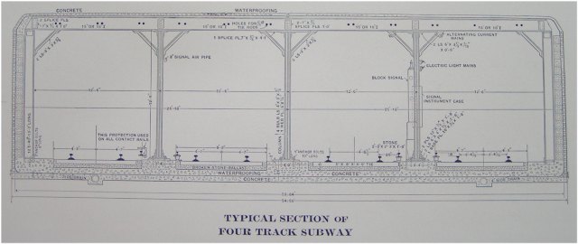
Wyet­zn­er effi­cient­ly sketch­es the open exca­va­tion design of the ear­ly IRT sta­tions — “cut and cov­er” trench­es less than 20’ deep, with room for four tracks, plat­forms, and no frills sup­port columns that are near­ly as ubiq­ui­tous white sub­way tiles.

For the most part, New York­ers take the sub­way for grant­ed, and are always pre­pared to beef about the fare to ser­vice ration, but this was not the case on New Year’s Day, 2017, when rid­ers went out of their way to take the Q train.

Fol­low­ing years of delays, aggra­vat­ing con­struc­tion noise and traf­fic con­ges­tion, every­one want­ed to be among the first to inspect Phase 1 of the Sec­ond Avenue Sub­way project, which extend­ed the line by three impres­sive­ly mod­ern, airy col­umn-free sta­tions.

(The mas­sive drills used to cre­ate tun­nels and sta­tions at a far greater depth than the IRT line, were left where they wound up, in prepa­ra­tion for Phase 2, which is slat­ed to push the line up to 125th St by 2029. (Don’t hold your breath…)

The design­ers of the sub­way placed a pre­mi­um on aes­thet­ics, as evi­denced by the domed Art Nou­veau IRT entrance kiosks and beau­ti­ful per­ma­nent plat­form signs.

From the orig­i­nal mosaics to Beaux Arts bas relief plaques like the ones pay­ing trib­ute to the for­tune John Jacob Astor amassed in the fur trade, there’s lots of his­to­ry hid­ing in plain sight.

The mid-80s ini­tia­tive to bring pub­lic art under­ground has filled sta­tions and pas­sage­ways with work by some mar­quee names, like Vik Muniz, Chuck Close, William Weg­man, Nick Cave, Tom Otter­ness, Roy Licht­en­stein and Yoko Ono.

Wyet­zn­er also name checks graph­ic design­er Mas­si­mo Vignel­li who was brought aboard in 1966 to stan­dard­ize the infor­ma­tion­al sig­nage.

The white-on-black sans serif font direct­ing us to our desired con­nec­tions and exits now seems like part of the subway’s DNA.

Per­haps 21st-cen­tu­ry inno­va­tions like count­down clocks and dig­i­tal screens list­ing real-time ser­vice changes and alter­na­tive routes will too, one of these days.

If Wyet­zn­er is open to film­ing the fol­low-up view­ers are clam­or­ing for in the com­ments, per­haps he’ll weigh in on the new A‑train cars that debuted last week, which boast secu­ri­ty cam­eras, flip-up seat­ing to accom­mo­date rid­ers with dis­abil­i­ties, and wider door open­ings to pro­mote quick­er board­ing.

(Yes, they’re still the quick­est way to get to Harlem…)

Relat­ed Con­tent 

A Sub­way Ride Through New York City: Watch Vin­tage Footage from 1905

How the Icon­ic Col­ors of the New York City Sub­way Sys­tem Were Invent­ed: See the 1930 Col­or Chart Cre­at­ed by Archi­tect Squire J. Vick­ers

Design­er Mas­si­mo Vignel­li Revis­its and Defends His Icon­ic 1972 New York City Sub­way Map

The Sound of Sub­ways Around the World: A Glob­al Col­lec­tion of Sub­way Door Clos­ing Announce­ments, Beeps & Chimes

– Ayun Hal­l­i­day is the Chief Pri­ma­tol­o­gist of the East Vil­lage Inky zine and author, most recent­ly, of Cre­ative, Not Famous: The Small Pota­to Man­i­festo and Cre­ative, Not Famous Activ­i­ty Book. Fol­low her @AyunHalliday.

A Retired Math Teacher Helps Students Learn Geometry Through Quilting

Some real talk from retired geom­e­try teacher Wendy Licht­man, above, the author of sev­er­al math-themed YA nov­els:

Not many 15-year-olds care that two par­al­lel lines are crossed by a trans­ver­sal.

“But right here are two par­al­lel lines,” she con­tin­ues, point­ing to a pink and orange quilt. “and these are trans­ver­sals, and they are at a 90º angle and it feels real. You’ve got­ta get it to look right.”

The teenaged par­tic­i­pants in the Oak­land, Cal­i­for­nia pro­gram she found­ed to demys­ti­fy geom­e­try through hands-on quilt­mak­ing get it to look right by plot­ting their designs on graph paper, care­ful­ly mea­sur­ing and cut­ting shapes from bright cal­i­co of their own choos­ing. (Lic­th­man has com­mit­ted to but­ton­ing her lip if their favored print is not to her taste.)

Licht­man came up with this cre­ative approach to help a bright stu­dent who was in dan­ger of not grad­u­at­ing, hav­ing flunked geom­e­try three times.

She details their jour­ney in How to Make a Geo­met­ric Quilt, an essay for­mat­ted as step-by-step instructions…not for quilt­mak­ing but rather how those in the teach­ing pro­fes­sion can lead with humil­i­ty and deter­mi­na­tion, while main­tain­ing good bound­aries.

Some high­lights:

6. Some­time after the sewing has begun, and the math note­book is ignored for weeks, begin to wor­ry that your stu­dent is not real­ly learn­ing geom­e­try.  She’s learn­ing sewing and she’s learn­ing to fix a bro­ken bob­bin, but real­ly, geom­e­try?

7. Remind your­self that this kid needs a quilt as much as she needs geom­e­try.

8. Remem­ber, also, the very, very old woman who taught you hat-mak­ing one night long ago.  She had gone to school only through 5th grade because, she said, she was a Black child in the deep south and that’s how it was back then.  Think about how she explained to the hat-mak­ing class that to fig­ure out the length of the hat’s brim, you need­ed to mea­sure from the cen­ter to the edge with a string and then do “three of those and a lit­tle bit more,” and remem­ber how you sat in awe, because three radii and a lit­tle bit more is the def­i­n­i­tion of pi, and this hat-mak­er had evi­dent­ly dis­cov­ered for her­self the for­mu­la for cir­cum­fer­ence.

As the two become bet­ter acquaint­ed, the stu­dent let her guard down, reveal­ing more about her sit­u­a­tion while they swapped sto­ries of their moth­ers.

But this was no easy A.

In addi­tion to expect­ing reg­u­lar, punc­tu­al atten­dance, Lict­man stip­u­lat­ed that in order to pass, the stu­dent could not give the fruits of her labor away.

(Sol­id advice for cre­ators of any craft project this ambi­tious. As Deb­bie Stoller, author of Stitch ‘n Bitch: The Knit­ter’s Hand­book coun­sels:

…those who have nev­er knit some­thing have no idea how much time it took. If you give some­one a sweater, they may think that you made that in an evening when you were watch­ing a half-hour sit­com. It’s only when peo­ple actu­al­ly attempt to knit that they final­ly get this real­iza­tion, this light bulb goes on over their heads, and they real­ize that, “Wow, this actu­al­ly takes some skill and some time. I’ve got new­found respect for my grand­ma.”)

Ulti­mate­ly, Licht­man con­cludes that the five cred­its she award­ed her stu­dent could not be reduced to some­thing as sim­ple as geom­e­try or quilt-mak­ing;

You are giv­ing her cred­it for some­thing less tan­gi­ble.  Some­thing like pride.  Five cred­it hours for feel­ing she can accom­plish some­thing hard that, okay, is slight­ly relat­ed to geom­e­try.

Exam­ples of the cur­rent cohort’s work can be seen on Rock Paper Scis­sors Col­lec­tive’s Insta­gram.

Once com­plet­ed, these quilts will be donat­ed to Bay Area fos­ter chil­dren and pedi­atric patients at the local Chil­dren’s Hos­pi­tal.

via Boing­Bo­ing

Relat­ed Con­tent 

The Solar Sys­tem Quilt: In 1876, a Teacher Cre­ates a Hand­craft­ed Quilt to Use as a Teach­ing Aid in Her Astron­o­my Class

17-Year-Old Ade­line Har­ris Cre­at­ed a Quilt Col­lect­ing 360 Sig­na­tures of the Most Famous Peo­ple of the 19th Cen­tu­ry: Lin­coln, Dick­ens, Emer­son & More (1863)

Bisa Butler’s Beau­ti­ful Quilt­ed Por­traits of Fred­er­ick Dou­glass, Nina Simone, Jean-Michel Basquiat & More

Via Boing Boing

– Ayun Hal­l­i­day is the Chief Pri­ma­tol­o­gist of the East Vil­lage Inky zine and author, most recent­ly, of Cre­ative, Not Famous: The Small Pota­to Man­i­festo and Cre­ative, Not Famous Activ­i­ty Book. Fol­low her @AyunHalliday.

Robots Are Carving Replicas of the Parthenon Marbles: Could They Help the Real Ancient Sculptures Return to Greece?

Art forgery is a stur­dy trope of film and fic­tion. We’re all famil­iar with the spec­ta­cle of a rar­i­fied expert exam­in­ing a work, while a wealthy col­lec­tor anx­ious­ly wrings their hands near­by.

As Mag­gie Cao observes in the Guardian:

Forg­eries expose some of the art world’s most psy­cho­log­i­cal­ly com­plex fig­ures: the col­lec­tor and the coun­ter­feit­er. What com­pels the pro­to­typ­i­cal col­lec­tor to accu­mu­late objects of beau­ty is usu­al­ly a pecu­liar devo­tion to the pow­er of sin­gu­lar­i­ty. The col­lec­tor wor­ships art’s pow­er to move us, a pow­er we imag­ine emanates from unique objects. Mean­while, what moti­vates the coun­ter­feit­er is an undue con­fi­dence in the pos­si­bil­i­ties of repli­ca­tion. To deceive a view­er with a copy is to affirm that copy’s inter­change­abil­i­ty with the orig­i­nal.

But what if art forgery can be used for good?

That’s the hope of Roger Michel, founder of the Insti­tute for Dig­i­tal Archae­ol­o­gy, who employs tech­no­log­i­cal advances to pre­serve cul­tur­al­ly sig­nif­i­cant objects and offer acces­si­ble tac­tile expe­ri­ences to those with vision impair­ment.

Short­ly after ISIS destroyed the Mon­u­men­tal Arch of Palymyra, he har­nessed 3D tech­nol­o­gy to recre­ate the 1800-year old land­mark in two-thirds scale Egypt­ian mar­ble.

The pub­lic was able to get up close and per­son­al with the mod­el in var­i­ous loca­tions around the world, includ­ing New York’s City Hall Park, Florence’s Piaz­za del­la Sig­no­ria, and London’s Trafal­gar Square, where Michel enjoyed watch­ing passers­by touch­ing and pho­tograph­ing the repli­ca Arch:

There are guys in Carn­a­by Street suits mixed with young peo­ple in hip-hop clothes and Syr­i­ans in tra­di­tion­al dress. It’s the cross­roads of human­i­ty, and that was what Palym­ra was.

Michel is also striv­ing to con­vince the British Muse­um that all will not be lost, should it choose to repa­tri­ate the 2,500-year-old Parthenon Mar­bles to Greece, much as the Smith­son­ian returned 29 Benin bronzes tak­en dur­ing an 1897 British raid to the Nation­al Com­mis­sion for Muse­ums and Mon­u­ments in Nige­ria.

Michel made his case with a robot­i­cal­ly carved fac­sim­i­le of the head of the Horse of Selene, above, which is all the more remark­able when one learns that he was work­ing from pho­tos tak­en on an iPhone and iPad while vis­it­ing the gallery in which it is dis­played, after the muse­um refused his request for an offi­cial scan.

The item descrip­tion on the museum’s collection’s por­tal notes that the Horse of Selene was pur­chased from Thomas Bruce, 7th Earl of Elgin, who took pos­ses­sion of it while serv­ing as Britain’s ambas­sador to Ottoman Turkey from 1799–1803.

(The descrip­tion neglects to men­tion that rather than allow him to adorn his home with this and oth­er ill-got­ten antiq­ui­ties, a par­lia­men­tary com­mit­tee ordered Lord Elgin to sell his vast col­lec­tion to the British gov­ern­ment for £35,000, which is how they wound up in the muse­um.)

Orig­i­nal­ly a part of the Parthenon’s east ped­i­ment, the Horse of Selene is such a fan favorite that the muse­um shop sells an “exquis­ite” hand-cast resin repli­ca for £1,650, promis­ing that it will make “a show-stop­ping point of focus in any home.”

Perhaps…though we’re will­ing to bet it can’t match the verisimil­i­tude of the tiny chips and chis­el marks painstak­ing­ly cap­tured by the robot carv­er, which took about about 8 days to cre­ate a rough mod­el once it received the scans, fol­lowed by some 3 weeks of refin­ing. The robot got an assist at the very end from human arti­sans, whose hand­i­work Michel calls “the cru­cial 3 to 5 per­cent.”

Gia­co­mo Mas­sari, founder of Robot­or, who part­nered with Michel on this recre­ation, vaunts the pre­ci­sion tech­nol­o­gy makes pos­si­ble:

You can rec­og­nize every scratch. You can see the flaws of the stone and you can see the chal­lenges our col­leagues from 2,000 years ago were fac­ing. It’s like going back in time — you can feel the strug­gles of the artist.

The muse­um brass appears unmoved by the prospect of swap­ping repli­cas, no mat­ter how excel­lent, for the frieze pan­els, sculp­tures, archi­tec­tur­al frag­ments and oth­er trea­sures of antiq­ui­ty Elgin shipped home from the Acrop­o­lis in the ear­ly 1800s, though the New York Times report­ed last week that secret talks with Greece’s prime min­is­ter may indi­cate the two par­ties are edg­ing clos­er to res­o­lu­tion.

This col­lec­tion has been a cul­tur­al hot pota­to since Lord Byron, tour­ing the Parthenon short­ly after Elgin made off with so many its trea­sures, denounced his avarice in a poem titled The Curse of Min­er­va:

Lo! here, despite of war and wast­ing fire,

I saw suc­ces­sive Tyran­nies expire;

‘Scaped from the rav­age of the Turk and Goth,

Thy coun­try sends a spoil­er worse than both.

Sur­vey this vacant, vio­lat­ed fane;

Recount the relics torn that yet remain:

‘These’ Cecrops placed, ‘this’ Per­i­cles adorned,

‘That’ Adri­an reared when droop­ing Sci­ence mourned.

What more I owe let Grat­i­tude attest—

Know, Alar­ic and Elgin did the rest.

That all may learn from whence the plun­der­er came,

The insult­ed wall sus­tains his hat­ed name:

For Elgin’s fame thus grate­ful Pal­las pleads,

Below, his name—above, behold his deeds!

The New York Times quot­ed a mid­dle-aged Lon­don bus dri­ver who voiced the opin­ion, as did the vast major­i­ty of respon­dents to a British sur­vey, that the Parthenon sculp­tures should be returned to their land of ori­gin, remark­ing, “It’s like the Crown Jew­els. If some­one took those, you’d want them back, wouldn’t you?”

His argu­ment is a hard one to refute in an age when the inno­v­a­tive tech­ni­cal solu­tions pro­mot­ed by Michel and the Insti­tute for Dig­i­tal Archae­ol­o­gy cre­ate oppor­tu­ni­ties that Lord Elgin and muse­um vis­i­tors of yore could nev­er have envi­sioned.

The pub­lic invi­ta­tion to the Novem­ber 2022 unveil­ing of the Selene Horse repli­ca stat­ed that “Britain’s stew­ard­ship of the Elgin mar­bles embod­ies a psy­cho­log­i­cal­ly com­plex sto­ry of obses­sion, pos­ses­sion, and assim­i­la­tion — so far with­out res­o­lu­tion”, ask­ing:

Might per­fect copies, ren­dered in sacred Pen­tel­ic mar­ble, sug­gest a pos­si­ble path for­ward?

Read­ers, what say you?

Relat­ed Con­tent

John Oliver’s Show on World-Class Art Muse­ums & Their Loot­ed Art: Watch It Free Online

Take a Vir­tu­al Real­i­ty Tour of the World’s Stolen Art

The British Muse­um Is Now Open To Every­one: Take a Vir­tu­al Tour and See 4,737 Arti­facts, Includ­ing the Roset­ta Stone

- Ayun Hal­l­i­day is the Chief Pri­ma­tol­o­gist of the East Vil­lage Inky zine and author, most recent­ly, of Cre­ative, Not Famous: The Small Pota­to Man­i­festo and Cre­ative, Not Famous Activ­i­ty Book. Fol­low her @AyunHalliday.

A Wooden Artwork That Beautifully Unfolds into a Functional Desk

Robert van Embric­qs, a design­er based in Ams­ter­dam, has cre­at­ed The Flow Wall Desk–a wood­en dec­o­ra­tion that “trans­forms from a piece of art on the wall into a func­tion­al desk by show­ing off its unique aes­thet­ic.” On his site, he writes:

The Flow Wall Desk acknowl­edges the poten­tial how to com­bine func­tion­al­i­ty with art. This results in cre­at­ing a desk inside one’s indoor envi­ron­ment. And only with one twist, it becomes a true joy to have a sep­a­rate work­ing area when need­ed. It can be sub­scribed as a piece of func­tion­al art that builds on the design track record of trans­for­ma­tions in space. How­ev­er, this one offers a part of the inte­ri­or that shifts with time: a cozy work­space dur­ing the day becomes a com­pact wall hang­ing after being used.

Inspired by recent glob­al events and the longer-term trends that pre­cede them, to devise a state­ment piece that lends dig­ni­ty to the dig­i­tal work­space through craft, warm tex­tures, and durably engi­neered fas­ten­ings. The Flow Wall Desk is adapt­able and with the con­tem­po­rary design ele­ments, it can be used through­out homes, libraries, hotels, and many oth­er inside des­ig­na­tions. Dur­ing the design process, van Embric­qs strove to merge the desk’s exe­cu­tion with its design for­mu­la by cre­at­ing a cohe­sive whole.

Usabil­i­ty demands that an every­day object such as this should be cre­at­ed with a gen­er­al­ized user’s psy­chol­o­gy in mind. Ver­ti­cal ele­ment emerges from the wall like a cater­pil­lar with the help of specif­i­cal­ly placed hinges. These exposed brass hinges estab­lish a visu­al rhythm and ensure that the form can fol­low its func­tion. This led to the notion of a trans­for­ma­tion in form and pur­pose achieved through a sin­gle, sim­ple ges­ture that every­one can famil­iar­ize them­selves with. With a sin­gle turn by hand around its axis, a table­top is cre­at­ed and once in its hor­i­zon­tal posi­tion, the table­top is sup­port­ed by wood­en slats, cre­at­ing a more nat­ur­al look and organ­ic effect that also serves as a screen for more pri­va­cy.

The hor­i­zon­tal work sur­face is com­fort­able yet func­tion­al due to its depth and width for the seat­ed user and mak­ing it per­fect for typ­ing and hand­writ­ing. Final­ly, a unique oppor­tu­ni­ty is cre­at­ed for a tem­po­rary work sur­face and ergonom­i­cal­ly adjustable desk in a sun­ny cor­ner which invites the user to fold that desk away when work is over.

With the fin­ished design appear­ance, more sus­tain­able mate­r­i­al devel­op­ments are being exam­ined and ana­lyzed for pro­duc­tion. And when it comes to func­tion­al­i­ty, each part of the Flow Wall desk has been specif­i­cal­ly engi­neered with­out los­ing the appeal to attract, just like a fold­ing mag­ic trick with a well-kept secret.

You can pur­chase your own Flow Wall desk (for about $2850) via Robert’s web­shop here. And find more of his work on Insta­gram here.

via Colos­sal

If you would like to sign up for Open Culture’s free email newslet­ter, please find it here. Or fol­low our posts on Threads, Face­book, BlueSky or Mastodon.

If you would like to sup­port the mis­sion of Open Cul­ture, con­sid­er mak­ing a dona­tion to our site. It’s hard to rely 100% on ads, and your con­tri­bu­tions will help us con­tin­ue pro­vid­ing the best free cul­tur­al and edu­ca­tion­al mate­ri­als to learn­ers every­where. You can con­tribute through Pay­Pal, Patre­on, and Ven­mo (@openculture). Thanks!

Relat­ed Con­tent 

Behold the Elab­o­rate Writ­ing Desks of 18th Cen­tu­ry Aris­to­crats

Who Wrote at Stand­ing Desks? Kierkegaard, Dick­ens and Ernest Hem­ing­way Too

by | Permalink | Make a Comment ( 1 ) |

Behold! The Very First Christmas Card (1843)

Christ­mas cards aren’t just an anachro­nism.

They’re almost an endan­gered species, the vic­tim of the Inter­net, postal rate increas­es, and the jet­ti­son­ing of any time con­sum­ing tra­di­tion whose exe­cu­tion has been found to bring the oppo­site of joy.

Above, Vic­to­ria and Albert Muse­um cura­tors Alice Pow­er and Sarah Beat­tie take us on a back­wards trip to a time when the exchange of Christ­mas cards was a source of true social mer­ri­ment.

Christ­mas cards must hold a spe­cial place in both the V&A’s col­lec­tions and heart, giv­en that the museum’s founder, Hen­ry Cole, inad­ver­tent­ly invent­ed them in 1843.

As a well respect­ed man about town, he received a great many more hol­i­day let­ters than he had time or incli­na­tion to respond to, but nei­ther did he wish to appear rude.

So he enlist­ed his friend, painter J.C. Hors­ley, to cre­ate a fes­tive illus­tra­tion with a built-in hol­i­day greet­ing, leav­ing just enough space to per­son­al­ize with a recipient’s name and per­haps, a hand­writ­ten line or two.

He then had enough post­card-sized repro­duc­tions print­ed up to send to 1000 of his friends.

(It’s hell being pop­u­lar…)

Talk about zeit­geist: Charles Dick­ens’ A Christ­mas Car­ol was first pub­lished that very same hol­i­day sea­son.

No won­der every­one want­ed in on the fun.

Part of the rea­son the cards in the V&A’s col­lec­tion are so well pre­served is that their recip­i­ents prized them enough to keep them in sou­venir albums.

Under­stand­ably. They’re very appeal­ing lit­tle arti­facts.

The upper crust could afford such fan­cy design ele­ments as clever die-cut shapes, pop up ele­ments, and translu­cent win­dows that encour­aged the recip­i­ents to hold them up to actu­al win­dows.

Tech­no­log­i­cal advances in the print­ing indus­try, and the cre­ation of the cost-effec­tive Pen­ny Post allowed those whose bud­gets were more mod­est than Mr. Cole’s to par­tic­i­pate too.

Their cards tend­ed to be sim­pler in exe­cu­tion, though not nec­es­sar­i­ly con­cept.

In addi­tion to the views we’ve come to expect — win­ter, Father Christ­mas, hol­ly — the Vic­to­ri­ans had a thing for jol­ly anthro­po­mor­phized food and some tru­ly shame­less puns.

Enjoy these Ghosts of Christ­mas Past, dear read­ers. We’re almost inspired to revive the tra­di­tion!

Read more about the advent of this tra­di­tion, includ­ing how it jumped the pond, in Smith­son­ian Magazine’s His­to­ry of the Christ­mas Card.

Relat­ed Con­tent 

When Sal­vador Dalí Cre­at­ed Christ­mas Cards That Were Too Avant Garde for Hall­mark (1960)

J.R.R. Tolkien Sent Illus­trat­ed Let­ters from Father Christ­mas to His Kids Every Year (1920–1943)

Langston Hugh­es’ Home­made Christ­mas Cards From 1950

Watch Ter­ry Gilliam’s Ani­mat­ed Short, The Christ­mas Card (1968)

Hear Neil Gaiman Read A Christ­mas Car­ol Just Like Charles Dick­ens Read It

An Oscar-Win­ning Ani­ma­tion of Charles Dick­ens’ Clas­sic Tale, A Christ­mas Car­ol (1971)

- Ayun Hal­l­i­day is the Chief Pri­ma­tol­o­gist of the East Vil­lage Inky zine and author, most recent­ly, of Cre­ative, Not Famous: The Small Pota­to Man­i­festo.  Fol­low her @AyunHalliday.

Behold Beautiful Original Movie Posters for Metropolis from France, Sweden, Germany, Japan & Beyond

Of Fritz Lang’s Metrop­o­lis, the crit­ic Siegfried Kra­cauer wrote that “the Amer­i­cans rel­ished its tech­ni­cal excel­lence; the Eng­lish remained aloof; the French were stirred by a film which seemed to them a blend of Wag­n­er and Krupp, and on the whole an alarm­ing sign of Ger­many’s vital­i­ty.” By Wag­n­er, Kra­cauer of course meant the com­pos­er; Krupp referred to the arms man­u­fac­tur­er Friedrich Krupp AG. We must remem­ber that Metrop­o­lis first came out in the Ger­many of 1927, and thus into a sociopo­lit­i­cal con­text grow­ing more volatile by the moment.

But the film also came out in the gold­en age of silent cin­e­ma, and every seri­ous movie­go­er in the world must have been enor­mous­ly eager for a glimpse of the spec­ta­cle of the elab­o­rate dystopi­an future Lang and his col­lab­o­ra­tors had put onscreen.

And screen around the world that spec­ta­cle did, albeit in a ver­sion cen­sored and oth­er­wise cut in a vari­ety of ways that Lang found ter­ri­bly dis­pleas­ing. How­ev­er bowd­ler­ized the Metrop­o­lis seen by so many back then, it proved to be so much of an attrac­tion that its adver­tis­ing mate­ri­als became near­ly as artis­tic as the film itself.

At Stephen O’Don­nel­l’s blog Gods and Fool­ish Grandeur, you can see a selec­tion of the posters for Metrop­o­lis put up dur­ing the late nine­teen-twen­ties and ear­ly nine­teen-thir­ties in the movie the­aters of var­i­ous coun­tries, includ­ing Swe­den, France, Japan, and Aus­tralia.

All are visu­al­ly strik­ing, but it prob­a­bly comes as no sur­prise that the Amer­i­can ones — prod­ucts, after all, of the cul­ture that gave rise to Hol­ly­wood — get espe­cial­ly breath­less with the accom­pa­ny­ing text.

“FANTASTIC FUTURISTIC FATALISTIC,” promis­es one poster, but not with­out adding “IMAGINARY IMPRESSIVE IMPOSSIBLE” and “EROTIC EXOTIC ERRATIC.” Anoth­er sheet holds out to view­ers a flight “HIGH INTO THE AIR!” Lest they sus­pect that would­n’t give them their quar­ter’s worth of fan­ta­sy, it also promis­es them a plunge “DEEP IN THE EARTH!” A dif­fer­ent tagline, also used in oth­er Eng­lish-speak­ing coun­tries, declares of the film that “Every­one is talk­ing about it, yet no one can describe it!”

That’s not for lack of try­ing, least of all by the dis­trib­u­tor’s pub­lic­i­ty depart­ment: anoth­er poster’s detailed para­graph boasts of a “mighty, surg­ing love dra­ma of the two worlds that work out their moil­ing des­tinies with­in the con­fines of a great city.” But over the gen­er­a­tions — and after restora­tions — Metrop­o­lis has sur­passed these claims with its val­ue as a work of cin­e­mat­ic art, and indeed become as time­less as a ques­tion once used to pro­mote it: “What’s the world com­ing to?”

via Messy­Nessy

Relat­ed con­tent:

Metrop­o­lis: Watch Fritz Lang’s 1927 Mas­ter­piece

Read the Orig­i­nal 32-Page Pro­gram for Fritz Lang’s Metrop­o­lis (1927)

H. G. Wells Pans Fritz Lang’s Metrop­o­lis in a 1927 Movie Review: It’s “the Sil­li­est Film”

Gaze at Glob­al Movie Posters for Hitchcock’s Ver­ti­go: U.S., Japan, Italy, Poland & Beyond

10,000 Clas­sic Movie Posters Get­ting Dig­i­tized & Put Online by the Har­ry Ran­som Cen­ter at UT-Austin: Free to Browse & Down­load

40,000 Film Posters in a Won­der­ful­ly Eclec­tic Archive: Ital­ian Tarkovsky Posters, Japan­ese Orson Welles, Czech Woody Allen & Much More

Based in Seoul, Col­in Mar­shall writes and broad­casts on cities, lan­guage, and cul­ture. His projects include the Sub­stack newslet­ter Books on Cities, the book The State­less City: a Walk through 21st-Cen­tu­ry Los Ange­les and the video series The City in Cin­e­ma. Fol­low him on Twit­ter at @colinmarshall or on Face­book.

« Go BackMore in this category... »
Quantcast
Open Culture was founded by Dan Colman.