Punk Meets High Fashion in Metropolitan Museum of Art Exhibition PUNK: Chaos to Couture

What­ev­er else British punk rock gave pop cul­ture, it was always a rev­o­lu­tion in fash­ion, engi­neered by Sex Pis­tols sven­gali Mal­colm McLaren and his part­ner, design­er Vivi­enne West­wood. The two pio­neered punk’s S&M‑inspired look from their Chelsea bou­tique, SEX, a one­time record shop that mor­phed into the epi­cen­ter of Lon­don street fash­ion. McLaren passed away in 2010, but his for­mer part­ner West­wood is still designing—only now her work is haute cou­ture nos­tal­gia, its shock­ing sneer at uptight British cul­ture a muse­um piece. Her lat­est col­lec­tion, Chaos, revis­its many of the icon­ic designs of the mid-sev­en­ties made famous by the Sex Pis­tols, such as the “tits square” and “cow­boy square” t‑shirts and the ubiq­ui­tous safe­ty pin.

The name of Westwood’s retro lat­est work is reflect­ed in a cur­rent exhi­bi­tion at the Met­ro­pol­i­tan Muse­um of Art called PUNK: Chaos to Cou­ture, which began May 9th and runs until August 14th. In the video above, cura­tor Andrew Bolton dis­cuss­es the exhibition’s stag­ing of low and high cul­ture crossover. In the press mate­ri­als, Bolton is frank about the con­tra­dic­to­ry aims of punk and high fash­ion:

Since its ori­gins, punk has had an incen­di­ary influ­ence on fash­ion… Although punk’s democ­ra­cy stands in oppo­si­tion to fashion’s autoc­ra­cy, design­ers con­tin­ue to appro­pri­ate punk’s aes­thet­ic vocab­u­lary to cap­ture its youth­ful rebel­lious­ness and aggres­sive force­ful­ness.

This is not the first time Bolton has appro­pri­at­ed punk fash­ion for high art or worked with Vivi­enne West­wood. In 2006, Bolton curat­ed a Met exhib­it called Anglo­Ma­nia (cat­a­log here), which drew its name and inspi­ra­tion from anoth­er of Westwood’s col­lec­tions.

Relat­ed Con­tent:

Sex Pis­tols Front­man John­ny Rot­ten Weighs In On Lady Gaga, Paul McCart­ney, Madon­na & Katy Per­ry

Mal­colm McLaren: The Quest for Authen­tic Cre­ativ­i­ty

The His­to­ry of Punk Rock

Josh Jones is a writer and musi­cian based in Wash­ing­ton, DC. Fol­low him at @jdmagness

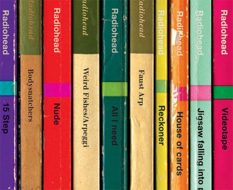
Eight Radiohead Albums Reimagined as Vintage Paperback Books

in rainbooks

Simon James, an artist liv­ing and work­ing in Lon­don, has a pen­chant for tak­ing albums and envi­sion­ing them as vin­tage Pen­guin & Pel­i­can-style books. So far, he has cov­ered The SmithsJoy Divi­sionNew OrderThe Cure and Kraftwerk. And now comes his favorite band, Radio­head. Here, he takes Pablo Hon­ey, The Bends, OK Com­put­er, Kid A, Amne­si­ac, Hail to the Thief, In Rain­bows and The King of Limbs and then turns each track, on each album, into its own nov­el. You can find the images on Etsy. Just fol­low the links above. Indi­vid­ual prints can also be pur­chased for $19.38.

If you would like to sign up for Open Culture’s free email newslet­ter, please find it here. Or fol­low our posts on Threads, Face­book, BlueSky or Mastodon.

If you would like to sup­port the mis­sion of Open Cul­ture, con­sid­er mak­ing a dona­tion to our site. It’s hard to rely 100% on ads, and your con­tri­bu­tions will help us con­tin­ue pro­vid­ing the best free cul­tur­al and edu­ca­tion­al mate­ri­als to learn­ers every­where. You can con­tribute through Pay­Pal, Patre­on, and Ven­mo (@openculture). Thanks!

Relat­ed Con­tent:

Radiohead’s Thom Yorke Gives Teenage Girls Endear­ing Advice About Boys (And Much More)

A Mid­dle-East­ern Ver­sion of Radiohead’s 1997 Hit “Kar­ma Police”

Radio­head-Approved, Fan-Made Film of the Band at Rose­land for 2011′s The King of Limbs Tour

The Art of Data Visualization: How to Tell Complex Stories Through Smart Design

The vol­ume of data in our age is so vast that whole new research fields have blos­somed to devel­op bet­ter and more effi­cient ways of pre­sent­ing and orga­niz­ing infor­ma­tion. One such field is data visu­al­iza­tion, which can be trans­lat­ed in plain Eng­lish as visu­al rep­re­sen­ta­tions of infor­ma­tion.

The PBS “Off Book” series turned its atten­tion to data visu­al­iza­tion in a short video fea­tur­ing Edward Tufte, a sta­tis­ti­cian and pro­fes­sor emer­i­tus at Yale, along with three young design­ers on the fron­tiers of data visu­al­iza­tion. Titled “The Art of Data Visu­al­iza­tion,” the video does a good job of demon­strat­ing how good design—from sci­en­tif­ic visu­al­iza­tion to pop infographics—is more impor­tant than ever.

In much the same way that Mar­shall McLuhan spoke about prin­ci­ples of com­mu­ni­ca­tion, Tufte talks in the video about what makes for ele­gant and effec­tive design. One of his main points: Look after truth and good­ness, and beau­ty will look after her­self.

What does Tufte mean by this? That design is only as good as the infor­ma­tion at its core.

OffBookSCSHT1

For those of us who aren’t design­ers, it’s refresh­ing to con­sid­er the ele­ments of good visu­al sto­ry-telling. And that’s what the best design is, accord­ing to the experts in this video. Every data set, or big bunch of infor­ma­tion, has its own core con­cept, just as every sto­ry has a main char­ac­ter. The designer’s job is to find the hero in the data and then tell the visu­al sto­ry.

So much of the infor­ma­tion we encounter every day is hard to con­cep­tu­al­ize. It’s so big and com­pli­cat­ed that a visu­al ren­der­ing rep­re­sents it the best. That’s because human brains are wired to take in a lot of infor­ma­tion at once. Good design­ers know that deci­sion-mak­ing isn’t lin­ear. It’s a super-fast process of rec­og­niz­ing pat­terns and mak­ing sense of them.

OffBookSCSHT2

Infor­ma­tion may be more abun­dant but it isn’t new, and nei­ther is data visu­al­iza­tion. In the video, Tufte talks about stone maps carved by ear­ly humans and how those ancient graph­ics form the tem­plate for Google maps.

What comes across in PBS’s video is that data visu­al­iza­tion is an art, and the sim­pler the bet­ter. Tufte seems to argue that good data guides the design­er to do good work, which leads to the ques­tion: Is the medi­um no longer, as McLuhan famous­ly com­ment­ed, the mes­sage?

Relat­ed Con­tent:

In Under Three Min­utes, Hans Rosling Visu­al­izes the Incred­i­ble Progress of the “Devel­op­ing World”

An Ani­mat­ed Visu­al­iza­tion of Every Observed Mete­orite That Has Hit Earth Since 861 AD

Watch a Cool and Creepy Visu­al­iza­tion of U.S. Births & Deaths in Real-Time

Kate Rix writes about dig­i­tal media and edu­ca­tion. Vis­it her web­site. Fol­low her on Twit­ter @mskaterix

Celebrate Saul Bass’ 93rd Birthday with an Animated Google Doodle

When it comes to title design, no one did it bet­ter than Saul Bass (1920–1996). Dur­ing his long career in Hol­ly­wood, Bass designed sequences for Otto Preminger’s The Man with the Gold­en Arm, Scorsese’s Good­fel­las and Cape Fear, Kubrick’s Spar­ta­cusand sev­er­al clas­sic films by Alfred Hitch­cock. And that’s just begin­ning to scratch the sur­face. (You can delve into Bass’ oth­er cre­ative work via the links below.)

Today, Google is cel­e­brat­ing what would have been Bass’ 93rd birth­day with an ani­mat­ed doo­dle (above). Accord­ing to Metafil­ter, the doo­dle “pays homage to Bass’ visu­al work on Psy­choThe Man With The Gold­en ArmSpar­ta­cusWest Side Sto­ry,Ver­ti­goNorth by North­westAnato­my of a Mur­der, and Around the World in 80 Days.” It’s also set to Dave Brubeck­’s 1961 tune, “Unsquare Dance.”

Relat­ed Con­tent:

Saul Bass’ Advice for Design­ers: Learn to Draw, and Cre­ate Beau­ty Even If Nobody Else Cares

Saul Bass’ Oscar-Win­ning Ani­mat­ed Short Pon­ders Why Man Cre­ates

Saul Bass Gives Ma Bell a Com­plete Makeover, 1969

The History of Typography Told in Five Animated Minutes

Caslon, Baskerville, Hel­veti­ca… these names have graced many a pull down menu, but what do they sig­ni­fy, exact­ly?

Graph­ic design­er Ben Bar­rett-For­rest spent 140 hours ani­mat­ing the 291 paper let­ters on dis­play in the His­to­ry of Typog­ra­phy, an intro­duc­tion to the ways in which lan­guage has been expressed visu­al­ly over time.

From Guten­berg’s inky, monk-inspired Black­lis­ter font to the ever-con­tro­ver­sial Com­ic Sans, Bar­rett-For­rest employs stop motion to spell out the quan­tifi­able rea­sons that cer­tain ser­ifs and stroke types are easy on the eye. Let’s not tell the cre­ators of Lla­ma Font or Mr. Twig­gy, but leg­i­bil­i­ty is the moth­er of sur­vival in this are­na.

If you would like to sign up for Open Culture’s free email newslet­ter, please find it here. Or fol­low our posts on Threads, Face­book, BlueSky or Mastodon.

If you would like to sup­port the mis­sion of Open Cul­ture, con­sid­er mak­ing a dona­tion to our site. It’s hard to rely 100% on ads, and your con­tri­bu­tions will help us con­tin­ue pro­vid­ing the best free cul­tur­al and edu­ca­tion­al mate­ri­als to learn­ers every­where. You can con­tribute through Pay­Pal, Patre­on, and Ven­mo (@openculture). Thanks!

Relat­ed Con­tent:

Font Based on Sig­mund Freud’s Hand­writ­ing Com­ing Cour­tesy of Suc­cess­ful Kick­starter Cam­paign

A Short Ani­mat­ed His­to­ry of the GIF

Ayun Hal­l­i­day has devot­ed the last 15 years to  pro­duc­ing The East Vil­lage Inky, an entire­ly hand­writ­ten zine whose aging read­ers com­plain that they can no long make out the tiny print.

A Short Animated History of the GIF

In 1987, Com­puserve begat­teth Image For­mat 87A.

Image For­mat 87A begat­teth Graph­ics Inter­change For­mat or GIF (rhymes with a cer­tain brand of peanut but­ter, the video his­to­ry above help­ful­ly points out).

The pro­lif­er­a­tions of free online GIF gen­er­a­tors begat­teth the count­less annoy­ing, smarmy, bone­head­ed ani­mat­ed loops you’ve seen junk­ing up emails, pro­file pic­tures, and MySpace pages.

Of course, some of them are also pret­ty cool, which is why they’re being cel­e­brat­ed with a fes­ti­val at the Brook­lyn Acad­e­my of Music. No tick­ets nec­es­sary. Mov­ing the Still: A GIF Fes­ti­val will be screen­ing through June on the out­door elec­tron­ic bill­board meant to pro­mote upcom­ing and cur­rent attrac­tions. Con­ceiv­ably, view­ers with wheels and time to spare could take it in on an end­less loop of their own, by cir­cling up Flat­bush to Lafayette, then mov­ing up when the light changes, bat­tling traf­fic from the near­by Bar­clays Cen­ter on the return leg.

What do we stand to see in this fes­ti­val? The video his­to­ry leads us to believe that any­thing is pos­si­ble, though cer­tain things—accidental hap­pen­ings, laser cats, col­or­ful barf­ing (…wait, col­or­ful barfing?)—have a built in appeal.

Relat­ed Con­tent:

A Gallery of Stan­ley Kubrick Cin­ema­graphs: Icon­ic Moments Briefly Ani­mat­ed

Kids (and Less Savvy Mar­keters) Imag­ine the Inter­net in 1995

Ayun Hal­l­i­day grav­i­tates toward the paper GIFs known as flip books. Fol­low her @AyunHalliday

The Making of John Mayer’s ‘Born & Raised’ Album Artwork, Captured in 18 Minute Short Film

This eigh­teen minute doc­u­men­tary takes you inside the work of David A. Smith, an Eng­lish artist who spe­cial­izes in “high-qual­i­ty orna­men­tal hand-craft­ed reverse glass signs and dec­o­ra­tive sil­vered and gild­ed mir­rors.” (Got that? You may want to read that last part again.) In some­thing of a depar­ture from ear­li­er projects, Smith designed an ornate “turn-of-the-cen­tu­ry, trade-card styled album cov­er” for John May­er’s album Born & Raised. His work is metic­u­lous and exact­ing. And this “Behind The Scenes” film, com­plete with com­men­tary from May­er and Smith, cap­tures the artist’s process in lov­ing detail. Now please sit back and enjoy.

Find us on Face­bookTwit­ter and Google Plus and we’ll make it easy to share intel­li­gent media with your friends!  

by | Permalink | Make a Comment ( 1 ) |

Visit the Museum of Endangered Sounds, and Experience a Blast from Technology’s Past

As gear­heads go, Bren­dan Chil­cut­t’s a pret­ty sen­ti­men­tal guy, and not just because he signs his cor­re­spon­dence with “love.” In Jan­u­ary, 2012, he found­ed the Muse­um of Endan­gered Sounds to keep out­mod­ed tech­nol­o­gy’s most icon­ic nois­es from van­ish­ing from the col­lec­tive mem­o­ry. Click on any image in the muse­um’s online col­lec­tion to be trans­port­ed in the Prous­t­ian sense.

Some of the exhibits—a man­u­al type­writer, a rotary phone—were already amply pre­served, thanks to a pro­lif­er­a­tion of cin­e­mat­ic appear­ances in their hey­day.

Oth­ers might well have slipped away unno­ticed, if not for Chil­cut­t’s cura­to­r­i­al efforts. Remem­ber that num­ber you could call to have a record­ed voice inform you of the cor­rect time? How about the sta­t­ic of an ana­log TV tuned to an emp­ty sta­tion? The hum of a mal­func­tion­ing Dis­c­man, the chirp of a Tamagotchi…wait, what’s that I hear? The dis­con­cert­ing whoosh of time speed­ing up?

Drown it out by acti­vat­ing all thir­ty exhibits at once. Let them sound their bar­bar­ic yaw­ps simul­ta­ne­ous­ly as the kids try to fig­ure out what that rack­et is.

h/t goes to @sheerly

Relat­ed Con­tent:

“Glitch” Artists Com­pose with Soft­ware Crash­es and Cor­rupt­ed Files

40 Great Film­mak­ers Go Old School, Shoot Short Films with 100 Year Old Cam­era

How Film Was Made: A Kodak Nos­tal­gia Moment

Ayun Hal­l­i­day is still try­ing to text on a cell phone from 2003

« Go BackMore in this category... »
Quantcast
Open Culture was founded by Dan Colman.