Remember disfiguring binders with band logos and lyrics, doodling in the margins of textbooks, idly marking the fore edges with ball point designs?
At most, such pursuits helped pass a few minutes in study hall.
How long would it take to undo all this handiwork?
Clearly much, much longer than it took to create. In the above episode of the Japanese documentary series, The Fascinating Repairmen, Tokyo-based book conservator Nobuo Okano brings over 30 years of experience to bear on a tattered, middle school English-to-Japanese dictionary. This is not the sort of job that can be rushed.
Its original owner must be driven by sentiment in hiring a master craftsman to restore the book as a present for his college-bound daughter. Surely it would be just as easy, possibly even more convenient, for the young woman in question to look up vocabulary online. If keeping things old school is the goal, I guarantee a recently published paperback would prove far cheaper than conservator Okano’s laborious fix.
He spends four hours just turning and pressing its battered pages—all 1000 of them—with tweezers and a tiny pink iron.
He also scrapes the spine free of crumbling glue, resets tattered maps, preserves the old cover’s title as a decorative element for the new one, and dispatches the initials of a teenage crush with one chop of his blade. (So much for sentiment…)
One need not speak Japanese to admire the painstaking craftsmanship that will keep this beat-up old book out of the landfill.
In the 1930s, the systems theorist, designer and inventor Buckminster Fuller created the Dymaxion car — an aerodynamic concept car that managed to get 30 miles per gallon while topping out at 90 miles per hour, and transporting 11 passengers. Like Fuller’s Dymaxion house, the three-wheel Dymaxion car could be disassembled and re-assembled with ease. You can see vintage videos of both here.
The concept car didn’t get much beyond the concept stage. Only three original versions were built, one of which rolled over at the 1933 World’s Fair, leaving the driver dead, three passengers injured, and investors reluctant to bring the car to market. In 2010, the British architect Sir Norman Foster built a replica of the Dymaxion. You can see Dan Neil, of The Wall Street Journal, take the car on a harrowing test drive above. And if you’re intrigued enough to learn more, you can hunt down the 2012 documentary called The Last Dymaxion (watch a trailer of the film here).
If you would like to support the mission of Open Culture, consider making a donation to our site. It’s hard to rely 100% on ads, and your contributions will help us continue providing the best free cultural and educational materials to learners everywhere. You can contribute through PayPal, Patreon, and Venmo (@openculture). Thanks!
In this talk, artist Jae Rhim Lee models her Mushroom Death Suit, a kicky little snuggy designed to decompose and remediate toxins from corpses before they leech back into the soil or sky. Despite Björk’s fondness for outré fashion, I’m pretty sure this choice goes beyond the merely sartorial.
For more information, or to get in line for a mushroom suit of your own, see the Infinity Burial Project.
Continuing with the mushroom / fashion theme, Björk next turns to designer Suzanne Lee, who demonstrates how she grows sustainable textiles from kombucha mushrooms. The resulting material may variously resemble paper or flexible vegetable leather. It is extremely receptive to natural dyes, but not water repellent, so bring a non-kombucha-based change of clothes in case you get caught in the rain.
For more information on Lee’s homegrown, super green fabric, visit BioCouture.
Björk’s clearly got a soft spot for things that grow: mushrooms, mushroom-based fabric, and now…building materials? Professor of Experimental Architecture Rachel Armstrong’s plan for self-regenerating buildings involves protocols, or “little fatty bags” that behave like living things despite an absence of DNA. I’m still not sure how it works, but as long as the little fatty bags are not added to my own ever-growing edifice, I’m down.
For more information on what Dr. Armstrong refers to as bottom up construction (including a scheme to keep Venice from sinking) see Black Sky Thinking.
Björk’s next choice takes a turn for the serious… with games. Game Designer Brenda Romero began exploring the heavy duty emotional possibilities of the medium when her 9‑year-old daughter returned from school with a less than nuanced understanding of the Middle Passage. The success of that experiment inspired her to create games that spur players to engage on a deeper level with thorny historical subjects. (The Trail of Tears required 50,000 individual reddish-brown pieces).
Remember those 50,000 individual pieces? As photographer Aaron Huey documented life on Pine Ridge Reservation, he was humbled by hearing himself referred to as “wasichu,” a Lakota word that can be translated as “non-Indian.” Huey decided not to shy away from its more pointed translation: “the one who takes the best meat for himself.” His TED Talk is an impassioned history lesson that begins in 1824 with the creation of the Bureau of Indian Affairs and ends in an activist challenge.
Proof that Björk is not entirely about the quirk.
Björk opts to close things on a musical note with excerpts from composer Eric Whitacre’s “Lux Aurumque” and “Sleep” performed by a crowdsourced virtual choir. Its members—they swell to 1999 for “Sleep”—record their parts alone at home, then upload them to be mixed into something sonically and spiritually greater than the sum of its parts.
The entity to whom Dutch group, Lifehunters, attributes the museum quality artwork in the video prank above doesn’t exist. The “famous” Swedish artist’s handle –IKE Andrews –is but a puckish reference to IKEA, the purveyor of the 10€ print (oh snap, it’s not even an original!) various unnamed “art experts” are asked to evaluate, having been led to believe it’s something rare and wonderful. IKE Andrews’ fellow fictional entity, Borat, would be gratified by how readily these experts accept presenter Boris Lange’s suggestions as to the value of this work.
Only if you think IKEA achieved global dominance by choosing designs, patterns, and images in order for snotty hipsters to buy them ironically…
As several YouTube, Twitter, and blog commenters have mentioned, the print itself is pretty cool.
It’s a media frenzy, but interestingly, the artist is not coming forward to herald his or her role in the hoax.
Make that artists. Turns out IKE Andrews is a pair of Swiss street artists, Christian Rebecchi and Pablo Togni, who collaborate as NEVERCREW.
They have a fascination with cross sections. As their website somewhat murkily explains [all sic]:
These models, as such, from time to time actually contain more or less extensive realities, represented as autonomous systems of which the reality of the viewer becomes a part. This then the rapport becomes the very subject, mainly highlighted as the relationship between man and nature (between human being and its nature), but automatically extended to a vision of total and inevitable relationship between everything, between every part, where it is only the point of view, the position within a system, to define a selection.
We call the theme “living structures” and we like to see them as models of living systems. We would like our art to generate interest and curiosity, and the viewer to become a part of the mechanism with his or her thoughts, perspective and emotions.
Philosophy’s all well and good, but what’s it actually look like, this “Message in a Bottle”?
Well, it seems to me to be a bottle, implausibly halved lengthwise to reveal a bunch of steampunk stuff balanced atop robot spider legs, forming a cage around an ancient-looking whale. Also, a cloud raining yellow liquid, or possibly light. (Hopefully the latter). Oh! And it appears to have been painted on a brown paper bag.
I can think of plenty of people who’d not only like it, but find meaning in it, as the experts do. The only difference is the experts do so on camera, a fact not all of them are willing to laugh at, when host Lange informs them they’ve been punked.
The artists aren’t the only ones playing it cool. The internet may be exploding, but so far, neither IKEA, nor the Netherlands’ Arnhem Museum, where the prank was staged, have made mention of this business.
Ayun Halliday is an author, illustrator, and mother of a teen filmmaker whose best known work was shot guerrilla style in a Red Hook, Brooklyn Ikea. Follow her @AyunHalliday
In high school, the language I most fell in love with happened to be a dead one: Latin. Sure, it’s spoken at the Vatican, and when I first began to study the tongue of Virgil and Catullus, friends joked that I could only use it if I moved to Rome. Tempting, but church Latin barely resembles the classical written language, a highly formal grammar full of symmetries and puzzles. You don’t speak classical Latin; you solve it, labor over it, and gloat, to no one in particular, when you’ve rendered it somewhat intelligible. Given that the study of an ancient language is rarely a conversational art, it can sometimes feel a little alienating.
And so you might imagine how pleased I was to discover what looked like classical Latin in the real world: the text known to designers around the globe as “Lorem Ipsum,” also called “filler text” and (erroneously) “Greek copy.”
The idea, Priceonomics informs us, is to force people to look at the layout and font, not read the words. Also, “nobody would mistake it for their native language,” therefore Lorem Ipsum is “less likely than other filler text to be mistaken for final copy and published by accident.” If you’ve done any web design, you’ve probably seen it, looking something like this:
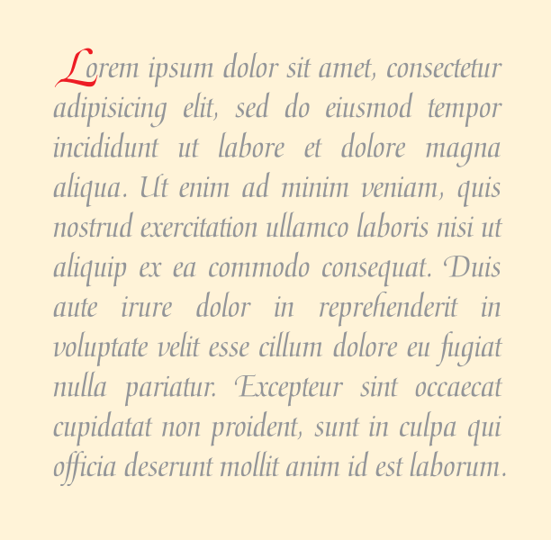
Lorem ipsum dolor sit amet, consectetur adipiscing elit, sed do eiusmod tempor incididunt ut labore et dolore magna aliqua. Ut enim ad minim veniam, quis nostrud exercitation ullamco laboris nisi ut aliquip ex ea commodo consequat. Duis aute irure dolor in reprehenderit in voluptate velit esse cillum dolore eu fugiat nulla pariatur. Excepteur sint occaecat cupidatat non proident, sunt in culpa qui officia deserunt mollit anim id est laborum.
When I first encountered this text, I did what any Latin geek will—set about trying to translate it. But it wasn’t long before I realized that Lorem Ipsum is mostly gibberish, a garbling of Latin that makes no real sense. The first word, “Lorem,” isn’t even a word; instead it’s a piece of the word “dolorem,” meaning pain, suffering, or sorrow. So where did this mash-up of Latin-like syntax come from, and how did it get so scrambled? First, the source of Lorem Ipsum—tracked down by Hampden-Sydney Director of Publications Richard McClintock—is Roman lawyer, statesman, and philosopher Cicero, from an essay called “On the Extremes of Good and Evil,” or De Finibus Bonorum et Malorum.
Why Cicero? Put most simply, writes Priceonomics, “for a long time, Cicero was everywhere.” His fame as the most skilled of Roman rhetoricians meant that his writing became the benchmark for prose in Latin, the standard European language of the middle ages. The passage that generated Lorem Ipsum translates in part to a sentiment Latinists will well understand:
Nor is there anyone who loves or pursues or desires to obtain pain of itself, because it is pain, but occasionally circumstances occur in which toil and pain can procure him some great pleasure.
Dolorem Ipsum, “pain in and of itself,” sums up the tortuous feeling of trying to render some of Cicero’s complex, verbose sentences into English. Doing so with tolerable proficiency is, for some of us, “great pleasure” indeed.
But how did Cicero, that master stylist, come to be so badly manhandled as to be nearly unrecognizable? Lorem Ipsum has a history that long predates online content management. It has been used as filler text since the sixteenth century when—as McClintock theorized—“some typesetter had to make a type specimen book, to demo different fonts” and decided that “the text should be insensible, so as not to distract from the page’s graphical features.” It appears that this enterprising craftsman snatched up a page of Cicero he had lying around and turned it into nonsense. The text, says McClintock, “has survived not only four centuries of letter-by-letter resetting but even the leap into electronic typesetting, essentially unchanged.”
The story of Lorem Ipsum is a fascinating one—if you’re into that kind of thing—but its longevity raises a further question: should we still be using it at all, this mangling of a dead language, in a medium as vital and dynamic as web publishing, where “content” refers to hundreds of design elements besides font. Is Lorem Ipsum a quaint piece of nostalgia that’s outlived its usefulness? In answer, you may wish to read Karen McGrane’s spirited defense of the practice. Or, if you feel it’s time to let the garbled Latin go the way of manual typesetting machines, consider perhaps as an alternative “Nietzsche Ipsum,” which generates random paragraphs of mostly verb-less, incoherent Nietzsche-like text, in English. Hey, at least it looks like a real language.
Red seems to be a magnet for angry bulls and great directors. After all, it’s the color that seems to stand out more than any other. Yasujiro Ozu, for one, made the jump to color movies very reluctantly late in his career and promptly became obsessed with the color red. His production team kept a box on set of small red household things – a matchbox, an umbrella, a teakettle — which he used to place in the background of just about every shot. Jean-Luc Godard famously bathed Brigitte Bardot’s backside in red light for his first color film Contempt. When critics complained that his feature, Pierrot le Fou, was too bloody, he quipped, “It’s not blood, it’s red.” And from HAL 9000’s unforgiving electronic eye in 2001 to the buckets of blood pouring out of the elevator from hell in The Shining, Stanley Kubrick built some of his most memorable scenes around the color red.
Editor and designer Rishi Kaneria, who seems to be making a career out of pointing out the color choices of auteurs, has just released a video called “Red & Yellow: A Wes Anderson Supercut” that squarely places Wes Anderson among the ranks of cinema’s great crimson-loving stylists – from Ben Stiller’s sweats in The Royal Tenenbaums to the luxurious carpets of his latest effort The Grand Budapest Hotel. As you might gather from the title of Kaneria’s short, Anderson is also a fan of the color yellow too. You can watch the video above. And you can watch Kaneria’s look into Kubrick’s use of red below.
Jonathan Crow is a Los Angeles-based writer and filmmaker whose work has appeared in Yahoo!, The Hollywood Reporter, and other publications. You can follow him at @jonccrow. And check out his blog Veeptopus, featuring lots of pictures of badgers and even more pictures of vice presidents with octopuses on their heads. The Veeptopus store is here.
A good title sequence tells you everything you need to know about the world of a movie. As it unspools the credits for a given film, it can also convey the movie’s mood, its sense of place, its story’s theme and even a few of its plot points. Saul Bass invented the modern title sequence with Otto Preminger’s The Man with the Golden Arm(1955). Consisting largely of moving white rectangles on a black background set to a jazzy score, the piece feels like a Blue Note record cover come to life – perfect for a gritty tale about heroin addiction. The opening was so striking that Hollywood took note and soon title sequences became the rage, especially ones made by Bass.
Above you can watch a long compilation of Saul Bass titles, starting with Man with the Golden Arm and ending with Martin Scorsese’s Casino (1995). Along the way, the montage illustrates the evolution of style over the course of those 40 years, showing how titles grew in ambition and sophistication. You can see titles for some great films from the yawning spiral in Vertigo to the monochrome crumbling busts in Stanley Kubrick’s Spartacus to the abstract shots of neon in Casino.
But to really get a sense of Bass’s talents, look to some of the less famous movies he worked on. For Carl Forman’s The Victors (1963), a bleak, big-budget anti-war flick, Bass compressed European history from the end of WWI to the devastation of WWII into one masterful montage. At one point, still photos of Hitler giving a speech flash across the screen, each shot pushed closer in on his mouth than the last, before the sequence culminates in a series of explosions. It’s one of the most concise and eloquent retellings of history in cinema. And for the zany comedy Not with My Wife, You Don’t!, Bass created an animated green-eyed monster of jealousy playing a violin. Say what you will about contemporary movies, but there are definitely not enough cartoon green-eyed monsters of jealousy these days.
Jonathan Crow is a Los Angeles-based writer and filmmaker whose work has appeared in Yahoo!, The Hollywood Reporter, and other publications. You can follow him at @jonccrow. And check out his blog Veeptopus, featuring lots of pictures of badgers and even more pictures of vice presidents with octopuses on their heads. The Veeptopus store is here.
Charlie Watts’s first love has always been jazz. While his Rolling Stones band mates spent their youth listening to the Blues, Watts listened to Miles Davis and John Coltrane. And something about that seems to have stuck. Mick Jagger and Keith Richards defined what a rock star should look like in the late 60s – disheveled and flamboyant. Watts always seemed to carry himself with a jazzman’s sense of cool.
Back in 1960, when he was working as a graphic designer and doing drumming gigs on the side, Watts found another way to show off his love for jazz. He wrote a children’s book. Ode to a Highflying Bird is about alt sax legend Charlie Parker, rendered in doodle-like fashion as a bird in shades. The hand-drawn text details Parker’s life story: “Frustrated with what life had to offer him in his hometown, he packed his whistle, pecked his ma goodbye and flew from his nest in Kansas City bound for New York.”
The book was originally done as a portfolio piece but, in 1964, after Watts became a member of the Stones, the book was published. As Watts recalled, “This guy who published ‘Rolling Stones Monthly’ saw my book and said ‘Ah, there’s a few bob in this!’”
This wasn’t the only ode to Bird that Watts made over his long career. In 1992, his jazz band, The Charlie Watts Quintet, released an album called From One Charlie… which, as the title suggests, pays homage to Parker and his other bee-bop gods. “I don’t really love rock & roll,” as he toldRolling Stone magazine. “I love jazz. But I love playing rock & roll with the Stones.”
A few old copies of Ode to a Highflying Bird can be found on Amazon and on Abe Books.
Jonathan Crow is a Los Angeles-based writer and filmmaker whose work has appeared in Yahoo!, The Hollywood Reporter, and other publications. You can follow him at @jonccrow. And check out his blog Veeptopus, featuring lots of pictures of badgers and even more pictures of vice presidents with octopuses on their heads. The Veeptopus store is here.
We're hoping to rely on loyal readers, rather than erratic ads. Please click the Donate button and support Open Culture. You can use Paypal, Venmo, Patreon, even Crypto! We thank you!
Open Culture scours the web for the best educational media. We find the free courses and audio books you need, the language lessons & educational videos you want, and plenty of enlightenment in between.