That’s what Warhol Campbell’s Soup Cans reconceived as Miyazaki films are,
M’m! M’m! Good!
Brazilian-Korean designer Hyo Taek Kim has found a continuing font of inspiration in his childhood love of Hayao Miyazaki’s animated films.
Miyazaki–Special Soup Series, his latest exploratory journey into the enchanted world of the revered master animator and director–finds him reducing each film to a couple of essential flavors.
One can imagine Mom calling the kids in from an afternoon of sledding for a warm, Cream of Tomato-ish bowl of Totoro.
Simple design that works is always so much harder to create than you might expect. It’s just very fun to marry two ideas, artists and/or concepts into one big image. Andy Warhol changed the world of physical arts. Hayao Miyazaki changed the world of animated arts.
This is not Kim’s first go at Campbell’s. His earlier Supersoup Series reduced superheroes to consommé and cream ofs. Don’t forget the oyster crackers.
Posters and t‑shirts of Hyo Taek Kim’s Miyazaki Special Soup and Soupersoup Series can be purchasedhere.
The instrument in the video above dates back to 1566.
Meaning, if it were the patriarch of a human family, siring musical sons every 20 to 25 years, it would take more than 10 generations to get to composer Robert Schumann, born in 1810.
Were you to peek at the back, you’d see traces of King Charles IX of France’s coat of arms. The Latin motto Pietate et Justitia–piety and justice–still lingers on its rib.
It was constructed by the master creator, Andrea Amati, as part of a large set of stringed instruments, of which it is one of four survivors of its size and class.
After leaving Charles’ court, the violin spent time in the Henry Hottinger collection, which was eventually acquired by the Wurlitzer Company in New York. In 1966, it was donated to Cremona, Italy, Amati’s birthplace and home to an international school of violin making.
Venerable unto the point of pricelessness, from time to time it is taken out and played–to wondrous effect–by world class violinists. It’s tempting to keep anthropomorphizing, so as to wonder if it might not prefer a forever home with a gifted young musician who would take it out and play it every day. I know what a children’s author would say on that subject.
You can view Amati’s Charles IX violin in more detail here, but why stop there, when you can also like it on Facebook!
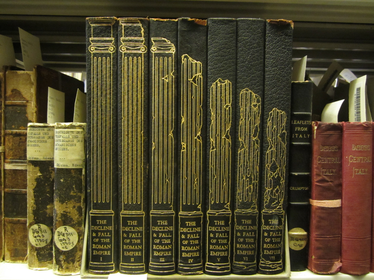
In 1929, the book publisher George Macy founded The Limited Editions Club (LEC), an imprint tasked with publishing finely illustrated limited editions of classic books. In the years to come, Macy worked with artists like Matisse and Picasso, and photographers like Edward Weston, to produce books with artistic illustrations on their inner pages. And sometimes The Limited Editions Club even turned its design focus to other parts of the book. Take for example this 1946 edition of Edward Gibbon’s The Decline and Fall of the Roman Empire and its pretty amazing spine design.
Created by Clarence P. Hornung, the design captures the essence of Gibbon’s classic, showing Roman pillars progressively crumbling as your eyes move from Volume 1 to Volume 7. George Macy later called the collection, which also features illustrations by the great 18th-century printmaker Giovanni Battista Piranesi, “the most herculean labor of our career.”
Note: an earlier version of this post appeared on our site in June 2015.
If you would like to sign up for Open Culture’s free email newsletter, please find it here. It’s a great way to see our new posts, all bundled in one email, each day.
If you would like to support the mission of Open Culture, consider making a donation to our site. It’s hard to rely 100% on ads, and your contributions will help us continue providing the best free cultural and educational materials to learners everywhere. You can contribute through PayPal, Patreon, and Venmo (@openculture). Thanks!
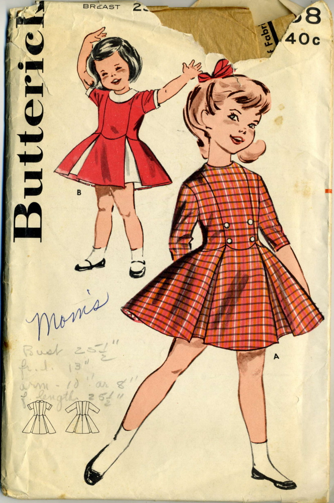
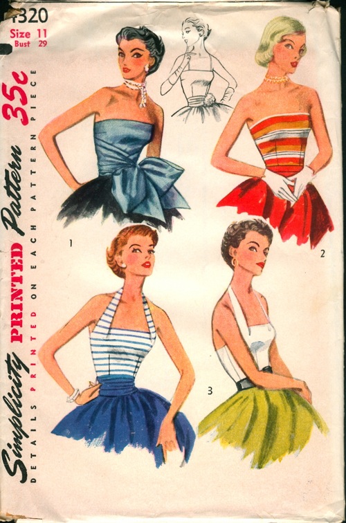
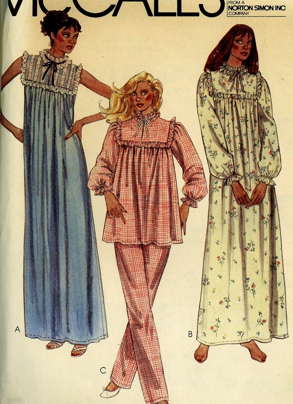
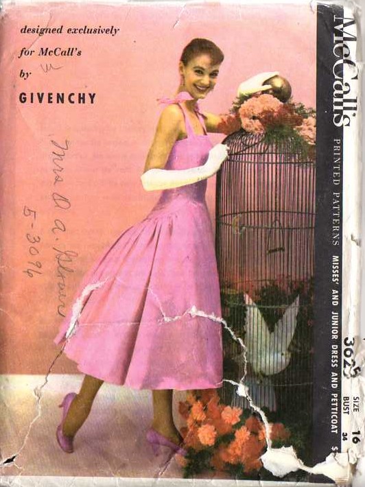
My costume design professor at Northwestern University, Virgil Johnson, delighted students with his formula for period clothing. I have forgotten some of the mathematic and semantic particulars—does dressing someone five years behind the times a “frumpy” character make? Or is it merely one?
I do recall some anxious hours, preparing for the school’s main stage production of the incestuous Jacobean revenge tragedy, ’Tis Pity She’s a Whore. The societal corruption of the play was underscored by having the supporting characters slouch around, snorting mimed cocaine in cutting edge, mid-80s Vogue Patterns … those big unstructured jackets were very a la mode, but they gobbled up a lot of high-budget fabric, and I didn’t want to be the one to make a costly sewing mistake.
What sticks in my mind most clearly is that 20 years was the sweet spot, the appropriate amount of elapsed time to ensure that one would not appear dumpy, dowdy, or oblivious, but rather prudent and discerning. Donning a garment that was 15 years out of fashion might be daringly “retro,” but another five and that same garment could be heralded as “vintage.”
The collaborative Vintage Pattern Wiki puts the magic number at 25, requesting that contributors make sure the patterns they post are from 1992 or earlier, and also out-of-print.
Visitors can narrow their search to focus on a particular garment, designer or decade. If you click these links, you can see patterns from the following decades: 1920s, 1930s, 1940s, 1950s, 1960s, 1970s, and 1980s.
And it goes without saying that the dog days of summer are the perfect time to get a jump on your Halloween costume.
Those who are itching to get sewing should check the links below each pattern envelope cover for vendors who have the pattern in stock and photos and posts by community members who have made that same garment.
The prices and handwritten jottings of the original owners will also put you in a vintage mood.
You’d be forgiven for assuming that the Bauhaus, the modern art and design movement that emerged from the eponymous German art school in the 1920s and 30s, didn’t involve many women. Perhaps the famous near-industrial austerity of its aesthetic, especially at large scales, has stereotypical associations with maleness, but also, Bauhaus’ most oft-referenced leading lights — Paul Klee, Walter Gropius, Wassily Kandinsky, László Moholy-Nagy, Oskar Schlemmer — all happened to be men. But if we seek out the women of the Bauhaus, what can we learn?
“When it opened, the Bauhaus school declared itself progressive and modern and advocated equality for the sexes, which was rare at the time,” says Evelyn Adams in her short video on the Women of the Bauhaus above. “Value was placed on skill rather than gender. Classes weren’t segregated, and women were free to select whichever subjects they wanted.”
This had an understandable appeal, and in the school’s first year more women applied than men. But alas, “in reality, despite having radical aspirations, the men in charge of the school represented the societal attitudes of the time. If everyone was welcomed as equals, then why did none of the women reach the same level of recognition as Paul Klee or Wassily Kandinsky?”
The story of Gertrud Arndt, one of whose self-portraits appears above and one of whose textiles appears below that, sheds some light on the answer. “She must have felt so optimistic,” writes the New York Times’ Alice Rawsthorn, when she arrived at the Bauhaus school of art and design in 1923 as “a gifted, spirited 20-year-old who had won a scholarship to pay for her studies. Having spent several years working as an apprentice to a firm of architects, she had set her heart on studying architecture.” But because of a “long-running battle between its founding director, the architect Walter Gropius, and one of its most charismatic teachers, Johannes Itten, who wanted to use the school as a vehicle for his quasi-spiritual approach to art and design,” the Bauhaus’ house, as it were, had fallen out of order.
Alas, “Arndt was told that there was no architecture course for her to join and was dispatched to the weaving workshop.” In recent years, the Bauhaus Archive in Berlin has put on shows to honor female Bauhausers like Ardnt, textile designer Benita Koch-Otte, and theater designer, illustrator, and color theorist Lou Scheper-Berkenkamp. “The situation improved after Gropius succeeded in ousting Itten in 1923,” writes Rawsthorn, hiring Moholy-Nagy in Itten’s place. “Having ensured that female students were given greater freedom, Moholy encouraged one of them, Marianne Brandt, to join the metal workshop. She was to become one of Germany’s foremost industrial designers during the 1930s,” and her 1924 tea infuser and strainer appears just above.
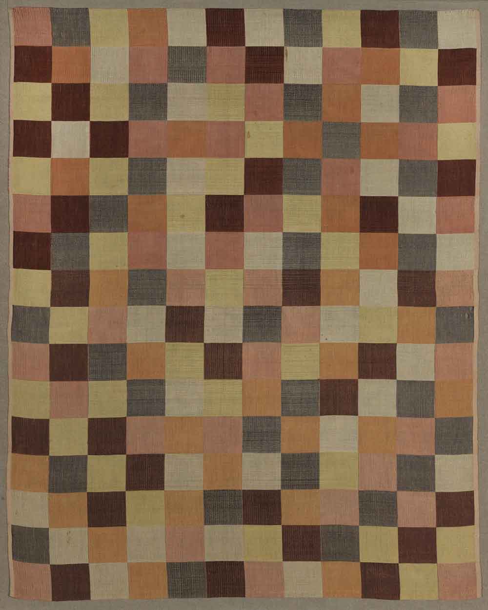
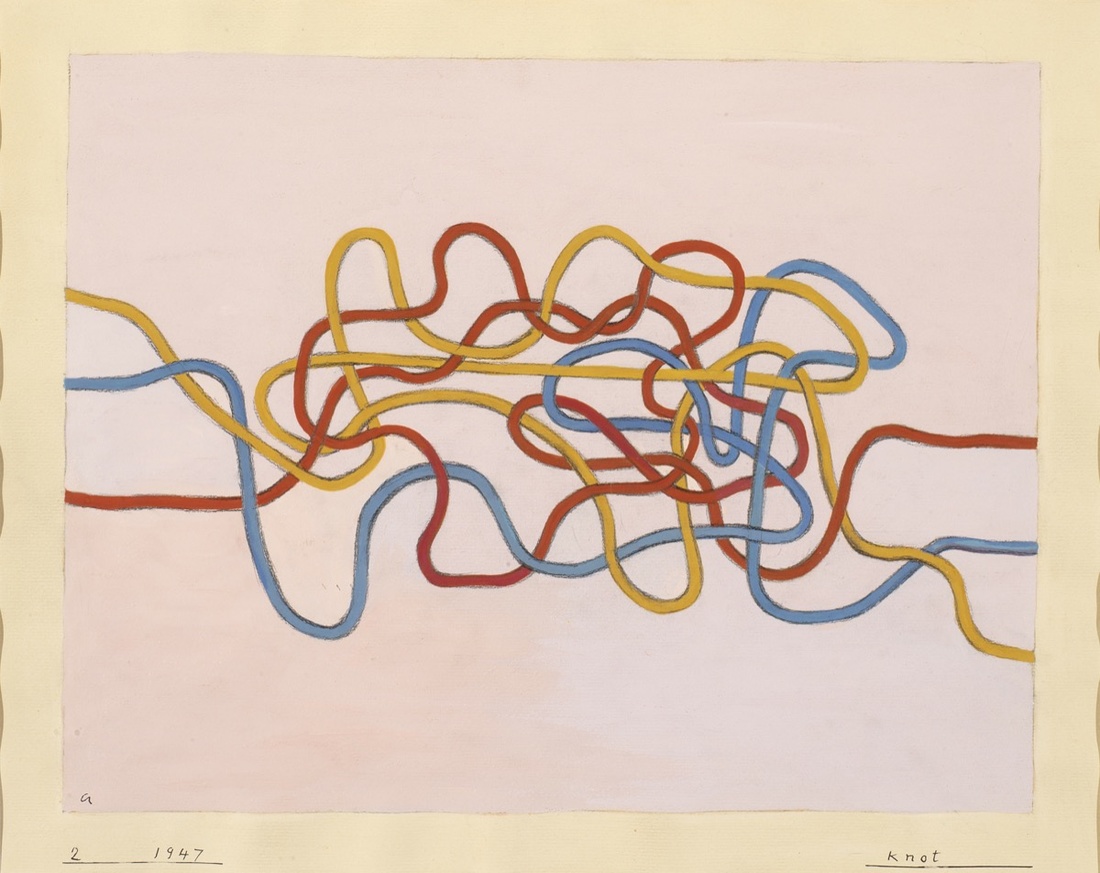
Artsy’s Alexxa Gotthardt has the stories of more women of the Bauhaus, including Anni Albers, whose 1947 Knot 2 appears just above. Her other work includes “a cotton and cellophane curtain that simultaneously absorbed sound and reflected light” and tapestries that “would go on to have a considerable impact on the development of geometric abstraction in the visual arts.” Alma Siedhoff-Buscher, writes Gotthardt, dared “to switch from the weaving workshop to the male-dominated wood-sculpture department,” where she invented a “small ship-building game,” pictured below and still in production today, that “manifested Bauhaus’s central tenets: its 22 blocks, forged in primary colors, could be constructed into the shape of a boat, but could also be rearranged to allow for creative experimentation.”
Bauhaus art and design took criticism in its heyday, as it still takes criticism now, for a certain coldness and sterility — or at least the work of the men of the Bauhaus does. But the more we discover about the lesser-known women of the Bauhaus, the more we see how they managed to bring no small degree of humanity to its artistic fruits, even to those of its most rigorous branches. “There is no difference between the beautiful sex and the strong sex,” Gropius once insisted in a somewhat self-defeating pronouncement, but the differences between the male and female Bauhausers — in their personalities as well as in their work — make the movement look all the richer in retrospect.
You can’t make a perfectly accurate map, as Jorge Luis Borges so succinctly told us, without making it the exact same size and shape as the land it portrays. But given the utter uselessness of such an enormous piece of paper (which so frustrated the citizens of the imaginary empire in Borges’ story that, “not without some pitilessness,” they tossed theirs into the desert), no mapmaker would ever want to. A more compact map is a more useful one; unfortunately, a more compact map is also, by its very nature, a less accurate one.
New York
The same rule applies to maps of all kinds, and especially to transit maps, quite possibly the most useful specialized maps we consult today. They show us how to navigate cities, and yet their clean, bold lines, sometimes turning but never wavering, hardly represent those cities — subject as they are to variations in terrain and density, as well as centuries of unplannably organic growth — with geographical faithfulness. One can’t help but wonder just how each urban transit map, some of them beloved works of design, strikes the usefulness-faithfulness balance.
London
Living in Seoul, I’ve grown used to the city’s standard subway map. I thus get a kick out of scrutinizing the more geographically accurate one, which overlays the train lines onto an existing map of the city, posted on some station platforms. It reveals the truth that some lines are shorter than they look on the standard map, some are much longer, and none cut quite as clean a path through the city as they seem to. At Twisted Sifter you’ll find a GIF gallery of 15 standard subway maps that morph into more geographically faithful equivalents, a vivid demonstration of just how much transit map designers need to twist, squeeze, and simplify an urban landscape to produce something legible at a glance.
Tokyo
All of those animations, just five of which you see in this post, come from the subreddit Data Is Beautiful, a realm populated by enthusiasts of the visual display of quantitative information — enthusiasts so enthusiastic that many of them create innovative data visualizations like these by themselves. According to their creations, subway maps, like that of New York City’s venerable system, do relatively little to distort the city; others, like Tokyo’s, look nearly unrecognizable when made to conform to geography.
Austin
Even the maps of new and incomplete transit networks do a number on the real shape and direction of their paths: the map of Austin, Texas’ Capital MetroRail, for instance, straightens a somewhat zig-zaggy northeast-southwest track into a single horizontal line. It may take a few generations before Austin’s “system” develops into one extensive and complex enough to inspire one of the great transit maps (the ranks, for example, of “The Wonderground Map of London Town”). But I wouldn’t count out the possibility: the more fully cities realize their public-transit potential, the more opportunity opens up for the advancement of the subway mapmaker’s art.
Apple Watch designer Marc Newson has created an hourglass that stands about 6 inches tall, measures 5 inches wide, and features 1,249,996 tiny spheres called “nanoballs,” each made of stainless steel and covered with a fine copper coating. It takes 10 minutes for the nanoballs to pour through the glass, from first to last. The action looks pretty mesmerizing, to say the least.
If you would like to sign up for Open Culture’s free email newsletter, please find it here. It’s a great way to see our new posts, all bundled in one email, each day.
If you would like to support the mission of Open Culture, consider making a donation to our site. It’s hard to rely 100% on ads, and your contributions will help us continue providing the best free cultural and educational materials to learners everywhere. You can contribute through PayPal, Patreon, and Venmo (@openculture). Thanks!
Architect, inventor, theorist, and all-around fount of ideas Buckminster Fuller came up with many new things, though most of us associate him with one above all: geodesic domes. Those distinctive hemispheric structures built out of strong triangular parts, having gone in and out of vogue over the decades, most recently reappeared in the zeitgeist as the type of lodging promised to the attendees of the ill-conceived Fyre Festival — an ultra-luxury market-targeted disaster not representative, safe to say, of the world Fuller spent his entire career trying to realize. His vision of a future for “Spaceship Earth,” as he called it, drove him to create all he created, from new maps to new houses to new cars to new sleeping methods. But what did he base that vision on?
“Fuller’s philosophy could be best summarized as being a social thinker, believing that humanity’s survival is contingent upon how it manages Spaceship Earth and the resources it contains,” says the narrator of the three-minute Prosocial Progress Foundation primer above, “and that creating abundance whilst doing little to no harm to the environment would help to alleviate a lot of the problems in the world today.”
With every project he emphasized “systems thinking,” or thinking premised on “the idea that the world is an interconnected system with interconnected problems, and that a way to solve these problems would be to call upon collective action.” We’d all have to work together, in his view, to solve the problems we suffer together.
That notion may strike us as utopian even today, and indeed, most of Fuller’s inventions only saw limited application during his lifetime. But the label of utopian, which suggests a disregard for the rigors of reality, doesn’t quite fit the man himself, so much concern did he have for practicalities like the efficient allocation of resources, quick construction and deployment, and ease of use. But given the dystopian terms we’ve increasingly come to use to describe events here on Spaceship Earth, maybe we need a Fuller-style practical utopianism now more than ever. If these three minutes have given you a taste for more of the details, have a look at Fuller’s video lecture series Everything I Know — but make sure to clear 42 hours of your calendar first. The future of humanity may depend on it!
We're hoping to rely on loyal readers, rather than erratic ads. Please click the Donate button and support Open Culture. You can use Paypal, Venmo, Patreon, even Crypto! We thank you!
Open Culture scours the web for the best educational media. We find the free courses and audio books you need, the language lessons & educational videos you want, and plenty of enlightenment in between.


