Modern Corporate Logos Reimagined in a Classic Bauhaus Style: Celebrate the 100th Anniversary of the Bauhaus Movement Today

Image by Vladimir Nikolic

Amer­i­can chil­dren, a study found a few years ago, rec­og­nize over 1,000 cor­po­rate logos but almost no plants. To some it was a damn­ing indict­ment of the mod­ern world; to oth­ers it was noth­ing more than a descrip­tion of the mod­ern world (in the 21st cen­tu­ry, after all, which skill is more help in find­ing food?); and to a few it was an oppor­tu­ni­ty to pro­claim that, for the sake of the chil­dren, the mod­ern world could use some bet­ter cor­po­rate logos.

Image by dell­fi

The artists, archi­tects, and design­ers of the Bauhaus, the mod­ernist art-school-turned-move­ment with its ori­gins in Weimar Ger­many, might well have agreed. Right from the Bauhaus’ foun­da­tion in 1919, its mem­bers worked on shap­ing the aes­thet­ics of the future.

Now, for the school’s 100th anniver­sary (today!), 99designs has com­mis­sioned revi­sions of cur­rent cor­po­rate logos in the Bauhaus style. “It out­last­ed a century’s worth of com­pet­ing styles,” writes 99designs’ Matt Ellis, “sur­vived the ini­tial crit­i­cisms from tra­di­tion­al­ists, and although the Nazis shut down the insti­tu­tion in 1933, the Bauhaus move­ment itself lives on to this day.”

Image by Ars­De­signs

Ellis goes on to quote the still-inspir­ing words of Bauhaus founder Wal­ter Gropius: “The artist is a height­ened man­i­fes­ta­tion of the crafts­man. Let us form… a new guild of crafts­men with­out the class divi­sions that set out to raise an arro­gant bar­ri­er between crafts­men and artists! Let us togeth­er cre­ate the new build­ing of the future which will be all in one: archi­tec­ture and sculp­ture and paint­ing.” This project put up the five pil­lars of the Bauhaus style: “form fol­lows func­tion,” “min­i­mal­ism,” “rev­o­lu­tion­ary typog­ra­phy,” “pas­sion for geom­e­try,” and “pri­ma­ry col­ors.”

Image by dnk

The reimag­ined cor­po­rate logos made for the cen­te­nary of the Bauhaus stand on all those pil­lars, turn­ing the emblems of prod­ucts and ser­vices that many of us con­sume and use every day — or per­haps, as we scroll through Insta­gram on our iPhones or Android devices at Star­bucks in our Adi­das­es, all at the same time — into designs that merge the cut­ting-edge aes­thet­ics of inter­war Europe with those of the thor­ough­ly glob­al­ized 2010s.

Image by Pono­marevD­mit­ry

Whether a pure Bauhaus revival will result in the actu­al adop­tion of logos like these remains to be seen, but in a way, the exer­cise sim­ply dou­bles down on an influ­ence that already runs deep. As Art­sy’s Kelsey Ables puts it, “It is a tes­ta­ment to the long­stand­ing influ­ence of Bauhau­sian min­i­mal­ist ideals that the select­ed logos were already stream­lined to begin with; many of the design­ers who reimag­ined ‘Bauhaus style’ logos had to add visu­al ele­ments. Per­haps Google and its brethren are more Bauhaus than the Bauhaus itself.”

Image by Ars­De­signs

Relat­ed Con­tent:

Watch Bauhaus World, a Free Doc­u­men­tary That Cel­e­brates the 100th Anniver­sary of Germany’s Leg­endary Art, Archi­tec­ture & Design School

Down­load Orig­i­nal Bauhaus Books & Jour­nals for Free: A Dig­i­tal Cel­e­bra­tion of the Found­ing of the Bauhaus School 100 Years Ago

How the Rad­i­cal Build­ings of the Bauhaus Rev­o­lu­tion­ized Archi­tec­ture: A Short Intro­duc­tion

An Oral His­to­ry of the Bauhaus: Hear Rare Inter­views (in Eng­lish) with Wal­ter Gropius, Lud­wig Mies van der Rohe & More

32,000+ Bauhaus Art Objects Made Avail­able Online by Har­vard Muse­um Web­site

The Female Pio­neers of the Bauhaus Art Move­ment: Dis­cov­er Gertrud Arndt, Mar­i­anne Brandt, Anni Albers & Oth­er For­got­ten Inno­va­tors

Based in Seoul, Col­in Mar­shall writes and broad­casts on cities, lan­guage, and cul­ture. His projects include the book The State­less City: a Walk through 21st-Cen­tu­ry Los Ange­les and the video series The City in Cin­e­ma. Fol­low him on Twit­ter at @colinmarshall or on Face­book.

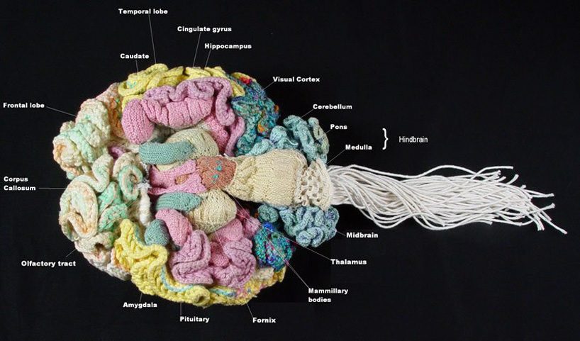
Behold an Anatomically Correct Replica of the Human Brain, Knitted by a Psychiatrist

Our brains dic­tate our every move.

They’re the ones who spur us to study hard, so we can make some­thing of our­selves, in order to bet­ter our com­mu­ni­ties.

They name our babies, choose our clothes, decide what we’re hun­gry for.

They make and break laws, orga­nize protests, frit­ter away hours on social media, and give us the green light to binge watch a bunch of dumb shows when we could be read­ing War and Peace.

They also plant the seeds for Fitz­car­ral­do-like cre­ative endeav­ors that take over our lives and gen­er­ate lit­tle to no income.

We may describe such endeav­ors as a labor of love, into which we’ve poured our entire heart and soul, but think for a sec­ond.

Who’s real­ly respon­si­ble here?

The heart, that mus­cu­lar fist-sized Valen­tine, con­tent to just pump-pump-pump its way through life, lub-dub, lub-dub, from cra­dle to grave?

Or the brain, a crafty Iago of an organ, pos­ses­sor of bil­lions of neu­rons, com­plex, con­tra­dic­to­ry, a mys­tery we’re far from unrav­el­ing?

Psy­chi­a­trist Dr. Karen Nor­berg’s brain has steered her to study such heavy duty sub­jects as the day­care effect, the rise in youth sui­cide, and the risk of pre­scrib­ing selec­tive sero­tonin reup­take inhibitors as a treat­ment for depres­sion.

On a lighter note, it also told her to devote nine months to knit­ting an anatom­i­cal­ly cor­rect repli­ca of the human brain.

(Twelve, if you count three months of research before cast­ing on.)

How did her brain con­vince her to embark on this mad­cap assign­ment?

Easy. It arranged for her to be in the mid­dle of a more pro­sa­ic knit­ting project, then goosed her into notic­ing how the ruf­fles of that project resem­bled the wrin­kles of the cere­bral cor­tex.

Coin­ci­dence?

Not like­ly. Espe­cial­ly when one of the cere­bral cor­tex’s most impor­tant duties is deci­sion mak­ing.

As she explained in an inter­view with The Tele­graph, brain devel­op­ment is not unlike the growth of a knit­ted piece:

You can see very nat­u­ral­ly how the ‘rip­pling’ effect of the cere­bral cor­tex emerges from prop­er­ties that prob­a­bly have to do with nerve cell growth. In the case of knit­ting, the effect is cre­at­ed by increas­ing the num­ber of stitch­es in each row.

Dr. Norberg—who, yes, has on occa­sion referred to her project as a labor of love—told Sci­en­tif­ic Amer­i­can that such a mas­sive crafty under­tak­ing appealed to her sense of humor because “it seemed so ridicu­lous and would be an enor­mous­ly com­pli­cat­ed, absurd­ly ambi­tious thing to do.”

That’s the point at which many people’s brains would give them per­mis­sion to stop, but Dr. Nor­berg and her brain per­sist­ed, push­ing past the hypo­thet­i­cal, cre­at­ing col­or­ful indi­vid­ual struc­tures that were even­tu­al­ly sewn into two cud­dly hemi­spheres that can be joined with a zip­per.

(She also let slip that her brain—by which she means the knit­ted one, though the obser­va­tion cer­tain­ly holds true for the one in her head—is female, due to its robust cor­pus cal­lo­sum, the “tough body” whose mil­lions of fibers pro­mote com­mu­ni­ca­tion and con­nec­tion.)

via The Tele­graph

Relat­ed Con­tent:

A Mas­sive, Knit­ted Tapes­try of the Galaxy: Soft­ware Engi­neer Hacks a Knit­ting Machine & Cre­ates a Star Map Fea­tur­ing 88 Con­stel­la­tions

Jazz Musi­cian Plays Acoustic Gui­tar While Under­go­ing Brain Surgery, Help­ing Doc­tors Mon­i­tor Their Progress

How Med­i­ta­tion Can Change Your Brain: The Neu­ro­science of Bud­dhist Prac­tice

Ayun Hal­l­i­day is an author, illus­tra­tor, the­ater mak­er and Chief Pri­ma­tol­o­gist of the East Vil­lage Inky zine.  Join her in New York City for the next install­ment of her book-based vari­ety show, Necro­mancers of the Pub­lic Domain, this April. Fol­low her @AyunHalliday.

The Roman Roads of Spain & Portugal Visualized as a Subway Map: Ancient History Meets Modern Graphic Design

Between the first cen­tu­ry BC and the fourth cen­tu­ry AD, Rome dis­played what we might call an impres­sive ambi­tion. In his project illus­trat­ing those chap­ters of his­to­ry in a way no one has before, sta­tis­tics stu­dent Sasha Tru­bet­skoy has shown increas­ing­ly Roman-grade ambi­tions him­self, at least in the realm of his­tor­i­cal graph­ic design. We’ve pre­vi­ous­ly fea­tured his mod­ern sub­way-style maps of the roads of the Roman Empire as well as the Roman roads of Britain here on Open Cul­ture. Today, we have his map of the Roman Roads of Iberia, the region today occu­pied main­ly by Spain and Por­tu­gal.

“This map was a blast to make,” writes Tru­bet­skoy. “I chose to fol­low the Anto­nine Itin­er­ary more strict­ly, which meant that I had to deal with many par­al­lel lines.” Also known as the itin­er­ary of the Emper­or Anton­i­nus or “Itin­er­ar­i­um Provin­cia­rum Antoni(ni) Augusti,” accord­ing to the Roman Roads Research Asso­ci­a­tion, the Anto­nine Itin­er­ary is “a col­lec­tion of 225 lists of stop­ping places along var­i­ous Roman roads across the Roman Empire.” Its val­ue “comes from it being one of a very few doc­u­ments to have sur­vived to mod­ern times which pro­vide detail of names and clues to the loca­tion of Roman sites and the routes of roads.”

Each list, or iter, that makes up the Anto­nine Itin­er­ary “gives the start and end of each route, with the total mileage of that route, fol­lowed by a list of inter­me­di­ate points with the dis­tances in between.” In cre­at­ing his Roman Roads of Iberia sub­way map, Tru­bet­skoy made each iter into its own “line,” though for some of them he had to draw from oth­er sources: “A cou­ple of Anto­nine routes were ambigu­ous and not eas­i­ly placed on a map, while a few impor­tant routes were miss­ing for which there is archae­o­log­i­cal evi­dence.”

It takes no small amount of work to con­vert this kind of often patchy and scat­tered knowl­edge from ancient his­to­ry into graph­ics as clean­ly and leg­i­bly designed as Tru­bet­skoy’s Roman-road sub­way maps. But the result, apart from offer­ing a nifty jux­ta­po­si­tion of past and present, reminds us of what the roads of the Romain Empire actu­al­ly meant: a degree of con­nect­ed­ness between dis­tant lands nev­er before achieved in human his­to­ry. You can sup­port Tru­bet­skoy’s efforts to show this to us in ever greater detail by mak­ing the US$9 sug­gest­ed dona­tion to down­load a high-res­o­lu­tion ver­sion of the Roman Roads of Iberia map. Rome was­n’t built in a day, much less its empire: the com­plete sub­way-map­ping of Rome’s roads will also require more time and labor — but then, would the builders of the Roman Empire have described their task as a “blast”?

Relat­ed Con­tent:

Ancient Rome’s Sys­tem of Roads Visu­al­ized in the Style of Mod­ern Sub­way Maps

The Roman Roads of Britain Visu­al­ized as a Sub­way Map

Rome Reborn: Take a Vir­tu­al Tour of Ancient Rome, Cir­ca 320 C.E.

How Did the Romans Make Con­crete That Lasts Longer Than Mod­ern Con­crete? The Mys­tery Final­ly Solved

The Rise & Fall of the Romans: Every Year Shown in a Time­lapse Map Ani­ma­tion (753 BC ‑1479 AD)

A Won­der­ful Archive of His­toric Tran­sit Maps: Expres­sive Art Meets Pre­cise Graph­ic Design

Based in Seoul, Col­in Mar­shall writes and broad­casts on cities, lan­guage, and cul­ture. His projects include the book The State­less City: a Walk through 21st-Cen­tu­ry Los Ange­les and the video series The City in Cin­e­ma. Fol­low him on Twit­ter at @colinmarshall or on Face­book.

Watch Bauhaus World, a Free Documentary That Celebrates the 100th Anniversary of Germany’s Legendary Art, Architecture & Design School

This April 1st marks the 100th anniver­sary of the found­ing of the Bauhaus, the Ger­man art school that, though short-lived, launched an entire design move­ment with a stark, func­tion­al aes­thet­ic all its own. It can be tempt­ing, look­ing into that aes­thet­ic that finds the beau­ty in indus­try and the indus­try in beau­ty, to regard it as pure­ly a prod­uct of its time and place, specif­i­cal­ly a 20th-cen­tu­ry Europe between the wars search­ing for ways to invent the future. But as revealed in Bauhaus World, this three-part doc­u­men­tary from Ger­man broad­cast­er Deutsche Welle, the lega­cy of the Bauhaus lives on not just in the rep­u­ta­tions of its best known orig­i­nal mem­bers — Wal­ter Gropius, Paul Klee, Lás­zló Moholy-Nagy, and Josef Albers, among oth­ers — but in the cur­rent­ly active cre­ators it con­tin­ues to inspire in every cor­ner of the Earth.

“What do esca­la­tors in Medel­lín, Ara­bic let­ter­ing in Amman, sto­ry-telling fur­ni­ture from Lon­don, urban farm­ing in Detroit and a co-liv­ing com­plex in Tokyo have to do with the Bauhaus?” asks Deutsche Welle’s web site. They all draw from “the influ­ence that the phi­los­o­phy of the Bauhaus move­ment still exerts on the glob­al­ized soci­ety of the 21st cen­tu­ry,” a time that has its soci­etal par­al­lels with the year 1919.

To illus­trate those par­al­lels as well as the con­tin­u­ing rel­e­vance of Bauhaus teach­ings, “we meet archi­tects, urban plan­ners, design­ers and artists from around the globe who, in the spir­it of the Bauhaus, want to rethink and change the world.” True to its title, Bauhaus World’s jour­ney involves a wide vari­ety of coun­tries, and not just Euro­pean ones: dif­fer­ent seg­ments pro­file the work of Bauhaus-influ­enced design­ers every­where from Mex­i­co to Jor­dan, Colom­bia to Israel, the Unit­ed States to Japan.

It’s in Japan, in fact, that the first part of Bauhaus World, “The Code,” finds the out­er reach­es of the spread of Bauhaus that began with the exile of its mem­bers from Nazi Ger­many. The sec­ond part, “The Effect,” deals with the endur­ing influ­ence that has turned Bauhaus and its prin­ci­ples from a move­ment to a brand, one that has poten­tial­ly done more than its share to make us as design-obsessed as we’ve become in the 21st cen­tu­ry — a cen­tu­ry that, the third and final part “The Utopia” con­sid­ers, may or may not have a place for the orig­i­nal Bauhaus ideals. But what­ev­er Gropius, Klee, Moholy-Nagy, Albers, and the rest would think of what the Bauhaus they cre­at­ed has become over the past hun­dred years, over the next hun­dred years more and more design­ers — emerg­ing from a wider and wider vari­ety of soci­eties and tra­di­tions — will come to see them­selves as its descen­dants.

Bauhaus World will be added to our list of Free Doc­u­men­taries, a sub­set of our col­lec­tion, 4,000+ Free Movies Online: Great Clas­sics, Indies, Noir, West­erns, Doc­u­men­taries & More.

Relat­ed Con­tent:

How the Rad­i­cal Build­ings of the Bauhaus Rev­o­lu­tion­ized Archi­tec­ture: A Short Intro­duc­tion

An Oral His­to­ry of the Bauhaus: Hear Rare Inter­views (in Eng­lish) with Wal­ter Gropius, Lud­wig Mies van der Rohe & More

32,000+ Bauhaus Art Objects Made Avail­able Online by Har­vard Muse­um Web­site

The Female Pio­neers of the Bauhaus Art Move­ment: Dis­cov­er Gertrud Arndt, Mar­i­anne Brandt, Anni Albers & Oth­er For­got­ten Inno­va­tors

Down­load Beau­ti­ful­ly-Designed Bauhaus Books & Jour­nals for Free: Gropius, Klee, Kandin­sky, Moholy-Nagy & More

Based in Seoul, Col­in Mar­shall writes and broad­casts on cities, lan­guage, and cul­ture. His projects include the book The State­less City: a Walk through 21st-Cen­tu­ry Los Ange­les and the video series The City in Cin­e­ma. Fol­low him on Twit­ter at @colinmarshall or on Face­book.

Dieter Rams Lists the 10 Timeless Principles of Good Design–Backed by Music by Brian Eno

Near­ly all of us have heard the dic­tum “Less, but bet­ter,” and near­ly all of us have used Braun prod­ucts. But how many of us know that both of those owe their con­sid­er­able pop­u­lar­i­ty to the same man? After study­ing archi­tec­ture, inte­ri­or dec­o­ra­tion, and car­pen­try, the Ger­man indus­tri­al design­er Dieter Rams spent 40 years at Braun, most of them as the com­pa­ny’s chief design offi­cer. There he cre­at­ed such hits as the 606 uni­ver­sal shelv­ing sys­tem, the SK61 record play­er, and the ET66 cal­cu­la­tor. That last pro­vid­ed the mod­el for the cal­cu­la­tor appli­ca­tion inter­face in Apple’s iOS 3, among oth­er homages Apple has paid to Rams.

Rams, in turn, has been com­pli­men­ta­ry to Apple, call­ing it one of the few com­pa­nies in exis­tence that designs prod­ucts accord­ing to his prin­ci­ples. Any­one can sense the affin­i­ty between the most endur­ing Apple prod­ucts and Rams-designed Braun prod­ucts, but what are those prin­ci­ples?

You can hear them laid out by the man him­self him­self in the trail­er above for Rams, last year’s doc­u­men­tary by Gary Hus­twit, he of Hel­veti­ca (the doc­u­men­tary about the font) and Objec­ti­fied (the doc­u­men­tary about indus­tri­al design that fea­tured Rams as an inter­vie­wee). The list is as fol­lows:

  1. Good design is inno­v­a­tive. “Design always comes about in con­nec­tion with inno­v­a­tive tech­nol­o­gy. How can design be good if the tech­nol­o­gy is not on the same lev­el?”
  2. Good design makes a prod­uct use­ful. “Good design opti­mizes use­ful­ness and ignores any­thing that does­n’t serve the pur­pose or works against it.”
  3. Good design is aes­thet­ic. “Objects you use dai­ly sig­nif­i­cant­ly shape your sur­round­ings and your sense of well-being. Only some­thing that is well-made can be beau­ti­ful.”
  4. Good design makes a prod­uct under­stand­able. “It makes it easy to under­stand the struc­ture of the prod­uct. Even more, it can make the prod­uct ‘talk.’ Ide­al­ly, it explains itself best.”
  5. Good design is unob­tru­sive. “Prod­ucts that serve a pur­pose have the char­ac­ter­is­tics of a tool. Their design should be neu­tral and leave room for the user’s self-expres­sion.”
  6. Good design is hon­est. “Hon­est means not try­ing to make a prod­uct look more inno­v­a­tive, pow­er­ful, or valu­able than it real­ly is.”
  7. Good design is long-last­ing. “In con­trast to fash­ion­able design, it lasts many years even in our cur­rent throw­away soci­ety.”
  8. Good design is thor­ough down to the last detail. “Noth­ing should be arbi­trary or left to chance. Thor­ough­ness and pre­ci­sion are expres­sions of respect for the user.”
  9. Good design is envi­ron­men­tal­ly friend­ly. “Design makes an impor­tant con­tri­bu­tion to pre­serv­ing the envi­ron­ment. It con­serves resources and min­i­mizes phys­i­cal and visu­al pol­lu­tion.”
  10. Good design is as lit­tle design as pos­si­ble. “Back to sim­plic­i­ty. Back to puri­ty. Less, but bet­ter.”

The trail­er illus­trates each of these prin­ci­ples with one of Rams’ designs, devel­oped at Braun or else­where: the T 1000 CD radio, the MPZ 21 cit­rus juicer, the 740 stool, the 620 chair. Though designed forty, fifty, even six­ty years ago, these gad­gets and pieces of fur­ni­ture have stood the test of time. Some have even made a return to the mar­ket in recent years of our both aes­thet­i­cal­ly and envi­ron­men­tal­ly con­scious age. You can watch Rams on Vimeo on Demand, and if you do, you’ll not only get to enjoy its Bri­an Eno-com­posed score, you’ll learn much more about how Rams designed his most beloved prod­ucts — and about where he still sees ways to improve them. That holds true even for his design prin­ci­ples them­selves: “I always empha­sized that they weren’t meant to last for­ev­er,” he says. “They should be updat­ed.”

via Uncrate

Relat­ed Con­tent:

Bauhaus, Mod­ernism & Oth­er Design Move­ments Explained by New Ani­mat­ed Video Series

Pao­la Antonel­li on Design as the Inter­face Between Progress and Human­i­ty

Saul Bass’ Oscar-Win­ning Ani­mat­ed Short Pon­ders Why Man Cre­ates

Saul Bass’ Advice for Design­ers: Make Some­thing Beau­ti­ful and Don’t Wor­ry About the Mon­ey

Sketch­es of Artists by the Late New Media Design­er Hill­man Cur­tis

Abstract: Netflix’s New Doc­u­men­tary Series About “the Art of Design” Pre­mieres Today

Based in Seoul, Col­in Mar­shall writes and broad­casts on cities, lan­guage, and cul­ture. His projects include the book The State­less City: a Walk through 21st-Cen­tu­ry Los Ange­les and the video series The City in Cin­e­ma. Fol­low him on Twit­ter at @colinmarshall or on Face­book.

Librarian Honors a Dying Tree by Turning It Into a Little Free Library

And then she said to Anni­ka, “Why don’t you feel in that old tree stump? One prac­ti­cal­ly always finds things in old tree stumps.” 

- Pip­pi Long­stock­ing, Astrid Lind­gren 

Remem­ber that oth­er clas­sic of chil­dren’s lit­er­a­ture, where­in a boy runs from the city to a seclud­ed moun­tain, tak­ing up res­i­dence in an old tree he hol­lows into a cozy shel­ter?

Pub­lic librar­i­an and artist Shar­alee Armitage Howard’s Lit­tle Free Library is a bit like that, except there was no run­ning involved.

When the ven­er­a­ble and ail­ing cot­ton­wood in her Coeur d’Alene front yard began drop­ping branch­es on cars parked below, Howard faced the inevitable. But rather than chop the tree even with the ground, she arranged with the removal crew to leave a con­sid­er­able amount of stump intact.

Then, in a Pip­pi Long­stock­ing-ish move, she filled it with books for her neigh­bors and strangers to dis­cov­er.

The inte­ri­or has a snug, wood­land vibe, wor­thy of Beat­rix Pot­ter or Ali­son Utt­ley, with tidy shelves, soft light­ing, and a shin­gled roof to pro­tect the con­tents from the ele­ments.

Ever since Decem­ber, when Howard post­ed pho­tos to social media, the fairy­tale-like struc­ture has been engen­der­ing epic amounts of glob­al good­will.

What a beau­ti­ful way to pre­serve and hon­or a tree that stood for well over a cen­tu­ry.

One of the few naysay­ers is Red­dit user dis­cern­ing­per­vert, who is per­haps not giv­ing voice to the Lorax, so much as Thalia, Muse of Com­e­dy, when he writes:

It’s like a house of hor­rors for trees. Inside the corpse of their for­mer com­rade are the processed rem­nants of their tree­broth­ers and treesisters.

A lit­er­al Tree­house of Hor­ror…

Vis­it Howard’s Lit­tle Free Library (char­ter #8206) the next time you’re in Ida­ho. Or install one of your own.

(Those with trees to throw at the cause may want to begin with the stump hol­low­ing tuto­r­i­al below.)

via Twist­ed Sifter

Relat­ed Con­tent:

RIP Todd Bol, Founder of the Lit­tle Free Library Move­ment: He Leaves Behind 75,000 Small Libraries That Pro­mote Read­ing World­wide

Free Libraries Shaped Like Doc­tor Who’s Time-Trav­el­ing TARDIS Pop Up in Detroit, Saska­toon, Macon & Oth­er Cities

Grow­ing Up Sur­round­ed by Books Has a Last­ing Pos­i­tive Effect on the Brain, Says a New Sci­en­tif­ic Study

Ayun Hal­l­i­day is an author, illus­tra­tor, the­ater mak­er and Chief Pri­ma­tol­o­gist of the East Vil­lage Inky zine.  See her onstage in New York City in Feb­ru­ary as host of  The­ater of the Apes book-based vari­ety show, Necro­mancers of the Pub­lic Domain. Fol­low her @AyunHalliday.

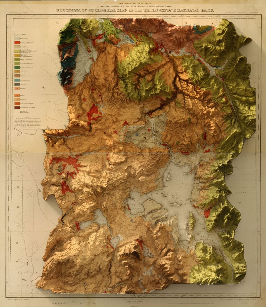
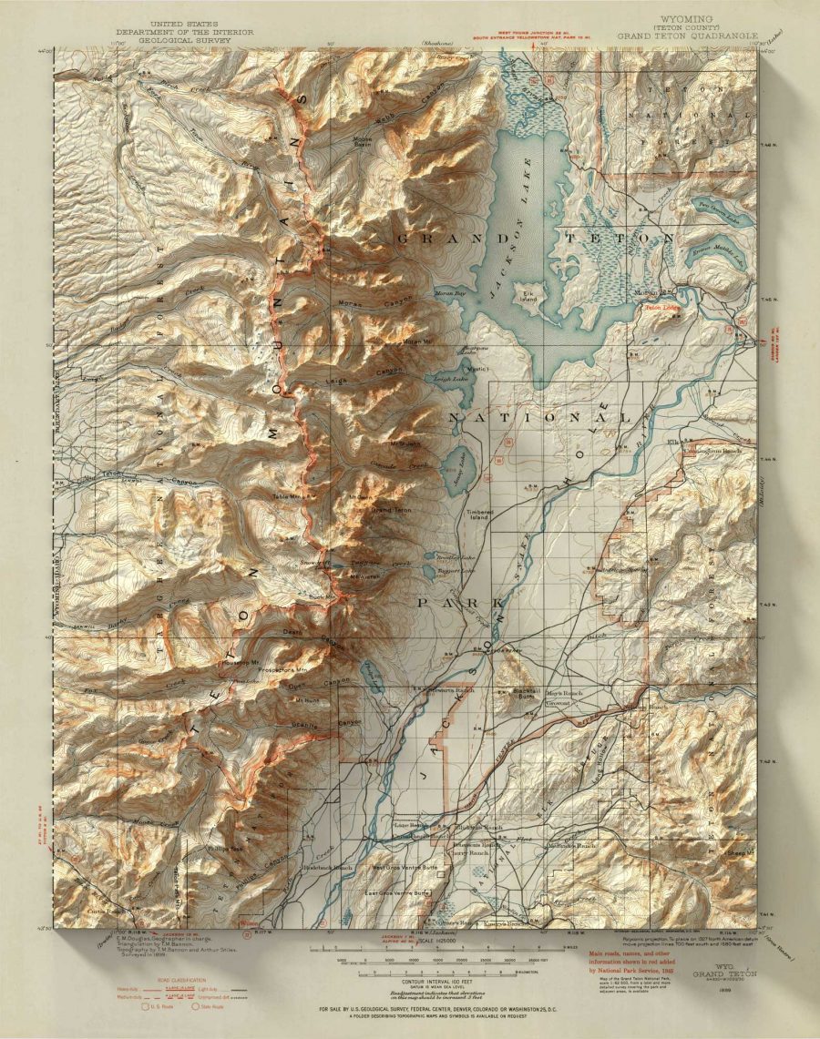
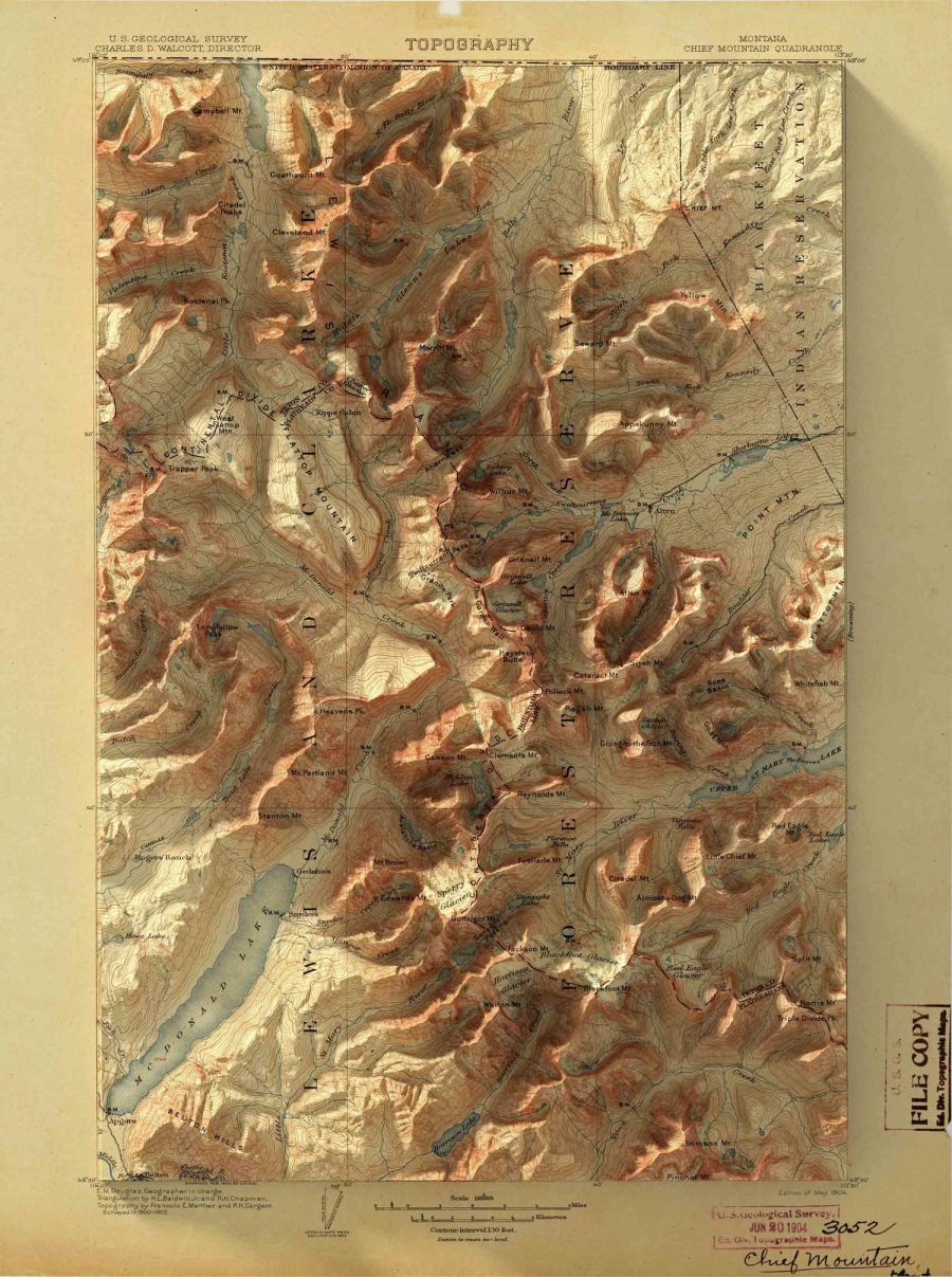
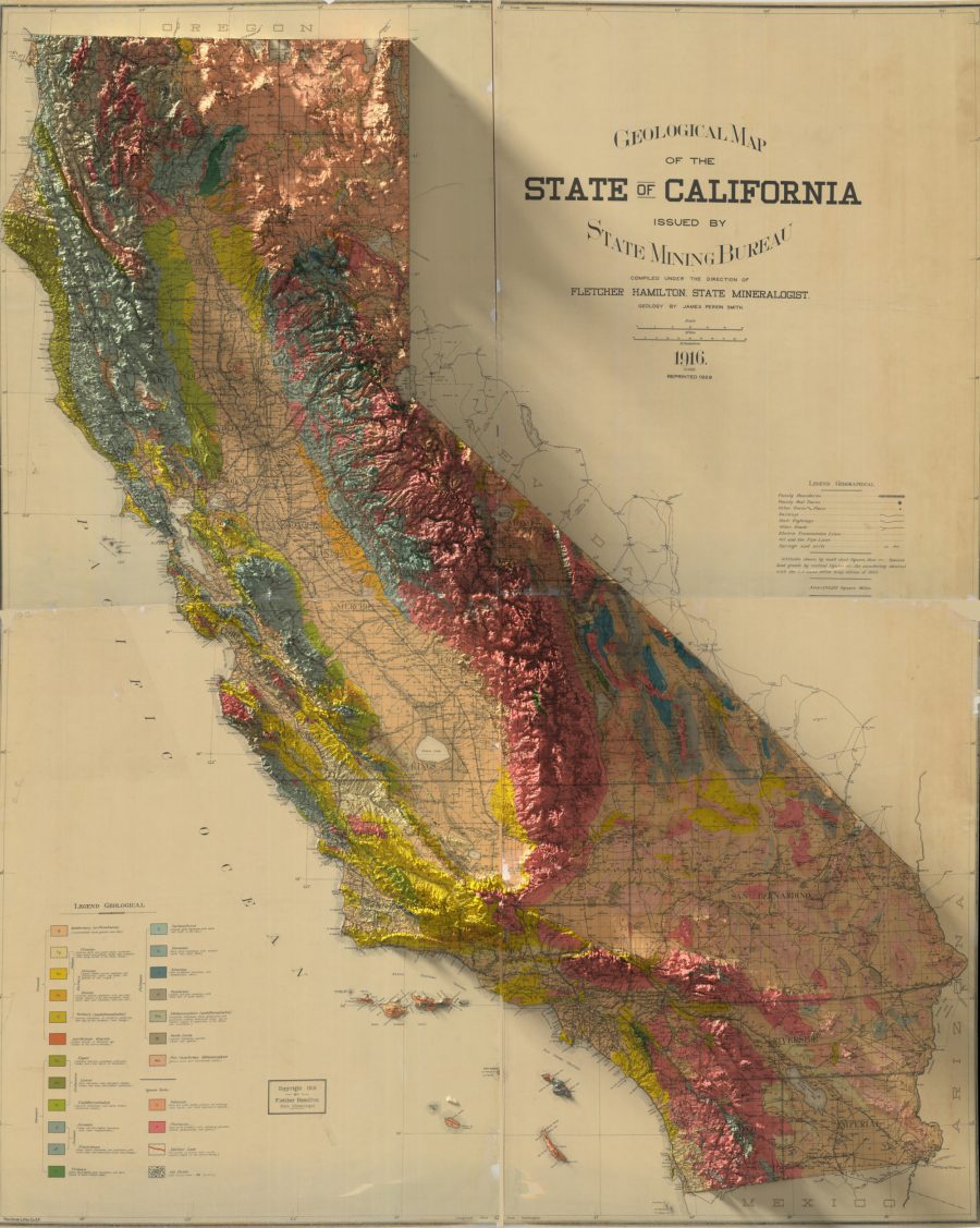
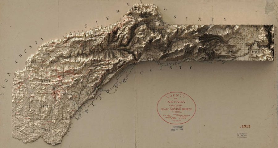
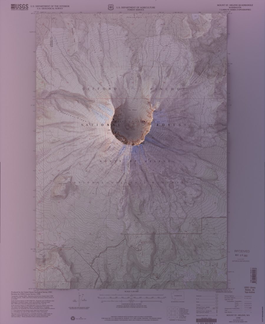
Vintage Geological Maps Get Turned Into 3D Topographical Wonders

What good is an old-fash­ioned map in the age of apps?

One need not be a moun­taineer, geo­sci­en­tist, or civ­il engi­neer to get the topo­graph­i­cal lay of the land with a speed and accu­ra­cy that would have blown Lewis and Clark’s minds’ right through the top of the lynx and otter top­pers they took to wear­ing after their stan­dard issue army lids wore out.

There’s still some­thing to be said for the old ways, though.

Graph­ic design­er Scott Rein­hard has all the lat­est tech­no­log­i­cal advances at his dis­pos­al, but it took com­bin­ing them with hun­dred-year-old maps for him to get a tru­ly 3‑D appre­ci­a­tion for loca­tions he has vis­it­ed around the Unit­ed States, as well as his child­hood home.

A son of Indi­ana, Rein­hard told Colossal’s Kate Sierzputows­ki that he found some Grand Teton-type excite­ment in the noto­ri­ous­ly flat Hoosier State once he start­ed mar­ry­ing offi­cial nation­al geospa­tial data to vin­tage map designs:

 When I began ren­der­ing the ele­va­tion data for the state, the sto­ry of the land emerged. The glac­i­ers that reced­ed across the north­ern half of the state after the last ice age scraped and gouged and shaped the land in a way that is spec­tac­u­lar­ly clear…I felt empow­ered by the abil­i­ty to col­lect and process the vast amounts of infor­ma­tion freely avail­able, and cre­ate beau­ti­ful images.

(The gov­ern­ment shut-down has not dam­aged the accu­ra­cy of Reinhard’s maps, but the U.S. Geo­log­i­cal Survey’s web­site does warn the pub­lic that the effects of any earth­quakes or oth­er force majeure occur­ring dur­ing this black-out peri­od will not imme­di­ate­ly be reflect­ed in their topos.)

(Nor are they able to respond to any inquiries, which puts a damper on hol­i­day week­end plans for mak­ing salt dough maps, anoth­er Hoosier state fave, at least in 1974…)

As writer Jason Kot­tke notes, the shad­ows the moun­tains cast on the mar­gins of Reinhard’s maps are a par­tic­u­lar­ly effec­tive opti­cal trick.

You can see more of Reinhard’s dig­i­tal­ly enhanced maps from the late 19th and ear­ly 20th-cen­tu­ry, and order prints in his online shop.

via Kot­tke/Colos­sal

Relat­ed Con­tent:

View and Down­load Near­ly 60,000 Maps from the U.S. Geo­log­i­cal Sur­vey (USGS)

Down­load 67,000 His­toric Maps (in High Res­o­lu­tion) from the Won­der­ful David Rum­sey Map Col­lec­tion

The His­to­ry of Car­tog­ra­phy, “the Most Ambi­tious Overview of Map Mak­ing Ever Under­tak­en,” Is Free Online

Ayun Hal­l­i­day is an author, illus­tra­tor, the­ater mak­er and Chief Pri­ma­tol­o­gist of the East Vil­lage Inky zine.  See her onstage in New York City in Feb­ru­ary as host of  The­ater of the Apes book-based vari­ety show, Necro­mancers of the Pub­lic Domain. Fol­low her @AyunHalliday.

An Illustrated and Interactive Dante’s Inferno: Explore a New Digital Companion to the Great 14th-Century Epic Poem

Medieval con­cep­tions of hell may have lit­tle effect on the laws and social mores of our sec­u­lar age. But they sure as hell did in the late 15th cen­tu­ry, when the first illus­trat­ed edi­tions of Dante’s Infer­no appeared. A 1481 edi­tion con­tained art based on a series of unfin­ished illus­tra­tions by Renais­sance mas­ter San­dro Bot­ti­cel­li. In 1491, the first ful­ly-illus­trat­ed edi­tion of the Infer­no arrived. As were most print­ed works at the time, these books were elab­o­rate and expen­sive, reflect­ing the very seri­ous treat­ment the sub­ject of Dante’s work received.

Cen­turies lat­er, Dante’s work has not lost its effect on our imag­i­na­tions. Though most peo­ple are far less like­ly to enter­tain belief in a giant corkscrew pit beneath the earth full of tor­tured souls, it remains a vivid, chill­ing (so to speak) metaphor. The epic poem’s lan­guage moves and entrances us; its psy­cho­log­i­cal insights daz­zle; its for­mal inno­va­tions con­tin­ue to awe; and its images still shock, amuse, and ter­ri­fy.

Every decade, it seems, pro­duces some new, fresh visu­al take on the Infer­no, from Bot­ti­cel­li to the stun­ning ren­der­ings of William Blake, Gus­tave Doré, Alber­to Mar­ti­ni, Sal­vador Dali, Robert Rauschen­berg.…

This is daunt­ing com­pa­ny, and the online, inter­ac­tive com­pan­ion to the Infer­no you see screen-shot­ted here does not attempt to join their ranks. Its charm­ing, children’s‑book-graphic visu­al pre­sen­ta­tion takes a G‑rated approach, ditch­ing accu­rate human anato­my and hor­rif­ic vio­lence for a car­toon­ish video game romp through hell that makes it seem like a super fun, if super weird, place to vis­it. Cre­at­ed by Alpaca, an Ital­ian design coop­er­a­tive, and design stu­dio Molotro, the tool aims to be “a synsemic access point to Dante’s lit­er­a­ture, aid­ing its study.”

What it lacks in visu­al high seri­ous­ness, it makes up for in util­i­ty. In this bril­liant­ly sim­ple design you can leap from Can­to to Can­to, learn the cir­cle each one cov­ers, the kind of sin­ners who inhab­it it, and the main char­ac­ters in each. Click on select­ed fig­ures in the graph­ic to see char­ac­ter names and quot­ed excerpts from the poem. A much longer list of char­ac­ters serves as an index, quick­ly link­ing each name to a Can­to, quo­ta­tion, cir­cle, and sin. The Ital­ian site links to the orig­i­nal poem on Wikipedia. The Eng­lish ver­sion’s anno­ta­tions link to Hen­ry Wadsworth Longfellow’s 1867 trans­la­tion.

Access Can­tos and Char­ac­ters in menus at the top of the main page or use the zoom but­ton to move clos­er into any point in the topo­graph­i­cal map and begin click­ing on car­toon fig­ures in var­i­ous stages of tor­tured dis­tress. See Behance for an illus­trat­ed guide through the online Infer­no, a com­i­cal-look­ing tool with very seri­ous appli­ca­tions for stu­dents of Dante’s poem. If you’re new to the Infer­no, dive right in here. Hell awaits, as it has for mil­lions of fas­ci­nat­ed read­ers for 800 years.

via Metafil­ter

Relat­ed Con­tent:

A Free Course on Dante’s Divine Com­e­dy from Yale Uni­ver­si­ty

Visu­al­iz­ing Dante’s Hell: See Maps & Draw­ings of Dante’s Infer­no from the Renais­sance Through Today

Artists Illus­trate Dante’s Divine Com­e­dy Through the Ages: Doré, Blake, Bot­ti­cel­li, Mœbius & More

A Dig­i­tal Archive of the Ear­li­est Illus­trat­ed Edi­tions of Dante’s Divine Com­e­dy (1487–1568)

Alber­to Martini’s Haunt­ing Illus­tra­tions of Dante’s Divine Com­e­dy (1901–1944)

Josh Jones is a writer and musi­cian based in Durham, NC. Fol­low him at @jdmagness

« Go BackMore in this category... »
Quantcast
Open Culture was founded by Dan Colman.