How to Take a Picture of a Black Hole: Watch the 2017 Ted Talk by Katie Bouman, the MIT Grad Student Who Helped Take the Groundbreaking Photo

What trig­gered the worst impuls­es of the Inter­net last week?

The world’s first pho­to of a black hole, which proved the pres­ence of troll life here on earth, and con­firms that female sci­en­tists, through no fault of their own, have a much longer way to go, baby.

If you want a taste, sort the com­ments on the two year old TED Talk, above, so they’re ordered  â€śnewest first.”

Katie Bouman, soon-to-be assis­tant pro­fes­sor of com­put­ing and math­e­mat­i­cal sci­ences at the Cal­i­for­nia Insti­tute of Tech­nol­o­gy, was a PhD can­di­date at MIT two years ago, when she taped the talk, but she could’ve passed for a ner­vous high school­er com­pet­ing in the Nation­al Sci­ence Bowl finals, in clothes bor­rowed from Aunt Judy, who works at the bank.

The focus of her stud­ies were the ways in which emerg­ing com­pu­ta­tion­al meth­ods could help expand the bound­aries of inter­dis­ci­pli­nary imag­ing.

Pri­or to last week, I’m not sure how well I could have parsed the focus of her work had she not tak­en the time to help less STEM-inclined view­ers such as myself wrap our heads around her high­ly tech­ni­cal, then-whol­ly-the­o­ret­i­cal sub­ject.

What I know about black holes could still fit in a thim­ble, and in truth, my excite­ment about one being pho­tographed for the first time pales in com­par­i­son to my excite­ment about Game of Thrones return­ing to the air­waves.

For­tu­nate­ly, we’re not oblig­at­ed to be equal­ly turned on by the same inter­ests, an idea the­o­ret­i­cal physi­cist Richard Feyn­man pro­mot­ed:

I’ve always been very one-sided about sci­ence and when I was younger I con­cen­trat­ed almost all my effort on it. I did­n’t have time to learn and I did­n’t have much patience with what’s called the human­i­ties, even though in the uni­ver­si­ty there were human­i­ties that you had to take. I tried my best to avoid some­how learn­ing any­thing and work­ing at it. It was only after­wards, when I got old­er, that I got more relaxed, that I’ve spread out a lit­tle bit. I’ve learned to draw and I read a lit­tle bit, but I’m real­ly still a very one-sided per­son and I don’t know a great deal. I have a lim­it­ed intel­li­gence and I use it in a par­tic­u­lar direc­tion.

I’m pret­ty sure my lack of pas­sion for sci­ence is not tied to my gen­der. Some of my best friends are guys who feel the same. (Some of them don’t like team sports either.)

But I could­n’t help but expe­ri­ence a wee thrill that this young woman, a sci­ence nerd who admit­ted­ly could’ve used a few the­ater nerd tips regard­ing relax­ation and pub­lic speak­ing, real­ized her dream—an hon­est to good­ness pho­to of a black hole just like the one she talked about in her TED Talk,  â€śHow to take a pic­ture of a black hole.”

Bouman and the 200+ col­leagues she acknowl­edges and thanks at every oppor­tu­ni­ty, achieved their goal, not with an earth-sized cam­era but rather a net­work of linked tele­scopes, much as she had described two years ear­li­er, when she invoked dis­co balls, Mick Jag­ger, oranges, self­ies, and a jig­saw puz­zle in an effort to help peo­ple like me under­stand.

Look at that suck­er (or, more accu­rate­ly, its shad­ow!) That thing’s 500 mil­lion tril­lion kilo­me­ters from Earth!

(That’s much far­ther than King’s Land­ing is from Win­ter­fell.)

I’ll bet a lot of ele­men­tary sci­ence teach­ers, be they male, female, or non-bina­ry, are going to make sci­ence fun by hav­ing their stu­dents draw pic­tures of the pic­ture of the black hole.

If we could go back (or for­ward) in time, I can almost guar­an­tee that mine would be among the best because while I didn’t “get” sci­ence (or gym), I was a total art star with the crayons.

Then, crafty as Lord Petyr Bael­ish when pre­sen­ta­tion time rolled around, I would part­ner with a girl like Katie Bouman, who could explain the sci­ence with win­ning vig­or. She gen­uine­ly seems to embrace the idea that it “takes a vil­lage,” and that one’s fel­low vil­lagers should be cred­it­ed when­ev­er pos­si­ble.

(How did I draw the black hole, you ask? Hon­est­ly, it’s not that much hard­er than draw­ing a dough­nut. Now back to Katie!)

Alas, her pro­fes­sion­al warmth failed to reg­is­ter with legions of Inter­net trolls who began slim­ing her short­ly after a col­league at MIT shared a beam­ing snap­shot of her, tak­en, pre­sum­ably, with a reg­u­lar old phone as the black hole made its debut. That pic cement­ed her acci­den­tal sta­tus as the face of this project.

Note to the trolls—it was­n’t a dang self­ie.

“I’m so glad that every­one is as excit­ed as we are and peo­ple are find­ing our sto­ry inspi­ra­tional,’’ Bouman told The New York Times. “How­ev­er, the spot­light should be on the team and no indi­vid­ual per­son. Focus­ing on one per­son like this helps no one, includ­ing me.”

Although Bouman was a junior team mem­ber, she and oth­er grad stu­dents made major con­tri­bu­tions. She direct­ed the ver­i­fi­ca­tion of images, the selec­tion of imag­ing para­me­ters, and authored an imag­ing algo­rithm that researchers used in the cre­ation of three script­ed code pipelines from which the instant­ly-famous pic­ture was cob­bled togeth­er.

As Vin­cent Fish, a research sci­en­tist at MIT’s Haystack Obser­va­to­ry told CNN:

One of the insights Katie brought to our imag­ing group is that there are nat­ur­al images. Just think about the pho­tos you take with your cam­era phone—they have cer­tain prop­er­ties.… If you know what one pix­el is, you have a good guess as to what the pix­el is next to it.

Hey, that makes sense.

As The Verge’s sci­ence edi­tor, Mary Beth Grig­gs, points out, the rush to defame Bouman is of a piece with some of the non-vir­tu­al real­i­ties women in sci­ence face:

Part of the rea­son that some posters found Bouman imme­di­ate­ly sus­pi­cious had to do with her gen­der. Famous­ly, a num­ber of promi­nent men like dis­graced for­mer CERN physi­cist Alessan­dro Stru­mia have argued that women aren’t being dis­crim­i­nat­ed against in sci­ence — they sim­ply don’t like it, or don’t have the apti­tude for it. That argu­ment for­ti­fies a notion that women don’t belong in sci­ence, or can’t real­ly be doing the work. So women like Bouman must be fakes, this warped line of think­ing goes…

Even I, whose 7th grade sci­ence teacher tem­pered a bad grade on my report card by say­ing my inter­est in the­ater would like­ly serve me much bet­ter than any­thing I might eek from her class, know that just as many girls and women excel at sci­ence, tech­nol­o­gy, engi­neer­ing, and math as excel in the arts. (Some­times they excel at both!)

(And pow­er to every lit­tle boy with his sights set on nurs­ing, teach­ing, or bal­let!)

(How many black holes have the haters pho­tographed recent­ly?)

Grig­gs con­tin­ues:

Say­ing that she was part of a larg­er team doesn’t dimin­ish her work, or min­i­mize her involve­ment in what is already a his­to­ry-mak­ing project. High­light­ing the achieve­ments of a bril­liant, enthu­si­as­tic sci­en­tist does not dimin­ish the con­tri­bu­tions of the oth­er 214 peo­ple who worked on the project, either. But what it is doing is show­ing a dif­fer­ent mod­el for a sci­en­tist than the one most of us grew up with. That might mean a lot to some kids — maybe kids who look like her — mak­ing them excit­ed about study­ing the won­ders of the Uni­verse.

via Boing­Bo­ing

Relat­ed Con­tent:

Women’s Hid­den Con­tri­bu­tions to Mod­ern Genet­ics Get Revealed by New Study: No Longer Will They Be Buried in the Foot­notes

New Aug­ment­ed Real­i­ty App Cel­e­brates Sto­ries of Women Typ­i­cal­ly Omit­ted from U.S. His­to­ry Text­books

Stephen Hawk­ing (RIP) Explains His Rev­o­lu­tion­ary The­o­ry of Black Holes with the Help of Chalk­board Ani­ma­tions

Watch a Star Get Devoured by a Super­mas­sive Black Hole

Ayun Hal­l­i­day is an author, illus­tra­tor, the­ater mak­er and Chief Pri­ma­tol­o­gist of the East Vil­lage Inky zine.  Join her in New York City tonight for the next install­ment of her book-based vari­ety show, Necro­mancers of the Pub­lic Domain. Fol­low her @AyunHalliday.

A Visualization of the United States’ Exploding Population Growth Over 200 Years (1790 – 2010)

The U.S. is bare­ly even an ado­les­cent com­pared to many oth­er coun­tries around the world. Yet it ranks third, behind Chi­na and India, in pop­u­la­tion. How did the coun­try go, in a lit­tle over 200 years, from 6.1 peo­ple per square mile in 1800 to 93 per square mile today? We’ve pre­vi­ous­ly fea­tured maps of how the real estate came on the mar­ket. And we’ve brought you a map that tells the loca­tions and sto­ries of the peo­ples who used to live there. The map above takes a dif­fer­ent approach, show­ing pop­u­la­tion den­si­ty growth from 1790 to 2010, in num­bers based on Cen­sus records.

Orig­i­nal­ly appear­ing on Vivid Maps, the ani­mat­ed time­line con­tains no infor­ma­tion about the how, who, or why of things. But we know that since it only accounts for those who were count­ed, the num­bers of peo­ple actu­al­ly liv­ing with­in the bor­ders is often much high­er. “Not only did the pop­u­la­tion boom as a result of births and immi­grants,” writes Jeff Des­jardins at the site Visu­al Cap­i­tal­ist, “but the bor­ders of the coun­try kept chang­ing as well.” This change, and the fact that indige­nous peo­ple were not record­ed, leads to an inter­est­ing visu­al­iza­tion of west­ward expan­sion from the point of view of the set­tlers.

As Des­jardins notes, the state of Okla­homa appears as an “emp­ty gap” on the map in the late-1800s, light­ly shad­ed while its bor­ders are sur­round­ed by dark brown. This is because “the area was orig­i­nal­ly des­ig­nat­ed as Indi­an Ter­ri­to­ry…. How­ev­er, in 1889, the land was opened up to a mas­sive land rush, and approx­i­mate­ly 50,000 pio­neers lined up to grab a piece of the two mil­lion acres opened for set­tle­ment.” Thou­sands of the peo­ple liv­ing there had already, of course, been pushed off their land dur­ing the decades-long “Trail of Tears.” The ques­tion of who “exact­ly is count­ed as a whole per­son?” comes up in the com­ments on Visu­al Cap­i­tal­ist post, anoth­er key con­sid­er­a­tion for under­stand­ing this data in its prop­er con­text.

The ways peo­ple have been cat­e­go­rized are prod­ucts of con­tem­po­rary bias­es, polit­i­cal atti­tudes, and legal and social dis­crim­i­na­tions. These atti­tudes are not inci­den­tal to the pop­u­lat­ing of the coun­try, but mate­ri­al­ly inte­gral. As we see the mas­sive, yet huge­ly uneven, spread of peo­ple across the expand­ing coun­try, we might be giv­en the impres­sion that it con­sti­tutes a uni­fied surge of expan­sion and devel­op­ment, when the his­tor­i­cal real­i­ty, of course, is any­thing but. Of the many ques­tions we can ask of this data, “who ful­ly count­ed as an Amer­i­can dur­ing each of these peri­ods and why or why not?” might be one of the most rel­e­vant, in 1790 and today. Or, if you’d rather just watch the map fill up with sepia and burnt umber pix­els, to the tune of some mar­tial-sound­ing drum & bass, watch the video above.

via Visu­al Cap­i­tal­ist

Relat­ed Con­tent:

Native Lands: An Inter­ac­tive Map Reveals the Indige­nous Lands on Which Mod­ern Nations Were Built

Inter­ac­tive Map Shows the Seizure of Over 1.5 Bil­lion Acres of Native Amer­i­can Land Between 1776 and 1887

A Rad­i­cal Map Puts the Oceans–Not Land–at the Cen­ter of Plan­et Earth (1942)

Josh Jones is a writer and musi­cian based in Durham, NC. Fol­low him at @jdmagness

M.I.T. Computer Program Alarmingly Predicts in 1973 That Civilization Will End by 2040

In 1704, Isaac New­ton pre­dict­ed the end of the world some­time around (or after, “but not before”) the year 2060, using a strange series of math­e­mat­i­cal cal­cu­la­tions. Rather than study what he called the “book of nature,” he took as his source the sup­posed prophe­cies of the book of Rev­e­la­tion. While such pre­dic­tions have always been cen­tral to Chris­tian­i­ty, it is star­tling for mod­ern peo­ple to look back and see the famed astronomer and physi­cist indulging them. For New­ton, how­ev­er, as Matthew Stan­ley writes at Sci­ence, “lay­ing the foun­da­tion of mod­ern physics and astron­o­my was a bit of a sideshow. He believed that his tru­ly impor­tant work was deci­pher­ing ancient scrip­tures and uncov­er­ing the nature of the Chris­t­ian reli­gion.”

Over three hun­dred years lat­er, we still have plen­ty of reli­gious doom­say­ers pre­dict­ing the end of the world with Bible codes. But in recent times, their ranks have seem­ing­ly been joined by sci­en­tists whose only pro­fessed aim is inter­pret­ing data from cli­mate research and sus­tain­abil­i­ty esti­mates giv­en pop­u­la­tion growth and dwin­dling resources. The sci­en­tif­ic pre­dic­tions do not draw on ancient texts or the­ol­o­gy, nor involve final bat­tles between good and evil. Though there may be plagues and oth­er hor­ri­ble reck­on­ings, these are pre­dictably causal out­comes of over-pro­duc­tion and con­sump­tion rather than divine wrath. Yet by some strange fluke, the sci­ence has arrived at the same apoc­a­lyp­tic date as New­ton, plus or minus a decade or two.

The “end of the world” in these sce­nar­ios means the end of mod­ern life as we know it: the col­lapse of indus­tri­al­ized soci­eties, large-scale agri­cul­tur­al pro­duc­tion, sup­ply chains, sta­ble cli­mates, nation states…. Since the late six­ties, an elite soci­ety of wealthy indus­tri­al­ists and sci­en­tists known as the Club of Rome (a fre­quent play­er in many con­spir­a­cy the­o­ries) has fore­seen these dis­as­ters in the ear­ly 21st cen­tu­ry. One of the sources of their vision is a com­put­er pro­gram devel­oped at MIT by com­put­ing pio­neer and sys­tems the­o­rist Jay For­rester, whose mod­el of glob­al sus­tain­abil­i­ty, one of the first of its kind, pre­dict­ed civ­i­liza­tion­al col­lapse in 2040. “What the com­put­er envi­sioned in the 1970s has by and large been com­ing true,” claims Paul Rat­ner at Big Think.

Those pre­dic­tions include pop­u­la­tion growth and pol­lu­tion lev­els, “wors­en­ing qual­i­ty of life,” and “dwin­dling nat­ur­al resources.” In the video at the top, see Aus­trali­a’s ABC explain the computer’s cal­cu­la­tions, “an elec­tron­ic guid­ed tour of our glob­al behav­ior since 1900, and where that behav­ior will lead us,” says the pre­sen­ter. The graph spans the years 1900 to 2060. “Qual­i­ty of life” begins to sharply decline after 1940, and by 2020, the mod­el pre­dicts, the met­ric con­tracts to turn-of-the-cen­tu­ry lev­els, meet­ing the sharp increase of the “Zed Curve” that charts pol­lu­tion lev­els. (ABC revis­it­ed this report­ing in 1999 with Club of Rome mem­ber Kei­th Suter.)

You can prob­a­bly guess the rest—or you can read all about it in the 1972 Club of Rome-pub­lished report Lim­its to Growth, which drew wide pop­u­lar atten­tion to Jay Forrester’s books Urban Dynam­ics (1969) and World Dynam­ics (1971). For­rester, a fig­ure of New­ton­ian stature in the worlds of com­put­er sci­ence and man­age­ment and sys­tems theory—though not, like New­ton, a Bib­li­cal prophe­cy enthusiast—more or less endorsed his con­clu­sions to the end of his life in 2016. In one of his last inter­views, at the age of 98, he told the MIT Tech­nol­o­gy Review, “I think the books stand all right.” But he also cau­tioned against act­ing with­out sys­tem­at­ic think­ing in the face of the glob­al­ly inter­re­lat­ed issues the Club of Rome omi­nous­ly calls “the prob­lem­at­ic”:

Time after time … you’ll find peo­ple are react­ing to a prob­lem, they think they know what to do, and they don’t real­ize that what they’re doing is mak­ing a prob­lem. This is a vicious [cycle], because as things get worse, there is more incen­tive to do things, and it gets worse and worse.

Where this vague warn­ing is sup­posed to leave us is uncer­tain. If the cur­rent course is dire, “unsys­tem­at­ic” solu­tions may be worse? This the­o­ry also seems to leave pow­er­ful­ly vest­ed human agents (like Exxon’s exec­u­tives) whol­ly unac­count­able for the com­ing col­lapse. Lim­its to Growth—scoffed at and dis­parag­ing­ly called “neo-Malthu­sian” by a host of lib­er­tar­i­an crit­ics—stands on far sur­er evi­den­tiary foot­ing than Newton’s weird pre­dic­tions, and its cli­mate fore­casts, notes Chris­t­ian Par­en­ti, “were alarm­ing­ly pre­scient.” But for all this doom and gloom it’s worth bear­ing in mind that mod­els of the future are not, in fact, the future. There are hard times ahead, but no the­o­ry, no mat­ter how sophis­ti­cat­ed, can account for every vari­able.

via Big Think

Relat­ed Con­tent:

In 1704, Isaac New­ton Pre­dicts the World Will End in 2060

A Cen­tu­ry of Glob­al Warm­ing Visu­al­ized in a 35 Sec­ond Video

A Map Shows What Hap­pens When Our World Gets Four Degrees Warmer: The Col­orado Riv­er Dries Up, Antarc­ti­ca Urban­izes, Poly­ne­sia Van­ish­es

It’s the End of the World as We Know It: The Apoc­a­lypse Gets Visu­al­ized in an Inven­tive Map from 1486

Josh Jones is a writer and musi­cian based in Durham, NC. Fol­low him at @jdmagness

Explore Meticulous 3D Models of Endangered Historical Sites in Google’s “Open Heritage” Project

One brisk thump­ing by a nat­ur­al dis­as­ter, total­i­tar­i­an regime, or ter­ror­ist group is more than enough to reduce an awe-inspir­ing her­itage site to rub­ble.

With that sad fact in mind, Google Arts & Cul­ture has paired with CyArk, a non prof­it whose mis­sion is using the lat­est tech­nolo­gies to dig­i­tal­ly doc­u­ment and pre­serve the world’s sig­nif­i­cant cul­tur­al her­itage in an eas­i­ly share­able for­mat.

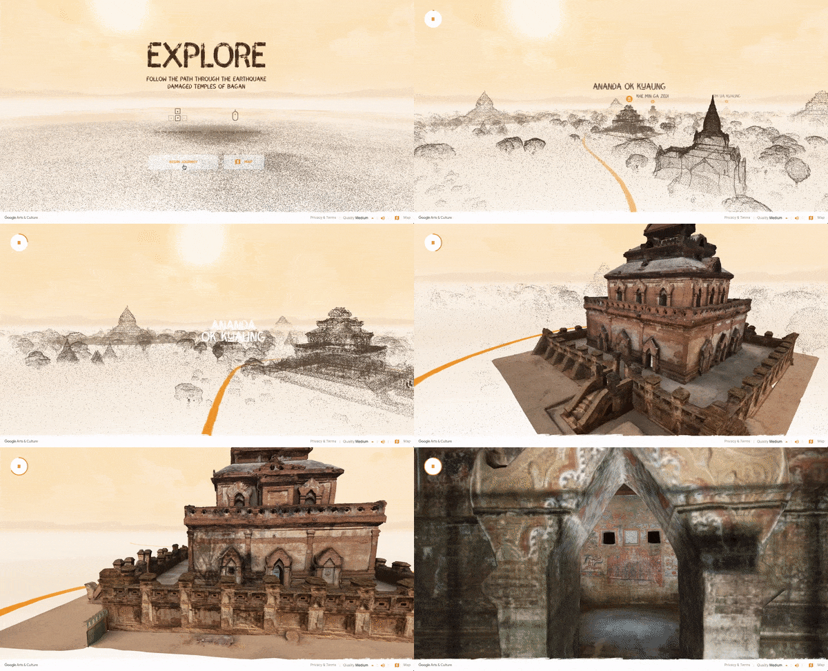
The result­ing project, Open Her­itage, is a mas­sive brows­able col­lec­tion of 3D her­itage data, already the largest of its kind, and cer­tain to increase as its cre­ators race against the clock.

As of this writ­ing, vis­i­tors can explore 3D mod­els of 27 her­itage sites from 18 coun­tries.

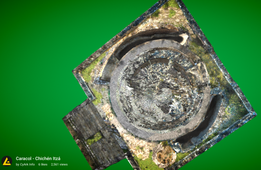
Even those of us who’ve had the good for­tune to vis­it these sites in per­son have much to gain from the drone’s eye view of the Cara­col obser­va­to­ry that’s part of Mexico’s ancient Mayan metrop­o­lis Chichén Itzá or Berlin’s icon­ic Bran­den­burg Gate.

Each mod­el is accom­pa­nied by an expe­di­tion overview that details the site’s his­to­ry and sig­nif­i­cance, as well as its loca­tion on a map. Time lapse pho­tos help give a sense of the site’s human traf­fic dur­ing the time it was being doc­u­ment­ed, as well as the nature of the work CyArk does on loca­tion. Sig­nif­i­cant details are high­light­ed, and their sym­bol­ism dis­cussed.

CyArk will share project data with view­ers who request it, using a Cre­ative Com­mons Attri­bu­tion-Non­Com­mer­cial 4.0 Inter­na­tion­al License.

Equal­ly impor­tant is the role these com­pre­hen­sive 3D scans can play in cur­rent and future restora­tion efforts, by iden­ti­fy­ing areas of dam­age and doc­u­ment­ing exist­ing col­or and tex­ture with down-to-the-mil­lime­ter pre­ci­sion.

Begin your vir­tu­al explo­rations of such Open Her­itage sites as Greece’s Ancient Corinth, Lebanon’s Tem­ple of Echoun, and Ayut­thaya, Thailand’s Wat Si San­phet, here.

Learn more about aer­i­al pho­togram­me­try, 3D laser scan­ning, stereo­scop­ic 360 imagery, and oth­er tools of the dig­i­tal preser­va­tion trade here.

And stay abreast of CyArk’s work by sub­scrib­ing to their free month­ly newslet­ter here.

Relat­ed Con­tent:

Vis­it 890 UNESCO World Her­itage Sites with Free iPhone/iPad App

Google Puts Over 57,000 Works of Art on the Web

Google Dig­i­tizes and Puts Online a Vast Archive of Lati­no Art­works and Arti­facts

Ayun Hal­l­i­day is an author, illus­tra­tor, the­ater mak­er and Chief Pri­ma­tol­o­gist of the East Vil­lage Inky zine.  Her solo show Nurse!, in which one of Shakespeare’s best loved female char­ac­ters hits the lec­ture cir­cuit to set the record straight pre­mieres in June at The Tank in New York City. Fol­low her @AyunHalliday.

Download 240+ Free eBooks on Design, Data, Software, Web Development & Business from O’Reilly Media

Last year we high­light­ed for you 20 Free eBooks on Design from O’Reilly Media. Lit­tle did we know that we were just scratch­ing the sur­face of the free ebooks O’Reil­ly Media has to offer.

If you head over to this page, you can access 240+ free ebooks cov­er­ing a range of dif­fer­ent top­ics. Below, we’ve divid­ed the books into sec­tions (and pro­vid­ed links to them), indi­cat­ed the num­ber of books in each sec­tion, and list­ed a few attractive/representative titles.

You can down­load the books in PDF for­mat. An email address–but no cred­it card–is required. Again the com­plete list is here.

Note: An ear­li­er ver­sion of this post orig­i­nal­ly appeared on our site in Jan­u­ary 2017.

If you would like to sign up for Open Culture’s free email newslet­ter, please find it here. Or fol­low our posts on Threads, Face­book, BlueSky or Mastodon.

If you would like to sup­port the mis­sion of Open Cul­ture, con­sid­er mak­ing a dona­tion to our site. It’s hard to rely 100% on ads, and your con­tri­bu­tions will help us con­tin­ue pro­vid­ing the best free cul­tur­al and edu­ca­tion­al mate­ri­als to learn­ers every­where. You can con­tribute through Pay­Pal, Patre­on, and Ven­mo (@openculture). Thanks!

Relat­ed Con­tent:

Down­load 20 Free eBooks on Design from O’Reilly Media

Read 700 Free eBooks Made Avail­able by the Uni­ver­si­ty of Cal­i­for­nia Press

A New Free eBook Every Month from the Uni­ver­si­ty of Chica­go Press

800 Free eBooks for iPad, Kin­dle & Oth­er Devices

by | Permalink | Make a Comment ( 2 ) |

Smartify, a Shazam for Art, Lets You Use Your Phone to Scan, Identify & Learn About Major Works of Art

Not so long ago, art muse­ums were known as tem­ples of qui­et con­tem­pla­tion, despite dai­ly inva­sions by rau­cous school groups.

Now, the onus is on the muse­ums to bring the moun­tain to Mohammed. Those kids have smart­phones. How long can a muse­um hope to stay relevant—nay, survive—without an app?

Many of the muse­ums who’ve already part­nered up with Smar­ti­fy—an app (Mac-Android) that lets you take a pic­ture of art­work with your phone and instant­ly access infor­ma­tion about them—have exist­ing apps of their own in place: the Met­ro­pol­i­tan Muse­um of Art in New York, the Her­mitage in St. Peters­burg, Amsterdam’s Rijksmu­se­um, to name a few.

These insti­tu­tion­al apps pro­vide vis­i­tors with an expand­ed view of the sort of infor­ma­tion one com­mon­ly finds on a muse­um card, in addi­tion to such prac­ti­cal­i­ties as gallery lay­outs and cal­en­dars of events. More often than not, there’s an option to “save” an art­work the vis­i­tor finds captivating—no word on what this fea­ture is doing to post­card sales in muse­um shops, so per­haps print isn’t dead yet.

Giv­en all the muse­um apps free for the down­load­ing, for whom is Smar­ti­fy, a “Shaz­am for art,” intend­ed?

Per­haps the glo­be­trot­ting muse­um hop­per eager to con­sol­i­date? Its devel­op­ers are adamant that it’s intend­ed to com­ple­ment, not replace, in-per­son vis­its to the insti­tu­tions where the works are housed, so arm­chair muse­um goers are advised to look else­where, like Google Arts & Cul­ture.

Per­haps the biggest ben­e­fi­cia­ries will be the small­er gal­leries and muse­ums ill equipped to launch free­stand­ing apps of their own. Smartify’s web­site states that it relies on “annu­al mem­ber­ship from muse­um part­ners, in-app trans­ac­tions, adver­tis­ing and data sales to rel­e­vant arts organ­i­sa­tions.”

Ear­ly adopters com­plained that while the app (Mac-Android) had no trou­ble iden­ti­fy­ing famous works of art, it came up emp­ty on the less­er-known pieces. That’s a pity as these are the works vis­i­tors are most like­ly to seek fur­ther infor­ma­tion on.

One of the devel­op­ers com­pared the Smar­ti­fy expe­ri­ence to vis­it­ing a muse­um in the com­pa­ny of “an enthu­si­as­tic and knowl­edge­able friend telling you more about a work of art.”

Maybe bet­ter to do just that, if the option exists? Such a friend would not be ham­pered by the copy­right laws that ham­per Smar­ti­fy with regard to cer­tain works. A friend might even stand you a hot choco­late or some pricey scone in the muse­um cafe.

At any rate, the app (Mac-Android) is now avail­able for vis­i­tors to take for a spin in 22 dif­fer­ent muse­ums and gal­leries in the UK, US, and Europe, with the promise of more to come.

Those whose knowl­edge of art his­to­ry is vast are like­ly to be under­whelmed, but it could be a way for those vis­it­ing with kids and teens to keep every­one engaged for the dura­tion. As one enthu­si­as­tic user wrote:

As a child­hood Poke­mon fan and avid art fan, this is a dream come true. This is like a Pokedex for art lol. If you ever watched the ani­me, Ash Ketchum would scan a Poke­mon with his Pokedex and get the details of its name, type, habits, etc. This app does that but instead of scan­ning mon­sters, it scans and ana­lyzes art work then gives you the load (sic) down about it.

Those with Inter­net pri­va­cy con­cerns may choose to heed, instead, the user who wrote:

Be aware, they want to gath­er as a “side effect” your pri­vate art col­lec­tion. I just want­ed to try it out with some of my art pieces (Gün­ther Förg, Richter, etc) but it does­n’t work if you don’t give them your loca­tion data. Be care­ful!


Muse­ums and Gal­leries Whose Images/Art Appear in Smar­ti­fy as of Jan­u­ary 2018

USA:

J. Paul Get­ty Muse­um

Los Ange­les Coun­ty Muse­um of Art (LACMA)

Lagu­na Art Muse­um

Muse­um of Con­tem­po­rary Pho­tog­ra­phy

Freer | Sack­ler Gal­leri­es­The Met­ro­pol­i­tan Muse­um of Art

The Met Clois­ters


UK:

The Bowes Muse­um

Mid­dles­brough Insti­tute of Mod­ern Art

Ben Uri Gallery

The Wal­lace Col­lec­tion

Roy­al Acad­e­my of Arts

Nation­al Gallery

Sculp­ture in the City


Europe:

Rijksmu­se­um

Rijksmu­se­um Twen­the

Lit­tle Beaux-Arts

Museo Cor­rer

Museo San Dona­to (MPSArt)

The State Her­mitage Muse­um

The Pushkin Muse­um of Fine Arts


Down­load Smar­ti­fy for Mac or Android.

via Dezeen

Relat­ed Con­tent:

Google’s Free App Ana­lyzes Your Self­ie and Then Finds Your Dop­pel­ganger in Muse­um Por­traits

1.8 Mil­lion Free Works of Art from World-Class Muse­ums: A Meta List of Great Art Avail­able Online

Where to Find Free Art Images & Books from Great Muse­ums, and Free Books from Uni­ver­si­ty Press­es

Ayun Hal­l­i­day is an author, illus­tra­tor, the­ater mak­er and Chief Pri­ma­tol­o­gist of the East Vil­lage Inky zine.  Fol­low her @AyunHalliday.

The Colors of Mister Rogers’ Hand-Knit Sweaters from 1979 to 2001: A Visual Graph Created with Data Science

Writer Owen Phillips may be a sol­id data ana­lyst, but I sus­pect he’s not much of a knit­ter.

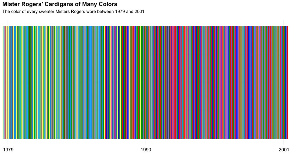
The soft­ware he used to run a sci­en­tif­ic analy­sis of 22 years worth of Fred Rogers’ sweaters ulti­mate­ly reduces the beloved children’s tele­vi­sion host’s homey zip-front cardi­gans to a slick graph­ic of col­or­ful bars.

A knit­ter would no doubt pri­or­i­tize oth­er types of pat­terns — stitch num­bers, wool weight, cable variations…the sort of infor­ma­tion Mis­ter Rogers’ moth­er, Nan­cy, would have had at her fin­ger­tips.

As Mis­ter Rogers reveals in the sto­ry of his sweaters, his mom was the knit­ter behind many of the on-air sweaters Phillips crunched with R code. Whether their sub­tly shift­ing palette reflects an adven­tur­ous spir­it on the part of the mak­er or the recipient’s evolv­ing taste is not for us to know.

After Mrs. Rogers’ death, pro­duc­ers had to resort to buy­ing sim­i­lar mod­els. Many of her orig­i­nals had worn through or been donat­ed to char­i­ty events.

“Not an easy chal­lenge in the 80’s and 90s,” Mar­gy Whit­mer, a pro­duc­er of Mis­ter Rogers’ Neigh­bor­hood told Rewire. “It cer­tain­ly wasn’t in style! But we found a com­pa­ny who made cot­ton ones that were sim­i­lar, so we bought a bunch and dyed them.”

(A moment of silent grat­i­tude that no one tried to shoe­horn Fred Rogers into a Cos­by Show sweater…)

It would be inter­est­ing to see what Phillips’ code could do with faulty view­er mem­o­ries.

His input for the Mis­ter Rogers’ Cardi­gans of Many Col­ors project was a chart on super fan Tim Lybarger’s Neigh­bor­hood Archive detail­ing the hue of every sweater Mis­ter Rogers changed into on-cam­era from 1979 to 2001.

With­out sam­ples of the actu­al sweaters, Lybarger’s col­or chart could only be approx­i­mate, but unlike view­ers’ fad­ing mem­o­ries, it’s root­ed in his own visu­al obser­va­tions of dis­tinct episodes. Aging fans tend to jet­ti­son Rogers’ spec­tral real­i­ty in favor of a sin­gle shade, the bright red in which he greet­ed Wicked Witch of the West Mar­garet Hamil­ton in 1975, say, or the pleas­ant mouse-col­ored num­ber he sport­ed for a 1985 break­danc­ing ses­sion with a vis­it­ing 12-year-old.

For those who’d rather code than purl, Phillips shares MrRogers.R, the pro­gram he used to scrape the Neigh­bor­hood Archive for Mis­ter Rogers dai­ly sweater col­ors.

Then have a look at Rogers’ sweaters as ren­dered by Phillips’ fel­low data geek, Alan Joyce, who tin­kered with Phillips’ code to pro­duce a gra­di­ent image.

via Kot­tke

Relat­ed Con­tent:

Mr. Rogers Takes Break­danc­ing Lessons from a 12-Year-Old (1985)

Mr. Rogers Intro­duces Kids to Exper­i­men­tal Elec­tron­ic Music by Bruce Haack & Esther Nel­son (1968)

Mis­ter Rogers Turns Kids On to Jazz with Help of a Young Wyn­ton Marsalis and Oth­er Jazz Leg­ends (1986)

Ayun Hal­l­i­day is an author, illus­tra­tor, the­ater mak­er and Chief Pri­ma­tol­o­gist of the East Vil­lage Inky zine.  Her cur­rent project is The­ater of the Apes Sub-Adult Division’s fast approach­ing pro­duc­tion of Ani­mal Farm at the Tank in New York City.  Fol­low her @AyunHalliday.

Animated GIFs Show How Subway Maps of Berlin, New York, Tokyo & London Compare to the Real Geography of Those Great Cities

You can’t make a per­fect­ly accu­rate map, as Jorge Luis Borges so suc­cinct­ly told us, with­out mak­ing it the exact same size and shape as the land it por­trays. But giv­en the utter use­less­ness of such an enor­mous piece of paper (which so frus­trat­ed the cit­i­zens of the imag­i­nary empire in Borges’ sto­ry that, “not with­out some piti­less­ness,” they tossed theirs into the desert), no map­mak­er would ever want to. A more com­pact map is a more use­ful one; unfor­tu­nate­ly, a more com­pact map is also, by its very nature, a less accu­rate one.

New York

The same rule applies to maps of all kinds, and espe­cial­ly to tran­sit maps, quite pos­si­bly the most use­ful spe­cial­ized maps we con­sult today. They show us how to nav­i­gate cities, and yet their clean, bold lines, some­times turn­ing but nev­er waver­ing, hard­ly rep­re­sent those cities — sub­ject as they are to vari­a­tions in ter­rain and den­si­ty, as well as cen­turies of unplannably organ­ic growth — with geo­graph­i­cal faith­ful­ness. One can’t help but won­der just how each urban tran­sit map, some of them beloved works of design, strikes the use­ful­ness-faith­ful­ness bal­ance.

Lon­don

Liv­ing in Seoul, I’ve grown used to the city’s stan­dard sub­way map. I thus get a kick out of scru­ti­niz­ing the more geo­graph­i­cal­ly accu­rate one, which over­lays the train lines onto an exist­ing map of the city, post­ed on some sta­tion plat­forms. It reveals the truth that some lines are short­er than they look on the stan­dard map, some are much longer, and none cut quite as clean a path through the city as they seem to. At Twist­ed Sifter you’ll find a GIF gallery of 15 stan­dard sub­way maps that morph into more geo­graph­i­cal­ly faith­ful equiv­a­lents, a vivid demon­stra­tion of just how much tran­sit map design­ers need to twist, squeeze, and sim­pli­fy an urban land­scape to pro­duce some­thing leg­i­ble at a glance.

Tokyo

All of those ani­ma­tions, just five of which you see in this post, come from the sub­red­dit Data Is Beau­ti­ful, a realm pop­u­lat­ed by enthu­si­asts of the visu­al dis­play of quan­ti­ta­tive infor­ma­tion — enthu­si­asts so enthu­si­as­tic that many of them cre­ate inno­v­a­tive data visu­al­iza­tions like these by them­selves. Accord­ing to their cre­ations, sub­way maps, like that of New York City’s ven­er­a­ble sys­tem, do rel­a­tive­ly lit­tle to dis­tort the city; oth­ers, like Toky­o’s, look near­ly unrec­og­niz­able when made to con­form to geog­ra­phy.

Austin

Even the maps of new and incom­plete tran­sit net­works do a num­ber on the real shape and direc­tion of their paths: the map of Austin, Texas’ Cap­i­tal Metro­Rail, for instance, straight­ens a some­what zig-zag­gy north­east-south­west track into a sin­gle hor­i­zon­tal line. It may take a few gen­er­a­tions before Austin’s “sys­tem” devel­ops into one exten­sive and com­plex enough to inspire one of the great tran­sit maps (the ranks, for exam­ple, of “The Won­der­ground Map of Lon­don Town”). But I would­n’t count out the pos­si­bil­i­ty: the more ful­ly cities real­ize their pub­lic-tran­sit poten­tial, the more oppor­tu­ni­ty opens up for the advance­ment of the sub­way map­mak­er’s art.

See all 15 of the sub­way GIFs at Twist­ed Sifter.

Relat­ed Con­tent:

A Won­der­ful Archive of His­toric Tran­sit Maps: Expres­sive Art Meets Pre­cise Graph­ic Design

Design­er Mas­si­mo Vignel­li Revis­its and Defends His Icon­ic 1972 New York City Sub­way Map

“The Won­der­ground Map of Lon­don Town,” the Icon­ic 1914 Map That Saved the World’s First Sub­way Sys­tem

Bauhaus Artist Lás­zló Moholy-Nagy Designs an Avant-Garde Map to Help Peo­ple Get Over the Fear of Fly­ing (1936)

Why Mak­ing Accu­rate World Maps Is Math­e­mat­i­cal­ly Impos­si­ble

Based in Seoul, Col­in Mar­shall writes and broad­casts on cities and cul­ture. He’s at work on a book about Los Ange­les, A Los Ange­les Primer, the video series The City in Cin­e­ma, the crowd­fund­ed jour­nal­ism project Where Is the City of the Future?, and the Los Ange­les Review of Books’ Korea Blog. Fol­low him on Twit­ter at @colinmarshall or on Face­book.

« Go BackMore in this category... »
Quantcast
Open Culture was founded by Dan Colman.