Simulating an Epidemic: Using Data to Show How Diseases Like COVID-19 Spread

Dis­ease mod­el­ing as a sci­ence has come into its own late­ly, for heart­break­ing­ly obvi­ous rea­sons. What may not be so obvi­ous to those of us who aren’t sci­en­tists is just how crit­i­cal data can be in chang­ing the course of events in an out­break. Virus out­breaks may be “acts of God” or acts of unreg­u­lat­ed black mar­kets and agribusi­ness­es, but in either case, sta­tis­ti­cal mod­els can show, con­crete­ly, how col­lec­tive human activ­i­ty can save lives—and show what hap­pens when peo­ple don’t act togeth­er.

For exam­ple, epi­demi­ol­o­gists and bio­sta­tis­ti­cians have shown in detail how social dis­tanc­ing led to a “decline in the pro­por­tion of influen­za deaths,” one study con­cludes, dur­ing the 1918 flu pan­dem­ic. The same researchers also saw evi­dence in their mod­els that showed “pub­lic risk per­cep­tion could be low­ered” when these prac­tices worked effec­tive­ly, lead­ing peo­ple think they could resume busi­ness as usu­al. But “less social dis­tanc­ing could even­tu­al­ly induce anoth­er epi­dem­ic wave.”

To say that it’s a chal­lenge to stay inside and wait out COVID-19 indef­i­nite­ly may be a gross under­state­ment, but hun­ker­ing down may save our lives. No one can say what will hap­pen, but as for how and why it hap­pens, well, “that is math, not prophe­cy,” writes Har­ry Stevens at The Wash­ing­ton Post. “The virus can be slowed,” if peo­ple con­tin­ue “avoid­ing pub­lic spaces and gen­er­al­ly lim­it­ing their move­ment.” Let’s take a look at how with the mod­el above. We must note that the video above does not mod­el COVID-19 specif­i­cal­ly, but a offers a detailed look at how a hypo­thet­i­cal epi­dem­ic spreads.

Cre­at­ed by YouTu­ber 3Blue1Brown, the mod­el­ing in the top video draws from a vari­ety of sources, includ­ing Stevens’ inter­ac­tive mod­els of a hypo­thet­i­cal dis­ease he calls “simuli­tis.” Anoth­er sim­u­la­tor whose work con­tributed to the video, Kevin Sim­ler, has also explained the spread of dis­ease with inter­ac­tive mod­els that enable us to visu­al­ize dif­fi­cult-to-grasp epi­demi­o­log­i­cal con­cepts, since “expo­nen­tial growth is real­ly, real­ly hard for our human brains to under­stand” in the abstract, says YouTube physics explain­er Minute Physics in the short, ani­mat­ed video above.

Deaths mul­ti­ply faster than the media can report, and what­ev­er totals we come across are hope­less­ly out­dat­ed by the time we read them, an emo­tion­al and intel­lec­tu­al bar­rage. So how can we know if we’re “win­ning or los­ing” (to use the not-par­tic­u­lar­ly-help­ful war metaphor) the COVID-19 fight? Here too, the cur­rent data on its pre­vi­ous progress in oth­er coun­tries can help plot the course of the dis­ease in the U.S. and else­where, and allow sci­en­tists and pol­i­cy-mak­ers to make rea­son­able infer­ences about how to stop expo­nen­tial growth.

But none of these mod­els show the kind of gran­u­lar­i­ty that doc­tors, nurs­es, and pub­lic health pro­fes­sion­als must deal with in a real pan­dem­ic. “Simuli­tis is not covid-19, and these sim­u­la­tions vast­ly over­sim­pli­fy the com­plex­i­ty of real life,” Stevens admits. Super-com­pli­cat­ing risk fac­tors like age, race, dis­abil­i­ty, and access to insur­ance and resources aren’t rep­re­sent­ed here. And there may be no way to mod­el what­ev­er the gov­ern­ment is doing.

But the data mod­els show us what has worked and what has­n’t, both in the past and in the recent present, and they have become very acces­si­ble thanks to the inter­net (and open source jour­nals on plat­forms like PLOS). For a longer, in-depth expla­na­tion of the cur­rent pan­demic’s expo­nen­tial spread, see the lec­ture by epi­demi­ol­o­gist Nicholas Jew­ell above from the Math­e­mat­i­cal Sci­ences Research Insti­tute (MSRI).

It may not sway peo­ple who active­ly ignore math, but dis­ease mod­el­ing can guide the mere­ly unin­formed to a much bet­ter under­stand­ing of what’s hap­pen­ing, and bet­ter deci­sions about how to respond under the cir­cum­stances.

Relat­ed Con­tent:  

Spring Break vs. COVID-19: Map­ping the Real Impact of Ignor­ing Social Dis­tanc­ing

Watch “Coro­n­avirus Out­break: What You Need to Know,” and the 24-Lec­ture Course “An Intro­duc­tion to Infec­tious Dis­eases,” Both Free from The Great Cours­es

The His­to­ry of the Plague: Every Major Epi­dem­ic in an Ani­mat­ed Map

Josh Jones is a writer and musi­cian based in Durham, NC. Fol­low him at @jdmagness

Linked Jazz: A Huge Data Visualization Maps the Relationships Between Countless Jazz Musicians & Restores Forgotten Women to Jazz History

Hav­ing watched the devel­op­ment of inter­ac­tive data visu­al­iza­tions as a writer for Open Cul­ture, I’ve seen my share of impres­sive exam­ples, espe­cial­ly when it comes to map­ping music. Per­haps the old­est such resource, the still-updat­ing Ishkur’s Guide to Elec­tron­ic Music, also hap­pens to be one of the best for its com­pre­hen­sive­ness and wit­ty tone. Anoth­er high achiev­er, The Uni­verse of Miles Davis, released on what would have been Davis’ 90th birth­day, is more focused but no less dense a col­lec­tion of names, record labels, styles, etc.

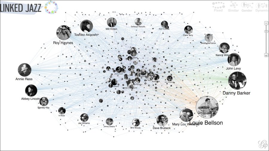
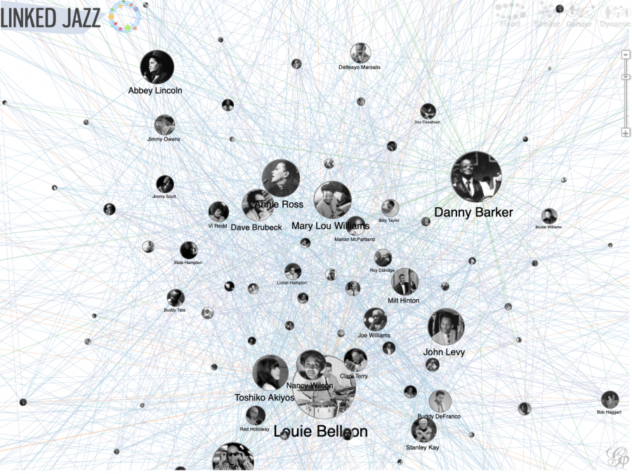
While visu­al­iz­ing the his­to­ry of any form of music can result in a sig­nif­i­cant degree of com­plex­i­ty, depend­ing on how deeply one drills down on the specifics, jazz might seem espe­cial­ly chal­leng­ing. Choos­ing one major fig­ure pulls up thou­sands of con­nec­tions. As these mul­ti­ply, they might run into the mil­lions. But some­how, one of the best music data visu­al­iza­tions I’ve seen yet—Pratt Institute’s Linked Jazz project—accounts seam­less­ly for what appears to be the whole of jazz, includ­ing obscure and for­got­ten fig­ures and inter­ac­tive, dynam­ic fil­ters that make the his­to­ry of women in jazz more vis­i­ble, and let users build maps of their own.

Jazz musi­cians “are like fam­i­ly,” Zena Lat­to, one of the musi­cians the project recov­ered, told an inter­view­er in 2015. A mul­ti-racial, transna­tion­al, active­ly mul­ti-gen­er­a­tional fam­i­ly that meets all over the world to play togeth­er con­stant­ly, that is. As a form of music built on ensem­ble play­ers and jour­ney­men soloists who some­times form bands for no more than a sin­gle album or tour, jazz musi­cians prob­a­bly form more rela­tion­ships across age, gen­der, race, and nation­al­i­ty than those in any oth­er genre.

That organ­ic, built-in diver­si­ty, a fea­ture of the music through­out its his­to­ry, shows up in every per­mu­ta­tion of the Linked Jazz map, and comes through in the record­ed inter­views, per­for­mances, and oth­er accom­pa­ny­ing info linked to each musi­cian. Like the Uni­verse of Miles Davis, Linked Jazz leans heav­i­ly on Wikipedia for its infor­ma­tion. And in using such “linked open data (LOD),” as Pratt notes in a blog post, the project “also reveals archival gaps. While icons such as John Coltrane and Miles Davis have large dig­i­tal foot­prints, less­er-known per­form­ers may bare­ly have a mention”—despite the fact that most of those play­ers, at one time or anoth­er, played with, stud­ied under, or record­ed with the greats.

Such was the case with Lat­to, who was men­tored by Ben­ny Good­man and toured through­out the 1940s and 50s with the Inter­na­tion­al Sweet­hearts of Rhythm, “con­sid­ered the first inte­grat­ed all-women band in the Unit­ed States.” Lat­to was “part of a net­work that stretched from New York to New Orleans,” but her name had dis­ap­peared entire­ly until Pratt School of Infor­ma­tion pro­fes­sor Cristi­na Pattuel­li found it on a tat­tered fly­er for a Carnegie Hall con­cert. “Soon, through Linked Jazz, Lot­ta had a Wikipedia page and her inter­view was pub­lished on the Inter­net Archive.”

Linked Jazz’s focus on women musi­cians does not mean gen­der seg­re­ga­tion, but a redis­cov­ery of wom­en’s place in all of jazz.  Like all of the oth­er fil­ters, the Linked Jazz data map’s gen­der view shows both men and women promi­nent­ly in the lit­tle pho­to bub­bles con­nect­ed by webs of red and blue lines. But as you begin click­ing around, you will see the per­spec­tive has shift­ed. “Linked Jazz has con­cen­trat­ed on pro­cess­ing more inter­views with women jazz musi­cians,” writes Pratt, “and these resources have been enhanced by a series of Women of Jazz Wikipedia Edit-a-thons in 2015 and 2017.”

Like­wise, the inclu­sion of these inter­views, biogra­phies, and record­ings have enhanced the breadth and scope of Linked Jazz, which as a whole rep­re­sents the best inten­tions in open data map­ping, real­ized by a design that makes explor­ing the daunt­ing his­to­ry of jazz a mat­ter of strolling through a dig­i­tal library with the entire cat­a­log appear­ing instant­ly at your fin­ger­tips. The project also shows how thought­ful data map­ping can not only repli­cate the exist­ing state of infor­ma­tion, but also con­tribute sig­nif­i­cant­ly by find­ing and restor­ing miss­ing links.

via

Relat­ed Con­tent:

The Influ­ence of Miles Davis Revealed with Data Visu­al­iza­tion: For His 90th Birth­day Today

How Dave Brubeck’s Time Out Changed Jazz Music

The Brains of Jazz and Clas­si­cal Musi­cians Work Dif­fer­ent­ly, New Research Shows

Josh Jones is a writer and musi­cian based in Durham, NC. Fol­low him at @jdmagness

Behold the New York City Street Tree Map: An Interactive Map That Catalogues the 700,000 Trees Shading the Streets of New York City

It may sound odd, but one of the things I miss most about liv­ing in New York City is the abil­i­ty to hop on a bus or train, or walk a few blocks from home, and end up loung­ing in a for­est, the cacoph­o­ny of traf­fic reduced to a dim hum, squir­rels bound­ing around, birds twit­ter­ing away above. Such urban respites are plen­ti­ful in NYC thanks to its 10,542 acres of forest­ed land, “about half as much as the Con­ga­ree Swamp in South Car­oli­na,” notes James Bar­ron at The New York Times, in one of the most dense­ly pop­u­lat­ed urban areas in the coun­try.

“Most of the city’s for­est is deep in parks”—in Cen­tral Park, of course, and also Prospect Park and River­side, and dozens of small­er oases, and the lush Botan­i­cal Gar­dens in the Bronx. The city’s forests are sub­ject to the usu­al pres­sures oth­er wood­ed areas face: cli­mate change, inva­sive species, etc.

They are also depen­dent on a well-fund­ed Parks Depart­ment and non­prof­its like the Nat­ur­al Areas Con­ser­van­cy for the preser­va­tion and upkeep not only of the large parks but of the trees that shade city streets in all five bor­oughs.

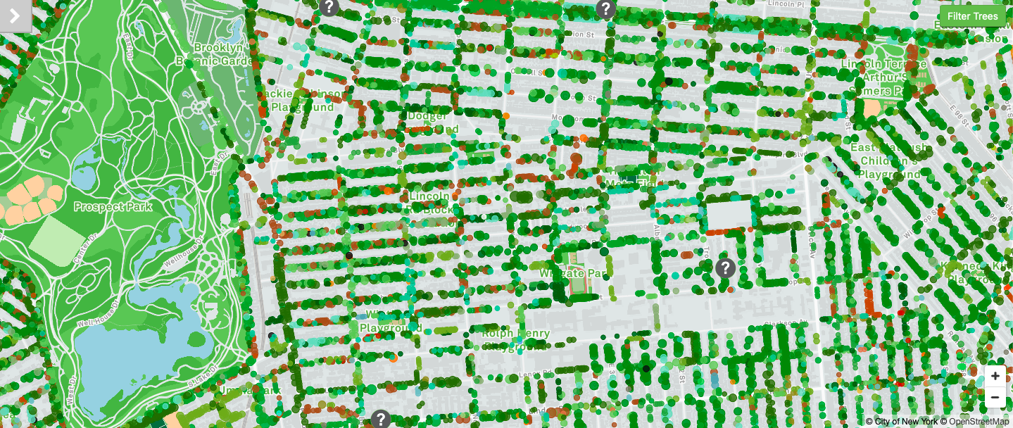
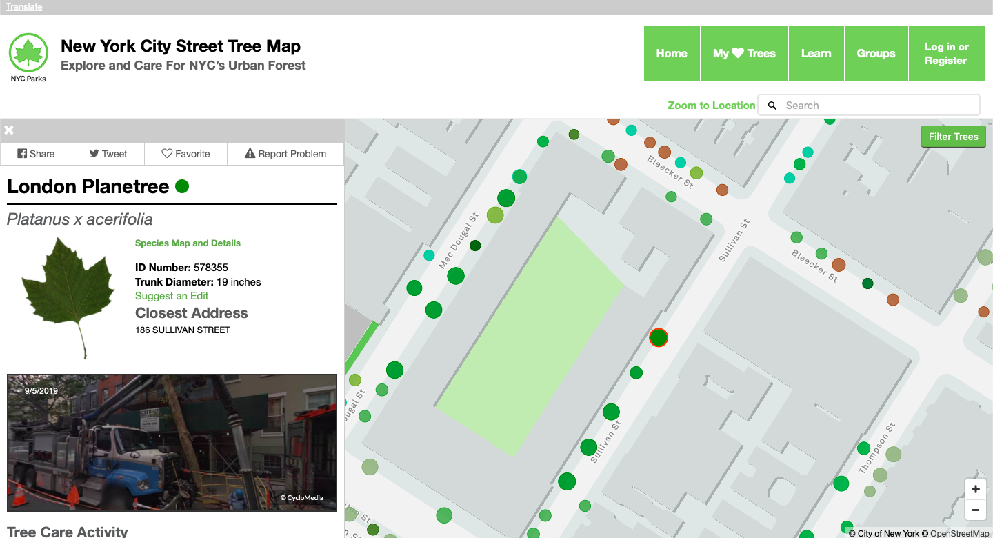
Luck­i­ly, the city and non­prof­it groups have been work­ing togeth­er to plan for what the conservancy’s senior ecol­o­gist, Helen For­gione, calls “future forests,” using big data to map out the best paths for urban wood­land. The NYC Parks depart­ment has been busy com­pil­ing fig­ures, and you can find all of their tree stats at the New York City Street Tree Map, which “brings New York City’s urban for­est to your fin­ger­tips. For the first time,” the Parks depart­ment writes, “you have access to infor­ma­tion about every street tree in New York City.”

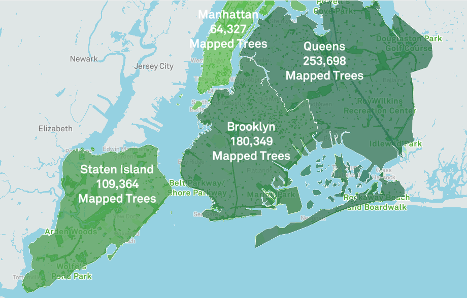
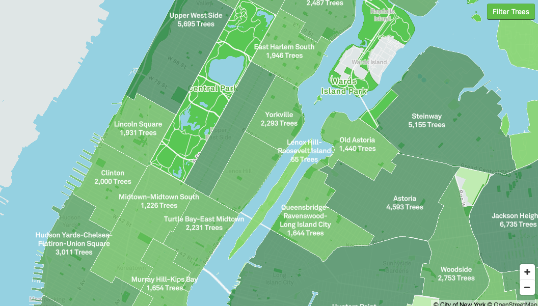
Large forest­ed parks on the inter­ac­tive map appear as flat green fields—the depart­ment has not count­ed each indi­vid­ual tree in Cen­tral Park. But the map gives us fine, gran­u­lar detail when it comes to street trees, allow­ing users to zoom in to every inter­sec­tion and click on col­ored dots that rep­re­sent each tree, for exam­ple lin­ing Avenue D in the East Vil­lage or Flat­bush Avenue in Brook­lyn. You can search spe­cif­ic loca­tions or comb through city­wide sta­tis­tics for the big pic­ture. At the time of this writ­ing, the project has mapped 694,249 trees, much of that work under­tak­en by vol­un­teers in the TreesCount! 2015 ini­tia­tive.

There are many more trees yet to map, and the department’s forestry team updates the site dai­ly. Out of 234 species iden­ti­fied, the most com­mon is the Lon­don Plan­e­tree, rep­re­sent­ing 12% of the trees on the map. Oth­er pop­u­lar species include the Lit­tle­leaf Lin­den, Nor­way Maple, Pin Oak, and Ginko. Some oth­er stats show the eco­log­i­cal ben­e­fits of urban trees, includ­ing the amount of ener­gy con­served (667,590,884 kWh, or $84,279,933.06) and amount of car­bon diox­ide reduced (612,100 tons).

Vis­it the New York City Street Tree Map for the full, vir­tu­al tour of the city’s trees, and marvel—if you haven’t expe­ri­enced the city’s vibrant tree life firsthand—at just how green the empire city’s streets real­ly are.

Relat­ed Con­tent:

New York Pub­lic Library Puts 20,000 Hi-Res Maps Online & Makes Them Free to Down­load and Use

New York City: A Social His­to­ry (A Free Online Course from N.Y.U.) 

The Secret Lan­guage of Trees: A Charm­ing Ani­mat­ed Les­son Explains How Trees Share Infor­ma­tion with Each Oth­er

Josh Jones is a writer and musi­cian based in Durham, NC. Fol­low him at @jdmagness

The 1855 Map That Revolutionized Disease Prevention & Data Visualization: Discover John Snow’s Broad Street Pump Map

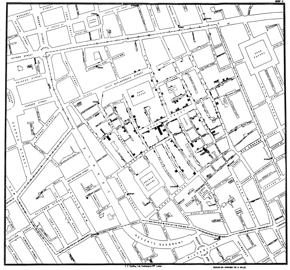
No, he didn’t help defeat an implaca­ble zom­bie army intent on wip­ing out all life. But Eng­lish obste­tri­cian John Snow seems as impor­tant as the sim­i­lar­ly-named Game of Thrones hero for his role in per­suad­ing mod­ern med­i­cine of the germ the­o­ry of dis­ease. Dur­ing the 1854 out­break of cholera in Lon­don, Snow con­vinced author­i­ties and crit­ics that the dis­ease spread from a con­t­a­m­i­nat­ed water pump on Broad Street, lead­ing to the now-leg­endary info­graph­ic map above show­ing the inci­dences of cholera clus­tered around the pump.

Snow’s per­sis­tence result­ed in the removal of the han­dle from the Broad Street pump and has been cred­it­ed with end­ing an epi­dem­ic that claimed 500 lives. The Broad Street pump map has become “an endur­ing fea­ture of the folk­lore of pub­lic health and epi­demi­ol­o­gy,” write the authors of an arti­cle pub­lished in The Lancet. They also point out that, con­trary to pop­u­lar retellings, the “map did not give rise to the insight” that the pump and its germ-cov­ered han­dle caused the out­break. “Rather it tend­ed to con­firm the­o­ries already held by the var­i­ous inves­ti­ga­tors.”

Snow him­self pub­lished a pam­phlet in 1849 called “On the Mode of Com­mu­ni­ca­tion of Cholera” in which he argued that “cholera is com­mu­ni­cat­ed by the evac­u­a­tions from the ali­men­ta­ry canal.” As he remind­ed read­ers of The Edin­burgh Med­ical Jour­nal in an 1856 let­ter, in that same year, “Dr William Budd pub­lished a pam­phlet ‘On Malig­nant Cholera’ in which he expressed views sim­i­lar to my own.” Germ the­o­ry had a long, dis­tin­guished his­to­ry already, and Snow and his con­tem­po­raries made sound, evi­dence-based argu­ments for it.

But their posi­tion “large­ly went ignored by the med­ical estab­lish­ment,” notes Randy Alfred at Wired, “and was opposed by a local water com­pa­ny near one Lon­don out­break.” The accept­ed, main­stream sci­en­tif­ic opin­ion held that all dis­ease was spread through “mias­ma,” or bad air. Pol­lu­tion, it was thought, must be the cause. After the pump handle’s removal, Snow pub­lished an 1855 mono­graph on water­borne dis­eases. This was the first pub­lic appear­ance of the leg­endary map—after the removal of the han­dle.

Help­ing to inform Snow’s map, anoth­er inves­ti­ga­tor, parish priest Hen­ry White­head had “con­clud­ed that it was the wash­ing of soiled dia­pers into drains which flowed to the com­mu­nal cesspool that con­t­a­m­i­nat­ed the pump and start­ed the out­break,” writes Atlas Obscu­ra. White­head, a for­mer crit­ic of germ the­o­ry, lat­er point­ed out that the removal of the pump han­dle didn’t actu­al­ly stop the epi­dem­ic, which, he said, “had already run its course” by that point.

Nonethe­less, Snow and oth­er pro­po­nents of the the­o­ry were vin­di­cat­ed, White­head had to admit, and Snow’s inter­ven­tion “had prob­a­bly every­thing to do with pre­vent­ing a new out­break.” The sim­ple, yet sophis­ti­cat­ed data visu­al­iza­tion would lead to rad­i­cal new ways of con­cep­tu­al­iz­ing dis­ease out­breaks, help­ing to stop or pre­vent who knows how many epi­demics before they killed hun­dreds or thou­sands. Snow’s map also deserves cred­it for giv­ing “data jour­nal­ists a mod­el of how to work today.”

It was hard­ly the first or only data visu­al­iza­tion of cholera out­breaks of the time. “As ear­ly as the 1830s,” Visu­al Cap­i­tal­ist points out, “geo­g­ra­phers began using spa­cial analy­sis to study cholera epi­demi­ol­o­gy.” But Snow’s was by far the most influ­en­tial, and effec­tive, of them all. In his TED talk above, jour­nal­ist Steven John­son (author of The Ghost Map:The Sto­ry of Lon­don’s Most Ter­ri­fy­ing Epi­dem­ic and How It Changed Sci­ence, Cities, and the Mod­ern World) tells the sto­ry of how the out­break, and Snow’s the­o­ry and map, “helped cre­ate the world that we live in today, and par­tic­u­lar­ly the kind of city that we live in today.”

Read a Q&A with John­son here; head over to The Guardian’s Data Blog to see Snow’s visu­al­iza­tion recre­at­ed over a mod­ern, satel­lite-view map of Lon­don and the Soho neigh­bor­hood of the famous Broad Street pump; and learn more about Snow and dead­ly cholera out­breaks in the crowd­ed Euro­pean cities of the ear­ly 19th cen­tu­ry at the John Snow Archive and Research Com­pan­ion online.

Relat­ed Con­tent:

Flo­rence Nightin­gale Saved Lives by Cre­at­ing Rev­o­lu­tion­ary Visu­al­iza­tions of Sta­tis­tics (1855)

Napoleon’s Dis­as­trous Inva­sion of Rus­sia Detailed in an 1869 Data Visu­al­iza­tion: It’s Been Called “the Best Sta­tis­ti­cal Graph­ic Ever Drawn”

The Art of Data Visu­al­iza­tion: How to Tell Com­plex Sto­ries Through Smart Design

Josh Jones is a writer and musi­cian based in Durham, NC. Fol­low him at @jdmagness

Napoleon’s Disastrous Invasion of Russia Detailed in an 1869 Data Visualization: It’s Been Called “the Best Statistical Graphic Ever Drawn”

It’s tempt­ing to asso­ciate data visu­al­iza­tions with Pow­er­Point and online graph­ics, which have enabled an unheard-of capac­i­ty for dis­sem­i­nat­ing full-col­or images. But the form reach­es much fur­ther back in his­to­ry. Fur­ther back, even, than the front pages of USA Today and glossy side­bars of Time and
Newsweek. In 1900, for exam­ple, W.E.B. Du Bois made impres­sive use of sev­er­al full-col­or data visu­al­iza­tions for the First Pan-African Con­fer­ence in Lon­don, with no access what­so­ev­er to desk­top pub­lish­ing soft­ware or a laser print­er.

Almost fifty years before Du Bois turned sta­tis­tics into swirls of col­or and shape, Flo­rence Nightin­gale used her lit­tle-known graph­ic design skills to illus­trate the caus­es of dis­ease in the Crimean War and John Snow (not Jon Snow) illus­trat­ed his rev­o­lu­tion­ary Broad Street Pump cholera the­o­ry with a famous info­graph­ic street map.

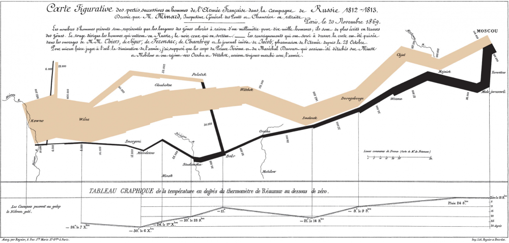
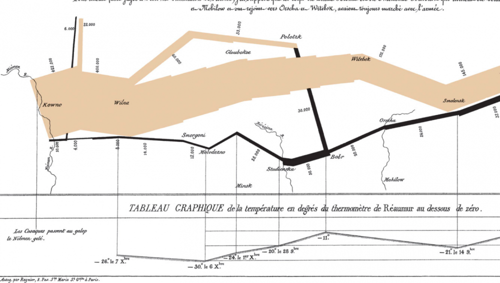
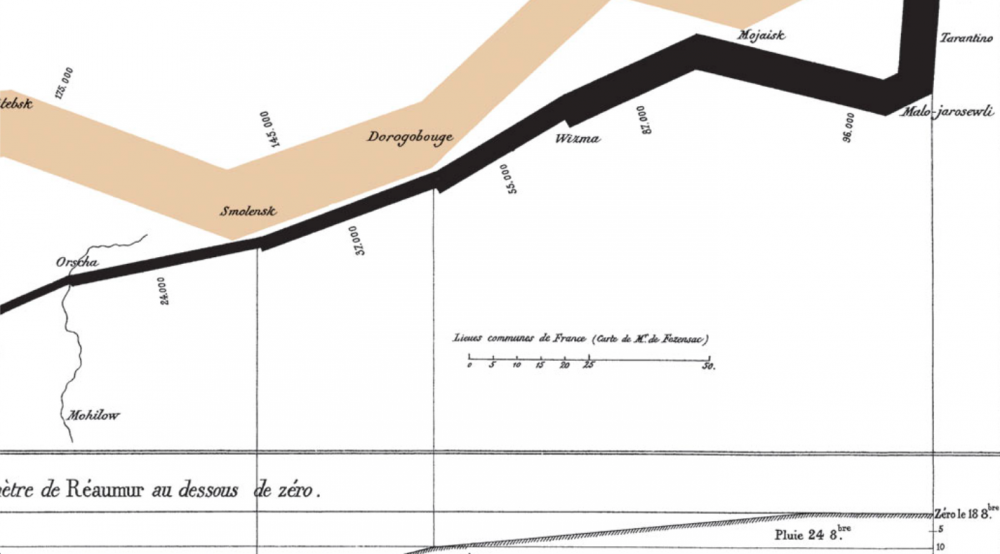
Around this same time, anoth­er data visu­al­iza­tion pio­neer, Charles Joseph Minard, pro­duced some of the most high­ly-regard­ed info­graph­ics ever made, includ­ing the 1869 illus­tra­tion above of Napoleon’s march to, and retreat from, Moscow in the War of 1812. View it in a large for­mat here.

Made fifty years after the event, when Minard was 80 years old, the map has been called by the bible of data visu­al­iza­tion studies—Edward Tufte’s The Visu­al Dis­play of Quan­ti­ta­tive Infor­ma­tion—“prob­a­bly the best sta­tis­ti­cal graph­ic ever drawn.” Over at thoughtbot.com, Joanne Cheng sums up the con­text, if you need­ed a his­tor­i­cal refresh­er: “The year is 1812 and Napoleon is doing pret­ty well for him­self. He has most of Europe under his con­trol, except for the UK.”

Angered by Czar Alexander’s refusal to sup­port a UK trade embar­go to weak­en their defens­es, Napoleon “gath­ers a mas­sive army of over 400,000 to attack Rus­sia.” The cam­paign was dis­as­trous: over­con­fi­dent advances on Moscow turned into dev­as­tat­ing win­ter­time retreats dur­ing which the Grande Armée only “nar­row­ly escaped com­plete anni­hi­la­tion.” So, how does Minard’s 1869 Tableau Graphique tell this grand sto­ry of hubris and icy car­nage? And, Cheng asks, “what makes it so good?”

Cheng breaks Minard’s series of jagged lines and shapes down into more con­ven­tion­al XY axis line graphs to show how he coor­di­nat­ed a huge amount of infor­ma­tion, includ­ing the loca­tions (by lon­gi­tude) of dif­fer­ent groups of Napoleon’s troops at dif­fer­ent points in time, their direc­tion, and the pre­cip­i­tous­ly falling tem­per­a­tures in the stages of retreat. He drew from a list of the best his­tor­i­cal sources he could con­sult at the time, turn­ing dense prose into the spare, clean lines that set data sci­en­tists’ hearts a‑flutter.

Minard began his career in a much more rec­og­niz­ably 19-cen­tu­ry design field, build­ing bridges, dams, and canals across Europe for the first few decades of the 1800s. As a civ­il engi­neer “he had the good for­tune to take part in almost all the great ques­tions of pub­lic works which ush­ered in our cen­tu­ry,” not­ed an obit­u­ary pub­lished in Annals of Bridges and Roads the year after Minard’s death in 1870. “And dur­ing the twen­ty years of retire­ment, always au courant of the tech­ni­cal and eco­nom­ic sci­ences, he endeav­ored to pop­u­lar­ize the most salient results.”

He did so by ven­tur­ing out­side the sub­ject of engi­neer­ing, while using the “inno­v­a­tive tech­niques he had invent­ed for the pur­pose of dis­play­ing flows of peo­ple” on paper, writes Michael Sand­berg at DataViz. In order to tell the trag­ic tale” of Napoleon’s crush­ing defeat “in a sin­gle image,” Minard imag­ined the event as a dynam­ic phys­i­cal struc­ture.

Minard’s chart shows six types of infor­ma­tion: geog­ra­phy, time, tem­per­a­ture, the course and direc­tion of the army’s move­ment, and the num­ber of troops remain­ing. The widths of the gold (out­ward) and black (return­ing) paths rep­re­sent the size of the force, one mil­lime­tre to 10,000 men. Geo­graph­i­cal fea­tures and major bat­tles are marked and named, and plum­met­ing tem­per­a­tures on the return jour­ney are shown along the bot­tom.

This was hard­ly Minard’s first info­graph­ic. In fact, he made “scores of oth­er graph­ics and charts,” Nation­al Geo­graph­ic writes, “as well as near­ly 50 maps. He pio­neered sev­er­al impor­tant the­mat­ic map­ping tech­niques and per­fect­ed oth­ers, such as using flow lines on a map.” (See oth­er exam­ples of his work at Nation­al Geographic’s site.) Minard may not be much remem­bered for his infra­struc­ture, but his abil­i­ty, as his obit­u­ar­ist wrote, to turn “the dry and com­pli­cat­ed columns of sta­tis­ti­cal data” into “images math­e­mat­i­cal­ly pro­por­tioned” has made him a leg­end in data sci­ence his­to­ry cir­cles.

Again, view Minard’s visu­al­iza­tion of Napoleon’s failed inva­sion in a large for­mat here.

Relat­ed Con­tent:

Flo­rence Nightin­gale Saved Lives by Cre­at­ing Rev­o­lu­tion­ary Visu­al­iza­tions of Sta­tis­tics (1855)

W.E.B. Du Bois Cre­ates Rev­o­lu­tion­ary, Artis­tic Data Visu­al­iza­tions Show­ing the Eco­nom­ic Plight of African-Amer­i­cans (1900)

Napoleon’s Eng­lish Lessons: How the Mil­i­tary Leader Stud­ied Eng­lish to Escape the Bore­dom of Life in Exile

Josh Jones is a writer and musi­cian based in Durham, NC. Fol­low him at @jdmagness

Two Animated Maps Show the Expansion of the U.S. from the Different Perspectives of Settlers & Native Peoples

After John Ford, the his­to­ry of U.S. expan­sion went by the name “How the West Was Won.” Decades ear­li­er, in his essay “Annex­a­tion,” Jack­son­ian jour­nal­ist John O’Sullivan famous­ly coined the phrase “man­i­fest des­tiny.” His­to­ri­an Richard Slotkin called it “regen­er­a­tion through vio­lence” and nov­el­ist Cor­mac McCarthy summed up the jagged, ever-mov­ing line of west­ward expan­sion from sea to sea with two words: Blood Merid­i­an.

Indige­nous ver­sions of the sto­ry do not tend to enter com­mon par­lance in quite the same way, a fact upon which Vine Delo­ria, Jr. remarks in his “Indi­an Man­i­festo,” Custer Died for Your Sins. Vio­lence is always cen­tral to the sto­ry. Usu­al­ly the sav­agery of Native peo­ple is tak­en for grant­ed. Sav­agery of set­tlers may be more or less empha­sized. Yet the long his­to­ry of land theft over the course of the cen­turies is also one of bro­ken treaty after treaty.

Few tribes were defeat­ed in war by the Unit­ed States, but most sold some land and allowed the Unit­ed States to hold the remain­der in trust for them. In turn, the tribes acknowl­edged the sov­er­eign­ty of the Unit­ed States in pref­er­ence to oth­er pos­si­ble sov­er­eigns.

Caught between war­ring Euro­pean empires, Indige­nous nations made the best deals they could with the advanc­ing U.S. and its army of Civ­il War vet­er­ans. “From this hum­ble begin­ning the fed­er­al gov­ern­ment stole some two bil­lion acres of land and con­tin­ues to take what it can with­out arous­ing the ire of the igno­rant pub­lic.”

The bru­tal­i­ty of the 19th cen­tu­ry became pro­fes­sion­al­ized, car­ried out by reg­u­lars in uni­form, hence the detached lan­guage of “Indi­an wars.” These were fol­lowed by oth­er kinds of vio­lence: insti­tu­tion­al­ized pater­nal­ism, fur­ther encroach­ment and enclo­sure, and the forced removal of thou­sands of chil­dren from their par­ents and into reed­u­ca­tion camps.

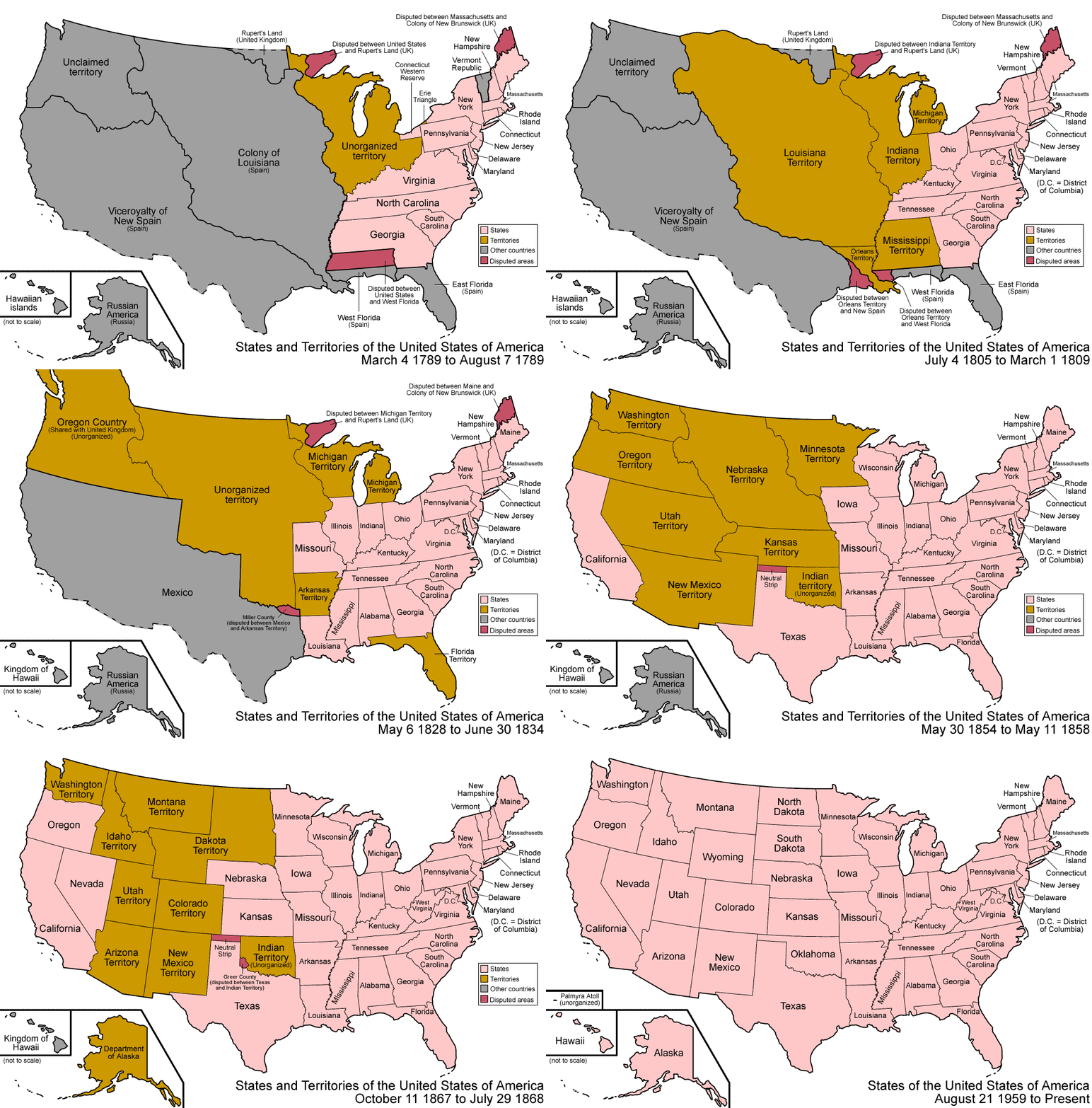
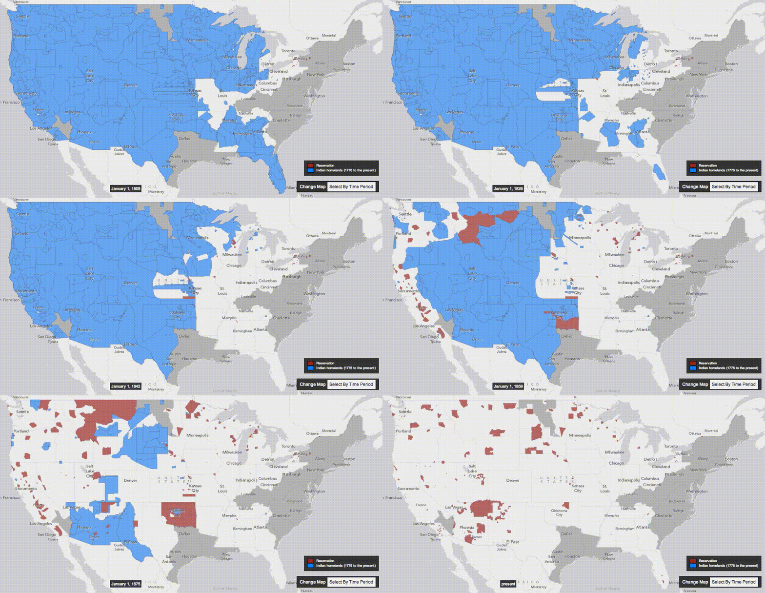
The two maps you see here, with sweep­ing­ly broad visu­al ges­tures in gif form, illus­trate the 19th cen­tu­ry seizure of land across the North Amer­i­can con­ti­nent from the per­spec­tive of a U.S. nation­al his­to­ry and that of an Indige­nous mul­ti-nation­al his­to­ry. The map at the top traces the sto­ry from the coun­try’s begin­nings in the 13 colonies to the annex­a­tion, pur­chase, and final­ly state­hood of Hawaii and Alas­ka in 1959.

The above map is more focused, span­ning the years 1810 to 1891. As Nick Rout­ley points out in a post at Visu­al Cap­i­tal­ist, “five of the largest expan­sion events in U.S. his­to­ry” took place dur­ing the 1800s, though the first one he cites falls out­side the time­line above. The 1803 Louisiana Pur­chase end­ed up acquir­ing what now makes up “near­ly 25% of the cur­rent ter­ri­to­ry of the Unit­ed States, stretch­ing from New Orleans all the way up to Mon­tana and North Dako­ta.”

Oth­er notable events include the 1819 pur­chase of Flori­da from Spain by John Quin­cy Adams, the afore­men­tioned pur­chase of Alas­ka from Rus­sia, and the 1845 annex­a­tion of Texas. The Mex­i­can-Amer­i­can War of 1848 gets less men­tion these days, though it expand­ed slav­ery and was quite hot­ly debat­ed at the time by such prin­ci­pled fig­ures as Hen­ry David Thore­au, who refused to pay his poll tax over it and wrote “Civ­il Dis­obe­di­ence” while in jail.

In the so-called Mex­i­can Ces­sion, Texas became a state and “the Unit­ed States took con­trol of a huge par­cel of land that includes the present-day states of Cal­i­for­nia, Neva­da, and Utah, as well as por­tions of Ari­zona, Col­orado, New Mex­i­co, and Wyoming.” Mex­i­co, on the oth­er hand, “saw the size of their ter­ri­to­ry halved.” After each seizure of ter­ri­to­ry, mass migra­tions west­ward com­menced in wave upon wave.

Route­ly does not sur­vey these migra­tion events, but you can learn about them in accounts like Rox­anne Dunbar-Ortiz’s Indige­nous People’s His­to­ry of the Unit­ed States and Deloria’s man­i­festo. When we approach the found­ing and expan­sion of the U.S. from mul­ti­ple per­spec­tives, both visu­al and his­tor­i­cal, we under­stand why crit­i­cal his­to­ri­ans often use the phrase “set­tler colo­nial­ism” rather than “west­ward expan­sion” or its syn­onyms. And why the overused and lim­it­ed phrase “nation of immi­grants” might just as well be “nation of migrants.”

via Visu­al Cap­i­tal­ist

Relat­ed Con­tent:

Inter­ac­tive Map Shows the Seizure of Over 1.5 Bil­lion Acres of Native Amer­i­can Land Between 1776 and 1887

Native Lands: An Inter­ac­tive Map Reveals the Indige­nous Lands on Which Mod­ern Nations Were Built

The Atlantic Slave Trade Visu­al­ized in Two Min­utes: 10 Mil­lion Lives, 20,000 Voy­ages, Over 315 Years

Josh Jones is a writer and musi­cian based in Durham, NC. Fol­low him at @jdmagness

What Advice Would You Give Your Younger Self?: What Research Shows, and What You Have to Say

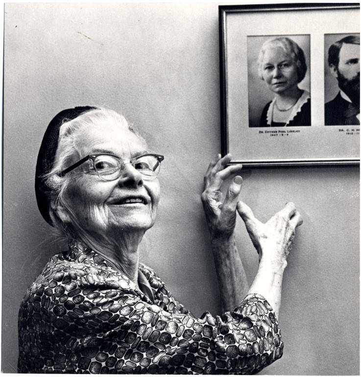
Pho­to of Dr. Esther Pohl Love­joy via Wiki­me­dia Com­mons

Almost every­one has advice they’d glad­ly give their younger self, so much so that Clem­son Uni­ver­si­ty psy­chol­o­gy pro­fes­sor Robin Kowal­s­ki and doc­tor­al stu­dent Annie McCord, were moved to ini­ti­ate a sys­tem­at­ic study of it.

The first of its kind, this study com­piled the respons­es of more than 400 par­tic­i­pants over 30, whose hypo­thet­i­cal younger self­’s aver­age age was 18.

The study’s data was culled from a sur­vey con­duct­ed over Amazon’s crowd­sourc­ing mar­ket­place, MTurk. Respon­dents spent 45 min­utes or so answer­ing hypo­thet­i­cal ques­tions online, receiv­ing $3 for their efforts.

Mon­ey-grub­bing, data-skew­ing shirk­ers were held at bay by ques­tion 36.

(Play along at home after the fact here.)

Kowal­s­ki and McCord’s find­ings, pub­lished in the bimonth­ly aca­d­e­m­ic Jour­nal of Social Psy­chol­o­gy, echo many recur­rent themes in their oth­er sur­vey of the same demo­graph­ic, this one hav­ing to do with regret—the one that got away, blown edu­ca­tion­al oppor­tu­ni­ties, mon­ey squan­dered, and risks not tak­en.

Per­son­al­i­ty and sit­u­a­tion fig­ure in, of course, but over­whelm­ing­ly, the crowd-sourced advice takes aim at the fate­ful choic­es (or non-choic­es) of youth.

Some com­mon pieces of advice include:

  • “Be kinder to your­self.”
  • “Always know your worth.”
  • “The world is big­ger than you think it is and your wor­ries aren’t as impor­tant as you think they are, just be you.”
  • “Don’t wor­ry if you look dif­fer­ent, or feel you look dif­fer­ent, from most oth­er peo­ple. There is much more to you than what oth­ers see on the sur­face.”
  • “Don’t get so caught up in the dif­fi­cul­ties of the moment since they are only tem­po­rary.”
  • “Don’t dwell on the past. Just because it was that way doesn’t mean it will be that way again.”

There’s not much research to sug­gest how recep­tive the par­tic­i­pants’ younger selves would have been to these unso­licit­ed pearls of wis­dom, but 65.7% of respon­dents report that they have imple­ment­ed some changes as a result of tak­ing Kowalk­si and McCord’s sur­vey.

Dr. Kowal­s­ki, who’s come to believe her “laser-focused on school” younger self would have ben­e­fit­ed from some inter­vals of rose-smelling, writes that the bet­ter-late-than-nev­er approach “can facil­i­tate well-being and bring us more in line with the per­son that we would like to be should we fol­low that advice.”

If you want to dou­ble down, share your advice with chil­dren, prefer­ably your own.

And for those who can’t rest easy til they’ve com­pared them­selves with Oprah Win­frey:

Be relaxed

Stop being afraid

Every­thing will be alright

No sur­prise there.

READERS—WHAT ADVICE WOULD YOU GIVE YOUR YOUNGER SELVES? Add your advice to the com­ments sec­tion below. (The author’s is some­what unprint­able…)

For inspi­ra­tion, see the Advice to My Younger Self Sur­vey Ques­tions here and the relat­ed sur­vey deal­ing with regret here.

via Big Think

Relat­ed Con­tent:

Stephen Fry: What I Wish I Knew When I Was 18

The Top Five Regrets of the Dying

Bertrand Russell’s Advice For How (Not) to Grow Old: “Make Your Inter­ests Grad­u­al­ly Wider and More Imper­son­al”

36 Artists Give Advice to Young Cre­ators: Wim Wen­ders, Jonathan Franzen, Lydia Davis, Pat­ti Smith, David Byrne, Umber­to Eco & More

Bri­an Eno’s Advice for Those Who Want to Do Their Best Cre­ative Work: Don’t Get a Job

Ayun Hal­l­i­day is an author, illus­tra­tor, the­ater mak­er and Chief Pri­ma­tol­o­gist of the East Vil­lage Inkyzine.  Her month­ly install­ment book-based vari­ety show, Necro­mancers of the Pub­lic Domain, will resume in the fall. Fol­low her @AyunHalliday.

Animations Visualize the Evolution of London and New York: From Their Creation to the Present Day

If you’ve ever lived in a metrop­o­lis like Lon­don or New York, you know the some­times-dis­ori­ent­ing feel­ing of expe­ri­enc­ing sev­er­al decades—or centuries—at once in the dizzy­ing accre­tions of archi­tec­ture, street, and park designs. Or, at least, if you’ve toured one of those cities with a long­time res­i­dent, you’ve heard them loud­ly com­plain about how every­thing has changed. Whether you study urban life as a his­to­ri­an or a city dweller, you know well that change is con­stant in the sto­ry of big cities.

The ani­ma­tions here illus­trate the point on a grand scale, with a satellite’s‑eye view of New York, above, from 1609 when the city was first built on Lenape land to its cur­rent con­fig­u­ra­tion of five bor­oughs, dense thick­ets of high-ris­es, a mas­sive, com­plex trans­porta­tion sys­tem, and 8,600,000 res­i­dents. It ends with a quote from E.B. White that sums up the geog­ra­phy and vibran­cy of Man­hat­tan: “The city is like poet­ry: it com­press­es all life, all races, and breeds, into a small island and adds music and the accom­pa­ni­ment of inter­nal engines.”

The New York video “ani­mates the devel­op­ment of this city’s street grid and infra­struc­ture sys­tems,” writes its cre­ator Myles Zhang at Here Grows New York City, “using geo-ref­er­enced road net­work data, his­toric maps, and geo­log­i­cal sur­veys” to give us “car­to­graph­ic snap­shots” of every 20–30 years. Anoth­er project, the Lon­don Evo­lu­tion Ani­ma­tion, uses sim­i­lar tech­niques. But, of course, it reach­es much fur­ther back in time, to over 2000 years ago when the Romans built the first road sys­tem across Eng­land and the port of Lon­dini­um.

Cre­at­ed in 2014, the visu­al­iza­tion shows how the city evolved, “from its cre­ation as a Roman city in 43AD to the crowd­ed, chaot­ic megac­i­ty we see today.” As design­ers Flo­ra Roumpani and Pol­ly Hud­son describe at The Guardian, the project drew from sev­er­al sources, includ­ing the Muse­um of Lon­don Archae­ol­o­gy and the Uni­ver­si­ty of Cambridge’s engi­neer­ing depart­ment. From these two insti­tu­tions came “datasets from the Roman and Medieval peri­ods as well as the 17th and ear­ly 18th cen­turies,” and “road net­work datasets from the late 18th cen­tu­ry to today.”

Oth­er archives offered infor­ma­tion on the city’s his­tor­i­cal build­ings and mon­u­ments. Cap­tions and a time­line pro­vide a handy guide through its long his­to­ry, as we watch more and more roads and build­ings appear (and dis­ap­pear after the Great Fire). These videos are use­ful ref­er­ences for stu­dents of urban­ism, and they might give some per­spec­tive to the New York­er or Lon­don­er in your life who can’t stop talk­ing about how much the city’s changed. Just imag­ine what these megac­i­ties could look like in anoth­er few hun­dred years.

Relat­ed Con­tent:

See New York City in the 1930s and Now: A Side-by-Side Com­par­i­son of the Same Streets & Land­marks

Immac­u­late­ly Restored Film Lets You Revis­it Life in New York City in 1911

The Lon­don Time Machine: Inter­ac­tive Map Lets You Com­pare Mod­ern Lon­don, to the Lon­don Short­ly After the Great Fire of 1666

Josh Jones is a writer and musi­cian based in Durham, NC. Fol­low him at @jdmagness

« Go BackMore in this category... »
Quantcast