John Cleese’s Philosophy of Creativity: Creating Oases for Childlike Play

Though he became known for the phys­i­cal com­e­dy of char­ac­ters like the irate own­er of a dead par­rot, a min­is­ter of sil­ly walks, and the always buf­foon­ish Basil Fawl­ty, John Cleese is actu­al­ly a very deep thinker. This will prob­a­bly come as no sur­prise to fans of Mon­ty Python’s intel­lec­tu­al humor, but it’s still a treat to see him, out of char­ac­ter, get­ting seri­ous about ideas, even if he can’t resist the odd joke or ten. His sub­ject? Cre­ativ­i­ty. His forum? Well, in the video above, we see Cleese at the 2009 World Cre­ativ­i­ty Forum in Ger­many. In a 2010 guest post on this talk, Maria Popo­va of Brain Pick­ings called the event “part cri­tique of modernity’s hus­tle-and-bus­tle, part hand­book for cre­at­ing the right con­di­tions for cre­ativ­i­ty.” What does John Cleese have to say about cre­at­ing those con­di­tions?

By com­bin­ing anoth­er talk from Cleese from 1991 (below), we are able to piece togeth­er a Cleese phi­los­o­phy of cre­ativ­i­ty. He begins in his ’91 talk by telling peo­ple what cre­ativ­i­ty is not, and why lec­tur­ing on it is “a com­plete waste of time.” The rea­son? It can­not be explained. “It is lit­er­al­ly inex­plic­a­ble.”

Draw­ing on research from his friend Bri­an Bates, a psy­chol­o­gist as Sus­sex Uni­ver­si­ty, Cleese claims that those con­sid­ered more cre­ative do not dif­fer in any sig­nif­i­cant way from their equal­ly intel­li­gent and tal­ent­ed peers, and there­fore, they do not pos­sess any spe­cial skills or abil­i­ties that would qual­i­fy as “cre­ativ­i­ty.” As a one­time stu­dent of the sci­ences at Cam­bridge, Cleese has a high regard for data and obser­va­tion, and in each of these talks, he applies a sci­en­tif­ic method to his sub­ject.

What, then, has he learned from observ­ing his own work habits and look­ing at the research? What can he pos­i­tive­ly say about cre­ativ­i­ty? For one thing, it is not a skill or an apti­tude, it is a “mood,” one Cleese describes as “child­like” in that it aids one in the abil­i­ty to play. Cleese makes a sim­i­lar point in his 2009 talk at the top, empha­siz­ing that acquir­ing this mood is dif­fi­cult but not impos­si­ble. As all artists know, gen­uine cre­ative insights occur when ratio­nal thought ceases—during dream­states or moments of absorp­tion so intense that self-con­scious­ness, anx­i­ety, and the needling cares of the day drop away. As Cleese put it at the World Cre­ativ­i­ty Forum, “if you’re rac­ing around all day, tick­ing things off a list, look­ing at your watch, mak­ing phone calls and gen­er­al­ly just keep­ing all the balls in the air, you are not going to have any cre­ative ideas.” This explains why the offices of com­pa­nies like Google are full of toys, why the work­days of the Mad Men “cre­atives” often resem­ble preschool, and why artists’ work spaces tend to be so intrigu­ing to peer into. They are, as Cleese terms them, “oases” from the pun­ish­ing pace of the worka­day world.

In Cleese’s con­sid­ered opin­ion, such oases, both phys­i­cal and men­tal, are the pre­con­di­tions for child­like won­der to over­ride adult rou­tine ways of think­ing. Of course as Cleese and his hard-work­ing co-cre­ators also show us, a great deal of grown-up dis­ci­pline is required to bring cre­ative ideas to fruition. The trick, Cleese says, is in mak­ing the space to engage in child­like play with­out rely­ing on child­ish spontaneity—he rec­om­mends sched­ul­ing time to be cre­ative, giv­ing one­self a “start­ing time and a fin­ish time” and there­by set­ting “bound­aries of space, bound­aries of time.” Of course, this kind of mind­ful struc­tur­ing is some­thing only a mature adult mind can do. See­ing this grown-up side of Cleese gives us a new appre­ci­a­tion for the con­sis­tent­ly child­like char­ac­ters he’s cre­at­ed over the years, and for the role of con­scious atten­tion in safe­guard­ing and nur­tur­ing uncon­scious insight.

Relat­ed Con­tent:

David Lynch Explains How Med­i­ta­tion Enhances Our Cre­ativ­i­ty

Mal­colm McLaren: The Quest for Authen­tic Cre­ativ­i­ty

Mihaly Czik­szent­mi­ha­lyi Explains Why the Source of Hap­pi­ness Lies in Cre­ativ­i­ty and Flow, Not Mon­ey

Josh Jones is a writer and musi­cian based in Durham, NC. Fol­low him at @jdmagness

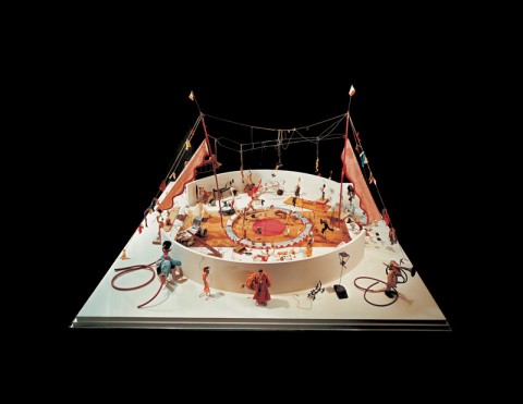
Discover Alexander Calder’s Circus, One of the Beloved Works at the Whitney Museum of American Art

Alexan­der Calder’s Calder’s Cir­cus, a toy the­ater piece the artist con­struct­ed between 1926 and 1931, and per­formed for decades, has the rag bag appeal of a much-repaired stuffed ani­mal who’s loved into a state of bald­ness. This charm pre­sent­ed con­ser­va­tors at the Whit­ney Muse­um of Amer­i­can Art with a unique set of chal­lenges. Not only were the cloth and wire struc­tures frag­ile with age, they’d tak­en a beat­ing dur­ing the peri­od when they were on active duty. Should the work be restored to its pris­tine state or should the artist’s clum­sy, on-the-fly patch jobs be pre­served as evi­dence of use?

calder circus whitney

As part of the restora­tion effort, the Whit­ney’s team  of con­ser­va­tors, archivists and his­to­ri­ans delved into cir­cus his­to­ry, learn­ing that Calder’s ring­mas­ter, tightrope dancer, bare­back rid­er, and lion tamer were all based on cir­cus stars of the peri­od.

They also leaned on two films depict­ing the work in motion, Jean Painleve’s Le Grand Cirque Calder 1927  and Le Cirque de Calder by Car­los Vilarde­bo. But with more than two hun­dred live per­for­mances, it seemed a good bet that the char­ac­ters could be manip­u­lat­ed in ways oth­er than the ones cap­tured on film. An acro­bat who was con­sult­ed agreed, but also con­clud­ed that some of the moves of which these lit­tle wire fig­ures were capa­ble would be impos­si­ble for human beings.

As archivist Ani­ta Duquette notes above, even in its restored state the Cir­cus will now be a sta­t­ic affair, part­ly from the ongo­ing effort to con­serve its del­i­cate mate­ri­als, but more because the mas­ter who appar­ent­ly took such plea­sure in bring­ing it to life is not avail­able for an encore per­for­mance.

- Ayun Hal­l­i­day will take a cork-wire-and-fab­ric-scrap table­top cir­cus over a 3D CGI any old day. Fol­low her @AyunHalliday

Nobel Laureates Draw Playful Pictures of Their Discoveries

nobel soccer 3

As an arty, unath­let­ic only child in the 70s, I refused to buy into the idea that sci­ence could be fun. This despite a wealth of zip­py edu­ca­tion­al pro­gram­ming, and the efforts of at least two cute young teach­ers whose hands-on approach includ­ed throw­ing eggs off of a rail­road tres­tle, demol­ish­ing tooth­pick bridges and dip­ping things into liq­uid nitro­gen for the sheer plea­sure of see­ing them explode when they hit the wall. Nice try. As far as I was con­cerned, those dullsville black-and-white films from the ’50s embod­ied the sub­jec­t’s gen­er­al vibe far more hon­est­ly than any attempt to force it down our throats with a fash­ion­able Hon­ey­comb Kids-style spin.

Hav­ing by now met dozens of sci­en­tists and sci­ence enthu­si­asts who are left cold by the arts, I’m not ashamed to be plain­spo­ken here.  I cer­tain­ly don’t begrudge them their pas­sion, and appre­ci­ate it when they don’t belit­tle mine. Dif­fer­ent strokes, you know?

Still, it’s nice to stum­ble across com­mon ground and for me, pho­tog­ra­ph­er Volk­er Ste­gerfor’s Nobel lau­re­ate por­traits pro­vides acreage on the order of Jim Otta­viani and Leland Myrick­’s graph­ic biog­ra­phy of Richard Feyn­man. I may be hard pressed to artic­u­late what the peo­ple in the por­traits are famous for, but I appre­ci­ate their will­ing­ness to be a play by the artist’s rules. (By his esti­mate, the decline rate is some­where around 4. 29%)

Ste­gerfor’s method for cap­tur­ing big brained inno­va­tors in a light frame of mind resem­bles a well run exper­i­ment. His unsus­pect­ing spec­i­mens were appre­hend­ed at Ger­many’s annu­al Lin­dau Nobel Lau­re­ate Meet­ing. Thus secured, they were led one at a time into a tem­po­rary stu­dio where each was invit­ed to draw what­ev­er it was that had earned him or her the Nobel prize. The results weren’t much as art, but they’re unmis­tak­ably play­ful, bristling with arrows, excla­ma­tion points, smi­ley faces, and word bub­bles. The pho­tog­ra­ph­er let his sub­jects pick the pose, at which points things did become art.

I’m going to award 1996 Chem­istry lau­re­ate Sir Harold Kro­to Best in Show for his well war­rant­ed action pose. Appar­ent­ly, his dis­cov­ery’s mol­e­c­u­lar struc­ture looks like a soc­cer ball.

It’s not exact­ly Break­ing Bad, but it does bring Chem­istry alive for me as a sub­ject oth­ers might find enjoy­able in the empir­i­cal sense.

View a gallery of Volk­er Ste­gerfor’s Sketch­es of Sci­ence. If you’re real­ly into it, the Nobel Muse­um is herald­ing a trav­el­ing exhi­bi­tion of Ste­gerfor’s work with audio record­ings of the sci­en­tists on the sub­ject of their dis­cov­er­ies.

via The Smith­son­ian blog

- Ayun Hal­l­i­day is slat­ed to direct the world’s first bio-his­tor­i­cal musi­cal in Novem­ber. Fol­low her @AyunHalliday


Now I Know My LSD ABCs: A Trippy Animation of the Alphabet

Many inter­ests have spurred cre­ative alpha­bet col­lec­tions: New York City. Geek­dom. Food snob­bery. Child­hood calami­ty. And now?

Actu­al­ly, LSD ABC, defies neat cat­e­go­riza­tion. Beyond the fact that they’re both spelled out using let­ters, what could Dim Sum pos­si­bly have in com­mon with VHS? Not much pri­or serv­ing as inspi­ra­tional prompts for graph­ic design­ers Lau­rent & Françoise (oth­er­wise known as Lau­ra Sicouri and Kadavre Exquis). Now they’re 1/13th of a delight­ful­ly twist­ed ani­mat­ed whole, one of those dead­line-free pet projects that goes on to spawn a lim­it­ed edi­tion vinyl album.

The duo is prone to fetishiz­ing the anachro­nis­tic tech­nolo­gies of the recent past, in a man­ner slight­ly more ele­gant than come­di­ans Tim Hei­deck­er and Eric Ware­heim. They toss in a foot sim­i­lar to the one Ter­ry Gilliam used to such effect on Mon­ty Python. H and S are sub­ject­ed to the sort of indig­ni­ties Wile E. Coy­ote used to suf­fer at the hands of the Road Run­ner. It’s all tied togeth­er with AT&T Lab’s decid­ed­ly unnat­ur­al-sound­ing Nat­ur­al Voice text-to-speech nar­ra­tion.

While it’s dif­fi­cult to pick a favorite from such a mind bend­ing array, I’m going to have to go with P…for Pet Piano, natch. You?

Relat­ed Con­tent:

Watch All of Ter­ry Gilliam’s Mon­ty Python Ani­ma­tions in a Row

Bauhaus, Mod­ernism & Oth­er Design Move­ments Explained by New Ani­mat­ed Video Series

Ayun Hal­l­i­day is stymied by the lack of Ys on cer­tain Euro­pean key­boards. Fol­low her @AyunHalliday

Jump Start Your Creative Process with Brian Eno’s “Oblique Strategies” Deck of Cards (1975)

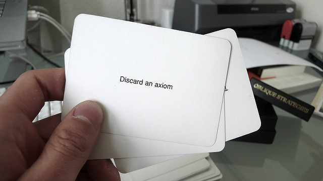
Image by Bas­ti­aan Ter­horst, via Flickr Com­mons

The likes of U2, Cold­play, and David Bowie can afford to hire pro­duc­er, artist, and thinker Bri­an Eno to shake up their cre­ative process­es. You and I, alas, prob­a­bly can’t. We can, how­ev­er, afford to con­sult the Oblique Strate­gies, a deck of cards invent­ed by Eno and painter Peter Schmidt in 1975. Each card offers, in its own oblique fash­ion, a strat­e­gy you can fol­low when you find your­self at an impasse in your own work, be it music, paint­ing, or any form at all: “Hon­or thy error as a hid­den inten­tion.” “State the prob­lem in words as clear­ly as pos­si­ble.” “Remem­ber those qui­et evenings.” “Once the search is in progress, some­thing will be found.” “Work at a dif­fer­ent speed.” “Look close­ly at the most embar­rass­ing details and ampli­fy them.”

“The Oblique Strate­gies evolved from me being in a num­ber of work­ing sit­u­a­tions when pan­ic, par­tic­u­lar­ly in stu­dios, tend­ed to make me quick­ly for­get that there were oth­ers ways of work­ing,” said Eno in a 1980 radio inter­view, “and that there were tan­gen­tial ways of attack­ing prob­lems that were in many sens­es more inter­est­ing than the direct head-on approach.”

Should you feel the need for just such a break with the obvi­ous approach, you can track down one of the offi­cial phys­i­cal edi­tions of the Oblique Strate­gies deck. Or you can con­sult one of  its many vir­tu­al ver­sions avail­able on the inter­net. Eno talks about how the deck of cards came into being. Vin­tage sets can be found on Ama­zon here.

Relat­ed Con­tent:

Bri­an Eno on Cre­at­ing Music and Art As Imag­i­nary Land­scapes (1989)

Watch Bri­an Eno’s “Video Paint­ings,” Where 1980s TV Tech­nol­o­gy Meets Visu­al Art

Day of Light: A Crowd­sourced Film by Mul­ti­me­dia Genius Bri­an Eno

Col­in Mar­shall hosts and pro­duces Note­book on Cities and Cul­ture and writes essays on lit­er­a­ture, film, cities, Asia, and aes­thet­ics. He’s at work on a book about Los Ange­lesA Los Ange­les Primer. Fol­low him on Twit­ter at @colinmarshall.

In “The Dictionary of Obscure Sorrows,” Artist John Koenig Names Feelings that Leave Us Speechless

It may be a mis­con­cep­tion, it may be a cliché: I’m not a Ger­man speaker—but read­ing translator’s intro­duc­tions to, say, Kant, Hegel or Goethe has con­vinced me that their lan­guage does a much bet­ter job than Eng­lish at cap­tur­ing those odd­ly spe­cif­ic twi­light moods and com­pound feel­ings that so often escape def­i­n­i­tion. Then again, Eng­lish absorbs, can­ni­bal­izes, appro­pri­ates, steals, and bas­tardizes words wher­ev­er it can find them, dri­ving lex­i­cog­ra­phers and gram­mar purists mad.

Graph­ic design­er and film­mak­er John Koenig does all of these things in his “Dic­tio­nary of Obscure Sor­rows,” a blog project in which he names emo­tions that oth­er­wise leave us speech­less. In his short video above, he illus­trates one of his words, “Son­der,” or “the real­iza­tion that each ran­dom passer­by is liv­ing a life as vivid and com­plex as your own…”—something like the shock of sud­den empa­thy that shakes us out of navel-gaz­ing. It’s an emo­tion I’ve expe­ri­enced, with­out know­ing what to call it.

This being an “obscure sor­row,” there’s more to it than empathy—in Koenig’s poet­ic video, “son­der” relates to the infi­nite num­ber of over­lap­ping sto­ries, in which each of us feels we are the hero, oth­ers sup­port­ing cast or extras. In a state of “son­der,” we sud­den­ly occu­py all of those roles at once, our screen time dimin­ish­ing as oth­ers take the lead. After watch­ing Koenig’s film, I’m think­ing “son­der” is a port­man­teau of “sub­lime” and “won­der.” It’s a mys­ti­cal phi­los­o­phy con­tained with­in a sin­gle made-up word.

Some oth­er Koenig coinages: “Ruck­kehrun­ruhe,” “nodus tol­lens,” “adroni­tis,” “rig­or sam­sa”.…. I leave it to you to vis­it Koenig’s Dic­tio­nary and learn what these words mean. It’s an expe­ri­ence well worth your time.

Relat­ed Con­tent:


The Atlas of True Names Restores Mod­ern Cities to Their Mid­dle Earth-ish Roots

The His­to­ry of the Eng­lish Lan­guage in Ten Ani­mat­ed Min­utes

Oxford Schol­ars Name Top Ten Irri­tat­ing Phras­es

Josh Jones is a writer and musi­cian based in Wash­ing­ton, DC. Fol­low him at @jdmagness

“Performance Philosopher” Jason Silva Introduces Mind-Altering New Video Series, “Shots of Awe”

Remem­ber that 1996 doc­u­men­tary The Cruise, chron­i­cle of New City Tour guide Tim­o­thy “Speed” Lev­itch, who com­pressed ency­clo­pe­dias full of ref­er­ences into a man­ic spit­fire style? Well, “per­for­mance philoso­pher” Jason Silva’s mono­logues are a bit like Levitch’s, with a lot less Woody Allen and a lot more of Richard Linklater’s ani­mat­ed head­trip Wak­ing Life.

Silva’s got a new web­series out called “Shots of Awe,” which he describes as “freestyle phi­los­o­phy videos [that] cel­e­brate exis­ten­tial jazz, big ques­tions, tech­nol­o­gy and sci­ence.” These short videos are indeed “shots,” with each one com­ing in at under three min­utes. The short above, “Awe,” defines the term as “an expe­ri­ence of such per­pet­u­al vast­ness you lit­er­al­ly have to recon­fig­ure your men­tal mod­els of the world to assim­i­late it.”

While the Eng­lish prof. in me winces at the use of “lit­er­al­ly” here (“men­tal mod­el” is a metaphor, after all), the video’s machine-gun edit­ing and Silva’s “con­trast between banal­i­ty and won­der” have me con­vinced he’s onto some­thing. Check out the series’ trail­er here and see two addi­tion­al episodes, “Sin­gu­lar­i­ty” (below) and “Mor­tal­i­ty.” The series is host­ed on Discovery’s Test­Tube net­work and fol­lows up Silva’s Espres­so video series.

Relat­ed Con­tent:

Jason Sil­va Preach­es the Gospel of “Rad­i­cal Open­ness” in Espres­so-Fueled Video (at TED­G­lob­al 2012)

Enthu­si­as­tic Futur­ist Jason Sil­va Wax­es The­o­ret­i­cal About the Immer­sive Pow­er of Cin­e­ma

Josh Jones is a writer and musi­cian based in Wash­ing­ton, DC. Fol­low him at @jdmagness

The Art of Data Visualization: How to Tell Complex Stories Through Smart Design

The vol­ume of data in our age is so vast that whole new research fields have blos­somed to devel­op bet­ter and more effi­cient ways of pre­sent­ing and orga­niz­ing infor­ma­tion. One such field is data visu­al­iza­tion, which can be trans­lat­ed in plain Eng­lish as visu­al rep­re­sen­ta­tions of infor­ma­tion.

The PBS “Off Book” series turned its atten­tion to data visu­al­iza­tion in a short video fea­tur­ing Edward Tufte, a sta­tis­ti­cian and pro­fes­sor emer­i­tus at Yale, along with three young design­ers on the fron­tiers of data visu­al­iza­tion. Titled “The Art of Data Visu­al­iza­tion,” the video does a good job of demon­strat­ing how good design—from sci­en­tif­ic visu­al­iza­tion to pop infographics—is more impor­tant than ever.

In much the same way that Mar­shall McLuhan spoke about prin­ci­ples of com­mu­ni­ca­tion, Tufte talks in the video about what makes for ele­gant and effec­tive design. One of his main points: Look after truth and good­ness, and beau­ty will look after her­self.

What does Tufte mean by this? That design is only as good as the infor­ma­tion at its core.

OffBookSCSHT1

For those of us who aren’t design­ers, it’s refresh­ing to con­sid­er the ele­ments of good visu­al sto­ry-telling. And that’s what the best design is, accord­ing to the experts in this video. Every data set, or big bunch of infor­ma­tion, has its own core con­cept, just as every sto­ry has a main char­ac­ter. The designer’s job is to find the hero in the data and then tell the visu­al sto­ry.

So much of the infor­ma­tion we encounter every day is hard to con­cep­tu­al­ize. It’s so big and com­pli­cat­ed that a visu­al ren­der­ing rep­re­sents it the best. That’s because human brains are wired to take in a lot of infor­ma­tion at once. Good design­ers know that deci­sion-mak­ing isn’t lin­ear. It’s a super-fast process of rec­og­niz­ing pat­terns and mak­ing sense of them.

OffBookSCSHT2

Infor­ma­tion may be more abun­dant but it isn’t new, and nei­ther is data visu­al­iza­tion. In the video, Tufte talks about stone maps carved by ear­ly humans and how those ancient graph­ics form the tem­plate for Google maps.

What comes across in PBS’s video is that data visu­al­iza­tion is an art, and the sim­pler the bet­ter. Tufte seems to argue that good data guides the design­er to do good work, which leads to the ques­tion: Is the medi­um no longer, as McLuhan famous­ly com­ment­ed, the mes­sage?

Relat­ed Con­tent:

In Under Three Min­utes, Hans Rosling Visu­al­izes the Incred­i­ble Progress of the “Devel­op­ing World”

An Ani­mat­ed Visu­al­iza­tion of Every Observed Mete­orite That Has Hit Earth Since 861 AD

Watch a Cool and Creepy Visu­al­iza­tion of U.S. Births & Deaths in Real-Time

Kate Rix writes about dig­i­tal media and edu­ca­tion. Vis­it her web­site. Fol­low her on Twit­ter @mskaterix

« Go BackMore in this category... »
Quantcast