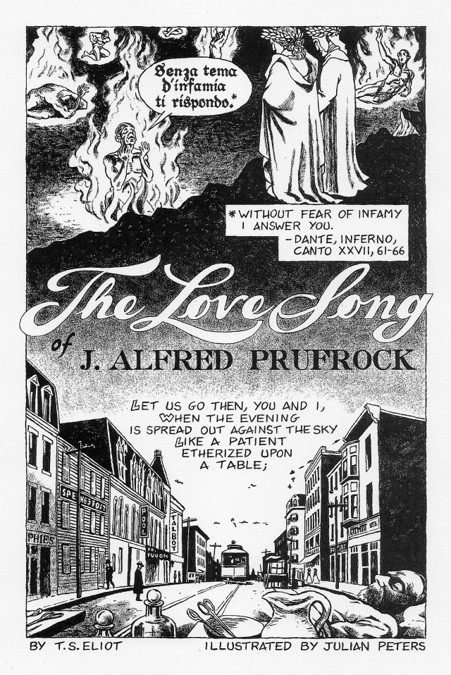
Two years ago, we highlighted for you the beginning of a promising project — Julian Peters’ comic book adaptation of T.S. Eliot’s 1910 poem “The Love Song of J. Alfred Prufrock.” At the time of our post, Peters had only completed the first nine pages of his adaptation. And, about those first pages, our Josh Jones had this to say:
Dante is where “Prufrock” begins, with an epigraph from the Inferno. Peters’ first page illustrates the agonized speaker of Dante’s lines, Guido da Montefeltro, a soul confined to the eighth circle, whom you can see at the top of the title page shown above. Peters’ visual choices place us firmly in the hellish emotional realm of “Prufrock,” a seeming catalogue of the mundane that harbors a darker import. Peters gives us no hint of when we might expect new pages, but I for one am eager to see more.
Note: Julian is looking for a publisher to help put his comic book in print. If any publishers want to chat with him, you can find his contact info on his web site.
Follow Open Culture on Facebook and Twitter and share intelligent media with your friends. Or better yet, sign up for our daily email and get a daily dose of Open Culture in your inbox. And if you want to make sure that our posts definitely appear in your Facebook newsfeed, just follow these simple steps.
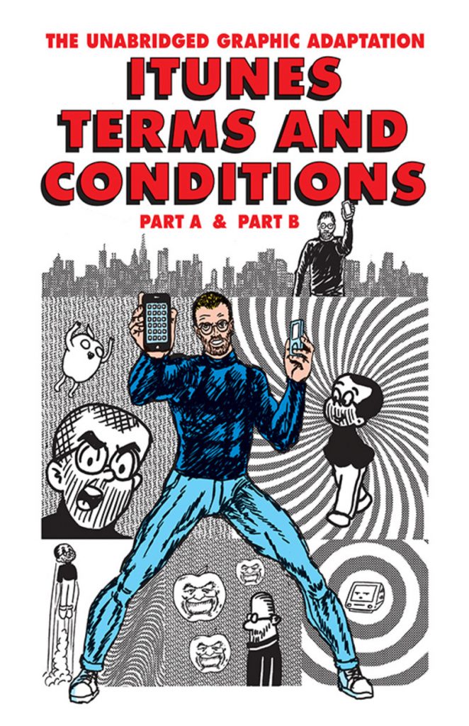
In the past, we’ve brought you the creative work of R. Sikoryak. An illustrator who teaches at the Parsons School of Design in NYC, Sikoryak has a penchant for creating comic book adaptations of literary classics. Take for example Dostoyevsky Comics where Batman stars in a comic book version of Crime & Punishment. Or Waiting to Go, which marries Waiting for Godot with Beavis and Butt-Head.
In his latest project, Sikoryak veers sharply away from literature toward language that is much more technical. Now, on his tumblr, you can findiTunes Terms & Conditions: The Graphic Novel.
Adding a new page every day, Sikoryak is creating an illustrated version of the “complete, unabridged legal agreement.” You can currently view the first 49 pages. Click here. Go to the bottom of the page. Then start scrolling up as you read.
Follow Open Culture on Facebook and Twitter and share intelligent media with your friends. Or better yet, sign up for our daily email and get a daily dose of Open Culture in your inbox. And if you want to make sure that our posts definitely appear in your Facebook newsfeed, just follow these simple steps.
Would John Lennon’s “Imagine” have been such a big hit if it had come from an unknown singer/songwriter instead of one of the most famous rock stars in the world? Impossible to say. Maybe a better question is: could anyone else have written the song? “Imagine” has become much more than a soft rock anthem since its release in 1971; it has become a global phenomenon. Among the innumerable big events at which the humanist hymn appears we can include, since 2005, New York’s New Year’s Eve celebration and, just recently, a performance by pop star Shakira at the UN General Assembly just before Pope Francis’ historical appearance.
It seems an odd choice, given the song’s apparent anti-religious message. And yet, though Lennon was no fan of organized religion, he told Playboy magazine in a 1980 interview that the song was inspired by “the concept of positive prayer” in a Christian prayer book given to him by Dick Gregory. “If you can imagine a world at peace,” said Lennon, “with no denominations of religion—not without religion but without this my God-is-bigger-than-your-God-thing—then it can be true….” As if to underscore that particular point in his adaptation of “Imagine” in the video above, cartoonist Pablo Stanley includes such religiously diverse, yet ecumenical figures as the agnostic Albert Einstein, Protestant Martin Luther King, Jr., Hindu Mahatma Gandhi, and Rastafarian Bob Marley, along with less-famous freedom fighters like Harvey Milk and murdered Russian journalist Anna Politkovskaya.
Stanley’s “Imagine” originally appeared in webcomic form, sans music, on his blog Stanleycolors.com. It seems that several people took exception to an earlier, mostly black-and-white draft (which also included what looks like the once-very-Southern-Baptist Jimmy Carter), so Stanley issued a multi-point disclaimer under his revised, full-color version. He states that this “is NOT an anti-religion/atheist propaganda comic”—charges also unfairly levied at Lennon’s song. Stanley doesn’t address the fact that most of the famous people in his comic, including Lennon, were assassinated, though this blog post offers a suggestive theory with interview footage from Lennon himself.
In every respect, the comic adaption of “Imagine” hews pretty closely to Lennon’s call for world peace. In another Beatles-penned ballad-adaptation, however, things take a much darker turn. Stanley uses his personal experience of near-suicidal depression in his comic realization of Paul McCartney’s song of lost love, “Yesterday.” (See a video version above, webcomic version here.) This is grim stuff, to be sure, but Stanley assures us that he “overcame that situation.” His commentary offers a hopeful take on the painful ending: “Looking at the yesterday reminds me that I should thrive for the tomorrow.” I’m sure McCartney would agree with the sentiment.
For many more smart, moving—though non-Beatles-related—comics from Pablo Stanley, see his blog, Stanley Colors.
Bob Kane created Batman in 1939 as a way to fulfill the public’s need for more comic book superheroes in the wake of Superman. And, by 1943, Batman made his way from pulpy print to the screen for first time.
In this video tribute to the many looks of Batman through the ages, Jacob T. Swinney advances chronologically, but also thematically, focusing on the interplay between Batman and his sidekick Robin; the fetishization of Batman’s tool belt; and the evolution of his costume from fabric (his classic look up through the ’80s) to the BDSM-inspired rubber outfits that have lasted since Michael Keaton donned the solid black get-up through Christian Bale’s interpretation. (It does seem that Ben Affleck’s version will not deviate from this course, but add some armor. He will also continue to perch on top of spires and tall buildings and stand watch over the city.)
The other evolution worth noticing is in Batman’s voice, and what it says about America’s relationship with authority. In the early serials up through Adam West’s iconic TV version, Batman speaks in clipped but enunciated tones, somewhere in the region of newscasters and G‑men. This connects Batman to the detective part of his character and telegraphs his innate goodness. But once Keaton takes on the role, Batman speaks in a low, gravely tone to suit his vigilante ethos, designed for meetings in dark alleys. This is how we want our heroes now.
This “serious” shift takes its cue from Frank Miller’s groundbreaking The Dark Knight Returns comic book, which is ground zero for every superhero film since that wears its gritty realism on its sleeve. This affected speech reaches its fairly ridiculous apotheosis in Christopher Nolan’s The Dark Knight Rises, where both hero and villain are incomprehensible. The only thing left is parody, and that’s how we end this video, with Will Arnett’s voice animating the Lego Movie’s version of the superhero: affected, narcissistic, and believing too much in his own myth.
Ted Mills is a freelance writer on the arts who currently hosts the FunkZone Podcast. You can also follow him on Twitter at @tedmills, read his other arts writing at tedmills.com and/or watch his films here.
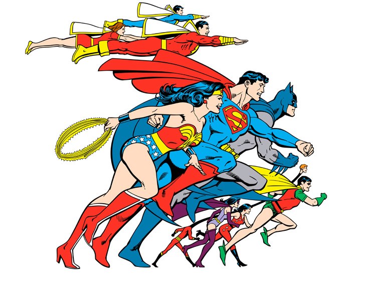
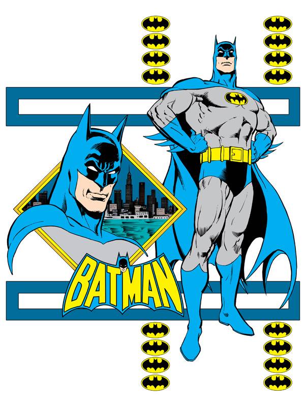
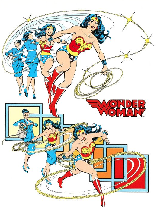
Even if you don’t like comic books, think of names like Superman, Batman, and Wonder Woman, and you get a very clear mental picture indeed. Classic superheroes live, breathe, battle supervillians, and even die and return to life across decades upon decades of storylines (and often more than one at once), but we all know them because, just like the most enduring corporate logos, they also stand as surpassingly effective works of commercial art. But given that countless different artists in various media have had to render these superheroes over those decades, how have their images remained so utterly consistent?
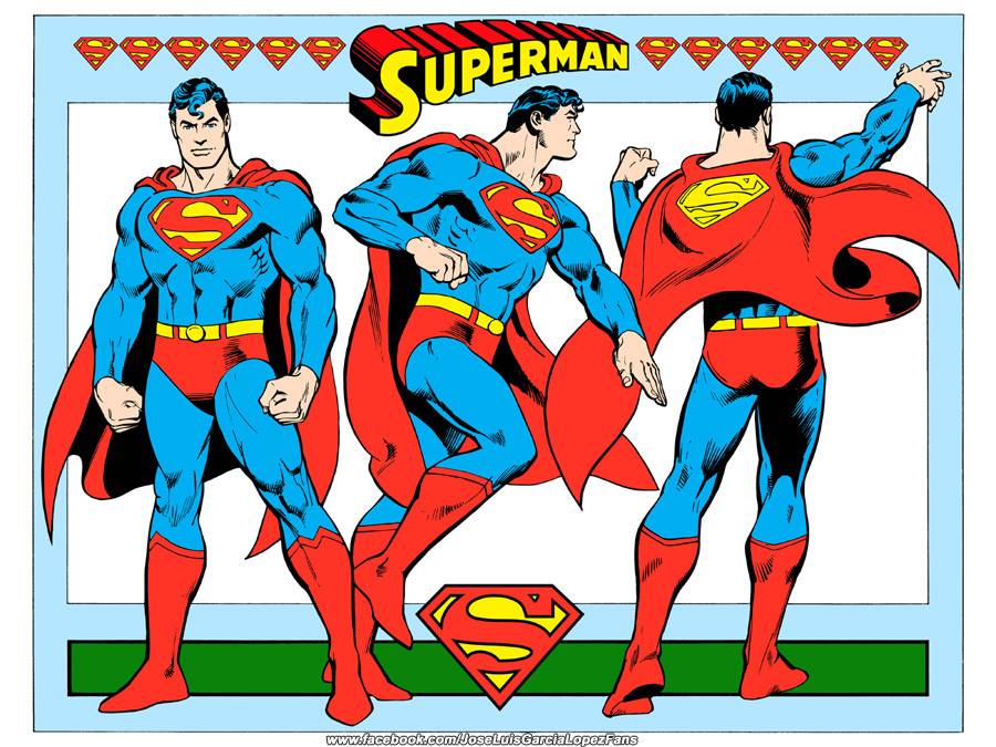
That owes to documents such as the 1982 DC Comics Style Guide, scanned and recently posted to a Facebook group for fans of comic-book artist José Luis García-López. Having spent most of his career with DC Comics, caretaker of Superman, Batman, Wonder Woman, and many other well-known and much-licensed heroes and villains besides, García-López surely knows in his very bones the sort of details of costume, physique, posture, and bearing these style guides exist to convey.
Being 33 years old, this particular style guide doesn’t perfectly reflect the way all of DC’s superheroes look today, what with the aesthetic changes made to keep them hip year on year. But you’ll notice that, while fashions tend to have their way with the more minor characters (longtime DC fans especially lament the headband and big hair this style guide inflicted upon Supergirl), the major ones still look, on the whole, pretty much the same. Sure, Superman has the strength and the flight, Batman has the wealth and the vast armory of high-tech crime-fighting tools, and Wonder Woman can do pretty much anything, but all those abilities pale in comparison to the sheer power of their design. You can flip through the rest of the Style Guide here.
It is surprising to me, but a few people I’ve come across don’t know the name of cartoonist Robert Crumb, cult hero of underground comics and obscure Americana record collecting. On second thought, maybe this shouldn’t come as such a surprise. These are some pretty small worlds, after all, populated by obsessive fans and archivists and not always particularly welcoming to outsiders. But Crumb is different. For all his social awkwardness and hyper-obsessiveness, he seems strangely accessible to me. The easiest reference for those who’ve never heard of him is Steve Buscemi’s Seymour in Terry Zwigoff’s Ghost World. There’s an obvious tribute to Crumb in the character (Zwigoff previously made an R. Crumb documentary), though it’s certainly not a one-to-one relation (the film adapts Daniel Clowe’s comic of the same name.)
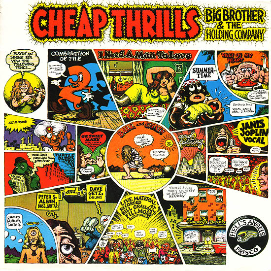
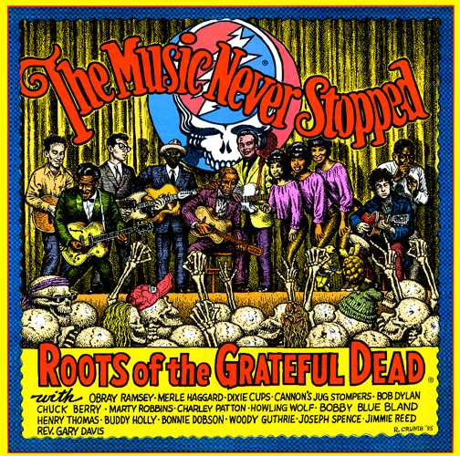
Whether or not Ghost World (or Zwigoff’s Crumb) rings a bell, there’s still the matter of how to communicate the lovable lewdness and aggressive anachronism that is Crumb’s art. For that one may only need to mention Big Brother & the Holding Company’s 1968 classic Cheap Thrills (top), the first album cover Crumb designed—and which Janis Joplin insisted upon over the record company’s objections. With its focus on musicians, and its appropriation of hippie weirdness, racist American imagery, and an obsession with female posteriors that rivals Sir-Mix-a-Lot’s, the cover pretty much spans the spectrum of perennial Crumb styles and themes. Above, see another of Crumb’s covers, for a compilation called The Music Never Stopped: Roots of the Grateful Dead, which collects such roots and old-school rock and roll artists as Merle Haggard, Chuck Berry, Bob Dylan, Reverend Gary Davis, Howlin’ Wolf, and more.
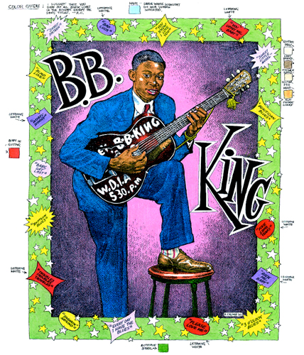
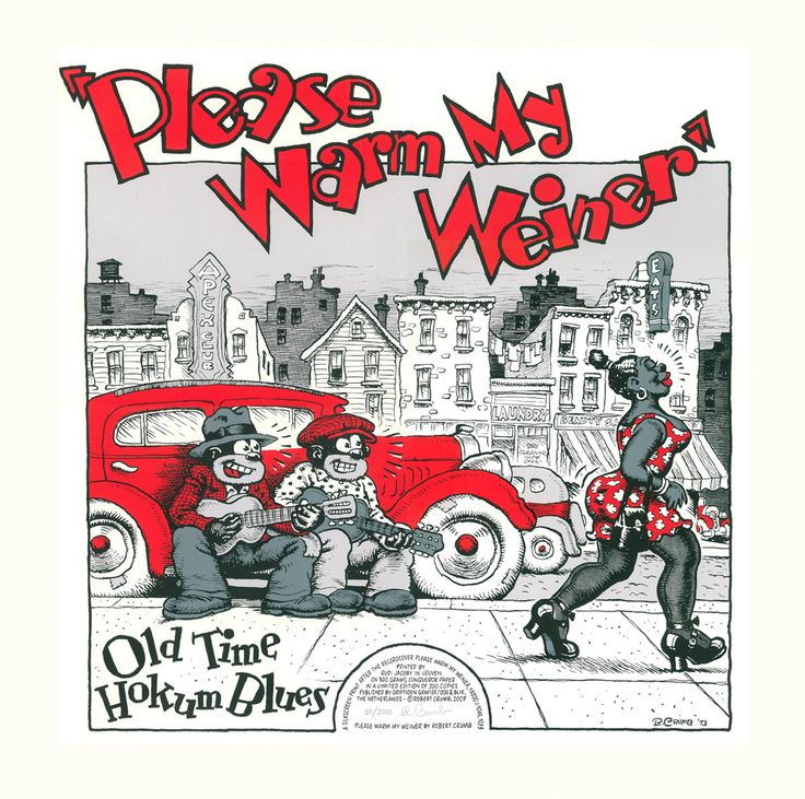
Though he objected to the 1995 assignment—saying to Shanachie Records, “You want all these people on a CD cover? What are they, like, five inches across?”—Crumb must have relished the subject. (And he was paid, as per usual, in vintage 78s.) Next to those posteriors, Crumb’s true love has always been American roots music—ragtime, swing, old country and bluegrass, Delta country blues—and he has spent a good part of his career illustrating artists he loves, and those he doesn’t. From famous names like Joplin, Dylan, and B.B. King (above, whose music Crumb said he “didn’t care for, but I don’t find it that objectionable either”), to much more obscure artists, like Bo Carter, known for his “Please Warm My Wiener,” on the 1974 compilation album below.
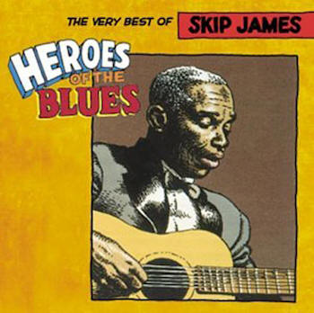
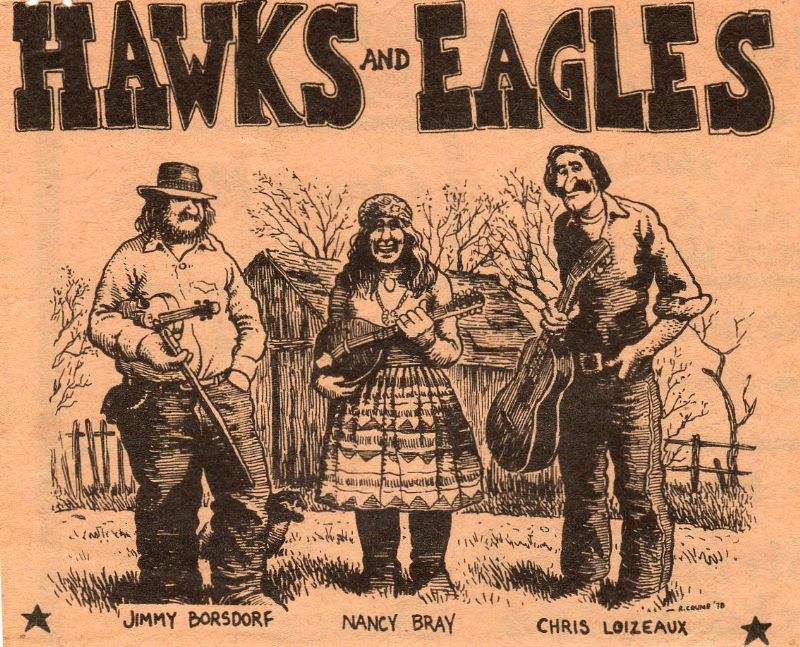
Crumb’s use of racially questionable and sexist imagery—however satirical—has perhaps rendered him untouchable in some circles, and it’s hard to imagine many of his album covers passing corporate muster these days. His recent work has moved toward more straightforward, respectful portraiture, like that of King and of Skip James on the best-of below, from a series called “Heroes of the Blues.” (Crumb also illustrated “Heroes of Jazz” and “Heroes of Country,” as we featured in this post.) See Crumb’s inimitable, looser portrait style again further down in 2002 album art for a group called Hawks and Eagles.
Crumb may have shed some of his more unpalatable tendencies, but he hasn’t lost his lascivious edge. However, his work has matured over the years, taking on serious subjects like the book of Genesis and the Charlie Hebdo massacre. For an artist with such peculiar personal focus, Crumb is surprisingly versatile, but it’s his album covers that combine his two greatest loves. “What makes Crumb’s art so appropriate for the album sleeve,” writes The Guardian’s Laura Barton, “is its vividness, and its certain oomph; it’s in the mingling of sex and joy and compulsion, and the vibrancy and movement of his illustrations.”
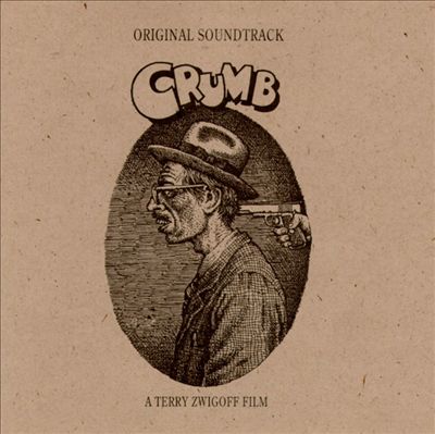
Crumb hasn’t only combined his art with music fandom, but also with his own musicianship, illustrating covers for several of his own albums by his ragtime band Cheap Suit Serenaders. And he even provided the illustration for the soundtrack to his own documentary, as you can see above—an extreme example of the many self-abasing portraits Crumb has drawn of himself over the years. Crumb’s album cover art has been collected in a book, and you can see many more of his covers at Rolling Stone and on this list here.
Abiding by the strong rules he established for the characters in the Looney Tunes stable was critical to his comic approach, as Jones explains in the above video essay, a bit of a departure for Tony Zhou’s celebrated cinema series, Every Frame a Picture. Rather than examine the framing and timing of “one of the all-time masters of visual comedy,” this time Zhou delves into the evolution of his subject’s artistic sensibilities.
Jones teased out the desires that became the primary engines for those characters’ physicality as well as their behavior. Daffy comes off as an unhinged lunatic in his early appearances. His comic potential grew once Jones reframed him as a conniver who’d do anything in pursuit of wealth and glory.
Once the characters’ motivations were clear, Jones could mess around with the ol’ one-two punch. It’s a classic comic structure, wherein reality wreaks havoc on the audience’s expectations about how things should unfold. Then again, a child can tell you what drives Jones’ creation, the passionate French skunk, Pepé Le Pew, as well as how those amorous ambitions of his are likely to work out. Funny! Dependably so!
Zhou also draws attention to the evolution of the characters’ expressions, from the antic to the economical. John Belushi was not the only comic genius to understand the power of a raised eyebrow.
Like many children of the 70s, I was wild for Charles Schulz’s Peanuts, and had the merchandise to prove it. I was a Snoopy girl, for the most part, but not averse to receiving items featuring other characters—Linus, Schroeder, the caustic Lucy, PigPen, and, of course, Charlie Brown. My father was a sucker for the comparatively butch Peppermint Patty, and Marcie, the bespectacled hanger-on who referred to Patty as “Sir.”
But there was one character I don’t remember seeing on any Peanuts swag in 1970s Indiana…. Actually, that’s not accurate. I don’t remember any Shermy sweatshirts. Female second bananas like Violet, the original, i.e. non-Peppermint Patty, and Frieda were also underrepresented, despite the latter’s oft-mentioned naturally curly hair.
The character I’m thinking of never became a major player, but he was notable. Ground-breaking even. Can you guess?
Thats right: Franklin, the only African-American member of the Peanuts gang.
(An African-American toddler, Milo, below, had a 17-strip run in 1977 when Charlie Brown had to skip town after exacting his revenge on the kite-eating tree… That’s it. Poor Franklin.)
Franklin owes his existence, in large part, to Harriet Glickman, a white teacher from LA, who found letter writing one of the few forms of activism in which a mother of three children—all squarely within the Peanuts demographic—could fully participate. Raised by liberal parents to consider herself a global citizen, and to speak out against injustice, she wrote the authors of several leading comic strips in the wake of Dr. Martin Luther King’s assassination in April, 1968. Would the creators of Peanuts and Mary Worth consider introducing a black character into the mix, as a first step on what Glickman foresaw as a “long and tortuous road” toward a future climate of “open friendship, trust and mobility” between the races?
Mary Worth’sAllen Saunders declined, apparently saying that he shared Glickman’s sentiments but feared the syndicate would drop his strip if he followed her suggestion.
Schulz didn’t exactly leap at the chance, either, saying that he was in the same boat as the other sympathetic cartoonists who’d begged off. What he feared wasn’t so much the syndicate’s response, as the suspicion that he might be seen as “patronizing our Negro friends.”
Glickman persisted, asking his permission to share his letter with some of her “Negro friends,” all parents. Perhaps they could offer some thoughts that might induce the cartoonist to say yes.
I’d like to express an opinion as a Negro father of two young boys. We have a situation in America in which racial enmity is constantly portrayed.
Like Glickman, he felt that a “casual day-to-day scene” featuring a non-white character would give his sons and other children of color a chance to see themselves reflected in the strip, while promoting “racial amity” to readers of all races.
Glickman expressed hope that Peanuts would eventually grow to include more than one black child:
Let them be as adorable as the others…but please…allow them a Lucy!
Within weeks of receiving Kelly’s letter, and just over two months into Glickman’s letter-writing campaign, Schulz reached a decision. He wrote Glickman that she should check the paper the week of July 29, 1968.
Franklin, his skin tone indicated by closely set diagonal lines, made his debut in a bathing suit, returning Charlie Brown’s runaway beach ball. The encounter took three days to play out, during which Franklin and Charlie Brown form an alliance of vacationing children whose usual playmates are elsewhere. It would seem that the major difference between them is that Franklin’s dad is in Vietnam. Obviously, a lot of thought went into their casual dialogue.
Benign as Franklin was, his presence sparked outrage. Some Southern readers cried foul when he showed up in the same classroom as Marcie and Peppermint Patty. Others felt Franklin wasn’t black enough.
Ultimately Franklin never achieved A‑list status, but he did resonate with certain readers, notably William Bell, a diversity officer working with the Cincinnati Police Department.
Visit Mashable to see reproductions of Glickman and Schulz’s correspondence. And watch the video above to hear more about her upbringing and another comic that featured black characters, Dateline: Danger!, a collaboration between Saunders’ son John and artist Al McWilliams.
We're hoping to rely on loyal readers, rather than erratic ads. Please click the Donate button and support Open Culture. You can use Paypal, Venmo, Patreon, even Crypto! We thank you!
Open Culture scours the web for the best educational media. We find the free courses and audio books you need, the language lessons & educational videos you want, and plenty of enlightenment in between.