Goethe’s Theory of Colors: The 1810 Treatise That Inspired Kandinsky & Early Abstract Painting

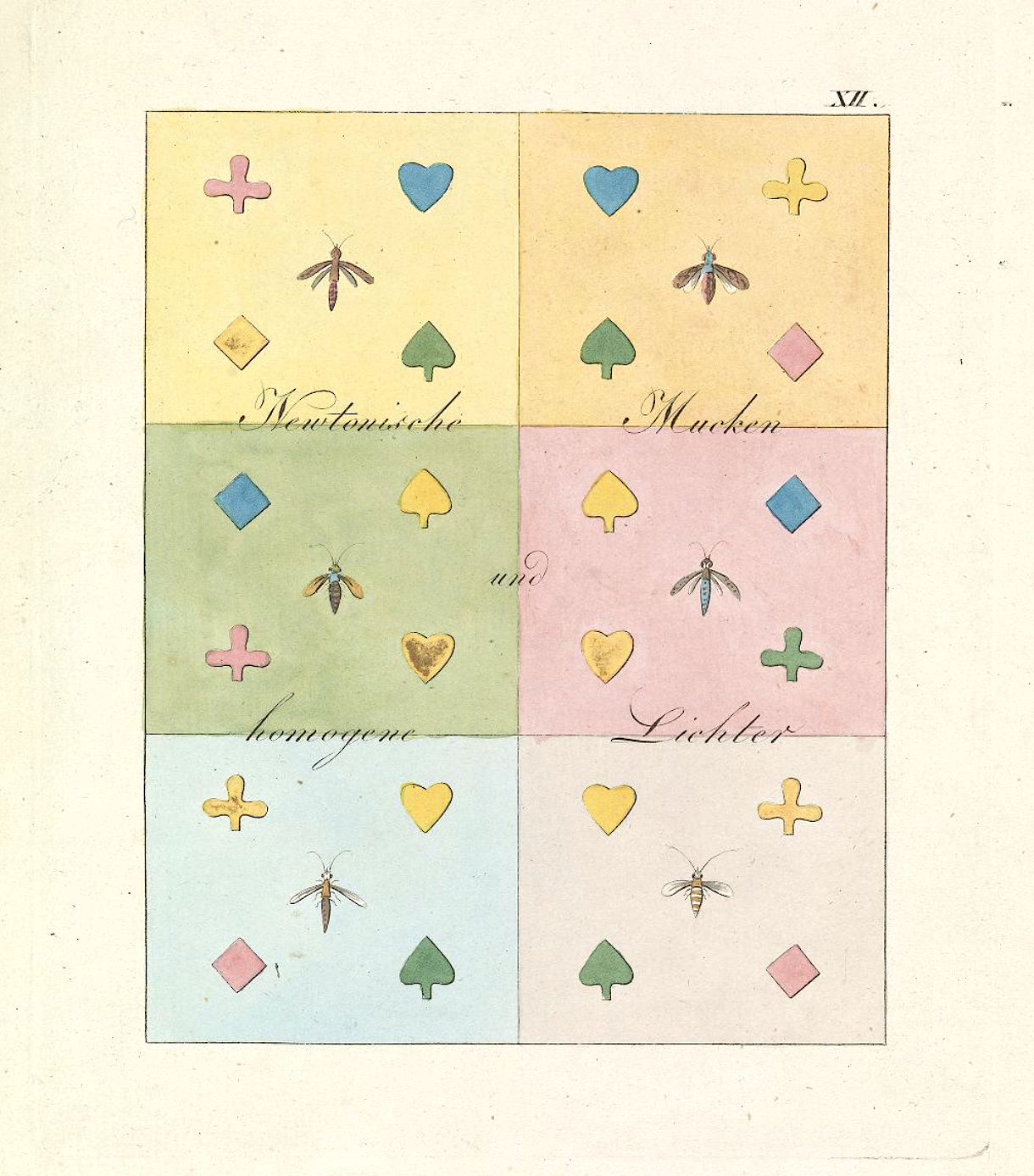
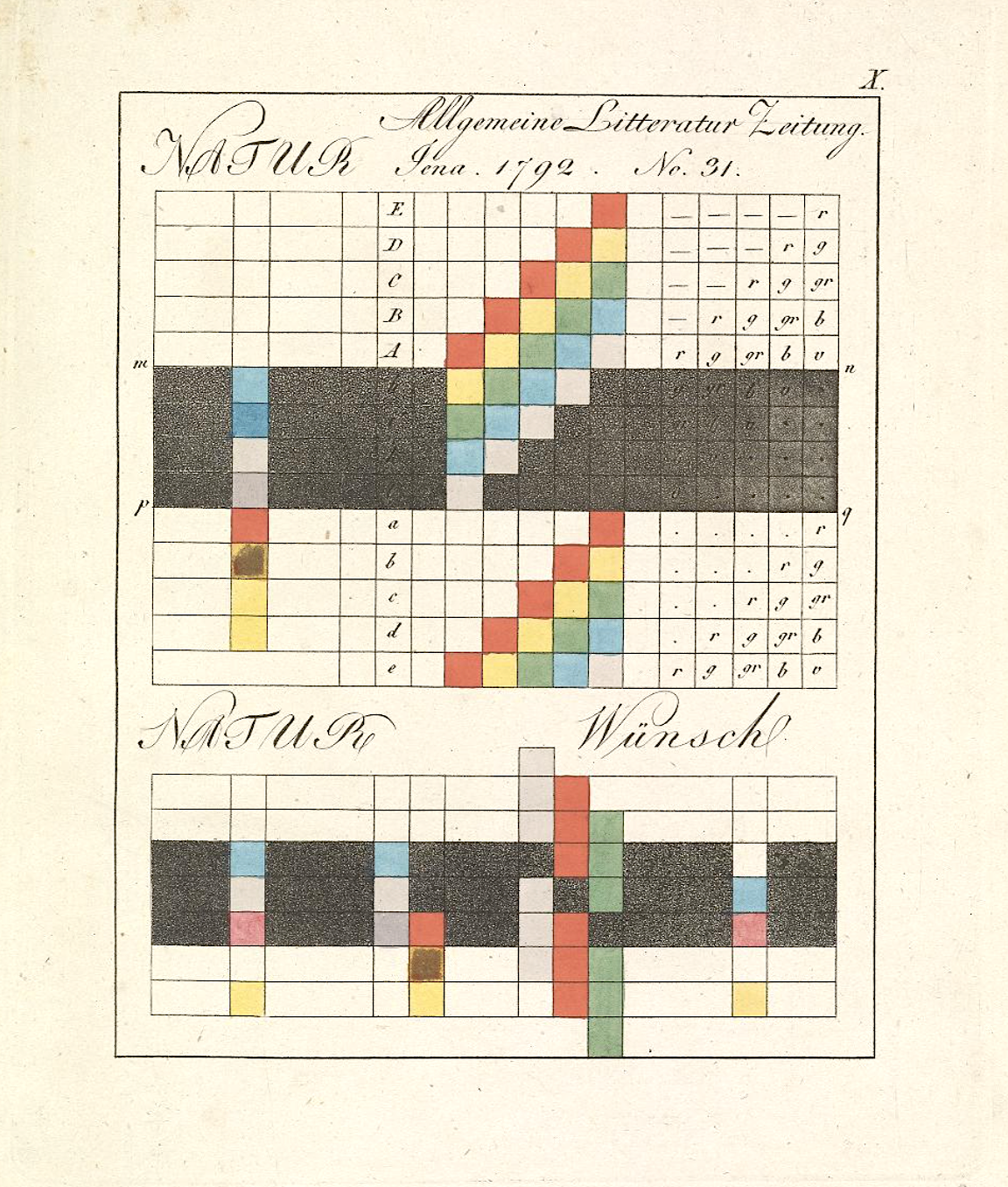
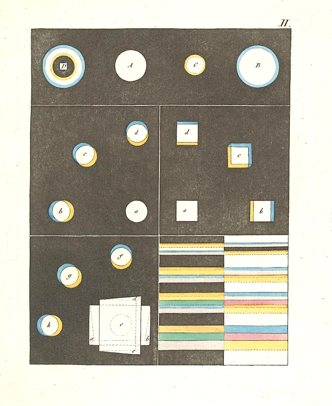
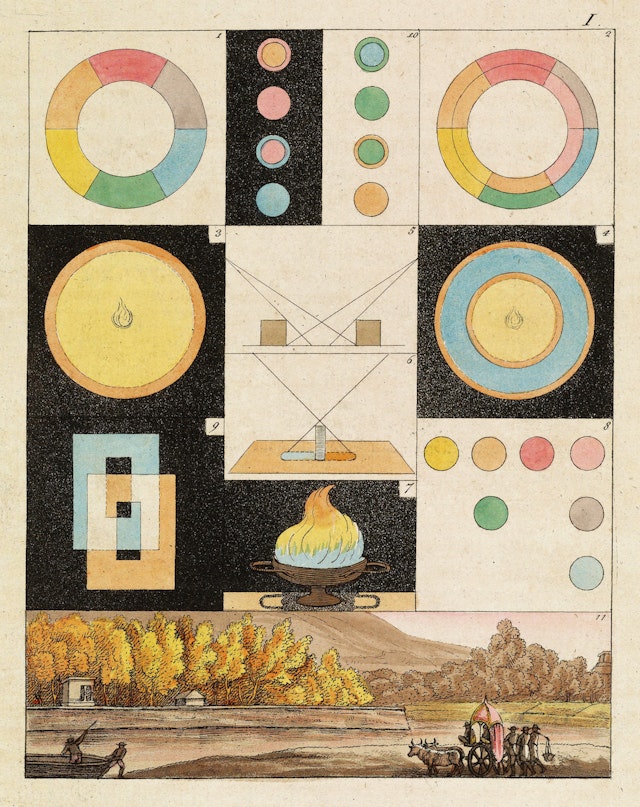
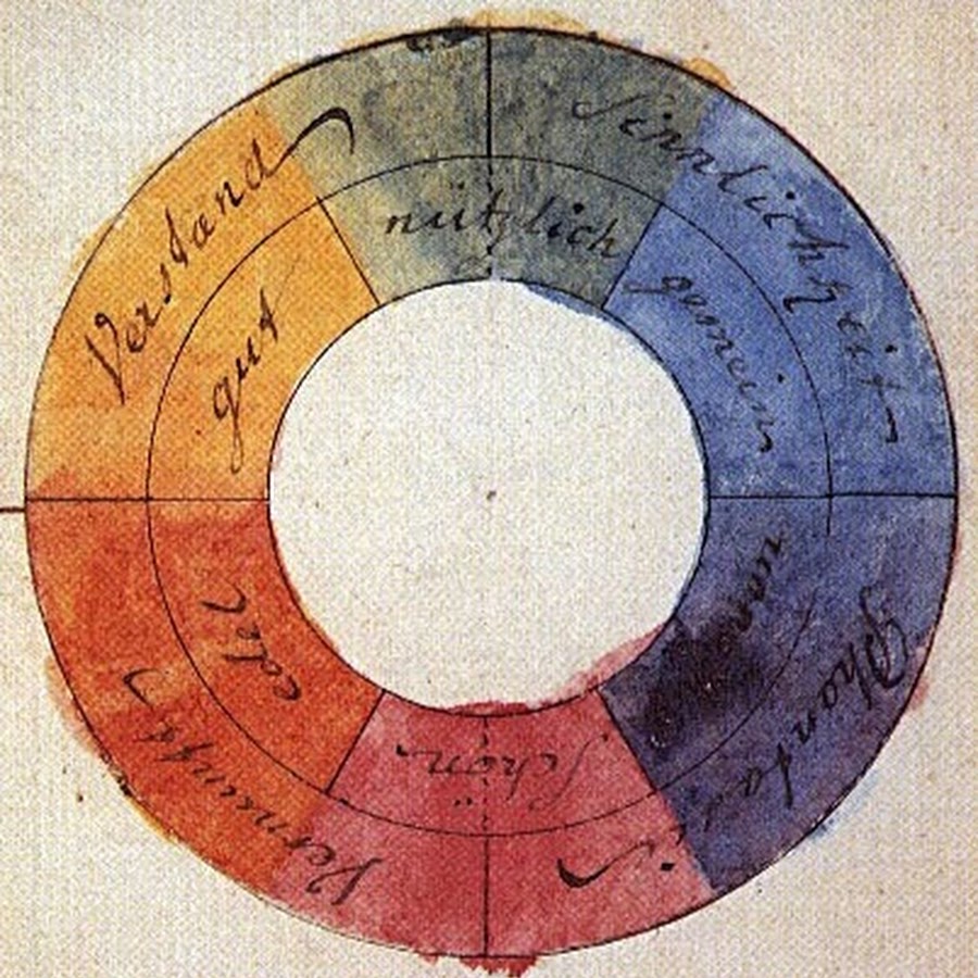
I doubt I need to list for you the many titles of the 18th cen­tu­ry Ger­man savant and poly­math Johann Wolf­gang von Goethe, but allow me to add one or two that were new to me, at least: col­or the­o­rist (or phe­nom­e­nol­o­gist of col­or) and prog­en­i­tor of abstract expres­sion­ism. As a fas­ci­nat­ing Book­tryst post informs us, Goethe’s book on col­or, Zur Far­ben­lehre (The­o­ry of Col­ors), writ­ten in 1810, dis­put­ed the New­ton­ian view of the sub­ject and for­mu­lat­ed a psy­cho­log­i­cal and philo­soph­i­cal account of the way we actu­al­ly expe­ri­ence col­or as a phe­nom­e­non. In his account, Goethe describes how he came by his views:

Along with the rest of the world, I was con­vinced that all the col­ors are con­tained in the light; no one had ever told me any­thing dif­fer­ent, and I had nev­er found the least cause to doubt it, because I had no fur­ther inter­est in the sub­ject.

But how I was aston­ished, as I looked at a white wall through the prism, that it stayed white! That only where it came upon some dark­ened area, it showed some col­or, then at last, around the win­dow sill all the col­ors shone… It did­n’t take long before I knew here was some­thing sig­nif­i­cant about col­or to be brought forth, and I spoke as through an instinct out loud, that the New­ton­ian teach­ings were false.

Schopen­hauer would lat­er write that “[Goethe] deliv­ered in full mea­sure what was promised by the title of his excel­lent work: data toward a the­o­ry of colour. They are impor­tant, com­plete, and sig­nif­i­cant data, rich mate­r­i­al for a future the­o­ry of colour.” It was a the­o­ry, Schopen­hauer admits, that does not “[fur­nish] us with a real expla­na­tion of the essen­tial nature of colour, but real­ly pos­tu­lates it as a phe­nom­e­non, and mere­ly tells us how it orig­i­nates, not what it is.”

Anoth­er lat­er philo­soph­i­cal inter­preter of Goethe, Lud­wig Wittgen­stein—a thinker great­ly inter­est­ed in visu­al perception—also saw Goethe’s work as oper­at­ing very dif­fer­ent­ly than New­ton’s optics—not as a sci­en­tif­ic the­o­ry but rather as an intu­itive schema. Wittgen­stein remarked that Goethe’s work “is real­ly not a the­o­ry at all. Noth­ing can be pre­dict­ed by means of it. It is, rather, a vague schemat­ic out­line, of the sort we find in [William] James’s psy­chol­o­gy. There is no exper­i­men­tum cru­cis for Goethe’s the­o­ry of colour.”

Yet a third lat­er Ger­man genius, Wern­er Heisen­berg, com­ment­ed on the influ­ence of Zur Far­ben­lehre, writ­ing that “Goethe’s colour the­o­ry has in many ways borne fruit in art, phys­i­ol­o­gy and aes­thet­ics. But vic­to­ry, and hence influ­ence on the research of the fol­low­ing cen­tu­ry, has been New­ton’s.”


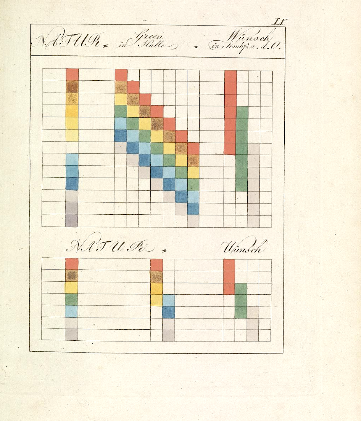
I’m not fit to eval­u­ate the rel­a­tive mer­its of Goethe’s the­o­ry, or lack there­of, ver­sus New­ton’s rig­or­ous work on optics. Whole books have been writ­ten on the sub­ject. But what­ev­er his inten­tions, Goethe’s work has been well-received as a psy­cho­log­i­cal­ly accu­rate account that has also, through his text and many illus­tra­tions you see here, had sig­nif­i­cant influ­ence on twen­ti­eth cen­tu­ry painters also great­ly con­cerned with the psy­chol­o­gy of col­or, most notably Wass­i­ly Kandin­sky, who pro­duced his own “schemat­ic out­line” of the psy­cho­log­i­cal effects of col­or titled Con­cern­ing the Spir­i­tu­al in Art, a clas­sic of mod­ernist aes­thet­ic the­o­ry. As is usu­al­ly the case with Goethe, the influ­ence of this sin­gle work is wider and deep­er than he prob­a­bly ever fore­saw.

You can find an afford­able ver­sion of Goethe’s The­o­ry of Col­ors on Ama­zon. Or find scans of the book at Archive.org.
Note: This post orig­i­nal­ly appeared on our site in 2013. We have updat­ed the post with new images and links.

Relat­ed Con­tent:

The Book of Colour Con­cepts: A New 800-Page Cel­e­bra­tion of Col­or The­o­ry, Includ­ing Works by New­ton, Goethe, and Hilma af Klint

A 900-Page Pre-Pan­tone Guide to Col­or from 1692: A Com­plete Dig­i­tal Scan

An Ani­mat­ed Intro­duc­tion to Goethe, Germany’s “Renais­sance Man”

Har­ry Clarke’s 1926 Illus­tra­tions of Goethe’s Faust: Art That Inspired the Psy­che­del­ic 60s

Watch Goethe’s Haunt­ing Poem, “Der Erlkönig,” Pre­sent­ed in an Art­ful Sand Ani­ma­tion

Josh Jones is a writer and musi­cian based in Durham, NC. Fol­low him at @jdmagness

The Beautiful Art of Making Japanese Calligraphy Ink Out of Soot & Glue

Found­ed in 1577, Kobaien remains Japan’s old­est man­u­fac­tur­er of sumi ink sticks. Made of soot and ani­mal glue, the ink stick—when ground against an ink­stone, with a lit­tle water added—produces a beau­ti­ful black ink used by Japan­ese cal­lig­ra­phers. And, often, a 200-gram ink stick from Kobaien can cost over $1,000.

How can soot and ani­mal glue com­mand such a high price? As the Busi­ness Insid­er video above shows, there’s a fine art to mak­ing each ingredient—an art honed over the cen­turies. Watch­ing the arti­sans make the soot alone, you imme­di­ate­ly appre­ci­ate the com­plex­i­ty beneath the appar­ent sim­plic­i­ty. When you’re done watch­ing how the ink gets made, you’ll undoubt­ed­ly want to watch the arti­sans mak­ing cal­lig­ra­phy brush­es, an art form that has its own fas­ci­nat­ing his­to­ry. Enjoy!

Relat­ed Con­tent 

Down­load 215,000 Japan­ese Wood­block Prints by Mas­ters Span­ning the Tradition’s 350-Year His­to­ry

Learn Cal­lig­ra­phy from Lloyd Reynolds, the Teacher of Steve Jobs’ Own Famous­ly Inspir­ing Cal­lig­ra­phy Teacher

The Mod­el Book of Cal­lig­ra­phy (1561–1596): A Stun­ning­ly Detailed Illu­mi­nat­ed Man­u­script Cre­at­ed over Three Decades

3,000 Illustrations of Shakespeare’s Complete Works from Victorian England, Presented in a Digital Archive

knightcover3

“We can say of Shake­speare,” wrote T.S. Eliot—in what may sound like the most back­hand­ed of com­pli­ments from one writer to another—“that nev­er has a man turned so lit­tle knowl­edge to such great account.” Eliot, it’s true, was not over­awed by the Shake­speare­an canon; he pro­nounced Ham­let “most cer­tain­ly an artis­tic fail­ure,” though he did love Cori­olanus. What­ev­er we make of his ambiva­lent, con­trar­i­an opin­ions of the most famous author in the Eng­lish lan­guage, we can cred­it Eliot for keen obser­va­tion: Shakespeare’s uni­verse, which can seem so sprawl­ing­ly vast, is actu­al­ly sur­pris­ing­ly spare giv­en the kinds of things it most­ly con­tains.

Ophelia ckham18

This is due in large part to the visu­al lim­i­ta­tions of the stage, but per­haps it also points toward an author who made great works of art from hum­ble mate­ri­als. Look, for exam­ple, at a search cloud of the Bard’s plays.

You’ll find one the front page of the Vic­to­ri­an Illus­trat­ed Shake­speare Archive, cre­at­ed by Michael John Good­man, an inde­pen­dent researcher, writer, edu­ca­tor, cura­tor and image-mak­er. The cloud on the left fea­tures a galaxy com­posed main­ly of ele­men­tal and arche­typ­al beings: “Ani­mals,” “Cas­tles and Palaces,” “Crowns,” “Flo­ra and Fau­na,” “Swords,” “Spears,” “Trees,” “Water,” “Woods,” “Death.” One thinks of the Zodi­ac or Tarot.

Roman Forum ckcor4

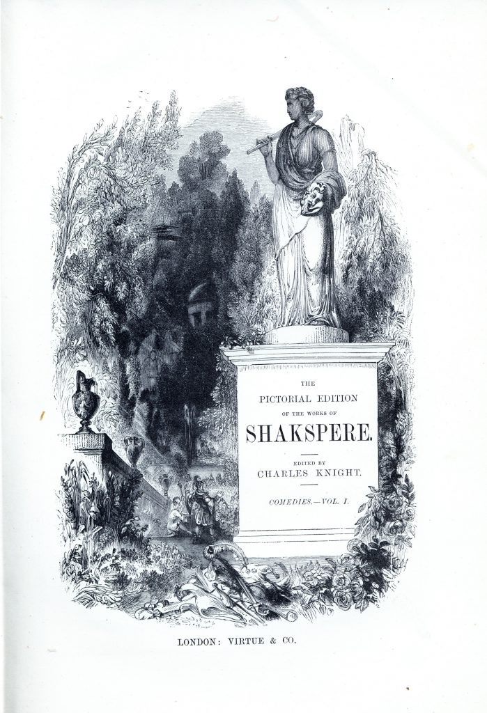
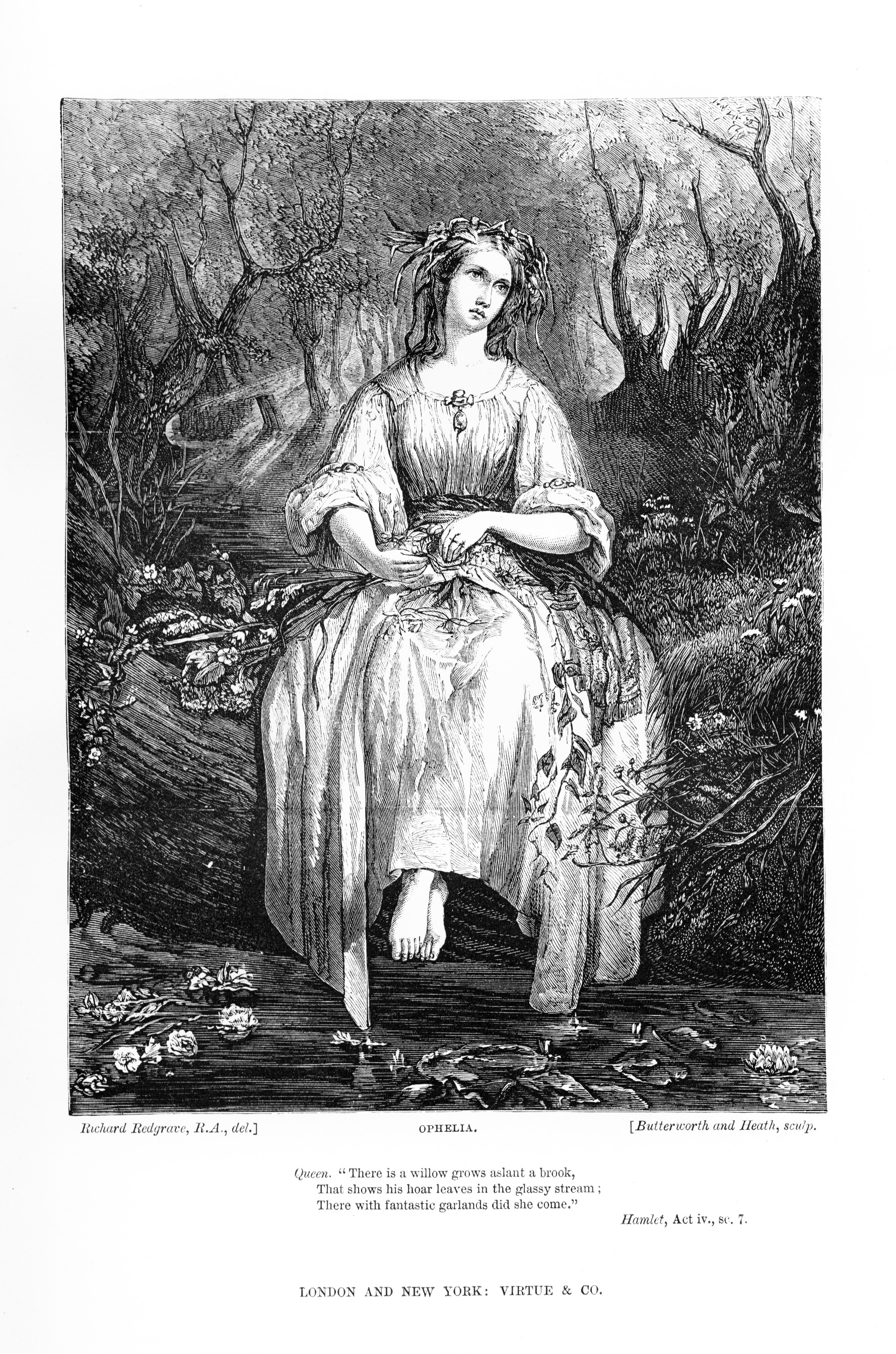
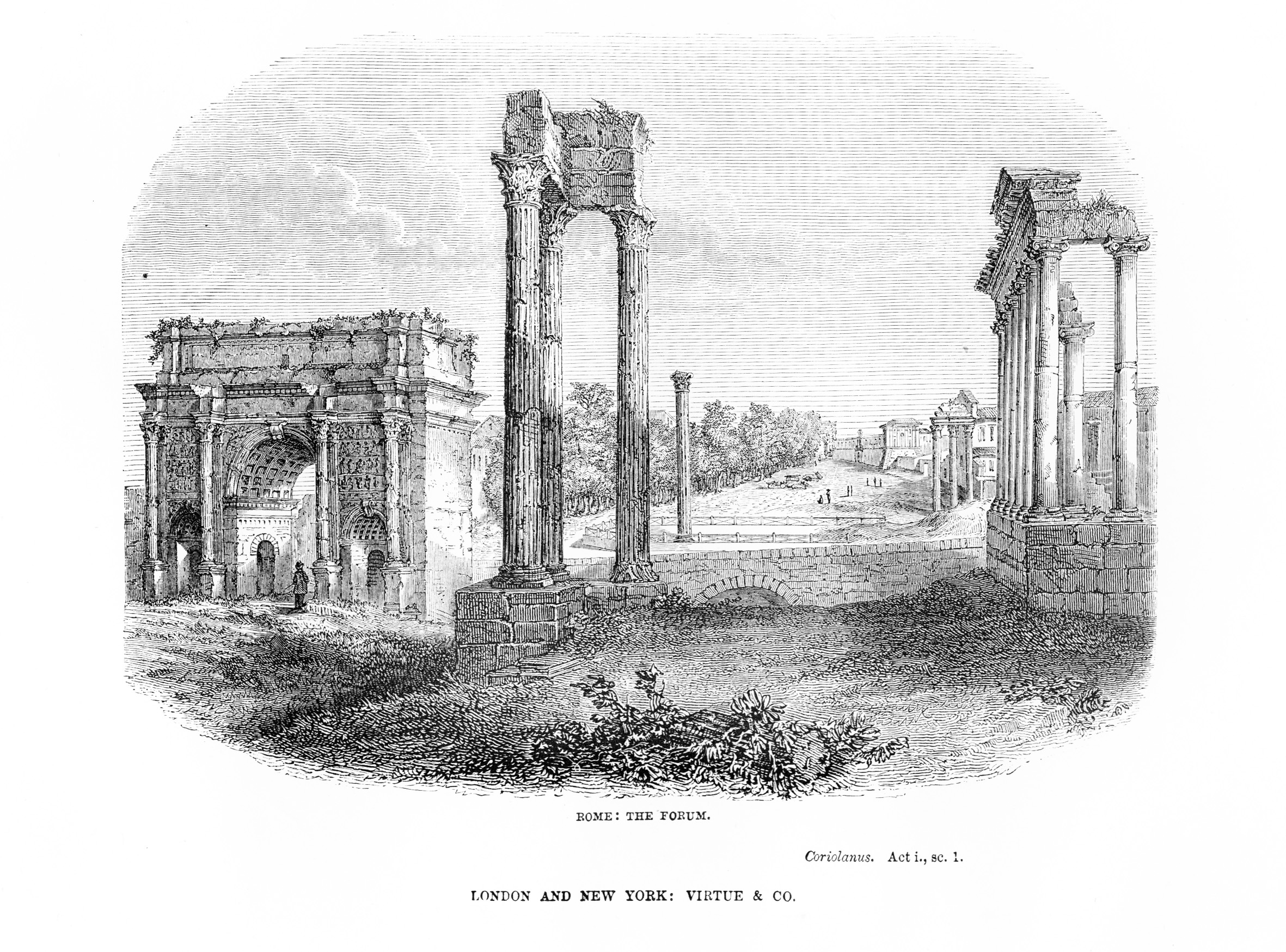
This par­tic­u­lar search cloud, how­ev­er, does not rep­re­sent the most promi­nent terms in the text, but rather the most promi­nent images in four col­lec­tions of illus­trat­ed Shake­speare plays from the Vic­to­ri­an peri­od. Goodman’s site hosts over 3000 of these illus­tra­tions, tak­en from four major UK edi­tions of Shake­speare’s Com­plete Works pub­lished in the mid-19th cen­tu­ry. The first, pub­lished by edi­tor Charles Knight, appeared in sev­er­al vol­umes between 1838 and 1841, illus­trat­ed with con­ser­v­a­tive engrav­ings by var­i­ous artists. Knight’s edi­tion intro­duced the trend of spelling Shakespeare’s name as “Shakspere,” as you can see in the title page to the “Come­dies, Vol­ume I,” at the top of the post. Fur­ther down, see two rep­re­sen­ta­tive illus­tra­tions from the plays, the first of Ham­let’s Ophe­lia and sec­ond Cori­olanus’ Roman Forum, above.

Tempest kmtemp41

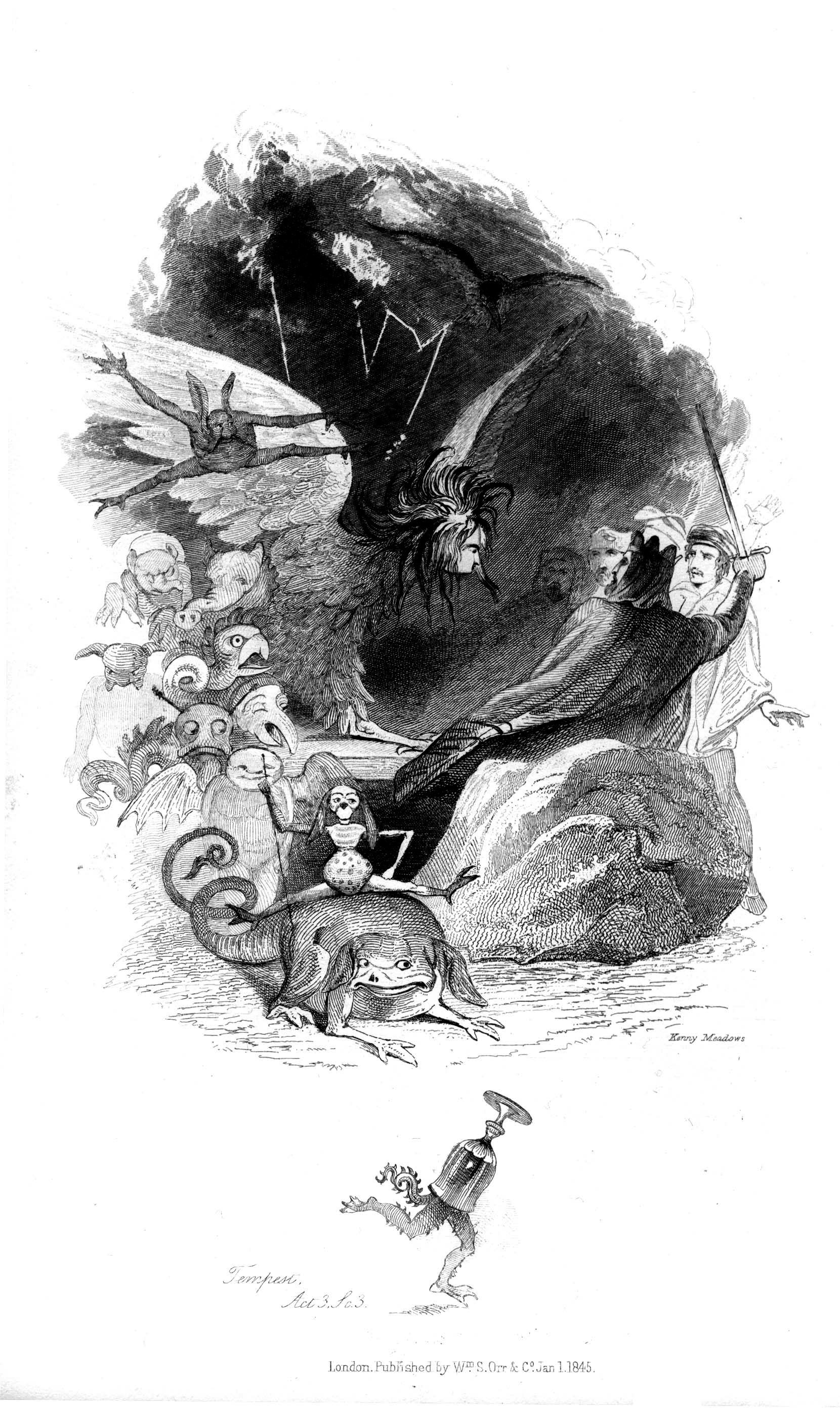
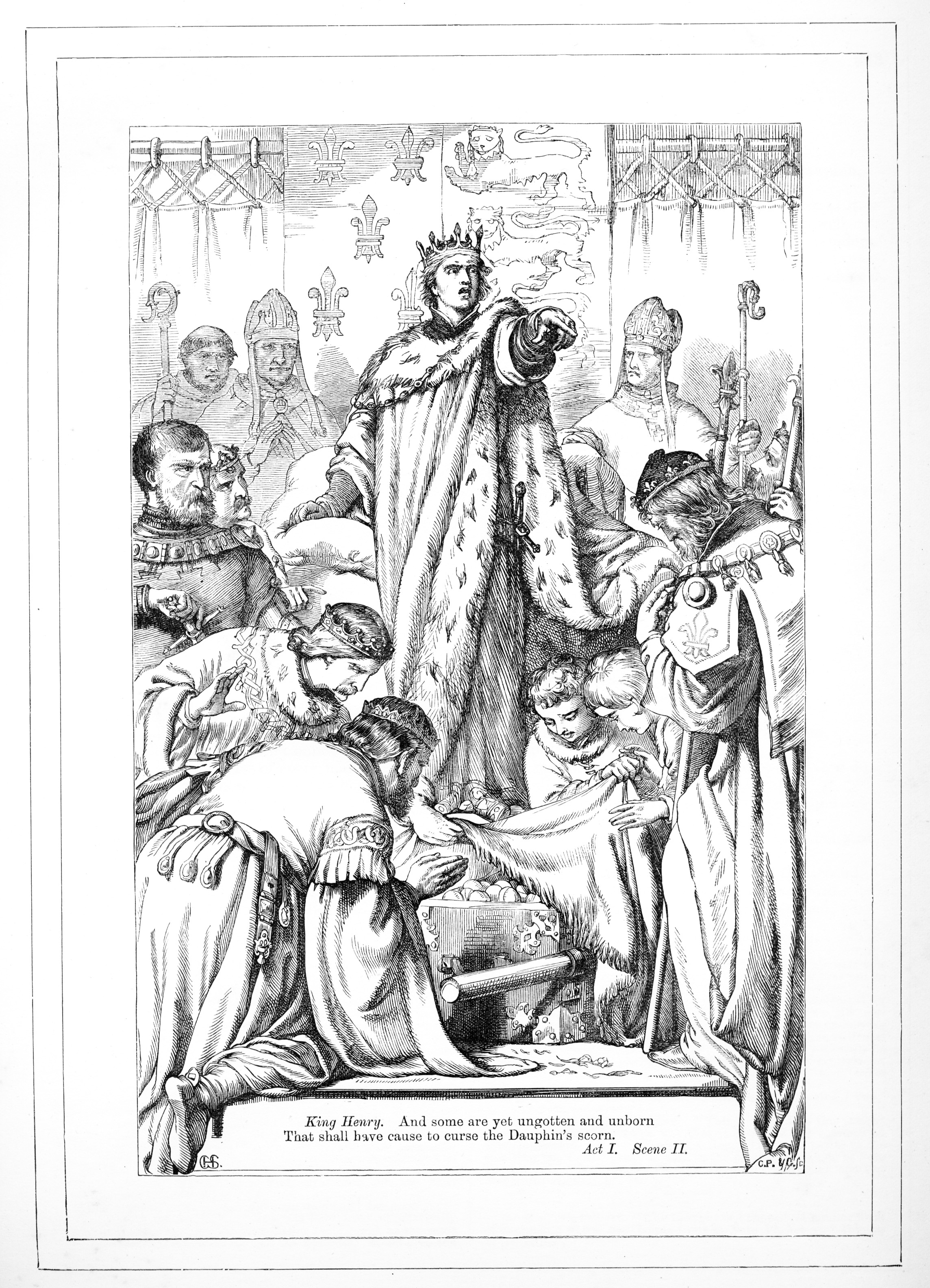
Part of a wave of “ear­ly Vic­to­ri­an pop­ulism” in Shake­speare pub­lish­ing, Knight’s edi­tion is joined by one from Ken­ny Mead­ows, who con­tributed some very dif­fer­ent illus­tra­tions to an 1854 edi­tion. Just above, see a Goya-like illus­tra­tion from The Tem­pest. Lat­er came an edi­tion illus­trat­ed by H.C. Selous in 1864, which returned to the for­mal, faith­ful real­ism of the Knight edi­tion (see a ren­der­ing of Hen­ry V, below), and includes pho­tograu­vure plates of famed actors of the time in cos­tume and an appen­dix of “Spe­cial Wood Engraved Illus­tra­tions by Var­i­ous Artists.”

Henry V hcseloushv4

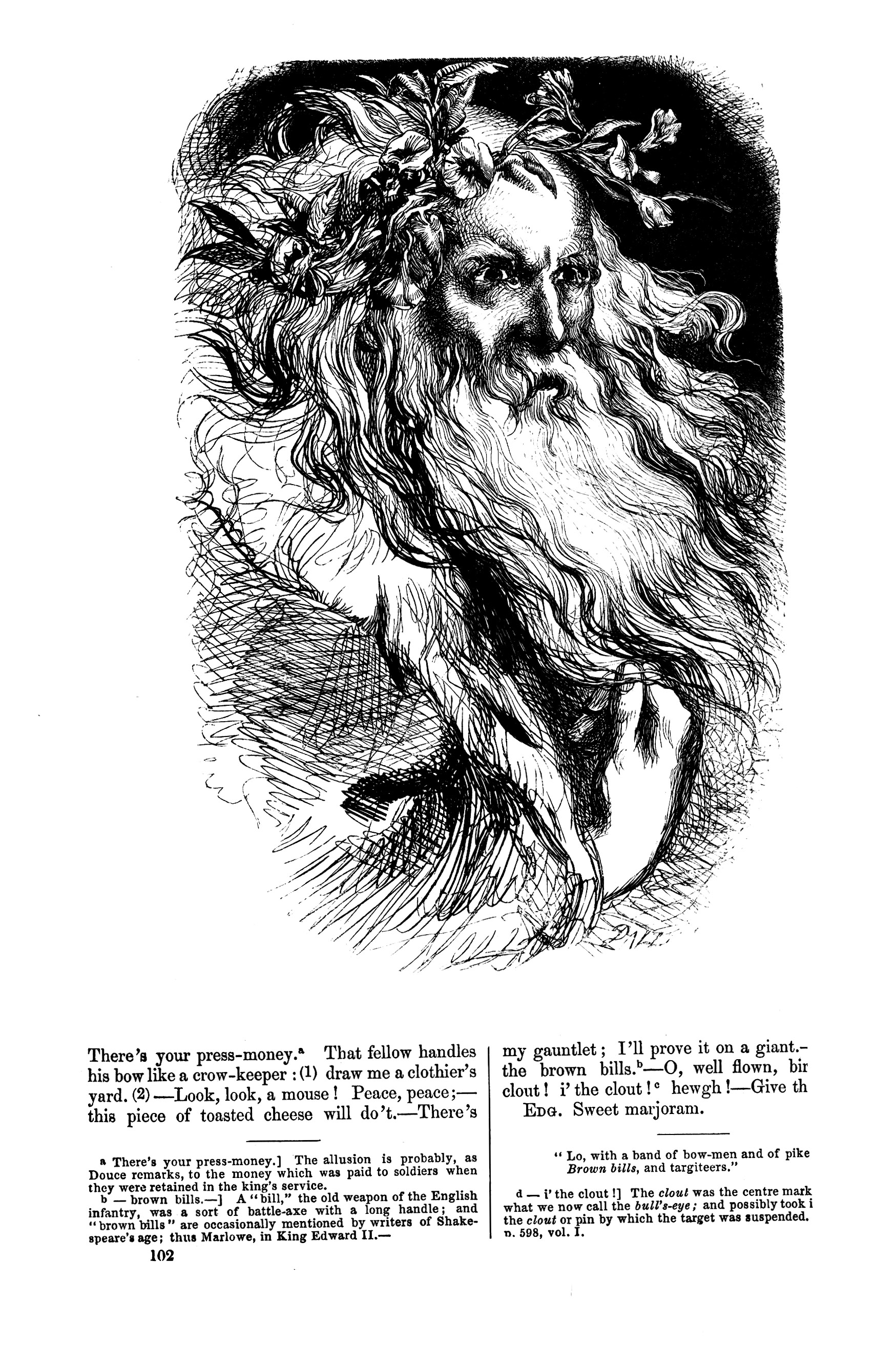
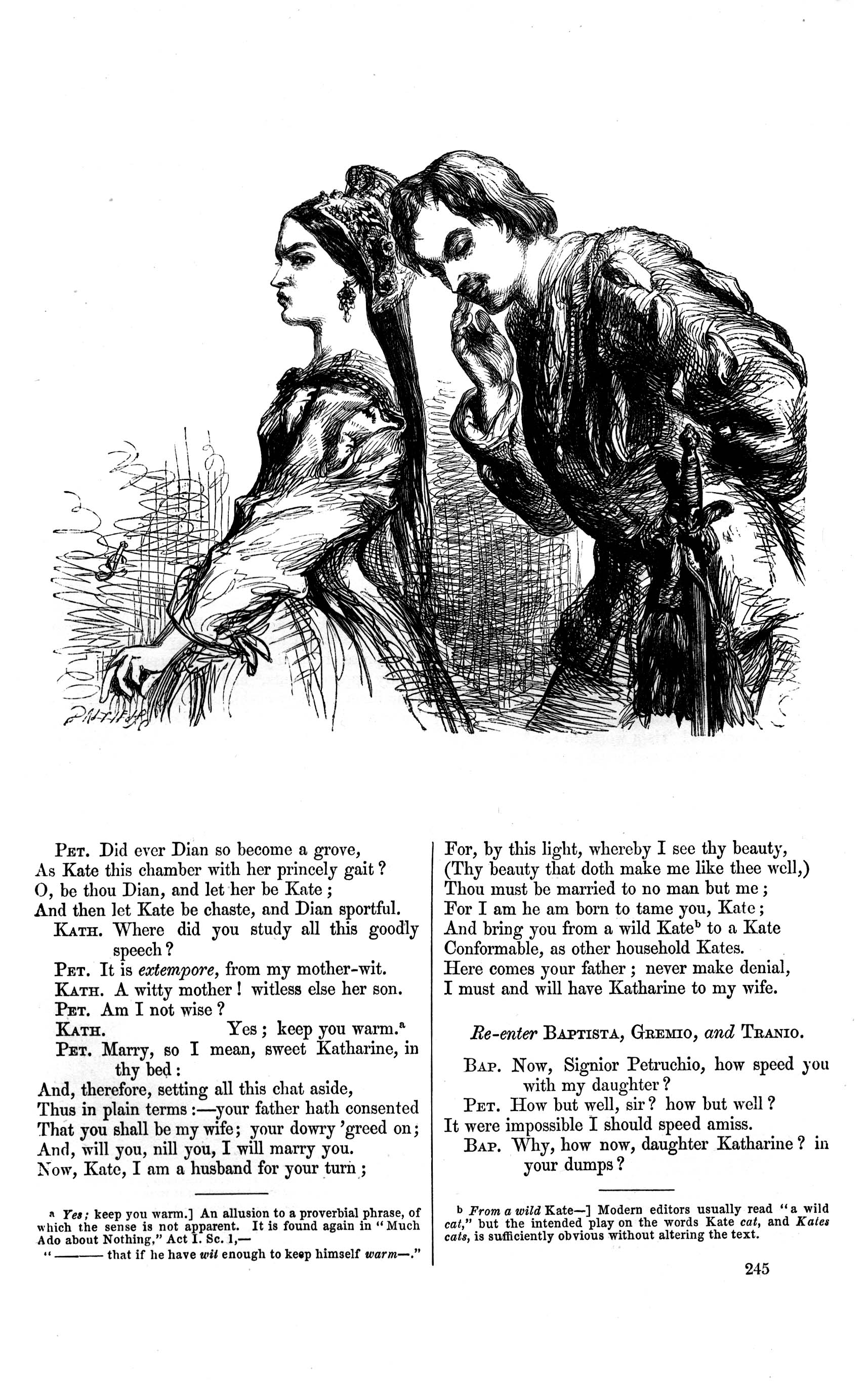
The final edi­tion whose illus­tra­tions Good­man has dig­i­tized and cat­a­logued on his site fea­tures engrav­ings by artist John Gilbert. Also pub­lished in 1864, the Gilbert may be the most expres­sive of the four, retain­ing real­ist pro­por­tions and mise-en-scène, yet also ren­der­ing the char­ac­ters with a psy­cho­log­i­cal real­ism that is at times unsettling—as in his fierce por­trait of Lear, below. Gilbert’s illus­tra­tion of The Tam­ing of the Shrew’s Kathe­ri­na and Petru­chio, fur­ther down, shows his skill for cre­at­ing believ­able indi­vid­u­als, rather than broad arche­types. The same skill for which the play­wright has so often been giv­en cred­it.

Lear

But Shake­speare worked both with rich, indi­vid­ual char­ac­ter stud­ies and broad­er, arche­typ­al, mate­r­i­al: psy­cho­log­i­cal real­ism and mytho­log­i­cal clas­si­cism. What I think these illus­trat­ed edi­tions show us is that Shake­speare, who­ev­er he (or she) may have been, did indeed have a keen sense of what Eliot called the “objec­tive cor­rel­a­tive,” able to com­mu­ni­cate com­plex emo­tions through “a skill­ful accu­mu­la­tion of imag­ined sen­so­ry impres­sions” that have impressed us as much on the can­vas, stage, and screen as they do on the page. The emo­tion­al expres­sive­ness of Shakespeare’s plays comes to us not only through elo­quent verse speech­es, but through images of both the stark­ly ele­men­tal and the unique­ly per­son­al.

Taming Of jgtos81

Spend some time with the illus­trat­ed edi­tions on Goodman’s site, and you will devel­op an appre­ci­a­tion for how the plays com­mu­ni­cate dif­fer­ent­ly to the dif­fer­ent artists. In addi­tion to the search clouds, the site has a head­er at the top for each of the four edi­tions. Click on the name and you will see front and back mat­ter and title pages. In the pull-down menus, you can access each indi­vid­ual play’s dig­i­tized illus­tra­tions by type—“Histories,” “Come­dies,” and “Tragedies.” All of the con­tent on the site, Good­man writes, “is free through a CC license: users can share on social media, remix, research, cre­ate and just do what­ev­er they want real­ly!”

Update: This post orig­i­nal­ly appeared on our site in 2016. Since then, Good­man has been reg­u­lar­ly updat­ing the Vic­to­ri­an Illus­trat­ed Shake­speare Archive with more edi­tions, giv­ing it more rich­ness and depth. These edi­tions include “one pub­lished by John Tallis, which fea­tures famous actors of the time in char­ac­ter.” This also includes “the first ever com­pre­hen­sive full-colour treat­ment of Shakespeare’s plays with the John Mur­doch edi­tion.” The archive, Good­man tells us, “now con­tains ten edi­tions of Shakespeare’s plays and is fair­ly com­pre­hen­sive in how peo­ple were expe­ri­enc­ing Shake­speare, visu­al­ly, in book form in the 19th Cen­tu­ry.”

Relat­ed Con­tent:

Take a Vir­tu­al Tour of Shakespeare’s Globe The­atre in Lon­don

Watch Very First Film Adap­ta­tions of Shakespeare’s Plays: King John, The Tem­pest, Richard III & More (1899–1936)

Read All of Shakespeare’s Plays Free Online, Cour­tesy of the Fol­ger Shake­speare Library

Fol­ger Shake­speare Library Puts 80,000 Images of Lit­er­ary Art Online, and They’re All Free to Use

Josh Jones is a writer and musi­cian based in Durham, NC. Fol­low him at @jdmagness

by | Permalink | Make a Comment ( 1 ) |

Free Coloring Books from Libraries & Museums: Download & Color Thousands of Free Images (2024)

Launched by The New York Acad­e­my of Med­i­cine Library in 2016, Col­or Our Col­lec­tions is “an annu­al col­or­ing fes­ti­val on social media dur­ing which libraries, muse­ums, archives and oth­er cul­tur­al insti­tu­tions around the world share free col­or­ing con­tent fea­tur­ing images from their col­lec­tions.” In Feb­ru­ary, the project released its 2024 archive of col­or­ing books, allow­ing you to down­load, print and col­or thou­sands of images from 93 libraries and muse­ums. The col­lec­tion includes sub­mis­sions from The New­ber­ry Library, the Nation­al Library of Med­i­cine, Euro­peana, the Harley-David­son Archives, Stan­ford Uni­ver­si­ty Libraries, the South­east Asia Dig­i­tal Library and more. Hap­py col­or­ing!

Note: When you nav­i­gate to a spe­cif­ic col­or­ing book with­in the col­lec­tion, you may ini­tial­ly encounter a blank sec­tion on the page. Please scroll down to locate the actu­al down­load link for the col­or­ing book.

Relat­ed Con­tent 

The Very First Col­or­ing Book, The Lit­tle Folks’ Paint­ing Book (Cir­ca 1879)

The First Adult Col­or­ing Book: See the Sub­ver­sive Exec­u­tive Col­or­ing Book From 1961

Free Col­or­ing Books from The Pub­lic Domain Review: Down­load & Col­or Works by Hoku­sai, Albrecht DĂĽr­er, Har­ry Clarke, Aubrey Beard­s­ley & More

by | Permalink | Make a Comment ( 1 ) |

The Book of Colour Concepts: A New 800-Page Celebration of Color Theory, Including Works by Newton, Goethe, and Hilma af Klint

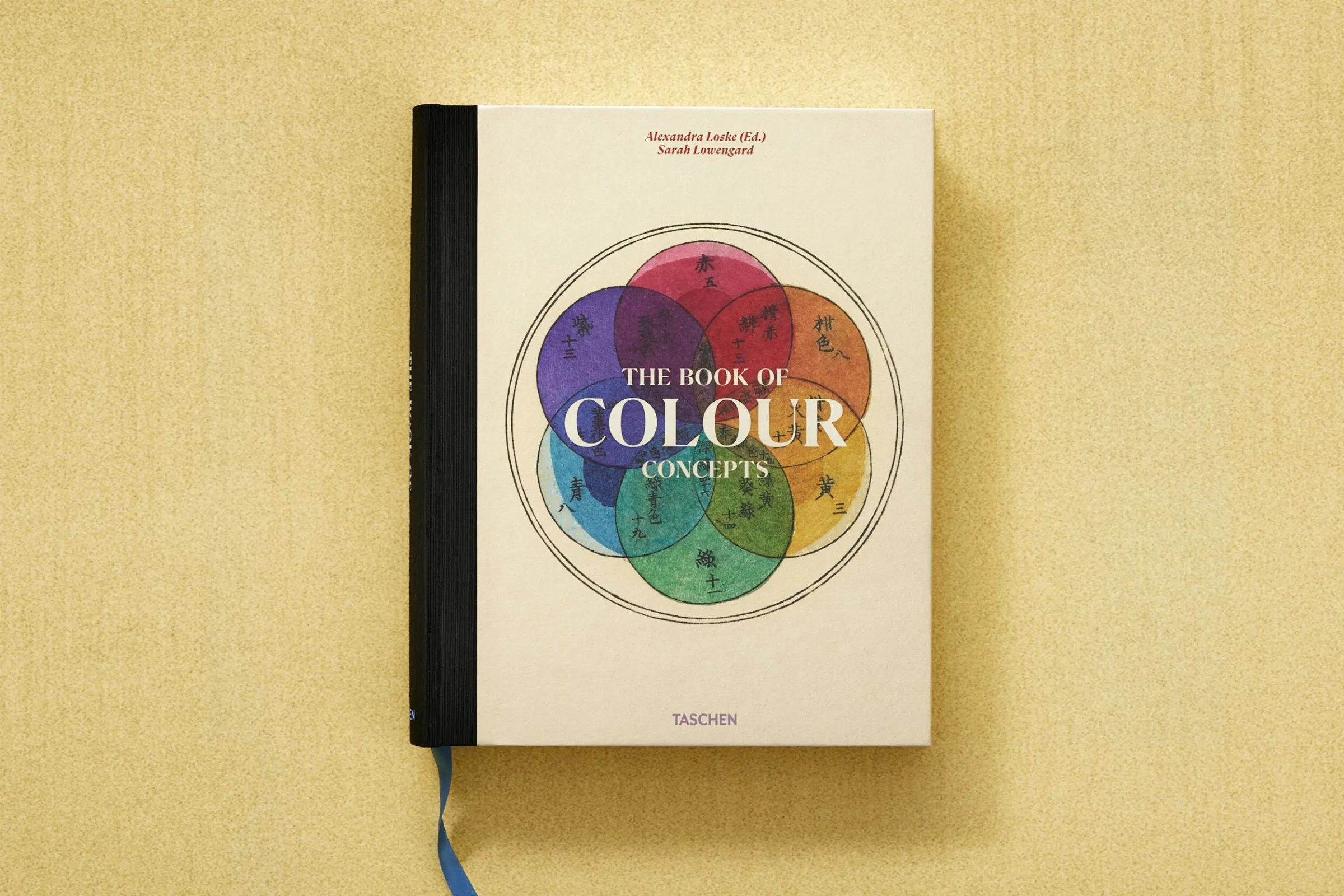
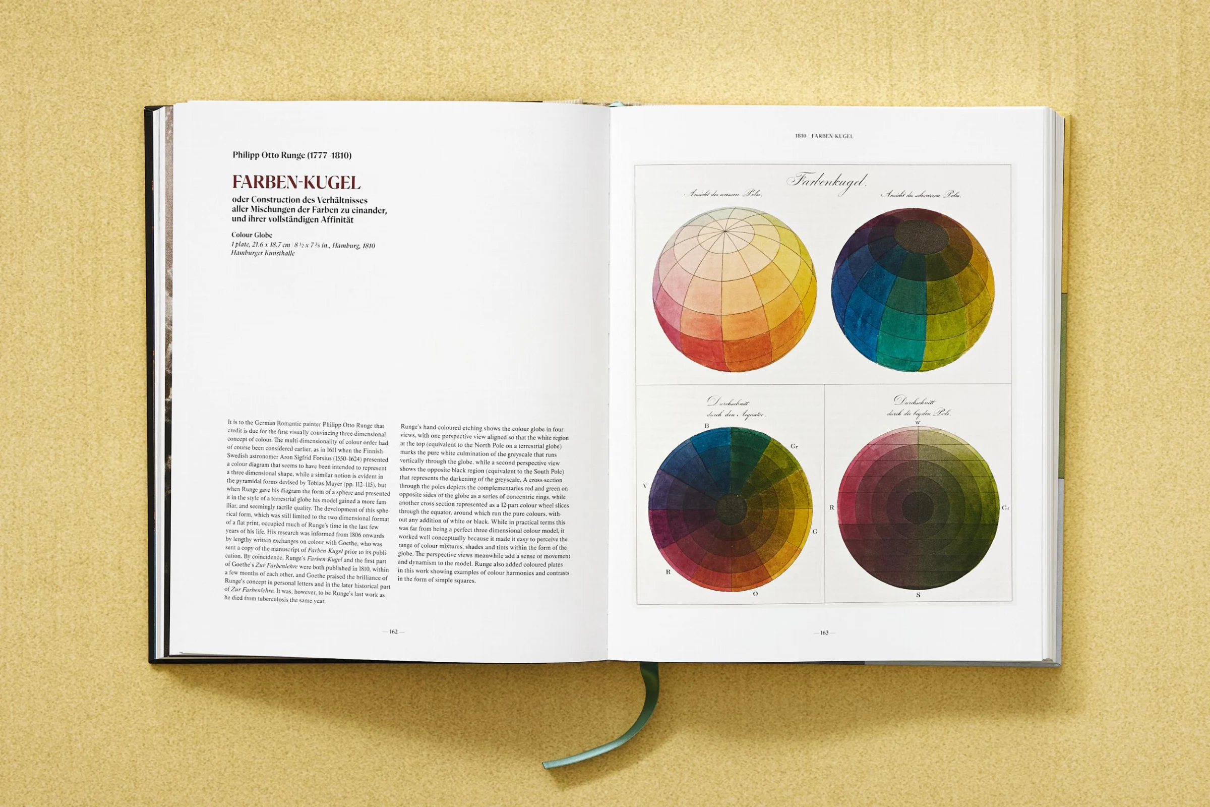
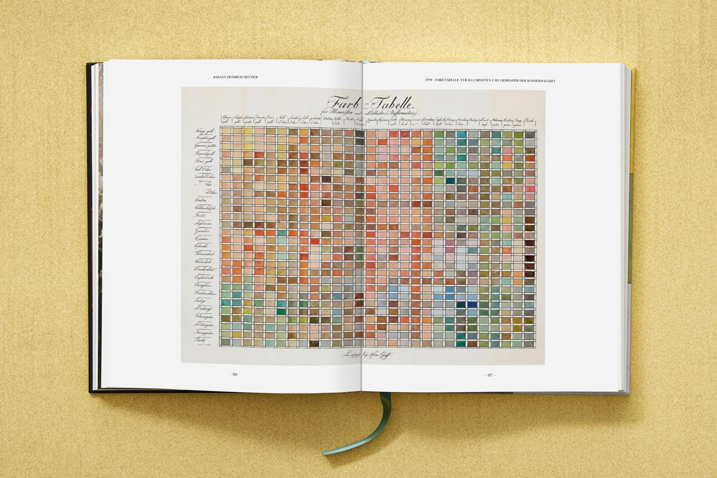
The Book of Colour Con­cepts will soon be pub­lished by Taschen in a mul­ti­lin­gual edi­tion, con­tain­ing text in Eng­lish, French, Ger­man, and Span­ish. This choice makes its abun­dance of explana­to­ry schol­ar­ship wide­ly acces­si­ble at a stroke, but even those who read none of those four lan­guages can enjoy the book. For it takes a deep dive — with Taschen’s char­ac­ter­is­tic visu­al lav­ish­ness — into one of the tru­ly uni­ver­sal lan­guages: that of col­or. Through­out its two vol­umes, The Book of Colour Con­cepts presents more than 1000 images drawn from four cen­turies’ worth of “rare books and man­u­scripts from a wealth of insti­tu­tions, includ­ing the most dis­tin­guished col­or col­lec­tions world­wide.”

Repro­duced with­in are selec­tions from more than 65 books and man­u­scripts, includ­ing such “sem­i­nal works of col­or the­o­ry” as Isaac Newton’s Opticks and Johann Wolf­gang von Goethe’s Zur Far­ben­lehre, as pre­vi­ous­ly fea­tured here on Open Cul­ture.

Kate Moth­es at Colos­sal adds that “read­ers will also find stud­ies from Col­or Prob­lems, the ear­ly 20th-cen­tu­ry hand­book by Emi­ly Noyes Van­der­poel, which described the­o­ries that would trend in sub­se­quent decades in design and art, like Joseph Albers’s series Homage to the Square.” In The Book of Colour Con­cepts’ 800 pages also appear a vari­ety of works that don’t belong, strict­ly speak­ing, to the field of col­or the­o­ry, such as a botan­i­cal note­book by the spir­i­tu­al­ist and ear­ly abstract artist Hilma af Klint.

Co-authors Sarah Lowen­gard and Alexan­dra Loske bring seri­ous cre­den­tials to this endeav­or: Lowen­gard is a his­to­ri­an of tech­nol­o­gy and sci­ence with more than 40 years’ expe­ri­ence as an “arti­san col­or-mak­er,” and Loske is an art his­to­ri­an and cura­tor who spe­cial­izes in “the role of women in the his­to­ry of col­or.” Both would no doubt agree on the spe­cial val­ue of revis­it­ing the his­to­ry of this par­tic­u­lar sub­ject here in the ear­ly twen­ty-first cen­tu­ry, with all its dis­course about the dis­ap­pear­ance of col­or from our every­day lives. It’s wor­ri­some enough that spo­ken and writ­ten lan­guages out­side the Eng­lish-French-Ger­man-Span­ish league seem to be declin­ing; rel­e­gat­ing our­selves to an ever-nar­row­ing vocab­u­lary of col­or would be an even graver loss indeed.

Relat­ed con­tent:

Goethe’s Col­or­ful & Abstract Illus­tra­tions for His 1810 Trea­tise The­o­ry of Col­ors: Scans of the First Edi­tion

A 900-Page Pre-Pan­tone Guide to Col­or from 1692: A Com­plete High-Res­o­lu­tion Dig­i­tal Scan

William Blake’s 102 Illus­tra­tions of The Divine Com­e­dy Col­lect­ed in a Beau­ti­ful Book from Taschen

The Vibrant Col­or Wheels Designed by Goethe, New­ton & Oth­er The­o­rists of Col­or (1665–1810)

The Woman Who The­o­rized Col­or: An Intro­duc­tion to Mary Gartside’s New The­o­ry of Colours (1808)

A Vision­ary 115-Year-Old Col­or The­o­ry Man­u­al Returns to Print: Emi­ly Noyes Vanderpoel’s Col­or Prob­lems

Based in Seoul, Col­in Marshall writes and broad­casts on cities, lan­guage, and cul­ture. His projects include the Sub­stack newslet­ter Books on Cities, the book The State­less City: a Walk through 21st-Cen­tu­ry Los Ange­les and the video series The City in Cin­e­ma. Fol­low him on Twit­ter at @colinmarshall or on Face­book.

The Founder of the Red Cross Creates a Diagram of the Apocalypse (1887)

His­to­ry remem­bers Hen­ry Dunant (1828–1910) for two things–being the co-founder of the Red Cross move­ment and win­ning the first Nobel Peace Prize in 1901.

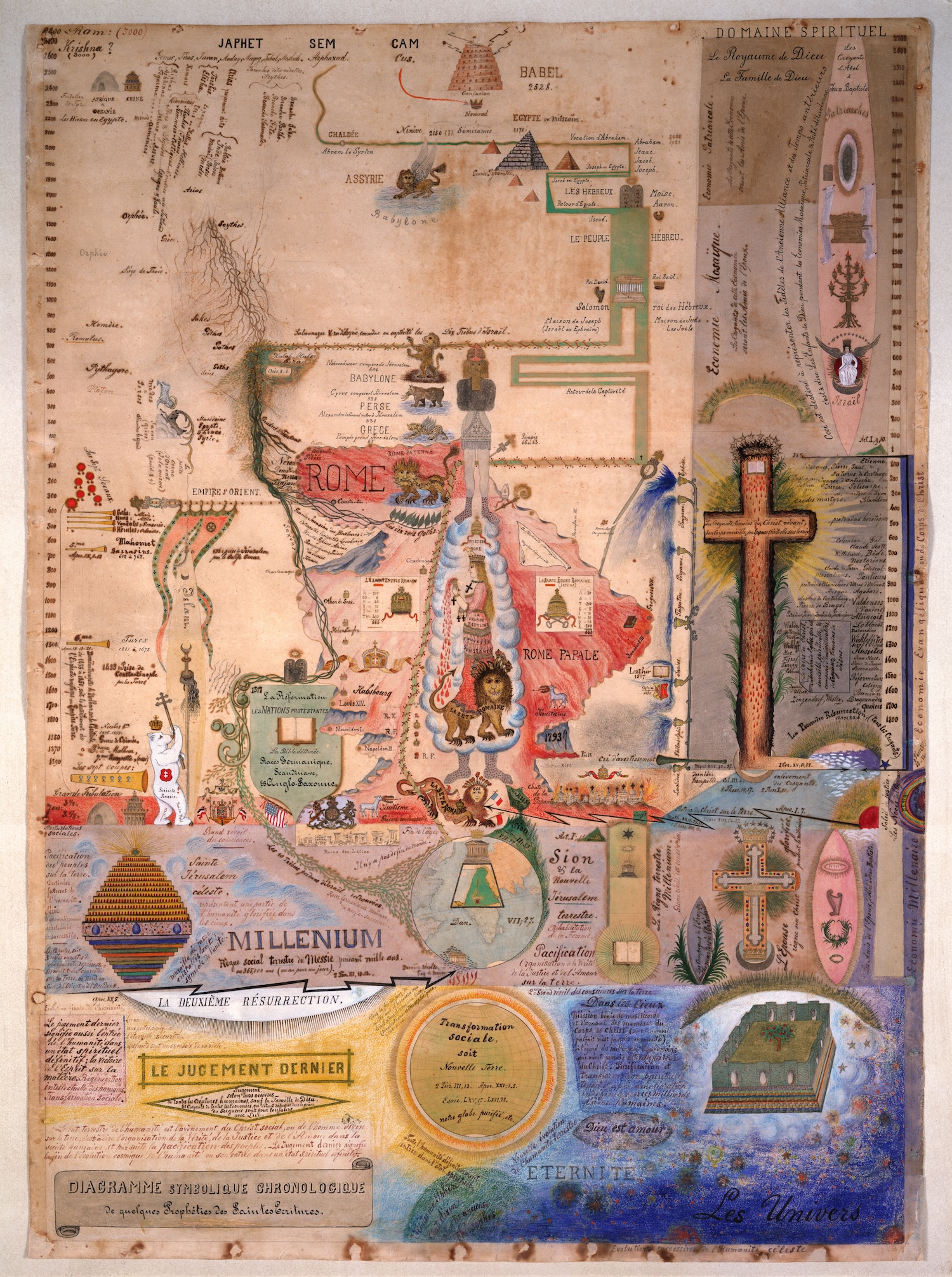
Less well known is his dia­gram of the Apoc­a­lypse. Between 1877 and 1890, notes the Red Cross Muse­um web­site, Hen­ry Dunant “pro­duced a series of dia­grams reflect­ing his dis­tinc­tive under­stand­ing of humanity’s past and future. Inspired by Chris­t­ian revival­ism, the draw­ings depict a time­line from the Flood of Noah to what Dunant believed was an impend­ing Apoc­a­lypse. The dia­grams fuse mys­ti­cal ref­er­ences with bib­li­cal, his­toric and sci­en­tif­ic events, while also set­ting up a clear oppo­si­tion between Gene­va, as the cen­tre of the Ref­or­ma­tion, and the Catholic Church.”

The image above is the first draw­ing out of a series of four, made with col­ored pen­cils, ink, India ink, wax crayons, and water­col­ors. Writes Messy Nessy, Dunant “spent con­sid­er­able time on the draw­ings, organ­is­ing the sym­bol­ic ele­ments accord­ing to a strict log­ic, mak­ing prepara­to­ry sketch­es and painstak­ing­ly incor­po­rat­ing draw­ings and colour­ings into his chronol­o­gy.” All along, he was dri­ven by the belief that the Apoc­a­lypse was in the off­ing, just a short time way.

Relat­ed Con­tent 

In 1704, Isaac New­ton Pre­dicts the World Will End in 2060

A Sur­vival Guide to the Bib­li­cal Apoc­a­lypse

It’s the End of the World as We Know It: The Apoc­a­lypse Gets Visu­al­ized in an Inven­tive Map from 1486

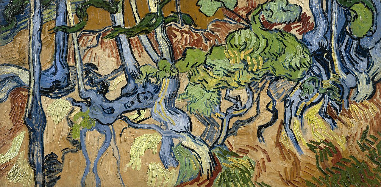
Vincent Van Gogh’s Final Painting: Discover Tree Roots, the Last Creative Act of the Dutch Painter (1890)

The sto­ry of Vin­cent van Gogh’s life tends to be defined by his psy­cho­log­i­cal con­di­tion and the not-unre­lat­ed man­ner of his death. (It does if we set aside the episode with the muti­lat­ed ear and the broth­el, any­way.) The fig­ure of the impov­er­ished, neglect­ed artist whose work would rev­o­lu­tion­ize his medi­um, and whose descent into mad­ness ulti­mate­ly drove him to take his own life, has proven irre­sistible to mod­ern sto­ry­tellers. That group includes painter-film­mak­er Julian Schn­abel, who told Van Gogh’s sto­ry a few years ago with At Eter­ni­ty’s Gate, and Vin­cente Min­nel­li, who’d ear­li­er giv­en it the full Cin­e­maS­cope treat­ment in 1956 with Lust for Life.

It is thanks in large part to Lust for Life that casu­al Van Gogh fans long regard­ed Wheat­field with Crows as his final paint­ing. “The paint­ing’s dark and gloomy sub­ject mat­ter seemed to per­fect­ly encap­su­late the last days of Van Gogh, full of fore­bod­ing of his even­tu­al death,” says gal­lerist-Youtu­ber James Payne in his new Great Art Explained video above.

Recent­ly, how­ev­er, the con­sen­sus has shift­ed toward a dif­fer­ent, less­er-known work, Tree Roots. Like Wheat­field with Crows, Van Gogh paint­ed it in the rur­al vil­lage of Auvers-sur-Oise, to which he moved after check­ing out of the last asy­lum in which he’d received treat­ment. There, in his final weeks, he “worked on a series of land­scapes on the hills above Auvers,” all ren­dered on wide-for­mat can­vas­es he’d nev­er used before.

That this series con­sists of “vast expans­es, total­ly devoid of any human fig­ures” makes it look “as if he has giv­en up on human­i­ty.” What’s more, Tree Roots is also “devoid of form. It is unfin­ished, which is extreme­ly unusu­al for Van Gogh, and a sign it was still being worked on when he died.” Its obscure loca­tion only became clear dur­ing the time of COVID-19, when Van Gogh spe­cial­ist Wouter van der Veen was look­ing through a cache of old French post­cards he’d received and hap­pened to spot a high­ly famil­iar set of roots. Thanks to this coin­ci­dence, we can now vis­it the very spot in which Van Gogh paint­ed what’s now thought to be his very last work on the morn­ing of July 27th, 1890, the same day he chose to end his own life. This counts as a mys­tery solved, but sure­ly the art Van Gogh made dur­ing his abbre­vi­at­ed but prodi­gious career still has much to reveal to us.

Relat­ed con­tent:

1,500 Paint­ings & Draw­ings by Vin­cent van Gogh Have Been Dig­i­tized & Put Online

Vin­cent van Gogh’s The Star­ry Night: Why It’s a Great Paint­ing in 15 Min­utes

Down­load Vin­cent van Gogh’s Col­lec­tion of 500 Japan­ese Prints, Which Inspired Him to Cre­ate “the Art of the Future”

Vin­cent van Gogh’s Self Por­traits: Explore & Down­load a Col­lec­tion of 17 Paint­ings Free Online

A Com­plete Archive of Vin­cent van Gogh’s Let­ters: Beau­ti­ful­ly Illus­trat­ed and Ful­ly Anno­tat­ed

Van Gogh’s Ugli­est Mas­ter­piece: A Break Down of His Late, Great Paint­ing, The Night Café (1888)

Based in Seoul, Col­in Marshall writes and broad­casts on cities, lan­guage, and cul­ture. His projects include the Sub­stack newslet­ter Books on Cities, the book The State­less City: a Walk through 21st-Cen­tu­ry Los Ange­les and the video series The City in Cin­e­ma. Fol­low him on Twit­ter at @colinmarshall or on Face­book.

Salvador Dalí’s Surreal Cutlery Set from 1957

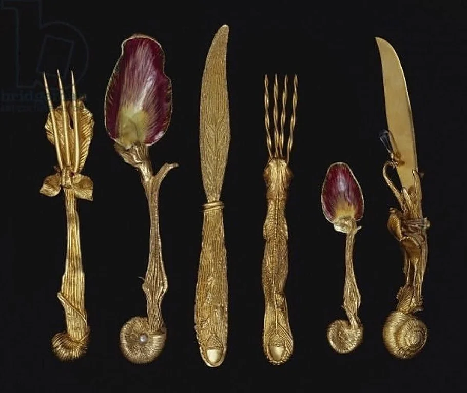
In 1957, Sal­vador Dalí cre­at­ed a table­ware set con­sist­ing of 1) a four-tooth fork with a fish han­dle, 2) an ele­phant fork with three teeth, 3) a snail knife with tears, 4) a leaf knife, 5) a small arti­choke spoon, and 6) an arti­choke spoon. When the set went on auc­tion in 2012, it sold for $28,125.

Infor­ma­tion on the cut­lery set remains hard to find, but we sus­pect that it sprang from Dalí’s desire to blur the lines between art and every­day life. It’s per­haps the same log­ic that led him to design a sur­re­al­ist cook­book—Les Din­ers de Gala—16 years lat­er. It’s not hard to imag­ine the uten­sils above going to work on his odd­ball recipes, like “Bush of Craw­fish in Viking Herbs,” “Thou­sand-Year-Old Eggs,” and “Veal Cut­lets Stuffed with Snails.” If you hap­pen to know more about Dalí’s cre­ation, please add any thoughts to the com­ments below.

Relat­ed Con­tent 

Sal­vador Dalí’s 1973 Cook­book Gets Reis­sued: Sur­re­al­ist Art Meets Haute Cui­sine

Sal­vador Dali’s 1978 Wine Guide, The Wines of Gala, Gets Reis­sued: Sen­su­al Viti­cul­ture Meets Sur­re­al Art

How to Actu­al­ly Cook Sal­vador Dali’s Sur­re­al­ist Recipes: Cray­fish, Prawns, and Spit­ted Eggs

by | Permalink | Make a Comment ( 4 ) |

« Go BackMore in this category... »
Quantcast
Open Culture was founded by Dan Colman.