Behold James Sowerby’s Strikingly Illustrated New Elucidation of Colours (1809)

James Sower­by was an artist ded­i­cat­ed to the nat­ur­al world. It thus comes as no sur­prise that he was also enor­mous­ly inter­est­ed in col­or, espe­cial­ly giv­en the era in which he lived. Born in 1757, he made his pro­fes­sion­al start as a painter of flow­ers: a viable career path in those days, at least to those with Sower­by’s tal­ent and ded­i­ca­tion. It was in 1790 that he began what would end up being the 23-years-in-the-mak­ing Eng­lish Botany, the land­mark 36-vol­ume work for which he remains best known today. Its 2,592 images cap­tured the full range of his coun­try’s flo­ra, some of them in hues that read­ers had nev­er before encoun­tered in real life.

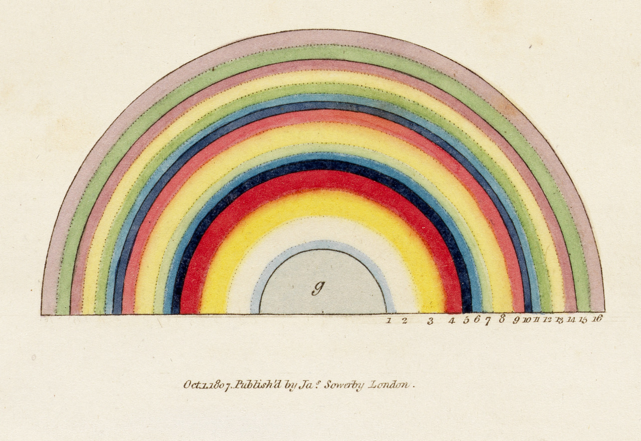
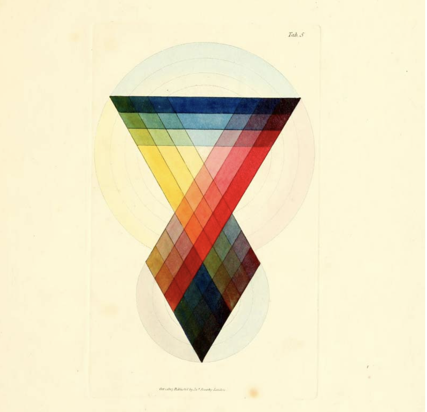
Alas, writes Joyce Dixon at Shap­ing Colour, “as the years passed, Sower­by watched with dis­may as the bright hues of his hand-col­ored engrav­ings began to fade and decay — the inevitable action of time and chem­i­cal insta­bil­i­ty work­ing away at his water­col­or pig­ments.” This inspired anoth­er ambi­tious artis­tic-sci­en­tif­ic project: “to devel­op a stan­dard, uni­ver­sal and per­ma­nent method of rep­re­sent­ing nat­ur­al col­or.” In 1809, he invent­ed a device he called the “Chro­matome­ter,” which “pre­sent­ed a stan­dard, mea­sur­able pris­mat­ic spec­trum to the user.” Look­ing through a prism, that user could the­o­ret­i­cal­ly “pin­point spe­cif­ic col­ors in the spec­trum revealed by the prism, offer­ing a stan­dard ref­er­ence for a spe­cif­ic hue” iden­ti­fied in real­i­ty.

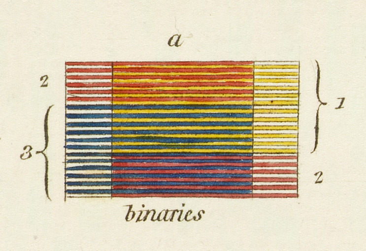
The Chro­matome­ter nev­er proved viable, writes Paul Sorene at Flash­bak, “because it was too fid­dly and botanists often worked at night,” but the work that doc­u­ment­ed it lives on. A New Elu­ci­da­tion of Colours, Orig­i­nal, Pris­mat­ic and Mate­r­i­al: Show­ing Their Con­cor­dance in the Three Prim­i­tives, Yel­low, Red and Blue: and the Means of Pro­duc­ing, Mea­sur­ing and Mix­ing Them: with some Obser­va­tions on the Accu­ra­cy of Sir Isaac New­ton presents a sys­tem of col­or the­o­ry based on red, yel­low, and blue (unlike mod­ern sys­tems, not red, green, and blue). At the same time that Sower­by was devel­op­ing it, his coun­try­man Thomas Young was putting togeth­er a sci­en­tif­ic the­o­ry of his own about how all per­cep­tion of col­or aris­es from the eye com­bin­ing just three wave­lengths — a the­o­ry that turned out to be true.

You can read or down­load A New Elu­ci­da­tion at the Well­come Col­lec­tion or the Inter­net Archive. These dig­i­tized ver­sions include all of Sower­by’s orig­i­nal illus­tra­tions, for use with the Chro­matome­ter and oth­er­wise, which remain aes­thet­i­cal­ly com­pelling these two cen­turies lat­er. But as under­scored by the copi­ous amounts of text, they reflect a time when human­i­ty was com­ing into an under­stand­ing of not just how to repli­cate col­ors reli­ably and accu­rate­ly, but of the nature of col­or itself. Sower­by may not have had the last word on the sub­ject, despite hav­ing cor­rect­ed no less a fore­bear than New­ton, but his inves­ti­ga­tions can only have helped him look even more close­ly at the nat­ur­al king­doms he meant to cap­ture — includ­ing that of min­er­als, which was also beck­on­ing at the time.

via Flash­bak

Relat­ed con­tent:

A 900-Page Pre-Pan­tone Guide to Col­or from 1692: A Com­plete High-Res­o­lu­tion Dig­i­tal Scan

The Woman Who The­o­rized Col­or: An Intro­duc­tion to Mary Gartside’s New The­o­ry of Colours (1808)

Goethe’s The­o­ry of Col­ors: The 1810 Trea­tise That Inspired Kandin­sky & Ear­ly Abstract Paint­ing

A Vision­ary 115-Year-Old Col­or The­o­ry Man­u­al Returns to Print: Emi­ly Noyes Vanderpoel’s Col­or Prob­lems

The Vibrant Col­or Wheels Designed by Goethe, New­ton & Oth­er The­o­rists of Col­or (1665–1810)

The Book of Colour Con­cepts: A New 800-Page Cel­e­bra­tion of Col­or The­o­ry, Includ­ing Works by New­ton, Goethe, and Hilma af Klint

Based in Seoul, Col­in Marshall writes and broad­casts on cities, lan­guage, and cul­ture. His projects include the Sub­stack newslet­ter Books on Cities and the book The State­less City: a Walk through 21st-Cen­tu­ry Los Ange­les. Fol­low him on Twit­ter at @colinmarshall or on Face­book.

The “Nonsense” Botanical Illustrations of Victorian Artist-Poet Edward Lear (1871–77)

Since the Vic­to­ri­an era, Edward Lear’s “The Owl and the Pussy-Cat” has been, for gen­er­a­tion upon gen­er­a­tion in the Eng­lish-speak­ing world, the kind of poem that one sim­ply knows, whether one remem­bers actu­al­ly hav­ing read it or not. As with most such works that seep so per­ma­nent­ly into the cul­ture, it does­n’t quite rep­re­sent its author in full. Though more or less of a piece with his cel­e­brat­ed “non­sense” verse (which I myself read in child­hood, more than a cen­tu­ry after its ini­tial pub­li­ca­tion), it hints only vague­ly at his intense artis­tic engage­ment with the nat­ur­al world, through the obser­va­tion and live­ly por­tray­al of which he made his name as an illus­tra­tor.

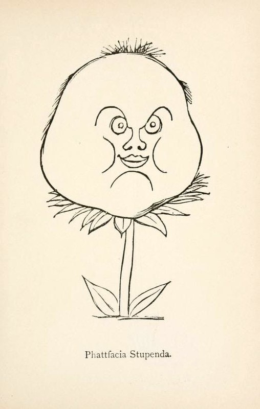
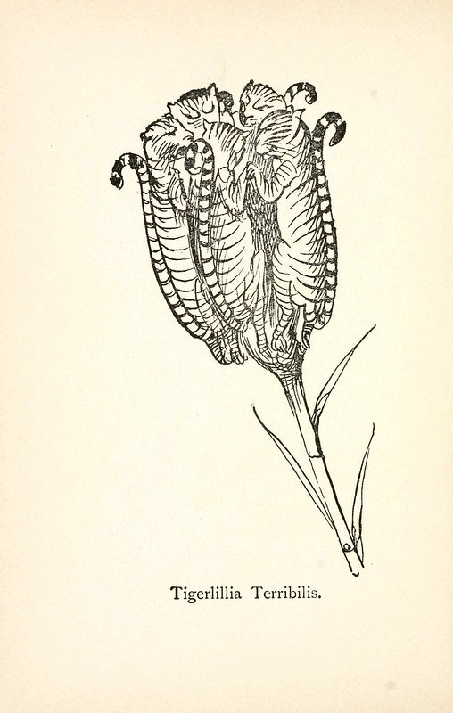
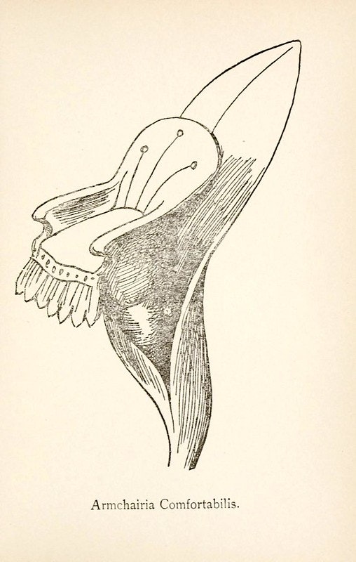
“Lear was an atten­tive and informed read­er of Dar­win; he worked with John Gould, the nat­ur­al-his­to­ry entre­pre­neur who had actu­al­ly picked apart the vari­eties of finch that Dar­win had brought back from the Galá­pa­gos Islands,” writes the New York­er’s Adam Gop­nik, not­ing that his work evi­dences a Lin­naean obses­sion “with the pow­er of nam­ing, with stick­ing a tag on a thing which gives it a place at, and on, the table.” Lear gave Latin names to at least two real species of par­rots, but he also fab­ri­cat­ed such chimeras as Phat­tfa­cia Stu­pen­da, Arm­chairia Com­fort­a­bilis, Tigerlil­ia Ter­ri­bilis, exam­ples of which he also illus­trates in his Non­sense Botany series of the eigh­teen-sev­en­ties.

Lear’s “pen­chant for the nat­ur­al world,” says The Dilet­tante, shaped his “knack for invent­ing ridicu­lous land­scapes and anthro­po­mor­phiz­ing all kind of crea­tures and objects. The result is a sur­re­al Leare­an world of Scroobi­ous Pips, Quan­gle Wan­gles, and Great Grom­boo­lian Plains.” His “fan­ci­ful re-sculpt­ing of the phys­i­cal world is bril­liant­ly exem­pli­fied” in his Non­sense Botany, with its “sketch­es and enter­tain­ing cap­tions read as a tax­on­o­my of incon­gru­ous plant-crea­tures.” Whether at the Pub­lic Domain Review or Project Guten­berg, you can gaze upon them all and expe­ri­ence not just light amuse­ment, but also a kind of aston­ish­ment at Lear’s pecu­liar tal­ent: he does­n’t “find the amaz­ing in the ordi­nary,” as Gop­nik puts it; “he finds the ordi­nary in the amaz­ing.”

via Pub­lic Domain Review

Relat­ed con­tent:

Behold an Inter­ac­tive Online Edi­tion of Eliz­a­beth Twining’s Illus­tra­tions of the Nat­ur­al Orders of Plants (1868)

Emi­ly Dickinson’s Herbar­i­um: A Beau­ti­ful Dig­i­tal Edi­tion of the Poet’s Pressed Plants & Flow­ers Is Now Online

Hor­tus Eystet­ten­sis: The Beau­ti­ful­ly Illus­trat­ed Book of Plants That Changed Botan­i­cal Art Overnight (1613)

The Bio­di­ver­si­ty Her­itage Library Makes 150,000 High-Res Illus­tra­tions of the Nat­ur­al World Free to Down­load

An Ani­mat­ed Read­ing of “The Jab­ber­wocky,” Lewis Carroll’s Non­sense Poem That Some­how Man­ages to Make Sense

Based in Seoul, Col­in Marshall writes and broad­casts on cities, lan­guage, and cul­ture. His projects include the Sub­stack newslet­ter Books on Cities and the book The State­less City: a Walk through 21st-Cen­tu­ry Los Ange­les. Fol­low him on Twit­ter at @colinmarshall or on Face­book.

Martin Scorsese Plays Vincent Van Gogh in a Short, Surreal Film by Akira Kurosawa

The idea of the auteur direc­tor has been a con­tro­ver­sial one at times giv­en the sheer num­ber of peo­ple required at every stage to pro­duce a film. But it hangs togeth­er for me when you look at the films of say, Mar­tin Scors­ese or Aki­ra Kuro­sawa, both direc­tors with very dis­tinc­tive visu­al lan­guages and ways of mov­ing the cam­era. Grant­ed, nei­ther direc­tor would be who he is with­out their crack teams of actors, writ­ers, com­posers, cin­e­matog­ra­phers, etc. But it is part of their genius to con­sis­tent­ly pull those teams togeth­er to real­ize visions that none of the indi­vid­u­als involved could ful­ly see on their own. Though the final prod­uct may be the result of mil­lions of dol­lars and thou­sands of hours of work by hun­dreds of peo­ple, the films of an auteur take shape fore­most in the direc­tors’ mind’s eye (and paint­ings and sto­ry­boards) rather than the writer’s script or pro­duc­er’s con­fer­ence room.

These direc­tors are dri­ven, like painters, to real­ize their visions, and in Kuro­sawa’s case, that dri­ve last­ed right up until the end of his life. (It was his wish to die on set, though an acci­dent left him unable to walk and put an end to his direct­ing career three years before the end of his life.) A painter him­self, his films have always been col­or­ful and painter­ly, and his final few projects were intense­ly so. One of those last films, 1990’s Dreams, the first of his films for which he alone wrote the screen­play, not only orig­i­nat­ed ful­ly in Kuro­sawa’s mind, but in his uncon­scious. A depar­ture from his typ­i­cal­ly epic nar­ra­tives, the film fol­lows var­i­ous Kuro­sawa sur­ro­gates through eight vignettes, based on eight recur­ring dreams, each one unfold­ing with a sur­re­al log­ic all of its own. In the fifth short episode, “Crows,” Kuro­sawa casts Scors­ese, his fel­low auteur and his equal as a visu­al styl­ist, as Vin­cent Van Gogh.

The cam­era begins in a gallery, mov­ing rest­less­ly before sev­er­al Van Gogh paint­ings and behind an art student—identifiable as a Kuro­sawa stand-in by the flop­py white hat he puts on in the next scene, when he wan­ders into the French coun­try­side of the paint­ings. The fields, bridge, and barns are ren­dered in Van Gogh’s bril­liant col­ors and skewed lines—and the stu­dent jour­neys fur­ther in to meet the artist him­self: Scors­ese in red beard and ban­daged ear. This is the only episode in the film not in Japan­ese; the stu­dent speaks French to a group of women, and Van Gogh speaks Scors­ese’s New York-accent­ed Eng­lish, giv­ing a les­son on “nat­ur­al beau­ty” (the video above adds Span­ish sub­ti­tles). It is not the most con­vinc­ing per­for­mance from Scors­ese, but that hard­ly seems to be the point. This is not so much Scors­ese as Van Gogh, but rather Van Gogh as Scors­ese, and Kuro­sawa dreams him­self as a younger acolyte of his Amer­i­can coun­ter­part.

“Crows,” writes Vin­cent Can­by, is the “least char­ac­ter­is­tic seg­ment ” of Dreams—the oth­ers man­i­fest much more famil­iar, more Japan­ese, scenes and themes. But it is for that rea­son that “Crows” is per­haps the most reveal­ing of Kuro­sawa’s state­ments on his sta­tus as an auteur and his rela­tion­ship with his peers. He approach­es Van Gogh/Scorsese not as a rival or even an equal, but as a stu­dent, filled with ques­tions and a desire to under­stand the artist’s meth­ods and motives. The short seg­ment speaks to the way Kuro­sawa eager­ly learned much from West­ern artists even as he mas­tered his own cin­e­mat­ic lan­guage with dis­tinct­ly Japan­ese sto­ries. In this way, he man­i­fest­ed yet anoth­er qual­i­ty of the auteur: a tru­ly inter­na­tion­al approach to film that tran­scends bar­ri­ers of lan­guage and cul­ture.

You can pur­chase a copy of Kuro­sawa’s com­plete film here.

Relat­ed Con­tent:

The Paint­ings of Aki­ra Kuro­sawa

Revis­it Mar­tin Scorsese’s Hand-Drawn Sto­ry­boards for Taxi Dri­ver

Josh Jones is a writer and musi­cian based in Durham, NC. Fol­low him at @jdmagness

by | Permalink | Make a Comment ( 2 ) |

Eno: The New “Generative Documentary” on Brian Eno That’s Never the Same Movie Twice

Bri­an Eno once wrote that “it’s pos­si­ble that our grand­chil­dren will look at us in won­der and say, ‘You mean you used to lis­ten to to exact­ly the same thing over and over again?’ ” That spec­u­la­tion comes from an essay on what he calls “gen­er­a­tive music,” which is auto­mat­i­cal­ly pro­duced by dig­i­tal sys­tems in accor­dance with human-set rules and pref­er­ences: “like live music, it is always dif­fer­ent. Like record­ed music, it is free of time-and-place lim­i­ta­tions.” These words were first pub­lished near­ly 30 years ago, in his book A Year with Swollen Appen­dices. Today, he has at least one grand­child, whose hand­writ­ing fig­ures in one of the music videos from his lat­est solo album. That par­tic­u­lar work may be non-gen­er­a­tive, but his inter­est in the con­cept of the gen­er­a­tive in art endures.

This year, Eno even stars in a gen­er­a­tive doc­u­men­tary about his life as an artist, music pro­duc­er, and “son­ic land­scap­er” direct­ed by Gary Hus­twit, best known for Hel­veti­ca and oth­er non-fic­tion films on design. The New York Times’ Rob Tan­nen­baum writes that Eno “is unlike any oth­er por­trait of a musi­cian. It’s not even a por­trait, because it isn’t fixed or sta­t­ic. Instead, Hus­twit used a pro­pri­etary soft­ware pro­gram that recon­fig­ures the length, struc­ture and con­tents of the movie.” This suit­ed both Eno’s pro­fes­sion­al phi­los­o­phy and his antipa­thy to the con­ven­tion­al doc­u­men­tary form. “Our lives are sto­ries we write and rewrite,” Tan­nen­baum quotes him as writ­ing in an e‑mail. ‘There is no sin­gle reli­able nar­ra­tive of a life.”

In fact, there are about 52 quin­til­lion dif­fer­ent nar­ra­tives, to go by the esti­mate of pos­si­ble per­mu­ta­tions of Eno Hus­twit has giv­en in inter­views. “We could make a 10-hour series about Bri­an, and we still wouldn’t be scratch­ing the sur­face of every­thing he’s done,” he told The Verge. “I just added a bunch of footage this past week that’s going into the Film Forum week two runs, which has nev­er been in the sys­tem before.” Not only do “we get to keep dig­ging into the footage and bring­ing new things into it, but we also get to keep chang­ing the soft­ware. And I don’t know, in a year from now, what the film will look like or what the stream­ing ver­sions of it will be.”

What Eno did­n’t have to clar­i­fy in 1996, but Hus­twit has to clar­i­fy in 2024, is that this kind of gen­er­a­tive film isn’t gen­er­at­ed by arti­fi­cial intel­li­gence. Empha­siz­ing that “the data set is all our mate­r­i­al,” includ­ing 30 hours of inter­views and 500 hours of con­ven­tion­al­ly shot film, Hus­twit frames his enter­prise’s cus­tom soft­ware, acronymi­cal­ly called Brain One, “as more like gar­den­ing.” That metaphor could have come straight from Eno him­self, who’s spo­ken about “chang­ing the idea of the com­pos­er from some­body who stood at the top of a process and dic­tat­ed pre­cise­ly how it was car­ried out, to some­body who stood at the bot­tom of a process who care­ful­ly plant­ed some rather well-select­ed seeds.” Even­tu­al­ly, “you stop think­ing of your­self as me, the con­troller, you the audi­ence, and you start think­ing of all of us as the audi­ence, all of us as peo­ple enjoy­ing the gar­den togeth­er.”

Relat­ed con­tent:

Eno: A 1973 Mini-Doc Shows Bri­an Eno at the Begin­ning of His Solo Career

Watch Bri­an Eno’s “Video Paint­ings,” Where 1980s TV Tech­nol­o­gy Meets Visu­al Art

Bri­an Eno on Cre­at­ing Music and Art As Imag­i­nary Land­scapes (1989)

How David Byrne and Bri­an Eno Make Music Togeth­er: A Short Doc­u­men­tary

Watch Anoth­er Green World, a Hyp­not­ic Por­trait of Bri­an Eno (2010)

Watch Bri­an Eno’s Exper­i­men­tal Film “The Ship,” Made with Arti­fi­cial Intel­li­gence

Based in Seoul, Col­in Marshall writes and broad­casts on cities, lan­guage, and cul­ture. His projects include the Sub­stack newslet­ter Books on Cities and the book The State­less City: a Walk through 21st-Cen­tu­ry Los Ange­les. Fol­low him on Twit­ter at @colinmarshall or on Face­book.

Andy Warhol Hosts Frank Zappa on His Cable TV Show, and Later Recalls, “I Hated Him More Than Ever” After the Show

Had Andy Warhol lived to see the internet–especially social networking–he would have loved it, though it may not have loved him. Though Warhol did see the very begin­nings of the PC rev­o­lu­tion, and made com­put­er art near the end of his life on a Com­modore Ami­ga 1000, he was most­ly enam­ored, unsur­pris­ing­ly, of TV. “I love tele­vi­sion,” he once remarked, “It is the medi­um I’d most like to shine in. I’m real­ly jeal­ous of every­body who’s got their own show on tele­vi­sion. I want a show of my own.”

Warhol real­ized his dream in 1979, though in a venue that may not have lived up to his fan­tasies: a New York pub­lic-access chan­nel called Man­hat­tan Cable, “which showed local sports match­es and agreed to sell 30-minute slots to Warhol for around $75 a pop,” notes The Tele­graph. Warhol made a total of 42 episodes of his odd inter­view show. The pop art impre­sario “wasn’t exact­ly a nat­ur­al… when it came to the del­i­cate art of chat-show host­ing,” but “he didn’t let that stop him.” By 1983, one might have thought he’d have got­ten the hang of it, yet he seems espe­cial­ly awk­ward when cranky prog genius Frank Zap­pa appeared on his show that year.

Luck­i­ly for Warhol, he is joined by Zap­pa fan Richard Berlin, who serves as a buffer between the two super­stars. (Berlin is prob­a­bly the son of William Ran­dolph Hearst’s hand­picked suc­ces­sor, whose daugh­ter, Brigid, was one of Warhol’s film stars.) At least in the excerpt above, Berlin does all of the work while Warhol looks on, seem­ing­ly stu­pe­fied. But the truth is that Warhol hat­ed Zap­pa, and after the inter­view, he wrote in his Diaries, “I hat­ed Zap­pa even more than when it start­ed.” Part of what the show’s osten­si­ble host found so objec­tion­able was Zappa’s ego­ma­ni­a­cal per­son­al­i­ty. Though Warhol, like Zap­pa, con­trolled his own small inde­pen­dent empire, in tem­pera­ment, the two couldn’t have been more dif­fer­ent.

But there was also some per­son­al his­to­ry between them that went back to the ear­li­est days of the Vel­vet Under­ground. “I remem­ber,” Warhol goes on, “when he was so mean to us when the Moth­ers of Inven­tion played with the Vel­vet Underground—I think both at the trip, in L.A., and at the Fill­more in San Fran­cis­co. I hat­ed him then and I still don’t like him.” Zap­pa wasn’t sim­ply rude, how­ev­er; at a 1967 show in New York, he turned his tal­ent for ridicule into what Kalei­do­scope mag­a­zine writer Chris Dar­row called “one of the great­est pieces of rock’n roll the­ater that I have ever seen.”

The open­ing night was very crowd­ed and Zap­pa and mem­bers of the Moth­ers of Inven­tion showed up to show their sup­port. (…) Nico’s deliv­ery of her mate­r­i­al was very flat, dead­pan, and expres­sion­less, and she played as though all of her songs were dirges. She seemed as though she was try­ing to res­ur­rect the ennui and deca­dence of Weimar, pre-Hitler Ger­many. Her icy, Nordic image also added to the detach­ment of her deliv­ery. (…) The audi­ence was on her side, as she was in her ele­ment and the Warhol con­tin­gent was very promi­nent that night. How­ev­er, what hap­pened next is what sticks in my mind the most from that night. In between sets, Frank Zap­pa got up from his seat and walked up on the stage and sat behind the key­board of Nico’s B‑3 organ. He pro­ceed­ed to place his hands indis­crim­i­nate­ly on the key­board in a total, aton­al fash­ion and screamed at the top of his lungs, doing a car­i­ca­ture of Nico’s set, the one he had just seen. The words to his impromp­tu song were the names of veg­eta­bles like broc­coli, cab­bage, aspara­gus… This “song” kept going for about a minute or so and then sud­den­ly stopped. He walked off the stage and the show moved on.

What Warhol took per­son­al­ly may have just been the irre­press­ible out­growth of Zappa’s dis­dain for vir­tu­al­ly every­thing, which he express­es to Berlin in the inter­view. Orig­i­nal Moth­ers of Inven­tion drum­mer Jim­my Carl Black spec­u­lat­ed that he may have hat­ed the Vel­vet Under­ground because “they were junkies and Frank just couldn’t tol­er­ate any kind of drugs.” The two bands were also, briefly, com­peti­tors at MGM.

But per­haps Zap­pa just couldn’t tol­er­ate any­one else tak­ing the spot­light, espe­cial­ly a tal­ent­ed female per­former. Warhol remem­bers Zap­pa’s response to a com­pli­ment about his daugh­ter, Moon. “Lis­ten,” he sup­pos­ed­ly told Warhol, “I cre­at­ed her. I invent­ed her.… She’s noth­ing. It’s all me.” In con­trast to the “pecu­liar” reply, Warhol writes “if it were my daugh­ter I would be say­ing ‘Gee, she’s so smart,’ but he’s tak­ing all the cred­it.” Zap­pa may have been a musi­cal genius with a spe­cial entre­pre­neur­ial flair and inci­sive crit­i­cal wit, but the “sex­ist auto­crat… with a scabrous atti­tude,” as Car­lo Wolff describes him, “was not a like­able man.” Cer­tain­ly the mild-man­nered Warhol didn’t think so.

Relat­ed Con­tent:

Andy Warhol Dig­i­tal­ly Paints Deb­bie Har­ry with the Ami­ga 1000 Com­put­er (1985)

Frank Zappa’s 1980s Appear­ances on The David Let­ter­man Show

When Andy Warhol Guest-Starred on The Love Boat (1985)

Josh Jones is a writer and musi­cian based in Durham, NC. Fol­low him at @jdmagness

by | Permalink | Make a Comment ( 62 ) |

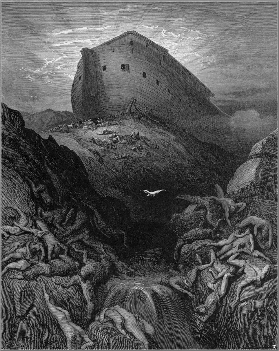
Behold Gustave Doré’s Dramatic Illustrations of the Bible (1866)

One occa­sion­al­ly hears it said that, thanks to the inter­net, all the books tru­ly worth read­ing are free: Shake­speare, Don Quixote, the sto­ries of Edgar Allan Poe, the Divine Com­e­dy, the Bible. Can it be a coin­ci­dence that all of these works inspired illus­tra­tions by Gus­tave Doré? When he was active in mid-nine­teenth-cen­tu­ry France, he worked in a vari­ety of forms, includ­ing paint­ing, sculp­ture, and even comics and car­i­ca­tures. But he lives on through noth­ing so much as his wood­block-print illus­tra­tions of what we now con­sid­er clas­sics of West­ern lit­er­a­ture — and, in the case of La Grande Bible de Tours, a text we could describe as “super-canon­i­cal.”

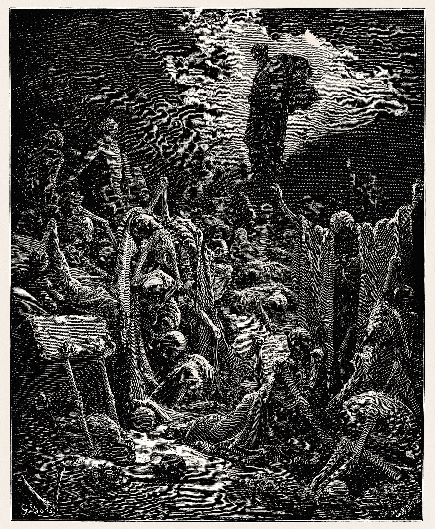
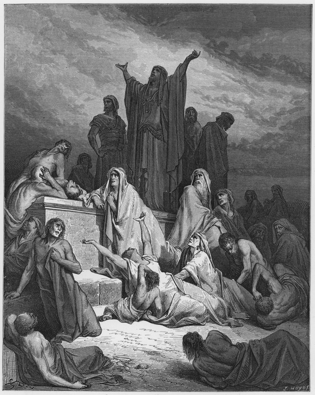
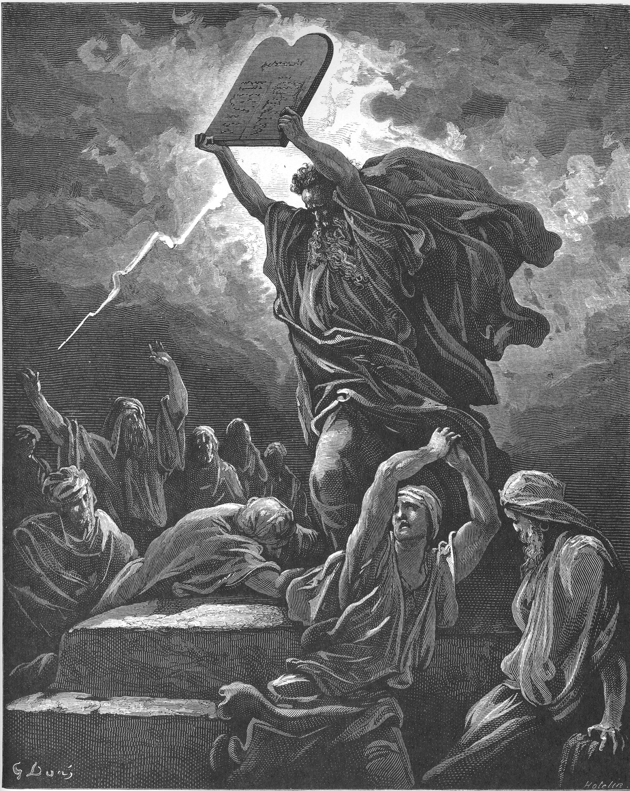
Doré took on the task of design­ing 241 engrav­ings for a lux­u­ri­ous new French-lan­guage edi­tion of the Vul­gate Bible in the mid-eigh­teen-six­ties. The project “offered him an almost end­less series of intense­ly dra­mat­ic events,” writes biog­ra­ph­er Joan­na Richard­son: “the loom­ing tow­er of Babel, the plague of dark­ness in Egypt, the death of Sam­son, Isa­iah’s vision of the destruc­tion of Baby­lon.”

All pro­vid­ed prac­ti­cal­ly ide­al show­cas­es for the ele­ments of Doré’s intense­ly Roman­tic style: “the moun­tain scenes, the lurid skies, the com­pli­cat­ed bat­tles, the almost unremit­ting bru­tal­ism.” But along with the Old Tes­ta­ment “mas­sacres and mur­ders, decap­i­ta­tions and aveng­ing angels” come Vic­to­ri­an angels, Vic­to­ri­an women, and Vic­to­ri­an chil­dren, “sen­ti­men­tal or wise beyond their years.”

Those choic­es may have been moti­vat­ed by the simul­ta­ne­ous pub­li­ca­tion of La Grande Bible de Tours in both France and the Unit­ed King­dom. In any event, the edi­tion proved suc­cess­ful enough on both sides of the Chan­nel that a major exhi­bi­tion of Doré’s work opened in Lon­don the very next year.

Though vis­i­bly root­ed in their time and place — as well as in the artist’s per­son­al sen­si­bil­i­ties and the aes­thet­ic cur­rents in which he was caught up — Doré’s visions of the Bible still make an impact with their rich and imme­di­ate­ly rec­og­niz­able chiaroscuro por­tray­als of scenes that have long res­onat­ed through the whole of West­ern cul­ture. You can see the whole series on Wikipedia, or as col­lect­ed in The Doré Gallery of Bible Illus­tra­tions at Project Guten­berg — all, of course, for no charge.

Relat­ed con­tent:

Gus­tave Doré’s Dra­mat­ic Illus­tra­tions of Dante’s Divine Com­e­dy

Gus­tave Doré’s Exquis­ite Engrav­ings of Cer­vantes’ Don Quixote

Gus­tave Doré’s Macabre Illus­tra­tions of Edgar Allan Poe’s “The Raven” (1884)

Behold Gus­tave Doré’s Illus­tra­tions for Rabelais’ Grotesque Satir­i­cal Mas­ter­piece Gar­gan­tua and Pan­ta­gru­el

The Adven­tures of Famed Illus­tra­tor Gus­tave Doré Pre­sent­ed in a Fantasic(al) Cutout Ani­ma­tion

Sal­vador Dalí’s Illus­tra­tions for the Bible (1963)

Based in Seoul, Col­in Marshall writes and broad­casts on cities, lan­guage, and cul­ture. His projects include the Sub­stack newslet­ter Books on Cities and the book The State­less City: a Walk through 21st-Cen­tu­ry Los Ange­les. Fol­low him on Twit­ter at @colinmarshall or on Face­book.

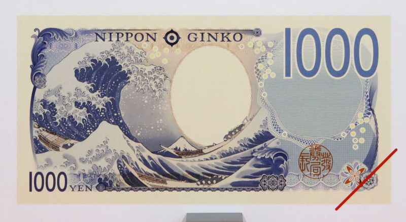
Hokusai’s The Great Wave off Kanagawa Now Appears on Japanese Banknotes

If you’ve lived or trav­eled in Japan, you know full well how much of dai­ly life in that cash-inten­sive soci­ety involves the use of thou­sand-yen bills. Once con­sid­ered the equiv­a­lent of the Amer­i­can ten-spot, the yen’s late­ly hav­ing fall­en to its low­est val­ue in decades means that it’s now worth clos­er to six U.S. dol­lars. This is good news for tourists, and espe­cial­ly so for tourists who appre­ci­ate the wood­block-print art of Hoku­sai, whose famous Great Wave off Kana­gawa adorns the brand new ¥1000 ban­knote. Issued just yes­ter­day by the Bank of Japan, it also bears the image of bac­te­ri­ol­o­gist Kitasato Shibasaburō, who co-dis­cov­ered the infec­tious agent of a bubon­ic plague out­break in 1894.

The last revi­sion of the ¥1000, twen­ty years ago, also fea­tured a bac­te­ri­ol­o­gist: Noguchi Hideyo, who iden­ti­fied syphilis as the cause of pro­gres­sive par­a­lyt­ic dis­ease. Before Noguchi, it bore the image of Nat­sume Sōse­ki, one of the most cel­e­brat­ed writ­ers in the his­to­ry of Japan­ese let­ters.

The Bank of Japan tends to roll out ban­knote designs for each offi­cial era, which begins when­ev­er a new emper­or ascends to the throne; the cur­rent one began in May of 2019, after Emper­or Aki­hi­to stepped down and his son Naruhi­to stepped up. Oth­er his­tor­i­cal fig­ures pic­tured on the cur­ren­cy of this Rei­wa era, as it’s called, include Tsu­da Uni­ver­si­ty founder Tsu­da Umeko and “father of Japan­ese cap­i­tal­ism” Shibu­sawa Eiichi.”

A not just respect­ed but pop­u­lar and com­mer­cial­ly suc­cess­ful artist, Hoku­sai knew a thing or two about cap­i­tal­ism him­self. Yet he also had an uncom­mon eye for the beau­ty of Japan, his dis­tinc­tive per­cep­tions of which have been high­ly influ­en­tial in both East­ern and West­ern art for near­ly two cen­turies now. Japan­ese ban­knotes have pre­vi­ous­ly fea­tured images of Mount Fuji, Oga­ta Kōrin’s six-pan­el paint­ing of iris­es, and a scene from the Tale of Gen­ji. But this is the first time any has drawn from ukiyo‑e, the “pic­tures of the float­ing world” of which Hoku­sai was one of sev­er­al mas­ters who worked from the sev­en­teenth through the nine­teenth cen­tu­ry. A Great Wave bill is some­thing to cel­e­brate, but giv­en that today hap­pens to be the Fourth of July, let it be said that the pyra­mid with the eye is also pret­ty cool.

Relat­ed con­tent:

An Intro­duc­tion to Hokusai’s Great Wave, One of the Most Rec­og­niz­able Art­works in the World

The Evo­lu­tion of Hokusai’s Great Wave: A Study of 113 Known Copies of the Icon­ic Wood­block Print

Watch Hokusai’s The Great Wave off Kana­gawa Get Entire­ly Recre­at­ed with 50,000 LEGO Bricks

Hokusai’s Action-Packed Illus­tra­tions of Japan­ese & Chi­nese War­riors (1836)

Alan Tur­ing Will Be Fea­tured on England’s New £50 Ban­knote

‘Pride and Prej­u­dice’ Author Jane Austen Will Appear on the £10 Note

Based in Seoul, Col­in Marshall writes and broad­casts on cities, lan­guage, and cul­ture. His projects include the Sub­stack newslet­ter Books on Cities and the book The State­less City: a Walk through 21st-Cen­tu­ry Los Ange­les. Fol­low him on Twit­ter at @colinmarshall or on Face­book.

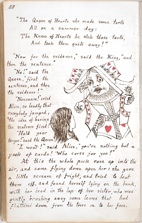
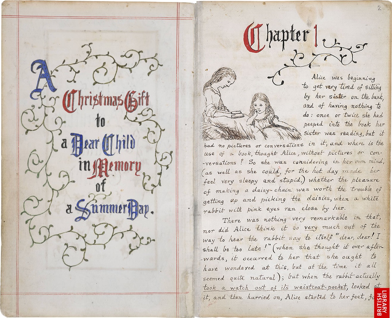
The Original Alice’s Adventures In Wonderland Manuscript, Handwritten & Illustrated By Lewis Carroll (1864)

On a sum­mer day in 1862, a tall, stam­mer­ing Oxford Uni­ver­si­ty math­e­mati­cian named Charles Lutwidge Dodg­son took a boat trip up the Riv­er Thames, accom­pa­nied by a col­league and the three young daugh­ters of uni­ver­si­ty chan­cel­lor Hen­ry Lid­dell. To stave off tedi­um dur­ing the five-mile jour­ney, Dodg­son regaled the group with a sto­ry of a bored girl named Alice who finds adven­ture in the most unex­pect­ed places. By the day’s end, Liddell’s mid­dle daugh­ter, also named Alice, was so enthralled by this account that she implored the math­e­mati­cian to write the sto­ry down. Some three years lat­er, Dodg­son would pub­lish Alice’s Adven­tures in Won­der­land under the nom de plume of Lewis Car­roll (the pen name is an Angli­cized ver­sion of “Car­o­lus Ludovi­cus,” the Latinized form of Charles Lud­widge). The peren­ni­al children’s read was imme­di­ate­ly pop­u­lar, count­ing Oscar Wilde and Queen Vic­to­ria among its ardent fans, and has nev­er been out of print since its ini­tial pub­li­ca­tion in 1865.

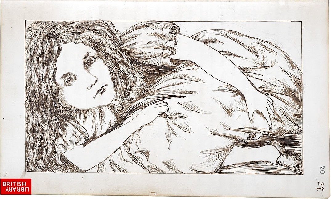
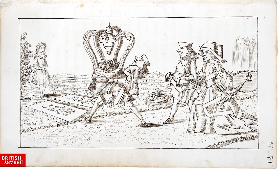
Alice’s Adven­tures Under Ground, the orig­i­nal ver­sion of the book that Car­roll pre­sent­ed to Alice Lid­dell in 1864, is present­ly housed in the British Library, which has gra­cious­ly made it freely avail­able online. You can view it here. The hand­writ­ten vol­ume includes 37 crisp ink illus­tra­tions, all per­son­al­ly drawn by Dodg­son. Dis­cern­ing Alice read­ers will notice that these illus­tra­tions dif­fer from the icon­ic images (and, to my eyes, very much supe­ri­or) cre­at­ed by famed Punch mag­a­zine polit­i­cal car­toon­ist John Ten­niel.

Title and illus­tra­tions aside, the orig­i­nal man­u­script is con­sid­er­ably slim­mer than the final ver­sion, con­tain­ing rough­ly 12,000 few­er words.

Those wish­ing to revis­it Alice’s adven­tures can do so at the British Library’s site.

Ilia Blin­d­er­man is a Mon­tre­al-based cul­ture and sci­ence writer. Fol­low him at @iliablinderman.

Relat­ed Con­tent:

See Sal­vador Dali’s Illus­tra­tions for the 1969 Edi­tion of Alice’s Adven­tures in Won­der­land

Meryl Streep Shrooms Her Way Through Mod­ern Alice in Won­der­land

The Real Alice in Won­der­land Cir­ca 1862, and Our Favorite Cul­ture Links on the Web

« Go BackMore in this category... »
Quantcast