Watch Hokusai’s The Great Wave off Kanagawa Get Entirely Recreated with 50,000 LEGO Bricks

A few years ago here on Open Cul­ture, we fea­tured a re-cre­ation of The Great Wave off Kanaza­wa made entire­ly out of LEGO by a seri­ous enthu­si­ast named Jumpei Mit­sui. Though the work’s depth does come across to some extent in still pho­tos, it bears repeat­ing that Mit­sui assem­bled not just a two-dimen­sion­al image, but a com­plete three-dimen­sion­al scene that, when viewed straight on, looks just like Hoku­sai’s famous wood­block print. All told, the project required 50,000 LEGO bricks, all of which you can now watch Mit­sui lay down in the ten-minute time-lapse video above.

By pre­sent­ing the whole con­struc­tion process from a vari­ety of angles, the video allows us to bet­ter appre­ci­ate not just the painstak­ing man­u­al labor involved, but the amount of cre­ative and tech­ni­cal work nec­es­sary to con­cep­tu­al­ize the Great Wave — per­haps the fore­most exam­ple of the vivid­ly flat ukiyo‑e wood­block print style — in phys­i­cal real­i­ty.

View­ers who’ve nev­er tried their hand at large-scale LEGO build­ing will also be sur­prised by the way in which Mit­sui goes about build­ing the grid-like sub-struc­ture that under­girds what looks, in the fin­ished prod­uct, like a sold sea of bricks.

It’s nat­ur­al that Mit­sui (now a “LEGO Cer­ti­fied Pro­fes­sion­al”) has shared the details of how he built his best-known LEGO cre­ation on Youtube, giv­en that it was on the same plat­form that he gained some of the knowl­edge nec­es­sary to exe­cute it in the first place. “The brick artist observed waves on Youtube for hours, and read aca­d­e­m­ic papers on waves to bet­ter under­stand their forms and ener­gy,” notes The Kid Should See This, under­scor­ing the inten­si­ty of prepa­ra­tion required even for what may, at first, look like a nov­el­ty project. And if the still-young Mit­sui is any­thing like his nine­teenth-cen­tu­ry coun­try­man, he’ll be tempt­ed to build the Great Wave again, and even bet­ter, a few more times in the decades to come.

via The Kid Should See This

Relat­ed con­tent:

Hokusai’s Icon­ic Print The Great Wave off Kana­gawa Recre­at­ed with 50,000 LEGO Bricks

Ai Wei­wei Recre­ates Monet’s Water Lilies Trip­tych Using 650,000 Lego Bricks

The Frank Lloyd Wright LEGO Set

With 9,036 Pieces, the Roman Colos­se­um Is the Largest LEGO Set Ever

Why Did LEGO Become a Media Empire? Pret­ty Much Pop: A Cul­ture Pod­cast #37

The Evo­lu­tion of The Great Wave off Kana­gawa: See Four Ver­sions That Hoku­sai Paint­ed Over Near­ly 40 Years

Based in Seoul, Col­in Marshall writes and broad­casts on cities, lan­guage, and cul­ture. His projects include the Sub­stack newslet­ter Books on Cities, the book The State­less City: a Walk through 21st-Cen­tu­ry Los Ange­les and the video series The City in Cin­e­ma. Fol­low him on Twit­ter at @colinmarshall or on Face­book.

One Hour of David Lynch Listening to Rain, Smoking & Reflecting on Art

At this point, there’s no need to point out the dan­gers posed by smok­ing. Those who do it these days do it in full knowl­edge of the health risks involved, for rea­sons of their own. Some­times those rea­sons are artis­tic ones: “I had this idea that you drink cof­fee, you smoke cig­a­rettes, and you paint, and that’s it,” says David Lynch in Jon Nguyen’s doc­u­men­tary David Lynch: The Art Life, describ­ing his youth­ful con­cep­tion of what it was to be an artist. “Maybe girls come into it a lit­tle bit, but basi­cal­ly, it’s the incred­i­ble hap­pi­ness of work­ing and liv­ing that life.” Though much bet­ter known as a film­mak­er than a painter, Lynch has nev­er stopped liv­ing that life, cig­a­rette-smok­ing and all.

The “you drink cof­fee, you smoke cig­a­rettes, and you paint” line sur­faces in the audio mix of the video above, which mash­es up that and oth­er of Lynch’s obser­va­tions from var­i­ous places and times with looped footage of him silent­ly smok­ing and lis­ten­ing to the rain falling out­side. Most of his words here have to do with “the art life”: how he con­ceives of it, how he lives it, and how he made his way into it in the first place.

Some of them will be well famil­iar to long­time Lynch fans, not least his notion that, when it comes to get­ting the ideas with which he builds his work, the “lit­tle fish” swim on the sur­face of con­scious­ness, but the “big fish” — the stranger, more pow­er­ful ideas that lead, pre­sum­ably, to a Blue Vel­vet or a Mul­hol­land Dr. — inhab­it the kind of depths acces­si­ble only through med­i­ta­tion.

Along with such pieces of Lynchi­an advice come expres­sions of enthu­si­asm, mem­o­ries from his younger days, and reflec­tions on his­to­ry, soci­ety, and nature, all of them sim­i­lar­ly decon­tex­tu­al­ized and backed by an omi­nous-sound­ing piece of music. The result­ing ambi­ence isn’t entire­ly unlike that of Lynch’s delib­er­ate­ly dis­turb­ing sit­com Rab­bits, but it also fits in with the bur­geon­ing genre of long-form Youtube videos opti­mized for relax­ation val­ue. Thir­ty years ago, when each movie or tele­vi­sion show he made seemed to sur­pass the last in sheer weird­ness, we entered Lynch’s world in order to be unset­tled, to see and hear things at once inex­plic­a­bly com­pelling and obscure­ly hor­ri­fy­ing; in the twen­ty-twen­ties, we go there to unwind.

Relat­ed Con­tent:

An Ani­mat­ed David Lynch Explains Where He Gets His Ideas

Bertrand Rus­sell Explains How Smok­ing Para­dox­i­cal­ly Saved His Life

David Lynch Explains How Med­i­ta­tion Enhances Our Cre­ativ­i­ty

Cig­a­rette Com­mer­cials from David Lynch, the Coen Broth­ers and Jean Luc Godard

An Anti, Anti-Smok­ing Announce­ment from John Waters

Two Short Films on Cof­fee and Cig­a­rettes from Jim Jar­musch & Paul Thomas Ander­son

Based in Seoul, Col­in Marshall writes and broad­casts on cities, lan­guage, and cul­ture. His projects include the Sub­stack newslet­ter Books on Cities, the book The State­less City: a Walk through 21st-Cen­tu­ry Los Ange­les and the video series The City in Cin­e­ma. Fol­low him on Twit­ter at @colinmarshall or on Face­book.

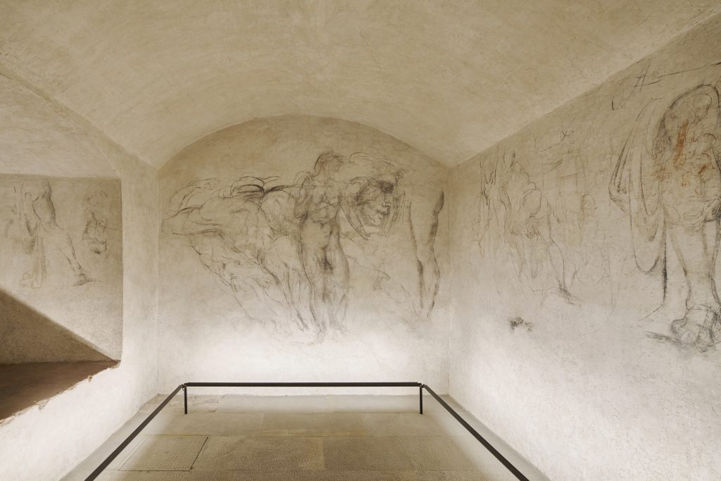
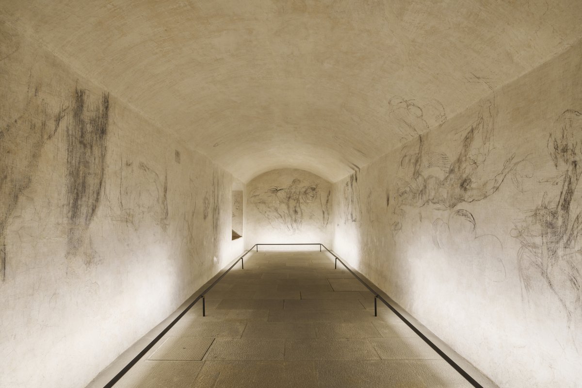
A Secret Room with Drawings Attributed to Michelangelo Opens to Visitors in Florence

Images on this page come cour­tesy of the Musei del Bargel­lo

In the year 1530, Michelan­ge­lo was sen­tenced to death by Pope Clement VII — who, not coin­ci­den­tal­ly, was born Giulio de’ Medici. That famous dynasty, which once seemed to hold absolute eco­nom­ic and polit­i­cal pow­er in Flo­rence, had just seen off a vio­lent chal­lenge to its rule by repub­li­can-mind­ed Flo­ren­tines who, embold­ened by the sack of Rome in 1527, took their city from the House of Medici that same year. Alas, that par­tic­u­lar Repub­lic of Flo­rence proved short-lived, thanks to the pope and Emper­or Charles V’s agree­ment agreed to use mil­i­tary pow­er to return it to Medici hands.

Dur­ing the strug­gles against the Medici, the Flo­rence-born Michelan­ge­lo had come to the aid of his home­town by work­ing on its for­ti­fi­ca­tions. It seems to have been his par­tic­i­pa­tion in the revolt that drew the ire of the Medici, despite their court’s on-and-off patron­age of his work for the pre­ced­ing four decades.

Mer­ci­ful­ly, they nev­er actu­al­ly exe­cut­ed Michelan­ge­lo, and indeed par­doned him before long–not least so he could fin­ish his work on the Sis­tine Chapel and the Medici fam­i­ly tomb. But how did he occu­py him­self while still liv­ing under the death sen­tence?

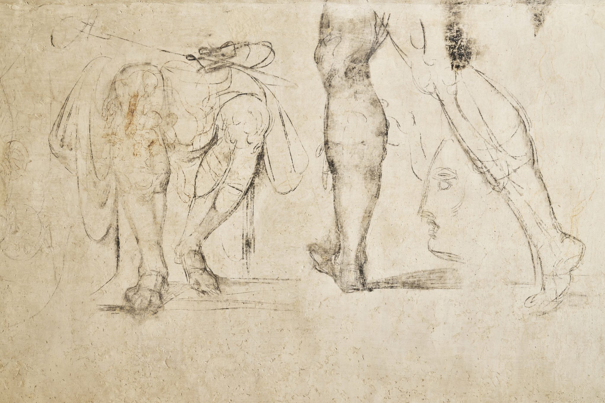
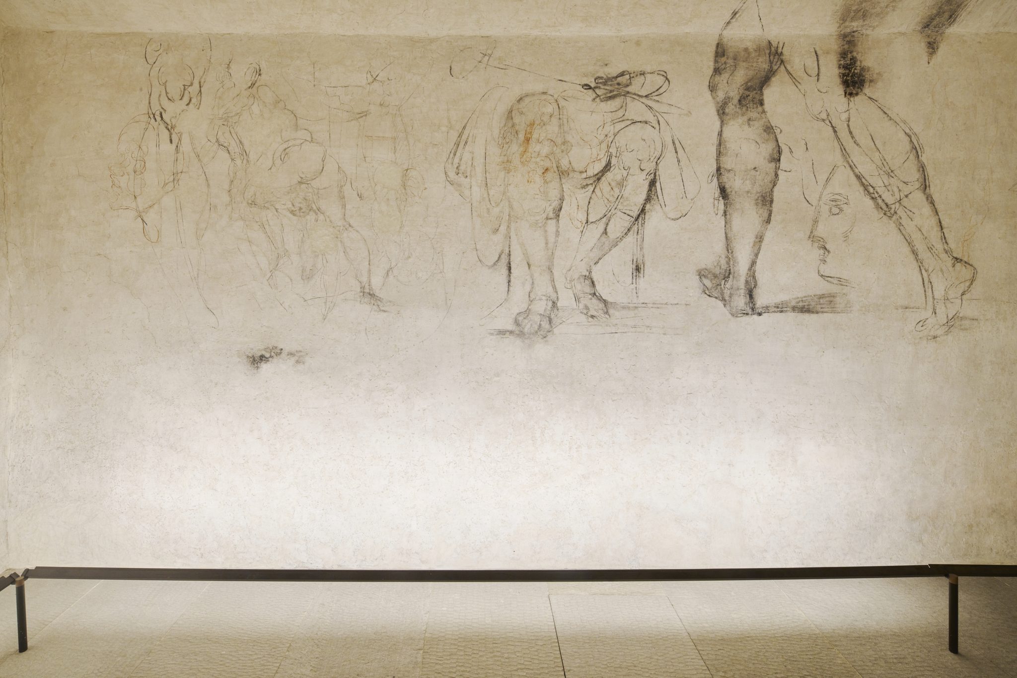
As one the­o­ry has it, he sim­ply hid out — and in a cor­ner of what’s now the Medici Chapels Muse­um at that. In a “tiny cham­ber beneath the Medici Chapels in the Basil­i­ca of San Loren­zo in 1530,” writes the Guardian’s Angela Giuf­fri­da, Michelan­ge­lo spent a cou­ple months “mak­ing dozens of draw­ings that are rem­i­nis­cent of his pre­vi­ous works, includ­ing a draw­ing of Leda and the Swan, a paint­ing pro­duced dur­ing the same year that was lat­er lost.” All of these he drew direct­ly on the walls, and their exis­tence “remained unknown until 1975 when Pao­lo Dal Pogget­to, then the direc­tor of the Medici Chapels, one of five muse­ums that make up the Bargel­lo Muse­ums, was search­ing for a suit­able space to cre­ate a new exit for the muse­um.”

“Oth­ers doubt that Michelan­ge­lo, already in his 50s and an acclaimed artist with pow­er­ful patrons, would have spent time in such a dingy hide out,” writes the New York Times’ Jason Horowitz. “But many schol­ars believe that the sketch­es show his hand”: the “impos­ing nude near the entrance” that evokes The Res­ur­rec­tion of Christ; the sketch­es that “resem­ble the cen­tral fig­ure of his The Fall of Phaeton. Some even think a flexed and dis­em­bod­ied arm on the wall evokes his David stat­ue.” And start­ing next week, vis­i­tors will be able to judge these very draw­ings for them­selves.

Not that you can just waltz into this stan­za seg­re­ta: “Vis­its will be kept to groups of four and lim­it­ed to 15 min­utes, with 45 minute lights-out peri­ods in between to pro­tect the draw­ings,” Horowitz writes. ‘Tick­ets, each con­nect­ed to a spe­cif­ic per­son whose I.D. will be checked to pre­vent tour oper­a­tors from gob­bling them up, will cost 32 euros (about $34), and include access to the Medici tombs.” Dur­ing your own fif­teen min­utes in this cramped, obscure room turned taste­ful­ly-lit gallery, you may or may not feel the pres­ence of Michelan­ge­lo, but you’ll sure­ly find your­self remind­ed that a true artist nev­er stops cre­at­ing, no mat­ter the cir­cum­stances in which he finds him­self.

Relat­ed Con­tent:

Watch the Painstak­ing and Nerve-Rack­ing Process of Restor­ing a Draw­ing by Michelan­ge­lo

Michelangelo’s David: The Fas­ci­nat­ing Sto­ry Behind the Renais­sance Mar­ble Cre­ation

Michelan­ge­lo Entered a Com­pe­ti­tion to Put a Miss­ing Arm Back on Lao­coön and His Sons — and Lost

New Video Shows What May Be Michelangelo’s Lost & Now Found Bronze Sculp­tures

Michelangelo’s Illus­trat­ed Gro­cery List

School Prin­ci­pal, Forced to Resign After Stu­dents Learn About Michelangelo’s David, Vis­its the Renais­sance Stat­ue in Flo­rence

Based in Seoul, Col­in Marshall writes and broad­casts on cities, lan­guage, and cul­ture. His projects include the Sub­stack newslet­ter Books on Cities, the book The State­less City: a Walk through 21st-Cen­tu­ry Los Ange­les and the video series The City in Cin­e­ma. Fol­low him on Twit­ter at @colinmarshall or on Face­book.

Dorothea Tanning: The Artist Who Pushed the Boundaries of Surrealism

As Great Art Explained’s James Payne notes in the above pro­file of Sur­re­al­ist Dorothea Tan­ning, the emo­tion­al and psy­cho­log­i­cal com­plex­i­ty of her work invites inter­pre­ta­tion, par­tic­u­lar­ly when it comes to one of best known paint­ings, 1943’s Eine Kleine Nacht­musik.

Its doors, young girls (femme-enfants, if you pre­fer) and sun­flower were recur­rent themes for her.

What’s it mean?

Tan­ning main­tained the paint­ing is about “con­fronta­tion:”

Every­one believes he/she is his/her dra­ma. While they don’t always have giant sun­flow­ers (most aggres­sive of flow­ers) to con­tend with, there are always stair­ways, hall­ways, even very pri­vate the­aters where the suf­fo­ca­tions and the final­i­ties are being played out, the blood red car­pet or cru­el yel­lows, the attack­er, the delight­ed vic­tim….

Art his­to­ri­an Whit­ney Chad­wick, author of Women Artists and the Sur­re­al­ist Move­ment, dared to com­pare Eine Kleine Nacht­musik to Pierre Roy’s 1927 work Dan­ger on the Stairs, which Tan­ning may have encoun­tered dur­ing her life chang­ing vis­it to the Muse­um of Mod­ern Art’s ground break­ing 1936 exhib­it Fan­tas­tic Art, Dada, Sur­re­al­ism.

Both paint­ings unfold on nar­row, win­dow­less land­ings. Roy’s fea­tures a snake, that har­bin­ger of “Freudi­an sym­bol­ic con­tent”, slith­er­ing down a stair­case; Tanning’s two long-haired girls in Vic­to­ri­an desha­bille and a “torn and writhing sun­flower, an image strong­ly iden­ti­fied with Tanning’s Mid­west­ern ori­gins, close to nature and capa­ble of con­vey­ing impres­sions of both fecun­di­ty and men­ace.”

Tan­ning bri­dled at the temer­i­ty of Chadwick’s char­ac­ter­i­za­tion:

To com­pare my vision with the per­fect­ly pro­por­tioned and very pho­to­graph­ic depic­tion of a snake (ana­con­da) on a stair, neat­ly paint­ed, some­what in the man­ner of Magritte, is sim­ple-mind­ed. The scene, though infre­quent, is pos­si­ble in the nat­ur­al out­side world. Mine is not.

Could it be that the sun­flower is a trap set for experts unable to resist the pull of pub­licly inter­pret­ing a Sur­re­al­ist scene?

Tan­ning died in 2012 at the age of 101, but Eine Kleine Nacht­musik’s sun­flower con­tin­ues to exert its siren pull.

Art his­to­ri­an, Catri­ona McAra, author of A Sur­re­al­ist Stratig­ra­phy of Dorothea Tanning’s Chasm sees it as a sym­bol of “deflo­ration, men­stru­a­tion and erot­ic noc­tur­nal knowl­edge”, while art his­to­ri­an Selin Genc pegs it as “the unknown the child sens­es with­in her­self: a source of con­cern and fas­ci­na­tion.”

Far be it from us to haz­ard a guess in the pub­lic forum, though we’d be keen to get an ado­les­cent girl’s unof­fi­cial take on it, par­tic­u­lar­ly if she shares Tanning’s fas­ci­na­tion for Alice’s Adven­tures in Won­der­land and is as yet unac­quaint­ed with the Sur­re­al­ists, female or oth­er­wise.

Giv­en that many young teens under­stand gen­der to be a non-bina­ry propo­si­tion, our hypo­thet­i­cal inter­vie­wee might appre­ci­ate Tanning’s staunch rejec­tion of the label ‘woman artist’, insist­ing that “there is no such thing or per­son” and it is “just as much a con­tra­dic­tion in terms as ‘man artist’ or ‘ele­phant artist’.”

21st-cen­tu­ry artists of all ages, gen­ders and gen­res could ben­e­fit from her advice to “keep your eye on your inner world and keep away from ads, idiots and movie stars.”

That, friends, is how you make Eine Kleine Nacht­musik.

In a 2001 arti­cle in ART­news titled The Old­est Liv­ing Sur­re­al­ist Tells (Almost) All, Tan­ning, then 91 and “still alive in every way” spelled it out:

(Art) should make us feel good about life, or at least make us think about the big ques­tions, the things that peo­ple don’t want to ask them­selves any­more.”

Here’s some more of Dorothea Tanning’s work to get you start­ed on those ques­tions.

Relat­ed Con­tent 

The Fan­tas­tic Women Of Sur­re­al­ism: An Intro­duc­tion

An Intro­duc­tion to Sur­re­al­ism: The Big Aes­thet­ic Ideas Pre­sent­ed in Three Videos

Dis­cov­er Leono­ra Car­ring­ton, Britain’s Lost Sur­re­al­ist Painter

What Makes Sal­vador Dalí’s Icon­ic Sur­re­al­ist Paint­ing “The Per­sis­tence of Mem­o­ry” a Great Work of Art

– Ayun Hal­l­i­day is the Chief Pri­ma­tol­o­gist of the East Vil­lage Inky zine and author, most recent­ly, of Cre­ative, Not Famous: The Small Pota­to Man­i­festo and Cre­ative, Not Famous Activ­i­ty Book. Fol­low her @AyunHalliday.

Meet the Man Who Created the Iconic Emblem of the Day of the Dead: José Guadalupe Posada

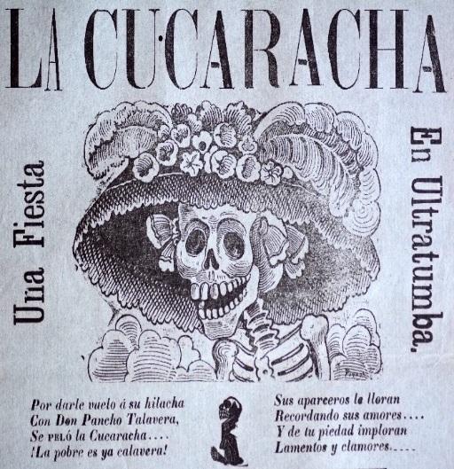
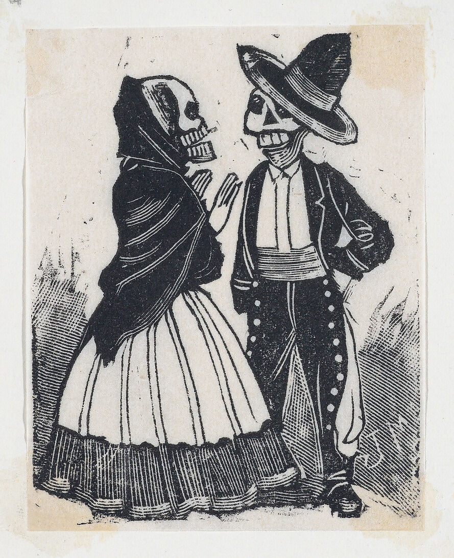
Odds are you’re acquaint­ed with the lady pic­tured above.

She’s called La Cat­ri­na, and her like­ness adorns count­less t‑shirts and tote bags.

She is a pop­u­lar Hal­loween cos­tume and a main­stay of Day of the Dead cel­e­bra­tions.

She pops up in the ani­mat­ed fam­i­ly fea­ture, Coco, to guide its young hero to the Land of the Dead. 

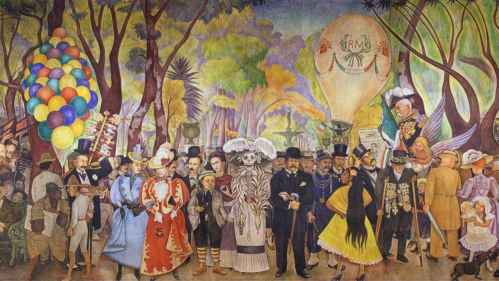
She’s spent the bet­ter part of a cen­tu­ry mak­ing cameos in numer­ous artists works, most famous­ly Diego Rivera’s sur­re­al 1947 mur­al, Sueño de una Tarde Domini­cal en la Alame­da Cen­tral, a fever dream that places her front and cen­ter, arm in arm with a dis­tin­guished-look­ing, mus­ta­chioed gent in a bowler hat.

That gent is her orig­i­nal cre­ator, José Guadalupe Posa­da, a hard­work­ing print­mak­er and polit­i­cal car­toon­ist who pro­duced over 20,000 images dur­ing his life­time, on sub­jects rang­ing from the Mex­i­can Rev­o­lu­tion and oth­er events, both cur­rent and his­tor­i­cal, to pop­u­lar enter­tain­ment and the dai­ly lives of aver­age men and women. 

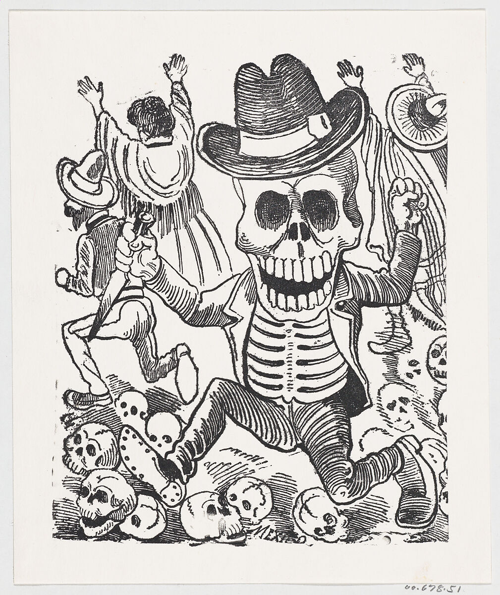
The artist fre­quent­ly ham­mered his point home by depict­ing the par­ties in his works as calav­eras - exu­ber­ant skele­tons seem­ing­ly unaware they had lost all flesh and blood. 

Posa­da was still a teenag­er in 1871 when a home­town paper picked up his first car­toons. One report­ed­ly enraged a local politi­cian to such a degree that the paper was forced to cease pub­li­ca­tion.

La Cat­ri­na was pub­lished posthu­mous­ly in 1913, as a broad­sheet illus­tra­tion accom­pa­ny­ing a satir­i­cal poem about chick­pea ven­dors. It’s believed that Posa­da intend­ed his image to be a jab at upper class Mex­i­can women obsessed with Euro­pean fash­ions.

(Rivera was the one who changed her name from La Cucaracha — the cock­roach — to the much more lyri­cal La Cat­ri­na. He also plant­ed the seed that Posa­da, who died pen­ni­less and large­ly for­got­ten, had been a rev­o­lu­tion­ary. The Mex­i­can pro­gres­sive print­mak­ing col­lec­tive El Taller Grafi­ca Pop­u­lar took graph­ic inspi­ra­tion from his calav­eras, while embrac­ing and dis­sem­i­nat­ing this myth.

What’s that they say about imi­ta­tion being the sin­cer­est form of flat­tery?

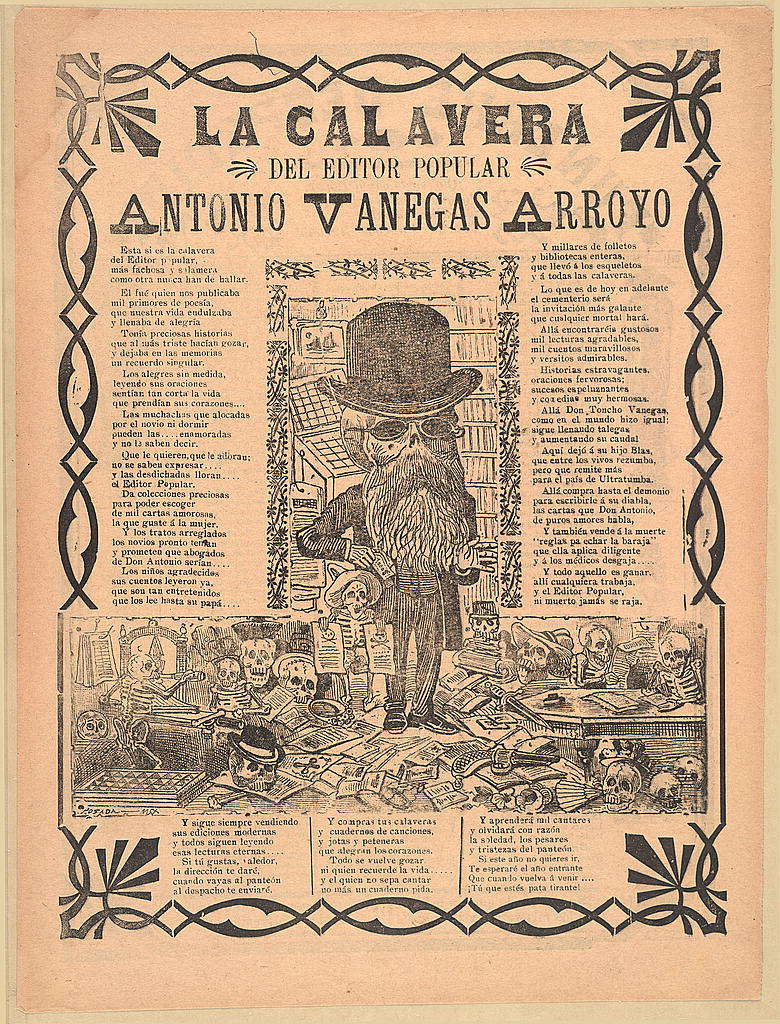
After Posada’s death, his col­leagues at the pub­lish­ing firm of Anto­nio Vane­gas Arroy­or, saved time and mon­ey by con­tin­u­ing to pro­duce work from his blocks and plates. 

As Jim Nikas, found­ing direc­tor of the Posa­da Art Foun­da­tion told Atlas Obscu­ra “If the image was neu­tral enough, you could change the text and use it as an illus­tra­tion for any sto­ry.”

Whether increas­ing pub­lic aware­ness of harm­ful agri­cul­tur­al pes­ti­cides, protest­ing Amer­i­can immi­gra­tion poli­cies, or, uh, sell­ing tequi­la, 21st cen­tu­ry artists, activists, and entre­pre­neurs con­tin­ue to har­ness Posada’s vision for their own pur­pos­es.

Nikas, who sam­pled Posada’s La Calav­era de Don Quixote for an Occu­py Wall Street col­lab­o­ra­tion with Art Hazel­wood and Mar­sha Shaw writes that “the calav­era is some­thing we all have bio­log­i­cal­ly in com­mon and, accord­ing­ly, may be used to con­vey mes­sages:

Posa­da and his pub­lish­ers used depic­tions of calav­eras not only to remind us of our col­lec­tive mor­tal­i­ty but also to shed light. His illus­tra­tions were often satir­i­cal car­i­ca­tures uproot­ed from the cur­rent polit­i­cal cli­mate and used to poke fun at our human con­di­tion. This use was evo­lu­tion­ary, occur­ring over time, and as applic­a­ble today as it was over a cen­tu­ry ago.

See more of José Guadalupe Posada’s calav­eras in the Library of Con­gress’ Prints and Pho­tographs Divi­sion col­lec­tion.

– Ayun Hal­l­i­day is the Chief Pri­ma­tol­o­gist of the East Vil­lage Inky zine and author, most recent­ly, of Cre­ative, Not Famous: The Small Pota­to Man­i­festo and Cre­ative, Not Famous Activ­i­ty Book. Fol­low her @AyunHalliday.

How the CIA Secretly Used Jackson Pollock & Other Abstract Expressionists to Fight the Cold War

What’s the dif­fer­ence between the Unit­ed States of Amer­i­ca and a cup of yogurt? If you leave the cup of yogurt alone for 200 years, it devel­ops a cul­ture. So goes one of many jokes long in cir­cu­la­tion about the sup­posed Amer­i­can ten­den­cy toward low-mind­ed, expe­di­ent philis­tin­ism. I grant, as an Amer­i­can myself, that such humor sur­rounds at least a grain of truth. But there was a time when the fed­er­al gov­ern­ment of the U.S., an orga­ni­za­tion not often accused of exces­sive high-mind­ed­ness, took an active role in pro­mot­ing the coun­try’s home-grown avant-garde — an appro­pri­ate term, notes Lucie Levine at JSTOR Dai­ly, since it “began as a French mil­i­tary term to describe van­guard troops advanc­ing into bat­tle,” and Amer­i­can mod­ern art had become a con­tin­u­a­tion of pol­i­tics by oth­er means.

“Up until World War II, Amer­i­ca had nev­er pro­duced large, influ­en­tial art move­ments like in Europe,” says the nar­ra­tor of the Con­spir­a­cy of Art video above. After the war, “some­thing unex­pect­ed hap­pened: a brood of rad­i­cal Amer­i­can painters helped make New York City the cen­ter of the art world.”

Mark Rothko, Willem de Koon­ing, and Jack­son Pol­lock: they and oth­er artists “cap­tured the world’s atten­tion with large-scale works of pure col­or and form.” This move­ment came to be known as abstract expres­sion­ism, and in the eyes of the new­ly estab­lished Cen­tral Intel­li­gence Agency, it came to show promise as pro­pa­gan­da. If shown abroad, it could func­tion as pro­pa­gan­da, high­light­ing “the dif­fer­ences between Amer­i­can and Sovi­et pol­i­tics”  — and more specif­i­cal­ly, “the appeal of Amer­i­can cul­ture over Sovi­et Cul­ture.”

“Was Jack­son Pol­lock a weapon in the Cold War?” asks the New York­er’s Louis Menand. While Pol­lock was indeed pro­mot­ed abroad with CIA mon­ey (usu­al­ly pro­vid­ed through lay­ers of orga­ni­za­tion­al mis­di­rec­tion), you don’t look at a paint­ing like Laven­der Mist and “think about ‘artis­tic free enter­prise’ or the CIA, or the cul­tur­al pol­i­tics of Par­ti­san Review. You think about how a painter could have tak­en all he had expe­ri­enced across a cre­ative thresh­old that no one had crossed before, and pro­duced this par­tic­u­lar thing.” But its “impor­tance for a cer­tain strand of Cold War cul­tur­al pol­i­tics is part of the sto­ry of how it got to us, a gen­er­a­tion or more lat­er, and that his­to­ry is worth know­ing.” It’s also worth ask­ing, should the Unit­ed States once again find itself face-to-face with a for­mi­da­ble polit­i­cal and cul­tur­al adver­sary, whether it will be pre­pared to draft a few Pol­locks back into ser­vice.

Relat­ed con­tent:

Watch “Jack­son Pol­lock 51,” a His­toric Short Film That Cap­tures Pol­lock Cre­at­ing Abstract Expres­sion­ist Art on a Sheet of Glass

How the CIA Secret­ly Fund­ed Abstract Expres­sion­ism Dur­ing the Cold War

Watch Por­trait of an Artist: Jack­son Pol­lock, the 1987 Doc­u­men­tary Nar­rat­ed by Melvyn Bragg

How the CIA Fund­ed & Sup­port­ed Lit­er­ary Mag­a­zines World­wide While Wag­ing Cul­tur­al War Against Com­mu­nism

Was Jack­son Pol­lock Over­rat­ed? Behind Every Artist There’s an Art Crit­ic, and Behind Pol­lock There Was Clement Green­berg

How the CIA Helped Shape the Cre­ative Writ­ing Scene in Amer­i­ca

Based in Seoul, Col­in Marshall writes and broad­casts on cities, lan­guage, and cul­ture. His projects include the Sub­stack newslet­ter Books on Cities, the book The State­less City: a Walk through 21st-Cen­tu­ry Los Ange­les and the video series The City in Cin­e­ma. Fol­low him on Twit­ter at @colinmarshall or on Face­book.

Behold Gustave Doré’s Illustrations for Rabelais’ Grotesque Satirical Masterpiece Gargantua and Pantagruel

When François Rabelais came up with a cou­ple of giants to put at the cen­ter of a series of inven­tive and rib­ald works of satir­i­cal fic­tion, he named one of them Gar­gan­tua. That may not sound par­tic­u­lar­ly clever today, gar­gan­tu­an being a fair­ly com­mon adjec­tive to describe any­thing quite large. But we actu­al­ly owe the word itself to Rabelais, or more specif­i­cal­ly, to the near­ly half-mil­len­ni­um-long lega­cy of the char­ac­ter into whom he breathed life. But there’s so much more to Les Cinq livres des faits et dits de Gar­gan­tua et Pan­ta­gru­el, or The Five Books of the Lives and Deeds of Gar­gan­tua and Pan­ta­gru­el, whose endur­ing sta­tus as a mas­ter­piece of the grotesque owes much to its author’s wit, lin­guis­tic vir­tu­os­i­ty, and sheer brazen­ness.

Nor has it hurt that the books have inspired vivid illus­tra­tions from a host of artists, one of whom in par­tic­u­lar stands out: Gus­tave Doré, whom Richard Smyth calls “one of the most pro­lif­ic — and most suc­cess­ful — book illus­tra­tors of the nine­teenth cen­tu­ry.”

Here at Open Cul­ture, we’ve pre­vi­ous­ly fea­tured the art he cre­at­ed to accom­pa­ny the work of Dante, Cer­vantes, and Poe, each a writer pos­sessed of a high­ly dis­tinc­tive set of lit­er­ary pow­ers, and each of whom thus received a dif­fer­ent but equal­ly lav­ish and evoca­tive treat­ment from Doré.

For Rabelais, says the site of book deal­er Herib­ert Ten­schert, the 22-year-old artist pro­duced (in 1854) “100 images that oscil­late between the whim­si­cal and the uncan­ny, between real­ism and fan­ta­sy,” a count he would expand to 700 in anoth­er edi­tion two decades lat­er.

You can see a great many of Doré’s illus­tra­tions for Gar­gan­tua and Pan­ta­gru­el at Wiki­me­dia Com­mons. The simul­ta­ne­ous extrav­a­gance and repug­nance of the series’ medieval France may seem impos­si­bly dis­tant to us, but it can hard­ly have felt like yes­ter­day to Doré either, giv­en that he was work­ing three cen­turies after Rabelais.

As sug­gest­ed by Herib­ert Ten­schert, per­haps these imag­i­na­tive visions of the Mid­dle Ages — like Balza­c’s Rabelaisian Les con­tes dro­la­tiques, which he also illus­trat­ed — “res­onat­ed with Doré because they remind­ed him of the mys­te­ri­ous atmos­phere of his child­hood, which he had spent in the mid­dle of the medieval city of Stras­bourg.” What­ev­er his con­nec­tion, Doré cre­at­ed images that still bring to mind a whole range of descrip­tors: somber­ly joc­u­lar, rig­or­ous­ly volup­tuous, com­pelling­ly repel­lent, and above all pan­ta­gru­elist. (Look it up.)

Relat­ed Con­tent:

Gus­tave Doré’s Exquis­ite Engrav­ings of Cer­vantes’ Don Quixote

The Adven­tures of Famed Illus­tra­tor Gus­tave Doré Pre­sent­ed in a Fantasic(al) Cutout Ani­ma­tion

Gus­tave Doré’s Dra­mat­ic Illus­tra­tions of Dante’s Divine Com­e­dy

The Dro­lat­ic Dreams of Pan­ta­gru­el: 120 Wood­cuts Envi­sion the Grotesque Inhab­i­tants of Rabelais’ World (1565)

Based in Seoul, Col­in Marshall writes and broad­casts on cities, lan­guage, and cul­ture. His projects include the Sub­stack newslet­ter Books on Cities, the book The State­less City: a Walk through 21st-Cen­tu­ry Los Ange­les and the video series The City in Cin­e­ma. Fol­low him on Twit­ter at @colinmarshall or on Face­book.

Download 222 Belle Époque Art Posters: An Online Archive of Masterpieces from the “Golden Age of the Poster” (1880–1918)

Europe at the end of the nine­teenth cen­tu­ry and begin­ning of the twen­ti­eth: what a time and place to be alive. Or rather, what a time and place to be alive for peo­ple in the right coun­tries and, more impor­tant­ly, of the right class­es, those who saw a new world tak­ing shape around them and par­took of it with all pos­si­ble hearti­ness. The peri­od between the end of the Fran­co-Pruss­ian War in 1871 and the out­break of World War I in 1914, best known by its French name La Belle Époque, saw not just peace in Europe and empires at their zenith, but all man­ner of tech­no­log­i­cal, social, and cul­tur­al inno­va­tions at home as well.

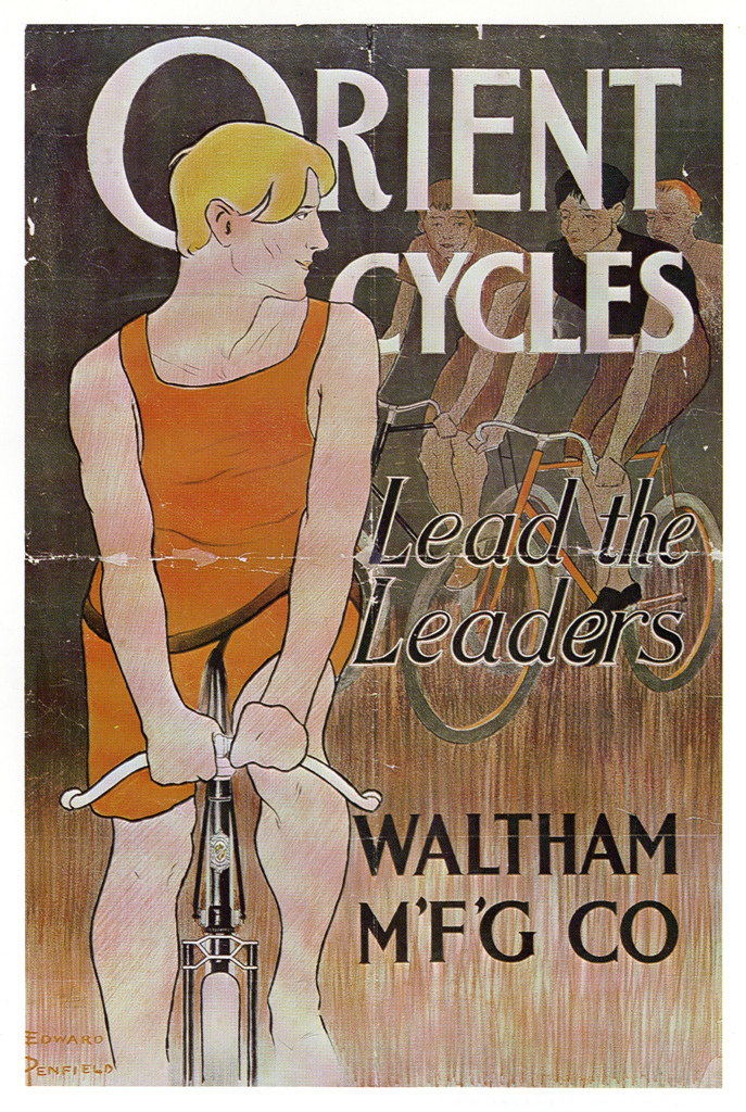
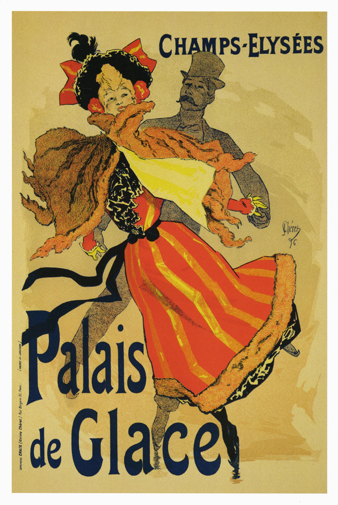
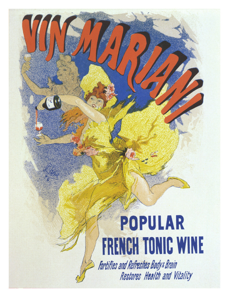
We here in the 21st cen­tu­ry have few ways of tast­ing the life of that time as rich as its posters, more than 200 of which you can view in high res­o­lu­tion and down­load from the “Art of the Poster 1880–1918,” a Flickr col­lec­tion assem­bled by the Min­neapo­lis Col­lege of Art and Design.

“In the late nine­teenth cen­tu­ry, lith­o­g­ra­phers began to use mass-pro­duced zinc plates rather than stones in their print­ing process,” says the accom­pa­ny­ing text. “This inno­va­tion allowed them to pre­pare mul­ti­ple plates, each with a dif­fer­ent col­or ink, and to print these with close reg­is­tra­tion on the same sheet of paper. Posters in a range of col­ors and vari­ety of sizes could now be pro­duced quick­ly, at mod­est cost.”

Like oth­er of the most fruit­ful tech­no­log­i­cal advance­ments of the era, this leap for­ward in poster-print­ing drew the atten­tion, and soon the efforts, of artists: well-regard­ed illus­tra­tors and graph­ic design­ers like Alphonse Mucha, Jules Chéret, Eugène Gras­set, and Hen­ri de Toulouse-Lautrec took to the new method, and “The ‘Gold­en Age of the Poster’ was the spec­tac­u­lar result.”

While many of the best-remem­bered posters of that Gold­en Age come from France, it touched the streets of every major city in west­ern Europe as well as those of Eng­land and Amer­i­ca, all places whose well-heeled pop­u­la­tions found them­selves new­ly and avid­ly inter­est­ed in art, pho­tog­ra­phy, motion pic­tures, mag­a­zines, bicy­cles, auto­mo­biles, absinthe, cof­fee, cig­a­rettes, and world trav­el.

The com­pa­nies behind all those excit­ing things had, of course, to adver­tise, but unlike in ear­li­er times, they could­n’t set­tle for get­ting the word out; they had to use images, and the most vivid ones pos­si­ble at that. They had to use them in such a way as to asso­ciate what they had to offer with the abun­dant spir­it of the time, whether they called that time La Belle Époque, the Wil­helmine peri­od, the late Vic­to­ri­an and Edwar­dian era, or the Gild­ed Age.

All those names, of course, were applied only in ret­ro­spect, after it became clear how bad times could get in the twen­ti­eth cen­tu­ry. But then, none of us ever real­ize we’re liv­ing through a gold­en age before it comes to its inevitable end; until that time, best just to enjoy it. You can enter the poster archive here.

Note: An ear­li­er ver­sion of this post appeared on our site in 2017.

Relat­ed Con­tent:

Watch Scenes from Belle Époque Paris Vivid­ly Restored with Arti­fi­cial Intel­li­gence (Cir­ca 1890)

Down­load 2,000 Mag­nif­i­cent Turn-of-the-Cen­tu­ry Art Posters, Cour­tesy of the New York Pub­lic Library

René Magritte’s Ear­ly Art Deco Adver­tis­ing Posters, 1924–1927

An Intro­duc­tion to René Magritte, and How the Bel­gian Artist Used an Ordi­nary Style to Cre­ate Extra­or­di­nar­i­ly Sur­re­al Paint­ings

Beau­ti­ful, Col­or Pho­tographs of Paris Tak­en 100 Years Ago—at the Begin­ning of World War I & the End of La Belle Époque

by | Permalink | Make a Comment ( 1 ) |

« Go BackMore in this category... »
Quantcast
Open Culture was founded by Dan Colman.