Buckminster Fuller’s Collaboration with The North Face Culminates with a New Geodesic Dome Tent, the Geodome 4

Most any­one who reg­u­lar­ly spends time in nature knows the name The North Face. For fifty years now, the com­pa­ny has fur­nished out­doors­men and out­door­swomen with not just appar­el but much else of the equal­ly rugged gear they might con­ceiv­ably need to go hik­ing, camp­ing, or per­ma­nent­ly off the grid. Some of their prod­uct designs have remained basi­cal­ly the same through the decades, while oth­ers have changed dra­mat­i­cal­ly. Even ear­ly in the com­pa­ny’s life it knew that a bet­ter tent, for instance, would get the out­doorsy world beat­ing a path to its door: hence its engage­ment of no less a design thinker than R. Buck­min­ster Fuller.

Bruce Hamil­ton, who worked for the com­pa­ny from 1970 to 1989, recent­ly wrote a few posts (part one, part two, part three) telling the sto­ry of the North Face/Buckminster Fuller con­nec­tion. It began in his first year on the job, when the com­pa­ny’s own­er Hap Klopp asked a friend whose fam­i­ly had con­nec­tions to Fuller to send the already world-famous archi­tect-sys­tems the­o­rist-inven­tor a let­ter. Describ­ing The North Face as “a small com­pa­ny that pro­duces what I believe to be the finest equip­ment present­ly avail­able,” the friend asked Fuller for ideas on how to improve the “archa­ic designs” then used to con­struct tents. “I have thought a great deal in the past about your sub­ject of the com­pact, light­weight, back-pack­able envi­ron­ment con­trol­ling device,” Fuller replied. “I am accept­ing your chal­lenge.”

Hamil­ton, a fan of Fuller’s work, had already been think­ing about how to use the prin­ci­ples of the light but stur­dy tri­an­gle-and-dome-based “tenseg­ri­ty struc­tures” Fuller so often wrote and (as in the clip above) talked about. One day Hamil­ton showed Klopp a mod­el of a Ful­ler­ian geo­des­ic sphere, and “it was at that moment that he con­nect­ed me with Bucky and with his dri­ve to bring a new tent to life.” The result, the Oval Inten­tion tent, first appeared in The North Face’s Fall 1975 cat­a­log, accom­pa­nied by a pho­to of Hamil­ton relax­ing inside one and a typ­i­cal­ly sweep­ing quote from Fuller him­self: “It is no aes­thet­ic acci­dent that nature encased our brains and regen­er­a­tive organs in com­pound­ly curvi­lin­ear struc­tures. There are no cubi­cal heads, eggs, nuts, or plan­ets.”

The North Face kept incor­po­rat­ing Fuller’s ideas into their tents, and they ham­mered out the terms of  direct col­lab­o­ra­tion on a new mod­el in 1983, a month before Fuller died. Judg­ments about oth­er tenseg­ri­ty struc­tures — geo­des­ic dome homes, for exam­ple — have var­ied over the years, but the Oval Inten­tion lives on in the form of the new Geodome 4. “Thanks to the most spa­tial­ly effi­cient shape in archi­tec­ture, it can with­stand winds of up to 60 mph as the force is spread even­ly across the struc­ture whilst even pro­vid­ing enough height for a six-foot per­son to stand com­fort­ably inside,” writes Arch­dai­ly’s Ella Thorns. “The extreme­ly effi­cient design has allowed the tent to weigh not much more than 11kg and com­prise of 5 main poles and the equa­tor for fast and easy assem­bly and stor­age.”

If this already has you excit­ed about your improved prospects for more geo­met­ri­cal­ly and struc­tural­ly effi­cient camp­ing on the sur­face of our Space­ship Earth, do be warned: at the moment The North Face has only made the Geodome 4 avail­able in Japan (see its Japan­ese page here), and with a price tag equiv­a­lent to $1,635 at that. Even so, one hopes that Bucky — as Hamil­ton and many of the oth­ers who knew him called him — looks on with pride from whichev­er space­ship he now finds him­self aboard.

via Arch Dai­ly

Relat­ed Con­tent:

The Life & Times of Buck­min­ster Fuller’s Geo­des­ic Dome: A Doc­u­men­tary

Watch an Ani­mat­ed Buck­min­ster Fuller Tell Studs Terkel All About “the Geo­des­ic Life”

Bet­ter Liv­ing Through Buck­min­ster Fuller’s Utopi­an Designs: Revis­it the Dymax­ion Car, House, and Map

Design­er Cre­ates Origa­mi Card­board Tents to Shel­ter the Home­less from the Win­ter Cold

Based in Seoul, Col­in Mar­shall writes and broad­casts on cities and cul­ture. His projects include the book The State­less City: a Walk through 21st-Cen­tu­ry Los Ange­les and the video series The City in Cin­e­ma. Fol­low him on Twit­ter at @colinmarshall or on Face­book.

Time Lapse Video Captures Light Illuminating the Stained Glass Windows of Washington National Cathedral

Col­in Win­ter­bot­tom spe­cial­izes in tak­ing pho­tographs that offer a fresh per­spec­tive on Amer­i­ca’s cap­i­tal, Wash­ing­ton DC. As his web site tells us, his pho­tos seek to express “not just what a place looks like, but how it feels to be there.” A point that also comes across in a video he shot sev­er­al years ago.

He intro­duces the video above, enti­tled “Stained glass time lapse, Wash­ing­ton Nation­al Cathe­dral,” with these back­ground words:

I am pri­mar­i­ly a black and white archi­tec­tur­al still pho­tog­ra­ph­er, but while doc­u­ment­ing post-earth­quake repairs at Wash­ing­ton Nation­al Cathe­dral I was impressed by the dra­ma of the vibrant col­ors the win­dows “paint­ed” on stone and scaf­fold. With just weeks before a relat­ed exhi­bi­tion was to open I began mount­ing cam­eras to scaf­fold to take advan­tage of rare van­tage points. The open­ing and clos­ing view, for exam­ple — with Rowan LeCompte’s remark­able west rose win­dow at eye-lev­el and cen­tered straight ahead with­in the nave — can­not be recre­at­ed now that scaf­fold is down.

The pho­tographs in the exhi­bi­tion “Scal­ing Wash­ing­ton” (which was at the Nation­al Build­ing Muse­um in 2015) often played off the unex­pect­ed har­mo­ny between the Cathe­dral archi­tec­ture and scaf­fold, both hav­ing engag­ing rhyth­mic struc­tur­al rep­e­ti­tions. Thus the inclu­sion of won­der­ful­ly paint­ed scaf­fold here­in. For the pur­pose of the exhi­bi­tion (which had much oth­er con­tent) the video was left silent and had remained so for sev­er­al years until com­pos­er Danyal Dhondy recent­ly offered to write an orig­i­nal score for it. It fits so well and com­ple­ments the rhythms of the orig­i­nal edit so per­fect­ly. Now the piece has new dimen­sion and life out­side the orig­i­nal exhi­bi­tion.

It’s good to know there’s still some beau­ty and tran­quil­i­ty some­where in Wash­ing­ton. Do enjoy.

via Aeon

Relat­ed Con­tent:

A Dig­i­tal Recon­struc­tion of Wash­ing­ton D.C. in 1814

5,000+ Pho­tographs by Minor White, One of the 20th Century’s Most Impor­tant Pho­tog­ra­phers, Now Dig­i­tized and Avail­able Online

Enroll in Harvard’s Free Online Archi­tec­ture Course: An Intro­duc­tion to the His­to­ry & The­o­ry of Archi­tec­ture

Enroll in Harvard’s Free Online Architecture Course: An Introduction to the History & Theory of Architecture

So, you want to be an archi­tect. Where to begin? It seems like a very big aspi­ra­tion. One the­o­rist argues that mod­ernist archi­tec­ture has been “char­ac­ter­ized by a thau­matur­gic… ambi­tion which would heal the ‘dis­eases’ of indi­vid­u­als and soci­ety.” As any­one who’s spent much time in a hous­ing project, face­less office park, or strip mall might attest, more recent approach­es can also have “the pow­er of hurt­ing.”

If you’re intent on wield­ing the pow­er of archi­tec­ture for good, you’ll need many years of study and appren­tice­ship. But whether you’re just get­ting your feet wet or have already wad­ed into the field, you’ll like­ly gain quite a lot of under­stand­ing from “The Archi­tec­tur­al Imag­i­na­tion,” a free online course from Har­vard’s Grad­u­ate School of Design, in which you will “learn how to ‘read’ archi­tec­ture as a cul­tur­al expres­sion as well as a tech­ni­cal achieve­ment.” The course, which begins on Feb­ru­ary 28th, is free, but for $99 stu­dents can also receive a cer­tifi­cate of com­ple­tion.

“Archi­tec­ture is one of the most com­plex­ly nego­ti­at­ed and glob­al­ly rec­og­nized cul­tur­al prac­tices,” notes the course intro­duc­tion. Build­ing design “involves all of the tech­ni­cal, aes­thet­ic, polit­i­cal, and eco­nom­ic issues at play with­in a giv­en soci­ety.” In addi­tion to cre­at­ing sin­gle-fam­i­ly dwellings, archi­tects are tasked with design­ing har­mo­nious spaces through which thou­sands of peo­ple might move on a dai­ly basis.

Suc­cess­ful design requires more than an under­stand­ing of the nec­es­sary rela­tion­ships between form and func­tion. “In some ways,” the course trail­er video above tells us, “it’s just what exceeds neces­si­ty that is archi­tec­ture. And it’s the open­ing onto that excess that makes archi­tec­ture a fun­da­men­tal­ly human endeav­or.”

Heal­ing soci­ety? Grasp­ing the big issues in arts, pol­i­tics, and engi­neer­ing? Design­ing for the “fun­da­men­tal­ly human”? These are deep briefs indeed. A more light­heart­ed approach to the field—the tongue-in-cheek “I Am an Archi­tect” rap above—suggests a cou­ple sim­pler pre­req­ui­sites for the aspir­ing archi­tect: a life­long pas­sion for mak­ing things (with blocks, Legos, Jen­ga, etc.), and, of course, a pair of black plas­tic glass­es. If you can relate, sign up for Harvard’s “The Archi­tec­tur­al Imag­i­na­tion” and find many more edX Archi­tec­ture cours­es here.

via Arch Dai­ly

Relat­ed Con­tent:

Roman Archi­tec­ture: A Free Course from Yale 

Archi­tec­ture Stu­dio: Build­ing in Land­scapes (A Free Course from MIT) 

A is for Archi­tec­ture: 1960 Doc­u­men­tary on Why We Build, from the Ancient Greeks to Mod­ern Times 

Josh Jones is a writer and musi­cian based in Durham, NC. Fol­low him at @jdmagness

How to Write Like an Architect: Short Primers on Writing with the Neat, Clean Lines of a Designer

We have anoth­er nation­al cri­sis on our hands.

Our chil­dren are not only ill-equipped to read maps and tell time with ana­log clocks, their hand­writ­ing is in seri­ous decline.

For­get cur­sive, which went the way of the dodo ear­li­er in the mil­len­ni­um. Young­sters who are dab hands on the key­board may have lit­tle impulse—or opportunity—to prac­tice their print­ing.

Does it mat­ter?

It sure as shootin’ might be dur­ing a zom­bie inva­sion, giv­en the atten­dant break­down of dig­i­tal com­mu­ni­ca­tion and the elec­tric­i­ty that pow­ered it.

But even in less dire times, leg­i­ble pen­man­ship is a good skill to mas­ter.

As Vir­ginia Berninger, pro­fes­sor emer­i­tus and prin­ci­pal inves­ti­ga­tor of the Uni­ver­si­ty of Washington’s Inter­dis­ci­pli­nary Learn­ing Dis­abil­i­ties Cen­ter, told The New York Times, “Hand­writ­ing — form­ing let­ters — engages the mind, and that can help chil­dren pay atten­tion to writ­ten lan­guage.”

Hand let­ter­ing is also a com­plex neu­ro­log­i­cal process, a work­out involv­ing var­i­ous cog­ni­tive, motor, and neu­ro­mus­cu­lar func­tions.

There’s also a school of thought that teach­ers who still accept hand­writ­ten assign­ments uncon­scious­ly award the high­est grades to pupils with the neat­est pen­man­ship, which is eas­i­er on tired eyes. Some­thing to keep in mind for those gear­ing up to take the hand­writ­ten essay por­tions of the SAT and ACT.

Let’s remem­ber that let­ters are real­ly just shapes.

The Finns and French have long-estab­lished uni­for­mi­ty with regard to hand­writ­ing. In the absence of class­room instruc­tion, Amer­i­cans have the free­dom to peruse var­i­ous pen­man­ship styles, iden­ti­fy their favorite, and work hard to attain it.

(This writer is proof that pen­man­ship can become part of the DNA through prac­tice, hav­ing set out to dupli­cate my mother’s delight­ful, eccen­tric-to-the-point-of-illeg­i­bile hand at around the age of 8. I added a few per­son­al quirks along the way. The result is I’m fre­quent­ly bam­boo­zled into serv­ing as scribe for what­ev­er group I hap­pen to find myself in, and my chil­dren can claim they could­n’t read the impor­tant hand­writ­ten instruc­tions hur­ried­ly left for them on Post-Its.)

His­tor­i­cal­ly, the most leg­i­ble Amer­i­can pen­man­ship belongs to archi­tects.

Their pre­cise­ly ren­dered all caps sug­gest metic­u­lous­ness, account­abil­i­ty, steadi­ness of char­ac­ter…

And almost any­one can achieve it, regard­less of whether those are qual­i­ties they per­son­al­ly pos­sess.

All it takes is deter­mi­na­tion, time, and—as taught by Doug Patt in his How to Archi­tect series, above—more tools than can be simul­ta­ne­ous­ly oper­at­ed with two hands:

an Ames let­ter­ing guide

a par­al­lel rule or t‑square

a small plas­tic tri­an­gle cus­tomized with bits of tape

a .5mm Pen­tel draft­ing pen­cil

If this sounds need­less­ly labo­ri­ous, keep in mind that such spe­cial­ty equip­ment may appeal to reluc­tant hand writ­ers with an inter­est in engi­neer­ing, robot­ics, or sci­en­tif­ic exper­i­men­ta­tion.

(Be pre­pared for some frus­tra­tion if this is the student’s first time at the rodeo with these instru­ments. As any vet­er­an com­ic book artist can attest, few are born know­ing how to use an Ames let­ter­ing guide.)

It should be not­ed that Patt’s alpha­bet devi­ates a bit from tra­di­tion­al stan­dards in the field.

His pref­er­ence for breath­ing some life into his let­ters by not clos­ing their loops, squash­ing tra­di­tion­al­ly cir­cu­lar forms into ellipses, and using “dynam­ic angles” to ren­der cross­pieces on a slant would like­ly not have passed muster with archi­tec­ture pro­fes­sors of an ear­li­er age, my sec­ond grade teacher, or the font design­ers respon­si­ble for the com­put­er-gen­er­at­ed “hand let­ter­ing” grac­ing the bulk of recent archi­tec­tur­al ren­der­ings.

He’s like­ly the only expert sug­gest­ing you make your Ks and Rs rem­i­nis­cent of actor Ralph Mac­chio in the 1984 film, The Karate Kid.

There’s lit­tle chance you’ll find your­self groov­ing to Patt’s videos for any­thing oth­er than their intend­ed pur­pose. Where­as the late Bob Ross’ Joy of Paint­ing series has legions of fans who tune in sole­ly for the med­i­ta­tive ben­e­fits they derive from his mel­low demeanor, Patt’s rapid fire instruc­tion­al style is that of the busy mas­ter, deft­ly exe­cut­ing moves the fledg­ling stu­dent can only but fum­ble through.

But if the Karate Kid taught us any­thing, it’s that prac­tice and grit lead to excel­lence. If the above demon­stra­tion whips by too quick­ly, Patt expands on the shap­ing of each let­ter in 30-sec­ond video tuto­ri­als avail­able as part of a $19 online course.

Those look­ing for archi­tec­tur­al low­er case, or tech­niques for con­trol­ling the thick­ness of their lines can find them in the episode devot­ed to let­ter­ing with a .7mm Pen­tel mechan­i­cal draft­ing pen­cil.

Explore fur­ther secrets of the archi­tects on Patt’s How to Archi­tect chan­nel or 2012 book, also called How to Archi­tect.

Relat­ed Con­tent:

The Art of Hand­writ­ing as Prac­ticed by Famous Artists: Geor­gia O’Keeffe, Jack­son Pol­lock, Mar­cel Duchamp, Willem de Koon­ing & More

Dis­cov­er What Shakespeare’s Hand­writ­ing Looked Like, and How It Solved a Mys­tery of Author­ship

Helen Keller Had Impec­ca­ble Hand­writ­ing: See a Col­lec­tion of Her Child­hood Let­ters

Ayun Hal­l­i­day is an author, illus­tra­tor, the­ater mak­er and Chief Pri­ma­tol­o­gist of the East Vil­lage Inky zine.  Fol­low her @AyunHalliday.

Hear the Hagia Sophia’s Awe-Inspiring Acoustics Get Recreated with Computer Simulations, and Let Yourself Get Transported Back to the Middle Ages

The tech­nol­o­gy used to pro­duce, record, and process music has become ever more sophis­ti­cat­ed and awe-inspir­ing, espe­cial­ly in the capa­bil­i­ty of soft­ware to emu­late real instru­ments and acoustic envi­ron­ments. Dig­i­tal emu­la­tion, or “mod­el­ing,” as it’s called, doesn’t sim­ply mim­ic the sounds of gui­tar ampli­fiers, pianos, or syn­the­siz­ers. At its best, it repro­duces the feel of an aur­al expe­ri­ence, its tex­tures and son­ic dimen­sions, while also adding a seem­ing­ly infi­nite degree of flex­i­bil­i­ty.

When it comes to a tech­nol­o­gy called “con­vo­lu­tion reverb,” we can vir­tu­al­ly feel the air pres­sure of sound in a phys­i­cal space, such that “lis­ten­ing in may be viewed as much as a spa­tial expe­ri­ence as it is a tem­po­ral one.” So notes Stanford’s Icons of Sound, a col­lab­o­ra­tion between the University’s Cen­ter for Com­put­er Research in Music and Acoustics (CCRMA) and the Depart­ment of Art & Art His­to­ry. The researchers in this joint project have com­bined resources to cre­ate a per­for­mance of Byzan­tine chant from the 6th cen­tu­ry CE, sim­u­lat­ed to sound like it takes place inside a prime acoustic envi­ron­ment designed for this very music, the Hagia Sophia in Istan­bul.

Built by the emper­or Jus­tin­ian between 532 and 537, when the city was Con­stan­tino­ple, the mas­sive church (lat­er mosque and now state-run muse­um) “has an extra­or­di­nar­i­ly large nave spread­ing over 70 meters in length; it is sur­round­ed by colon­nad­ed aisles and gal­leries. Mar­ble cov­ers the floor and walls.” Its cen­ter is “crowned by a dome glit­ter­ing in gold mosaics and ris­ing 56 meters above the ground.” The effect of the build­ing’s heavy, reflec­tive sur­faces and its archi­tec­tur­al enor­mi­ty “chal­lenges our con­tem­po­rary expec­ta­tion of the intel­li­gi­bil­i­ty of lan­guage.”

We are accus­tomed to hear the spo­ken or sung word clear­ly in dry, non-rever­ber­ant spaces in order to decode the encod­ed mes­sage. By con­trast, the wet acoustics of Hagia Sophia blur the intel­li­gi­bil­i­ty of the mes­sage, mak­ing words sound like ema­na­tion, emerg­ing from the depth of the sea. 

The Icons of Sound team has recon­struct­ed the under­wa­ter acoustics of the Hagia Sophia using con­vo­lu­tion reverb tech­niques and what are called “impulse responses”—recordings of the rever­ber­a­tions in par­tic­u­lar spaces, which are then loaded into soft­ware to dig­i­tal­ly sim­u­late the same psy­choa­coustics, a process known as “aural­iza­tion.” CCRMA describes an impulse response as an “imprint of the space,” which is then applied to sounds record­ed in oth­er envi­ron­ments. Typ­i­cal­ly, the process is used in stu­dio music pro­duc­tion, but Icons of Sound brought it to live per­for­mance at Stanford’s Bing Con­cert Hall last year, and made the group Cap­pel­la Romana sound like their voic­es had trans­port­ed from the Holy Roman Empire.

“To recre­ate the unique sound,” writes Kat Eschn­er at Smith­son­ian, “per­form­ers sang while lis­ten­ing to the sim­u­lat­ed acoustics of Hagia Sophia through ear­phones. Their singing was then put through the same acoustic sim­u­la­tor and played dur­ing the live per­for­mance through speak­ers in the con­cert hall.” As you can hear in these clips, the result is immer­sive and pro­found. One can only imag­ine what it must have been like live. To com­plete the effect, the pro­duc­tion used “atmos­pher­ic rein­force­ment,” notes Stan­ford Live, “via pro­ject­ed images and light­ing.” The audi­ence was “immersed in an envi­ron­ment where the unique inter­play of music, light, art, and sacred text has the poten­tial to induce a qua­si-mys­ti­cal state of rev­e­la­tion and won­der.”

The only sounds the researchers were able to record in the actu­al space of the ancient church were four pop­ping bal­loons. By lay­er­ing the rever­ber­a­tions cap­tured in these record­ings, and com­pen­sat­ing for the dif­fer­ent decay times inside the Bing, they were able to approx­i­mate the acoustic prop­er­ties of the build­ing. You can hear sev­er­al more audio sam­ples record­ed in dif­fer­ent places at this site. In the video above, asso­ciate pro­fes­sor of medieval art Bis­sera Pentche­va explains how and why the Hagia Sophia shapes sound and light the way it does. While purists might pre­fer to see a per­for­mance in the actu­al space, one must admit, the abil­i­ty to vir­tu­al­ly deliv­er a ver­sion of it to poten­tial­ly any con­cert hall in the world is pret­ty cool.

via The Smith­son­ian

Relat­ed Con­tent:

David Byrne: How Archi­tec­ture Helped Music Evolve

The Same Song Sung in 15 Places: A Won­der­ful Case Study of How Land­scape & Archi­tec­ture Shape the Sounds of Music

What Did Ancient Greek Music Sound Like?: Lis­ten to a Recon­struc­tion That’s ‘100% Accu­rate’

Josh Jones is a writer and musi­cian based in Durham, NC. Fol­low him at @jdmagness.

An Espresso Maker Made in Le Corbusier’s Brutalist Architectural Style: Raw Concrete on the Outside, High-End Parts on the Inside

From the 1950s through the 1970s, Bru­tal­ist archi­tec­ture flour­ished in North Amer­i­ca and Europe (both West and East) and many coun­tries beyond. Made out of raw con­crete, Bru­tal­ist buildings–usually munic­i­pal build­ings, cam­pus­es, and hous­ing projects–have an almost unfin­ished look to them. The first and most famous exam­ple of this archi­tec­tur­al style is the Unité d’habi­ta­tion, the hous­ing com­plex built by Le Cor­busier in Mar­seille between 1947 and 1952.

Though Bru­tal­ism has since fall­en out of fash­ion, it might be poised for a come­back, espe­cial­ly if this new espres­so machine is any indi­ca­tion. After a suc­cess­ful Kick­starter cam­paign this sum­mer (rais­ing $145k), the Nor­we­gian-Cal­i­forn­ian design firm Mon­taag Prod­ucts is putting the fin­ish­ing touch­es on a bru­tal­ist espres­so mak­er.

They want­ed to design a machine made out of “com­plete­ly hon­est mate­ri­als.” Hence the raw con­crete. Inside the espres­so mak­er, how­ev­er, they’ve used mate­ri­als typ­i­cal­ly found inside $1300 Ital­ian machines, accord­ing to Food & Wine. You can pre-order the machine at Indiegogo for $799. It should be ready in March (or there­abouts).

If you would like to sign up for Open Culture’s free email newslet­ter, please find it here. Or fol­low our posts on Threads, Face­book, BlueSky or Mastodon.

If you would like to sup­port the mis­sion of Open Cul­ture, con­sid­er mak­ing a dona­tion to our site. It’s hard to rely 100% on ads, and your con­tri­bu­tions will help us con­tin­ue pro­vid­ing the best free cul­tur­al and edu­ca­tion­al mate­ri­als to learn­ers every­where. You can con­tribute through Pay­Pal, Patre­on, and Ven­mo (@openculture). Thanks!

Relat­ed Con­tent:

Wake Up & Smell the Cof­fee: The New All-in-One Cof­fee-Mak­er/Alarm Clock is Final­ly Here!

Cof­fee Entre­pre­neur Rena­to Bialet­ti Gets Buried in the Espres­so Mak­er He Made Famous

Life and Death of an Espres­so Shot: Choose Your Sound­track

Physics & Caf­feine: Stop Motion Film Uses a Cup of Cof­fee to Explain Key Con­cepts in Physics

by | Permalink | Make a Comment ( 1 ) |

China’s New Luminous White Library: A Striking Visual Introduction

MVRDV, a Dutch archi­tec­ture and urban design firm, teamed up with Chi­nese archi­tects to cre­ate the Tian­jin Bin­hai Library, a mas­sive cul­tur­al cen­ter fea­tur­ing “a lumi­nous spher­i­cal audi­to­ri­um around which floor-to-ceil­ing book­cas­es cas­cade.” Locat­ed not far from Bei­jing, the library was built quick­ly by any stan­dards. It took only three years to move from “the first sketch to the [grand] open­ing” on Octo­ber 1. Elab­o­rat­ing on the library, which can house 1.2 mil­lion books, MVRDV notes:

The building’s mass extrudes upwards from the site and is ‘punc­tured’ by a spher­i­cal audi­to­ri­um in the cen­tre. Book­shelves are arrayed on either side of the sphere and act as every­thing from stairs to seat­ing, even con­tin­u­ing along the ceil­ing to cre­ate an illu­mi­nat­ed topog­ra­phy. These con­tours also con­tin­ue along the two full glass facades that con­nect the library to the park out­side and the pub­lic cor­ri­dor inside, serv­ing as lou­vres to pro­tect the inte­ri­or against exces­sive sun­light whilst also cre­at­ing a bright and even­ly lit inte­ri­or.

The video above gives you a visu­al intro­duc­tion to the build­ing. And, on the MRDV web­site, you can view a gallery of pho­tos that let you see the library’s shape­ly design.

If you would like to sign up for Open Culture’s free email newslet­ter, please find it here. Or fol­low our posts on Threads, Face­book, BlueSky or Mastodon.

If you would like to sup­port the mis­sion of Open Cul­ture, con­sid­er mak­ing a dona­tion to our site. It’s hard to rely 100% on ads, and your con­tri­bu­tions will help us con­tin­ue pro­vid­ing the best free cul­tur­al and edu­ca­tion­al mate­ri­als to learn­ers every­where. You can con­tribute through Pay­Pal, Patre­on, and Ven­mo (@openculture). Thanks!

Relat­ed Con­tent:

Watch 50+ Doc­u­men­taries on Famous Archi­tects & Build­ings: Bauhaus, Le Cor­busier, Hadid & Many More

A is for Archi­tec­ture: 1960 Doc­u­men­tary on Why We Build, from the Ancient Greeks to Mod­ern Times

A Vir­tu­al Tour of Japan’s Inflat­able Con­cert Hall

by | Permalink | Make a Comment ( 3 ) |

New Digital Archive Puts Online 4,000 Historic Images of Rome: The Eternal City from the 16th to 20th Centuries

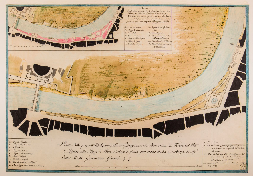
The poet Tibul­lus first described Rome as “The Eter­nal City” in the first cen­tu­ry BC, and that evoca­tive nick­name has stuck over the thou­sands of years since. Or rather, he would have called it “Urbs Aeter­na,” which for Ital­ian-speak­ers would have been “La Cit­tà Eter­na,” but regard­less of which lan­guage you pre­fer it in, it throws down a daunt­ing chal­lenge before any his­to­ri­an of Rome. Each schol­ar has had to find their own way of approach­ing such a his­tor­i­cal­ly for­mi­da­ble place, and few have built up such a robust visu­al record as Rodol­fo Lan­ciani, 4000 items from whose col­lec­tion became avail­able to view online this year, thanks to Stan­ford Libraries.

As an “archae­ol­o­gist, pro­fes­sor of topog­ra­phy, and sec­re­tary of the Archae­o­log­i­cal Com­mis­sion,” says the col­lec­tion’s about page, Lan­ciani, “was a pio­neer in the sys­tem­at­ic, mod­ern study of the city of Rome.”

Hav­ing lived from 1845 to 1929 with a long and fruit­ful career to match, he “col­lect­ed a vast archive of his own notes and man­u­scripts, as well as works by oth­ers includ­ing rare prints and orig­i­nal draw­ings by artists and archi­tects stretch­ing back to the six­teenth cen­tu­ry.” After he died, his whole library found a buy­er in the Isti­tu­to Nazionale di Arche­olo­gia e Sto­ria dell’Arte (INASA), which made it avail­able to researchers at the 15th-cen­tu­ry Palaz­zo Venezia in Rome.

Enter a team of pro­fes­sors, archae­ol­o­gists, and tech­nol­o­gists from Stan­ford and else­where, who with a grant from the Samuel H. Kress Foun­da­tion, and in part­ner­ship with Italy’s Min­istry of Cul­tur­al Her­itage and Activ­i­ties and Tourism and the Nation­al Insti­tute, began dig­i­tiz­ing it all. Their efforts have so far yield­ed an exhi­bi­tion of about 4,000 of Lan­cian­i’s draw­ings, prints, pho­tographs and sketch­es of Rome from the 16th cen­tu­ry to the 20th. Not only can you exam­ine them in high-res­o­lu­tion in your brows­er as well as down­load them, you can also see the loca­tions of what they depict pin­point­ed on the map of Rome. That fea­ture might come in espe­cial­ly handy when next you pay a vis­it to The Eter­nal City, though for many of the fea­tures depict­ed in Lan­cian­i’s col­lec­tion, you hard­ly need direc­tions. Enter the dig­i­tal col­lec­tion here.

via Stan­ford News

Relat­ed Con­tent:

The His­to­ry of Rome in 179 Pod­casts

Ancient Rome’s Sys­tem of Roads Visu­al­ized in the Style of Mod­ern Sub­way Maps

How Did the Romans Make Con­crete That Lasts Longer Than Mod­ern Con­crete? The Mys­tery Final­ly Solved

Based in Seoul, Col­in Mar­shall writes and broad­casts on cities and cul­ture. His projects include the book The State­less City: a Walk through 21st-Cen­tu­ry Los Ange­les and the video series The City in Cin­e­ma. Fol­low him on Twit­ter at @colinmarshall or on Face­book.

« Go BackMore in this category... »
Quantcast
Open Culture was founded by Dan Colman.