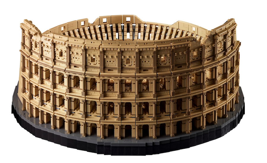
With 9,036 Pieces, the Roman Colosseum Is the Largest Lego Set Ever

“For a nor­mal per­son back in the day,” says LEGO designer/architect Rok Kobe about the Colos­se­um in Rome, “You had nev­er seen a build­ing that was over a sto­ry high. And to be con­front­ed with such an amaz­ing piece of engi­neer­ing that’s almost 200-meters wide and 50 meters tall, it was unprece­dent­ed.”

Sim­i­lar­ly, any LEGO fan might feel this awe while greet­ing this month’s debut of the LEGO Colos­se­um. At 9036 pieces it has bro­ken the record as the biggest LEGO set in exis­tence, beat­ing out the Star Wars’ Mil­len­ni­um Fal­con (7,541 pieces) and the Taj Mahal (5,923 pieces). Every few years LEGO steps up its game, which might pos­si­bly end with a neigh­bor­hood-devour­ing repli­ca of the Great Wall of Chi­na. But we’re get­ting ahead of our­selves.

The Colos­se­um’s facade has been faith­ful­ly recre­at­ed on all three lev­els, with the Doric columns at the bot­tom, the Ion­ic columns in the mid­dle, and the Corinthi­an columns on top. And it also adds the con­tem­po­rary part of the are­na that has been rebuilt to show the orig­i­nal lev­el of the are­na in Roman times.

The orig­i­nal Colos­se­um was built over eight years between year 72 AD and 80 AD and between two emper­ors, Ves­pasian and Titus. And though we know it as a sand­stone-col­ored struc­ture these days, arche­ol­o­gists have deter­mined it was also col­ored red, black, and azure. The LEGO ver­sion may not be so dra­mat­ic, but it does con­tain a bit more col­or than the real-life mod­el.

Rok Kobe knows of what he speaks and mod­els. Grow­ing up in Ljubl­jana, capi­tol of Slove­nia, he would play on the Roman ruins in the city cen­ter, espe­cial­ly the Roman Wall. “The five year old would be proud of the adult that got to design this LEGO set,” he says.
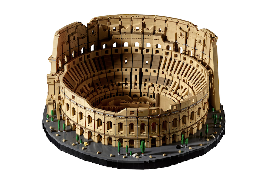
At $798, this is not a friv­o­lous pur­chase. But it will bring an adult hours of fun and keep them occu­pied.

Relat­ed Con­tent:

The Frank Lloyd Wright Lego Set

Cam­bridge Uni­ver­si­ty to Cre­ate a Lego Pro­fes­sor­ship

The LEGO Tur­ing Machine Gives a Quick Primer on How Your Com­put­er Works

Ted Mills is a free­lance writer on the arts who cur­rent­ly hosts the Notes from the Shed pod­cast and is the pro­duc­er of KCR­W’s Curi­ous Coast. You can also fol­low him on Twit­ter at @tedmills, and/or watch his films here.

A Glass Floor in a Dublin Grocery Store Lets Shoppers Look Down & Explore Medieval Ruins

In South Korea, where I live, many recent build­ings — the new Seoul City Hall, Zaha Hadid’s Dong­dae­mun Design Plaza — have incor­po­rat­ed the cen­tu­ry-upon-cen­tu­ry old ruins dis­cov­ered on their sites. This makes lit­er­al­ly vis­i­ble, often through clear glass floors, the “5,000 years of unbro­ken his­to­ry” about which one often hears boasts in Korea. But nor is Europe his­tor­i­cal­ly impov­er­ished, and there the win­dow-onto-the-past archi­tec­tur­al tech­nique has been applied in even less like­ly places: a new Dublin loca­tion, for instance, of Ger­man chain dis­count super­mar­ket Lidl.

“Archi­tects dis­cov­ered the remains of an 11th-cen­tu­ry house dur­ing the devel­op­ment of the site on Aungi­er Street,” says the video from Irish broad­cast­er RTÉ above. “The sunken-floored struc­ture has been pre­served and is dis­played beneath the glass.” Archae­o­log­i­cal site direc­tor Paul Duffy described the dis­cov­ery as poten­tial­ly hav­ing “func­tioned as many things, as a house or an extra space for the fam­i­ly. It’s a domes­tic struc­ture, so you have to imag­ine that there would have been a sub­urb here of Hiber­no-Norse Dublin­ers, who were effec­tive­ly the ances­tors of the Vikings.”

We’re a long way indeed from James Joyce’s Dublin­ers of 900 years lat­er. But the new Lidl has put more than one for­mer­ly buried era of the city’s past on dis­play: “A sec­ond glass pan­el near the check­out tills allows shop­pers to glimpse an 18th-cen­tu­ry ‘pit trap’ from the stage of the old Aungi­er Street The­atre,” writes Irish Cen­tral’s Shane O’Brien, pit traps being devices “used to bring an actor on stage as if by mag­ic. Anoth­er work­ing area under the build­ing pre­serves “the foun­da­tions of the medieval parish church of St. Peter, which served parish­ioners for more than 600 years between 1050 AD and 1650 AD.”

In the RTÉ video, Dublin City Archae­ol­o­gist Ruth John­son frames this as a chal­lenge to the speed-ori­ent­ed con­struc­tion mod­el — “put up a hoard­ing, exca­vate a site, and then put up a devel­op­ment” — preva­lent dur­ing Ire­land’s recent “Celtic Tiger” peri­od of eco­nom­ic growth. That and oth­er fac­tors have made the built envi­ron­ment of Dublin, a city of many charms, less inter­est­ing than it could be. In his recent book Trans-Europe Express’ chap­ter on Dublin, crit­ic Owen Hather­ley writes that “con­tem­po­rary Irish archi­tec­ture is marked by a strik­ing par­si­mo­ny, a cheap­ness and care­less­ness in con­struc­tion.” Look­ing to the past isn’t always the answer, of course, but in this case Lidl has done well to take it lit­er­al­ly.

via Colos­sal

Relat­ed Con­tent:

Mag­nif­i­cent Ancient Roman Mosa­ic Floor Unearthed in Verona, Italy

Explore Metic­u­lous 3D Mod­els of Endan­gered His­tor­i­cal Sites in Google’s “Open Her­itage” Project

See the Expan­sive Ruins of Pom­peii Like You’ve Nev­er Seen Them Before: Through the Eyes of a Drone

Watch Ancient Ruins Get Restored to their Glo­ri­ous Orig­i­nal State with Ani­mat­ed GIFs: The Tem­ple of Jupiter, Lux­or Tem­ple & More

James Joyce’s Dublin Cap­tured in Vin­tage Pho­tos from 1897 to 1904

Based in Seoul, Col­in Mar­shall writes and broad­casts on cities, lan­guage, and cul­ture. His projects include the Sub­stack newslet­ter Books on Cities, the book The State­less City: a Walk through 21st-Cen­tu­ry Los Ange­les and the video series The City in Cin­e­ma. Fol­low him on Twit­ter at @colinmarshall, on Face­book, or on Insta­gram.

Daisugi, the 600-Year-Old Japanese Technique of Growing Trees Out of Other Trees, Creating Perfectly Straight Lumber

Image by Wrath of Gnon

We’ve all admired the ele­gance of Japan’s tra­di­tion­al styles of archi­tec­ture. Their devel­op­ment required the kind of ded­i­cat­ed crafts­man­ship that takes gen­er­a­tions to cul­ti­vate — but also, more prac­ti­cal­ly speak­ing, no small amount of wood. By the 15th cen­tu­ry, Japan already faced a short­age of seedlings, as well as land on which to prop­er­ly cul­ti­vate the trees in the first place. Neces­si­ty being the moth­er of inven­tion, this led to the cre­ation of an inge­nious solu­tion: daisu­gi, the grow­ing of addi­tion­al trees, in effect, out of exist­ing trees — cre­at­ing, in oth­er words, a kind of giant bon­sai.

“Writ­ten as 台杉 and lit­er­al­ly mean­ing plat­form cedar, the tech­nique result­ed in a tree that resem­bled an open palm with mul­ti­ple trees grow­ing out if it, per­fect­ly ver­ti­cal,” writes Spoon and Tam­ago’s John­ny Wald­man. “Done right, the tech­nique can pre­vent defor­esta­tion and result in per­fect­ly round and straight tim­ber known as taru­ki, which are used in the roofs of Japan­ese tea­hous­es.”

These tea­hous­es are still promi­nent in Kyoto, a city still known for its tra­di­tion­al cul­tur­al her­itage, and not coin­ci­den­tal­ly where daisu­gi first devel­oped. “It’s said that it was Kyoto’s pre­em­i­nent tea mas­ter, Sen-no-rikyu, who demand­ed per­fec­tion in the Kitaya­ma cedar dur­ing the 16th cen­tu­ry,” writes My Mod­ern Met’s Jes­si­ca Stew­art.

At the time “a form of very straight and styl­ized sukiya-zukuri archi­tec­ture was high fash­ion, but there sim­ply weren’t near­ly enough raw mate­ri­als to build these homes for every noble or samu­rai who want­ed one,” says a thread by Twit­ter account Wrath of Gnon, which includes these and oth­er pho­tos of daisu­gi in action. “Hence this clever solu­tion of using bon­sai tech­niques on trees.” Aes­thet­ics aside — as far aside as they ever get in Japan, at any rate — “the lum­ber pro­duced in this method is 140% as flex­i­ble as stan­dard cedar and 200% as dense/strong,” mak­ing it “absolute­ly per­fect for rafters and roof tim­ber.” And not only is daisu­gi’s prod­uct straight, slen­der, and typhoon-resis­tant, it’s mar­veled at around the world 600 years lat­er. Of how many forestry tech­niques can we say the same?

via Spoon and Tam­a­go

Relat­ed Con­tent:

The Art & Phi­los­o­phy of Bon­sai

This 392-Year-Old Bon­sai Tree Sur­vived the Hiroshi­ma Atom­ic Blast & Still Flour­ish­es Today: The Pow­er of Resilience

The Philo­soph­i­cal Appre­ci­a­tion of Rocks in Chi­na & Japan: A Short Intro­duc­tion to an Ancient Tra­di­tion

The Secret Lan­guage of Trees: A Charm­ing Ani­mat­ed Les­son Explains How Trees Share Infor­ma­tion with Each Oth­er

The Social Lives of Trees: Sci­ence Reveals How Trees Mys­te­ri­ous­ly Talk to Each Oth­er, Work Togeth­er & Form Nur­tur­ing Fam­i­lies

A Dig­i­tal Ani­ma­tion Com­pares the Size of Trees: From the 3‑Inch Bon­sai, to the 300-Foot Sequoia

Based in Seoul, Col­in Mar­shall writes and broad­casts on cities, lan­guage, and cul­ture. His projects include the Sub­stack newslet­ter Books on Cities, the book The State­less City: a Walk through 21st-Cen­tu­ry Los Ange­les and the video series The City in Cin­e­ma. Fol­low him on Twit­ter at @colinmarshall, on Face­book, or on Insta­gram.

An Animated Video Shows the Building of a Medieval Bridge: 45 Years of Construction in 3 Minutes

With­out mas­sive feats of engi­neer­ing we rarely notice any­more because they seem so com­mon­place, the built envi­ron­ments we nav­i­gate each day wouldn’t exist. When we do turn our atten­tion to how the build­ings get made, we are met with sur­pris­es, curiosi­ties, puz­zles, moments of won­der. How much more is this the case when learn­ing about fix­tures of cities that are hun­dreds or thou­sands of years old, con­struct­ed with what we would con­sid­er prim­i­tive meth­ods, pro­duc­ing results that seem supe­ri­or in dura­bil­i­ty and aes­thet­ic qual­i­ty to most mod­ern struc­tures?

Of course, while mod­ern struc­tures can take months or even weeks to fin­ish, those of a more ancient or medieval age were con­struct­ed over decades and repaired, rebuilt, and restored over cen­turies. Con­sid­er the Charles Bridge, which cross­es the Vlta­va (Moldau) riv­er in Prague.

Con­struc­tion began on the famous structure—nearly 1,700 feet (516 meters) long and 33 feet (10 meters) wide—in 1357 under King Charles IV. Forty-five years lat­er, in 1402, the bridge was com­plet­ed. It was dam­aged in the Thir­ty Years’ War, then repaired, dam­aged in floods in the 15th, 18th, and 19th cen­turies, and repaired, and updat­ed with more mod­ern appoint­ments over time, such as gaslights. But its bones, as they say, stayed strong.

In the dig­i­tal­ly ani­mat­ed video above, you can watch the ini­tial con­struc­tion process in fast-motion–nearly half a cen­tu­ry con­densed into 3 min­utes. Built by archi­tect Peter Par­ler, it was orig­i­nal­ly called Stone Bridge. It acquired the king’s name in 1870. “The low-lying medieval struc­ture,” notes Google, who cel­e­brat­ed the 660th anniver­sary of the bridge in 2017, “is com­prised of 16 shal­low arch­es and three Goth­ic tow­ers, and lined with 30 Baroque-style stat­ues,” added some 200 years ago. Every build­ing has its secrets, and the Charles Bridge no doubt has more than most. One of the first has noth­ing to do with hid­den cham­bers or buried remains. Rather, “accord­ing to leg­end, dur­ing con­struc­tion, masons added a secret ingre­di­ent that they thought would make it stronger: eggs!”

See more ani­mat­ed videos of vin­tage con­struc­tion at the Pra­ha Arche­o­log­ic­ka chan­nel on YouTube and learn much more about medieval Prague’s many archi­tec­tur­al sur­pris­es at their site.

via Twist­ed Sifter

Relat­ed Con­tent:

A Vir­tu­al Time-Lapse Recre­ation of the Build­ing of Notre Dame (1160)

Take an Aer­i­al Tour of Medieval Paris

Watch 50+ Doc­u­men­taries on Famous Archi­tects & Build­ings: Bauhaus, Le Cor­busier, Hadid & Many More

Josh Jones is a writer and musi­cian based in Durham, NC. Fol­low him at @jdmagness

Take a Digital Drive Along Ed Ruscha’s Sunset Boulevard, the Famous Strip That the Artist Photographed from 1965 to 2007

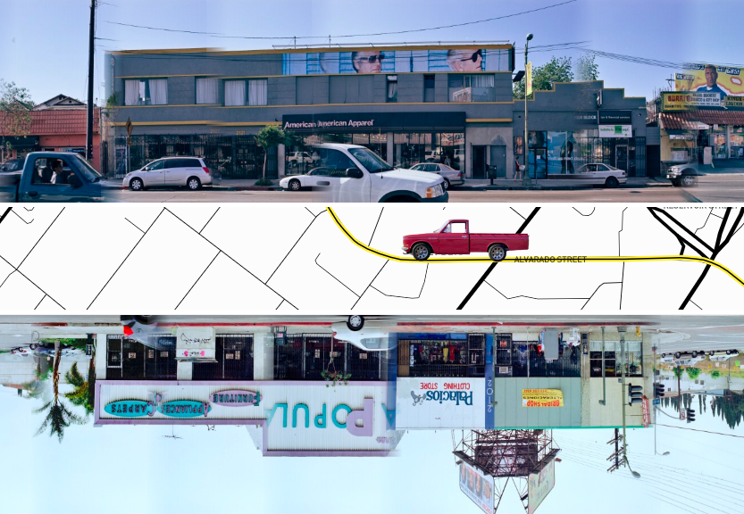
Ed Ruscha has lived near­ly 65 years in Los Ange­les, but he insists that he has no par­tic­u­lar fas­ci­na­tion with the place. Not every­one believes him: is dis­in­ter­est among the many pos­si­ble feel­ings that could moti­vate a paint­ing like The Los Ange­les Coun­ty Muse­um on Fire? Nev­er­the­less, the plain­spo­ken Okla­homa-born artist has long stuck to his sto­ry, per­haps in order to let his often cryp­tic work speak for itself. Orig­i­nal­ly trained in com­mer­cial art, Ruscha has paint­ed, print­ed, drawn, and tak­en pho­tographs, the most cel­e­brat­ed fruit of that last pur­suit being 1966’s Every Build­ing on the Sun­set Strip, a book that stitch­es his count­less pho­tographs of that famous boule­vard — both sides of it — onto one long, con­tin­u­ous page.

What­ev­er you think of such a project, you can’t accuse it of a mis­match between form and sub­stance. Nor can you call it a cyn­i­cal one-off: between 1967 and 2007, Ruscha drove Sun­set Boule­vard with his cam­era no few­er than twelve times in order to pho­to­graph most or all of its build­ings.

These include gas sta­tions (an archi­tec­tur­al form to which Ruscha has made the sub­ject of its own pho­to book as well as one of his most famous paint­ings), drug­stores, appli­ance deal­ers, Cen­tral Amer­i­can restau­rants, karate schools, trav­el agen­cies, car wash­es, Mod­ernist office tow­ers, and two of the most char­ac­ter­is­tic struc­tures of Los Ange­les: low-rise, kitschi­ly named “ding­bat” apart­ment blocks and L‑shaped “La Man­cha” strip malls.

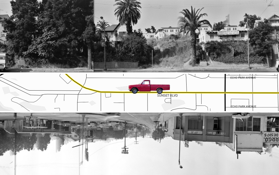
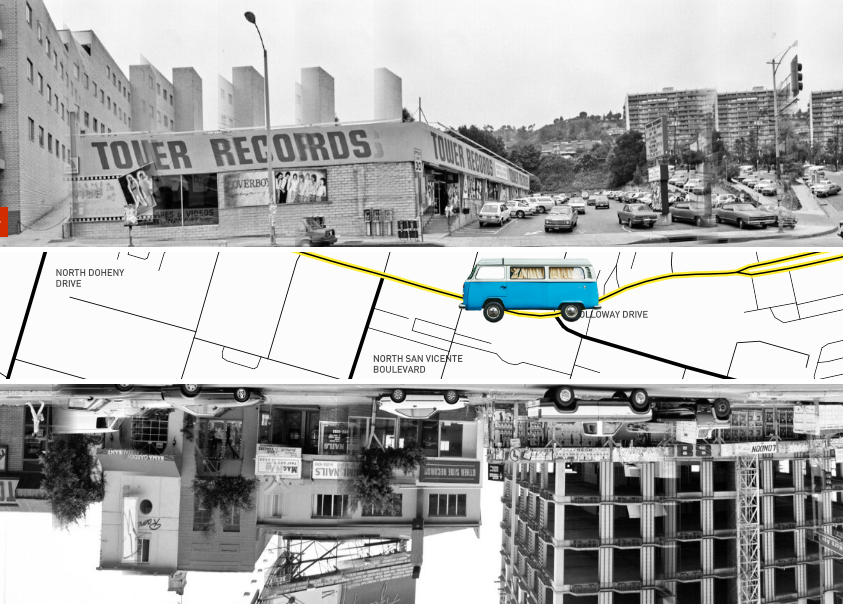
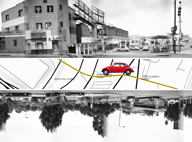
The mix of the built envi­ron­ment varies great­ly, of course, depend­ing on where you choose to go on this 22-mile-long boule­vard, only a short stretch of which con­sti­tutes the “Sun­set Strip.” It also depends on when you choose to go: not which time of day, but which era, a choice put at your fin­ger­tips by the Get­ty Research Insti­tute’s Ed Ruscha Streets of Los Ange­les Project, and specif­i­cal­ly its inter­ac­tive fea­ture 12 Sun­sets. In it you can use your left and right arrow keys to “dri­ve” east or west (in your choice between a van, a VW Bee­tle, or Ruscha’s own trusty Dat­sun pick­up), and your up and down but­ton to flip between the year of the pho­to shoots that make up the boule­vard around you.

Many long­time Ange­lenos (or enthu­si­asts of Los Ange­les cul­ture) will motor straight to the inter­sec­tion with Horn Avenue, loca­tion of the much-mythol­o­gized Sun­set Strip Tow­er Records from which the very Amer­i­can musi­cal zeit­geist once seemed to emanate. The Sacra­men­to-found­ed store was actu­al­ly a late­com­er to Los Ange­les com­pared to Ruscha him­self, and the build­ing first appears in his third pho­to shoot, of 1973. The next year the ever-chang­ing posters on its exte­ri­or walls includes Bil­ly Joel’s Piano Man. About a decade lat­er appear the one-hit likes of Lover­boy, and in the twi­light of the 1990s the street ele­va­tion touts the Beast­ie Boys and Rob Zom­bie. In 2007, Tow­er’s sig­na­ture red and yel­low are all that remain, the chain itself hav­ing gone under (at least out­side Japan) the year before.

12 Sun­sets’ inter­face pro­vides two dif­fer­ent meth­ods to get straight from one point to anoth­er: you can either type a spe­cif­ic place name into the “loca­tion search” box on the upper right, or click the map icon on the mid­dle left to open up the line of the whole street click­able any­where from down­town Los Ange­les to the Pacif­ic Ocean. This is a much eas­i­er way of mak­ing your way along Sun­set Boule­vard than actu­al­ly dri­ving it, even in the com­par­a­tive­ly nonex­is­tent traf­fic of 1965. Nev­er­the­less, Ruscha con­tin­ues to pho­to­graph­i­cal­ly doc­u­ment it and oth­er Los Ange­les streets, using the very same method he did 55 years ago. The build­ings keep chang­ing, but the city has nev­er stopped exud­ing its char­ac­ter­is­tic nor­mal­i­ty so intense­ly as to become eccen­tric­i­ty (and vice ver­sa). What artist wor­thy of the title would­n’t be fas­ci­nat­ed?

Explore the Get­ty Research Insti­tute’s Ed Ruscha Streets of Los Ange­les Project here.

via Austin Kleon

Relat­ed Con­tent:

Artist Ed Ruscha Reads From Jack Kerouac’s On the Road in a Short Film Cel­e­brat­ing His 1966 Pho­tos of the Sun­set Strip

Roy Licht­en­stein and Andy Warhol Demys­ti­fy Their Pop Art in Vin­tage 1966 Film

A Brief His­to­ry of John Baldessari, Nar­rat­ed by Tom Waits

Take a Dri­ve Through 1940s, 50s & 60s Los Ange­les with Vin­tage Through-the-Car-Win­dow Films

Watch Randy Newman’s Tour of Los Ange­les’ Sun­set Boule­vard, and You’ll Love L.A. Too

Based in Seoul, Col­in Mar­shall writes and broad­casts on cities, lan­guage, and cul­ture. His projects include the Sub­stack newslet­ter Books on Cities, the book The State­less City: a Walk through 21st-Cen­tu­ry Los Ange­les and the video series The City in Cin­e­ma. Fol­low him on Twit­ter at @colinmarshall, on Face­book, or on Insta­gram.

Denmark’s Utopian Garden City Built Entirely in Circles: See Astounding Aerial Views of Brøndby Haveby

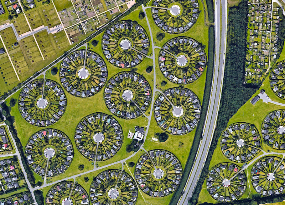
For decades, urban plan­ners around the world have looked to the Dan­ish cap­i­tal of Copen­hagen, with its low-rise high den­si­ty and unpar­al­leled cul­ture of every­day cycling, as an exam­ple of how to design a city. But what of the Dan­ish track record in design­ing sub­urbs? Recent­ly, a pho­tog­ra­ph­er by the name of Hen­ry Do brought the world’s atten­tion to one such set­tle­ment, Brønd­by Have­by or Gar­den City, with a series of aer­i­al pho­tographs post­ed to Insta­gram. “Unre­al how my recent images from here went crazy viral,” Do writes in the cap­tion of a fol­low-up drone video — “unre­al” being just the word some have used to describe the place itself, com­posed as it is entire­ly out of cir­cles.

Built in 1964 to the design of “genius land­scape archi­tect Erik Mygind,” Brønd­by Have­by mim­ics “the tra­di­tion­al pat­terns of the 18th cen­tu­ry Dan­ish vil­lages, where peo­ple would use the mid­dle as a focal point for hang­ing out, min­gle and social inter­change between neigh­bors.”

This unusu­al form, more of which you can see in Do’s drone pho­tos at Lone­ly Plan­et, suits the long-estab­lished Dan­ish cab­in cul­ture, accord­ing to which every city-dwelling Dane with the means buys a small­er sec­ond home in the coun­try­side as a retreat. (Though the hous­es in Brønd­by Have­by are owned, the gar­dens are rent­ed, and local zon­ing laws pre­vent any­one from occu­py­ing their prop­er­ties for more than six months out of the year.)

Wher­ev­er it is, this cab­in must be made hyggelige, an adjec­tive often trans­lat­ed into Eng­lish as “cozy” and that, in recent years, has become a byword for the love of small-scale con­tent­ment that sets Den­mark apart. (Not every­body is sold on the con­cept: “With its relent­less dri­ve towards the mid­dle ground and its depen­dence on keep­ing things light and breezy,” writes British Den­mark expat Michael Booth, “hygge does get a bit bor­ing some­times.”) As Lenni Mad­sen, a Dan­ish Quo­ra user with a Brønd­by Have­by house in the fam­i­ly, puts it, “Imag­ine your aver­age small-time com­mu­ni­ty, where every­one knows every­one else, you see each oth­er across the hedge, per­haps shar­ing a beer or hav­ing cof­fee at each oth­ers’ hous­es.”

This seems a far cry from the alien­ation and deprav­i­ty of the stan­dard sub­ur­ban cul-de-sac, at least as por­trayed in Amer­i­can pop­u­lar myth. And it isn’t hard to see the appeal for aver­age urban­ites, espe­cial­ly those look­ing to spend their gen­er­ous vaca­tion time in as dif­fer­ent an envi­ron­ment as pos­si­ble with­out hav­ing to go far. (Home­own­ers must already have a pri­ma­ry res­i­dence with­in 20 kilo­me­ters, which includes the city of Copen­hagen.) The aston­ished reac­tions on social media would sug­gest that most of us have nev­er seen a place like this before. But for the Danes, it’s just anoth­er chap­ter in their civ­i­liza­tion­al pur­suit of all that is hyggelige.

via Messy Nessy

Relat­ed Con­tent:

Frank Lloyd Wright Designs an Urban Utopia: See His Hand-Drawn Sketch­es of Broad­acre City (1932)

The Medieval City Plan Gen­er­a­tor: A Fun Way to Cre­ate Your Own Imag­i­nary Medieval Cities

Japan­ese Design­er Cre­ates Incred­i­bly Detailed & Real­is­tic Maps of a City That Doesn’t Exist

IKEA Dig­i­tizes & Puts Online 70 Years of Its Cat­a­logs: Explore the Designs of the Swedish Fur­ni­ture Giant

In Search of Lud­wig Wittgenstein’s Seclud­ed Hut in Nor­way: A Short Trav­el Film

Based in Seoul, Col­in Mar­shall writes and broad­casts on cities, lan­guage, and cul­ture. His projects include the Sub­stack newslet­ter Books on Cities, the book The State­less City: a Walk through 21st-Cen­tu­ry Los Ange­les and the video series The City in Cin­e­ma. Fol­low him on Twit­ter at @colinmarshall, on Face­book, or on Insta­gram.

The Story Behind the Iconic Photograph of 11 Construction Workers Lunching 840 Feet Above New York City (1932)

Dorothea Lange’s “Migrant Moth­er”…

Nick Ut’s Pulitzer Prize-win­ning “The Ter­ror of War”…

Richard Drew’s “The Falling Man”…

Through­out the years, a num­ber of icon­ic pho­tographs have tapped into the col­lec­tive uncon­scious, shap­ing our view of his­toric events, some­times to a degree that leads to social change.

These images are not depen­dent on know­ing the sub­jects’ iden­ti­ties, though it’s always inter­est­ing when more con­text leaks out, often as the result of some seri­ous sleuthing by reporters, archivists, or oth­er inter­est­ed par­ties.

1932’s “Lunch atop a Sky­scraper (New York Con­struc­tion Work­ers Lunch­ing on a Cross­beam)” is one of the lighter-heart­ed pho­tos to cre­ate such a last­ing pub­lic impres­sion.

Eleven work­ers are depict­ed enjoy­ing their break, relax­ing on a gird­er a dizzy­ing 840-feet above New York City, unbur­dened by safe­ty har­ness­es or oth­er pro­tec­tive gear.

In the words of Rock­e­feller Cen­ter archivist Christi­na Rous­sel, who nar­rates the TIME Mag­a­zine 100 Pho­tos episode above, they are the “unsung heroes of con­struc­tion.”

The unusu­al des­ig­na­tion may lead you to rack your brains for a sung hero of con­struc­tion.

Grandpa’s cog-in-the-wheel con­tri­bu­tion to the erec­tion of an icon­ic land­mark can be a source of anec­do­tal pride for fam­i­lies, but it rarely leads to greater renown.

Loom­ing over this image is John D. Rock­e­feller, Jr, who mas­ter­mind­ed a 22 acre com­plex of 14 com­mer­cial build­ings in the Art Deco style. The project was a boost to the econ­o­my dur­ing the Great Depres­sion, employ­ing over 250,000 people—from truck­ers and quar­ry­men to glaziers and steel­work­ers and hun­dreds of oth­er jobs in between. It cre­at­ed an enor­mous amount of good­will and patri­ot­ic pride.

The Rock­e­feller orga­ni­za­tion cap­i­tal­ized on this pos­i­tive recep­tion, with a steady stream of staged pub­lic­i­ty pho­tos, includ­ing the dar­ing eleven shar­ing a nose­bleed seat on what was to become the 69th floor of the RCA Build­ing (now known as 30 Rock.)

As film crit­ic John Ander­son, review­ing the doc­u­men­tary Men at Lunch in The New York Times, wrote:

The pop­u­lar­i­ty of the pic­ture, which has been col­orized, sat­i­rized, bur­lesqued with the Mup­pets and turned into a life-size sculp­ture by Ser­gio Furnari, is part­ly about the casu­al reck­less­ness of its sub­jects: The beam on which they sit seems sus­pend­ed over an urban abyss, with the vast­ness of Cen­tral Park spread out behind them and noth­ing, seem­ing­ly below. But in fact a fin­ished floor of 30 Rock­e­feller Plaza was prob­a­bly just a few feet away.

The doc­u­men­tary helped con­firm the iden­ti­ties of sev­er­al of the men.

Irish immi­grants Mad­dy O’Shaughnessy and Son­ny Glynn hold down either end, as ver­i­fied by their sons.

William Eck­n­er, third from left, and Joe Cur­tis, third from right, were named in a sim­i­lar­ly spir­it­ed anno­tat­ed pho­to tak­en around the same time.

The man seat­ed to Cur­tis’ right may or may not be John Charles Cook of the St. Reg­is Mohawk Reser­va­tion.

The photographer’s iden­ti­ty is also debat­able. It’s most often cred­it­ed to Charles C. Ebbets but Tom Kel­ley and William Left­wich were also on hand that day, leather satchels of glass plates slung across their backs, as they, too, defied grav­i­ty, doc­u­ment­ing the com­ple­tion of archi­tect Ray­mond Hood’s mas­ter plan.

Relat­ed Con­tent:

How Dorothea Lange Shot, Migrant Moth­er, Per­haps the Most Icon­ic Pho­to in Amer­i­can His­to­ry

Yale Presents an Archive of 170,000 Pho­tographs Doc­u­ment­ing the Great Depres­sion

Yale Presents an Archive of 170,000 Pho­tographs Doc­u­ment­ing the Great Depres­sion

Ayun Hal­l­i­day is an author, illus­tra­tor, the­ater mak­er and Chief Pri­ma­tol­o­gist of the East Vil­lage Inky zine.  Fol­low her @AyunHalliday.

A Beautiful 1897 Illustrated Book Shows How Flowers Become Art Nouveau Designs

The art of draw­ing is not the art of observ­ing forms and objects alone, it is not mere mim­ic­ry of these objects; it is the art of know­ing how far and where­in, and with what just lim­i­ta­tions, those forms and objects can be repro­duced in a pic­ture, or in a dec­o­ra­tive work. — Eugène Gras­set, 1896

Flow­ers loomed large in Art Nou­veau, from the volup­tuous flo­ral head­pieces that crowned Alphonse Mucha’s female fig­ures to the stained glass ros­es favored by archi­tect Charles Ren­nie Mack­in­tosh.

Graph­ic design­er Eugène Gras­set’s 1897 book, Plants and Their Appli­ca­tion to Orna­ment, vivid­ly demon­strates the ways in which nature was dis­tilled into pop­u­lar dec­o­ra­tive motifs at the end of the 19th-cen­tu­ry.


Twen­ty-four flow­er­ing plants were select­ed for con­sid­er­a­tion, from hum­ble spec­i­mens like dan­de­lions and this­tle to such Art Nou­veau heavy hit­ters as pop­pies and iris­es.

Each flower is rep­re­sent­ed by a real­is­tic botan­i­cal study, with two addi­tion­al col­or plates in which its form is flat­tened out and mined for its dec­o­ra­tive, styl­is­tic ele­ments.


The plates were ren­dered by Grasset’s stu­dents at the École Guérin, young artists whom he had “for­bid­den to con­de­scend to the art of base and servile imi­ta­tion”:

The art of draw­ing is not the art of observ­ing forms and objects alone, it is not mere mim­ic­ry of these objects; it is the art of know­ing how far and where­in, and with what just lim­i­ta­tions, those forms and objects can be repro­duced in a pic­ture, or in a dec­o­ra­tive work.

He also expect­ed stu­dents to hone their pow­ers of obser­va­tion through intense study of the organ­ic struc­tures that would pro­vide their inspi­ra­tion, becom­ing inti­mate­ly acquaint­ed with the char­ac­ter of petal, leaf, and stem:

Beau­ti­ful lines are the foun­da­tion of all beau­ty. In a work of art, what­ev­er it be, appar­ent or hid­den sym­me­try is the vis­i­ble or secret cause of the plea­sure we feel. Every­thing that is cre­at­ed must have some rep­e­ti­tion in its parts to be under­stood, retained in the mem­o­ry, and per­ceived as a whole

When it came to adorn­ing house­hold imple­ments such as vas­es and plates, Gras­set insist­ed that dec­o­ra­tive ele­ments exist in har­mo­ny with their hosts, snip­ing that any artist who would dis­tort form with ill con­sid­ered flour­ish­es should make a bas-relief instead.

Thus­ly do chrysan­the­mum stems pro­vide log­i­cal-look­ing bal­last for a chan­de­lier, and a dandelion’s curved leaves hug the con­tours of a table leg.

Gras­set’s best known stu­dent, Mau­rice Pil­lard Verneuil, whose career spanned Art Nou­veau to Art Deco, absorbed and artic­u­lat­ed the master’s teach­ings:


It is no longer the nature (artists) see that they rep­re­sent, that they tran­scribe, but the nature that they aspire to see; nature more per­fect and more beau­ti­ful and of which they have the inte­ri­or vision.


View Eugène Grasset’s Plants and Their Appli­ca­tion to Orna­ment as part of the New York Pub­lic Library’s Dig­i­tal Col­lec­tions here. Or find illus­tra­tions at Raw­Pix­el.

via The Pub­lic Domain Review

Relat­ed Con­tent:

His­toric Man­u­script Filled with Beau­ti­ful Illus­tra­tions of Cuban Flow­ers & Plants Is Now Online (1826 )

Beau­ti­ful Hand-Col­ored Japan­ese Flow­ers Cre­at­ed by the Pio­neer­ing Pho­tog­ra­ph­er Ogawa Kazu­masa (1896)

Dis­cov­er Emi­ly Dickinson’s Herbar­i­um: A Beau­ti­ful Dig­i­tal Edi­tion of the Poet’s Col­lec­tion of Pressed Plants & Flow­ers Is Now Online

Ayun Hal­l­i­day is an author, illus­tra­tor, the­ater mak­er and Chief Pri­ma­tol­o­gist of the East Vil­lage Inky zine.  Fol­low her @AyunHalliday.

« Go BackMore in this category... »
Quantcast
Open Culture was founded by Dan Colman.