The Alphabet Explained: The Origin of Every Letter

Think back, if you will, to the cli­mac­tic scenes of Indi­ana Jones and the Last Cru­sade, which take place in the hid­den tem­ple that con­tains the Holy Grail. His father hav­ing been shot by the das­tard­ly Nazi-sym­pa­thiz­ing immor­tal­i­ty-seek­er Wal­ter Dono­van, Indy has no choice but to retrieve the leg­endary cup to make use of its reput­ed heal­ing pow­ers. This entails pass­ing through three dead­ly cham­bers, one of which has a floor cov­ered in stones, each one labeled with a let­ter of the alpha­bet. The way through, accord­ing to Jones père’s research, is the name of God. But when Indy steps on “J” for Jeho­vah, it crum­bles away, and he near­ly plunges into the enor­mous pit below.

Of course, true fans will have already quot­ed the rel­e­vant line: “But in the Latin alpha­bet, Jeho­va begins with an I!” Those of us who first watched the movie as kids — and, for that mat­ter, many of us who first watched it as adults — sim­ply took that fact as giv­en. But if we watch the Rob­Words video above, we can learn how and when that “I” became a “J”.

To the ancient Romans, explains host Rob Watts, these let­ters were one and the same, serv­ing both vow­el and con­so­nant duty depend­ing on the con­text (as in “Iulius” Cae­sar). Both of them date back to a “rather more com­pli­cat­ed char­ac­ter” that looks like a bad­ly con­tort­ed F, and which orig­i­nat­ed as a pic­togram rep­re­sent­ing a human hand and fore­arm.

The let­ter J only emerged lat­er, “when scribes want­ed to dif­fer­en­ti­ate between these two usages.” (As we’ve seen, it also offered the descen­dants of the Knights Tem­plar a way to trick inter­lop­ers in their cav­erns.) Through­out the course of the video, Watts cov­ers this and oth­er curi­ous steps in the evo­lu­tion of the alpha­bet we use to write Eng­lish and many oth­er lan­guages today. These pro­duced such fea­tures as the plur­al of knife and wolf being knives and wolves, the seem­ing super­fluity of Q, and — for an Eng­lish­man like Watts, an unig­nor­able sub­ject — the transat­lantic “zed”/“zee” divid­ing line. Exam­ined close­ly, the forms of our let­ters tells a mil­len­nia-span­ning sto­ry whose cast includes Egyp­tians, Phoeni­cians, Canaan­ites, Etr­uscans, Greeks, Romans, and oth­ers besides. And as the expe­ri­ence of Indi­ana Jones illus­trates, you nev­er know when you’ll need its lessons.

Relat­ed con­tent:

The Evo­lu­tion of the Alpha­bet: A Col­or­ful Flow­chart, Cov­er­ing 3,800 Years, Takes You From Ancient Egypt to Today

How Writ­ing Has Spread Across the World, from 3000 BC to This Year: An Ani­mat­ed Map

The Writ­ing Sys­tems of the World Explained, from the Latin Alpha­bet to the Abugi­das of India

How to Write in Cuneiform, the Old­est Writ­ing Sys­tem in the World: A Short, Charm­ing Intro­duc­tion

The Old­est Known Sen­tence Writ­ten in an Alpha­bet Has Been Found on a Head-Lice Comb (Cir­ca 1700 BC)

Based in Seoul, Col­in Marshall writes and broad­casts on cities, lan­guage, and cul­ture. His projects include the Sub­stack newslet­ter Books on Cities and the book The State­less City: a Walk through 21st-Cen­tu­ry Los Ange­les. Fol­low him on Twit­ter at @colinmarshall or on Face­book.

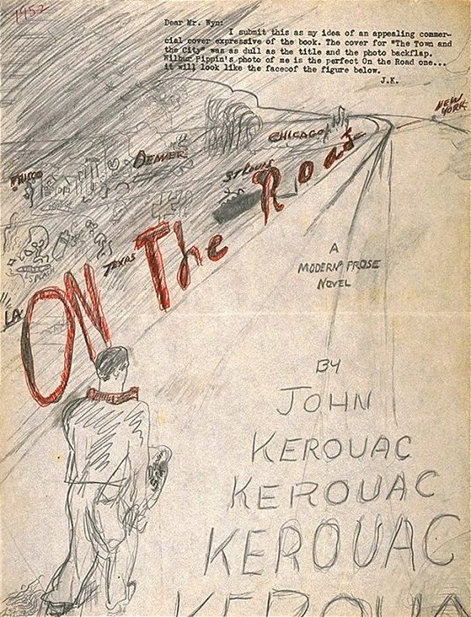
Jack Kerouac’s Hand-Drawn Cover for On the Road (1952)

This falls under the cat­e­go­ry, “If you want it done right, you have to do it your­self.”

In 1950, when Jack Ker­ouac released his first nov­el, The Town and the City, he was less than impressed by the book cov­er pro­duced by his pub­lish­er, Har­court Brace. (Click here to see why.) So, in 1952, when he began shop­ping his sec­ond nov­el, the great beat clas­sic On the Road, Ker­ouac went ahead and designed his own cov­er. He sent it to a poten­tial pub­lish­er A.A. Wyn, with a lit­tle note typed at the very top:

Dear Mr. Wyn:

I sub­mit this as my idea of an appeal­ing com­mer­cial cov­er expres­sive of the book. The cov­er for “The Town and the City” was as dull as the title and the pho­to back­flap. Wilbur Pippin’s pho­to of me is the per­fect On the Road one … it will look like the face of the fig­ure below.

J.K.

Wyn turned down the nov­el, and it would­n’t get pub­lished until 1957. It would, how­ev­er, become a best­seller and be pub­lished with many dif­fer­ent cov­ers through the years. They’re all on dis­play here.

If you would like to sign up for Open Culture’s free email newslet­ter, please find it here. It’s a great way to see our new posts, all bun­dled in one email, each day.

If you would like to sup­port the mis­sion of Open Cul­ture, con­sid­er mak­ing a dona­tion to our site. It’s hard to rely 100% on ads, and your con­tri­bu­tions will help us con­tin­ue pro­vid­ing the best free cul­tur­al and edu­ca­tion­al mate­ri­als to learn­ers every­where. You can con­tribute through Pay­Pal, Patre­on, and Ven­mo (@openculture). Thanks!

Relat­ed Con­tent:

Jack Kerouac’s Hand-Drawn Map of the Hitch­hik­ing Trip Nar­rat­ed in On the Road

Hear Jack Ker­ouac Read from On The Road on the 100th Anniver­sary of His Birth

Four Inter­ac­tive Maps Immor­tal­ize the Road Trips That Inspired Jack Kerouac’s On the Road

Jack Ker­ouac Lists 9 Essen­tials for Writ­ing Spon­ta­neous Prose

Jack Kerouac’s “Beat Paint­ings:” Now Gath­ered in One Book and Exhi­bi­tion for the First Time

An Architect Breaks Down the 5 Most Common Styles of College Campus

Every now and again on social media, the obser­va­tion cir­cu­lates that Amer­i­cans look back so fond­ly on their col­lege years because nev­er again do they get to live in a well-designed walk­a­ble com­mu­ni­ty. The orga­ni­za­tion of col­lege cam­pus­es does much to shape that expe­ri­ence, but so do the build­ings them­selves. “Peo­ple often say that col­lege is the best four years of your life,” says archi­tect Michael Wyet­zn­er in the new Archi­tec­tur­al Digest video above, “but it was also like­ly that it was some of the best archi­tec­ture you’ve been around as well.” He goes on to iden­ti­fy, explain, and con­tex­tu­al­ize the five build­ing styles most com­mon­ly seen on Amer­i­can col­lege cam­pus­es: colo­nial, Col­le­giate Goth­ic, mod­ernism, bru­tal­ism, and post­mod­ernism.

For exam­ples of colo­nial cam­pus archi­tec­ture, look no fur­ther than the Ivy League, only one of whose schools was built after the Dec­la­ra­tion of Inde­pen­dence — whose author, Thomas Jef­fer­son, lat­er designed the Uni­ver­si­ty of Vir­ginia, draw­ing much inspi­ra­tion (if not always first-hand) from ancient Greece and Rome. “Iron­i­cal­ly, after the US declared inde­pen­dence, new­er schools want­ed to look old­er,” says Wyet­zn­er, a desire that spawned the endur­ing Col­le­giate Goth­ic style. Con­struct­ed out of mason­ry and brick, its ear­li­est build­ings tend to pick and choose fea­tures of gen­uine Goth­ic archi­tec­ture while mix­ing and match­ing them with the design lan­guages of oth­er times and places. More recent exam­ples have been stren­u­ous­ly faith­ful by com­par­i­son, incor­po­rat­ing gar­goyles and all.

When they arise, archi­tec­tur­al styles tend to align them­selves with the old or the new, and it was the lat­ter that over­took col­lege cam­pus­es after the Sec­ond World War. Take the Illi­nois Insti­tute of Tech­nol­o­gy, which was designed whole by no less a Bauhaus-cre­den­tialed mod­ernist than Lud­wig Mies van der Rohe. Mod­u­lar, flat-roofed, and built with plen­ty of exposed brick, glass, and steel, its build­ings proved influ­en­tial enough that “near­ly every high school in the Unit­ed States that was built in the fifties and six­ties” was designed in more or less the same way — albeit with­out the ear­ly utopi­an mod­ernist spir­it, which by that point had devolved into an indus­tri­al empha­sis on “ratio­nal­ism, func­tion­al­i­ty, and hygiene.”

After mod­ernism came bru­tal­ism, the style of the least-beloved build­ings on many a cam­pus today. Coined by Le Cor­busier, the style’s name comes from béton brut, or raw con­crete, vast quan­ti­ties of which were used to shape its hulk­ing and, depend­ing on how you feel about them, either drea­ry or awe-inspir­ing struc­tures. The aes­thet­i­cal­ly promis­cu­ous post­mod­ernist build­ings that began appear­ing in the six­ties and mul­ti­plied in the sev­en­ties and eight­ies were more play­ful and his­tor­i­cal­ly aware — or all too play­ful and his­tor­i­cal­ly aware, as their detrac­tors would put it. If you think back to your own col­lege days, you can prob­a­bly remem­ber spend­ing time in, or around, at least one exam­ple of each of these styles, because large US col­lege cam­pus­es have, over time, become rich antholo­gies of archi­tec­tur­al his­to­ry. Would that most Amer­i­cans could say the same about the places they live after grad­u­a­tion.

Relat­ed con­tent:

Why Peo­ple Hate Bru­tal­ist Build­ings on Amer­i­can Col­lege Cam­pus­es

Archi­tect Breaks Down the Design Of Four Icon­ic New York City Muse­ums: the Met, MoMA, Guggen­heim & Frick

How Editing Saved Ferris Bueller’s Day Off & Made It a Classic

“In our sal­ad days, we are ripe for a par­tic­u­lar movie that will linger, death­less­ly, long after the green­ness has gone,” writes the New York­er’s Antho­ny Lane in a recent piece on movies in the eight­ies. “When a friend turned to me after the first twen­ty min­utes of Fer­ris Bueller’s Day Off, in 1986, and calm­ly declared, ‘This is the best film ever made,’ I had no cause to dis­agree.” Many of us react­ed sim­i­lar­ly, whether we saw the movie in its first the­atri­cal run or not — but we prob­a­bly would­n’t have, had the final prod­uct adhered more close­ly to writer-direc­tor John Hugh­es’ orig­i­nal vision. Such, in any case is the con­tention of the new Cin­e­maS­tix video essay above.

Incred­i­bly, says the video’s cre­ator Dan­ny Boyd, the Fer­ris Bueller screen­play “took Hugh­es less than a week to com­plete — and, by some accounts, just two nights, fin­ish­ing the script just as the Writ­ers Guild was about to go on strike, and just 36 hours after pitch­ing the movie to Para­mount with noth­ing but the tagline ‘A high-school­er takes a day off from school.’ ”

At the height of my own ado­les­cent Fer­ris Bueller-relat­ed enthu­si­asm, I actu­al­ly read it myself; all I remem­ber is appre­ci­at­ing that the mon­tage Hugh­es wrote of Fer­ris gath­er­ing up change from cook­ie jars and sofa cush­ions, set to Pink Floy­d’s “Mon­ey,” did­n’t make it into the final pro­duc­tion.

Fer­ris Bueller’s first cut ran two hours and 45 min­utes and did­n’t work at all,” says Boyd, and its only hope lay in the edit­ing room. Luck­i­ly, that room was occu­pied by Paul Hirsch, edi­tor of Star Wars, Blow Out, and Foot­loose. The movie had to be not just cut down but rearranged into an order with which audi­ences — who’d already voiced their dis­plea­sure in test screen­ings — could con­nect. Ini­tial­ly, Fer­ris, Sloane, and Cameron’s trip to the Art Insti­tute of Chica­go came last, after the parade scene in which Fer­ris gets up on a float. This may have felt right on the page, but it did­n’t on the screen: under­stand­ing that the parade “could­n’t be topped,” Hirsch and Hugh­es real­ized they had to fin­ish the tri­o’s excur­sion with it (and change up its score as well). Thanks to these post-pro­duc­tion inter­ven­tions, Fer­ris Bueller lives on in the pan­theon of mod­ern-day trick­ster gods.

Relat­ed con­tent:

Alfred Hitchcock’s 7‑Minute Mas­ter Class on Film Edit­ing

The Alche­my of Film Edit­ing, Explored in a New Video Essay That Breaks Down Han­nah and Her Sis­ters, The Empire Strikes Back & Oth­er Films

How Film­mak­ers Tell Their Sto­ries: Three Insight­ful Video Essays Demys­ti­fy the Craft of Edit­ing, Com­po­si­tion & Col­or

The Impor­tance of Film Edit­ing Demon­strat­ed by the Bad Edit­ing of Major Films: Bohemi­an Rhap­sody, Sui­cide Squad & More

The Art Insti­tute of Chica­go Puts 44,000+ Works of Art Online: View Them in High Res­o­lu­tion

Based in Seoul, Col­in Marshall writes and broad­casts on cities, lan­guage, and cul­ture. His projects include the Sub­stack newslet­ter Books on Cities and the book The State­less City: a Walk through 21st-Cen­tu­ry Los Ange­les. Fol­low him on Twit­ter at @colinmarshall or on Face­book.

Hear the Very First Adaptation of George Orwell’s 1984 in a Radio Play Starring David Niven (1949)

Since George Orwell pub­lished his land­mark polit­i­cal fable 1984, each gen­er­a­tion has found ample rea­son to make ref­er­ence to the grim near-future envi­sioned by the nov­el. Whether Orwell had some prophet­ic vision or was sim­ply a very astute read­er of the insti­tu­tions of his day—all still with us in mutat­ed form—hardly mat­ters. His book set the tone for the next 70-plus years of dystopi­an fic­tion and film.

Orwell’s own polit­i­cal activities—his stint as a colo­nial police­man or his denun­ci­a­tion of sev­er­al col­leagues and friends to British intel­li­gence—may ren­der him sus­pect in some quar­ters. But his night­mar­ish fic­tion­al pro­jec­tions of total­i­tar­i­an rule strike a nerve with near­ly every­one on the polit­i­cal spec­trum because, like the spec­u­la­tive future Aldous Hux­ley cre­at­ed, no one wants to live in such a world. Or at least no one will admit it if they do.


Even the insti­tu­tions most like­ly to thrive in Orwell’s vision have co-opt­ed his work for their own pur­pos­es. The C.I.A. rewrote the ani­mat­ed film ver­sion of Ani­mal Farm. And if you’re of a cer­tain vin­tage, you’ll recall Apple’s appro­pri­a­tion of 1984 in Rid­ley Scott’s Super Bowl ad that very year for the Mac­in­tosh com­put­er. But of course not every Orwell adap­ta­tion has been made in the ser­vice of polit­i­cal or com­mer­cial oppor­tunism. Long before the Apple ad, and Michael Radford’s 1984 film ver­sion of Nine­teen Eighty-Four, there was the 1949 radio dra­ma above. Star­ring British great David Niv­en, with inter­mis­sion com­men­tary by author James Hilton, the show aired on the edu­ca­tion­al radio series NBC Uni­ver­si­ty The­ater.

This radio dra­ma, the “first audio pro­duc­tion of the most chal­leng­ing nov­el of 1949,” opens with a trig­ger warn­ing, of sorts, that pre­pares us for a “dis­turb­ing broad­cast.” To audi­ences just on the oth­er side of the Nazi atroc­i­ties and the nuclear bomb­ings of Japan, then deal­ing with the threat of Sovi­et Com­mu­nism, Orwell’s dystopi­an fic­tion must have seemed dire and dis­turb­ing indeed.

Every adap­ta­tion of a lit­er­ary work is unavoid­ably also an inter­pre­ta­tion, bound by the ideas and ide­olo­gies of its time. The Niv­en broad­cast shares the same his­tor­i­cal con­cerns as Orwell’s nov­el. More recent­ly, this 70-year-old audio has itself been co-opt­ed by a pod­cast called “Great Speech­es and Inter­views,” which edit­ed the broad­cast togeth­er with a per­plex­ing selec­tion of pop­u­lar songs and an inter­view between jour­nal­ists Glenn Green­wald and Dylan Rati­gan. What­ev­er we make of these devel­op­ments, one thing seems cer­tain. We won’t be done with Orwell’s 1984 for some time, and it won’t be done with us.

Relat­ed Con­tent:

George Orwell Explains in a Reveal­ing 1944 Let­ter Why He’d Write 1984

The Cov­er of George Orwell’s 1984 Becomes Less Cen­sored with Wear & Tear

Hear George Orwell’s 1984 Adapt­ed as a Radio Play at the Height of McCarthy­ism & The Red Scare (1953)

Free Down­load: A Knit­ting Pat­tern for a Sweater Depict­ing an Icon­ic Cov­er of George Orwell’s 1984

Josh Jones is a writer and musi­cian based in Durham, NC. Fol­low him at @jdmagness

by | Permalink | Make a Comment ( 3 ) |

What is Electronic Music?: Pioneering Electronic Musician Daphne Oram Explains (1969)

Sur­vey the British pub­lic about the most impor­tant insti­tu­tion to arise in their coun­try after World War II, and a lot of respon­dents are going to say the Nation­al Health Ser­vice. But keep ask­ing around, and you’ll soon­er or lat­er encounter a few seri­ous elec­tron­ic-music enthu­si­asts who name the BBC Radio­phon­ic Work­shop. Estab­lished in 1958 to pro­vide music and sound effects for the Bee­b’s radio pro­duc­tions — not least the doc­u­men­taries and dra­mas of the artis­ti­cal­ly and intel­lec­tu­al­ly ambi­tious Third Pro­gramme — the unit’s work even­tu­al­ly expand­ed to work on tele­vi­sion shows as well. One could scarce­ly imag­ine Doc­tor Who, which debuted in 1963, with­out the Radio­phon­ic Work­shop’s son­ic aes­thet­ic.

By the end of the nine­teen-six­ties, the Radio­phon­ic Work­shop had been cre­at­ing elec­tron­ic music and inject­ing it into the lives of ordi­nary lis­ten­ers and view­ers for more than a decade. Even so, that same pub­lic did­n’t nec­es­sar­i­ly pos­sess a clear under­stand­ing of what, exact­ly, elec­tron­ic music was. Hence this explana­to­ry BBC tele­vi­sion clip from 1969, which brings on Radio­phon­ic Work­shop head Desmond Briscoe as well as com­posers John Bak­er, David Cain, and Daphne Oram (pre­vi­ous­ly fea­tured here on Open Cul­ture).

Hav­ing long since built her own stu­dio, Oram also demon­strates her own tech­niques for cre­at­ing and manip­u­lat­ing sound, few of which will look famil­iar to fans of elec­tron­ic music in our dig­i­tal cul­ture today.

Even in 1969, none of Oram’s tools were dig­i­tal in the way we now under­stand the term. In fact, the work­ing process shown in this clip was so thor­ough­ly ana­log as to involve paint­ing the forms of sound waves direct­ly onto slides and strips of film. She craft­ed sounds by hand in this way not pure­ly due to tech­ni­cal lim­i­ta­tion, but because exten­sive expe­ri­ence had shown her that it pro­duced more inter­est­ing results: “if one does it by pure­ly elec­tron­ic means, one tends to get fixed on one vibra­tion, one fre­quen­cy of vibra­to, which becomes dull.” Believ­ing that “music should be a pro­jec­tion of a thought process in the mind of a human being,” Oram expressed reser­va­tions about a future in which com­put­ers pump out “music by the yard”: a future that, these 55 years lat­er, seems to have arrived.

Relat­ed con­tent:

Daphne Oram Cre­at­ed the BBC’s First-Ever Piece of Elec­tron­ic Music (1957)

Meet Delia Der­byshire, the Dr. Who Com­pos­er Who Almost Turned The Bea­t­les’ “Yes­ter­day” Into Ear­ly Elec­tron­i­ca

Meet Four Women Who Pio­neered Elec­tron­ic Music: Daphne Oram, Lau­rie Spiegel, Éliane Radigue & Pauline Oliv­eros

Hear Elec­tron­ic Lady­land, a Mix­tape Fea­tur­ing 55 Tracks from 35 Pio­neer­ing Women in Elec­tron­ic Music

New Doc­u­men­tary Sis­ters with Tran­sis­tors Tells the Sto­ry of Elec­tron­ic Music’s Female Pio­neers

Hear Sev­en Hours of Women Mak­ing Elec­tron­ic Music (1938–2014)

Based in Seoul, Col­in Marshall writes and broad­casts on cities, lan­guage, and cul­ture. His projects include the Sub­stack newslet­ter Books on Cities and the book The State­less City: a Walk through 21st-Cen­tu­ry Los Ange­les. Fol­low him on Twit­ter at @colinmarshall or on Face­book.

Ray Bradbury Explains Why Literature is the Safety Valve of Civilization (in Which Case We Need More Literature!)

Ray Brad­bury had it all thought out. Behind his cap­ti­vat­ing works of sci­ence fic­tion, there were sub­tle the­o­ries about what lit­er­a­ture was meant to do. The retro clip above takes you back to the 1970s and it shows Brad­bury giv­ing a rather intrigu­ing take on the role of lit­er­a­ture and art. For the author of Fahren­heit 451 and The Mar­t­ian Chron­i­cles, lit­er­a­ture has more than an aes­thet­ic pur­pose. It has an impor­tant sociological/psychoanalytic role to play. Sto­ries are a safe­ty valve. They keep soci­ety col­lec­tive­ly, and us indi­vid­u­al­ly, from com­ing apart at the seams. Which is to say–if you’ve been fol­low­ing the news lately–we need a hel­lu­va lot more lit­er­a­ture these days. And a few new Ray Brad­burys.

If you would like to sign up for Open Culture’s free email newslet­ter, please find it here. It’s a great way to see our new posts, all bun­dled in one email, each day.

If you would like to sup­port the mis­sion of Open Cul­ture, con­sid­er mak­ing a dona­tion to our site. It’s hard to rely 100% on ads, and your con­tri­bu­tions will help us con­tin­ue pro­vid­ing the best free cul­tur­al and edu­ca­tion­al mate­ri­als to learn­ers every­where. You can con­tribute through Pay­Pal, Patre­on, and Ven­mo (@openculture). Thanks!

Relat­ed Con­tent

A New Edi­tion of Ray Bradbury’s Fahren­heit 451 That’s Only Read­able When You Apply Heat to Its Pages: Pre-Order It Today

Ray Brad­bury Reveals the True Mean­ing of Fahren­heit 451: It’s Not About Cen­sor­ship, But Peo­ple “Being Turned Into Morons by TV”

Ray Brad­bury Wrote the First Draft of Fahren­heit 451 on Coin-Oper­at­ed Type­writ­ers, for a Total of $9.80

by | Permalink | Make a Comment ( 4 ) |

J. G. Ballard Demystifies Surrealist Paintings by Dalí, Magritte, de Chirico & More

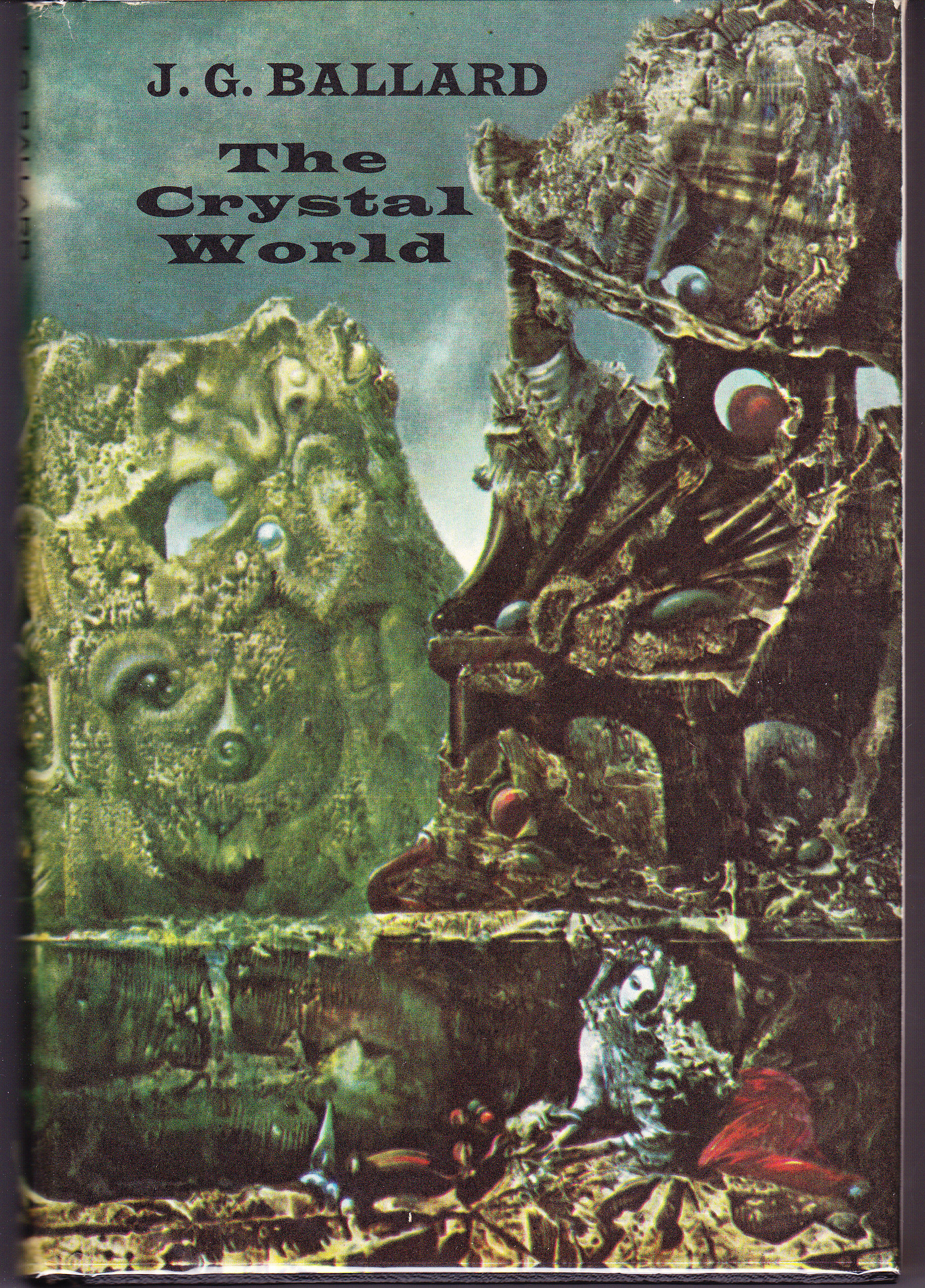
Before his sig­na­ture works like The Atroc­i­ty Exhi­bi­tion, Crash, and High-Rise, J. G. Bal­lard pub­lished three apoc­a­lyp­tic nov­els, The Drowned World, The Burn­ing World, and The Crys­tal World. Each of those books offers a dif­fer­ent vision of large-scale envi­ron­men­tal dis­as­ter, and the last even pro­vides a clue as to its inspi­ra­tion. Or rather, its orig­i­nal cov­er does, by using a sec­tion of Max Ern­st’s paint­ing The Eye of Silence. “This spinal land­scape, with its fren­zied rocks tow­er­ing into the air above the silent swamp, has attained an organ­ic life more real than that of the soli­tary nymph sit­ting in the fore­ground,” Bal­lard writes in “The Com­ing of the Uncon­scious,” an arti­cle on sur­re­al­ism writ­ten short­ly after The Crys­tal World appeared in 1966.

First pub­lished in an issue of the mag­a­zine New Worlds (which also con­tains Bal­lard’s take on Chris Mark­er’s La Jetée), the piece is osten­si­bly a review of Patrick Wald­berg’s Sur­re­al­ism and Mar­cel Jean’s The His­to­ry of Sur­re­al­ist Paint­ing, but it ends up deliv­er­ing Bal­lard’s short analy­ses of a series of paint­ings by var­i­ous sur­re­al­ist mas­ters.

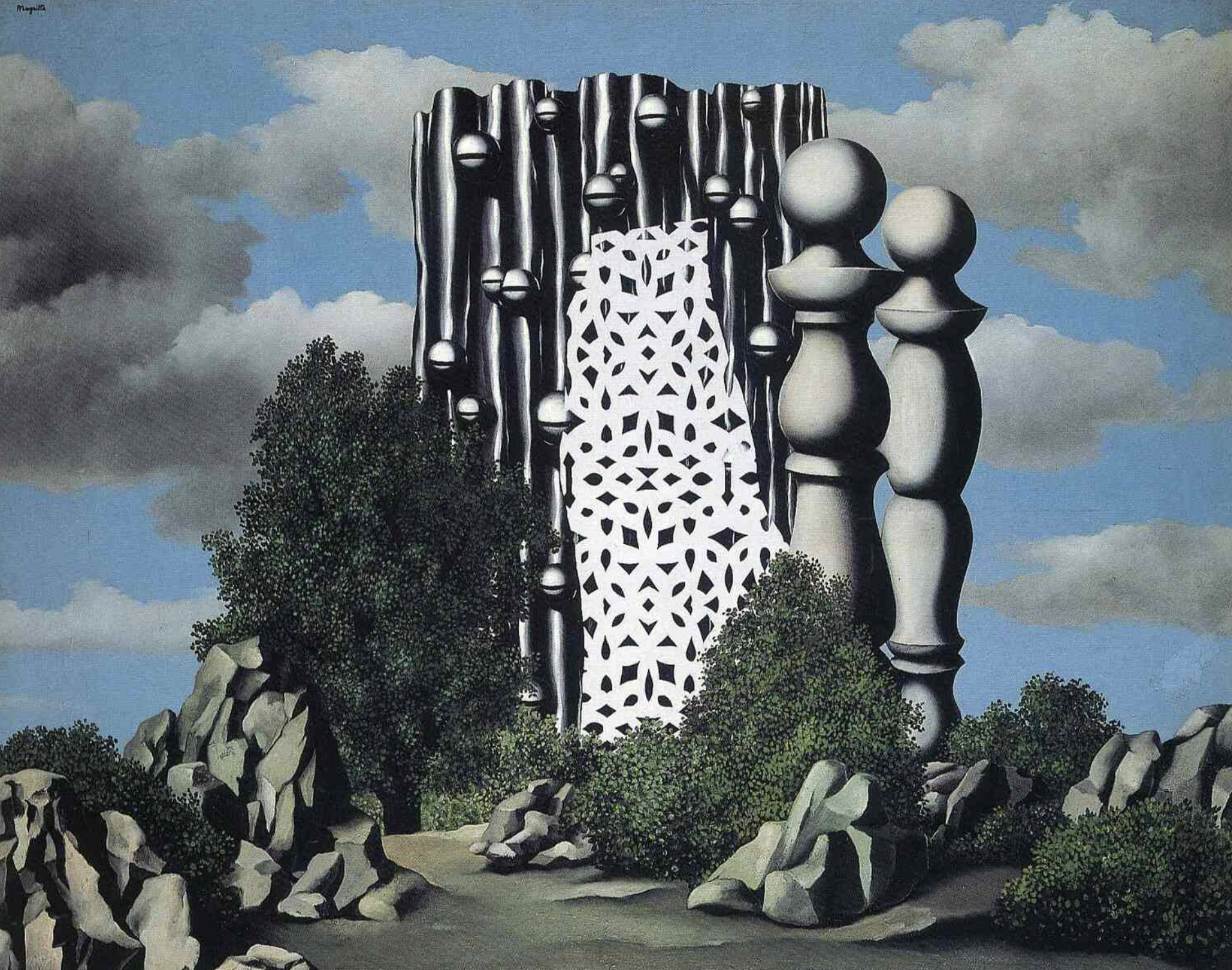
The Eye of Silence shows the land­scapes of our world “for what they are — the palaces of flesh and bone that are the liv­ing facades enclos­ing our own sub­lim­i­nal con­scious­ness.” The “ter­ri­fy­ing struc­ture” at the cen­ter of René Magritte’s The Annun­ci­a­tion is “a neu­ron­ic totem, its round­ed and con­nect­ed forms are a frag­ment of our own ner­vous sys­tems, per­haps an insol­u­ble code that con­tains the oper­at­ing for­mu­lae for our own pas­sage through time and space.”

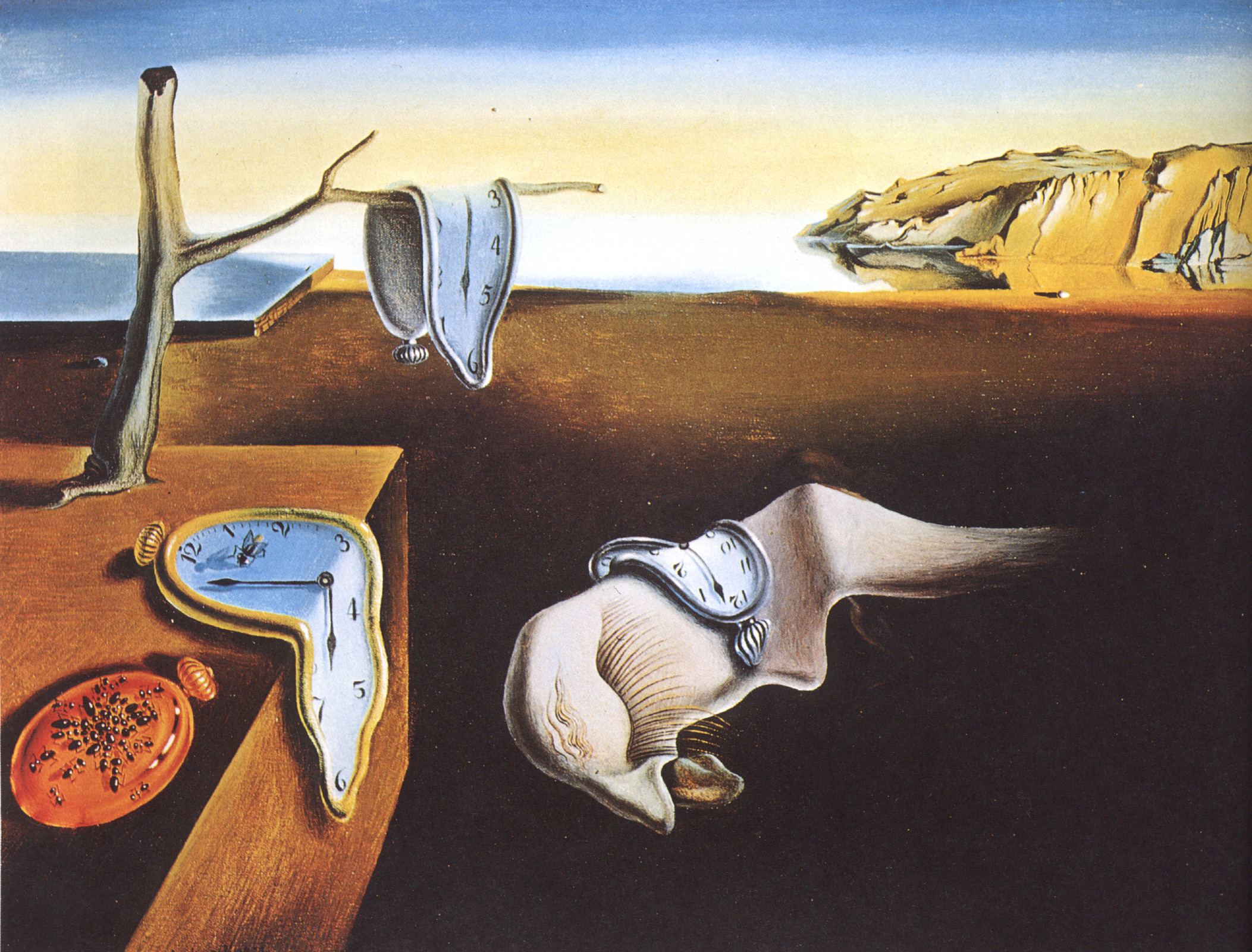
In Gior­gio de Chiri­co’s The Dis­qui­et­ing Mus­es, “an unde­fined anx­i­ety has begun to spread across the desert­ed square. The sym­me­try and reg­u­lar­i­ty of the arcades con­ceals an intense inner vio­lence; this is the face of cata­ton­ic with­draw­al”; its fig­ures are “human beings from whom all tran­si­tion­al time has been erod­ed.” Anoth­er work depicts an emp­ty beach as “a sym­bol of utter psy­chic alien­ation, of a final sta­sis of the soul”; its dis­place­ment of beach and sea through time “and their mar­riage with our own four-dimen­sion­al con­tin­u­um, has warped them into the rigid and unyield­ing struc­tures of our own con­scious­ness.” There Bal­lard writes of no less famil­iar a can­vas than The Per­sis­tence of Mem­o­ry by Sal­vador Dalí, whom he called “the great­est painter of the twen­ti­eth cen­tu­ry” more than 40 years after “The Com­ing of the Uncon­scious” in the Guardian.

A decade there­after, that same pub­li­ca­tion’s Declan Lloyd the­o­rizes that the exper­i­men­tal bill­boards designed by Bal­lard in the fifties (pre­vi­ous­ly fea­tured here on Open Cul­ture) had been tex­tu­al rein­ter­pre­ta­tions of Dalí’s imagery. Until the late six­ties, Bal­lard says in a 1995 World Art inter­view, “the Sur­re­al­ists were very much looked down upon. This was part of their attrac­tion to me, because I cer­tain­ly did­n’t trust Eng­lish crit­ics, and any­thing they did­n’t like seemed to me prob­a­bly on the right track. I’m glad to say that my judg­ment has been seen to be right — and theirs wrong.” He under­stood the long-term val­ue of Sur­re­al­ist visions, which had seem­ing­ly been obso­lesced by World War II before, “all too soon, a new set of night­mares emerged.” We can only hope he won’t be proven as pre­scient about the long-term hab­it­abil­i­ty of the plan­et.

via Flash­bak

Relat­ed con­tent:

Sci-Fi Author J.G. Bal­lard Pre­dicts the Rise of Social Media (1977)

What Makes Sal­vador Dalí’s Icon­ic Sur­re­al­ist Paint­ing “The Per­sis­tence of Mem­o­ry” a Great Work of Art

An Intro­duc­tion to René Magritte, and How the Bel­gian Artist Used an Ordi­nary Style to Cre­ate Extra­or­di­nar­i­ly Sur­re­al Paint­ings

When Our World Became a de Chiri­co Paint­ing: How the Avant-Garde Painter Fore­saw the Emp­ty City Streets of 2020

J. G. Ballard’s Exper­i­men­tal Text Col­lages: His 1958 For­ay into Avant-Garde Lit­er­a­ture

An Intro­duc­tion to Sur­re­al­ism: The Big Aes­thet­ic Ideas Pre­sent­ed in Three Videos

Based in Seoul, Col­in Marshall writes and broad­casts on cities, lan­guage, and cul­ture. His projects include the Sub­stack newslet­ter Books on Cities and the book The State­less City: a Walk through 21st-Cen­tu­ry Los Ange­les. Fol­low him on Twit­ter at @colinmarshall or on Face­book.

« Go BackMore in this category... »
Quantcast