Today one can behold the pyramids of Giza and feel the temptation to believe that the ancient Egyptians knew something we moderns didn’t. Just imagine, then, what it must have felt like in the 17th century, when the recovery of lost ancient knowledge was still very much an active enterprise. Back then, no less formidable a mind than Sir Isaac Newton suspected that to understand the pyramids would be to understand much else besides, from the nature of gravity — a subject on which he would become something of an authority — to Biblical prophecy. The key he reckoned, lay in an ancient Egyptian unit of measurement called the royal cubit.
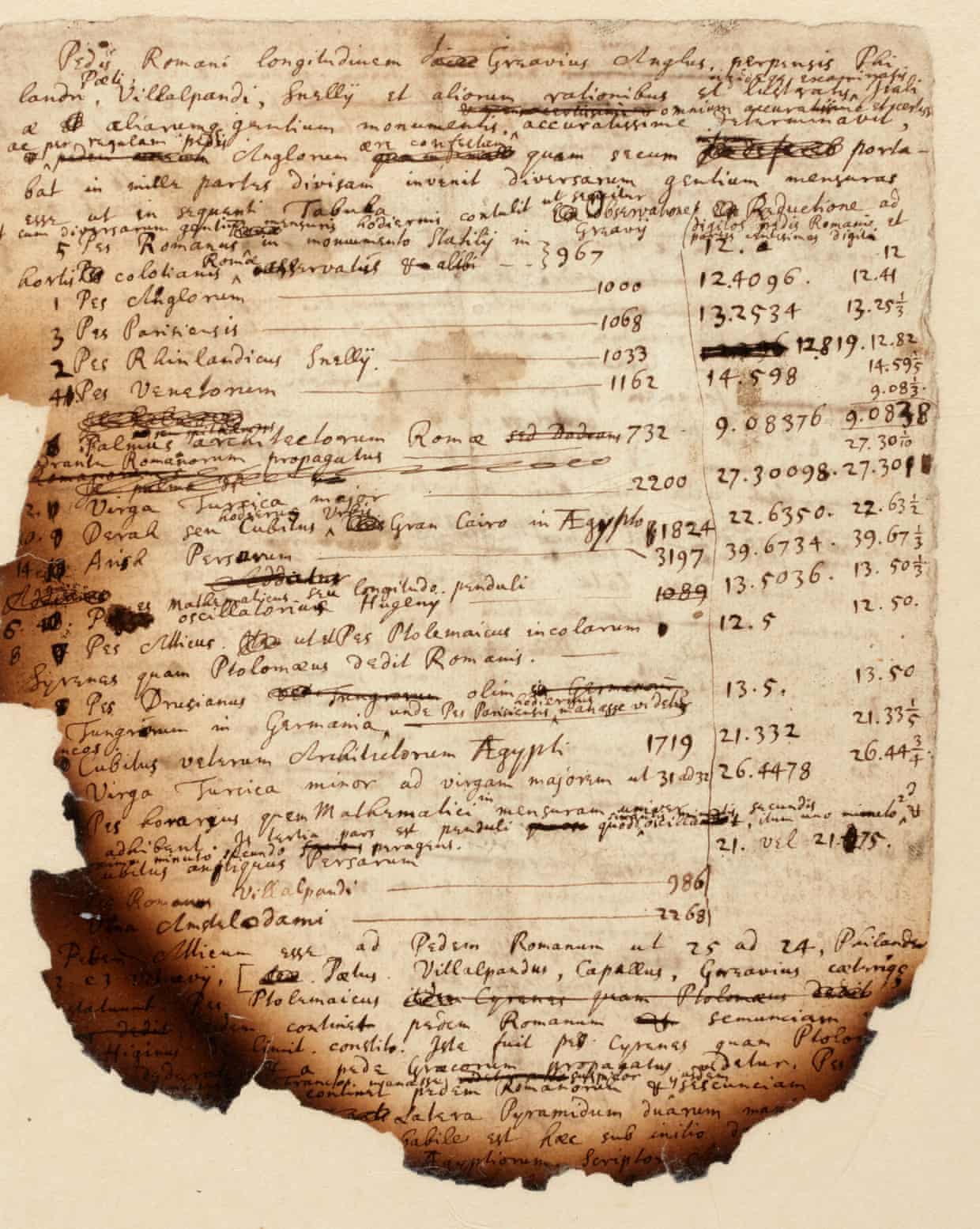
“Establishing the precise length of the Egyptian cubit would allow him to reconstruct in turn other ancient measures, crucially the sacred cubit of the Hebrews, and so be able to reconstruct with precision a building that was, to Newton, of much greater import even than the Great Pyramid: the Temple of Solomon,” says Sotheby’s.
There, a few pages of Newton’s notes on the subject (burnt at the edges, which legend has it happened when his dog knocked over a candle) recently sold for £378,000, but you can still view them online. Given that Ezekiel describes the Temple of Solomon as the setting of the Apocalypse — the end of the world being another subject of Newtonian interest — “an exact knowledge of the Temple’s architecture and dimensions was therefore needed to correctly interpret the Bible’s deep and hidden meanings.” It would also reveal the eventual timing of the the Apocalypse.
Newton’s belief that “the ancient Egyptians possessed knowledge that had been lost in the intervening centuries,” as Smithsonian.com’s Livia Gershon puts it, did not set him far apart from mainstream European scholarship at the time. He also thought, Gershon writes, “that the ancient Greeks had successfully measured Earth’s circumference using a unit called the stade, which he believed was borrowed from the Egyptians. By translating the ancient measurement, Newton hoped to validate his own theory of gravity,” as he ultimately did, though not, perhaps, in the manner he first expected to. We must, it seems, consider the pyramids, alongside the Philosopher’s stone, the South Sea Company, and toad-vomit plague cures, as another example of the great genius’ occasionally excessive enthusiasms — albeit an unusually powerful one.
Related Content:
Neil deGrasse Tyson on the Staggering Genius of Isaac Newton
Isaac Newton Conceived of His Most Groundbreaking Ideas During the Great Plague of 1665
In 1704, Isaac Newton Predicts the World Will End in 2060
How the Egyptian Pyramids Were Built: A New Theory in 3D Animation
Based in Seoul, Colin Marshall writes and broadcasts on cities, language, and culture. His projects include the Substack newsletter Books on Cities, the book The Stateless City: a Walk through 21st-Century Los Angeles and the video series The City in Cinema. Follow him on Twitter at @colinmarshall, on Facebook, or on Instagram.


