George Herriman’s Krazy Kat, Praised as the Greatest Comic Strip of All Time, Gets Digitized as Early Installments Enter the Public Domain

“As a car­toon­ist, I read Krazy Kat with awe and won­der,” writes Calvin and Hobbes cre­ator Bill Wat­ter­son in his intro­duc­tion to The Kom­plete Kolor Krazy Kat. The cre­ator of quite pos­si­bly the most beloved com­ic strip of the past thir­ty years calls Krazy Kat “such a pure and com­plete­ly real­ized per­son­al vision that the strip’s inner mech­a­nism is ulti­mate­ly as unknow­able as George Her­ri­man,” the artist who wrote and drew it for its entire three-decade run from 1913 to 1944. “I mar­vel at how this fan­ci­ful world could be so force­ful­ly imag­ined and brought to paper with such imme­di­a­cy. THIS is how good a com­ic strip can be.”

High praise, espe­cial­ly from the hyper­bole-resis­tant Wat­ter­son, a sharp-eyed crit­ic of his art form and per­ceiv­er of its unre­al­ized poten­tial. “Quirky, indi­vid­ual, and uncom­pro­mised, Krazy Kat is one of the very few com­ic strips that takes full advan­tage of its medi­um. There are some things a com­ic strip can do that no oth­er medi­um, not even ani­ma­tion, can touch, and Krazy Kat is a vir­tu­al essay on com­ic strip essence.”

The “self-con­scious­ly baroque nar­ra­tions and mono­logues” show that “words can be fun­ny in them­selves”; “the sky turns from black to white to zigza­gs and plaids sim­ply because, in a com­ic strip, it CAN”; its sur­re­al Ari­zona desert set­ting “is a char­ac­ter in the sto­ry, and the strip is ‘about’ that land­scape as much as it is about the ani­mals who pop­u­late it,” Ignatz Mouse, Off­is­sa Pupp, and the tit­u­lar Krazy Kat.

Ignatz Mouse “demon­strates his con­tempt for Krazy by throw­ing bricks at her” (though their gen­ders, so mod­ern observers note, were nev­er quite sta­ble), “Krazy rein­ter­prets the bricks as signs of love,” and Off­is­sa Pupp, the desert’s lone law­man, is “oblig­ed by duty (and regard for Krazy) to thwart and pun­ish Ignatz’s ‘sin,’ there­by inter­fer­ing with a process that’s sat­is­fy­ing to every­one for all the wrong rea­sons.”

Now read­ers every­where can feel that sat­is­fac­tion for them­selves at the web site of Krazy Kat fan Joel Franu­sic, who has launched a project to find and dig­i­tize (using Machine Learn­ing) all of Her­ri­man’s strips that have so far fall­en into the pub­lic domain. Franu­sic writes of hav­ing got into Krazy Kat in the first place because of the pres­ence of Calvin and Hobbes in his child­hood: “I remem­bered how Bill Wat­ter­son ref­er­enced Krazy Kat as a big rea­son why he insist­ed on get­ting a larg­er full col­or for­mat for his Sun­day com­ic strips.”

I myself first picked up a Krazy Kat col­lec­tion as a Calvin and Hobbes-lov­ing ele­men­tary school­er, and soon found myself cap­ti­vat­ed by the sheer den­si­ty of strange­ness in its pages. But read enough of Her­ri­man’s mas­ter­work, and that strange­ness takes on a strong mean­ing that nev­er­the­less dif­fers from read­er to read­er. “Krazy Kat has been described as a para­ble of love, a metaphor for democ­ra­cy, a ‘sur­re­al­is­tic’ poem, unfold­ing over years and years,” writes Chris Ware, anoth­er of the most respect­ed com­ic-strip artists alive. “It is all of these, but so much more: it is a por­trait of Amer­i­ca, a self-por­trait of Her­ri­man, and, I believe, the first attempt to paint the full range  of human con­scious­ness in the lan­guage of the com­ic strip.” And now, 75 years after its con­clu­sion, much more of human­i­ty can enjoy Krazy Kat than ever. Explore dig­i­tized scans at Franu­sic’s web site. Or pick up a copy of the new edi­tion of The Com­plete Krazy Kat in Col­or, a col­or fac­sim­i­le of the com­plete pages of Krazy Kat 1935–44.

via Boing­Bo­ing

Relat­ed Con­tent:

Umber­to Eco Explains the Poet­ic Pow­er of Charles Schulz’s Peanuts

24,000 Vin­tage Car­toons from the Library of Con­gress Illus­trate the His­to­ry of This Mod­ern Art Form (1780–1977)

Down­load 15,000+ Free Gold­en Age Comics from the Dig­i­tal Com­ic Muse­um

Down­load Over 22,000 Gold­en & Sil­ver Age Com­ic Books from the Com­ic Book Plus Archive

Clas­sic Children’s Books Now Dig­i­tized and Put Online: Revis­it Vin­tage Works from the 19th & 20th Cen­turies

A Dig­i­tal Archive of Heavy Met­al, the Influ­en­tial “Adult Fan­ta­sy Mag­a­zine” That Fea­tured the Art of Moe­bius, H.R. Giger & More

Based in Seoul, Col­in Mar­shall writes and broad­casts on cities, lan­guage, and cul­ture. His projects include the book The State­less City: a Walk through 21st-Cen­tu­ry Los Ange­les and the video series The City in Cin­e­ma. Fol­low him on Twit­ter at @colinmarshall, on Face­book, or on Insta­gram.

An Illustrated Version of The Mueller Report: Read Online an Edition Created by the Author of Black Hawk Down and an Illustrator from Archer

The 448 page Mueller Report does­n’t make for breezy beach read­ing. That’s for sure. But, “buried with­in the Mueller report, there is a nar­ra­tive that reads in parts like a thriller.” Work­ing with that the­o­ry, Insider.com “hired Mark Bow­den, a jour­nal­ist and author known for his bril­liant works of nar­ra­tive non­fic­tion like Black Hawk Down, Killing Pablo, and Hue 1968.” And they gave him an assign­ment: “Use the inter­views and facts laid out in the Mueller Report (plus those from reli­able, fact-checked sources and pub­lished first­hand accounts)” and cre­ate an account that’s “so grip­ping it will hold your atten­tion (and maybe your con­gres­sion­al rep­re­sen­ta­tive’s).” They also hired “Chad Hurd, an illus­tra­tor from the art depart­ment of Archer,” and “asked him to draw out scenes from the report to bring them to life.” Find the result­ing illus­trat­ed edi­tion of The Mueller Report right here.

If you would like to sign up for Open Culture’s free email newslet­ter, please find it here. Or fol­low our posts on Threads, Face­book, BlueSky or Mastodon.

If you would like to sup­port the mis­sion of Open Cul­ture, con­sid­er mak­ing a dona­tion to our site. It’s hard to rely 100% on ads, and your con­tri­bu­tions will help us con­tin­ue pro­vid­ing the best free cul­tur­al and edu­ca­tion­al mate­ri­als to learn­ers every­where. You can con­tribute through Pay­Pal, Patre­on, and Ven­mo (@openculture). Thanks!

Relat­ed Con­tent:

The Mueller Report Released as a Free Well-For­mat­ted eBook (by The Dig­i­tal Pub­lic Library of Amer­i­ca)

Watch a Star-Stud­ded Cast Read The Mueller Report: John Lith­gow, Kevin Kline, Sigour­ney Weaver, Annette Ben­ing & More

by | Permalink | Make a Comment ( 2 ) |

A Beautiful 1870 Visualization of the Hallucinations That Come Before a Migraine

Headaches num­ber among human­i­ty’s most com­mon ail­ments. The headache-relat­ed dis­or­ders known as migraines may be rar­er, afflict­ing rough­ly fif­teen per­cent of the pop­u­la­tion, but they’re also much more severe. Besides a headache that can last as long as three days, migraines can also come with var­i­ous oth­er symp­toms includ­ing nau­sea as well as sen­si­tiv­i­ty to light, sound, and smells. They even cause some suf­fer­ers to hal­lu­ci­nate: the visu­al ele­ments of these pre-migraine “auras” might take the shape of dis­tor­tions, vibra­tions, zig-zag lines, bright lights, blobs, or blind spots. Some­times they also come in col­or, and bril­liant col­or at that.

Those col­ors jump right out of this 1870 draw­ing by Eng­lish physi­cian Hubert Airy, with which he sought to cap­ture his own visu­al expe­ri­ence of a migraine. He “first became aware of his afflic­tion in the fall of 1854,” writes Nation­al Geo­graph­ic’s Greg Miller, “when he noticed a small blind spot inter­fer­ing with his abil­i­ty to read. ‘At first it looked just like the spot which you see after hav­ing looked at the sun or some bright object,’ he lat­er wrote. But the blind spot was grow­ing, its edges tak­ing on a zigzag shape that remind­ed Airy of the bas­tions of a for­ti­fied medieval town.” As Airy describes it, “All the inte­ri­or of the for­ti­fi­ca­tion, so to speak, was boil­ing and rolling about in a most won­der­ful man­ner as if it was some thick liq­uid all alive.”

To a migra­neur, that descrip­tion may sound famil­iar, and the draw­ing that accom­pa­nied it in the Philo­soph­i­cal Trans­ac­tions of the Roy­al Soci­ety in 1870 may look even more so. Called “arguably the most beau­ti­ful sci­en­tif­ic records of migraine aura ever made” by G.D. Schott in Brain, Airy’s draw­ings “record the progress and expan­sion of his own visu­al dis­tur­bances” over their half-hour-long onset. Apart from their stark beau­ty, writes Miller, the set of draw­ings “antic­i­pates dis­cov­er­ies in neu­ro­science that were still decades in the future,” such as the assump­tion that the hal­lu­ci­na­tions orig­i­nate in the brain rather than the eyes and that cer­tain parts of the field of vision cor­re­spond to cer­tain parts of the visu­al cor­tex.

“There’s still much we don’t know about migraines and migraine auras,” Miller writes. “One hypoth­e­sis is that a sort of elec­tri­cal wave sweeps across the visu­al cor­tex, caus­ing hal­lu­ci­na­tions that spread across the cor­re­spond­ing parts of the visu­al field” — an idea with which Airy’s ear­ly ren­der­ings also accord. And what about the source of all those col­ors? Elec­tri­cal waves pass­ing through parts of the brain “that con­tain neu­rons that respond to spe­cif­ic col­ors” may be respon­si­ble, but near­ly 150 years after the pub­li­ca­tion of Airy’s draw­ings, “no one real­ly knows.” Migraine research of the kind pio­neered by Airy him­self may have dis­pelled some of the mys­tery sur­round­ing the afflic­tion, but a great deal nev­er­the­less remains. Airy’s draw­ings, still among the most vivid rep­re­sen­ta­tions of the visu­al aspect of migraines ever cre­at­ed, will no doubt inspire gen­er­a­tions of future neu­ro­sci­en­tists to find out more.

via Greg Miller at Nation­al Geo­graph­ic and don’t miss his book: All Over the Map: A Car­to­graph­ic Odyssey.

Relat­ed Con­tent:

Oliv­er Sacks Explains the Biol­o­gy of Hal­lu­ci­na­tions: “We See with the Eyes, But with the Brain as Well”

When Jean-Paul Sartre Had a Bad Mesca­line Trip and Then Hal­lu­ci­nat­ed That He Was Being Fol­lowed by Crabs

Hunter S. Thompson’s Per­son­al Hang­over Cure (and the Real Sci­ence of Hang­overs)

Free Guid­ed Imagery Record­ings Help Kids Cope with Pain, Stress & Anx­i­ety

Based in Seoul, Col­in Mar­shall writes and broad­casts on cities, lan­guage, and cul­ture. His projects include the book The State­less City: a Walk through 21st-Cen­tu­ry Los Ange­les and the video series The City in Cin­e­ma. Fol­low him on Twit­ter at @colinmarshall, on Face­book, or on Insta­gram.

Hear the First Recording of the Human Voice (1860)

When inven­tor Édouard-Léon Scott de Mar­t­inville sang a nurs­ery rhyme into his phonoau­to­gram in 1860, he had no plans on ever play­ing this record­ing back. A pre­cur­sor to the wax cylin­der, the phonoau­to­gram took inputs for the study of sound waves, but could not be turned into an out­put device. How amaz­ing then, that 150 or so years lat­er, we can hear the voice of Scott in what is now con­sid­ered the first ever record­ing of human sound.

What you will hear in the above video are the var­i­ous stages of recon­struct­ing and reverse engi­neer­ing the voice that sung on that April day in 1860, until, like wip­ing away decades of dirt and soot, the orig­i­nal art is revealed.

Scott had looked to the inven­tion of pho­tog­ra­phy and won­dered if some­thing sim­i­lar could be done with sound waves, focused as he was on improv­ing stenog­ra­phy. And so the phonoau­to­gram took in sound vibra­tions through a diaphragm, which moved a sty­lus against a rotat­ing cylin­der cov­ered in lamp­black. What was left was a wig­gly line in a con­cen­tric cir­cle.

But how to play them back? That was the prob­lem. Scott’s inven­tion nev­er turned a prof­it and he went back to book­selling. The inven­tion and some of the paper cylin­ders went into muse­ums.

In 2008, Amer­i­can audio his­to­ri­ans dis­cov­ered the scrib­bles and turned to the Lawrence Berke­ley Nation­al Lab­o­ra­to­ry and a soft­ware called IRENE. The soft­ware was designed to extract sounds from wax cylin­ders with­out touch­ing the del­i­cate sur­faces, and the first pass revealed what they thought at first was a young woman or child singing “Au Clair de la lune,” the French nurs­ery rhyme (not the Debussy piano work).

How­ev­er, a fur­ther exam­i­na­tion of Scott’s notes revealed that the record­ing was at a much slow­er speed, and it was a man–most prob­a­bly Scott–singing the lul­la­by.

The video shows the stages that brought Scott back to life: Denois­ing a lot of extra­ne­ous sound; stretch­ing the record­ing back to nat­ur­al time; “tun­ing and quantizing”–correcting for imper­fec­tions in the human-turned cylin­der; clean­ing up har­mon­ics; and final­ly adding fur­ther har­mon­ics, reverb and a stereo effect.

The result is less an unrec­og­niz­able ghost sig­nal and more a touch­ing sound of human­i­ty, desir­ing some­how to have their voice live on.

Relat­ed Con­tent:

Opti­cal Scan­ning Tech­nol­o­gy Lets Researchers Recov­er Lost Indige­nous Lan­guages from Old Wax Cylin­der Record­ings

Hear Singers from the Met­ro­pol­i­tan Opera Record Their Voic­es on Tra­di­tion­al Wax Cylin­ders

Down­load 10,000 of the First Record­ings of Music Ever Made, Thanks to the UCSB Cylin­der Audio Archive

Ted Mills is a free­lance writer on the arts who cur­rent­ly hosts the artist inter­view-based FunkZone Pod­cast and is the pro­duc­er of KCR­W’s Curi­ous Coast. You can also fol­low him on Twit­ter at @tedmills, read his oth­er arts writ­ing at tedmills.com and/or watch his films here.

The New David Bowie Barbie Doll Released to Commemorate the 50th Anniversary of “Space Oddity”

This week Open Cul­ture com­mem­o­rat­ed the 50th anniver­sary of the release of David Bowie’s “Space Odd­i­ty” by explor­ing the song’s rela­tion­ship to the Apol­lo 11 moon land­ing and Stan­ley Kubrick­’s 2001: A Space Odyssey. Mat­tel, they han­dled things a lit­tle dif­fer­ent­ly, releas­ing a new David Bowie Bar­bie Doll. Here’s their spiel:

  • In the defin­i­tive cel­e­bra­tion of two pop cul­ture icons, Bar­bie hon­ors the ulti­mate pop chameleon, Eng­lish singer, song­writer and actor, David Bowie.
  • This col­lectible Bar­bie doll wears the metal­lic Zig­gy Star­dust ‘space suit’ with red and blue stripes, flared shoul­ders and Bowie’s sig­na­ture cher­ry-red plat­form boots.
  • Spe­cial details include bold make­up — fea­tur­ing the famed astral sphere fore­head icon — and a hair­style inspired by Bowie’s fiery-red locks.
  • Spe­cial­ly designed pack­ag­ing makes Bar­bie David Bowie the ulti­mate collector’s item for Bowie and Bar­bie fans alike.
  • Hon­or David Bowie’s extra­or­di­nary tal­ent and unde­ni­able influ­ence with Bar­bie David Bowie doll.

You can pur­chase it online.

Relat­ed Con­tent

David Bowie’s “Space Odd­i­ty” and the Apol­lo 11 Moon Land­ing Turn 50 This Month: Cel­e­brate Two Giant Leaps That Took Place 9 Days Apart

David Bowie’s Top 100 Books

Hear Demo Record­ings of David Bowie’s “Zig­gy Star­dust,” “Space Odd­i­ty” & “Changes”

by | Permalink | Make a Comment ( 2 ) |

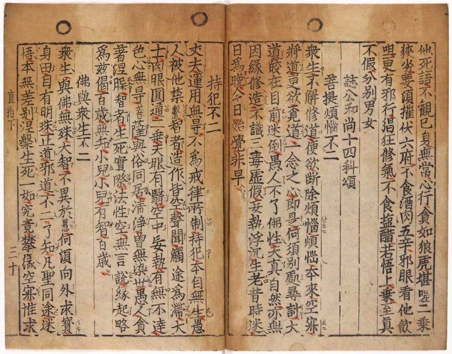
The Oldest Book Printed with Movable Type is Not The Gutenberg Bible: Jikji, a Collection of Korean Buddhist Teachings, Predated It By 78 Years and It’s Now Digitized Online

The his­to­ry of the print­ed word is full of bib­li­o­graph­ic twists and turns, major his­tor­i­cal moments, and the sig­nif­i­cant print­ing of books now so obscure no one has read them since their pub­li­ca­tion. Most of us have only the sketchi­est notion of how mass-pro­duced print­ed books came into being—a few scat­tered dates and names. But every school­child can tell you the first book ever print­ed, and every­one knows the first words of that book: “In the begin­ning….”

The first Guten­berg Bible, print­ed in 1454 by Johannes Guten­berg, intro­duced the world to mov­able type, his­to­ry tells us. It is “uni­ver­sal­ly acknowl­edged as the most impor­tant of all print­ed books,” writes Mar­garet Leslie Davis, author of the recent­ly pub­lished The Lost Guten­berg: The Astound­ing Sto­ry of One Book’s Five-Hun­dred-Year Odyssey. In 1900, Mark Twain expressed the sen­ti­ment in a let­ter “com­ment­ing on the open­ing of the Guten­berg Muse­um,” writes M. Sophia New­man at Lithub. “What the world is to-day,” he declared, “good and bad, it owes to Guten­berg. Every­thing can be traced to this source.”

There is kind of an over­sim­pli­fied truth in the state­ment. The print­ed word (and the print­ed Bible, at that) did, in large part, deter­mine the course of Euro­pean his­to­ry, which, through empire, deter­mined the course of glob­al events after the “Guten­berg rev­o­lu­tion.” But there is anoth­er sto­ry of print entire­ly inde­pen­dent of book his­to­ry in Europe, one that also deter­mined world his­to­ry with the preser­va­tion of Bud­dhist, Chi­nese dynas­tic, and Islam­ic texts. And one that begins “before Johannes Guten­berg was even born,” New­man points out.

The old­est extant text ever print­ed with mov­able type pre­dates Guten­berg him­self (born in 1400) by 23 years, and pre­dates the print­ing of his Bible by 78 years. It is the Jikji, print­ed in Korea, a col­lec­tion of Bud­dhist teach­ings by Seon mas­ter Bae­gun and print­ed in mov­able type by his stu­dents Seok-chan and Dai­jam in 1377. (Seon is a Kore­an form of Chan or Zen Bud­dhism.) Only the sec­ond vol­ume of the print­ing has sur­vived, and you can see sev­er­al images from it here.

Impres­sive as this may be, the Jikji does not have the hon­or of being the first book print­ed with mov­able type, only the old­est sur­viv­ing exam­ple. The tech­nol­o­gy could go back two cen­turies ear­li­er. Mar­garet Davis nods to this his­to­ry, New­man con­cedes, writ­ing that “mov­able type was an 11th cen­tu­ry Chi­nese inven­tion, refined in Korea in 1230, before meet­ing con­di­tions in Europe that would allow it to flour­ish.” This is more than most pop­u­lar accounts of the print­ed word say on the mat­ter, but it’s still an inac­cu­rate and high­ly cur­so­ry sum­ma­ry of the evi­dence.

New­man her­self says quite a lot more. In essays at Lithub and Tri­cy­cle, she describes how print­ing tech­niques devel­oped in Asia and were tak­en up in Korea in the 1200s by the Goryeo dynasty, who com­mis­sioned a print­er named Choe Yun-ui to recon­struct a wood­block print of the mas­sive col­lec­tion of ancient Bud­dhists texts called the Tip­i­ta­ka after the Mon­gols burned the only Kore­an copy. By cast­ing “indi­vid­ual char­ac­ters in met­al” and arrang­ing them in a frame—the same process Guten­berg used—he was able to com­plete the project by 1250, 200 years before Gutenberg’s press.

This text, how­ev­er, did not sur­vive, nor did the count­less num­ber of oth­ers print­ed when the tech­nol­o­gy spread across the Mon­gol empire on the Silk Road and took root with the Mus­lim Uyghurs. It is pos­si­ble, though “no clear his­tor­i­cal evi­dence” yet sup­ports the con­tention, that mov­able type spread to Europe from Asia along trade routes. “If there was any con­nec­tion,” wrote Joseph Need­ham in Sci­ence and Civ­i­liza­tion in Chi­na, “in the spread of print­ing between Asia and the West, the Uyghurs, who used both block print­ing and mov­able type, had good oppor­tu­ni­ties to play an impor­tant role in this intro­duc­tion.”

With­out sur­viv­ing doc­u­men­ta­tion, this ear­ly his­to­ry of print­ing in Asia relies on sec­ondary sources. But “the entire his­to­ry of the print­ing press” in Europe” is like­wise “rid­dled with gaps,” New­man writes. What we do know is that Jikji, a col­lec­tion of Kore­an Zen Bud­dhist teach­ings, is the world’s old­est extant book print­ed with mov­able type. The myth of Johannes Guten­berg as “a lone genius who trans­formed human cul­ture,” as Davis writes, “endures because the sweep of what fol­lowed is so vast that it feels almost myth­ic and needs an ori­gin sto­ry to match.” But this is one inven­tive indi­vid­ual in the his­to­ry of print­ing, not the orig­i­nal, god­like source of mov­able type.

Guten­berg makes sense as a con­ve­nient start­ing point for the growth and world­wide spread of cap­i­tal­ism and Euro­pean Chris­tian­i­ty. His inno­va­tion worked much faster than ear­li­er sys­tems, and oth­ers that devel­oped around the same time, in which frames were pressed by hand against the paper. Flows of new cap­i­tal enabled the rapid spread of his machine across Europe. The achieve­ment of the Guten­berg Bible is not dimin­ished by a fuller his­to­ry. But “what gets left out” of the usu­al sto­ry, as New­man tells us in great detail, “is star­tling­ly rich.”

“Only very recent­ly, most­ly in the last decade” has the long his­to­ry of print­ing in Asia been “acknowl­edged at all” in pop­u­lar cul­ture, though schol­ars in both the East and West have long known it. Korea has regard­ed Jikji “and oth­er ancient vol­umes as nation­al points of pride that rank among the most impor­tant of books.” Yet UNESCO only cer­ti­fied Jikji as the “old­est mov­able met­al type print­ing evi­dence” in 2001. The recog­ni­tion may be late in com­ing, but it mat­ters a great deal, nonethe­less. Learn much more about the his­to­ry, con­tent, and prove­nance of Jikji at this site cre­at­ed by “cyber diplo­mats” in Korea after UNESCO bestowed World Her­itage sta­tus on the book. And see a ful­ly dig­i­tized copy of the book here.

via Lithub

Relat­ed Con­tent:

The World’s Old­est Mul­ti­col­or Book, a 1633 Chi­nese Cal­lig­ra­phy & Paint­ing Man­u­al, Now Dig­i­tized and Put Online

1,000+ His­toric Japan­ese Illus­trat­ed Books Dig­i­tized & Put Online by the Smith­son­ian: From the Edo & Meji Eras (1600–1912)

See How The Guten­berg Press Worked: Demon­stra­tion Shows the Old­est Func­tion­ing Guten­berg Press in Action

Oxford Uni­ver­si­ty Presents the 550-Year-Old Guten­berg Bible in Spec­tac­u­lar, High-Res Detail

Josh Jones is a writer and musi­cian based in Durham, NC. Fol­low him at @jdmagness

The Evolution of the World Map: An Inventive Infographic Shows How Our Picture of the World Changed Over 1,800 Years

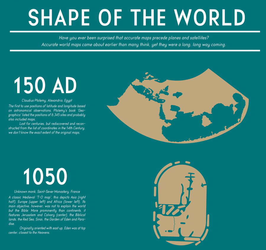
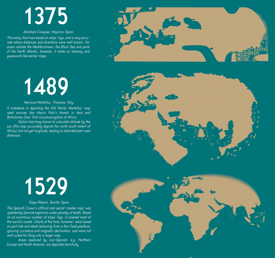
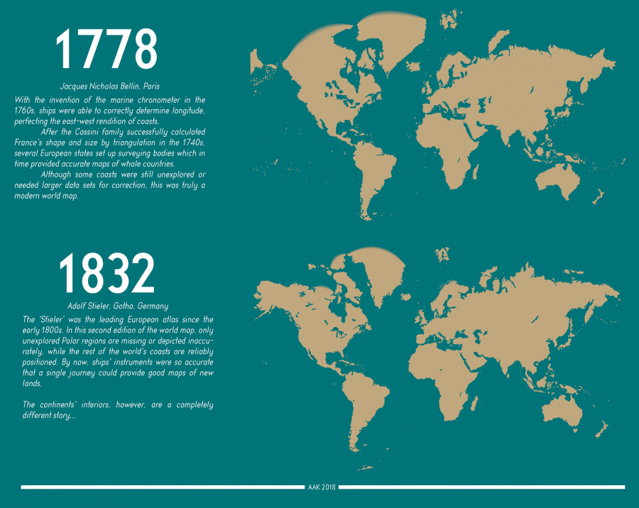
For about 190 years, human­i­ty has known what the world looks like. Or rather, human­i­ty has known the shape and size of the land mass­es that rise up above the oceans, as well as where those land mass­es stand in rela­tion to one anoth­er. For gen­er­a­tion upon gen­er­a­tion, we’ve all grown up see­ing visu­al depic­tions of this knowl­edge in the form of the stan­dard world map — dis­tort­ed, of course, usu­al­ly by Mer­ca­tor pro­jec­tion, giv­en the impos­si­bil­i­ty of turn­ing a three-dimen­sion­al globe into a two-dimen­sion­al image with per­fect accu­ra­cy. We can call it to mind (or up on our phones) when­ev­er we need it. But what did the world look like before we knew what it looked like? Thanks to a Red­di­tor who goes by PisseGuri82, we can now take in, at a glance, human­i­ty’s image of the world as it evolved over the past two mil­len­nia.

This Shape of the World info­graph­ic begins in 150 AD with the world map used by Claudius Ptole­my of Alexan­dria, Egypt, “the first to use posi­tions of lat­i­tude and lon­gi­tude based on astro­nom­i­cal obser­va­tions.” Not that those obser­va­tions pro­duced any­thing imme­di­ate­ly resem­bling an ances­tor of the map we remem­ber from class­room walls grow­ing up, but it cer­tain­ly must have marked an improve­ment on the guess­work and pure fan­ta­sy used in even ear­li­er times.

World maps from the medieval peri­od, such as the one includ­ed on the dia­gram cre­at­ed by an unknown French monk in 1050, were meant “not to explain the world but the Bible.” Hence its focus on such Bib­li­cal parts of the world as Jerusalem, the Red Sea, and even the Gar­den of Eden.

Just over a cen­tu­ry lat­er, a map by Italy’s Muhammed al-Idrisi employed the more objec­tive method of cal­cu­lat­ing dis­tances by what trav­el­ers and mer­chants told him about how long it took them to reach the dis­tant lands they vis­it­ed. Despite its “rec­og­niz­able and detailed Eura­sia and North­ern Africa,” how­ev­er, it still makes for a vague (and, need­less to say, hard­ly com­plete) approx­i­ma­tion of the world. Only in 1529, with the empire-mind­ed Span­ish Crown’s offi­cial and secret “mas­ter map,” updat­ed “by Span­ish explor­ers on pain of death,” do we arrive at a world map that would remind any of us of the ones we use in the 21st cen­tu­ry.

Sub­se­quent devel­op­ments came from such advances as the afore­men­tioned Mer­ca­tor pro­jec­tion, invent­ed in 1569 in the Nether­lands and refined in Eng­land 30 years lat­er, as well as the inven­tion of the marine chronome­ter in 1778. The final map in the chart, an 1832 edi­tion by Ger­many’s Adolf Stiel­er in which “only the unex­plored Polar regions are miss­ing or depict­ed inac­cu­rate­ly,” may look almost exact­ly like the world maps we use today. But the evo­lu­tion cer­tain­ly has­n’t stopped: with the ever more detailed dig­i­tal maps and satel­lite imagery that now fea­ture in our world maps, our abil­i­ty to per­ceive the Earth still improves every day. Our descen­dants 2000 years hence may well place them­selves in a world we would hard­ly rec­og­nize. See the full-size “Shape of the World” info­graph­ic here. Make sure you click on the image once you open the page, and then you can see it in a larg­er for­mat.

Relat­ed Con­tent:

Ani­mat­ed Maps Reveal the True Size of Coun­tries (and Show How Tra­di­tion­al Maps Dis­tort Our World)

The “True Size” Maps Shows You the Real Size of Every Coun­try (and Will Change Your Men­tal Pic­ture of the World)

Japan­ese Design­ers May Have Cre­at­ed the Most Accu­rate Map of Our World: See the Autha­Graph

The His­to­ry of Car­tog­ra­phy, the “Most Ambi­tious Overview of Map Mak­ing Ever,” Now Free Online

A Rad­i­cal Map Puts the Oceans – Not Land – at the Cen­ter of Plan­et Earth (1942)

Why Mak­ing Accu­rate World Maps Is Math­e­mat­i­cal­ly Impos­si­ble

Based in Seoul, Col­in Mar­shall writes and broad­casts on cities, lan­guage, and cul­ture. His projects include the book The State­less City: a Walk through 21st-Cen­tu­ry Los Ange­les and the video series The City in Cin­e­ma. Fol­low him on Twit­ter at @colinmarshall, on Face­book, or on Insta­gram.

Napoleon’s Disastrous Invasion of Russia Detailed in an 1869 Data Visualization: It’s Been Called “the Best Statistical Graphic Ever Drawn”

It’s tempt­ing to asso­ciate data visu­al­iza­tions with Pow­er­Point and online graph­ics, which have enabled an unheard-of capac­i­ty for dis­sem­i­nat­ing full-col­or images. But the form reach­es much fur­ther back in his­to­ry. Fur­ther back, even, than the front pages of USA Today and glossy side­bars of Time and
Newsweek. In 1900, for exam­ple, W.E.B. Du Bois made impres­sive use of sev­er­al full-col­or data visu­al­iza­tions for the First Pan-African Con­fer­ence in Lon­don, with no access what­so­ev­er to desk­top pub­lish­ing soft­ware or a laser print­er.

Almost fifty years before Du Bois turned sta­tis­tics into swirls of col­or and shape, Flo­rence Nightin­gale used her lit­tle-known graph­ic design skills to illus­trate the caus­es of dis­ease in the Crimean War and John Snow (not Jon Snow) illus­trat­ed his rev­o­lu­tion­ary Broad Street Pump cholera the­o­ry with a famous info­graph­ic street map.

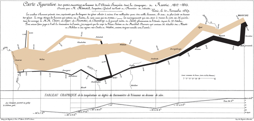
Around this same time, anoth­er data visu­al­iza­tion pio­neer, Charles Joseph Minard, pro­duced some of the most high­ly-regard­ed info­graph­ics ever made, includ­ing the 1869 illus­tra­tion above of Napoleon’s march to, and retreat from, Moscow in the War of 1812. View it in a large for­mat here.

Made fifty years after the event, when Minard was 80 years old, the map has been called by the bible of data visu­al­iza­tion studies—Edward Tufte’s The Visu­al Dis­play of Quan­ti­ta­tive Infor­ma­tion—“prob­a­bly the best sta­tis­ti­cal graph­ic ever drawn.” Over at thoughtbot.com, Joanne Cheng sums up the con­text, if you need­ed a his­tor­i­cal refresh­er: “The year is 1812 and Napoleon is doing pret­ty well for him­self. He has most of Europe under his con­trol, except for the UK.”

Angered by Czar Alexander’s refusal to sup­port a UK trade embar­go to weak­en their defens­es, Napoleon “gath­ers a mas­sive army of over 400,000 to attack Rus­sia.” The cam­paign was dis­as­trous: over­con­fi­dent advances on Moscow turned into dev­as­tat­ing win­ter­time retreats dur­ing which the Grande Armée only “nar­row­ly escaped com­plete anni­hi­la­tion.” So, how does Minard’s 1869 Tableau Graphique tell this grand sto­ry of hubris and icy car­nage? And, Cheng asks, “what makes it so good?”

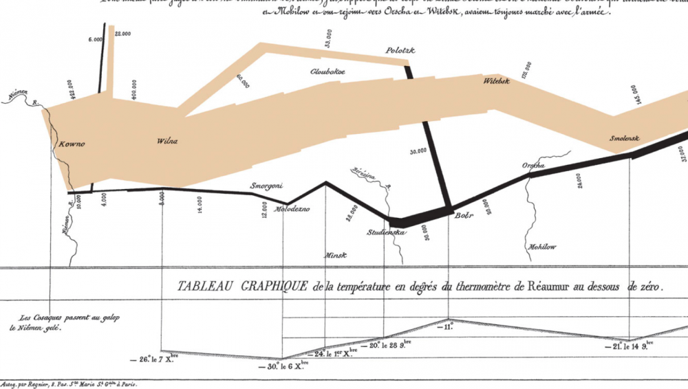
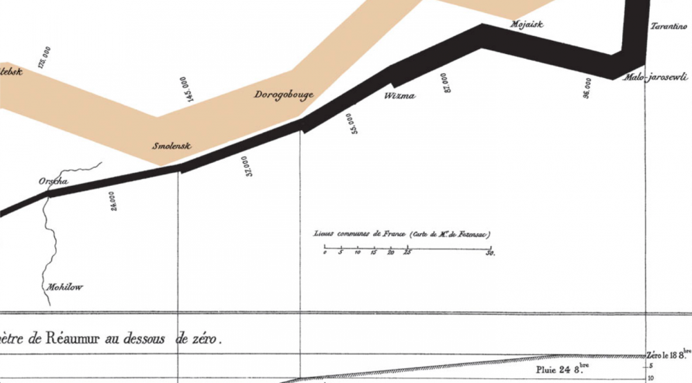
Cheng breaks Minard’s series of jagged lines and shapes down into more con­ven­tion­al XY axis line graphs to show how he coor­di­nat­ed a huge amount of infor­ma­tion, includ­ing the loca­tions (by lon­gi­tude) of dif­fer­ent groups of Napoleon’s troops at dif­fer­ent points in time, their direc­tion, and the pre­cip­i­tous­ly falling tem­per­a­tures in the stages of retreat. He drew from a list of the best his­tor­i­cal sources he could con­sult at the time, turn­ing dense prose into the spare, clean lines that set data sci­en­tists’ hearts a‑flutter.

Minard began his career in a much more rec­og­niz­ably 19-cen­tu­ry design field, build­ing bridges, dams, and canals across Europe for the first few decades of the 1800s. As a civ­il engi­neer “he had the good for­tune to take part in almost all the great ques­tions of pub­lic works which ush­ered in our cen­tu­ry,” not­ed an obit­u­ary pub­lished in Annals of Bridges and Roads the year after Minard’s death in 1870. “And dur­ing the twen­ty years of retire­ment, always au courant of the tech­ni­cal and eco­nom­ic sci­ences, he endeav­ored to pop­u­lar­ize the most salient results.”

He did so by ven­tur­ing out­side the sub­ject of engi­neer­ing, while using the “inno­v­a­tive tech­niques he had invent­ed for the pur­pose of dis­play­ing flows of peo­ple” on paper, writes Michael Sand­berg at DataViz. In order to tell the trag­ic tale” of Napoleon’s crush­ing defeat “in a sin­gle image,” Minard imag­ined the event as a dynam­ic phys­i­cal struc­ture.

Minard’s chart shows six types of infor­ma­tion: geog­ra­phy, time, tem­per­a­ture, the course and direc­tion of the army’s move­ment, and the num­ber of troops remain­ing. The widths of the gold (out­ward) and black (return­ing) paths rep­re­sent the size of the force, one mil­lime­tre to 10,000 men. Geo­graph­i­cal fea­tures and major bat­tles are marked and named, and plum­met­ing tem­per­a­tures on the return jour­ney are shown along the bot­tom.

This was hard­ly Minard’s first info­graph­ic. In fact, he made “scores of oth­er graph­ics and charts,” Nation­al Geo­graph­ic writes, “as well as near­ly 50 maps. He pio­neered sev­er­al impor­tant the­mat­ic map­ping tech­niques and per­fect­ed oth­ers, such as using flow lines on a map.” (See oth­er exam­ples of his work at Nation­al Geographic’s site.) Minard may not be much remem­bered for his infra­struc­ture, but his abil­i­ty, as his obit­u­ar­ist wrote, to turn “the dry and com­pli­cat­ed columns of sta­tis­ti­cal data” into “images math­e­mat­i­cal­ly pro­por­tioned” has made him a leg­end in data sci­ence his­to­ry cir­cles.

Again, view Minard’s visu­al­iza­tion of Napoleon’s failed inva­sion in a large for­mat here.

Relat­ed Con­tent:

Flo­rence Nightin­gale Saved Lives by Cre­at­ing Rev­o­lu­tion­ary Visu­al­iza­tions of Sta­tis­tics (1855)

W.E.B. Du Bois Cre­ates Rev­o­lu­tion­ary, Artis­tic Data Visu­al­iza­tions Show­ing the Eco­nom­ic Plight of African-Amer­i­cans (1900)

Napoleon’s Eng­lish Lessons: How the Mil­i­tary Leader Stud­ied Eng­lish to Escape the Bore­dom of Life in Exile

Josh Jones is a writer and musi­cian based in Durham, NC. Fol­low him at @jdmagness

« Go BackMore in this category... »
Quantcast