Comic Sans Turns 25: Graphic Designer Vincent Connare Explains Why He Created the Most Hated Font in the World

What we write reveals who we are, but so, and often more clear­ly, does how we write. And in an age when hand­writ­ing has giv­en way to typ­ing, how we write has much to do with which font we use. Many of us play it safe, rarely stray­ing from the realm of twelve-point Times New Roman hyper­nor­mal­i­ty, but even there “type is a voice; its very qual­i­ties and char­ac­ter­is­tics com­mu­ni­cate to read­ers a mean­ing beyond mere syn­tax.” That obser­va­tion comes from the Ban Com­ic Sans Man­i­festo, drawn up two decades ago by graph­ic design­ers Hol­ly and David Combs as a strike against the font that, 25 years after its cre­ation, remains a hate object of choice for the visu­al­ly lit­er­ate every­where.

“You don’t like that your cowork­er used me on that note about steal­ing her yogurt from the break room fridge?” asks Com­ic Sans itself, ven­tril­o­quized in McSweeney’s by Mike Lach­er. “You don’t like that I’m all over your sister-in-law’s blog? You don’t like that I’m on the sign for that new Thai place? You think I’m pedes­tri­an and tacky?” Well, tough: “Peo­ple love me. Why? Because I’m fun. I’m the life of the par­ty. I bring lev­i­ty to any sit­u­a­tion. Need to soft­en the blow of a harsh mes­sage about restroom eti­quette? SLAM. There I am. Need to spice up the direc­tions to your grad­u­a­tion par­ty? WHAM. There again. Need to con­vey your fun-lov­ing, approach­able nature on your busi­ness’ web­site? SMACK.”

In the Great Big Sto­ry video above, Com­ic Sans cre­ator Vin­cent Connare tells his side of the sto­ry. While employed at Microsoft in the ear­ly 1990s, he saw a pro­to­type ver­sion of Microsoft Bob, a kind of add-on to the Win­dows inter­face designed for max­i­mum user friend­li­ness. It fea­tured onscreen ani­mal char­ac­ters that spoke in speech bub­bles, but the words in those speech bub­bles appeared in what was every­one’s default font. When it hit him that “dogs don’t talk in Times New Roman,” Connare, a graph­ic-nov­el fan, got to work on a type­face for the speech bub­bles mod­eled on the let­ter­ing by John Costan­za in The Dark Knight Returns and by Dave Gib­bons in Watch­men.

Com­ic Sans did­n’t make it into Microsoft Bob, it did make it into a some­what more suc­cess­ful Microsoft prod­uct: Win­dows 95, which David Kadavy at Design for Hack­ers calls “the first oper­at­ing sys­tem to real­ly hit it big. Just as com­put­ers were start­ing to pop up in near­ly every home in Amer­i­ca, Win­dows 95 was find­ing itself installed on all of those com­put­ers, and with it, the font Com­ic Sans. So now, near­ly every man, woman, child, and bake sale orga­niz­er find them­selves armed with pub­lish­ing pow­er unlike civ­i­liza­tion had ever seen; and few of them real­ly had any design sense.” Then came the inter­net boom, which meant that “instead of fly­ers post­ed in break rooms, Com­ic Sans was show­ing up on web­sites, and even as the default font for many people’s emails. Now, any one per­son could write a mes­sage that could poten­tial­ly be read by mil­lions, in Com­ic Sans.”

What makes Com­ic Sans so reviled? Kadavy points to sev­er­al rea­sons hav­ing to do with typo­graph­i­cal aes­thet­ics, includ­ing awk­ward weight dis­tri­b­u­tion (“weight” being the thick­ness of its lines) and poor let­ter­fit (mean­ing that its let­ters don’t, or can’t, sit well next to each oth­er). But the prob­lem most of us notice is that “Com­ic Sans isn’t used as intend­ed”: A type­face meant only for speech bub­bles in Microsoft Bob has some­how become one of the most pop­u­lar in the world, appear­ing unsuit­ably in every­thing from Cleve­land Cav­a­liers own­er Dan Gilbert’s open let­ter on the depar­ture of LeBron James to CERN’s announce­ment of evi­dence of the Hig­gs boson par­ti­cle to, just last month, a let­ter from Don­ald Trump’s lawyer’s to the House Intel­li­gence Com­mit­tee.

Through it all, Connare him­self — who has designed such rel­a­tive­ly respectable type­faces as Tre­buchet, and has famous­ly only used Com­ic Sans once, in a com­plaint let­ter to his cable com­pa­ny — has kept his sense of humor, as evi­denced by his talk enti­tled “Com­ic Sans Is the Best Font in the World.” Even the Combs’ move­ment has changed its name, if not with­out irony, into “Use Com­ic Sans.” Pieces mark­ing the font’s 25th anniver­sary include “Hat­ing Com­ic Sans Is Not a Per­son­al­i­ty” by The New York Times’ Emma Gold­berg and “In Bad Taste or Not, I’ll Keep My Com­ic Sans” by The Wash­ing­ton Post’s Joseph Epstein (pub­lished, entire­ly and coura­geous­ly, in Com­ic Sans). If you love the font, Connare often says, you don’t know much about typog­ra­phy, but if you hate it, “you should get anoth­er hob­by.” Besides, the sto­ry of Com­ic Sans also con­tains an impor­tant life les­son: “You have to do things that aren’t beau­ti­ful some­times.”

Relat­ed Con­tent:

The His­to­ry of Typog­ra­phy Told in Five Ani­mat­ed Min­utes

Down­load Icon­ic Nation­al Park Fonts: They’re Now Dig­i­tized & Free to Use

Learn Cal­lig­ra­phy from Lloyd Reynolds, the Teacher of Steve Jobs’ Own Famous­ly Inspir­ing Cal­lig­ra­phy Teacher

How to Write Like an Archi­tect: Short Primers on Writ­ing with the Neat, Clean Lines of a Design­er

Based in Seoul, Col­in Mar­shall writes and broad­casts on cities, lan­guage, and cul­ture. His projects include the book The State­less City: a Walk through 21st-Cen­tu­ry Los Ange­les and the video series The City in Cin­e­ma. Fol­low him on Twit­ter at @colinmarshall, on Face­book, or on Insta­gram.

The Difference Between the United Kingdom, Great Britain and England: A (Pre-Brexit) Video Explains

I once played in a New York pub band with an Eng­lish­man, a North­ern Irish­man, and a Scots­man. This is not the set­up for a joke. (We weren’t that bad!) But I had ques­tions. Were they all from dif­fer­ent coun­tries or dif­fer­ent parts of one coun­try called Britain, or Great Britain, or the grander-sound­ing Unit­ed King­dom?

British his­to­ry could be a con­tentious sub­ject in such com­pa­ny, and no won­der giv­en that the vio­lence of the Empire began at home, or with the neigh­bor­ing peo­ple who were absorbed—sometimes, part­ly, but not always—against their will into a larg­er enti­ty. So, what to call that ter­ri­to­ry of the crown which once claimed one fourth of the world as its own prop­er­ty?

CGP Grey, mak­er of the YouTube explain­er above, aims to clear things up in five min­utes, offer­ing his own spin on British impe­r­i­al his­to­ry along the way. The Unit­ed King­dom is a “coun­try of coun­tries that con­tains inside it four coequal and sov­er­eign nations,” Eng­land, Scot­land, Wales, and North­ern Ire­land. “You can call them all British,” says Grey, but “it’s gen­er­al­ly not rec­om­mend­ed as the four coun­tries gen­er­al­ly don’t like each oth­er.”

Like it or not, how­ev­er, they are all British cit­i­zens of “The Unit­ed King­dom of Great Britain and North­ern Ire­land.” Still con­fused? Well, Britain and the Unit­ed King­dom name the same coun­try. But “Great Britain” is a geo­graph­i­cal term that includes Scot­land, Eng­land, and Wales, but not North­ern Ire­land. As a “geo­graph­i­cal rather than a polit­i­cal term,” Great Britain sounds sil­ly when used to describe nation­al­i­ty.

But it gets a bit more com­pli­cat­ed. All of the coun­tries locat­ed with­in Great Britain have neigh­bor­ing islands that are not part of Great Britain, such as the Hebrides, Shet­land and Orkney Islands, and Isles of Angle­sey and Wight. Ire­land is a geo­graph­i­cal term for the land mass encom­pass­ing two nations: North­ern Ire­land, which is part of Britain, or the Unit­ed King­dom, and the Repub­lic of Ire­land, which—as you know—is decid­ed­ly not.

All of these coun­tries and “coun­tries of coun­tries” are part of the Euro­pean Union, says Grey, at which point it becomes clear that the video, post­ed in 2011, did not antic­i­pate any such thing as Brex­it. Nonethe­less, this infor­ma­tion holds true for the moment, though that ugly saga is sure to reach some res­o­lu­tion even­tu­al­ly, at which point, who knows what new maps, inde­pen­dence ref­er­en­da, and bor­der wars will arise, or res­ur­rect, on the British Isles.

Relat­ed Con­tent:

The Entire His­to­ry of the British Isles Ani­mat­ed: 42,000 BCE to Today

Watch the Rise and Fall of the British Empire in an Ani­mat­ed Time-Lapse Map ( 519 A.D. to 2014 A.D.)

The His­to­ry of Europe from 400 BC to the Present, Ani­mat­ed in 12 Min­utes

Josh Jones is a writer and musi­cian based in Durham, NC. Fol­low him at @jdmagness

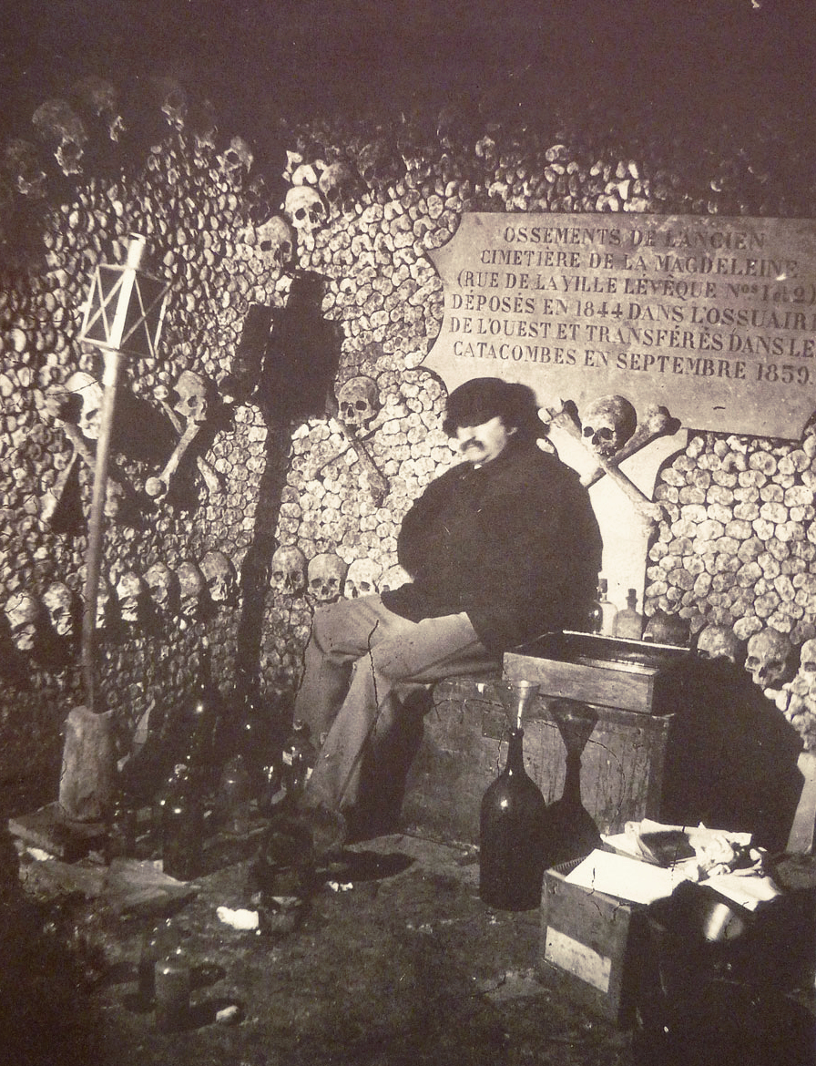
Behold Félix Nadar’s Pioneering Photographs of the Paris Catacombs (1861)

As a tourist in Eng­land, one may be per­suad­ed to pick a piece of mer­chan­dise with the now-ubiq­ui­tous slo­gan “Keep Calm and Car­ry On,” from a lit­tle-dis­played World War II moti­va­tion­al poster redis­cov­ered in 2000 and turned into the 21st-cen­tu­ry’s most cheeky emblem of stiff-upper-lip-ness. Trav­el across the Chan­nel, how­ev­er, and you’ll find anoth­er ver­sion of the sen­ti­ment, drawn not from war mem­o­ra­bil­ia but the ancient warn­ing of memen­to mori.

“Keep Calm and Remem­ber You Will Die” say mag­nets, key chains, and oth­er sou­venirs embla­zoned with the logo of the Paris Cat­a­combs, a major tourist attrac­tion that sells timed tick­ets “to man­age the large queue that forms dai­ly out­side the non­de­script entrance on the Place Den­fert-Rochere­au (for­mer­ly called the Place d’Enfer, or Hell Square),” writes Alli­son Meier at Pub­lic Domain Review. Still pro­found­ly creepy, the Cat­a­combs were once as for­bid­ding to descend into as their walls of skulls and bones are to gaze upon, requir­ing vis­i­tors to car­ry flam­ing torch­es into their depths.

When pio­neer­ing pho­tog­ra­ph­er Félix Nadar “descend­ed into this ‘empire of death’ in the 1860s arti­fi­cial light­ing was still in its infan­cy.” Using Bun­sen bat­ter­ies “and a good deal of patience,” Nadar cap­tured the Cat­a­combs as they had nev­er been seen. He also doc­u­ment­ed the com­ple­tion of “artis­tic facades” of skulls and long bones, built “to hide piles of oth­er bones,” notes Strange Remains, from an esti­mat­ed six mil­lion corpses exhumed from over­crowd­ed Parisian ceme­ter­ies in the 18th and 19th cen­turies.

Nadar (the pseu­do­nym of Gas­pard-Félix Tour­na­chon, born 1820), helped turn the Cat­a­combs into the glob­al­ly famous des­ti­na­tion they became. His “sub­ter­ranean pho­tographs,” writes Matthew Gandy in The Fab­ric of Space: Water, Moder­ni­ty, and the Urban Imag­i­na­tion, “played a key role in fos­ter­ing the grow­ing pop­u­lar­i­ty of sew­ers and cat­a­combs among mid­dle-class Parisians, and from the 1867 Expo­si­tion onward the city author­i­ties began offer­ing pub­lic tours of under­ground Paris.” The Cat­a­combs became, in Nadar’s own words, “one of those places that every­one wants to see and no one wants to see again.”

Vis­i­tors came seek­ing the grim fas­ci­na­tions they had seen in Nadar’s pho­tos, tak­en dur­ing a “sin­gle three-month cam­paign,” Meier notes, some­time in 1861, after the pho­tog­ra­ph­er “pio­neered new approach­es to arti­fi­cial light.” The project was an irre­sistible pho­to­graph­ic essay on the lev­el­ing force of mor­tal­i­ty. In an essay titled “Paris Above and Below,” pub­lished in the 1867 Expo­si­tion guide, Nadar described the “egal­i­tar­i­an con­fu­sion of death,” in which “a Merovin­gian king remains in eter­nal silence next to those mas­sa­cred in Sep­tem­ber ’92.”

The ancient and the mod­ern dead, peas­ants, aris­to­crats, vic­tims of the Rev­o­lu­tion­ary ter­ror all piled togeth­er, “every trace implaca­bly lost in the unac­count­able clut­ter of the most hum­ble, the anony­mous.” The huge necrop­o­lis ini­tial­ly had no shape or order. Its 19th cen­tu­ry redesign reflect­ed that of the Parisian streets above. In 1810, Napoleon autho­rized quar­ries inspec­tor Héri­cart de Thury to under­take a ren­o­va­tion that account­ed for what Thury called “the inti­mate rap­port that will sure­ly exist between the Cat­a­combs and the events of the French Rev­o­lu­tion.”

This “rap­port” not only includ­ed the “mass bur­ial of the vic­tims of the 1792 Sep­tem­ber Mas­sacres” Nadar ref­er­ences in his essay, but also, Meier points out, the arrange­ment of bones in “pat­terns, rows, and cross­es; altars and columns were installed below the earth. Plaques with evoca­tive quo­ta­tions were added to encour­age vis­i­tors to reflect on mor­tal­i­ty.” Because of the long expo­sure times the pho­tographs required, Nadar used man­nequins to stand in for the liv­ing work­ers who com­plet­ed this work. The only liv­ing body he cap­tured was his own, in the self-por­trait above.

Learn more about the his­to­ry of the Cat­a­combs and Nadar’s now-leg­endary pho­to­graph­ic project at Pub­lic Domain Review and see many more memen­to mori images here.

Relat­ed Con­tent:

Notre Dame Cap­tured in an Ear­ly Pho­to­graph, 1838

Take a Visu­al Jour­ney Through 181 Years of Street Pho­tog­ra­phy (1838–2019)

19th-Cen­tu­ry Skele­ton Alarm Clock Remind­ed Peo­ple Dai­ly of the Short­ness of Life: An Intro­duc­tion to the Memen­to Mori

Josh Jones is a writer and musi­cian based in Durham, NC. Fol­low him at @jdmagness

Pretty Much Pop #18 Discusses Stephen King’s Media Empire

This image has an empty alt attribute; its file name is PMP-Stephen-Kings-Media-Empire-400-x-800.jpg

Is the most pop­u­lar writer of our time actu­al­ly a good writer? Or maybe he used to be good but has long since run out of inspi­ra­tion? What are the most effec­tive ways to adapt these very read­able short sto­ries and nov­els? Does show­ing us the evil in a film lessen its impact? While you’ve been think­ing about those ques­tions, King has already writ­ten anoth­er book.

Mark Lin­sen­may­er, Eri­ca Spyres, and Bri­an Hirt share their expe­ri­ences with and opin­ions about King’s oeu­vre and the films and shows that have come out of it, includ­ing It, “The Body” (aka Stand By Me), The Shin­ing, In the Tall Grass, The Dark Tow­er, The Stand, Chil­dren of the Corn, From a Buick 8, Under the Dome, The Out­sider, Mr. Mer­cedes, Cas­tle Rock, Pet Sematary, Mis­ery, The Shaw­shank Redemp­tion, and more.

Some arti­cles we read to pre­pare for this dis­cus­sion include:

If you’ve nev­er actu­al­ly read a Stephen King novel­la, go ahead and read “The Body.”

This episode includes bonus dis­cus­sion that you can only hear by sup­port­ing the pod­cast at patreon.com/prettymuchpop. This pod­cast is part of the Par­tial­ly Exam­ined Life pod­cast net­work.

Pret­ty Much Pop: A Cul­ture Pod­cast is the first pod­cast curat­ed by Open Cul­ture. Browse all Pret­ty Much Pop posts or start with the first episode.


Watch J.S. Bach’s “Air on the G String” Played on the Actual Instruments from His Time

There is no wrong way to lis­ten to the music of Johann Sebas­t­ian Bach. You may pre­fer the aus­tere, idio­syn­crat­ic piano inter­pre­ta­tions of Glenn Gould; you may pre­fer the ground­break­ing ana­log-syn­the­siz­er ren­di­tions painstak­ing­ly record­ed by Wendy Car­los (whose ear­ly fans includ­ed Gould him­self); or you may pre­fer faith­ful per­for­mances using only the instru­ments extant in the late 17th to mid-18th cen­tu­ry peri­od in which Bach lived. In that last case, the San Fran­cis­co ear­ly-music ensem­ble Voic­es of Music has you cov­ered. You may remem­ber us pre­vi­ous­ly fea­tur­ing their per­for­mances of Vival­di and Pachel­bel; in the video above, you can hear and see them play Bach.

More specif­i­cal­ly, you can hear them play the sec­ond move­ment, Aria, from Bach’s orches­tral suite in D Major, BWV 1068. The instru­ments they play it on include an Ital­ian baroque vio­lin from 1660 and an Aus­tri­an baroque vio­la from 1680, as well as more recent­ly craft­ed exam­ples rig­or­ous­ly mod­eled after instru­ments from that same era. “As instru­ments became mod­ern­ized in the 19th cen­tu­ry, builders and play­ers tend­ed to focus on the vol­ume of sound and the sta­bil­i­ty of tun­ing,” says VoM’s expla­na­tion of their use of peri­od instru­ments. “Mod­ern steel strings replaced the old­er mate­ri­als, and instru­ments were often machine made. His­tor­i­cal instru­ments, built indi­vid­u­al­ly by hand and with over­all lighter con­struc­tion, have extreme­ly com­plex over­tones — which we find delight­ful.”

Any lover of Bach’s music has heard this piece many times, not least due to its pop­u­lar­iza­tion in the late 19th cen­tu­ry, in an arrange­ment by Ger­man vio­lin­ist August Wil­helmj, as “Air on the G String.” The orig­i­nal work dates to “some time between the years 1717 and 1723,” writes music blog­ger Özgür Nevres, when Bach com­posed it for his patron Prince Leopold of Anhalt. It also holds the hon­or of being the first work by Bach ever record­ed, “by the Russ­ian cel­list Alek­san­dr Verzh­bilovich and an unknown pianist, in 1902 (as the Air from the Over­ture No. 3 in D major, BWV 1068).” But no mat­ter how many dif­fer­ent record­ings from dif­fer­ent eras of Bach’s orches­tral suite in D Major in which you’ve steeped your­self, if you’ve only heard it played on mod­ern instru­ments, a per­for­mance like Voic­es of Music’s shows that it still has sur­pris­es to offer.

Relat­ed Con­tent:

Hear the Sounds of the Actu­al Instru­ments for Which Mozart, Beethoven, Haydn, and Han­del Orig­i­nal­ly Com­posed Their Music

The Authen­tic Vivaldi’s The Four Sea­sons: Watch a Per­for­mance Based on Orig­i­nal Man­u­scripts & Played with 18th-Cen­tu­ry Instru­ments

The Authen­tic Pachelbel’s Canon: Watch a Per­for­mance Based on the Orig­i­nal Man­u­script & Played with Orig­i­nal 17th-Cen­tu­ry Instru­ments

Watch Glenn Gould Per­form His Last Great Stu­dio Record­ing of Bach’s Gold­berg Vari­a­tions (1981)

All of Bach for Free! New Site Will Put Per­for­mances of 1080 Bach Com­po­si­tions Online

How a Bach Canon Works. Bril­liant

Based in Seoul, Col­in Mar­shall writes and broad­casts on cities, lan­guage, and cul­ture. His projects include the book The State­less City: a Walk through 21st-Cen­tu­ry Los Ange­les and the video series The City in Cin­e­ma. Fol­low him on Twit­ter at @colinmarshall, on Face­book, or on Insta­gram.

Women Scientists Launch a Database Featuring the Work of 9,000 Women Working in the Sciences

“Why are there so few women in sci­ence?” has almost become a tire­some refrain over the years, giv­en how lit­tle the answers engage with the thou­sands of female sci­en­tists work­ing all over the world. “Too often,” writes the project 500 Women Sci­en­tists, “high-pro­file arti­cles, con­fer­ence pan­els, and boards are filled with a dis­pro­por­tion­ate num­ber of male voic­es. News sto­ries are report­ed by more men by a huge mar­gin, and this imbal­ance is reflect­ed in how fre­quent­ly women are quot­ed in news sto­ries unless jour­nal­ists make a con­scious effort to reach out.

“Most keynote speak­ers at con­fer­ences are men. Pan­els are so fre­quent­ly all-male that a new word evolved to describe the phe­nom­e­non: manels. These imbal­ances add up and rein­force the inac­cu­rate per­cep­tion that sci­ence is stale, pale and male.” The next time the ques­tion arises—“why are there so few women in science?”—or any oth­er ques­tion need­ing sci­en­tif­ic exper­tise, one need only ges­ture silent­ly to 500 Women Sci­en­tists, a grass­roots orga­ni­za­tion con­sist­ing of far more sci­en­tists than its title sug­gests.

Described as “a resource for jour­nal­ists, edu­ca­tors, pol­i­cy mak­ers, sci­en­tists and any­one need­ing sci­en­tif­ic exper­tise,” the project began in 2016 as an open let­ter penned by its founders, then grad­u­ate stu­dents at Col­orado Uni­ver­si­ty, Boul­der, who decid­ed to re-affirm their val­ues against reac­tionary attacks by amass­ing 500 sig­na­tures on an open let­ter. They’ve since built a search­able data­base of over 9,000 women researchers from around the world, and a resource that helps build local sci­en­tif­ic com­mu­ni­ties.

Since launch­ing last year, their Request a Sci­en­tist data­base has shown “the excuse that you can’t find a qual­i­fied woman just does­n’t hold,” says co-founder and micro­bial ecol­o­gist Dr. Kel­ly Ramirez-Don­ders. It has also pro­vid­ed much more detailed data on women in sci­ence, which was pub­lished in a paper at PLOS Biol­o­gy in April. “The group has ambi­tious plans to keep expand­ing its reach,” writes STAT. “They’re rais­ing mon­ey to start a fel­low­ship for women of col­or… and they have already launched an affil­i­ate group, 500 Women in Med­i­cine.”

“We’re sci­en­tists. We’re lovers of evi­dence and data points,” says co-founder Maryam Zaring­ha­lam, a mol­e­c­u­lar biol­o­gist. “And so now any­time some­body tells us they couldn’t find some­one or there just aren’t enough women in STEM fields, we can point them to [the data­base] and say, ‘Well, actu­al­ly, this is the tip of the ice­berg, and there’s over 8,000.’… ensur­ing that women’s voic­es are rep­re­sent­ed in the media nar­ra­tives is real­ly essen­tial for show­ing that, ‘No, we are here, it’s just that peo­ple haven’t nec­es­sar­i­ly been aware of us or done the work to find us.’”

Cor­rect­ing mis­per­cep­tions not only helps reduce bias­es with­in sci­en­tif­ic com­mu­ni­ties; it also encour­ages bud­ding sci­en­tists who might oth­er­wise be dis­cour­aged from the pur­suit. “It’s not that girls are not inter­est­ed in sci­ence,” co-founder Jane Zeliko­va tells Good Morn­ing Amer­i­ca. “Some­thing hap­pens where they don’t see women or girls rep­re­sent­ed as sci­en­tists and they don’t think it’s for them.” 500 Women in Sci­ence proves that notion wrong—science is for them, and for every­one who wants to devote their lives to sci­en­tif­ic research. Just look at the data.

Relat­ed Con­tent:

Women’s Hid­den Con­tri­bu­tions to Mod­ern Genet­ics Get Revealed by New Study: No Longer Will They Be Buried in the Foot­notes

“The Matil­da Effect”: How Pio­neer­ing Women Sci­en­tists Have Been Denied Recog­ni­tion and Writ­ten Out of Sci­ence His­to­ry

Real Women Talk About Their Careers in Sci­ence

Josh Jones is a writer and musi­cian based in Durham, NC. Fol­low him at @jdmagness

The Very First Picture of the Far Side of the Moon, Taken 60 Years Ago

Six­ty years ago, mankind got its very first glimpse of the far side of the Moon, so called because it faces away from the Earth. (And as astronomers like Neil DeGrasse Tyson have long tak­en pains to point out to Pink Floyd fans, it isn’t “dark.”) Tak­en by the Sovi­et Union, that first pho­to may not look like much today, espe­cial­ly com­pared to the high-res­o­lu­tion col­or images sent back from the sur­face itself by Chi­na’s Chang’e‑4 probe ear­li­er this year. But with the tech­nol­o­gy of the late 1950s, even the tech­nol­o­gy com­mand­ed by the Sovi­ets’ then-world-beat­ing space pro­gram, the fact that it was tak­en at all seems not far short of mirac­u­lous. How did they do it?

“This pho­to­graph was tak­en by the Sovi­et space­craft Luna 3, which was launched a month after the Luna 2 space­craft became the first man-made object to impact on the sur­face of the Moon,” explains astronomer Kevin Hain­line in a recent Twit­ter thread. “Luna 2 fol­lowed Luna 1, the first space­craft to escape a geo­syn­chro­nous Earth orbit.” Luna 3 was designed to take pho­tographs of the Moon, hard­ly an uncom­pli­cat­ed prospect: “To take pic­tures you have to be sta­ble on three-axes. You have to take the pho­tographs remote­ly. AND you have to some­how trans­fer those pic­tures back to Earth.” The first three-axis sta­bi­lized space­craft ever sent on a mis­sion, Luna 3 “had to use a lit­tle pho­to­cell to ori­ent towards the Moon so that now, while sta­bi­lized, it could take the pic­tures. Which it did. On PHOTOGRAPHIC FILM.”

Even those of us who took pic­tures on film for decades have start­ed to take for grant­ed the con­ve­nience of dig­i­tal pho­tog­ra­phy. But think back to all the has­sle of tra­di­tion­al pho­tog­ra­phy, then imag­ine mak­ing a robot car­ry them out in space. Once tak­en Luna 3’s pho­tos “were then moved to a lit­tle CHEMICAL PLANT to DEVELOP AND DRY THEM.” (In oth­er words, “Luna 3 had a lit­tle 1 Hour Pho­to inside.”) Then they con­tin­ued into “a device that shone a cath­ode ray tube, like in an old­er TV, through them, towards a device that record­ed the bright­ness and con­vert­ed this to an elec­tri­cal sig­nal.” You can read about what hap­pened then in more detail at Damn Inter­est­ing, where Alan Bel­lows describes how the space­craft sent “the light­ness and dark­ness infor­ma­tion line-by-line via fre­quen­cy-mod­u­lat­ed ana­log sig­nal — in essence, a fax sent over radio.”

Sovi­et Sci­en­tists could thus “retrieve one pho­to­graph­ic frame every 30 min­utes or so. Due to the dis­tance and weak sig­nal, the first images received con­tained noth­ing but sta­t­ic. In sub­se­quent attempts in the fol­low­ing few days, an indis­tinct, blotchy white disc began to resolve on the ther­mal paper print­outs at Sovi­et lis­ten­ing sta­tions.” As Luna 3’s pho­tos became clear­er, they revealed, as Hain­line puts it, that “the back­side of the moon was SO WEIRD AND DIFFERENT” — cov­ered in the craters, for exam­ple, which have become its visu­al sig­na­ture. For a mod­ern-day equiv­a­lent to this achieve­ment, we might look not just to Chang’e‑4 but to the image of a black hole cap­tured by the Event Hori­zon Tele­scope this past April — the one that led to an abun­dance of arti­cles like “In Defense of the Blur­ry Black Hole Pho­to” and “We Need to Admit That the Black Hole Pho­to Isn’t Very Good.” Astropho­tog­ra­phy has come a long way, but at least back in 1959 it did­n’t pro­duce quite so many takes.

via Kot­tke

Relat­ed Con­tent:

Mankind’s First Steps on the Moon: The Ultra High Res Pho­tos

8,400 Stun­ning High-Res Pho­tos From the Apol­lo Moon Mis­sions Are Now Online

How Sci­en­tists Col­orize Those Beau­ti­ful Space Pho­tos Tak­en By the Hub­ble Space Tele­scope

There’s a Tiny Art Muse­um on the Moon That Fea­tures the Art of Andy Warhol & Robert Rauschen­berg

The Glo­ri­ous Poster Art of the Sovi­et Space Pro­gram in Its Gold­en Age (1958–1963)

Won­der­ful­ly Kitschy Pro­pa­gan­da Posters Cham­pi­on the Chi­nese Space Pro­gram (1962–2003)

Based in Seoul, Col­in Mar­shall writes and broad­casts on cities, lan­guage, and cul­ture. His projects include the book The State­less City: a Walk through 21st-Cen­tu­ry Los Ange­les and the video series The City in Cin­e­ma. Fol­low him on Twit­ter at @colinmarshall or on Face­book.

The Time When Charlie Chaplin Entered a Chaplin Look-Alike Contest & Came in 20th Place

chaplin contest

Char­lie Chap­lin start­ed appear­ing in his first films in 1914—40 films, to be precise—and, by 1915, the Unit­ed States had a major case of “Chap­lini­tis.” Chap­lin mus­tach­es were sud­den­ly pop­ping up every­where–as were Chap­lin imi­ta­tors and Chap­lin look-alike con­tests. A young Bob Hope appar­ent­ly won one such con­test in Cleve­land. Chap­lin Fever con­tin­ued burn­ing hot through 1921, the year when the Chap­lin look-alike con­test, shown above, was held out­side the Lib­er­ty The­atre in Belling­ham, Wash­ing­ton.

Accord­ing to leg­end, some­where between 1915 and 1921, Chap­lin decid­ed to enter a Chap­lin look-alike con­test, and lost, bad­ly.

A short arti­cle called “How Char­lie Chap­lin Failed,” appear­ing in The Straits Times of Sin­ga­pore in August of 1920, read like this:

Lord Des­bor­ough, pre­sid­ing at a din­ner of the Anglo-Sax­on club told a sto­ry which will have an endur­ing life. It comes from Miss Mary Pick­ford who told it to Lady Des­bor­ough, “Char­lie Chap­lin was one day at a fair in the Unit­ed States, where a prin­ci­pal attrac­tion was a com­pe­ti­tion as to who could best imi­tate the Char­lie Chap­lin walk. The real Char­lie Chap­lin thought there might be a chance for him so he entered for the per­for­mance, minus his cel­e­brat­ed mous­tache and his boots. He was a fright­ful fail­ure and came in twen­ti­eth.

A vari­a­tion on the same sto­ry appeared in a New Zealand news­pa­per, the Pover­ty Bay Her­ald, again in 1920. As did anoth­er sto­ry in the Aus­tralian news­pa­per, the Albany Adver­tis­er, in March, 1921.

A com­pe­ti­tion in Char­lie Chap­lin imper­son­ations was held in Cal­i­for­nia recent­ly. There was some­thing like 40 com­peti­tors, and Char­lie Chap­lin, as a joke, entered the con­test under an assumed name. He imper­son­at­ed his well known film self. But he did not win; he was 27th in the com­pe­ti­tion.

Did Chap­lin come in 20th place? 27th place? Did he enter a con­test at all? It’s fun to imag­ine that he did. But, a cen­tu­ry lat­er, many con­sid­er the sto­ry the stuff of urban leg­end. When one researcher asked the Asso­ci­a­tion Chap­lin to weigh in, they appar­ent­ly had this to say: “This anec­dote told by Lord Des­bor­ough, who­ev­er he may have been, was quite wide­ly report­ed in the British press at the time. There are no oth­er ref­er­ences to such a com­pe­ti­tion in any oth­er press clip­ping albums that I have seen so I can only assume that this is the source of that rumour, urban myth, what­ev­er it is. How­ev­er, it may be true.”

I’d like to believe it is.

Note: An ear­li­er ver­sion of this post appeared on our site in ear­ly 2016.

via France Cul­ture/Stack Exchange

Relat­ed Con­tent:

65 Free Char­lie Chap­lin Films Online

The Char­lie Chap­lin Archive Opens, Putting Online 30,000 Pho­tos & Doc­u­ments from the Life of the Icon­ic Film Star

Char­lie Chap­lin Gets Strapped into a Dystopi­an “Rube Gold­berg Machine,” a Fright­ful Com­men­tary on Mod­ern Cap­i­tal­ism


« Go BackMore in this category... »
Quantcast