See the Oldest Printed Advertisement in English: An Ad for a Book from 1476

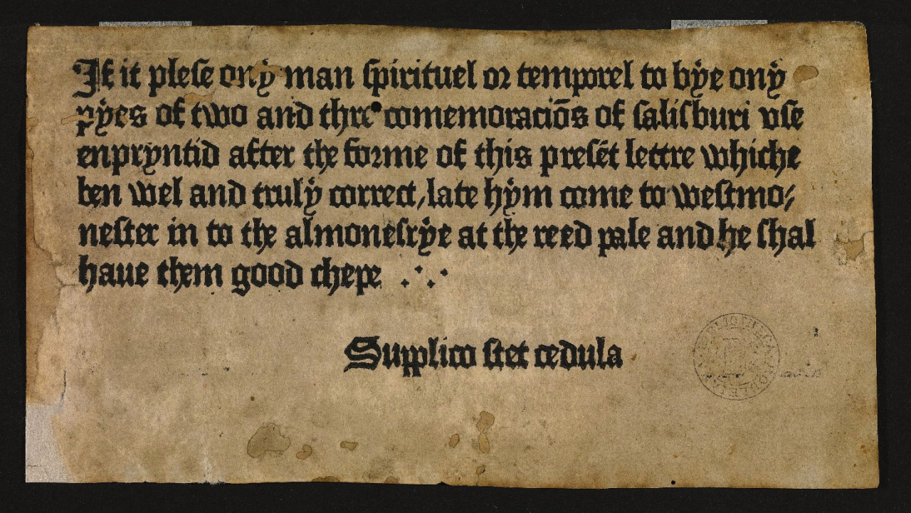
Nobody pays much mind to adver­tis­ing, at least the hap­haz­ard kind of adver­tis­ing that clut­ters the space around us. But here in the 21st cen­tu­ry, when both that space and the ads that appear through­out it are as like­ly to be dig­i­tal as phys­i­cal, we might take a moment to look back at how the prac­tice of putting up notices to sell things began. In the Eng­lish lan­guage, it goes back to at least to the mid-fif­teenth cen­tu­ry — specif­i­cal­ly, to the year 1476, when Britain’s first print­er William Cax­ton pro­duced not just a man­u­al for priests called Sarum Pie (or the Ordi­nale ad usum Sarum), but eas­i­ly postable, play­ing card-sized adver­tise­ments for the book as well.

“This piece of paper, of which two copies sur­vive, is regard­ed as the ear­li­est sur­viv­ing print­ed adver­tise­ment in the Eng­lish lan­guage,” writes Erik Kwakkel at medieval­books. It states that Sarum Pie “is print­ed in the same let­ter type as the adver­tise­ment (‘enpryn­tid after the forme of this present let­tre,’ line 3). Even with­out hav­ing seen the new book, its key fea­ture, the type, can thus already be assessed.” This pio­neer­ing adver­tise­ment also “reas­sures poten­tial clients that the text of the hand­book is ‘tru­ly cor­rect’ (line 4) and that it can be acquired cheap­ly (‘he shal have them good chepe,’ lines 5–6). Both fea­tures will have been wel­comed by priests, the tar­get audi­ence, who need­ed their tex­tu­al tools to be flaw­less and did not have much mon­ey to spend on them.”

Kwakkel also gets into oth­er notable fea­tures of this decep­tive­ly sim­ple-look­ing pro­duc­tion, includ­ing “the pre­cise loca­tion of Caxton’s shop,” a warn­ing in Latin urg­ing read­ers not to remove the notice (“show­ing that it was put on dis­play some­where,” per­haps a church porch), and even the type. In both the adver­tise­ment and Sarum Pie itself, “the let­ter shapes lack ‘sharp­ness:’ fre­quent­ly ‘blobs’ and small hair­lines appear as let­ters, while an indi­vid­ual let­ter usu­al­ly has a vari­ety of appear­ances when looked at in detail,” pos­si­bly an attempt by the print­er to cre­ate “a more ‘gen­uine’ – i.e. tra­di­tion­al, ‘man­u­script’ – look.”

It would have been impor­tant back then to make print­ed books look hand-copied, since not so long before, all books were hand-copied by def­i­n­i­tion. With the first Guten­berg Bible still less than half a cen­tu­ry old, ear­ly print­ers had to make sure their rel­a­tive­ly inex­pen­sive books did­n’t look like low-qual­i­ty sub­sti­tutes for the “real thing”; hence the assur­ances about both the type and the price in the text of Cax­ton’s adver­tise­ment. That the ori­gin of adver­tis­ing turns out to be close­ly con­nect­ed with reli­gion may come as a sur­prise — though giv­en the fact that the print rev­o­lu­tion itself began with a Bible, a prod­uct that in either phys­i­cal or dig­i­tal form now prac­ti­cal­ly sells itself, it may not be that big a sur­prise.

If you would like to sign up for Open Culture’s free email newslet­ter, please find it here. Or fol­low our posts on Threads, Face­book, BlueSky or Mastodon.

If you would like to sup­port the mis­sion of Open Cul­ture, con­sid­er mak­ing a dona­tion to our site. It’s hard to rely 100% on ads, and your con­tri­bu­tions will help us con­tin­ue pro­vid­ing the best free cul­tur­al and edu­ca­tion­al mate­ri­als to learn­ers every­where. You can con­tribute through Pay­Pal, Patre­on, and Ven­mo (@openculture). Thanks!

via medieval­books

Relat­ed Con­tent:

Oxford Uni­ver­si­ty Presents the 550-Year-Old Guten­berg Bible in Spec­tac­u­lar, High-Res Detail

See How The Guten­berg Press Worked: Demon­stra­tion Shows the Old­est Func­tion­ing Guten­berg Press in Action

One of World’s Old­est Books Print­ed in Mul­ti-Col­or Now Opened & Dig­i­tized for the First Time

Watch the First Com­mer­cial Ever Shown on Amer­i­can TV, 1941

Sell & Spin: The His­to­ry of Adver­tis­ing, Nar­rat­ed by Dick Cavett (1999)

Based in Seoul, Col­in Mar­shall writes and broad­casts on cities, lan­guage, and cul­ture. His projects include the book The State­less City: a Walk through 21st-Cen­tu­ry Los Ange­les and the video series The City in Cin­e­ma. Fol­low him on Twit­ter at @colinmarshall or on Face­book.

The Devilish History of the 1980s Parental Advisory Sticker: When Heavy Metal & Satanic Lyrics Collided with the Religious Right

Frank Zap­pa called them the “Moth­ers of Pre­ven­tion,” the group of wives mar­ried to mem­bers of Con­gress who decid­ed in the mid-80s to go to war against rock lyrics and whip up some good ol’ con­ser­v­a­tive hys­te­ria.

We’ve talked about this time before on this site, espe­cial­ly as Zap­pa him­self tes­ti­fied in front of Con­gress and sparred on the Sun­day Belt­way shows like Cross­fire.

Vox’s Ear­worm series, now back for a sec­ond sea­son, tack­les this moment in a time that would have lit­tle ram­i­fi­ca­tion before the design-ugly “Parental Advi­so­ry: Explic­it Con­tent” stick­er.
(Just an aside: I know their head­line is click-baity, but real­ly? Heavy met­al and Satan gave us this stick­er? More like Tip­per Gore and their family’s pres­i­den­tial ambi­tions gave us it. Oy.)

Any­way, Gore’s Par­ents Music Resource Cen­ter (PMRC) gave us a list of the “Filthy Fif­teen,” includ­ing songs like Sheena Easton’s “Sug­ar Walls” and Madonna’s “Dress You Up,” which either con­tained lyrics “pro­mot­ing” vio­lence, sex­u­al ref­er­ences, drug and alco­hol, and Satan’s favorite, the “occult.”

Estelle Caswell explores that last cat­e­go­ry and dives into the increas­ing pop­u­lar­i­ty dur­ing the ‘80s of heavy met­al music, which was often invok­ing Satan in its lyrics, or cre­at­ing occult-like atmos­pheres in its pro­duc­tion.

This campy, hor­ror­show cul­ture ran right into the grow­ing pow­er of con­ser­v­a­tive Chris­tians and evan­gel­i­cal preach­ers who made a *lot* of mon­ey whip­ping up “Satan­ic Pan­ic” among their nation­al flock. They lis­tened to rock records back­wards, believ­ing they heard sub­lim­i­nal mes­sages.

Of course, none of this would have gone much fur­ther than church­es if it wasn’t for the major net­works turn­ing a noth­ing sto­ry into headlines–the Vox video reminds us how com­plic­it Ted Kop­pel, Bar­bara Wal­ters, Ger­al­do Rivera, et al were in pro­mot­ing it. They also looked at the ris­ing teenage sui­cide rate and used heavy met­al as a scape­goat, instead of–as the video explains–family breakups, drug abuse, eco­nom­ic uncer­tain­ty, and increas­ing access to guns.

The warn­ing label itself appeared in 1990, just as rap was tak­ing off and a new lyri­cal boogey­man appeared. Dig­i­tal media and file shar­ing, along with YouTube and oth­er sites, mut­ed this kind of cen­sor­ship. And par­ents, in the end, still need to do the job over what their chil­dren see or don’t.

How­ev­er, cen­sor­ship is back, but there are no Wash­ing­ton Wives act­ing as scolds. Now it is the whims of cap­i­tal, as in the col­lapse of Tum­blr, or it is a faulty algo­rithm that cen­sors old mas­ter paint­ings filled with nudi­ty, just as guilty as porn, that are our new decen­cy guardians. Where are those con­gres­sion­al hear­ings?

Relat­ed Con­tent:

A Brief His­to­ry of Hol­ly­wood Cen­sor­ship and the Rat­ings Sys­tem

George Orwell Iden­ti­fies the Main Ene­my of the Free Press: It’s the “Intel­lec­tu­al Cow­ardice” of the Press Itself

Home Tap­ing Is Killing Music: When the Music Indus­try Waged War on the Cas­sette Tape in the 1980s, and Punk Bands Fought Back

Frank Zap­pa Debates Whether the Gov­ern­ment Should Cen­sor Music in a Heat­ed Episode of Cross­fire: Why Are Peo­ple Afraid of Words? (1986)

Ted Mills is a free­lance writer on the arts who cur­rent­ly hosts the artist inter­view-based FunkZone Pod­cast and is the pro­duc­er of KCR­W’s Curi­ous Coast. You can also fol­low him on Twit­ter at @tedmills, read his oth­er arts writ­ing at tedmills.com and/or watch his films here.

Economics 101: Hedge Fund Investor Ray Dalio Explains How the Economy Works in a 30-Minute Animated Video

Want to know how the econ­o­my works? It “works like a sim­ple machine,” accord­ing to Ray Dalio, who explains its mech­a­nisms in the 30-minute video above. The pre­sen­ta­tion is “sim­ple but not sim­plis­tic,” says the site Eco­nom­ic Prin­ci­ples, a research arm of Dalio’s com­pa­ny Bridge­wa­ter Asso­ciates. The les­son packs in most of the major bold­faced con­cepts in the aver­age over­priced col­lege eco­nom­ics text­book, “such as cred­it, inter­est, rates, lever­ag­ing, and delever­ag­ing.” And it does so in that most engag­ing means of learn­ing things online, an ani­mat­ed video, nar­rat­ed by an expert.

All that’s well and good, but can we real­ly under­stand such a volatile beast as “the economy”—an abstrac­tion that some­times seems like a cru­el­ly rigged game and some­times like a not-par­tic­u­lar­ly-benev­o­lent (to most peo­ple) deity—in only half an hour? Should we trust Dalio to sum­ma­rize its com­plex­i­ty? The bil­lion­aire hedge-fund man­ag­er did, he tells us, man­age “to antic­i­pate and to side­step the glob­al finan­cial cri­sis.” And he has made quite an impres­sion on peo­ple like Forbes Senior Con­trib­u­tor Carmine Gal­lo with his “7,500-word LinkedIn arti­cle titled ‘Why and How Cap­i­tal­ism Needs to be Reformed.’”

In that piece, the “vora­cious learn­er who stud­ies nar­ra­tive and com­mu­ni­ca­tion… turns an enor­mous­ly com­plex sub­ject into a sim­ple, com­pelling nar­ra­tive.” He also makes it clear right in the title that by “the econ­o­my” he means a cap­i­tal­ist econ­o­my. It’s a point large­ly tak­en for grant­ed in the ani­mat­ed explain­er but an impor­tant one nonethe­less giv­en the under­ly­ing assump­tions of the the­o­ry. Seri­ous cri­tiques of cap­i­tal­ism seem much hard­er to con­dense because they’re tasked with unpack­ing all those assump­tions.

Marx’s Das Kap­i­tal spans three vol­umes, though he only lived to pub­lish the first one, itself a mon­ster of a read. Thomas Piketty’s Cap­i­tal in the 21st Cen­tu­ry is maybe a lit­tle breezi­er, at 696 pages (though if you let The Econ­o­mist read it for you, they can sum it up in four para­graphs). By con­trast, Dalio offers a com­pre­hen­sive primer in brief for those of us who skipped that macro­eco­nom­ics course, or who nev­er got the chance to sign up for one. But else­where he has matched cap­i­tal­is­m’s biggest crit­ics with his own best-sell­ing book Prin­ci­ples: Life and Work, a huge and high­ly-praised look at eco­nom­ic crises of debt, gross inequal­i­ty, stag­nant wages, etc. See him describe the book, in five min­utes, on 60 Min­utes, just above.

Cap­i­tal­is­m’s best-known crit­ics, even those who want to see the cur­rent sys­tem swapped out for a more equi­table, sus­tain­able mod­el, have known they must begin by learn­ing how the cur­rent sys­tem works, or how it doesn’t. Dalio him­self isn’t set­ting out to build a worker’s par­adise or to make financiers like him­self obso­lete, but he does have some tren­chant thoughts on capitalism’s failures—and they are many, in his esti­ma­tion. Still, he believes he knows how it can be reformed “to pro­duce bet­ter out­comes.” Learn more in his com­pelling­ly-writ­ten essay here.

Relat­ed Con­tent:

How The Eco­nom­ic Machine Works: A 30-Minute Ani­mat­ed Primer by Hedge Fund Investor Ray Dalio

Free Online Eco­nom­ics Cours­es

David Harvey’s Course on Marx’s Cap­i­tal: Vol­umes 1 & 2 Now Avail­able Free Online

Piketty’s Cap­i­tal in a Nut­shell

Free Online Eco­nom­ics Cours­es 

Josh Jones is a writer and musi­cian based in Durham, NC. Fol­low him at @jdmagness

Nick Cave Creates a List of His Top 10 Love Songs

This wall I built around you
Is made out of stone-lies
O lit­tle girl the truth would be
An axe in thee

—Nick Cave, “Say Good­bye to the Lit­tle Girl Tree”

Nick Cave has been many things in his long, fas­ci­nat­ing career—lewd punk-coun­try croon­er for the assaultive Birth­day Par­ty, prophet­ic trou­ba­dour and Bib­li­cal bal­ladeer, founder of the grit­ty, sleazy Grin­der­man, nov­el­ist and poet of the dark­er realms of human expe­ri­ence. He has been many things, but sen­ti­men­tal has rarely been one of them, though he can be quite ten­der and vul­ner­a­ble. These qual­i­ties stand as some of the many rea­sons I trust Cave to make a list of love songs worth a damn. Not only has he writ­ten some of the finest tunes about heart­break, betray­al, regret, and desire but he has done so with an atti­tude of rev­er­ence for influ­ences like Leonard Cohen and Nina Simone, artists with their own com­pli­cat­ed rela­tion­ships with love.

Ear­li­er this year, Cave revealed to read­ers of his blog The Red Hand Files a selec­tion of his “hid­ing songs”—music that “I can pull over myself,” he wrote, “like a child might pull the bed cov­ers over their head, when the blaze of the world becomes too intense.”

The list includes Dylan’s “It’s All Over Now, Baby Blue,” and Simone’s heart­break­ing­ly somber “Plain Gold Ring.”  When Cave is hid­ing, it ain’t in a hap­py place, but then sad songs usu­al­ly give us the great­est com­fort. Maybe they also offer the best way we have to under­stand love, “this strange, inscrutable feel­ing that tears away at us, all our lives,” Cave writes in answer to two of his fans from Aus­tralia and Brazil. He leaves them, and us, his list of top ten love songs below.

01. “To Love Some­body” – Bee Gees

02. “My Father” – Nina Simone

03. “I Threw It All Away” – Bob Dylan

04. “Com­fort You” – Van Mor­ri­son

05. “Angel of the Morn­ing” – Mer­rilee Rush & The Turn­abouts

06. “Nights in White Satin” – The Moody Blues

07. “Where’s the Play­ground Susie?” – Glen Camp­bell

08. “Some­thing on Your Mind” – Karen Dal­ton

09. “Always on My Mind” – Elvis Pres­ley

10. “Super­star” – Car­pen­ters

“Maybe some songs are the embod­i­ment of love itself and that’s why they move us so deeply.” No one needs to tell us: love is nev­er easy, and hard­ly ever just a feel­ing of eupho­ria. Like every emo­tion and expe­ri­ence, it has its melan­choly shad­ows, and the best love songs cap­ture this in their lyrics, chord pro­gres­sions, etc. The ten love songs Cave chose—“simple, plain­spo­ken, incen­di­ary devices that bomb the heart to pieces”—are all clas­sics from the six­ties and sev­en­ties, decades he draws from lib­er­al­ly in his “hid­ing songs” playlist.

He favors artists with big per­son­al­i­ties, coun­try and folk lean­ings, and often­times a more com­mer­cial sound than his own. Nonethe­less, those famil­iar with his music will hear the influ­ence of Elvis, Van Mor­ri­son, and maybe even the Bee Gees on his work with the Bad Seeds. He has a new album com­ing, the fol­low-up to 2016’s har­row­ing Skele­ton Tree. While we wait to hear what his wife calls “his Fever Songs,” lis­ten to his top ten love songs here.

via Brook­lyn Veg­an

Relat­ed Con­tent:

Lis­ten to Nick Cave’s Lec­ture on the Art of Writ­ing Sub­lime Love Songs (1999)

Nick Cave Answers the Hot­ly Debat­ed Ques­tion: Will Arti­fi­cial Intel­li­gence Ever Be Able to Write a Great Song?

Ani­mat­ed Sto­ries Writ­ten by Tom Waits, Nick Cave & Oth­er Artists, Read by Dan­ny Devi­to, Zach Gal­i­fi­anakis & More

Josh Jones is a writer and musi­cian based in Durham, NC. Fol­low him at @jdmagness

A Brief History of IDEO: A Short Documentary Takes You Inside the Design Firm That Changed the Way We Think about Design

The design firm IDEO was found­ed in 1991, which may not sound like an espe­cial­ly long time ago, but con­sid­er it in tech­no­log­i­cal terms: what kind of devices were we using in 1991? How did they look and feel? Chances are not just that the phone and com­put­er you now car­ry around bear no resem­blance to the ones you would have car­ried around — not that most of them could be car­ried around — 28 years ago, but that your fur­ni­ture and house­hold appli­ances have changed as well. And think, too, of your every­day expe­ri­ences with shop­ping, med­ical care, and gov­ern­ment ser­vices: some have trans­formed, usu­al­ly for the bet­ter, and if oth­ers haven’t, it’s prob­a­bly not a good thing that they’ve stayed the same.

IDEO has worked on the design of prod­ucts and ser­vices in all those fields and oth­ers, and has indeed done much to rede­fine the field of design itself. The com­pa­ny’s founders and employ­ees tell the sto­ry in their own words in the short doc­u­men­tary video IDEO and a Sto­ry of Design above, which focus­es on IDEO’s achieve­ments in chang­ing the way we think about design (exem­pli­fied by the time they redesigned the hum­ble shop­ping cart on Night­line).

And though IDEO as a cor­po­rate enti­ty has only exist­ed since the ear­ly 1990s, it has deep­er roots in the his­to­ry of design, appear­ing as it did as a merg­er of four exist­ing firms, David Kel­ley Design, ID Two, Matrix Prod­uct Design in Cal­i­for­nia, and Mog­gridge Asso­ciates in Lon­don. Kel­ley, who’s also a pro­fes­sor at Stan­ford, appears in the video not only to remem­ber IDEO’s found­ing, but also to talk about its future.

So does Tim Brown, who after nine­teen years as IDEO’s CEO announced last week that he will step down, pass­ing the posi­tion on to for­mer glob­al man­ag­ing direc­tor Sandy Spe­ich­er. When IDEO enters a world, Spe­ich­er says in the video, “we bring our cre­ative lens, imag­in­ing how we can make that world bet­ter. I’m care­ful about words like ‘solu­tion’ or ‘the answer,’ because these are peo­ple-based sys­tems.” That remark, as well as the oth­ers made by the vari­ety of IDEO peo­ple — in a vari­ety of accents befit­ting a now-glob­al firm with nine loca­tions around the world — pro­vide a glimpse into IDEO’s mutu­al­ly insep­a­ra­ble cor­po­rate cul­ture and its con­cep­tion of design. And if all their talk about rein­ven­tion, respon­sive­ness, and ask­ing the big ques­tions sounds a bit high-flown, most of it may come down to an old say­ing that holds up in every domain just as well today as it did in 1991: There’s always room for improve­ment.

Relat­ed Con­tent:

Free: A Crash Course in Design Think­ing from Stanford’s Design School

Down­load 20 Free eBooks on Design from O’Reilly Media

Saul Bass’ Advice for Design­ers: Make Some­thing Beau­ti­ful and Don’t Wor­ry About the Mon­ey

Pao­la Antonel­li on Design as the Inter­face Between Progress and Human­i­ty

Mil­ton Glaser’s 10 Rules for Life & Work: The Cel­e­brat­ed Design­er Dis­pens­es Wis­dom Gained Over His Long Life & Career

Dieter Rams Lists the 10 Time­less Prin­ci­ples of Good Design–Backed by Music by Bri­an Eno

Based in Seoul, Col­in Mar­shall writes and broad­casts on cities, lan­guage, and cul­ture. His projects include the book The State­less City: a Walk through 21st-Cen­tu­ry Los Ange­les and the video series The City in Cin­e­ma. Fol­low him on Twit­ter at @colinmarshall or on Face­book.

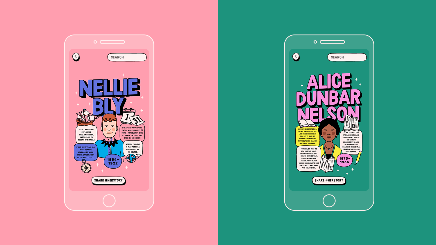
New Augmented Reality App Celebrates Stories of Women Typically Omitted from U.S. History Textbooks

How do we know if we’ve lived through a major shift toward greater equal­i­ty? Maybe it’s when his­to­ry text­books start telling dif­fer­ent sto­ries than the ones they’ve always told about heroes in knee breech­es, waist­coats, epaulets, top hats, and beards. Aside from the occa­sion­al his­tor­i­cal fig­ure in bon­net or bloomers, most texts real­ly have just told “his sto­ry.”

In the U.S., at least, stud­ies show that only 11% of the sto­ries in his­to­ry text­books are about women. Is this because 50% of the pop­u­la­tion only con­tributed to 11% per­cent of the country’s events? No, even the kids know—like the kids in the video above from a new app called Lessons in Her­sto­ry—his­to­ry most­ly fea­tures men because “a lot of it was writ­ten by men and was most­ly all about men.”

Text­book mak­ers, and the school boards who give them march­ing orders, may stick to their guns, so to speak, but anoth­er major shift could ren­der their dic­tates irrel­e­vant. Smart­phone and tablet tech­nol­o­gy has become so famil­iar to today’s kids that instead of turn­ing the pages, they “swipe, like, in the his­to­ry books,” as one of the young­sters puts it.

Stu­dents stuck with the old patri­ar­chal ped­a­go­gies can eas­i­ly sup­ple­ment, enhance, or sub­sti­tute their edu­ca­tion with new media. While there are some seri­ous down­sides to this phe­nom­e­non, giv­en a dis­tinct lack of qual­i­ty con­trol online, the inter­net has also opened up innu­mer­able oppor­tu­ni­ties for telling the sto­ries of women in his­to­ry.

Lessons in Her­sto­ry, built by an orga­ni­za­tion called Daugh­ters of the Evo­lu­tion, takes a unique approach. Instead of sup­plant­i­ng text­books, it adds to them in an aug­ment­ed real­i­ty smart­phone app (cur­rent­ly designed for ios devices) stu­dents can point at pic­tures of his­tor­i­cal dudes to pull up sto­ries about a notable women from the same time.

Grant­ed, some of these women, like Har­ri­et Tub­man and Saca­gawea, had already been grant­ed access to the lim­it­ed space allot­ted female fig­ures in grade school text­books. But a great many oth­er peo­ple in the app have not. Fea­tur­ing a diverse selec­tion of 75 her­stor­i­cal women, Lessons in Her­sto­ry is the prod­uct of ad agency Good­by Sil­ver­stein & Part­ners’ chief cre­ative offi­cer Mar­garet John­son, who launched it at this year’s SXSW.

The app has pret­ty lim­it­ed appli­ca­tion at the moment. It works with one text­book, A His­to­ry of US, Book 5: Lib­er­ty for All? 1820–1860, and with a hand­ful of his­tor­i­cal pho­tographs on its web­site. (Many of the women fea­tured made their mark after 1860.) But with plans to expand and with the back­ing of a large ad agency, who may or may not have their own designs in mar­ket­ing Lessons in Her­sto­ry, it promis­es to make women’s his­to­ry more acces­si­ble to stu­dents who already spend more time star­ing at screens than pages.

“There’s a say­ing,” writes Cara Cur­tis at The Next Web, “’you can’t be what you can’t see.’” Apps like Lessons in Her­sto­ry, along with a num­ber of influ­en­tial books and web­sites for young peo­ple that nar­rate the past through the lens of women, indige­nous peo­ple, African-Amer­i­cans, artists, activists, work­ing peo­ple, and so on, show kids that no mat­ter who they are or where they come from, peo­ple who looked like them have always made sig­nif­i­cant con­tri­bu­tions to his­to­ry.

Relat­ed Con­tent:

“The Matil­da Effect”: How Pio­neer­ing Women Sci­en­tists Have Been Denied Recog­ni­tion and Writ­ten Out of Sci­ence His­to­ry

The Ency­clo­pe­dia of Women Philoso­phers: A New Web Site Presents the Con­tri­bu­tions of Women Philoso­phers, from Ancient to Mod­ern

Pop Art Posters Cel­e­brate Pio­neer­ing Women Sci­en­tists: Down­load Free Posters of Marie Curie, Ada Lovelace & More

Josh Jones is a writer and musi­cian based in Durham, NC. Fol­low him at @jdmagness

When the Nazis Declared War on Expressionist Art (1937)

The 1937 Nazi Degen­er­ate Art Exhi­bi­tion dis­played the art of Paul Klee, Wass­i­ly Kandin­sky, Georg Grosz, and many more inter­na­tion­al­ly famous mod­ernists with max­i­mum prej­u­dice. Ripped from the walls of Ger­man muse­ums, the 740 paint­ings and sculp­tures were thrown togeth­er in dis­ar­ray and sur­round­ed by deroga­to­ry graf­fi­ti and hell-house effects. Right down the street was the respectable Great Ger­man Art Exhi­bi­tion, designed as coun­ter­pro­gram­ming “to show the works that Hitler approved of—depicting stat­uesque blonde nudes along with ide­al­ized sol­diers and land­scapes,” writes Lucy Burns at the BBC.

View­ers were sup­posed to sneer and recoil at the mod­ern art, and most did, but whether they were gawk­ers, Nazi sym­pa­thiz­ers, or art fans in mourn­ing, the exhib­it drew mas­sive crowds. Over a mil­lion peo­ple first attend­ed, three times more than saw the exhi­bi­tion of state-sanc­tioned art—or more specif­i­cal­ly, art sanc­tioned by Hitler the failed artist, who had endured watch­ing “the real­is­tic paint­ings of build­ings and land­scapes,” of stur­dy peas­ants and suf­fer­ing poets, “dis­missed by the art estab­lish­ment in favour of abstract and mod­ern styles.” The Degen­er­ate Art Exhi­bi­tion “was his moment to get his revenge,” and he had it. Over a hun­dred artists were denounced as Bol­she­viks and Jews bent on cor­rupt­ing Ger­man puri­ty.

After­wards, thou­sands of works of art were destroyed or dis­ap­peared, as did many of their cre­ators. Many artists fled, many could not. Enraged by the eclipse of sen­ti­men­tal aca­d­e­m­ic styles and by his own igno­rance, Hitler railed against “works of art which can­not be under­stood in them­selves,” as he put it in a speech that sum­mer. These “will nev­er again find their way to the Ger­man peo­ple.” Many such quo­ta­tions sur­round­ed the offend­ing art. The 1993 doc­u­men­tary above, writ­ten, pro­duced, and direct­ed by David Gru­bin, tells the sto­ry of the exhi­bi­tion, which has in time proven Hitler’s great­est cul­ture war fol­ly. It accom­plished its imme­di­ate pur­pose, but as Jonathan Petropou­los, pro­fes­sor of Euro­pean His­to­ry at Clare­mont McKen­na Col­lege points out, “this art­work became more attrac­tive abroad…. I think that over the longer run it was good for mod­ern art to be viewed as some­thing that the Nazis detest­ed and hat­ed.”

Not every anti-Nazi crit­ic saw mod­ern art as sub­vert­ing fas­cism. Ten years after the Degen­er­ate Art Exhi­bi­tion, philoso­pher Theodor Adorno, him­self a refugee from Nazism, called Expres­sion­ism “a naïve aspect of lib­er­al trust­ful­ness,” on a con­tin­u­um between fas­cist tools like Futur­ism and “the ide­ol­o­gy of the cin­e­ma.” Nonethe­less, it was Hitler who most bore out Adorno’s gen­er­al obser­va­tion: “Taste is the most accu­rate seis­mo­graph of his­tor­i­cal expe­ri­ence…. React­ing against itself, it rec­og­nizes its own lack of taste.” The hys­ter­i­cal per­for­mance of dis­gust sur­round­ing so-called “degen­er­ate art” turned the exhib­it into a sen­sa­tion, a block­buster that, if it did not prove the virtues of mod­ernism, showed many around the world that the Nazis were as crude, dim, and vicious as they alleged their sup­posed ene­mies to be.

In the doc­u­men­tary, you’ll see actu­al footage of the the­atri­cal exhi­bi­tion, jux­ta­posed with film of a 1992 Berlin exhi­bi­tion of much of that for­mer­ly degen­er­ate art. Restaged Degen­er­ate Art Exhi­bi­tions have become very pop­u­lar in the art word, bring­ing togeth­er artists who need no fur­ther expo­sure, in order to his­tor­i­cal­ly reen­act, in some fash­ion, the expe­ri­ence of see­ing them all togeth­er for the first time. From a recent his­tor­i­cal review at New York’s Neue Gal­lerie to the dig­i­tal exhib­it at MoMA.org, degen­er­ate art ret­ro­spec­tives show, as Adorno wrote, that indeed “taste is the most accu­rate seis­mo­graph of his­tor­i­cal expe­ri­ence.”

The orig­i­nal exhi­bi­tion “went on tour all over Ger­many,” writes Burns, “where it was seen by a mil­lion more peo­ple.” Thou­sands of ordi­nary Ger­mans who went to jeer at it were exposed to mod­ern art for the first time. Mil­lions more peo­ple have learned the names and styles of these artists by learn­ing about the his­to­ry of Nazism and its cult of pet­ti­ness and per­son­al revenge. Learn much more in the excel­lent doc­u­men­tary above and at our pre­vi­ous post on the Degen­er­ate Art Exhi­bi­tion.

Degen­er­ate Art — 1993, The Nazis vs. Expres­sion­ism will be added to our list of Free Doc­u­men­taries, a sub­set of our col­lec­tion, 4,000+ Free Movies Online: Great Clas­sics, Indies, Noir, West­erns, Doc­u­men­taries & More

Relat­ed Con­tent:

The Nazi’s Philis­tine Grudge Against Abstract Art and The “Degen­er­ate Art Exhi­bi­tion” of 1937

Titan­ic: The Nazis Cre­ate a Mega-Bud­get Pro­pa­gan­da Film About the Ill-Fat­ed Ship … and Then Banned It (1943)

When Ger­man Per­for­mance Artist Ulay Stole Hitler’s Favorite Paint­ing & Hung it in the Liv­ing Room of a Turk­ish Immi­grant Fam­i­ly (1976)

Josh Jones is a writer and musi­cian based in Durham, NC. Fol­low him at @jdmagness

550 Million Years of Human Evolution in an Illustrated Flipbook

Graph­ic artist Juri­an Moller cre­at­ed a flip­book that lets you watch 550 mil­lion years of human evo­lu­tion unfold in a mat­ter of sec­onds. He writes: “This flip­book goes back in time and shows you the evo­lu­tion of the gen­er­a­tions in both a per­son­al and sci­en­tif­ic way. The dif­fer­ences between the gen­er­a­tions on each page are very dif­fi­cult to see, but the long, con­tin­u­ous ances­tral line goes right back to our very ori­gins.”

The action is on full dis­play above. Below, watch the same flip­book in an ani­mat­ed form. Pur­chase the book in var­i­ous for­mats at Moller’s site here.

If you would like to sign up for Open Culture’s free email newslet­ter, please find it here. Or fol­low our posts on Threads, Face­book, BlueSky or Mastodon.

If you would like to sup­port the mis­sion of Open Cul­ture, con­sid­er mak­ing a dona­tion to our site. It’s hard to rely 100% on ads, and your con­tri­bu­tions will help us con­tin­ue pro­vid­ing the best free cul­tur­al and edu­ca­tion­al mate­ri­als to learn­ers every­where. You can con­tribute through Pay­Pal, Patre­on, and Ven­mo (@openculture). Thanks!

Relat­ed Con­tent:

Carl Sagan Explains Evo­lu­tion in an Eight-Minute Ani­ma­tion

10 Mil­lion Years of Evo­lu­tion Visu­al­ized in an Ele­gant, 5‑Foot Long Info­graph­ic from 1931

Richard Dawkins Explains Why There Was Nev­er a First Human Being

« Go BackMore in this category... »
Quantcast
Open Culture was founded by Dan Colman.