1934 Map Resizes the World to Show Which Country Drinks the Most Tea

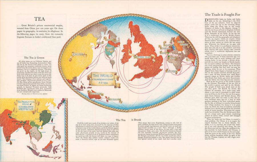
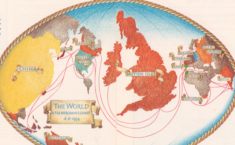
Not a day goes by that I don’t use Google Maps for some­thing or oth­er, whether it’s basic nav­i­ga­tion, research­ing an address, or find­ing a dry clean­er. Though some of us might resent the dom­i­nance such map­ping tech­nol­o­gy has over our dai­ly inter­ac­tions, there’s no deny­ing its end­less util­i­ty. But maps can be so much more than use­ful tools for get­ting around—they are works of art, thought exper­i­ments, imag­i­na­tive flights of fan­cy, and data visu­al­iza­tion tools, to name but a few of their over­lap­ping func­tions. For the impe­ri­al­ists of pre­vi­ous ages, maps dis­played a mas­tery of the world, whether cat­a­logu­ing trav­el times from Lon­don to every­where else on the globe, or—as in the exam­ple we have here—resizing coun­tries accord­ing to how much tea their peo­ple drank.

But this is not a map we should look to for accu­ra­cy. Like many such car­to­graph­ic data charts, it pro­motes a par­tic­u­lar agen­da. “George Orwell once wrote that tea was one of the main­stays of civ­i­liza­tion,” notes Jack Good­man at Atlas Obscu­ra. “Tea, assert­ed Orwell, has the pow­er to make one feel braver, wis­er, and more opti­mistic. The man spoke for a nation.” (And he spoke to a nation in a 1946 Evening Stan­dard essay, “A Nice Cup of Tea.”) From the map above, titled “The Tea is Drunk” and pub­lished by For­tune Mag­a­zine in 1934, we learn, writes Good­man, that “Britain con­sumed 485,000 pounds of tea per year. That’s one hun­dred bil­lion cups of tea, or around six cups a day for each per­son.” We might note how­ev­er, that “the pop­u­la­tion of Chi­na was then nine times big­ger than that of the U.K., and they drank rough­ly twice as much tea as the Brits did.” Why isn’t Chi­na at the cen­ter of the map? “The author made a ten­u­ous point about the cul­tur­al dif­fer­ences between the two: the Chi­nese drank tea as a neces­si­ty, the British by choice.”

Cor­nell Uni­ver­si­ty library’s descrip­tion of the map is more forth­right: “While Chi­na actu­al­ly con­sumed twice as much tea as Britain, its posi­tion at the edge of the map assured that the focus will be on the British Isles.” That focus is com­mer­cial in nature, meant to encour­age and inform British tea mer­chants for whom tea was more than a bev­er­age; it was one of the nation’s pre-emi­nent com­modi­ties, though most of what was sold as a nation­al prod­uct was Indi­an tea grown in India. Yet the map brims with pride in the British tea trade. “Thus may be told the geog­ra­phy and alle­giance of Tea,” its author pro­claims, “an empire with­in an empire, whose bor­ders fol­low every­where the scat­tered ter­ri­to­ries of that nation on which the sun nev­er sets.” A lit­tle over a decade lat­er, India won its inde­pen­dence, and the empire began to fall apart. But the British nev­er lost their taste for or their nation­al pride in tea. View and down­load a high-res­o­lu­tion scan of the “Tea is Drunk” map at the Cor­nell Library site.

via Atlas Obscu­ra

Relat­ed Con­tent:

George Orwell Explains How to Make a Prop­er Cup of Tea

10 Gold­en Rules for Mak­ing the Per­fect Cup of Tea (1941)

Col­or­ful Maps from 1914 and 2016 Show How Planes & Trains Have Made the World Small­er and Trav­el Times Quick­er

Josh Jones is a writer and musi­cian based in Durham, NC. Fol­low him at @jdmagness

Expensive Wine Is for Dupes: Scientific Study Finds No Strong Correlation Between Quality & Price

If wine is on your Thanks­giv­ing menu tomor­row, then keep this sci­en­tif­ic find­ing in mind: Accord­ing to a 2008 study pub­lished in the Jour­nal of Wine Eco­nom­ics, the qual­i­ty of wine does­n’t gen­er­al­ly cor­re­late with its price. At least not for most peo­ple. Writ­ten by researchers from Yale, UC Davis and the Stock­holm School of Eco­nom­ics, the abstract for the study states:

Indi­vid­u­als who are unaware of the price do not derive more enjoy­ment from more expen­sive wine. In a sam­ple of more than 6,000 blind tast­ings, we find that the cor­re­la­tion between price and over­all rat­ing is small and neg­a­tive, sug­gest­ing that indi­vid­u­als on aver­age enjoy more expen­sive wines slight­ly less. For indi­vid­u­als with wine train­ing, how­ev­er, we find indi­ca­tions of a non-neg­a­tive rela­tion­ship between price and enjoy­ment. Our results are robust to the inclu­sion of indi­vid­ual fixed effects, and are not dri­ven by out­liers: when omit­ting the top and bot­tom deciles of the price dis­tri­b­u­tion, our qual­i­ta­tive results are strength­ened, and the sta­tis­ti­cal sig­nif­i­cance is improved fur­ther. These find­ings sug­gest that non-expert wine con­sumers should not antic­i­pate greater enjoy­ment of the intrin­sic qual­i­ties of a wine sim­ply because it is expen­sive or is appre­ci­at­ed by experts.

You can read online the com­plete study, “Do More Expen­sive Wines Taste Bet­ter? Evi­dence from a Large Sam­ple of Blind Tast­ings.” But if you’re look­ing for some­thing that puts the sci­ence into more quo­ti­di­en Eng­lish and makes the larg­er case for keep­ing your hard-earned cash, watch the video from Vox above.

Relat­ed Con­tent:

The Old­est Unopened Bot­tle of Wine in the World (Cir­ca 350 AD)

Vin­tage Wine in our Col­lec­tion of 1100 Free Online Cours­es

Sal­vador Dali’s 1978 Wine Guide, The Wines of Gala, Gets Reis­sued: Sen­su­al Viti­cul­ture Meets Sur­re­al Art

The Corkscrew: The 700-Pound Mechan­i­cal Sculp­ture That Opens a Wine Bot­tle & Pours the Wine

by | Permalink | Make a Comment ( 4 ) |

See the First Photograph of a Human Being: A Photo Taken by Louis Daguerre (1838)

You’ve like­ly heard the rea­son peo­ple nev­er smile in very old pho­tographs. Ear­ly pho­tog­ra­phy could be an excru­ci­at­ing­ly slow process. With expo­sure times of up to 15 min­utes, por­trait sub­jects found it impos­si­ble to hold a grin, which could eas­i­ly slip into a pained gri­mace and ruin the pic­ture. A few min­utes rep­re­sent­ed marked improve­ment on the time it took to make the very first pho­to­graph, Nicéphore Niépce’s 1826 “heli­o­graph.” Cap­tur­ing the shapes of light and shad­ow out­side his win­dow, Niépce’s image “required an eight-hour expo­sure,” notes the Chris­t­ian Sci­ence Mon­i­tor, “long enough that the sun­light reflects off both sides of the build­ings.”

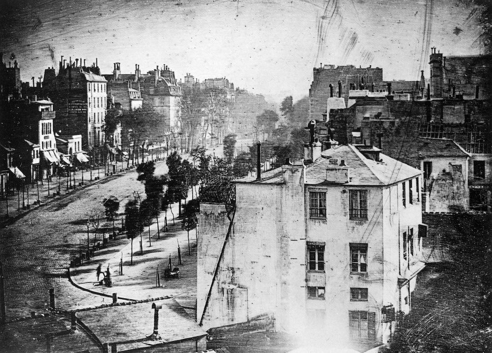
Niépce’s busi­ness and invent­ing part­ner is much more well-known: Louis-Jacques-Mandé Daguerre, who went on after Niépce’s death in 1833 to devel­op the Daguerreo­type process, patent­ing it in 1839. That same year, the first self­ie was born. And the year pri­or Daguerre him­self took what most believe to be the very first pho­to­graph of a human, in a street scene of the Boule­vard du Tem­ple in Paris. The image shows us one of Daguerre’s ear­ly suc­cess­ful attempts at image-mak­ing, in which, writes NPR’s Robert Krul­wich, “he exposed a chem­i­cal­ly treat­ed met­al plate for ten min­utes. Oth­ers were walk­ing or rid­ing in car­riages down that busy street that day, but because they moved, they didn’t show up.”

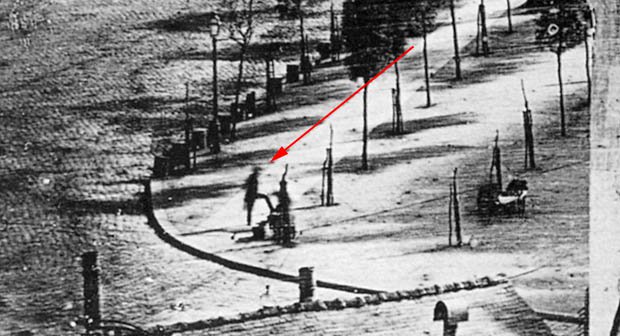
Vis­i­ble, how­ev­er, in the low­er left quad­rant is a man stand­ing with his hands behind his back, one leg perched on a plat­form. A clos­er look reveals the fuzzy out­line of the per­son shin­ing his boots. A much fin­er-grained analy­sis of the pho­to­graph shows what may be oth­er, less dis­tinct fig­ures, includ­ing what looks like two women with a cart or pram, a child’s face in a win­dow, and var­i­ous oth­er passers­by. The pho­to­graph marks a his­tor­i­cal­ly impor­tant peri­od in the devel­op­ment of the medi­um, one in which pho­tog­ra­phy passed from curios­i­ty to rev­o­lu­tion­ary tech­nol­o­gy for both artists and sci­en­tists.

Although Daguerre had been work­ing on a reli­able method since the 1820s, it wasn’t until 1838, the Met­ro­pol­i­tan Muse­um of Art explains, that his “con­tin­ued exper­i­ments pro­gressed to the point where he felt com­fort­able show­ing exam­ples of the new medi­um to select­ed artists and sci­en­tists in the hope of lin­ing up investors.” Photography’s most pop­u­lar 19th cen­tu­ry use—perhaps then as now—was as a means of cap­tur­ing faces. But Daguerre’s ear­li­est plates “were still life com­po­si­tions of plas­ter casts after antique sculp­ture,” lend­ing “the ‘aura’ of art to pic­tures made by mechan­i­cal means.” He also took pho­tographs of shells and fos­sils, demon­strat­ing the medium’s util­i­ty for sci­en­tif­ic pur­pos­es.

If por­traits were per­haps less inter­est­ing to Daguerre’s investors, they were essen­tial to his suc­ces­sors and admir­ers. Can­did shots of peo­ple mov­ing about their dai­ly lives as in this Paris street scene, how­ev­er, proved next to impos­si­ble for sev­er­al more decades. What was for­mer­ly believed to be the old­est such pho­to­graph, an 1848 image from Cincin­nati, shows what appears to be two men stand­ing at the edge of the Ohio Riv­er. It seems as though they’ve come to fetch water, but they must have been stand­ing very still to have appeared so clear­ly. Pho­tog­ra­phy seemed to stop time, freez­ing a sta­t­ic moment for­ev­er in phys­i­cal form. Blurred images of peo­ple mov­ing through the frame expose the illu­sion. Even in the stillest, stiffest of images, there is move­ment, an insight Ead­weard Muy­bridge would make cen­tral to his exper­i­ments in motion pho­tog­ra­phy just a few decades after Daguerre debuted his world-famous method.

Relat­ed Con­tent:

The First Pho­to­graph Ever Tak­en (1826)

See The First “Self­ie” In His­to­ry Tak­en by Robert Cor­nelius, a Philadel­phia Chemist, in 1839

Ead­weard Muybridge’s Motion Pho­tog­ra­phy Exper­i­ments from the 1870s Pre­sent­ed in 93 Ani­mat­ed Gifs

Josh Jones is a writer and musi­cian based in Durham, NC. Fol­low him at @jdmagness


Watch “Alike,” a Poignant Short Animated Film About the Enduring Conflict Between Creativity and Conformity

From Barcelona comes “Alike,” a short ani­mat­ed film by Daniel Martínez Lara and Rafa Cano Mén­dez. Made with Blender, an open-source 3D ren­der­ing pro­gram, “Alike” has won a heap of awards and clocked an impres­sive 10 mil­lion views on Youtube and Vimeo. A labor of love made over four years, the film revolves around this ques­tion: “In a busy life, Copi is a father who tries to teach the right way to his son, Paste. But … What is the cor­rect path?” To find the answer, they have to let a dra­ma play out. Which will pre­vail? Cre­ativ­i­ty? Or con­for­mi­ty? It’s an inter­nal con­flict we’re all famil­iar with. 

Watch the film when you’re not in a rush, when you have sev­en unbur­dened min­utes to take it in. “Alike” will be added to our list of Free Ani­ma­tions, a sub­set of our col­lec­tion, 4,000+ Free Movies Online: Great Clas­sics, Indies, Noir, West­erns, Doc­u­men­taries & More.

If you would like to sign up for Open Culture’s free email newslet­ter, please find it here. Or fol­low our posts on Threads, Face­book, BlueSky or Mastodon.

If you would like to sup­port the mis­sion of Open Cul­ture, con­sid­er mak­ing a dona­tion to our site. It’s hard to rely 100% on ads, and your con­tri­bu­tions will help us con­tin­ue pro­vid­ing the best free cul­tur­al and edu­ca­tion­al mate­ri­als to learn­ers every­where. You can con­tribute through Pay­Pal, Patre­on, and Ven­mo (@openculture). Thanks!

via Design Taxi

Relat­ed Con­tent:

The Employ­ment: A Prize-Win­ning Ani­ma­tion About Why We’re So Dis­en­chant­ed with Work Today

Bertrand Rus­sell & Buck­min­ster Fuller on Why We Should Work Less, and Live & Learn More

Charles Bukows­ki Rails Against 9‑to‑5 Jobs in a Bru­tal­ly Hon­est Let­ter (1986)

William Faulkn­er Resigns From His Post Office Job With a Spec­tac­u­lar Let­ter (1924)

60-Second Introductions to 12 Groundbreaking Artists: Matisse, Dalí, Duchamp, Hopper, Pollock, Rothko & More

Some art his­to­ri­ans ded­i­cate their entire careers, and indeed lives, to the work of a sin­gle artist. But what about those of us who only have a minute to spare? Address­ing the demand for the briefest pos­si­ble primers on the cre­ators of impor­tant art, paint­ings and oth­er­wise, of the past cen­tu­ry or so, the Roy­al Acad­e­my of Arts’ Painters in 60 Sec­onds series has pub­lished twelve episodes so far. Of those infor­ma­tion­al­ly dense videos, you see here the intro­duc­tions to Sal­vador Dalí, Mar­cel Duchamp, Edward Hop­per, Jack­son Pol­lock, and Mark Rothko.

Though short, these crash cours­es do find their way beyond the very basics. “There’s more to Dalí,” says the Roy­al Acad­e­my of the Arts’ Artis­tic Direc­tor Tim Mar­low, than “skill­ful­ly ren­dered fever dreams of sex and decay.

He paint­ed one of the twen­ti­eth cen­tu­ry’s great cru­ci­fix­ions, but it’s more about physics than reli­gion, and he was as influ­enced by phi­los­o­phy as he was by Sig­mund Freud.” Ducham­p’s unortho­dox and influ­en­tial ideas “came togeth­er in one of the most ambi­tious works of the 20th cen­tu­ry, The Large Glass, an end­less­ly ana­lyzed work of machine-age erot­ic sym­bol­ism, sci­ence, alche­my, and then some.”

In the seem­ing­ly more staid Depres­sion-era work of Edward Hop­per, Mar­low points to “a pro­found con­tem­pla­tion of the world around us. Hop­per slows down time and cap­tures a moment of still­ness in a fran­tic world,” paint­ed in a time of “deep nation­al self-exam­i­na­tion about the very idea of Amer­i­can­ness.” Hop­per paint­ed the famous Nighthawks in 1942; the next year, and sure­ly on the very oth­er end of some kind of artis­tic spec­trum, Hop­per’s coun­try­man and near-con­tem­po­rary Jack­son Pol­lock paint­ed Mur­al, which shows “the young Pol­lock work­ing through Picas­so, con­tin­u­ing to frac­ture the archi­tec­ture of cubism” while “at the same time tak­ing on the lessons of the Mex­i­can mural­ists like Siqueiros and Oroz­co.”

Yet Mur­al also “starts to pro­claim an orig­i­nal­i­ty that is all Pol­lock­’s,” open­ing the gate­way into his hero­ic (and well-known) “drip peri­od.” Rothko, prac­tic­ing an equal­ly dis­tinc­tive but entire­ly dif­fer­ent kind of abstrac­tion, end­ed up pro­duc­ing “some of the most mov­ing paint­ings in all of the 20th cen­tu­ry: sat­u­rat­ed stains of col­or.” Mak­ing ref­er­ence to clas­si­cal archi­tec­ture — going back, even, to Stone­henge — his work becomes “a kind of thresh­old into which you, the view­er, project your­self,” but its soft edges also give it a sense of “breath­ing, pul­sat­ing, and some­times, of dying.”

If you hap­pen to have more than a minute avail­able, how could you resist dig­ging a bit deep­er into the life and work of an artist like that? Or per­haps you’d pre­fer to get intro­duced to anoth­er: Hen­ri Matisse or Grant Wood, say, or Kaz­imir Male­vich or Joan Mitchell. You may just find one about whom you want to spend the rest of your years learn­ing.

See all videos, includ­ing new ones down the road, at the Painters in 60 Sec­onds series playlist.

Relat­ed Con­tent:

Edward Hopper’s Icon­ic Paint­ing Nighthawks Explained in a 7‑Minute Video Intro­duc­tion

Jack­son Pol­lock 51: Short Film Cap­tures the Painter Cre­at­ing Abstract Expres­sion­ist Art

Hear Mar­cel Duchamp Read “The Cre­ative Act,” A Short Lec­ture on What Makes Great Art, Great

Walk Inside a Sur­re­al­ist Sal­vador Dalí Paint­ing with This 360º Vir­tu­al Real­i­ty Video

An Intro­duc­tion to 100 Impor­tant Paint­ings with Videos Cre­at­ed by Smarthis­to­ry

Based in Seoul, Col­in Mar­shall writes and broad­casts on cities and cul­ture. His projects include the book The State­less City: a Walk through 21st-Cen­tu­ry Los Ange­les and the video series The City in Cin­e­ma. Fol­low him on Twit­ter at @colinmarshall or on Face­book.

Colorful Maps from 1914 and 2016 Show How Planes & Trains Have Made the World Smaller and Travel Times Quicker

This time of year espe­cial­ly, we com­plain about the greed and arro­gance of air­lines, the con­fu­sion and inef­fi­cien­cy of air­ports, and the sar­dine seat­ing of coach. But we don’t have to go back very far to get a sense of just how tru­ly painful long-dis­tance trav­el used to be. Just step back a hun­dred years or so when—unless you were a WWI pilot—you trav­eled by train or by ship, where all sorts of mis­ad­ven­tures might befall you, and where a jour­ney that might now take sev­er­al dull hours could take sev­er­al dozen, often very uncom­fort­able, days. Before rail­roads crossed the con­ti­nents, that num­ber could run into the hun­dreds.

In the ear­ly 1840s, for exam­ple, notes Simon Willis at The Econ­o­mist’s 1843 Mag­a­zine, “an Amer­i­can dry-goods mer­chant called Asa Whit­ney, who lived near New York, trav­elled to Chi­na on busi­ness. It took 153 days, which he thought was a waste of time.” It’s prob­a­bly eas­i­er to swal­low plat­i­tudes about des­ti­na­tions and jour­neys when the jour­ney doesn’t take up near­ly half the year and run the risk of cholera. By 1914, the explo­sion of rail­roads had reduced trav­el times con­sid­er­ably, but they remained at what we would con­sid­er intol­er­a­ble lengths.

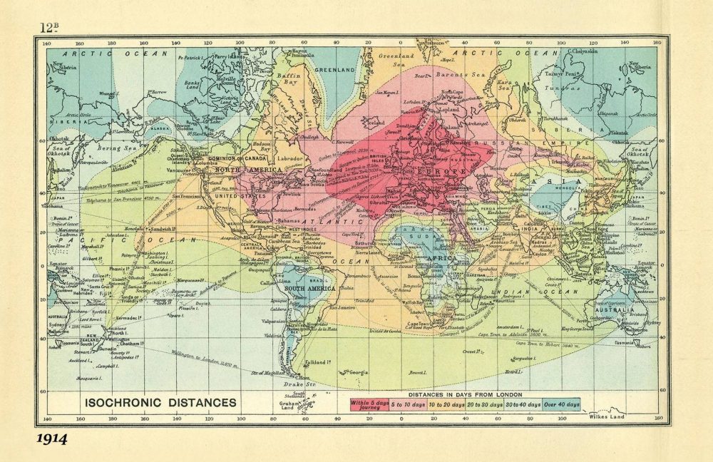
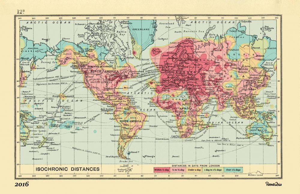
We can see just how long it took to get from place to place in the “isochron­ic map” above (view it in a large for­mat here), which visu­al­izes dis­tances all over the globe. The rail­ways “were well-estab­lished,” notes Giz­mo­do, “in Europe and the U.S., too, mak­ing trav­el far more swift than it had been in the past.” One could reach “the depths of Siberia” from Lon­don in under ten days, thanks to the Trans-Siber­ian Rail­way. By con­trast, in Africa and South Amer­i­ca, “any trav­el inland from the coast took weeks.”

The map, cre­at­ed by roy­al car­tog­ra­ph­er John G. Bartholomew, came pack­aged with sev­er­al oth­er such tools in An Atlas of Eco­nom­ic Geog­ra­phy, a book, Willis explains, “intend­ed for school­boys,” con­tain­ing “every­thing a thrust­ing young entre­pre­neur, impe­ri­al­ist, trad­er or trav­eller could need.” All of the dis­tances are mea­sured in “days from Lon­don,” and col­or-cod­ed in the leg­end below. Dark green areas, such as Sudan, much of Brazil, inland Aus­tralia, or Tibet might take over 40 days trav­el to reach. All of West­ern Europe is acces­si­ble, the map promis­es, with­in five days, as are parts of the east coast of the U.S., with parts fur­ther Mid­west tak­ing up to 10 days to reach.

What might have seemed like wiz­ardry to Wal­ter Raleigh prob­a­bly sounds like hell on earth to busi­ness class denizens every­where. How do these jour­neys com­pare to the cur­rent age of rapid air trav­el? Rome2rio, a “com­pre­hen­sive glob­al trip plan­ner,” aimed to find out by recre­at­ing Bartholomew’s map, updat­ed to 2016 stan­dards. You can see, just above (or expand­ed here), the same view of the world from its one­time impe­ri­al­ist cen­ter, Lon­don, with the same col­or-cod­ed leg­end below, “Dis­tances in Days from Lon­don.” And yet here, a jour­ney to most places will take less than a day, with cer­tain out­er reaches—Siberia, Green­land, the Arc­tic Cir­cle, stretch­ing into two, maybe three.

Should we have rea­son to com­plain, when those of us who do travel—or who must—have it so easy com­pared to the dan­ger, bore­dom, and gen­er­al unpleas­ant­ness of long-dis­tance trav­el even one-hun­dred years ago? The ques­tion pre­sumes humans are capa­ble of not com­plain­ing about trav­el. Such com­plaint may form the basis of an ancient lit­er­ary tra­di­tion, when heroes ven­tured over vast ter­rain, slay­ing mon­sters, solv­ing rid­dles, mak­ing friends, lovers, and ene­mies…. The epic dimen­sions of his­toric trav­el can seem quaint com­pared to the ster­ile tedi­um of air­port ter­mi­nals. But just maybe—as in those long sea and rail­way voy­ages that could span sev­er­al months—we can dis­cov­er a kind of romance amidst the queasy food courts, tacky gift shops, and motor­ized mov­ing walk­ways.

via  1843 Mag­a­zine

Relat­ed Con­tent:

A Col­or­ful Map Visu­al­izes the Lex­i­cal Dis­tances Between Europe’s Lan­guages: 54 Lan­guages Spo­ken by 670 Mil­lion Peo­ple

Down­load 67,000 His­toric Maps (in High Res­o­lu­tion) from the Won­der­ful David Rum­sey Map Col­lec­tion

The Roman Roads of Britain Visu­al­ized as a Sub­way Map

Josh Jones is a writer and musi­cian based in Durham, NC. Fol­low him at @jdmagness

What Made Freddie Mercury the Greatest Vocalist in Rock History? The Secrets Revealed in a Short Video Essay

I wasn’t always a Queen fan. Hav­ing cut my music fan teeth on espe­cial­ly down­beat, mis­er­able bands like Joy Divi­sion, The Cure, and The Smiths, I couldn’t quite dig the unabashed sen­ti­men­tal­i­ty and oper­at­ic bom­bast. Like one of the “Kids React to Queen” kids, I found myself ask­ing, “What is this?” What turned me around? Maybe it was the first time I heard Queen’s theme song for Flash Gor­don. The 1980 space opera is most remark­able for Max von Sydow’s turn as Ming the Mer­ci­less, and for those bursts of Fred­die Mer­cury and his mates’ mul­ti-tracked voic­es, explo­sions of syn­co­pat­ed angel song, announc­ing the com­ing of the eight­ies with all the high camp of Rocky Hor­ror and the rock con­fi­dence of Robert Plant.

As a front­man Mer­cury had so much more than the per­fect style and stance—though he did own every stage he set foot on. He had a voice that com­mand­ed atten­tion, even from mopey new wave teenagers vibrat­ing on Ian Curtis’s fre­quen­cy. What makes Mer­cury’s voice so compelling—as most would say, the great­est vocal­ist in all of rock his­to­ry? One recent sci­en­tif­ic study con­clud­ed that Mercury’s phys­i­cal method of singing resem­bled that of Tuvan throat singers.

He was able to cre­ate a faster vibra­to and sev­er­al more lay­ers of har­mon­ics than any­one else. The video above from Poly­phon­ic adds more to the expla­na­tion, quot­ing opera sopra­no Montser­rat Cabal­lé, with whom Mer­cury record­ed an album in 1988. In addi­tion to his incred­i­ble range, Mer­cury “was able to slide effort­less­ly from a reg­is­ter to anoth­er,” she remarked. Though Mer­cury was nat­u­ral­ly a bari­tone, he pri­mar­i­ly sang as a tenor, and had no dif­fi­cul­ty, as we know, with sopra­no parts.

Mer­cury was a great performer—and he was a great per­for­ma­tive vocal­ist, mean­ing, Cabal­lé says, that “he was sell­ing the voice…. His phras­ing was sub­tle, del­i­cate and sweet or ener­getic and slam­ming. He was able to find the right colour or expres­sive nuance for each word.” He had incred­i­ble dis­ci­pline and con­trol over his instru­ment, and an under­rat­ed rhyth­mic sen­si­bil­i­ty, essen­tial for a rock singer to con­vinc­ing­ly take on rock­a­bil­ly, gospel, dis­co, funk, and opera as well as the blues-based hard rock Queen so eas­i­ly mas­tered. No style of music elud­ed him, except per­haps for those that call for a cer­tain kind of vocal­ist who can’t actu­al­ly sing.

That’s the rub with Queen—they were so good at every­thing they did that they can be more than a lit­tle over­whelm­ing. Watch the rest of the video to learn more about how Mercury’s super­hu­man vibra­to pro­duced sounds almost no oth­er human can make; see more of Polyphonic’s music analy­sis of one-of-a-kind musi­cians at our pre­vi­ous posts on Leonard Cohen and David Bowie’s final albums and John Bonham’s drum­ming; and just below, hear all of those Mer­cury qualities—the vibra­to, the per­fect tim­ing, and the expres­sive performativity—in the iso­lat­ed vocal track from “I Want to Break Free” just below.

Relat­ed Con­tent:

Sci­en­tif­ic Study Reveals What Made Fred­die Mercury’s Voice One of a Kind; Hear It in All of Its A Cap­pel­la Splen­dor

Watch Behind-the-Scenes Footage From Fred­die Mercury’s Final Video Per­for­mance

Queen Doc­u­men­tary Pays Trib­ute to the Rock Band That Con­quered the World

Josh Jones is a writer and musi­cian based in Durham, NC. Fol­low him at @jdmagness

An Artist with Synesthesia Turns Jazz & Rock Classics Into Colorful Abstract Paintings

For those in the arts, few moments are more bliss­ful than those spent “in the zone,” those times when the words or images or notes flow unim­ped­ed, the artist func­tion­ing as more con­duit than cre­ator.

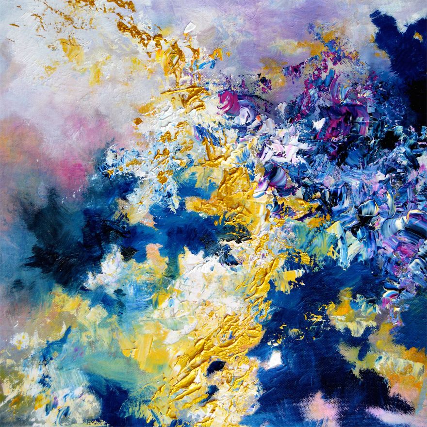
Viewed in this light, artist Melis­sa McCrack­en’s chromes­the­sia—or sound-to-col­or synesthesia—is a gift. Since birth, this rare neu­ro­log­i­cal phe­nom­e­non has caused her to see col­ors while lis­ten­ing to music, an expe­ri­ence she likens to visu­al­iz­ing one’s mem­o­ries.

Trained as a psy­chol­o­gist, she has made a name for her­self as an abstract painter by trans­fer­ring her col­or­ful neu­ro­log­i­cal asso­ci­a­tions onto can­vas.

John Lennon’s “Julia” yields an impas­to flame across a pale green field.

The bold daf­fodil and phlox hues of Jimi Hendrix’s “Lit­tle Wing” could have sprung from Monet’s gar­den at Giverny.

McCrack­en told Broad­ly that chromes­thetes’ col­or asso­ci­a­tions vary from indi­vid­ual to indi­vid­ual, though her own expe­ri­ence of a par­tic­u­lar song only wavers when she is focus­ing on a par­tic­u­lar ele­ment, such as a bass line she’s nev­er paid atten­tion to before.

While her port­fo­lio sug­gests a woman of catholic musi­cal tastes, col­or­wise, she does tend to favor cer­tain gen­res and instru­ments:

Expres­sive music such as funk is a lot more col­or­ful, with all the dif­fer­ent instru­ments, melodies, and rhythms cre­at­ing a high­ly sat­u­rat­ed effect. Gui­tars are gen­er­al­ly gold­en and angled, and piano is more mar­bled and jerky because of the chords. I rarely paint acoustic music because it’s often just one per­son play­ing gui­tar and singing, and I nev­er paint coun­try songs because they’re bor­ing mut­ed browns.

Her favorite kind of music, jazz, almost always presents itself to her in shades of gold and blue, lead­ing one to won­der if per­haps the Utah Jazz’s uni­form redesign has a synes­thet­ic ele­ment.

Cer­tain­ly, there are a large num­ber of musi­cians—includ­ing Duke Elling­ton, Kanye West, and Bil­ly Joel—for whom col­or and music are inex­tri­ca­bly linked.

View Melis­sa McCracken’s port­fo­lio here.

via Broad­ly

Relat­ed Con­tent:

Wass­i­ly Kandin­sky Syncs His Abstract Art to Mussorgsky’s Music in a His­toric Bauhaus The­atre Pro­duc­tion (1928)

Goethe’s The­o­ry of Col­ors: The 1810 Trea­tise That Inspired Kandin­sky & Ear­ly Abstract Paint­ing

The MoMA Teach­es You How to Paint Like Pol­lock, Rothko, de Koon­ing & Oth­er Abstract Painters

Ayun Hal­l­i­day is an author, illus­tra­tor, the­ater mak­er and Chief Pri­ma­tol­o­gist of the East Vil­lage Inky zine.  Fol­low her @AyunHalliday.

« Go BackMore in this category... »
Quantcast