The supercontinent of Pangea formed some 270 million years ago, during the Early Permian Period, and then began to break up 70 million years later, eventually yielding the continents we inhabit today. Pangea was, of course, a peopleless place. But if you were to drop today’s nations on that great land mass, here’s what it might look like. (Click on the image to view it in a much larger, high resolution format.) The map’s creator is Massimo Pietrobon, someone who playfully describes himself as “a famous explorer and cartographer of Atlantis,” and who has taken on other experiments with maps in the past. When someone claimed that the scale of certain countries wasn’t exactly right, Massimo was quick to confess on his blog, “Yes, it’s just a trial, it can be better.” But it’s a creative start.
If you would like to support the mission of Open Culture, consider making a donation to our site. It’s hard to rely 100% on ads, and your contributions will help us continue providing the best free cultural and educational materials to learners everywhere. You can contribute through PayPal, Patreon, and Venmo (@openculture). Thanks!
In April, we featured a tour of 14 British accents in 84 seconds. But as any commenter to that video will tell you, such a selection only scratches the surface of the variety of ways a given Briton could potentially speak English. “It’s important to state that there is no ‘British’ accent,” says the web site of BBC America’s Anglophenia. “There are so many regional dialects spread across tiny geographical areas that to arrive in, say, Swansea or Leicester (pronounced “lester” — you’re welcome), and launch into a stream of corblimey cockneyisms would go down extraordinarily badly.” This blog and video series, which brands itself “British Culture with an American Accent,” has spent more than a little energy helping its fans sort out the “infinite world of variety in the accents of the British Isles.” At the top of the post, Anglophenia host Siobhan Thompson demonstrates no fewer than seventeen British accents.
And not only can Thompson speak them, she can tell you who else speaks them. Other users of the middle-class, BBC-friendly “received pronunciation” include currently bankable film and television actors Martin Freeman and Benedict Cumberbatch. And pretty much only on film and television do you hear the more refined-sounding “heightened received pronunciation,” and even then mainly from characters like Downton Abbey’s Dowager Countess. She also does a truly Lock, Stock, and Two Smoking Barrels London accent, the flat East Anglian inflection that everyone loses when they move out of East Anglia, and thirteen more from across the rest of England as well as Wales, Scotland, and Ireland. Once you learn to comprehend all these varieties of speech, though, you may still fail to grasp the meaning of what you hear. The Anglophenia episode above, “How to Speak British,” gives you a primer on a series of expressions — “Away with the fairies,” “Swings and roundabouts,” “Horses for courses” — you’ll only ever hear said in a British accent.
An exclamation point looks like an index finger raised in warning; a question mark looks like a flashing light or the blink of an eye. A colon, says Karl Kraus, opens its mouth wide: woe to the writer who does not fill it with something nourishing. Visually, the semicolon looks like a drooping moustache; I am even more aware of its gamey taste. With self-satisfied peasant cunning, German quotation marks («> >) lick their lips.
The skillful deployment of aphorism seems typical; the playfulness not so much. But Adorno’s short essay, “punctuation marks,” takes a sober turn shortly thereafter, and for good reason. Punctuation is serious business. Sounding much more like the Adorno I know, the dour Marxist writes, “History has left its residue in punctuation marks, and it is history, far more than meaning or grammatical function, that looks out at us, rigidified and trembling slightly, from every mark of punctuation.” Okay.
Well, Adorno would just hate what I’m about to do, but—hey—this is the internet; who has the time and concentration to traverse the rocky course of thought he carves out in his work? Maybe you? Good, read the full essay. Not you? See below for some bite-sized highlights.
Punctuation as music: “punctuation marks,” Adorno writes, “are marks of oral delivery.” As such, they function like musical notation. “The comma and the period correspond to the half-cadence and the authentic cadence.” Exclamation points are “like silent cymbal clashes, question marks like musical upbeats.” Colons are like “dominant seventh chords.” Adorno, a musicologist and composer himself, heard things in these symbols most of us probably don’t.
The semicolon: There is no mark of punctuation that Adorno rejects outright. All have their place and purpose. He does decry the modernist tendency to mostly leave them out, since “then they simply hide.” But Adorno reserves a special pride of place for the semicolon. He claims that “only a person who can perceive the different weights of strong and weak phrasings in musical form” can understand the difference between semicolon and comma. He differentiates between the Greek and German semicolon. And he expresses alarm “that the semicolon is dying out.” This, he claims, is due to a fear of “page-long paragraphs”—the kind he often writes. It is “a fear created by the marketplace—by the consumer who does not want to tax himself.” Right, I told you, he would hate the internet, though he seems to thrive—posthumously—on Twitter.
Quotation marks: While Adorno accepts every punctuation mark as meaningful, he does not accept all uses of them. In the case of the quotation mark, his advice is precisely what I have received, and have passed on to overly glib and thoughtless students. Quotation marks, he writes, should only be used for direct quotes, “and if need be when the text wants to distance itself from a word it is referring to.” This can include writing words as words (the word “word” is a word…). Adorno rejects quotation marks as an “ironic device.” This usage presents “a predetermined judgment on the subject”; it offers a “blind verdict.”
The ellipsis: On this mark, Adorno becomes very prickly, particular, and, well… elliptical. Three dots “suggests an infinitude of thoughts and associations.” Two is the mark of a hack. I leave it to you to parse his reasoning.
The dash: First, we have “the serious dash,” in which “thought becomes aware of its fragmentary character.” Dashes may signal “mute lines into the past, wrinkles on the brow” of the text, ”uneasy silence.” Dashes need not connect thoughts. The “desire to connect everything,” Adorno writes, is the mark of “literary dilettantes.” Thus the “modern dash” is debased, a symptom of “the progressive degeneration of language.” It prepares us “in a foolish way for surprises that by that very token are no longer surprising.” Adorno also prefers another use of dashes—more below.
Parentheses: Parenthetical phrases (like this) create “enclaves” and admit the “superfluousness” of their contents, which is why many stylebooks frown upon them. Their use in this way “capitulate[s] to pedantic philistinism.” The “cautious writer”—writes punctiliously cautious Adorno—will place parentheticals between dashes, “which block off parenthetical material from the flow of the sentence without shutting it up in a prison.” The parentheses do have their place, as do all marks of punctuation in Adorno’s lexical theory. But probably only if you are Proust.
Reading Adorno—on punctuation and anything else—can be intimidating. His erudition, his disdain for carelessness, middlebrow expediency, and the crude forms of expression given birth by commerce of all kinds: these are attitudes that can seem at times like overbearing elitism. And yet, Adorno understands the burdensome nature of writing prescriptions. “The writer,” he admits, “is in a permanent predicament when it comes to punctuation marks: if one were fully aware while writing, one would sense the impossibility of ever using a mark of punctuation correctly and would give up writing altogether.” Far too many have done so. We “cannot trust in the rules,” nor can we ignore them. What to do? Err on the side of the abstemious says our poker-faced German Strunk; to avoid sloppiness or rote misuse, follow an Epicurean mean: “better too few than too many.”
The New Yorker wasn’t the only magazine that relaunched its web site this week. The Baffler did the same. They got a new look and feel. And they made plenty of loyal readers happy by making 25 years of back issues freely available online. The editors of the magazine — that “loose collective of disaffiliated culture critics, knowledge workers, poets, illustrators, and closet utopians” — write:
Well, when The Baffler was born in 1988, we never could have foreseen this #innovation, but here we are. Please enjoy this new and uncharacteristically shiny iteration of The Baffler online—featuring not only our new issue (no. 25, “The None and the Many”), but also, for the first time ever, all of our digitized archives in one place.
That’s 25 issues, 432 contributors, 277 salvos, 450 graphics, 172 poems, 73 stories, 3,396 pages made of 1,342,785 words. You can click on individual pieces or flip through entire issues page by page, if you so desire.
You can flip through the sporadically-published back issues and revel in the iconoclastic magazine that “ridicules respectable business leaders, laughs at popular consumer brands as souvenirs of the cultural industry, and debunks the ideology of free-market nincompoops in the media and on the campuses.” Or, if you’re looking for some more direction, you can head to the The Paris Review, where Dan Piepenbring makes some recommendations, starting with his “personal favorite, Steve Albini’s “The Problem with Music,” a terse, caustic critique of the record industry at the height of yuppie-ism and major-label excess.”
Right now, Marvel is running a promotion where if you join Marvel Unlimited, using the promo code SDCC14, you can pay 99 cents for your first month, during which time you can access “over 15,000 Digital Comics, featuring Earth’s Mightiest Heroes and the galaxy’s vilest villains – all spanning Marvel’s 75 year history!” Yes, that includes the Incredible Hulk, Captain America, The Mighty Thor & many other favorites.
According to Wired, the “comics can be viewed on PC and Mac, as well as iOS and Android devices through a Marvel Unlimited app. Readers can download up to 12 comics at a time for offline reading.”
A Marvel Unlimited subscription usually costs 69 dollars a year or $9.99 a month, but the terms and conditions say that “Subscribers can cancel their subscription at any time by accessing My account or e‑mailing Marvel customer service.” In other words, you can subscribe for one month, pay 99 cents, read a heck of a lot of comics, then decide if you want to continue the subscription — or not — before the end of 30 days. (Just as an fyi, Audible.com offers a similar arrangement with audio books. You can join their 30-day free trial, download a free audio book, then decide whether you want to stick with the program before the month’s end. No matter what you decide, you can keep the free audio book. Find more details here.)
If you prefer to just pay zero cents for comics, please see our two prior posts.
This week is the anniversary of the Apollo 11 journey to the moon. And while most people will celebrate the event by acknowledging the abilities and courage of Neil Armstrong and company in this landmark of human endeavor, a small, though vocal, group of people will decry the moon landing as a fraud.
In that spirit, French filmmaker William Karel spins an elaborate tale of intrigue in Dark Side of the Moon. (See outtakes above.) The 2002 film posits that the Apollo 11 moon landing was staged by none other than Stanley Kubrick. How else did the director get his hands on a super advanced lens from NASA to shoot those gorgeous candle-lit scenes in Barry Lyndon? The film is slickly produced and features an impressive array of interviewees from Henry Kissinger, to Buzz Aldrin to Christiane Kubrick. Some of the other people interviewed include Jack Torrance and David Bowman. If that’s not a tip off that the whole movie is fake, then the blooper reel at the end drives the point home. Only a lot of people didn’t get the joke. Conspiracy enthusiasts Wayne Green cited the movie as further proof that the moon landing was faked.
Moon hoaxers like to point to The Shining as a confession by Kubrick that he was forced into a Big Lie. In the documentary Room 237, Jay Weidner claims as much. And Michael Wysmierski argues the same in The Shining Code 2.0, a feature length video that you can watch below. Or get right to the meat of things here.
And just in case you get swept up in Wysmierski’s loony logic, filmmaker S. G. Collins makes the very compelling argument that the technology simply didn’t exist to fake the moon landing in 1969. Case closed.
Jonathan Crow is a Los Angeles-based writer and filmmaker whose work has appeared in Yahoo!, The Hollywood Reporter, and other publications. You can follow him at @jonccrow.
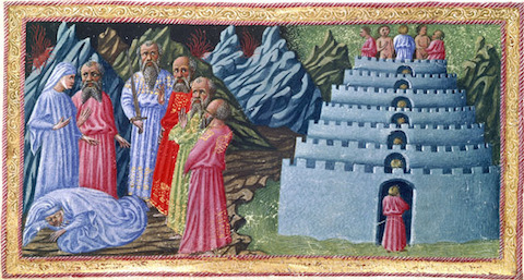
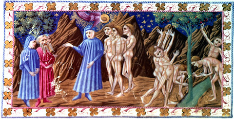
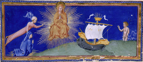
Few writers have inspired so many artists, so deeply and for so long, as Dante Alighieri. His epic poem the Divine Comedy (find in our collection of Free eBooks)has received striking illuminations at the hands of Gustave Doré, Sandro Botticelli, Alberto Martini, and Salvador Dalí — to name only those we’ve featured before here on Open Culture. The names Priamo della Quercia and Giovanni di Paolo may mean relatively little to you right now, but they’ll mean much more once you’ve taken a look at the illustrations featured here and at The World of Dante, which come from an illuminated manuscript of the Divine Comedy at the British Library known as Yates Thompson 36. Produced in Siena around 1450 for an unknown original patron, “the codex belonged to Alfonso V, king of Aragon, Naples, and Sicily,” and includes “110 large miniatures and three historiated initials.” (See all here.) Della Quercia illustrated the Inferno and Purgatorio and all three historiated initials; di Paolo illustrated Paradiso.
“This makes for two distinctly different styles,” continues The World of Dante’s page. “Priamo’s work reflects the more realistic style of late fifteenth-century Florentine painting, an influence which is particularly noticeable in his use of contours and outlines in the depiction of nudes. Giovanni di Paolo’s style is closer to that of late fourteenth-century Sienese artists,” producing results “greatly admired for their visual interpretation of the poem: the artist doesn’t just transcribe Dante’s words but seeks to render their meaning.”
The British Library’s medieval manuscripts blog describes it as “certainly a lavish production” that “must have been an expensive undertaking,” given the status of the men doing the illuminating as “two of the preeminent artists of the day.” But when it came to visualizing Dante’s journey, quite literally, to hell and back in 15th-century Italy, no artist ranked too highly. Even today, I can’t imagine any artist reading the Divine Comedy, illuminated or no, without getting a few vivid ideas of their own.
We're hoping to rely on loyal readers, rather than erratic ads. Please click the Donate button and support Open Culture. You can use Paypal, Venmo, Patreon, even Crypto! We thank you!
Open Culture scours the web for the best educational media. We find the free courses and audio books you need, the language lessons & educational videos you want, and plenty of enlightenment in between.