This ambitious project deserves a mention: Mediakraft Networks has launched a video series on Youtube that will document how World War I unfolded, week-by-week, over a four-year period, from 1914 to 1918. A new video will be released every Thursday, and it will reflect on what happened during the same week 100 years prior. Launched in late July, the series has already covered 16 weeks of The Great War, with latest video showing how World War I became a defensive war and trenches began to scar the land. Hosted by Indy Neidell (read an interview with him here), each video features archival footage from British Pathé, the newsreel archive company that put over 85,000 historical films on YouTube earlier this year.
You can watch all 16 episodes above, along with a few helpful primers that explain why the War started in the first place. To view new videos as they get released, keep tabs on this Youtube page. There should eventually be close to 300 episodes. Quite an undertaking!
As a side note, I noticed that a Dutch podcast (in English) will cover “The First World War in 261 weeks.” That’s the title of the podcast itself. Find it here.
“When it comes to ripe old frighteners — or to any other overheated genre — Scorsese is the most ardent of proselytizers,” writes the New Yorker’s Anthony Lane in a review of that respected director’s ripe-old-frightener-flavored Shutter Island, “so much so that I would prefer to hear him enthuse about Hammer Horror films, say, than to watch a Hammer Horror film.” And though no Hammer productions appear on it, Scorsese, who often seems as much film enthusiast as filmmaker, has put together a solid list of his personal eleven scariest horror movies for The Daily Beast. At its very top we have Robert Wise’s The Haunting, whose trailer you can watch above. Scorsese promisingly describes the story of the film, originally ballyhooed with the tagline “You may not believe in ghosts but you cannot deny terror!,” as “about the investigation of a house plagued by violently assaultive spirits.” His full and frightening list runs as follows:
You can watch clips of all these movies over at The Daily Beast. With only 351 days until next Halloween, this should help you plan your next midcentury-centered, British-inflected horror movie marathon. (And if you simply can’t get enough of the things, see also Time Out London’s list of the 100 best horror films.) Such tastes make it no surprise to see a Hitchcock film make Scorsese’s list; so much does Scorsese love Hitchcock’s work — “one of my guiding lights,” he calls the maker of Psycho — that he once spoofed his own fanboyism in a commercial for Freixenet sparkling wine. For those who’d prefer a more conventional Scorsese-inspired binge watch, we’ve also featured his list of twelve favorite films overall and his list of 39 Essential Foreign Films. Whatever genre you favor, you could do much worse than taking his recommendations.
Like all great writers, Leo Tolstoy has inspired a great many visual adaptations of his work, of varying degrees of quality. Just this past month, the Volgograd Fine Arts Museum in Russia held an exhibition of “92 graphic works from the collection of the Yasnaya Polyana Estate-Museum,” the author’s country estate and birthplace. Each work of art “recreates immortal images of the characters, reconstructs the historic epoch, and reflects the dynamics” of his masterpieces Anna Karenina and War and Peace, as well as his short stories for children.
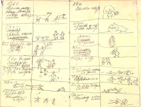
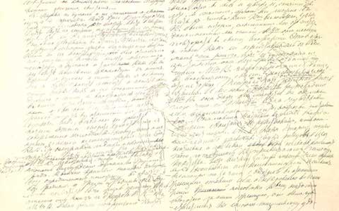
Travel to Moscow, however, to the Leo Tolstoy State Museum, and you’ll find Tolstoy’s own visual art, which he sketched both on the very manuscript pages of those novels and stories and in the notebooks that inspired them. At the top of the post, see a manuscript page of War and Peace with the figures of a boy and a well-dressed woman drawn very faintly into the text. Directly above, see a sketch for his ABC book, a primer he created for his peasant schools at Yasnaya Polyana.
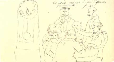
Tolstoy didn’t only illustrate his own work; he also made some sketches of his contemporary Jules Verne’s Around the World in Eighty Days—see one above—which he read in French with his children. These few drawings may seem like little more than doodles, but Tolstoy in fact had a very fine hand, as you can see in the two sketches below from notebooks he kept during his time in the Caucusus. It was then, while serving in the army, that Tolstoy began writing, and the notebooks he kept would eventually inspire his 1863 novel, The Cossacks.
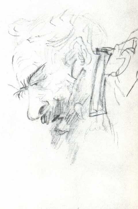
These drawings are so well rendered they make me think Tolstoy could have become a visual artist as well as a great writer. But perhaps the exacting novelist was too harsh a critic to allow himself to pursue that course. Over forty years after making these drawings, Tolstoy published his thoughts on art in essay called What is Art?. In it, the great Russian writer creates what Gary R. Jahn in The Journal of Aesthetics and Art Criticism admits are some “unreasonably narrow, exclusive” criteria for defining art.
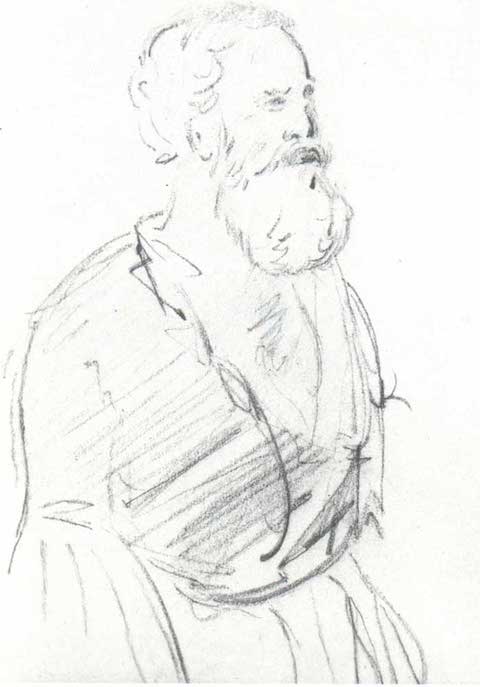
Tolstoy also propounds something akin to a meme theory, which he calls a quality of “infectiousness.” Art, he writes, is “a human activity consisting in this, that one man consciously, by means of certain external signs, hands on to others feelings he has lived through, and that other people are infected by these feelings and also experience them.” At the crucially formative period when these drawings were made, Tolstoy obviously decided he could best “infect” others through writing. That same year, he published the first part of his autobiographical trilogy, Childhood, under a pseudonym, followed quickly by Boyhood. By the time he retired from the army in 1856 and left the Caucusus for St. Petersburg, he was already a literary celebrity. See more of Tolstoy’s drawings from his Caucusus notebooks here.
René Clair’s 1924 avant-garde masterpiece Entr’Acte opens with a cannon firing into the audience and that’s pretty much a statement of purpose for the whole movie. Clair wanted to shake up the audience, throwing it into a disorienting world of visual bravado and narrative absurdity. You can watch it above.
The film was originally designed to be screened between two acts of Francis Picabia’s 1924 opera Relâche. Picabia reportedly wrote the synopsis for the film on a single sheet of paper while dining at the famous Parisian restaurant Maxim’s and sent it to Clair. While that handwritten note was the genesis of what we see on screen, it’s Clair sheer cinematic inventiveness that is why the film is still shown in film schools today.
Clair sought to create a work of “pure cinema,” so he filled the film with just about every camera trick in the book: slow motion, fast motion, split screen and superimpositions among others. The camera is unbound and wildly kinetic. At one point, Clair mounts the camera upside down to the front of a rollercoaster.
In true Dadaist fashion, Clair creates a series of striking images – an upskirt shot of a leaping ballerina; a funeral procession bounding down the street in slow motion; a corpse springing out of a coffin – that seem to cry out for an explanation but remain maddeningly, frequently hilariously obscure.
The movie also serves as a class portrait of the Parisian avant-garde scene of the early ‘20s. Picabia and Erik Satie – who scored the movie – are the ones who fired that cannon. In another scene, Marcel Duchamp and Man Ray can be seen playing chess with each other on a Parisian rooftop.
Compared to Luis Bunuel and Salvador Dali’s notorious 1928 short Un Chien Andalou – a movie that is still quite shocking today – Entr’Acte is a much lighter, funnier work, one that looks to thwart bourgeois expectations of narrative logic but doesn’t quite try to shock them into indignant outrage. In fact, to modern eyes, the movie feels at times like a particularly unhinged Monty Python skit. Picabia himself once asserted that Entr’acte “respects nothing except the right to roar with laughter.” So watch, laugh and prepare to be confused.
Jonathan Crow is a Los Angeles-based writer and filmmaker whose work has appeared in Yahoo!, The Hollywood Reporter, and other publications. You can follow him at @jonccrow. And check out his blog Veeptopus, featuring lots of pictures of vice presidents with octopuses on their heads. The Veeptopus store is here.
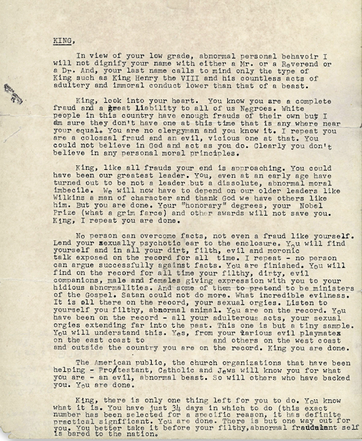
In November of 1964, Martin Luther King received a chilling letter, purportedly from a disillusioned member of the African-American community. “King, look into your heart,” writes MLK’s critic. “You know you are a complete fraud and a great liability to all of us Negroes.”
The letter then turns menacing. It gives the civil rights leader a choice. Commit suicide or get killed:
You are done.
King, there is only one thing left for you to do. You know what it is. You have just 34 days in which to do it (this exact number has been selected for a specific reason, it has definite practical significance). You are done. There is but one way out for you. You better take it before your filthy, abnormal fraudulent self is bared to the nation.
Straight from the beginning, King knew the real author behind the “suicide letter,” as it’s now called. It was the FBI, led by J. Edgar Hoover, who harbored a deep and abiding hatred for King. For years, the public only had access to redacted copies of the letter. The redactions obscured the methods of the FBI — the way the agency tried to “fracture movements and pit leaders against one another,” writes the Electronic Frontier Foundation, and the way it used surveillance to invade King’s personal life and then blackmailed him with the information it gathered. That’s what’s happening in the paragraph that begins “No person can overcome the facts, not even a fraud like yourself.”
This summer, while researching at the National Archives, Beverly Gage, a professor of American history at Yale, stumbled upon an unredacted copy. You can read it above. On Tuesday, Gage wrote about the letter and its historical significance in The New York Times. The unredacted letter was also published in the Times.
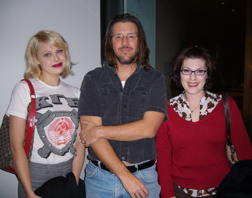
The term “creative nonfiction” has picked up a great deal of traction over the past decade — perhaps too much, depending upon how valid or invalid you find it. Meaningful or not, the label has come into its current popularity in part thanks to the essays of novelist David Foster Wallace: whether writing nonfictionally about the Illinois State Fair, David Lynch, professional tennis, or a seven-night Caribbean cruise, he did it in a way unlike any other man or woman of letters. While nobody can learn to write quite like him — this we’ve seen when Wallace-imitators write pastiches of their own — he did spend time teaching the art of creative nonfiction as he saw it,
a broad category of prose works such as personal essays and memoirs, profiles, nature and travel writing, narrative essays, observational or descriptive essays, general-interest technical writing, argumentative or idea-based essays, general-interest criticism, literary journalism, and so on. The term’s constituent words suggest a conceptual axis on which these sorts of prose works lie. As nonfiction, the works are connected to actual states of affairs in the world, are “true” to some reliable extent. If, for example, a certain event is alleged to have occurred, it must really have occurred; if a proposition is asserted, the reader expects some proof of (or argument for) its accuracy. At the same time, the adjective creative signifies that some goal(s) other than sheer truthfulness motivates the writer and informs her work. This creative goal, broadly stated, may be to interest readers, or to instruct them, or to entertain them, to move or persuade, to edify, to redeem, to amuse, to get readers to look more closely at or think more deeply about something that’s worth their attention… or some combination(s) of these.
In some ways, Wallace syllabi themselves count as pieces of creative nonfiction. What other professor ever had the prose chops to make you actually want to read anything under the “Class Rules & Procedures” heading? In the ninth of its thirteen points, he lays out the workshop’s operative belief:
that you’ll improve as a writer not just by writing a lot and receiving detailed criticism but also by becoming a more sophisticated and articulate critic of other writers’ work. You are thus required to read each of your colleagues’ essays at least twice, making helpful and specific comments on the manuscript copy wherever appropriate. You will then compose a one-to-three-page letter to the essay’s author, communicating your sense of the draft’s strengths and weaknesses and making clear, specific suggestions for revision.
But whatever the rigors of English 183D, Wallace would have succeeded, to my mind, if he’d instilled nothing more than this in the minds of his departing students:
In the grown-up world, creative nonfiction is not expressive writing but rather communicative writing. And an axiom of communicative writing is that the reader does not automatically care about you (the writer), nor does she find you fascinating as a person, nor does she feel a deep natural interest in the same things that interest you.
True to form, DFW’s syllabus comes complete with footnotes.
1 (A good dictionary and usage dictionary are strongly recommended. You’re insane if you don’t own these already.)
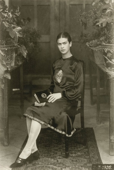
Long before the tumultuous marriage to Diego Rivera and the mortifications of the flesh occasioned by a horrific bus accident, and longer still before the avalanche of Frida-centric kitsch and tchotchkes and the Julie Taymor biopic starring Salma Hayek, there was a cherubic little girl named Magdalena Carmen Frieda Kahlo y Calderón.
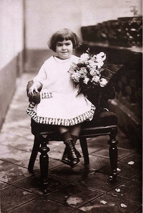
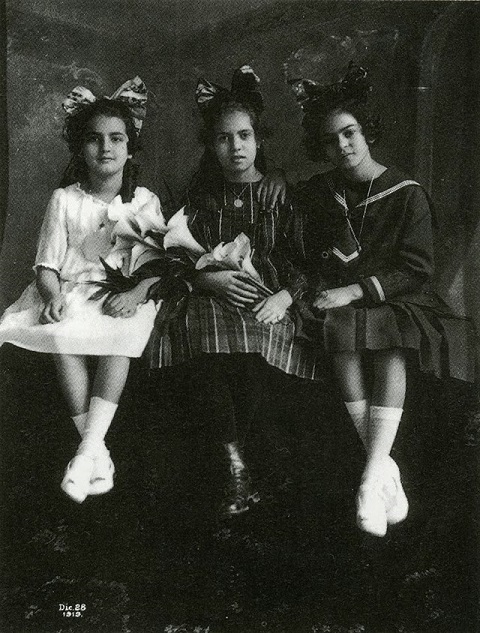
Witness these photos of young Magdalena Carmen Frieda, taken by her Hungarian Jewish father, Guillermo, over a period of twenty years.
The 2‑year-old Frida is merry, chubby, and barely recognizable.
The piercing gaze starts coming into focus around age 5. Kid looks like an artist already!
The famous eyebrows have filled in by 12, when she faces the camera in a sailor suit and giant hair bow.
The 18-year-old pre-med student adopting an unsmiling pose in 1926—the year of the accident—is unapologetic, intense, and unmistakably Frida Kahlo.
Visit Vintage Everyday for more of Guillermo Kahlo’s images of his second-to-last daughter.
You might think that a movie about information from 1953 couldn’t possibly be relevant in the age of iPhone apps and the Internet but you’d be wrong. A Communications Primer, directed by that power couple of design Charles and Ray Eames, might refer to some hopelessly quaint technology – computer punch cards, for instance – but the underlying ideas are as current as anything you’re likely to see at a TED talk. You can watch it above.
In fact, the film made for IBM was the result of the first ever multi-media presentations that Charles Eames developed for the University of Georgia and UCLA. Using slides, music, narration and film, Eames broke down some elemental aspects of communications for the audience. Central to the film is an input/output diagram that was laid out by Claude Shannon, the father of information theory, in his 1949 book, The Mathematical Theory of Communication. As the perhaps overly soothing narrator intones, any message is transmitted by a signal through a channel to its receiver. While in the channel, the signal is altered and degraded by noise. The key to effective communication is to reduce “noise” (construed broadly) that interferes with the message and to generally simplify things.
The issue of signal vs noise is probably more relevant now in this age of perpetual distraction than it was during the Eisenhower administration. Every email, text message or Buzzfeed article seen individually is clearly a signal. Yet for someone trying to work, say on an article about a short film by Charles and Ray Eames, they are definitely noise.
The Eames use the terms “signal,” “noise,” and “communication” quite broadly. Not only do they use these terms to describe, say, a radio broadcast or a message being relayed by Morse code but also the creation of architecture, design and even visual art.
The source of a painting is the mind and experience of the painter. Message? His concept of a particular painting. Transmitter? His talent and technique. Signal? The painting itself. Receiver? All the eyes and nervous systems and previous conditioning of those who see the painting. Destination? Their minds, their emotions, their experience. Now in this case, the noise that tends to disrupt the signal can take many forms. It can be the quality of the light. The color of the light. The prejudices of the viewer. The idiosyncrasies of the painter.
Of course, a painting — or a poem, or a film by Andrei Tarkovsky — is a different kind of signal than an email. It’s message is multilayered and multivalent. And while a generation of cultural theorists would no doubt chafe at Eames’s reductive, Modernist view of art, it is still interesting to think of a painting in the same manner as smoke signals.
The film’s narrator continues:
But besides noise, there are other factors that can keep information from reaching its destination in tact. The background and conditioning of the receiving apparatus may so differ from that of the transmitter that it may be impossible for the receiver to pick up the signal without distortion.
That’s about as good a description of cable new pundits as I’ve ever seen.
Jonathan Crow is a Los Angeles-based writer and filmmaker whose work has appeared in Yahoo!, The Hollywood Reporter, and other publications. You can follow him at @jonccrow. And check out his blog Veeptopus, featuring lots of pictures of vice presidents with octopuses on their heads. The Veeptopus store is here.
We're hoping to rely on loyal readers, rather than erratic ads. Please click the Donate button and support Open Culture. You can use Paypal, Venmo, Patreon, even Crypto! We thank you!
Open Culture scours the web for the best educational media. We find the free courses and audio books you need, the language lessons & educational videos you want, and plenty of enlightenment in between.