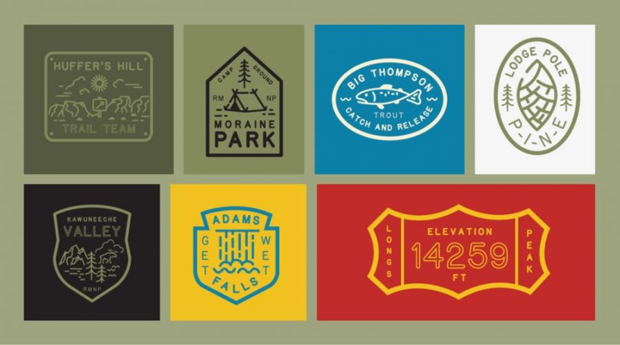
Fonts put in the service of the public good, like road signs, and street names, try to be invisible most of the time. They’re here to do their job and nothing else. But certain fonts accumulate something else, a sense of familiarity, a feeling of comfort and affection. That’s the thinking behind this recreation of America’s National Park font, which a team of five designers has created after much loving research.
Jeremy Shelhorn, the font studio’s founder, pinpoints exactly that kind of comfort:
Anyway I wasn’t fishing for some reason and was wandering around following a deer trail turned into fisherman’s trail then back to another trail as sometime fisherman do. I had trekked pretty far that day and wasn’t exactly lost, but I needed a little reassurance that I was heading the right direction when I came across one of those ubiquitous signs you see in a national park. You know the ones that have the text carved or “routed” into it. Entering Rocky Mountain National Park.
The font is “routed” into wooden signs and follows familiar rules: rounded serifs, simple angles. Shelhorn began to wonder:
…if it actually was a typeface or “font” that anyone could download and use? Do park rangers have this as a typeface on their computers to set in their word docs, pdfs and power point slides?…Turns out it isn’t a typeface at all but a system of paths, points and curves that a router follows.
The National Park Type Face was created by Shelhorn, his partner Andrea Herstowski, two students from the University of Kansas– Chloe Hubler and Jenny O’Grady–and an actual NPS Ranger Miles Barger. It looks like the real thing and comes in three weights and one outline font. Research was done by taking pencil rubbings of various signs. And now you can download the fonts here.
Outside this font, Jeremy Shellhorn and associates work on other projects involving our National Parks (always under threat from big industry and rapacious capitalists). You can check their various work here.
Melbourne typographer Stephen Banham once described the cultural baggage that comes with Gil Sans:
Whenever I read text set in Gill Sans, I can’t help but hear the voice of an English narrator reading along with me.
With that in mind, what does the National Park font (download here) sound like to you? A friendly ranger? The sound of hiking boots on a trail? Birdsong? A babbling brook? The voice of nature itself? Let us know in the comments.
Related Content
The History of Typography Told in Five Animated Minutes
Ted Mills is a freelance writer on the arts who currently hosts the artist interview-based FunkZone Podcast and is the producer of KCRW’s Curious Coast. You can also follow him on Twitter at @tedmills, read his other arts writing at tedmills.com and/or watch his films here.


Leave a Reply