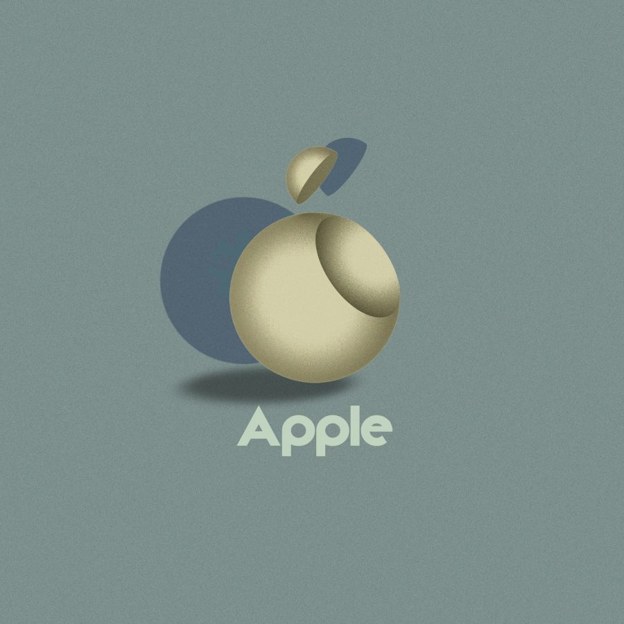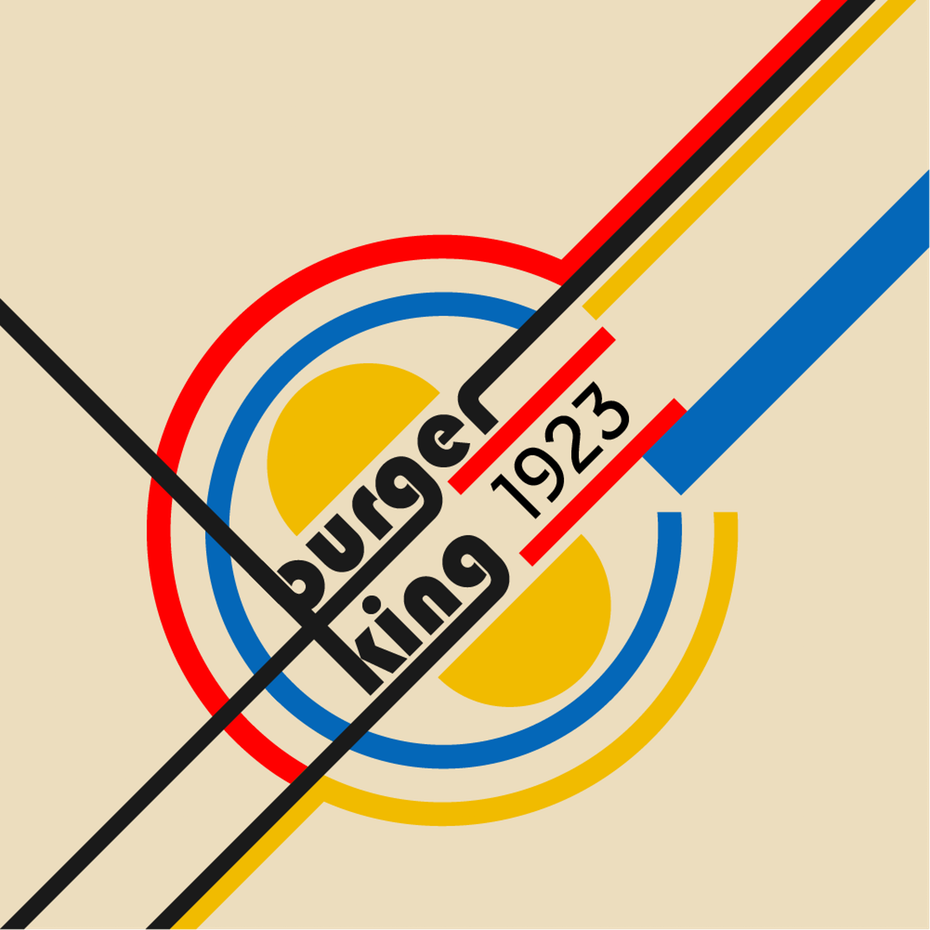
Image by Vladimir Nikolic
American children, a study found a few years ago, recognize over 1,000 corporate logos but almost no plants. To some it was a damning indictment of the modern world; to others it was nothing more than a description of the modern world (in the 21st century, after all, which skill is more help in finding food?); and to a few it was an opportunity to proclaim that, for the sake of the children, the modern world could use some better corporate logos.

Image by dellfi
The artists, architects, and designers of the Bauhaus, the modernist art-school-turned-movement with its origins in Weimar Germany, might well have agreed. Right from the Bauhaus’ foundation in 1919, its members worked on shaping the aesthetics of the future.
Now, for the school’s 100th anniversary (today!), 99designs has commissioned revisions of current corporate logos in the Bauhaus style. “It outlasted a century’s worth of competing styles,” writes 99designs’ Matt Ellis, “survived the initial criticisms from traditionalists, and although the Nazis shut down the institution in 1933, the Bauhaus movement itself lives on to this day.”

Image by ArsDesigns
Ellis goes on to quote the still-inspiring words of Bauhaus founder Walter Gropius: “The artist is a heightened manifestation of the craftsman. Let us form… a new guild of craftsmen without the class divisions that set out to raise an arrogant barrier between craftsmen and artists! Let us together create the new building of the future which will be all in one: architecture and sculpture and painting.” This project put up the five pillars of the Bauhaus style: “form follows function,” “minimalism,” “revolutionary typography,” “passion for geometry,” and “primary colors.”

Image by dnk
The reimagined corporate logos made for the centenary of the Bauhaus stand on all those pillars, turning the emblems of products and services that many of us consume and use every day — or perhaps, as we scroll through Instagram on our iPhones or Android devices at Starbucks in our Adidases, all at the same time — into designs that merge the cutting-edge aesthetics of interwar Europe with those of the thoroughly globalized 2010s.

Image by PonomarevDmitry
Whether a pure Bauhaus revival will result in the actual adoption of logos like these remains to be seen, but in a way, the exercise simply doubles down on an influence that already runs deep. As Artsy’s Kelsey Ables puts it, “It is a testament to the longstanding influence of Bauhausian minimalist ideals that the selected logos were already streamlined to begin with; many of the designers who reimagined ‘Bauhaus style’ logos had to add visual elements. Perhaps Google and its brethren are more Bauhaus than the Bauhaus itself.”

Image by ArsDesigns
Related Content:
32,000+ Bauhaus Art Objects Made Available Online by Harvard Museum Website
Based in Seoul, Colin Marshall writes and broadcasts on cities, language, and culture. His projects include the book The Stateless City: a Walk through 21st-Century Los Angeles and the video series The City in Cinema. Follow him on Twitter at @colinmarshall or on Facebook.


Leave a Reply