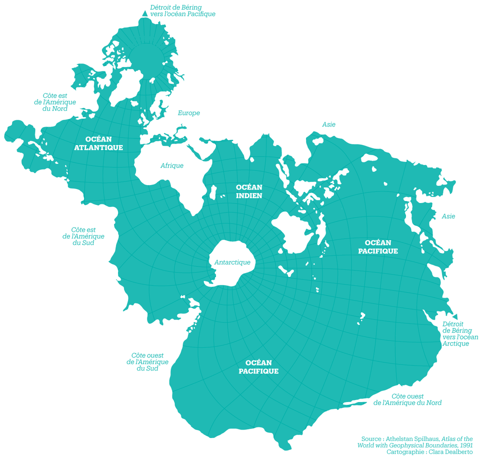
We all learn the names, locations, and even characteristics of the oceans in school. But unless we go into oceanography or some other body-of-water-centric profession, few of us keep them at our command. Maybe the loss of that knowledge has to do with our land-centricity as a species: not only do we live on the stuff, we also put it before water intellectually. You can see how by taking a glance at the design of most any world map, whose framing, details, and color scheme all work together to highlight the land, not the water. Only the map above, the “Spilhaus Projection,” dares to reverse that scheme, putting Earth’s water at the center and turning it from negative space into positive.
Named for its creator, the South African-born oceanographer, geophysicist, inventor, urban designer (having come up with Minneapolis Skyway System), and comic artist Athelstan Spilhaus, the Spilhaus Projection “reverses the land-based bias of traditional cartographic projections,” writes Big Think’s Frank Jacobs, placing “the poles of the map in South America and China, ripping up continents to show the high seas as one interrupted whole.” The resulting “earth-sea” is “perforated by Antarctica and Australia, and fringed by the other land masses.” If you look closely at the top and lower right of the map, you’ll find triangular symbols indicating the Bering Strait, perhaps the best landmark to orient your perception of this radically new view of planet Earth.
But the view provided by the Spilhaus Projection (rendered here by graphic designer Clara Dealberto for Libération) isn’t as new as it may look. Spilhaus designed it back in 1942, as a side project while working on the invention for which he is perhaps most remembered: the bathythermograph, a device for measuring ocean depths and temperatures from moving vessels like boats and submarines. But Jacobs credits it with a new relevance today: “Our oceans produce between 50% and 85% of the world’s oxygen and are a major source of food for humanity. But they are in mortal danger, from overfishing, acidification, plastic pollution and climate change. Maritime ‘dead zones’ – with zero oxygen and zero marine life – have quadrupled since the 1950s.”
In other words, our world and the oceans that cover more than 70 percent of its surface already look quite a bit different than they did when Spilhaus designed this re-prioritized way of visualizing them. Spilhaus lived until 1998, long enough to see the emergence of current ideas about climate change, but one does wonder whether we in the 21st century have developed the kind of ocean-consciousness for which he must have hoped. Perhaps our times call for even more drastic mapping action, not just showing the centrality of the oceans but, as we’ve previously featured here on Open Culture, showing what might happen if they change much more.
via Big Think
Related Content:
A Century of Global Warming Visualized in a 35 Second Video
Countries and Coastlines: A Dramatic View of Earth from Outer Space
Japanese Designers May Have Created the Most Accurate Map of Our World: See the AuthaGraph
Based in Seoul, Colin Marshall writes and broadcasts on cities, language, and culture. His projects include the book The Stateless City: a Walk through 21st-Century Los Angeles and the video series The City in Cinema. Follow him on Twitter at @colinmarshall or on Facebook.


Leave a Reply