How do we begin to read philosophy? Can we slide a book from the shelf, thumb through it casually, picking out the bits of wisdom that make sense?
Should we find a well-known “important” work, sit in a quiet study, read the preface, translator’s introduction, etc…
How soon we discover we know less about the book than when we started.
We go wandering, lose ourselves in secondary sources, glosses, footnotes, comments sections, Wikipedia articles…. The important book remains unread….
In-between these two extremes are a variety of approaches that work well for many an autodidact. When data scientist Grant Louis Oliveira decided he wanted to undertake a self-guided course of study to “more rigorously explore my ideas,” he began with the honest admission, “I find the world of philosophy a bit impenetrable.”
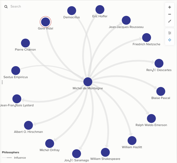
Where some of us might make an outline, a spreadsheet, or a humble reading list, Oliveira created a complex “social network visualization” of “a history of philosophy” to act as his guide.
“What I imagined,” he writes, “is something like a tree arranged down a timeline. More influential philosophers would be bigger nodes, and the size of the lines between the nodes would perhaps be variable by strength of influence.”
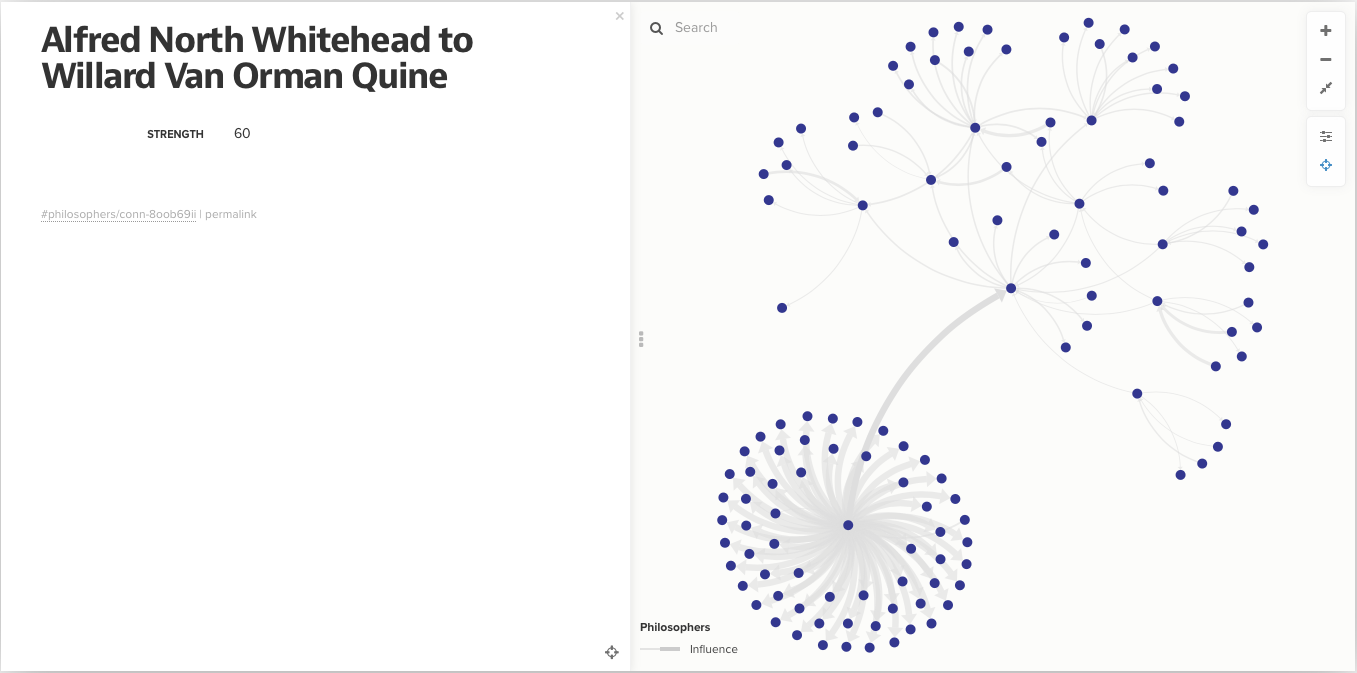
The project, called “Philosopher’s Web,” shows us an impressively dense collection of names—hundreds of names—held together by what look like the bendy filaments in a fiber-optic cable. Each blue dot represents a philosopher, the thin gray lines between the dots represent lines of influence.
The data for the project comes not from academic scholarship but from Wikipedia, whose “semantic companion” dbpedia Oliveira used to construct the web of “influenced” and “influenced by” connections. (Read about his method here.)
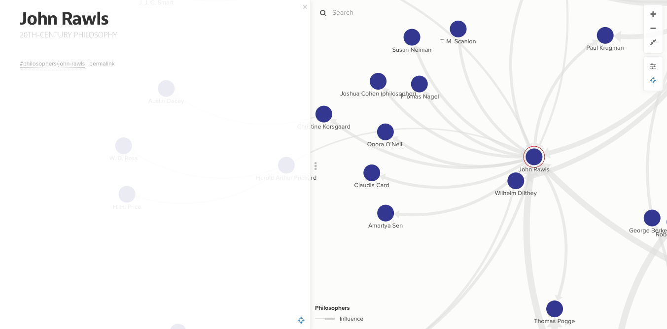
As you zoom in, click around, and access different views, the dots and lines wave like tendrils of a sea anemone. Oliveira describes the process thus: “the more influential the philosopher, the thicker and more numerous the lines emanating from him. You can click on any one of these nodes to see which philosopher it represents. If you click and hold, it will display the network of philosophers he has been influenced by, and has influenced. Each line has an arrow at the end to denote the direction of the relationship.” (Despite his use of the masculine pronoun, Oliveira’s web of connections is not exclusively male.)
Both the project’s site and Daily Nous have more nuanced, detailed instructions. While at first glance the Philosopher’s Web can itself seem a bit impenetrable, it reveals more of its inner workings the more you use it. Press and hold on one of the blue dots, and it expands into a smaller cluster of its own, showing a cloud of connections hovering around the central figure. Toggle the “focus” and you get secondary and tertiary relationships.
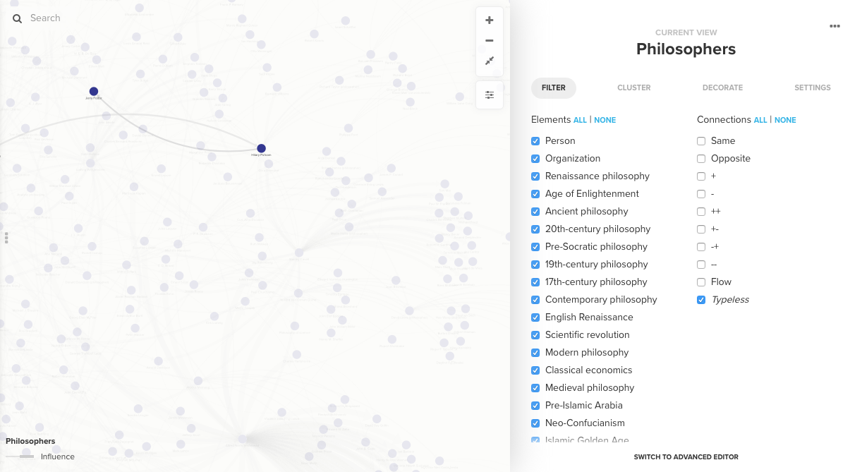
Click on the lines of influence and see, instead of an explanation, a somewhat mystifying “influence score.” Click on the “Filter” tab under “Settings” and find a range of filters that allow you to narrow or widen the scope of the map to certain historical periods.
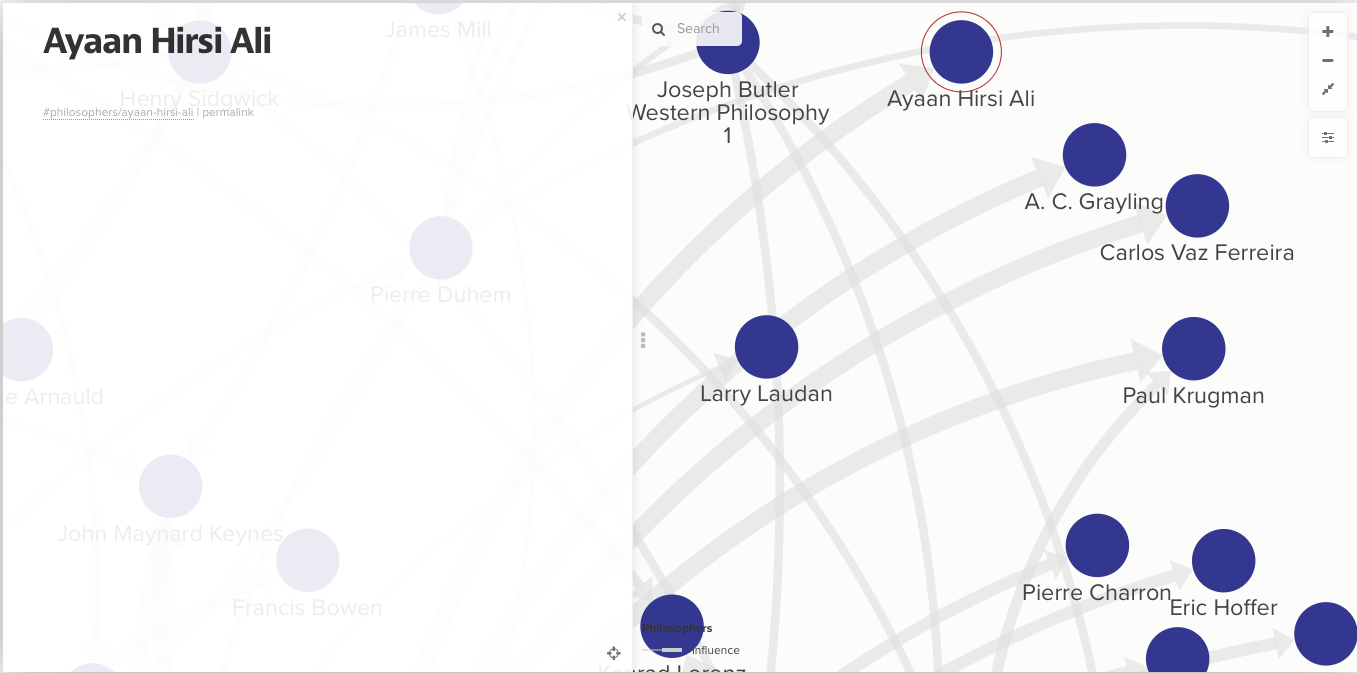
In addition to individual philosophers, the web also contains the names of several writers, journalists, columnists, and popular public intellectuals, like Paul Krugman and Ayaan Hirsi Ali. It also displays several movements or schools of thought as blue dots. Want to know the big names in “Insurrectionary Anarchism”? Click on the node and chose your levels of specificity.
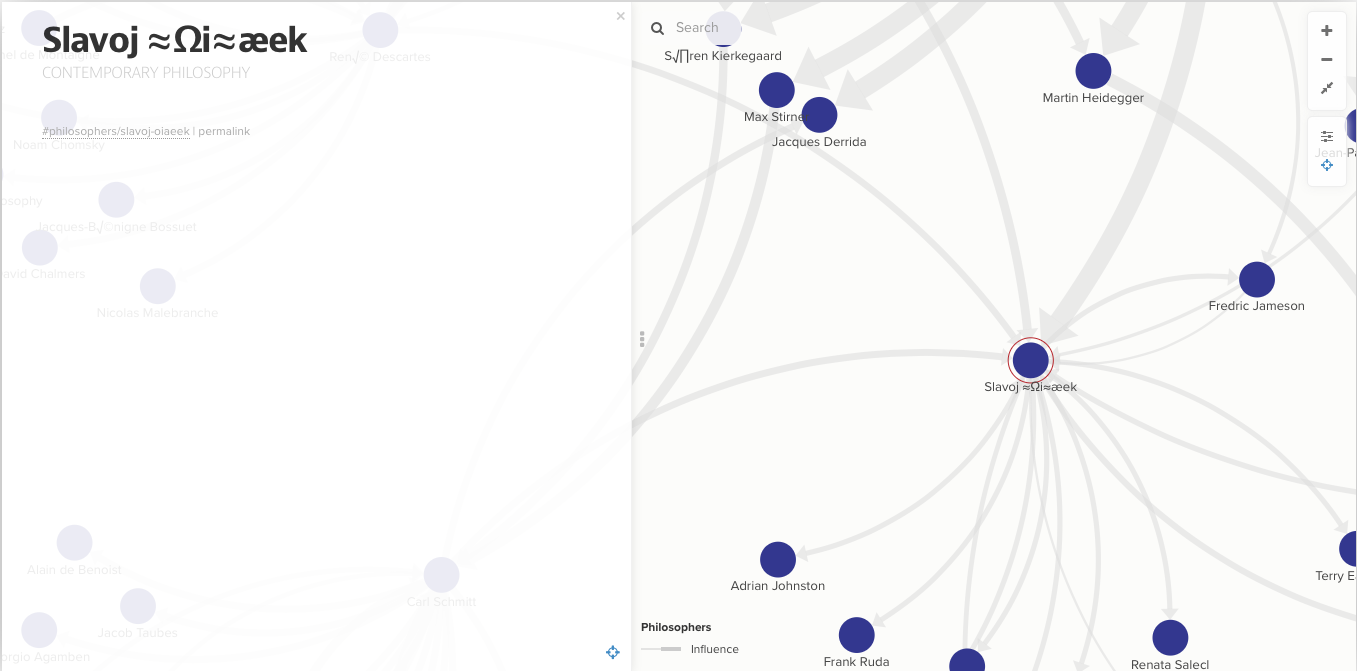
The weaknesses of the approach are perhaps immediately apparent. What good is a cluster of unfamiliar names to the beginner, especially since each one appears devoid of historical and intellectual context? Oliveira discloses some other problems, including an issue with the software rendering accents and foreign characters (as you can see in Slavoj Žižek’s entry above.)
But the more one uses the Philosopher’s Web, the more its utility becomes apparent. “Hopefully based on context,” writes Oliveira, “you should be able to figure out who these people are with a little bit of google.” Visualizing the connections between them gives one an instant sense of the communities and continuities to which they belong, and among each cluster will always be at least one or two familiar names, at least in passing, to act as an anchor.
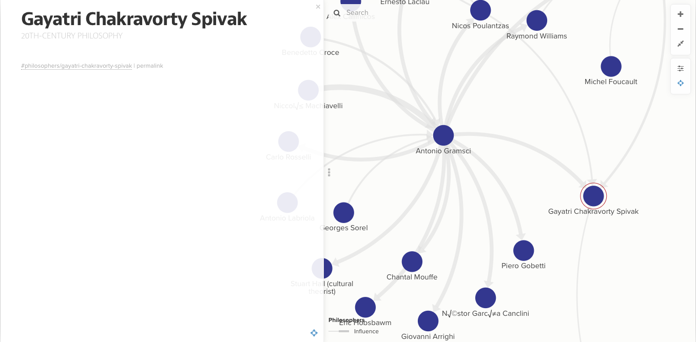
All in all, the Philosopher’s Web should prove to be a useful application for a certain kind of learner, and it represents a step-up from the ritual of clicking through Wikipedia links to try and put the puzzle pieces together one at a time. The Philosopher’s Web joins a number of other similar visualizations (see the links below) that aim at creating similar maps of the discipline.
Should you find the approach a little sterile and schematic, well… there’s always that book you put down a few hours ago.…
via Daily Nous
Related Content:
The History of Philosophy Visualized
Introduction to Philosophy: A Free Online Course
Josh Jones is a writer and musician based in Durham, NC. Follow him at @jdmagness


Leave a Reply